Interior design doesn’t have to be costly. At our Design Studio we champion craft and small changes. Sometimes it’s the smallest details in design that make the biggest impact. Join us as we explore some examples.
Striking Piping
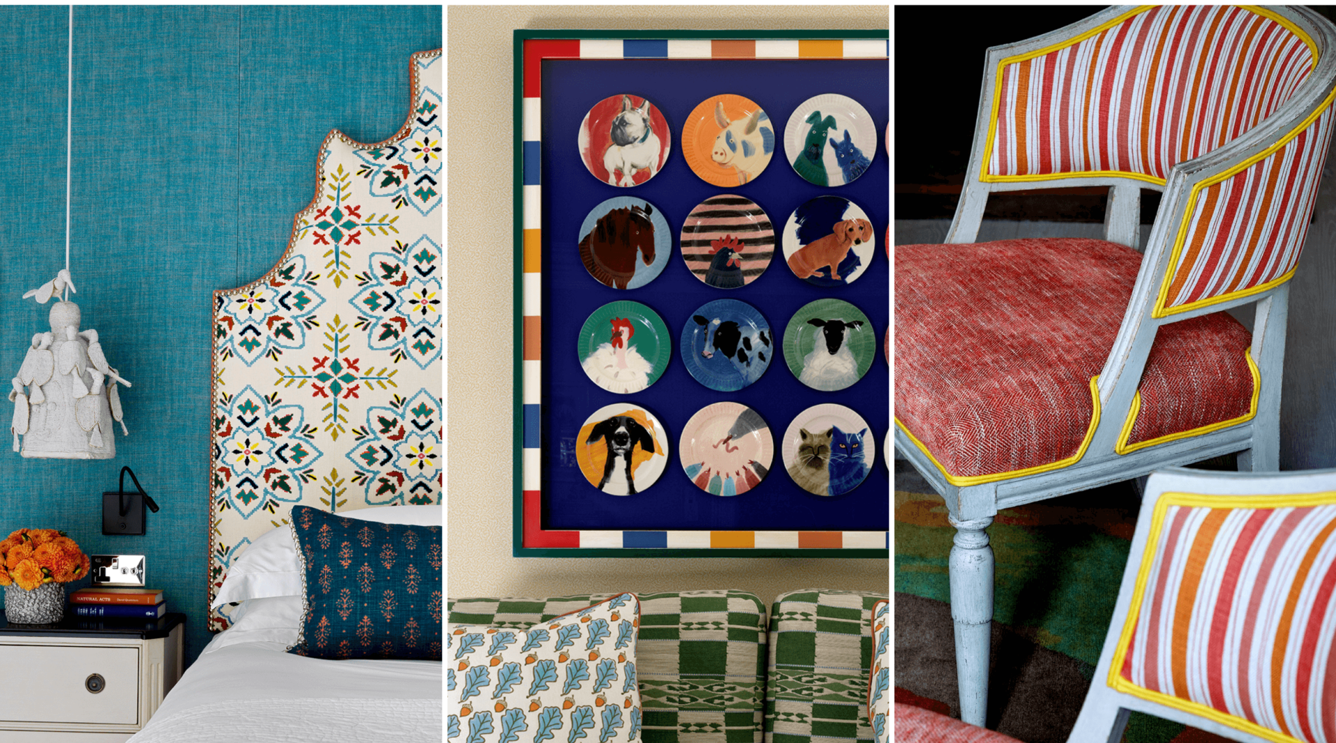
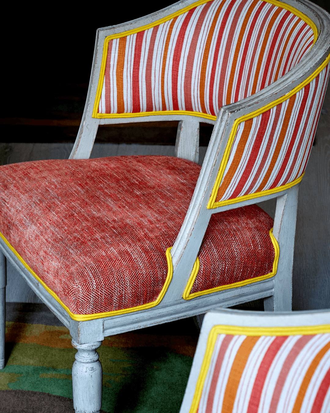
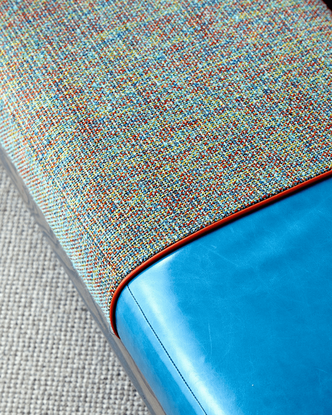
We love to go bold with our designs and piping is no exception. Use a striking colour when adding piping to traditional chairs as seen here on this Whitby Chair. We love how the yellow piping ‘pops’ and accentuates the chair’s curvature. You can also add double piping for extra impact, or use it to divide different fabrics. On an EBS (End of Bed Stool), we have used a bright orange colour to create a striking distinction between the two textiles. The piping also gives this piece a bespoke quality.
Bold Borders
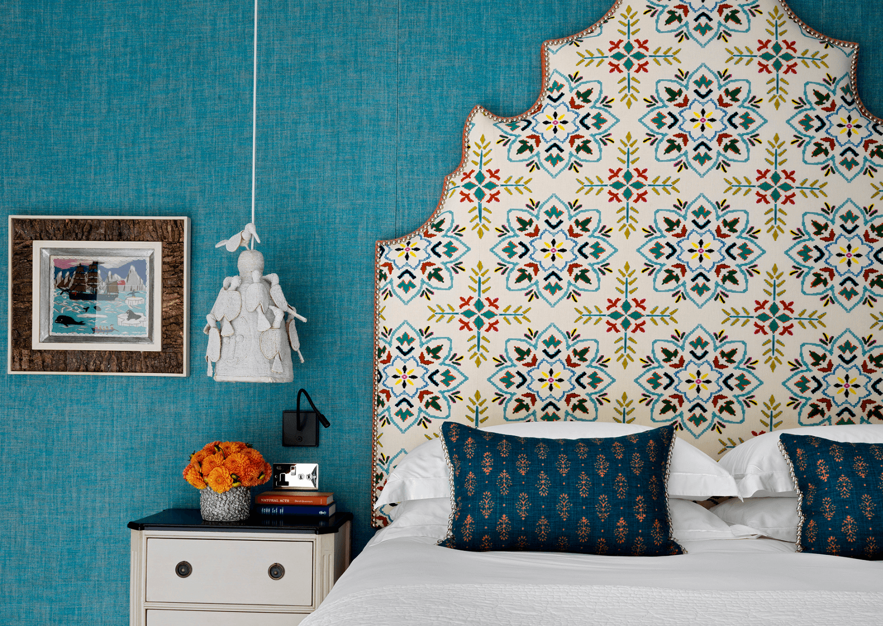
In The Oak Leaf Suite at Ham Yard Hotel, the headboard’s bold orange border has been framed with intricately placed metallic studs. Studding can be a great way of framing a piece of furniture, giving it added strength and definition. Our headboards are like artworks, so why treat them any differently? Find more ideas in our blog post: Our Dos & Don’ts for Upholstery Studding.
In Room 101 at Ham Yard Hotel, fabric by Carolina Irving Textiles creates an impact with its whimsical charm in an otherwise traditional scheme.
Graphic Fabrics
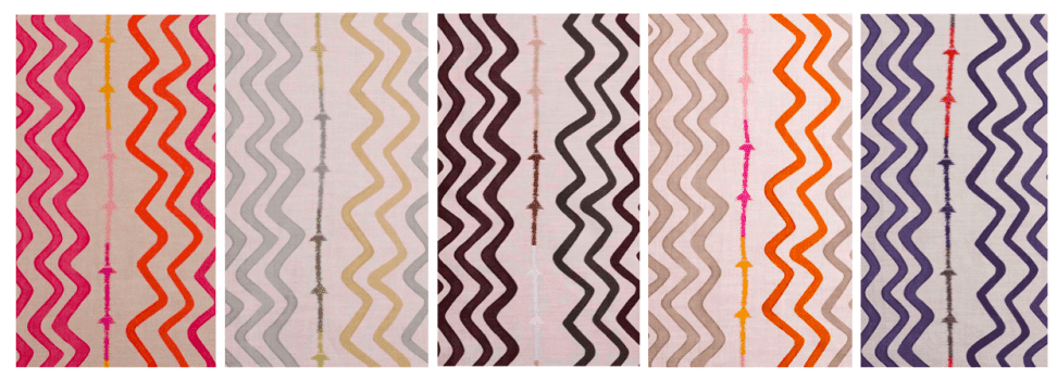
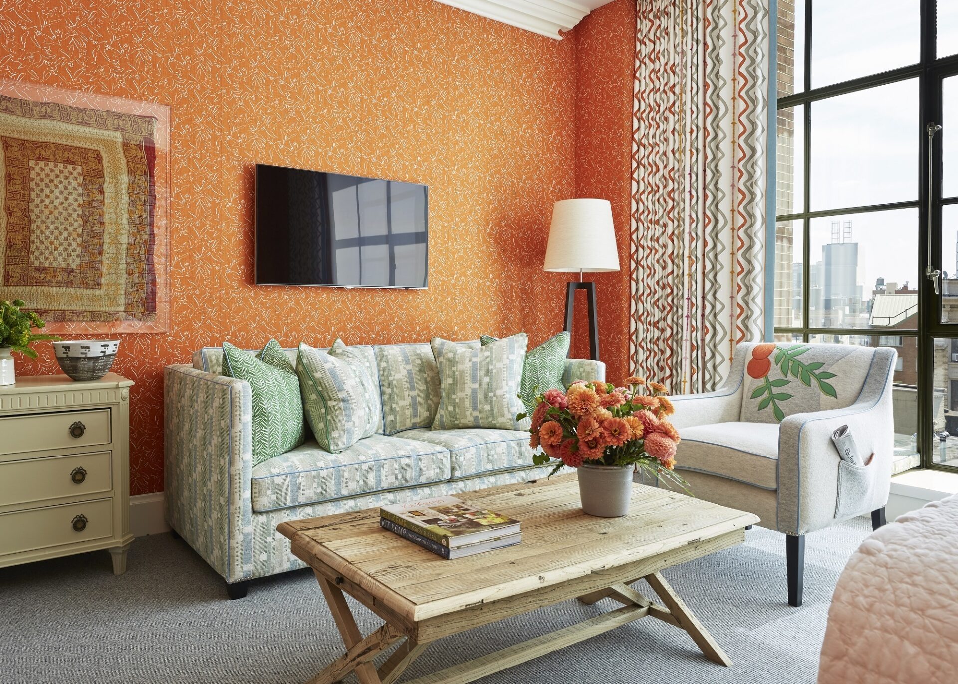
An easy way to refresh your space is by introducing graphic fabrics. Our ‘Rick Rack’ design for Christopher Farr looks hand painted and can be used in so many different interiors, both classical and modern. See ‘How We Use Rick Rack’ here.
Use Funky Frames
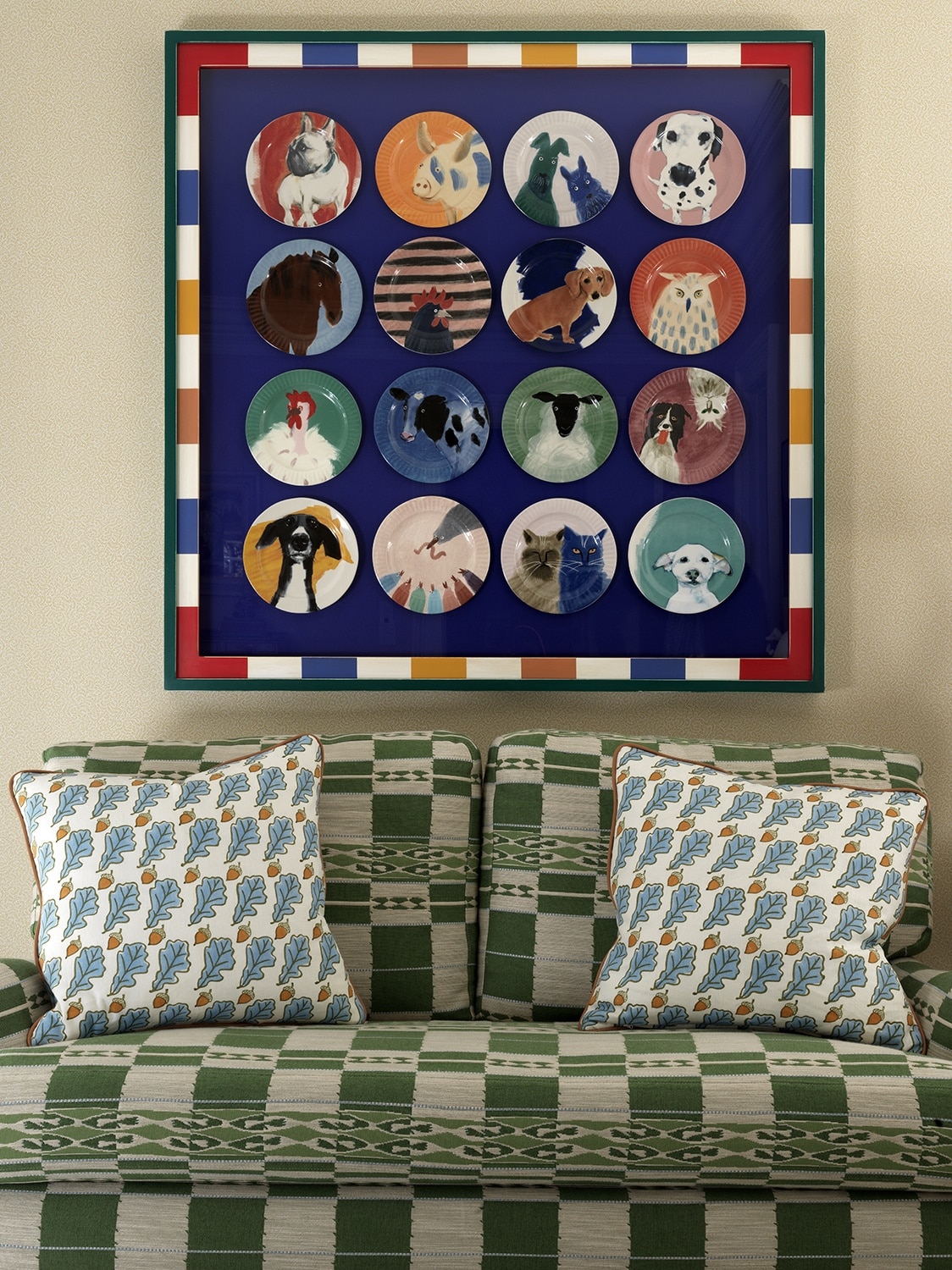
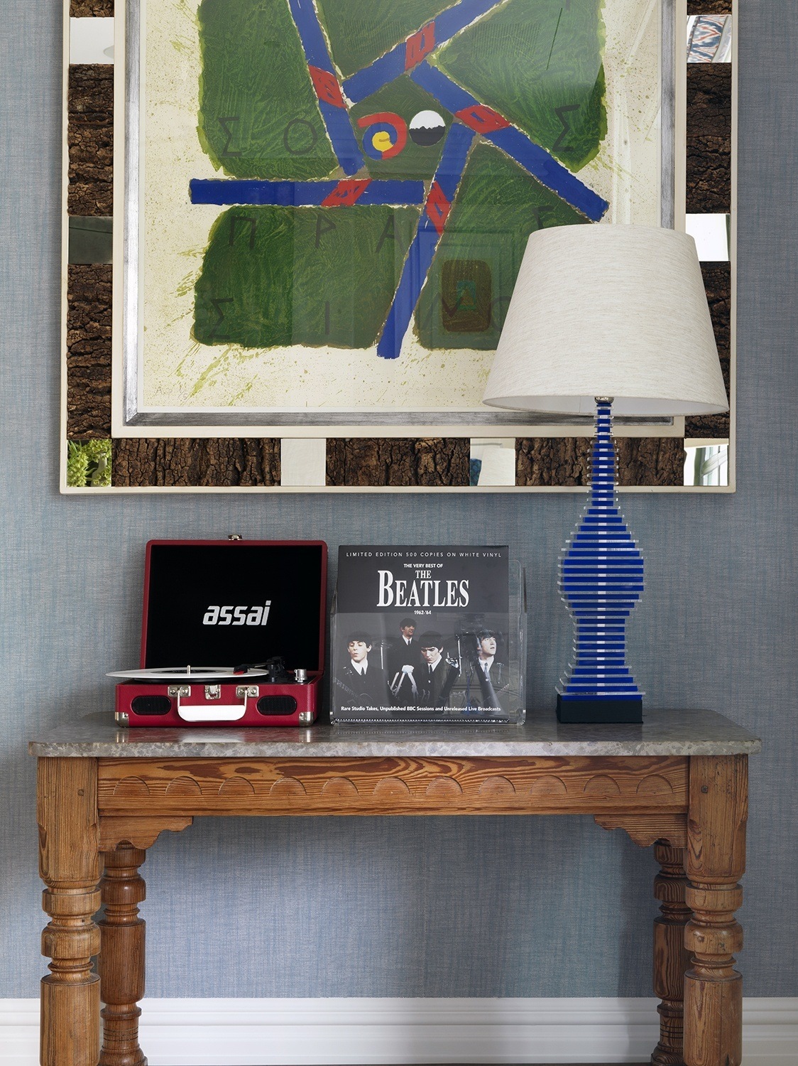
In our schemes and hotels we’ve framed art in almost every way possible and yet there are still more possibilities! A frame should complement your art, but that doesn’t mean it needs to be boring. If you’re looking to brighten up your home, use a funky frame to give your art an even bigger impact. Find our ‘Fun Ways to Elevate Your Art’ here.
Play with Texture
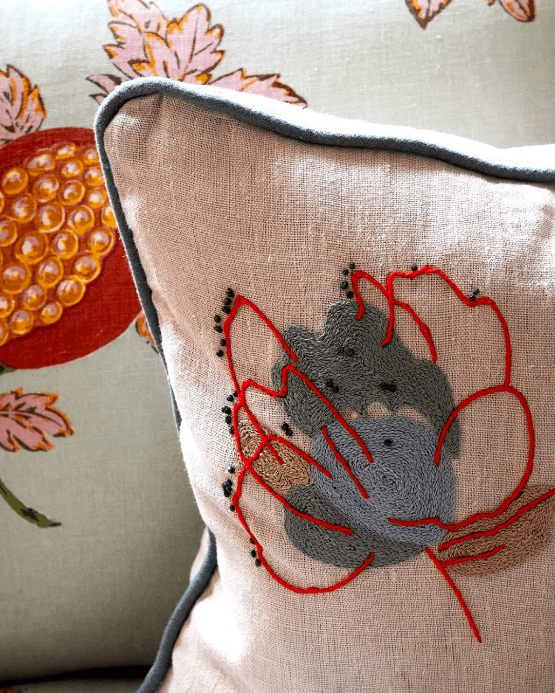
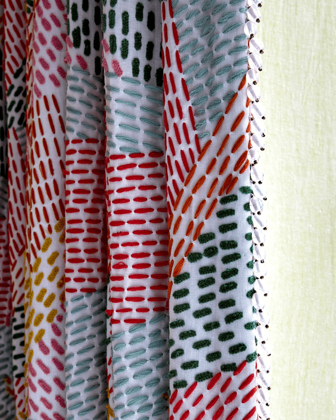
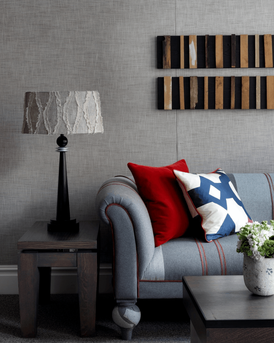
Unexpected details such as stitching or a combination of materials can make all the difference. Details in stitching are also a great way to create a bespoke and handmade impression.
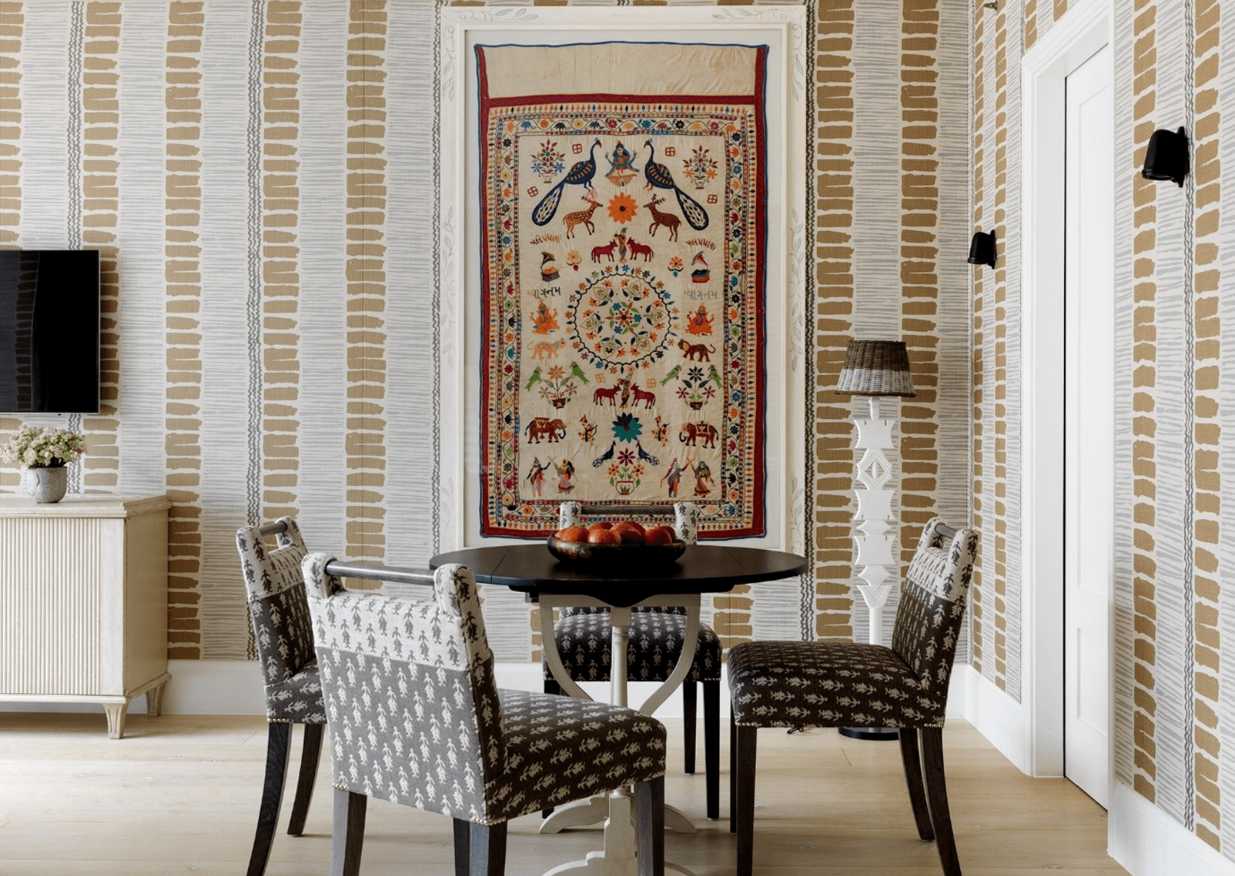
In Apartment 14 at One Denman Place, a graphic fabric design adorns the walls. This creates an element of excitement within this calm and neutral scheme.
Paint Power!
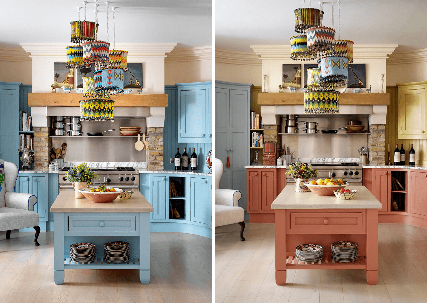
One small lick of paint, one giant leap for your home. We often talk about using fabric walls and wallpapers to refresh a space, but changing small details with paint can also make a big of impact. See how we transformed the appearance of an entire kitchen in this residential project – all with just a lick of paint.
Before and after…
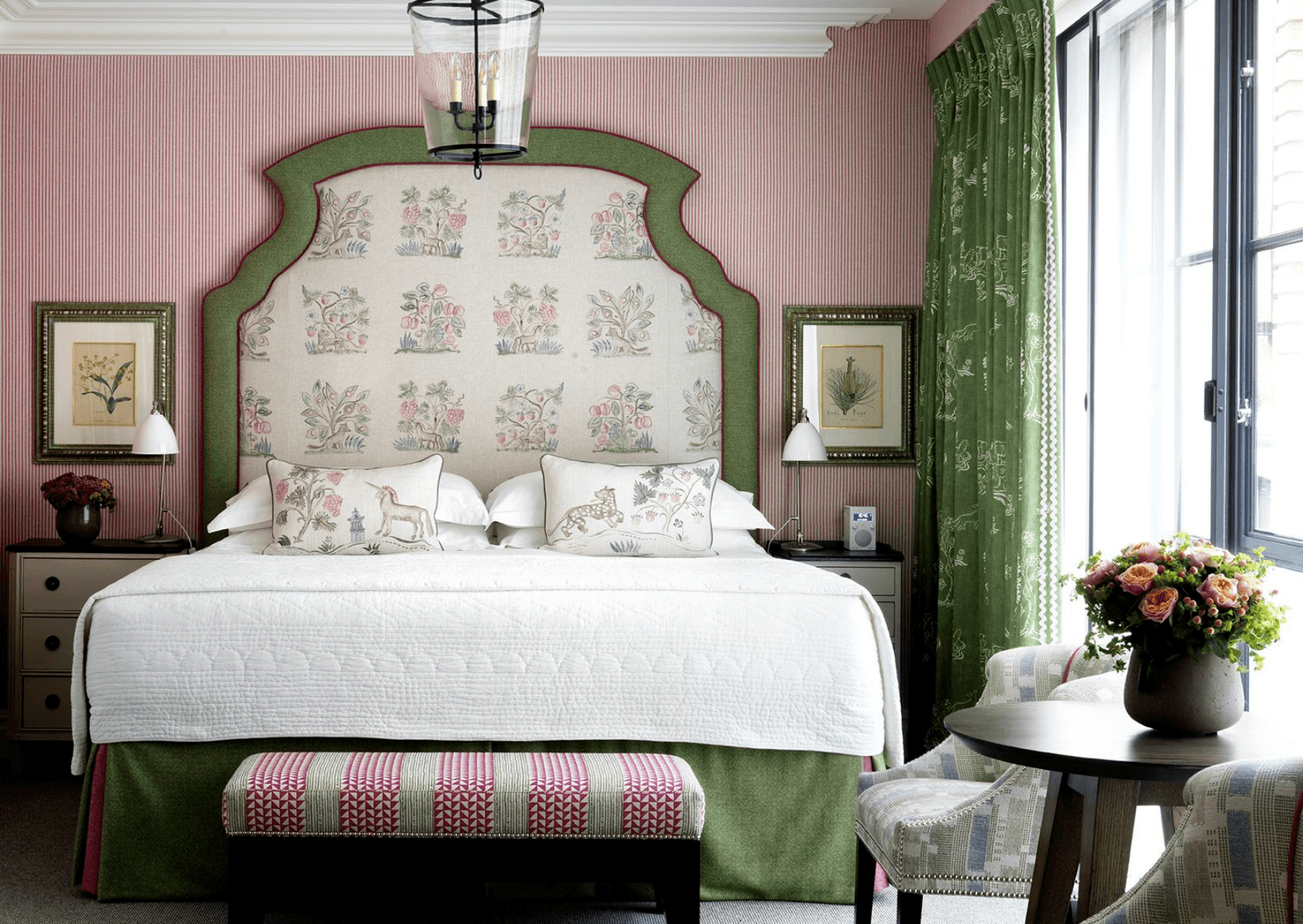
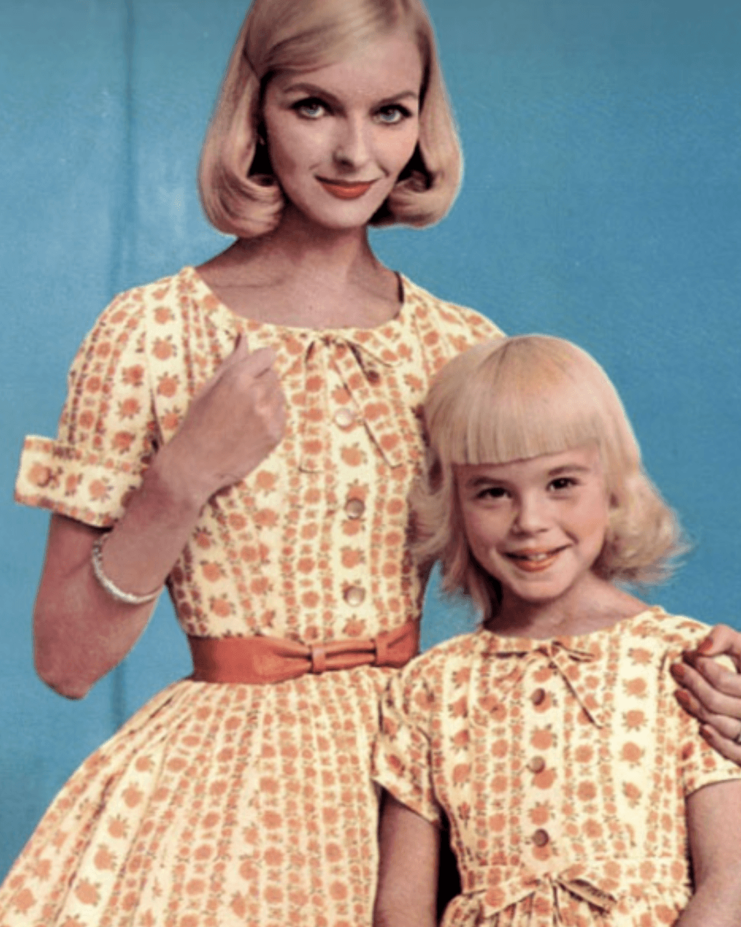
Finally, our last tip, avoid going too ‘matchy matchy’! Remember that unexpected details will keep you amused and make a space feel alive and exciting.
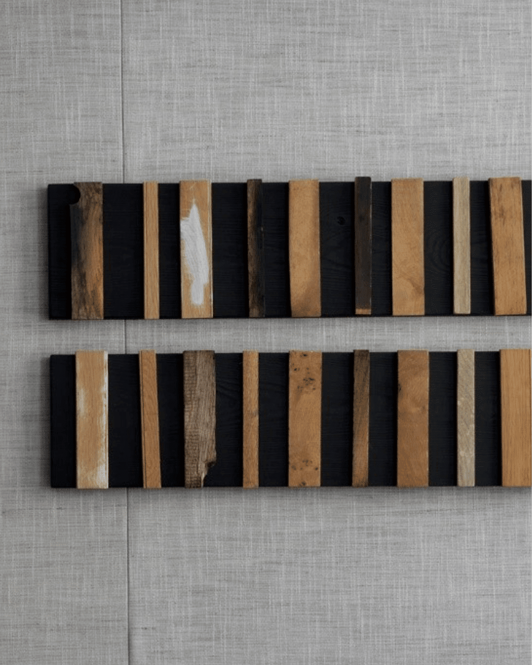
In a modern grey scheme, the addition of this timber artwork brings new textures and a sense of warmth.

