
‘Rick Rack’ is an effortlessly fun, large scale design. It is a mix of printed linen and embroidery, created as part of my collection with Christopher Farr Cloth.
Antique textiles were the primary source of inspiration. A recurring zig-zag motif, seen on a number of traditional Indian woven blankets was our starting point. We wanted something up to date and contemporary, so the challenge was adapting it to create something fresh and modern. We did this by isolating the pattern, simplifying it and enlarging it, with each wavy line changing in depth of colour.
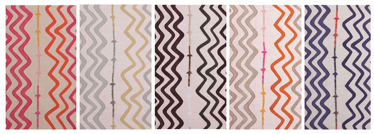
When we received the first samples, it looked good but I felt something was missing. That something was the arrow stitching which gives greater detail to the design.
This was the first time Michal Silver and I had explored printing and embroidery together, but as soon as the stitching was added it made all the difference, giving life and vitality to the design. Trying to convince the embroiderer that we wanted an imperfect, uneven line took some back and forth, but the end result, using a heavy cotton thread, is the imperfect perfection we adore.

I love how the very dark brown and black colourway looks so architectural on the white background.

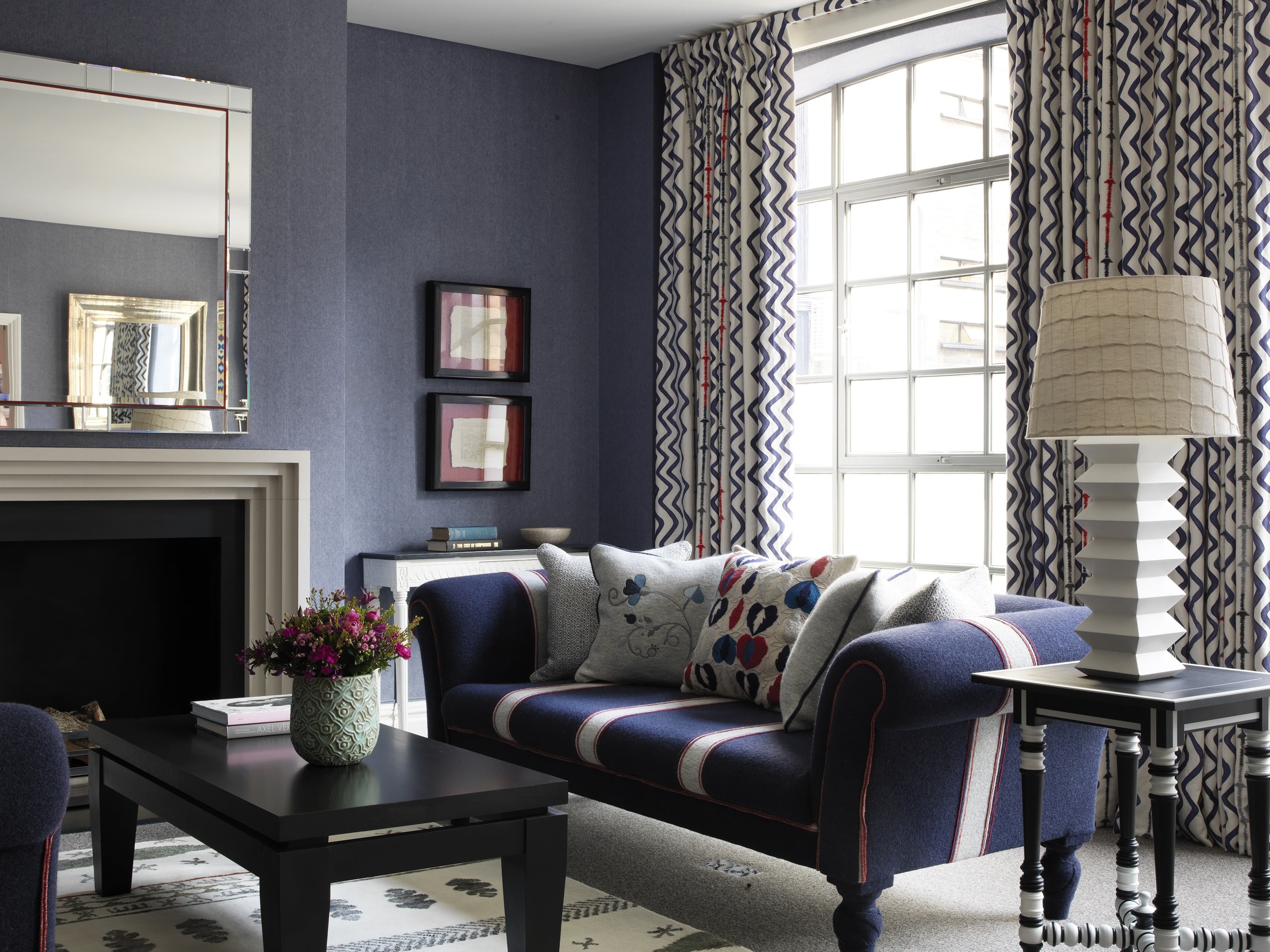
I love the way ‘Rick Rack’ can be used in so many different interiors, both classical and modern. The indigo looks as good in a beach house as it does in a Northern European bedroom. Here in the Richmond Suite at The Soho Hotel, we have used it for curtains. The fresh white ground of the fabric keeps the room light and airy. The bold wavy vertical lines of the design makes it a perfect choice for window treatment, adding height and interest to the space without it feeling too structured. We have also carried the flash of red from the embroidered stitch throughout the scheme as piping and in the scatter cushions.
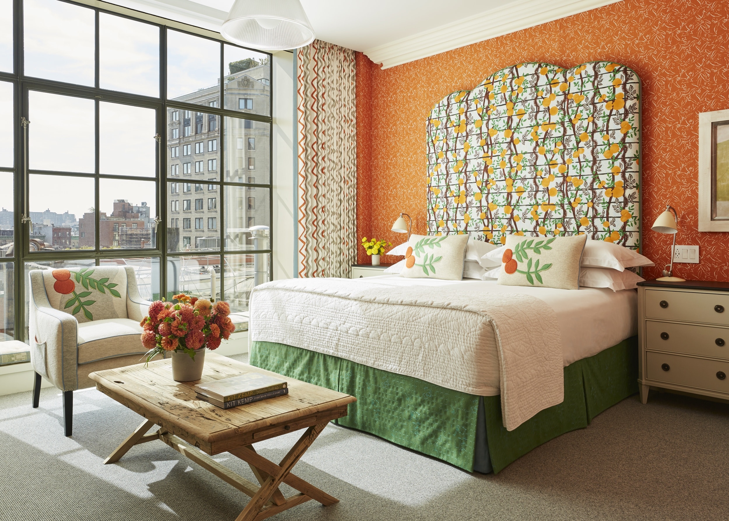
Used above as curtains and as bed cushions in a monochrome scheme at The Soho Hotel in London and below on curtains and on our signature mannequin in a suite at The Whitby Hotel in New York.

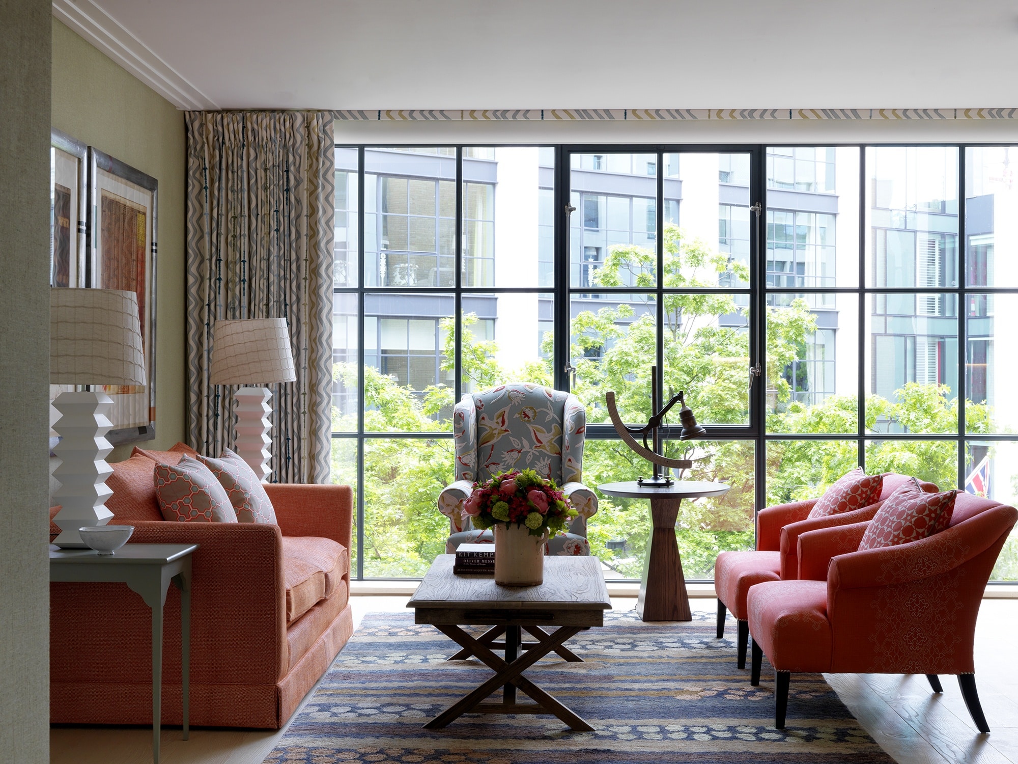
At Crosby Street Hotel, the orange zig-zag in this scheme really pops, however the neutral tones are essential to balance the room. The walls are lined with another of my fabrics for Christopher Farr, ‘Inside Out’ in orange.
The sage and orange colourways are made up of more neutral tones making them incredibly versatile and easy to use. Here at Ham Yard Hotel, the sage colourway on the curtains is the perfect neutral backdrop to this rich, earthy scheme.
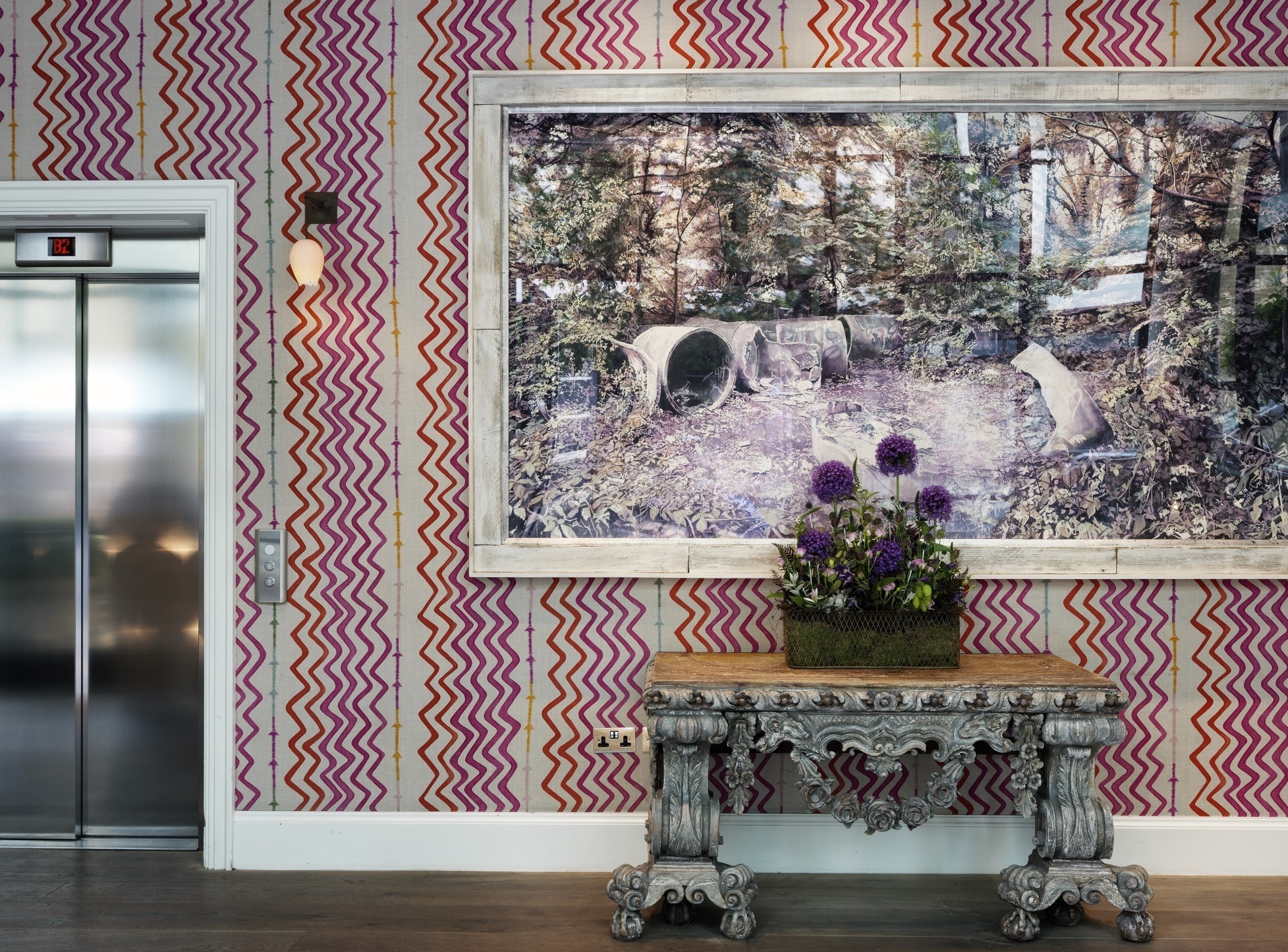
Perhaps the most iconic and recognisable of the colourways is the hot pink. The combination of fuchsia pink and orange on a white linen is so fun. It looks fabulous as curtains and cushions, but where I love it most is as walling in the public areas at Ham Yard Hotel. It is such a vibrant backdrop for artwork and sets the tone for the rest of the hotel.
We even enlarged it to a massive degree in the Dive Bar, playing with scale to make a strong feature. This is the design thread between the spaces without it feeling too repetitive.

‘Rick Rack’s’ success as a fabric inspired us to adapt the design and use it elsewhere. We recently collaborated with Balineum to create ‘Rick Rack’ inspired bathroom tiles for our pop up at the CP Hart showroom in Waterloo.

Our RikRak products are packaged in the design and can be found in both the hotel rooms and at Shop Kit Kemp.

And please come and pick up a coffee from Ham Yard Hotel, now serving coffee from the courtyard, in one of our Rick Rack take away cups!
