
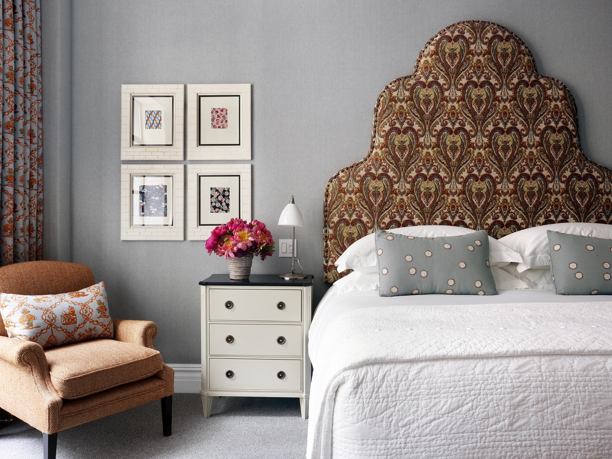
Whilst we’re known for making brave and audacious moves with vibrant colours, we often bring grey tones into our schemes. Let us introduce you to room 302 at The Whitby Hotel, which makes a great example for working with greys and how to make other colours to shine forth.
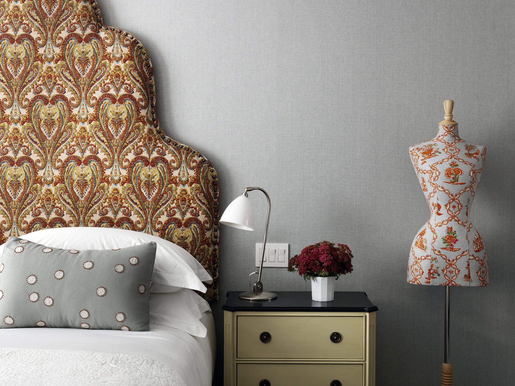
Burnt oranges have been used for the headboard’s upholstery and although the design boasts elegance, its patterns become playfully animated against the muted tones of blue and grey for the walls.
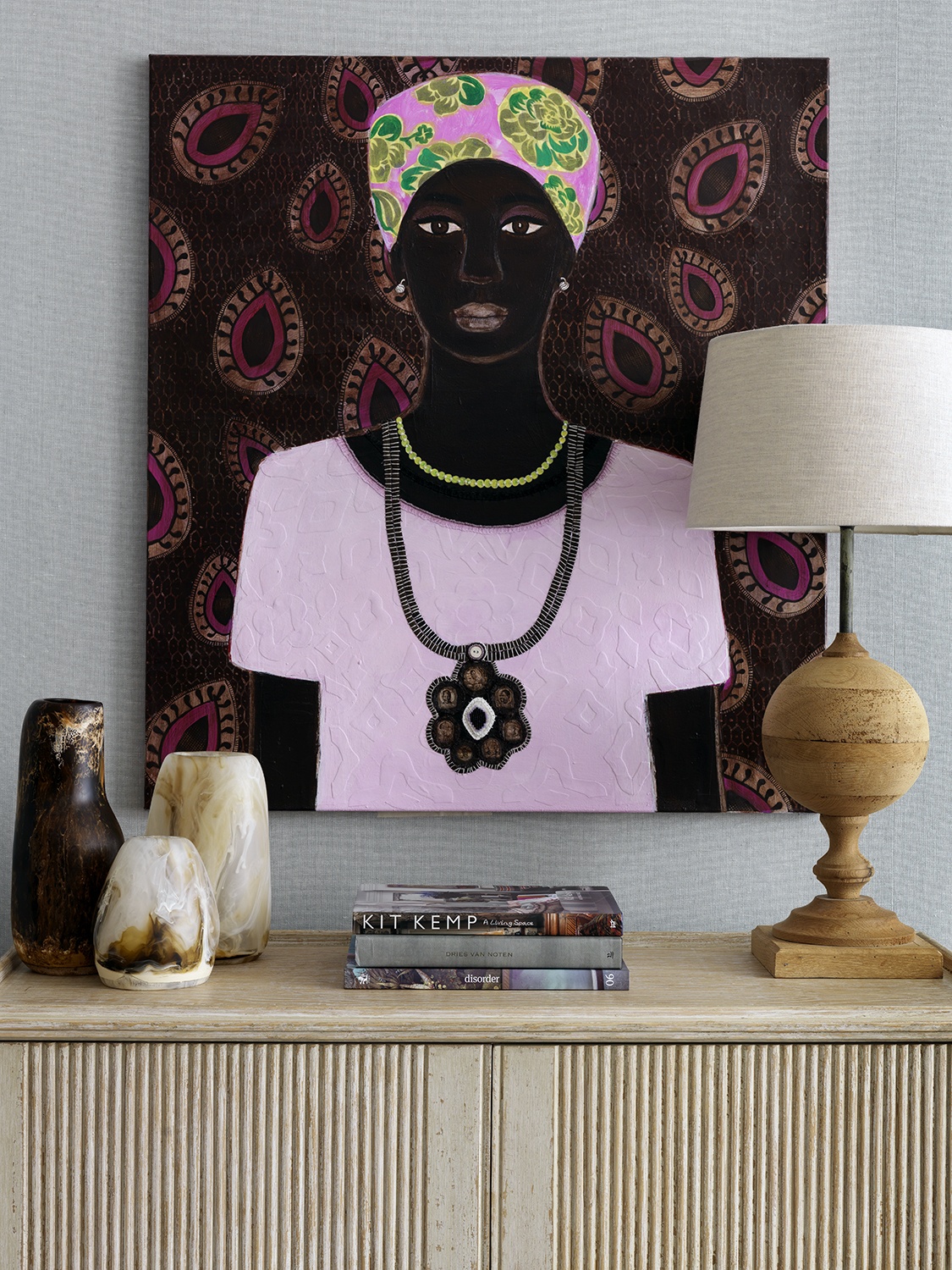
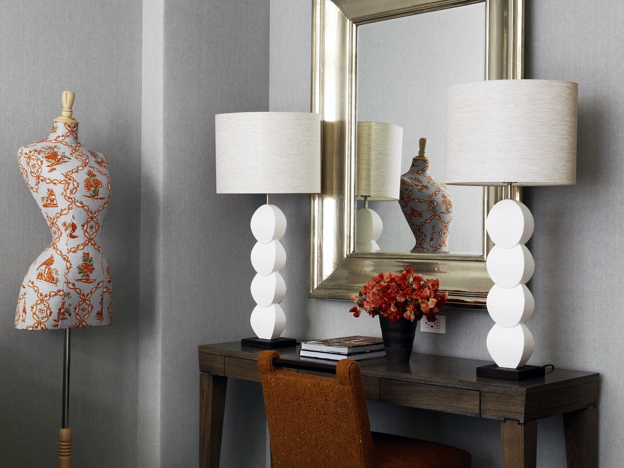
Below are accessories made with resin and placed next to the wooden lamp, they make us feel connected to nature.
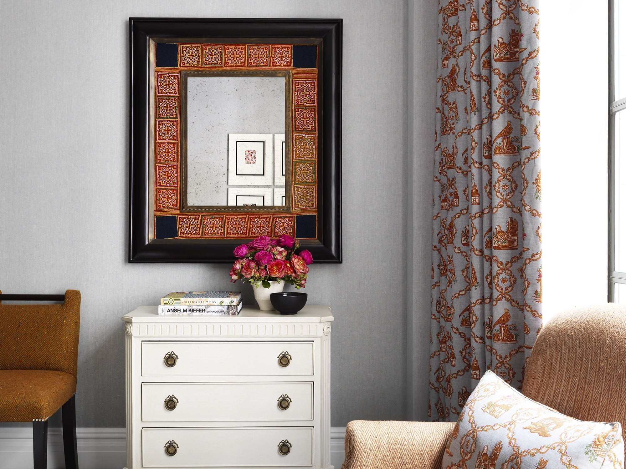
On the other side of the bedroom, we have a mirror housed in a frame designed especially for the room. With colours matching the fabrics, we’ve combined it with black to create contrast and a sense of strength.
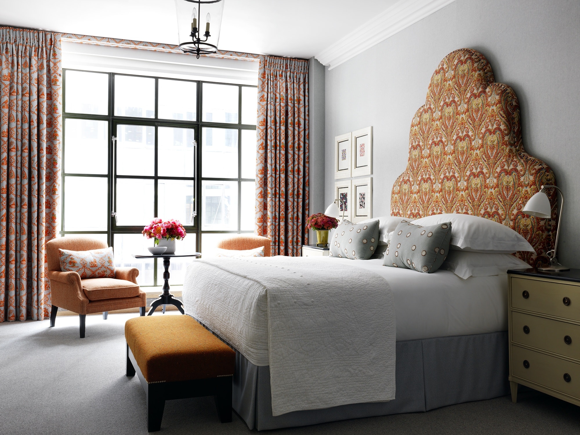
The headboard and curtain fabric evoke a sense of tradition and together they give the room a feeling of familiarity. These few elements alone make the room feel utterly luxurious and complete. It goes to show, you don’t always need to make seismic changes to transform a space.
We’ve used other subtle patterns such as herringbone in orange to create further balance. The room invites us to sit by the window and enjoy a good book!
Art and accessories play an integral role for bringing a scheme together and room 302 is no exception. This striking piece is by Carla Kranendonk, whose work is inspired by her travels to Africa and combines vivid brushwork with hand-embroidered paper collage, as well as photographic elements. The colours stand out triumphantly against the grey walls.
Whilst this bedroom is compact in size, we’ve used principles of colour, focal points and scale to make room 302 an incredibly comfortable space to enjoy.