Lava, Rock, Smoke and Stone: Our Recipe for using Grey in Interiors
When you think of a Kit Kemp scheme, is grey the first colour you think of? Well neither do we. But with that said, grey has such varying tonal qualities that it often makes its way into our schemes – just not in the way you might think!
It acts as a wonderful base to allow other colours to shine forth. Paired with the right tones and in all its own varying forms it can feel both restful and calming, yet also packing a punch.
Here is our guide to working with grey and those occasional instances where it works!
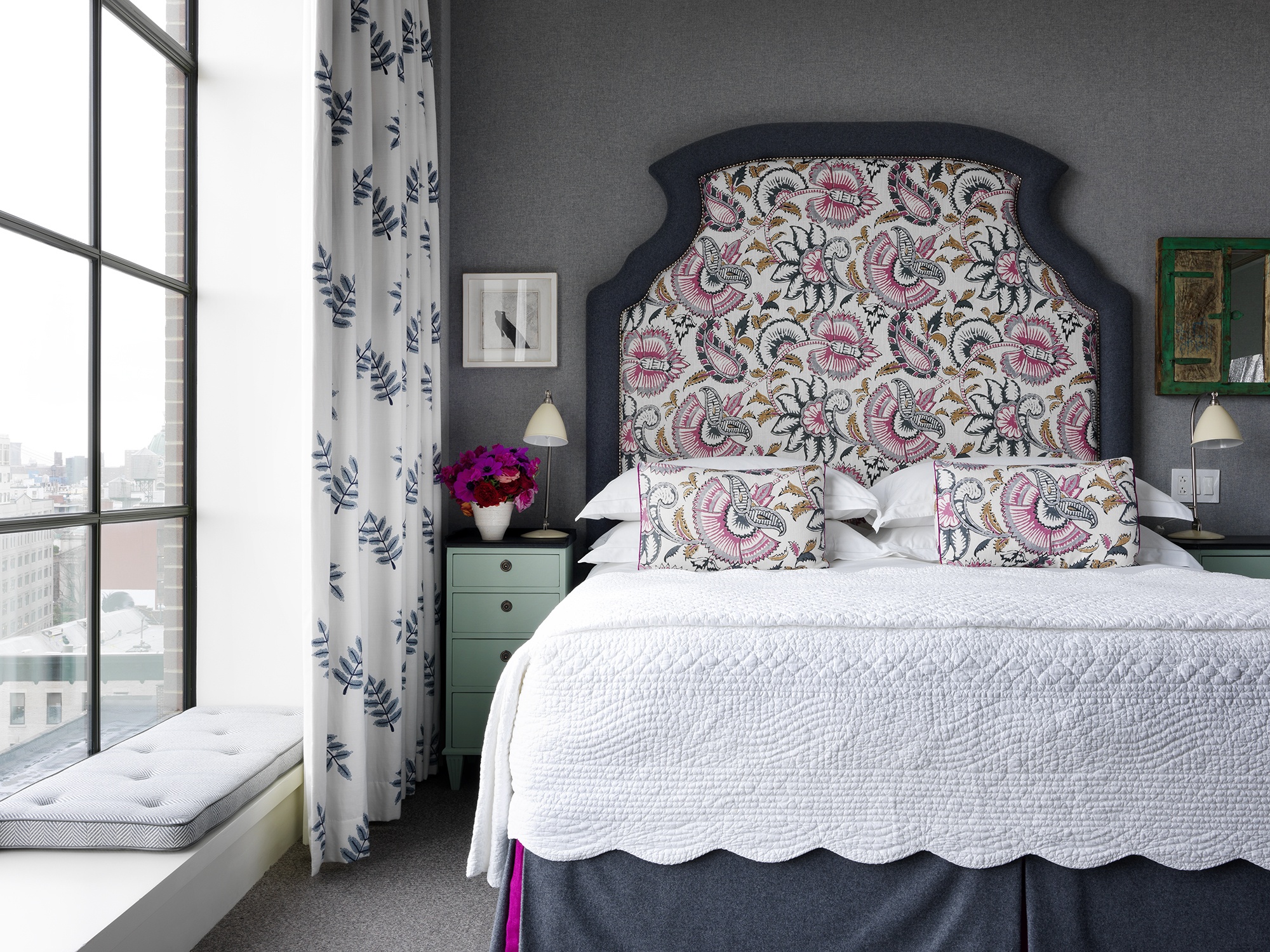
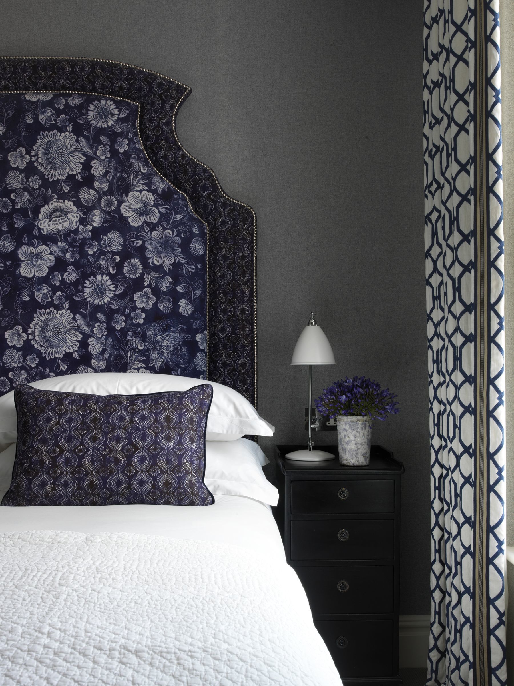
We adore fun and vibrant colour combinations and there are some we turn to time and time again. One such pairing is pink and grey. This room with its variation of greys is brought to life by the delicate pink fabric on the headboard and bed cushions.
The accents of the room give it punch and joy, seen in the bed valance kick pleats and the happy florals on the bedside table. The cleverest part of this scheme though is the layers of grey, from slate to smoke there is a depth being created for the pink to springboard from.
The same is true for this suite at The Whitby Hotel. There is a soft and smoky grey lining the walls with a deeper carbon grey acting as the base colour for the sofa and armchairs. The top third of the chairs have been upholstered in a vibrant pink, along with the sofa embroidery with flashes of corresponding Indian pink and the geometric red and pink curtains almost cause you to forget there is any grey at play at all. It sets the stage for the other hues in the scheme.

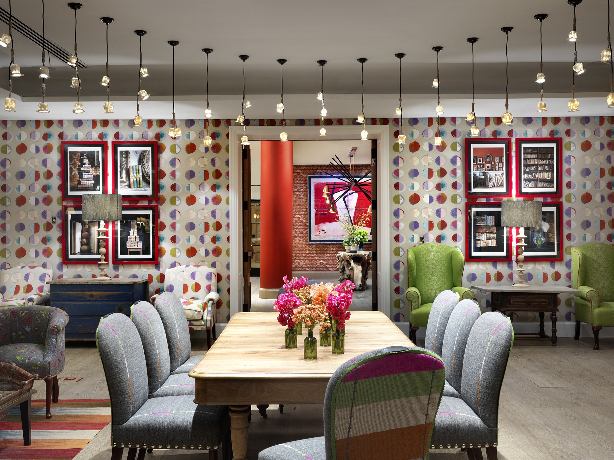
In the Reading Room at The Whitby Hotel, the space is alive with greens, oranges, pinks and reds. A rainbow of colours are present in the Jane Churchill walling fabric, Lisa Fine green wing chairs and colourful backs of the dining chairs. Here the grey acts as a pacifier, giving the space a moody, sophisticated edge.
If the grey was removed from this space, we would be left with a mesh of sugary colours that start to clash. Instead with the help of the grey wools on the surrounding upholstery and inside seats of the dining chairs we have a mature scheme perfect for special events.
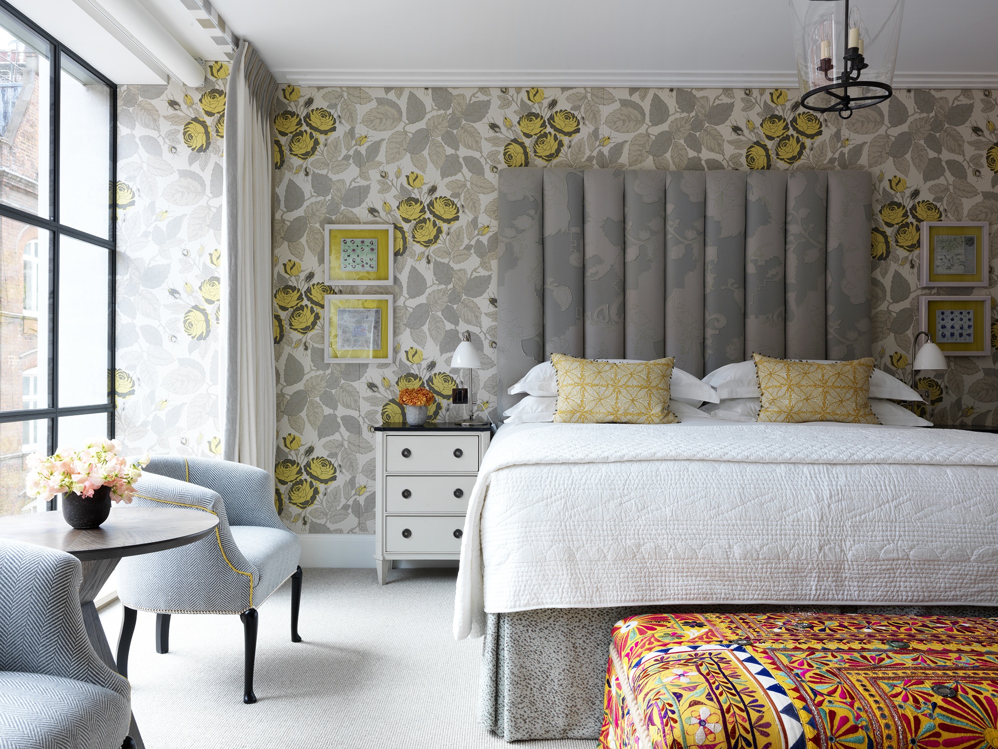
In this suite at Ham Yard Hotel, old friends yellow and grey come together to create a romantic and fun room. Yellow is always the mood booster; cheerful and bold it works perfectly with grey. They are a match made in heaven as the pair work in harmony. Calming grey tones mellow out the vibrancy of yellow and in return the uplifting, sunny shade gives grey a personality and strength it wouldn’t have on its own.
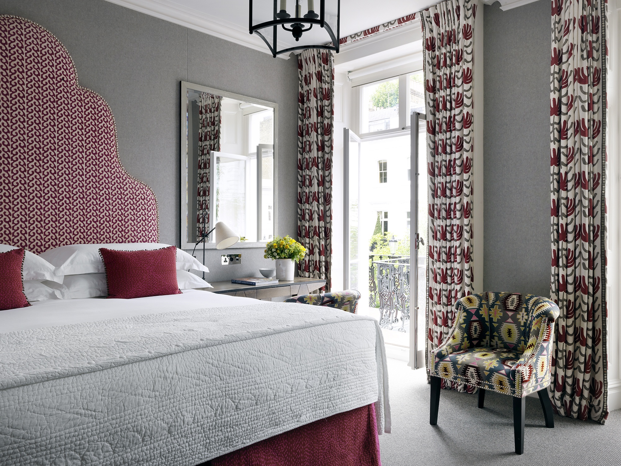
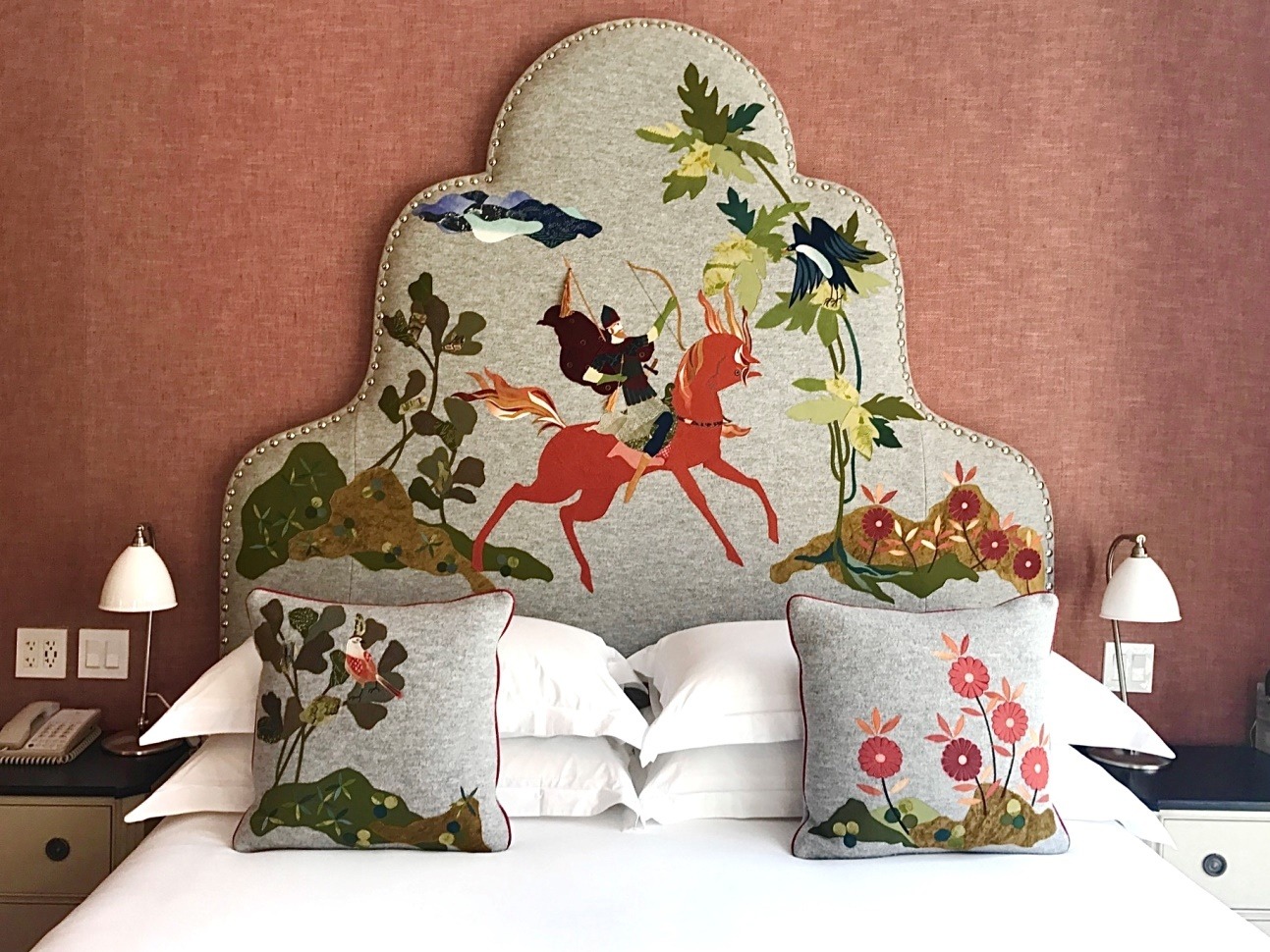
A smoky grey is often the backdrop for one of our classic statement headboards. We find its subtle blue tone pops enough whilst also providing a stage set for the design that sits on it to leap forth.
To ensure our bespoke headboard stands out, especially those that have a busier narrative scene happening, a light and airy grey provides the canvas, that something more ornate like this headboard at The Whitby Hotel needs.
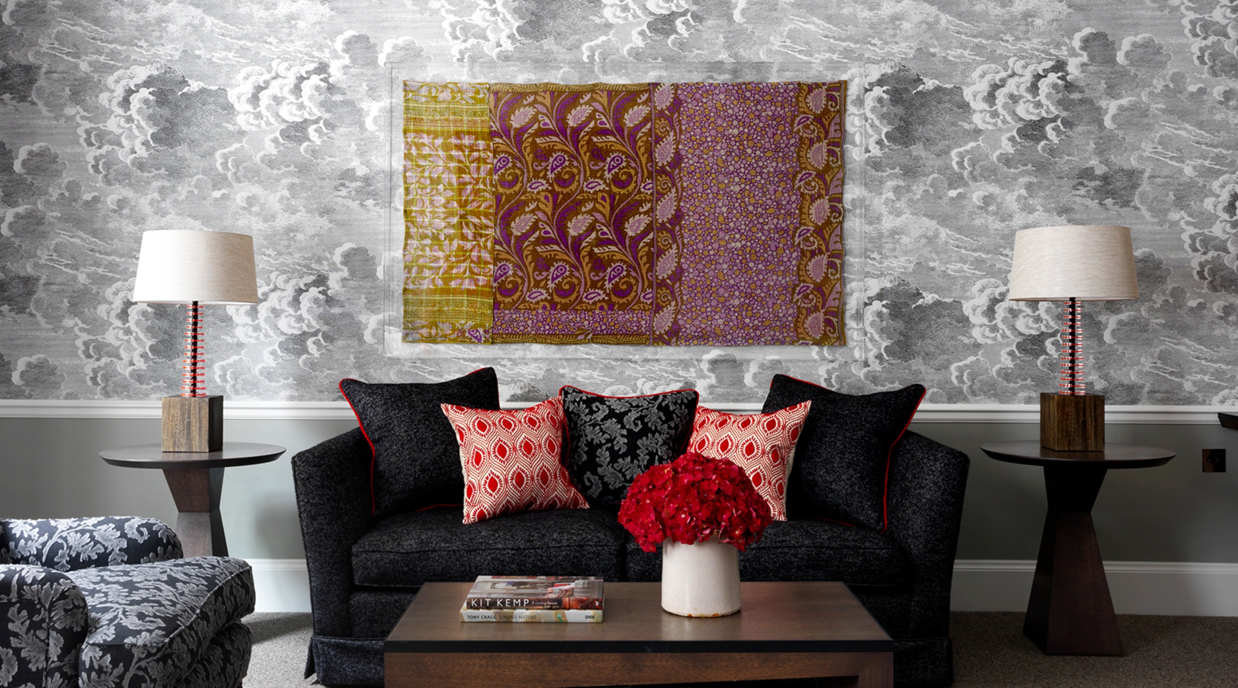
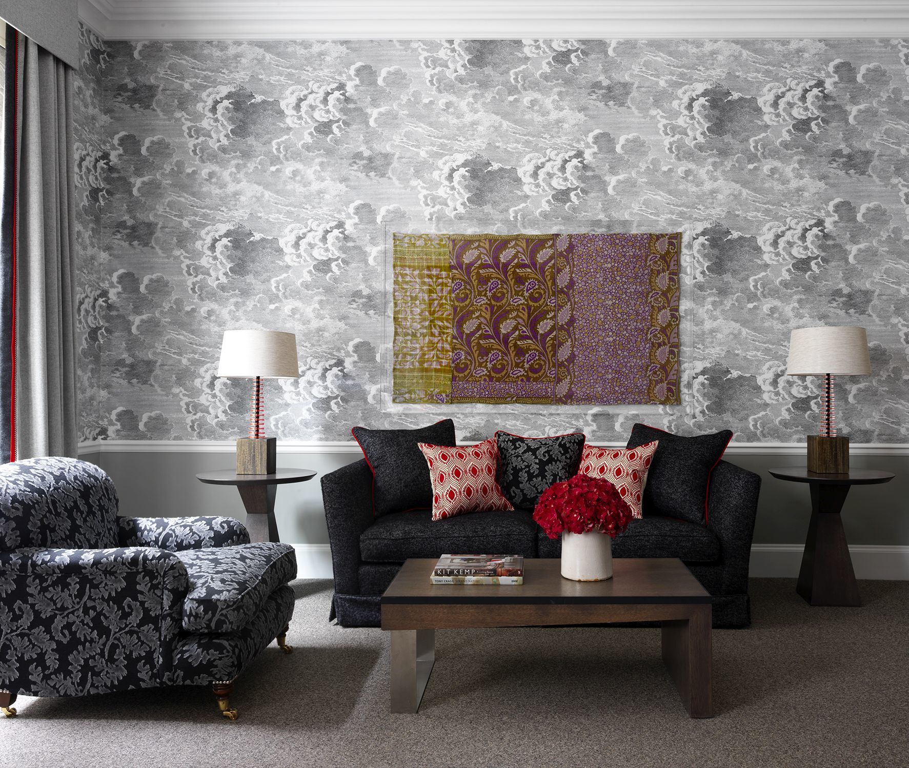
Here at Haymarket Hotel, grey is the star of the show. In this scheme we really played into the moodiness and drama of a stormy sky and let grey take over. How we make this room work is by adding in charcoals and really deep slate greys to the upholstery for added punch. The red accents and sumptuous Indian textile over the sofa bring warmth and added energy to the scheme.
When working predominantly with grey it’s important not to work exclusively with soft greys so as to prevent an uninspiring insipid overall feel.
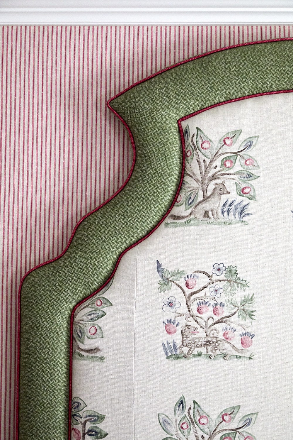
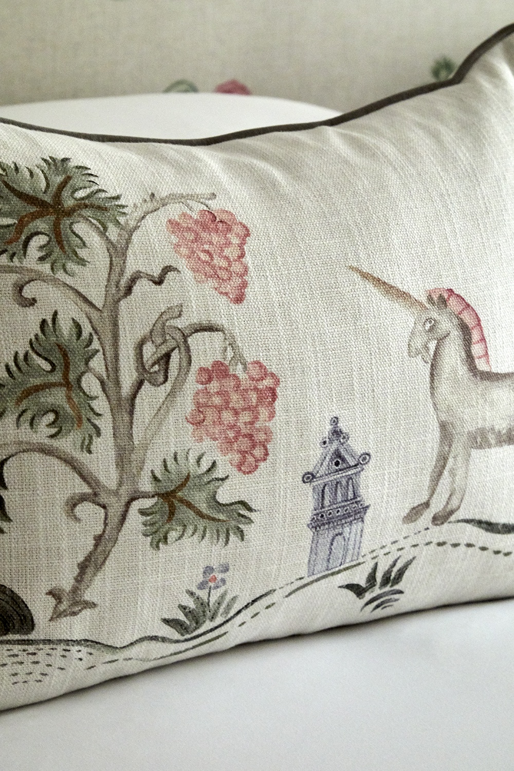
When I was designing my Hedgerow fabric for the Kit Kemp for Andrew Martin collection I really wanted it to feel like a sketchbook drawing. The grey that comes in to create these painterly sketched scenes not only evokes that feeling of pencil or brush strokes, but allows it to sit within a romantic space. The inclusion of grey here is tonal and subtle.
We love the varying tones and surprise that grey brings to a scheme. It’s a secret weapon in creating a rich and vibrant interior.
It is worth remembering that sometimes the most unassuming colours are the ones that allow a charming interior to shine.