Knowing how to plan a room’s layout is a fundamental aspect of interior design. A successful layout will optimise the use of available space in a room. It’s the first stage of our design process and we take various factors into account, from the purpose of the room to size.
Whether you are designing a bedroom, living room or kitchen, we’d like to share our tips to help you create an effective and visually pleasing room layout…
Establish Zones…
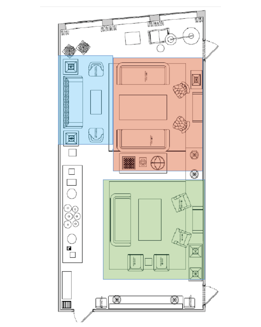
Start by dividing the space up into functional zones based on its purpose.
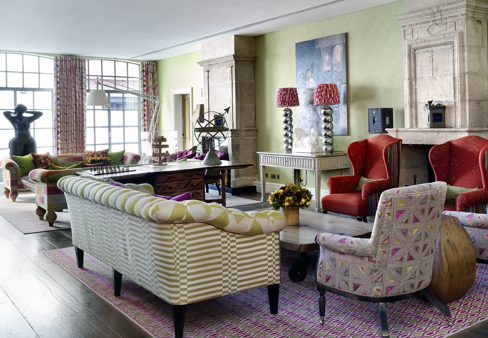
In our Drawing Room at The Soho Hotel, we wanted two main seating areas and a separate reading area. From here, we ensured that pathways are clear and easy for our guests to move around in. It was important to us that guests could enjoy the same space, while having separate areas with a sense of privacy.
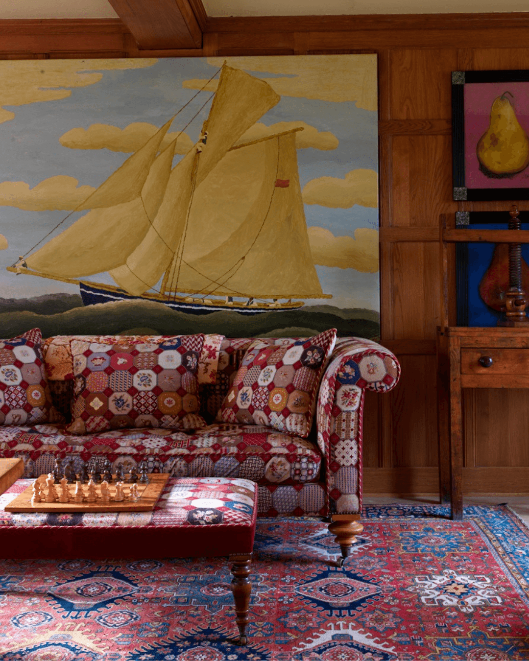
Our top tip: Use rugs and furniture to create different focal points. Here we have two large stone fireplaces, allowing us to create two separate seating areas. A stunning Scandinavian table with a chessboard functions well as a room divider.
Choose a Focal Point…
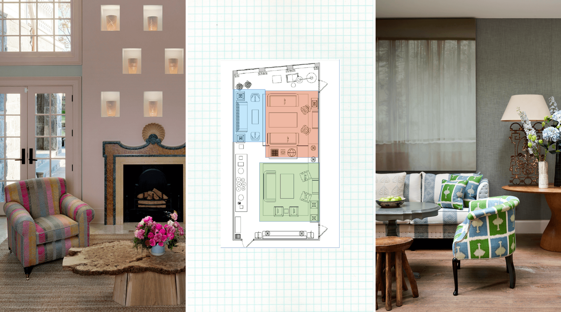
When designing a room it’s important to figure out what your focal point will be. It might be a fireplace or a piece of art. This will help you decide where to place the rest of your furniture. In this residential project we built back-lit niches into a wall to display engraved ceramic pots by Martha Freud. We then arranged furniture around this centre point, creating a sense of balance.
Furniture Scale…
Scale is always important when it comes to practicality. Over the years, we have seen so many homes where the furniture is made for a much larger room and immediately, it feels cramped! Equally, small furniture in a large room can look uncomfortable and out of proportion. The height of furniture has to be right.
Balance and Symmetry…
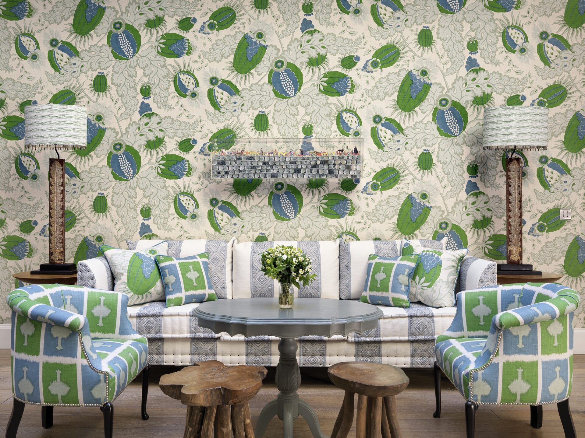
Balance is a key ingredient to a successful composition, as the eye unconsciously seeks out symmetry. In the Conservatory at Haymarket Hotel, we have used symmetry to create a calming effect in a scheme where there’s a lot going on. A contrasting sofa is centred beneath an art piece by Jack Milroy. The sofa is flanked by a pair of Tub Chairs, covered in our Ozone fabric for Christopher Farr. Completing the balance are side tables with matching, tall antique table lamps.
Lighting…
Keep lighting low, directional and practical. We try to avoid using spotlights where possible, especially in rooms such as living rooms, libraries and bedrooms. These spaces are meant to be warm and inviting, so we tend to use low level lighting with table lamps, standing lights and picture wall lights.
Our top tip: Placing table lamps or standing lights behind furniture can make a space feel larger!
We hope this blog post inspires you to make the most out of your rooms at home. Effective space planning is crucial in making an interior space both aesthetically pleasing and functional.

