
How We Use Ozone
How ToOne of my favourite fabrics from my Christopher Farr Collection has to be ‘Ozone’. Its diversity means it is such a pleasure to work with. It’s one of those fabrics that looks and feels so different from colourway to colourway and scheme to scheme. This post visits each colourway and the fun and different ways we have played with ‘Ozone’ in our designs...
One of my favourite fabrics from my Christopher Farr Collection has to be ‘Ozone’. Its diversity means it is such a pleasure to work with. It’s one of those fabrics that looks and feels so different from colourway to colourway and scheme to scheme. This post visits each colourway and the fun and different ways we have played with ‘Ozone’ in our designs.
CORAL
This colourway is so sophisticated and unexpected. The petrol and light blues against the shock of poppy red is so exciting. Here in one of our Ham Yard apartments, we used ‘Ozone’ for the walling around these bookshelves. It’s always good to use fun and punchy fabrics in little corners to give them life of their own.
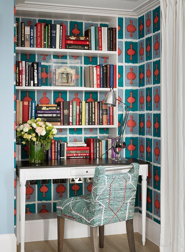
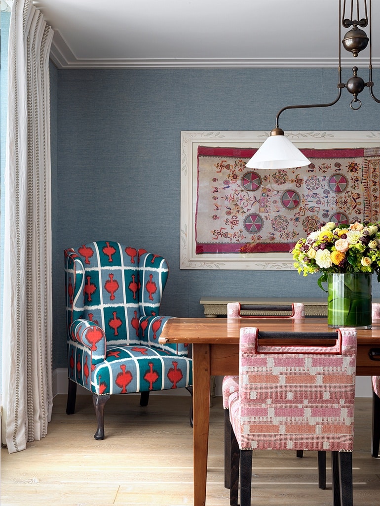
The same principle is seen in the use of ‘Ozone’ on the chair. The design creates a sculptural piece in the corner of the room that might otherwise be a dead space. We paired it with my ‘Loom Weave’ in hot pink. The reds in both fabrics work so well together and the pink and blue tones sing in contrast. There is definitely a little alchemy going on between the fabrics in this scheme.
LEMON
Lemon is the combination of three happy colours: pink, yellow and a cantaloupe orange. Whilst these hues are all so joyful, this fabric is incredibly strong and we love it as an accent fabric in a scheme. At the House and Garden Festival, we created a stand featuring all of my Christopher Farr designs. ‘Ozone’ in Lemon was the perfect endnote, looking powerful on the sofa cushions and on the back of my classic Susan chair.
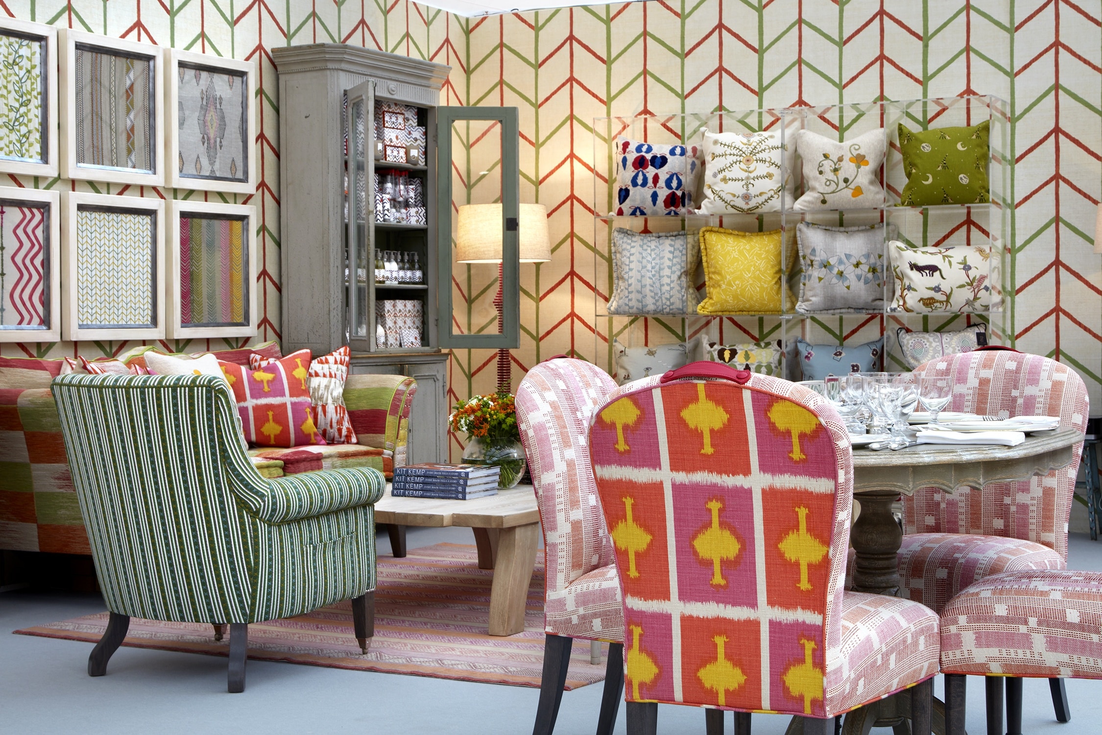
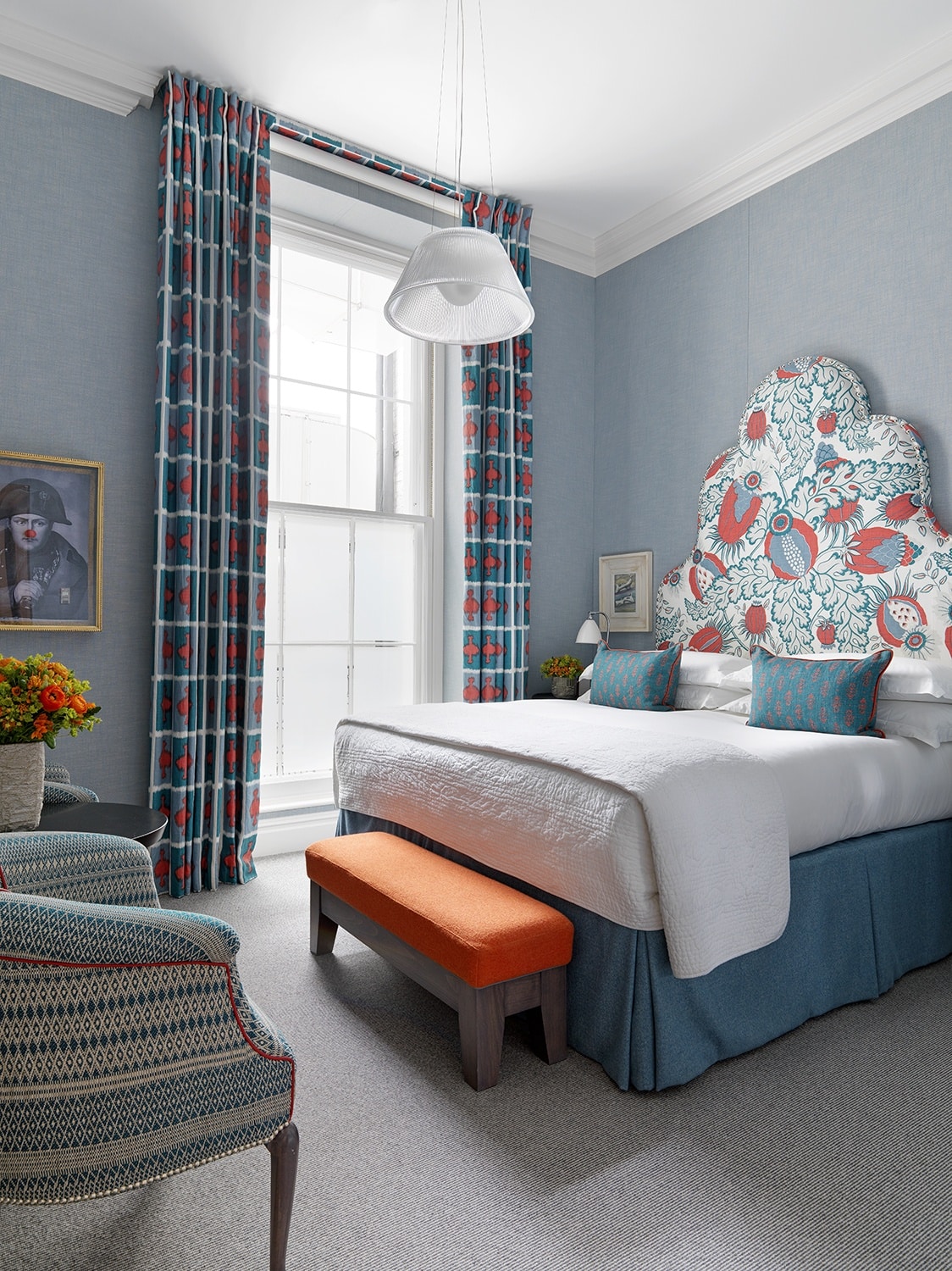
We also used ‘Ozone’ in Coral in this tall ceilinged room at the Dorset Square Hotel. This block design is perfect for such long curtains, and really plays into the height of the space, harmonising perfectly with the headboard fabric.
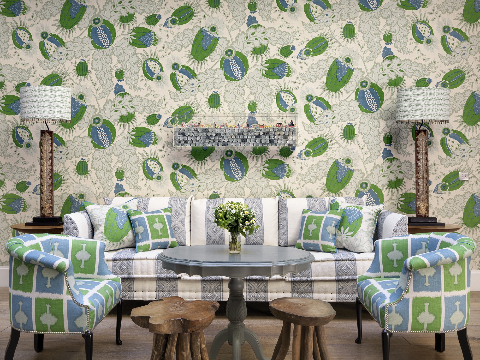
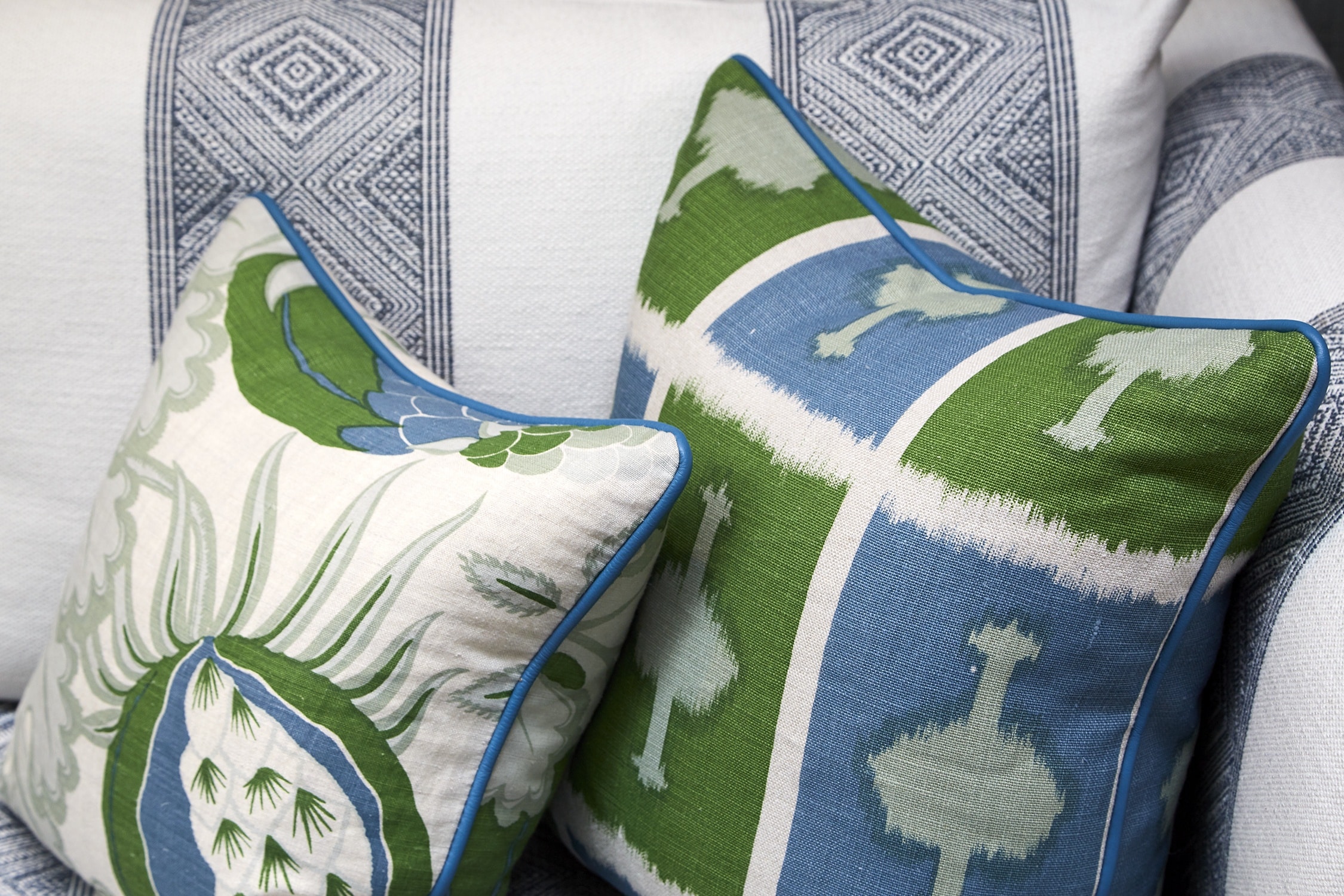
GREEN
‘Ozone’ in Green is such a zip of fun and we used it in one of our favourite spaces, the conservatory at Haymarket Hotel. The green is so energising, complemented by a happy blue which softens the apple and sage hues of the textile.
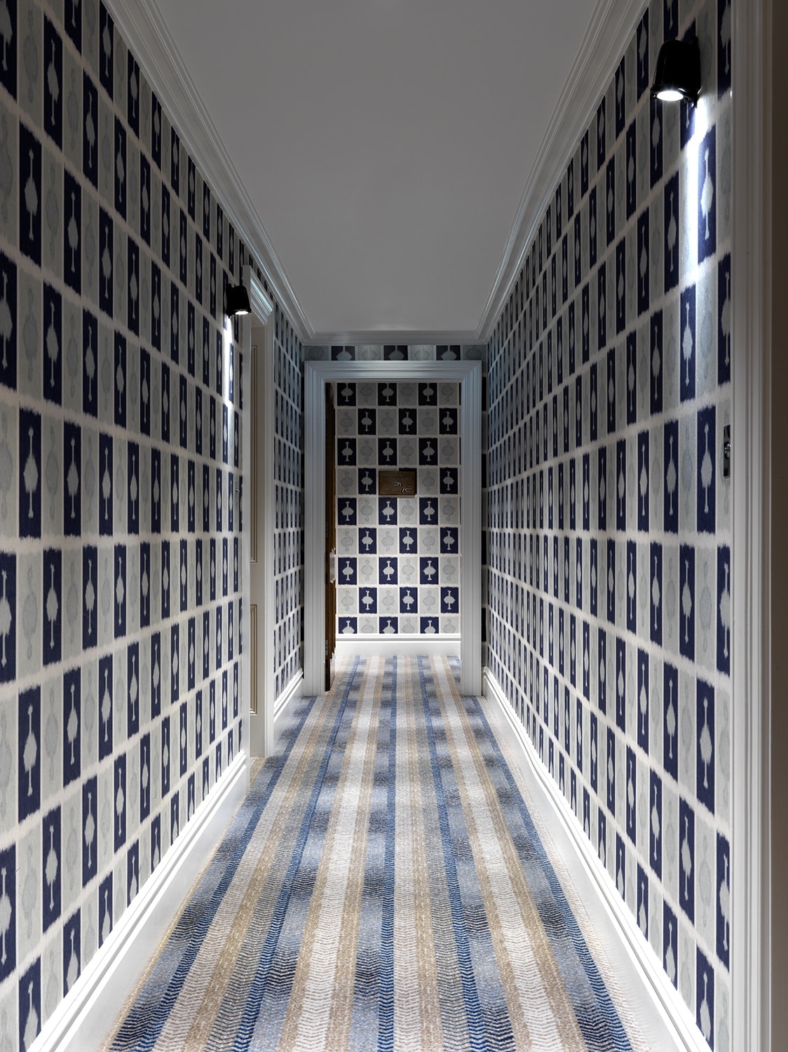
INDIGO
This blue colourway is so smart and tailored. It feels like a checkerboard design with the contrast of the indigo blue against the pale grey blue. It features in the corridors of The Soho Hotel. We love to create a transportive journey from room to room for our guests and ‘Ozone’ makes this in-between space a real event.
We paired it with another Christopher Farr textile so the colours work in complete harmony. The painterly floral works brilliantly with the blocky design of ‘Ozone’, allowing for a perfectly balanced contrast. We often like to pair geometrics with florals, it’s a brilliant way to romanticise the former and empower the latter.
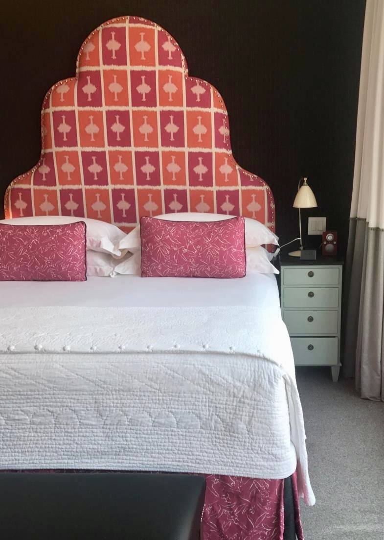
HOT PINK
We rarely play by the rules in the design studio and this scheme is a perfect example. We paired ‘Ozone’ in hot pink with a black tailored pinstripe on the walls. We rarely use black or charcoal but when we do it’s often with vibrant and colourful fabrics. ‘Ozone’ has such an impact on the headboard, popping out from the walls. The valance and bed cushions are in my ‘Inside Out’ in Indian Pink. All my Christopher Farr textiles are designed to work in the same colour groups, so they can create cohesive schemes.
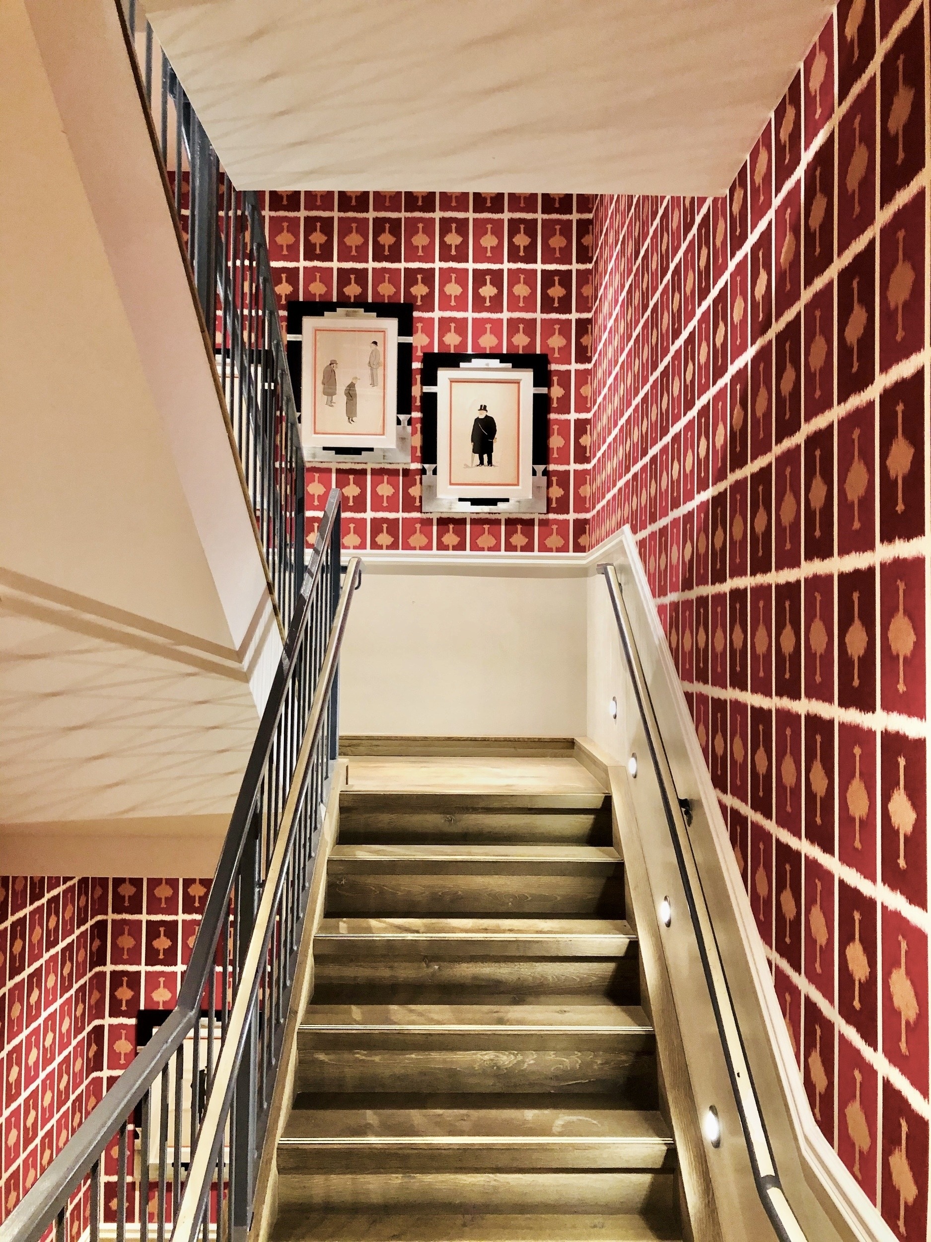
RUBY
Ruby is another colorway that works so well as walling. The hot and warming tones are so cosy and rich. We used it at The Whitby Hotel on the walls of one of our staircases. It’s important to fill these spaces in which you travel from one area to another with something exciting and punchy. We hung a collection of vintage spy prints in strong black frames on the walls to really play into the graphic ‘Ozone’ design.
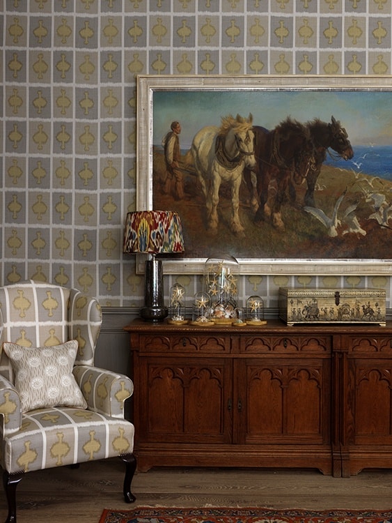
SMOKE
I think Smoke has to be my favourite colourway in ‘Ozone’. Its subtlety is so charming, providing depth, and movement to the walls of the Ham Yard Library.
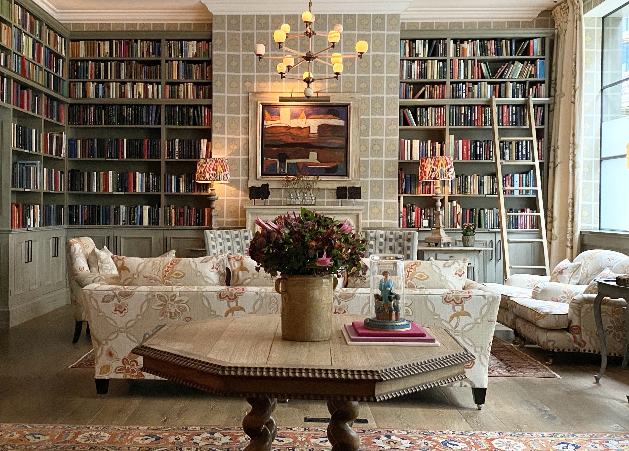
It is so striking paired with ‘Chainstitch’ by Hazleton House on the upholstery and the embroidered Chelsea Textiles ‘Suzani’ fabric on the curtains. It provides a serene backdrop to the fiery tones of the artwork and the vivid spines of books, but also holds its own as a fabric with strength.
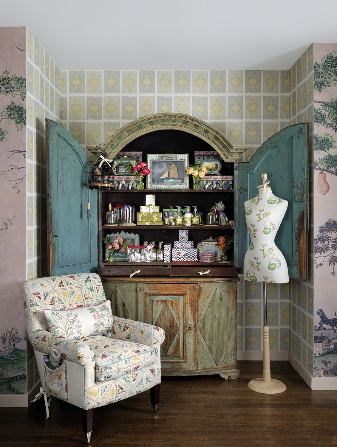
We used ‘Ozone’ again at my Bergdorf pop-up in New York for this small corner, the tones work beautifully with the faded paint of this Swedish armoire. Smoke is the more earthy brother to its vibrant and colorful sisters.
‘Ozone’ is so diverse and versatile, it never fails to create joy in a scheme. Check out Shop Kit Kemp where you can take ‘Ozone’ home today as a delightful silk scarf.