We recently blogged about our favourite ways to display souvenirs from your summer adventures, so this week we’d like to explore further and share some ‘Dos & Don’ts’ for grouping your favourite trinkets and antique pieces to create stylish surfaces…
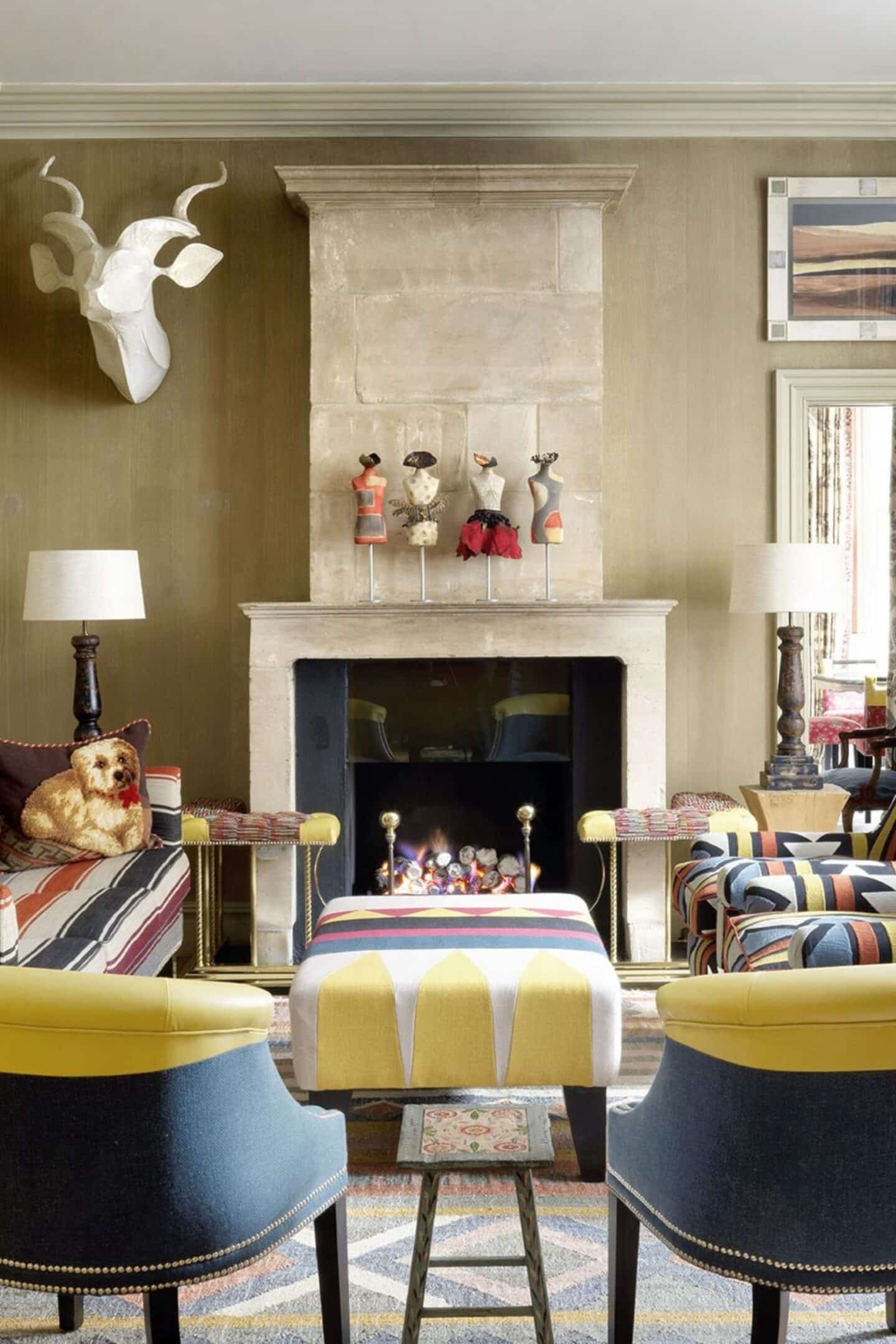
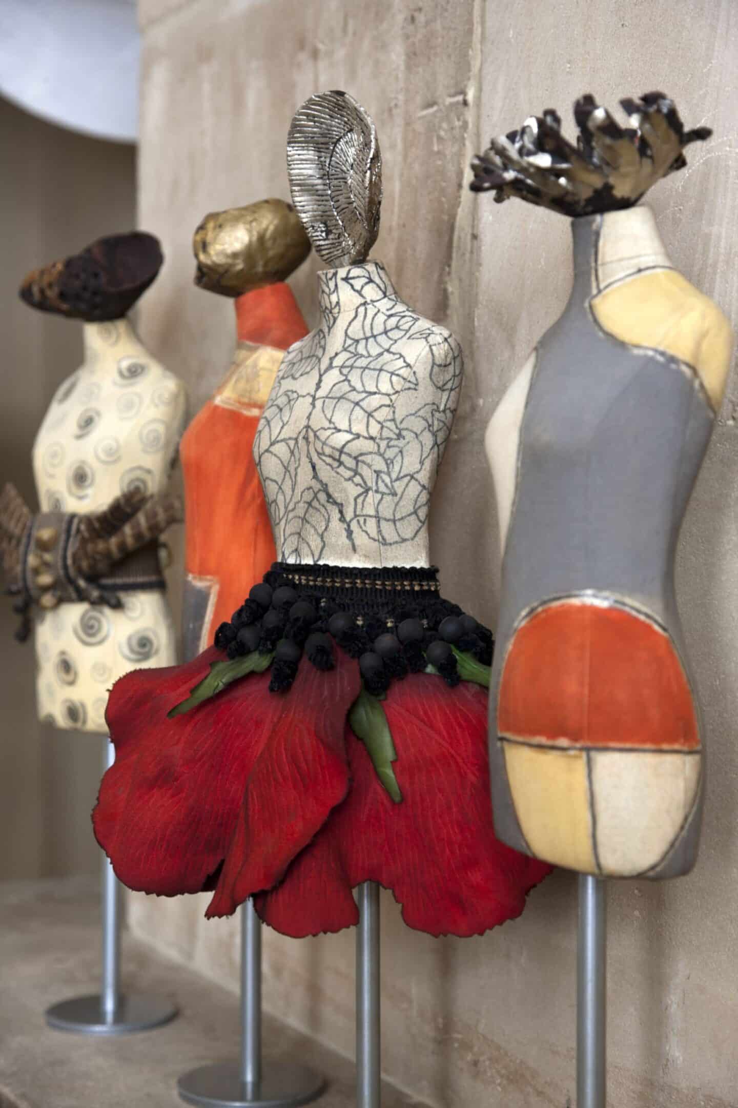
Do give them their own space to shine. Clear the decks and play around with getting the best from your collection, especially if the pieces are on a smaller scale and run the risk of getting lost in a larger display. On this mantelpiece at Knightsbridge Hotel, we’ve created a focal point by placing a collection of decorative figurines in a row. Simple, yet oh so charming and fun!
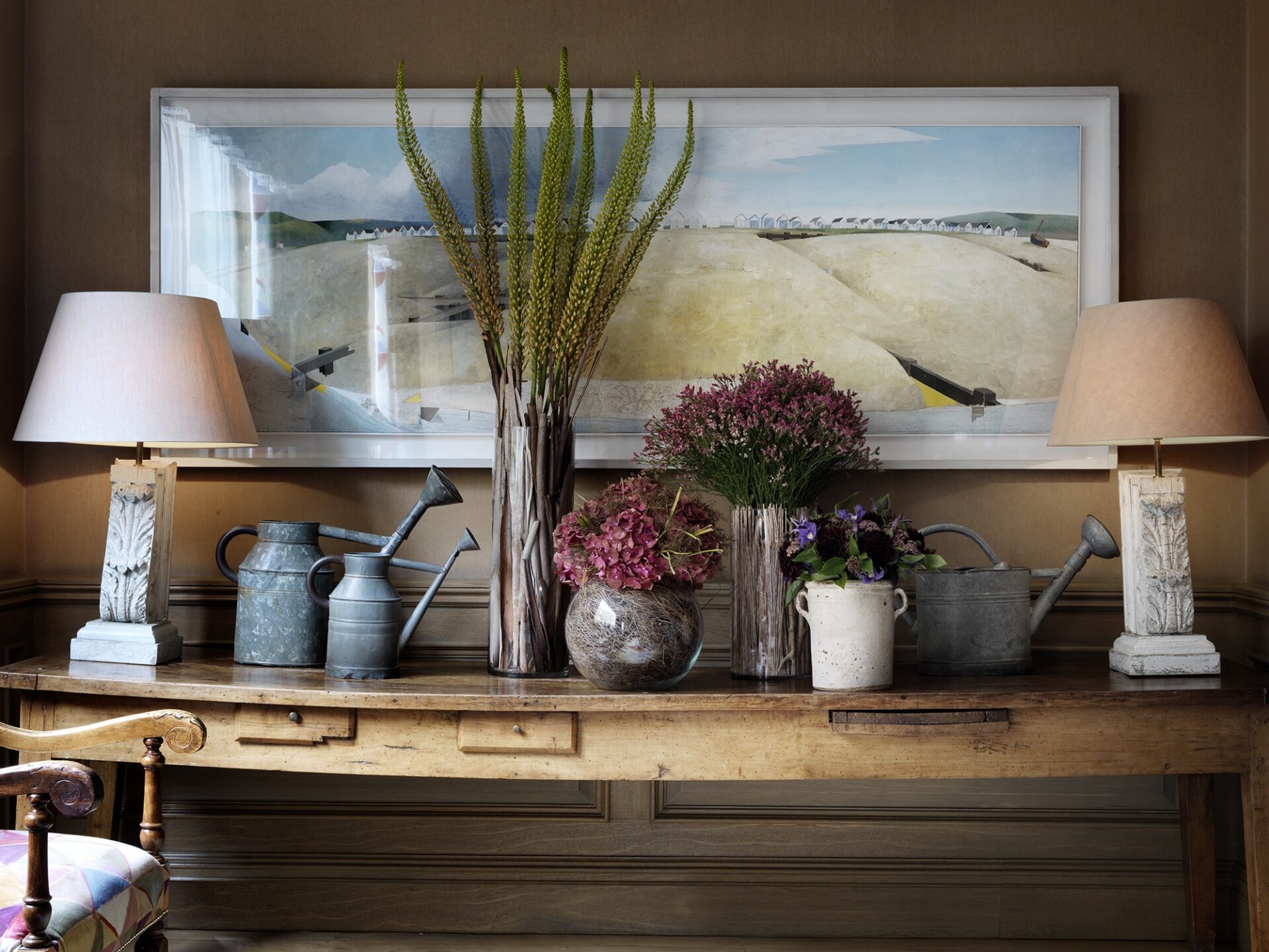
Do think outside the box. In the Drawing Room at Charlotte Street Hotel, we’ve elevated the humble watering can and given it a presence by grouping a few together on the same table and integrating them with another collection – fresh flowers in different sized vases. A pair of table lamps on either end rounds things off beautifully to give you something fabulous.
Don’t hesitate to adapt the pieces to suit your room. You’ll see we’ve painted the watering cans white to tie in with the scheme, taking them from ordinary everyday objects to something sculptural and unique.
Staying with the same display, don’t forget to play around with height. A rigid display of identically tall pieces on a long table can leave things feeling a little flat. By mixing up the heights of the flowers and the sizes of the watering cans you immediately pique the interest of your guests and draw their eyes to the interesting shapes and sizes on show. It’s the use of layers that really makes this work.
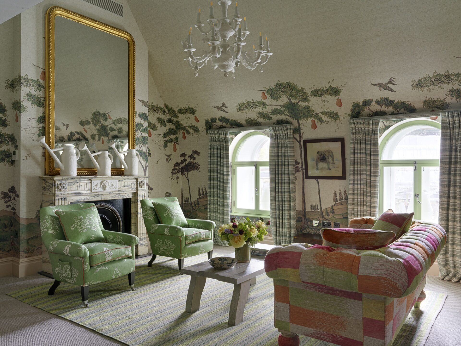
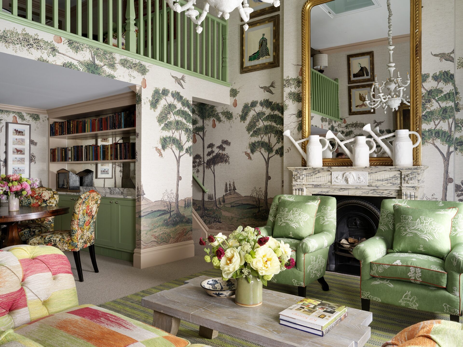
Do use mirrors to double up on the effect. In the Loft Suite at Covent Garden Hotel, we’ve used a trio of large watering cans in front of the fireplace mirror to give the illusion of there being more on display.
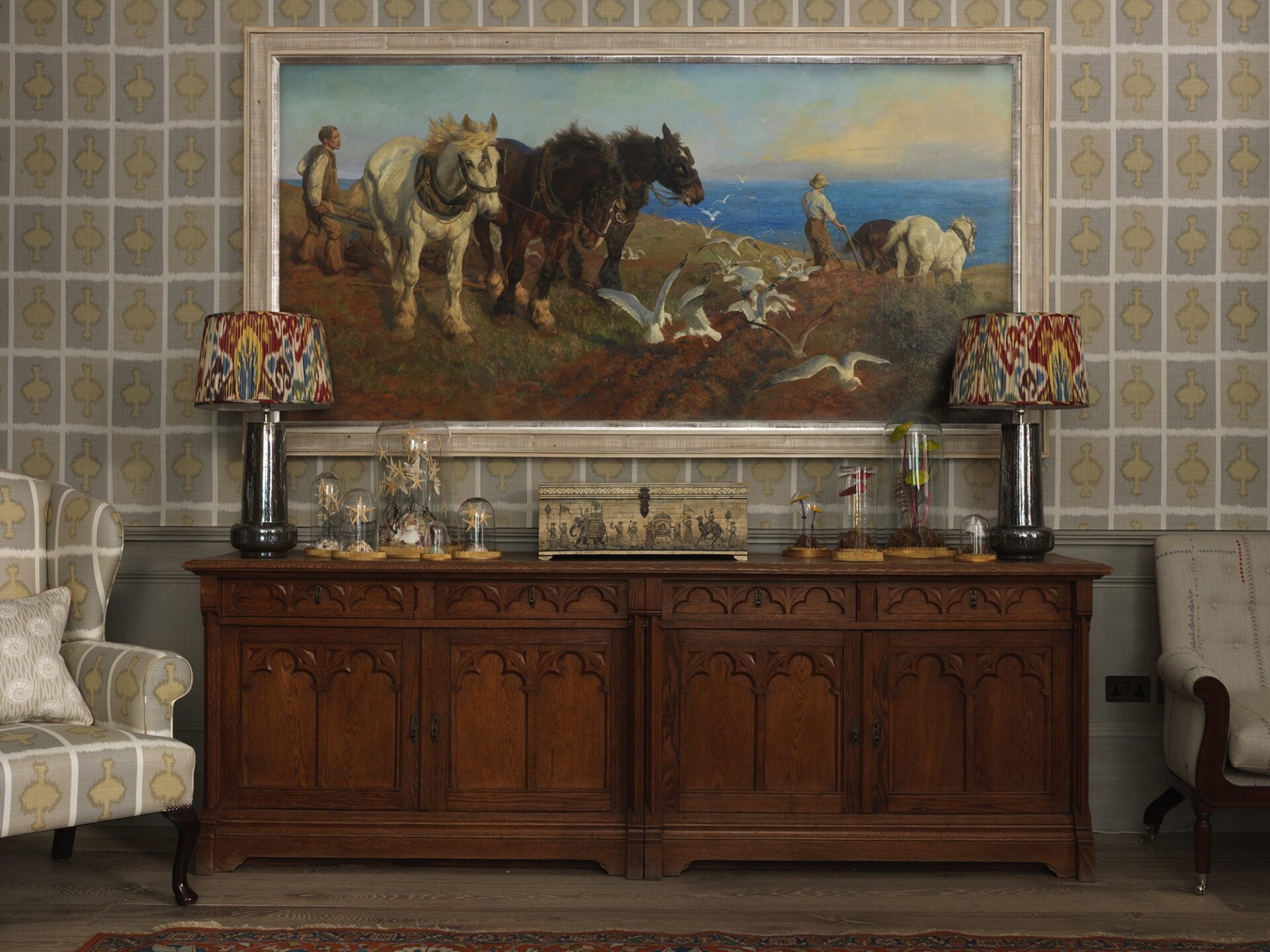
Do take inspiration from the natural world. No-one groups things together better than Mother Nature and in the Library at Ham Yard Hotel we’ve celebrated this natural beauty by grouping together antique specimens mounted under glass domes of different heights, again between a pair of lamps and on either side of a decorative box to create a gorgeous vignette. The glass domes slightly overlap on the painting above to bring it into the fold.
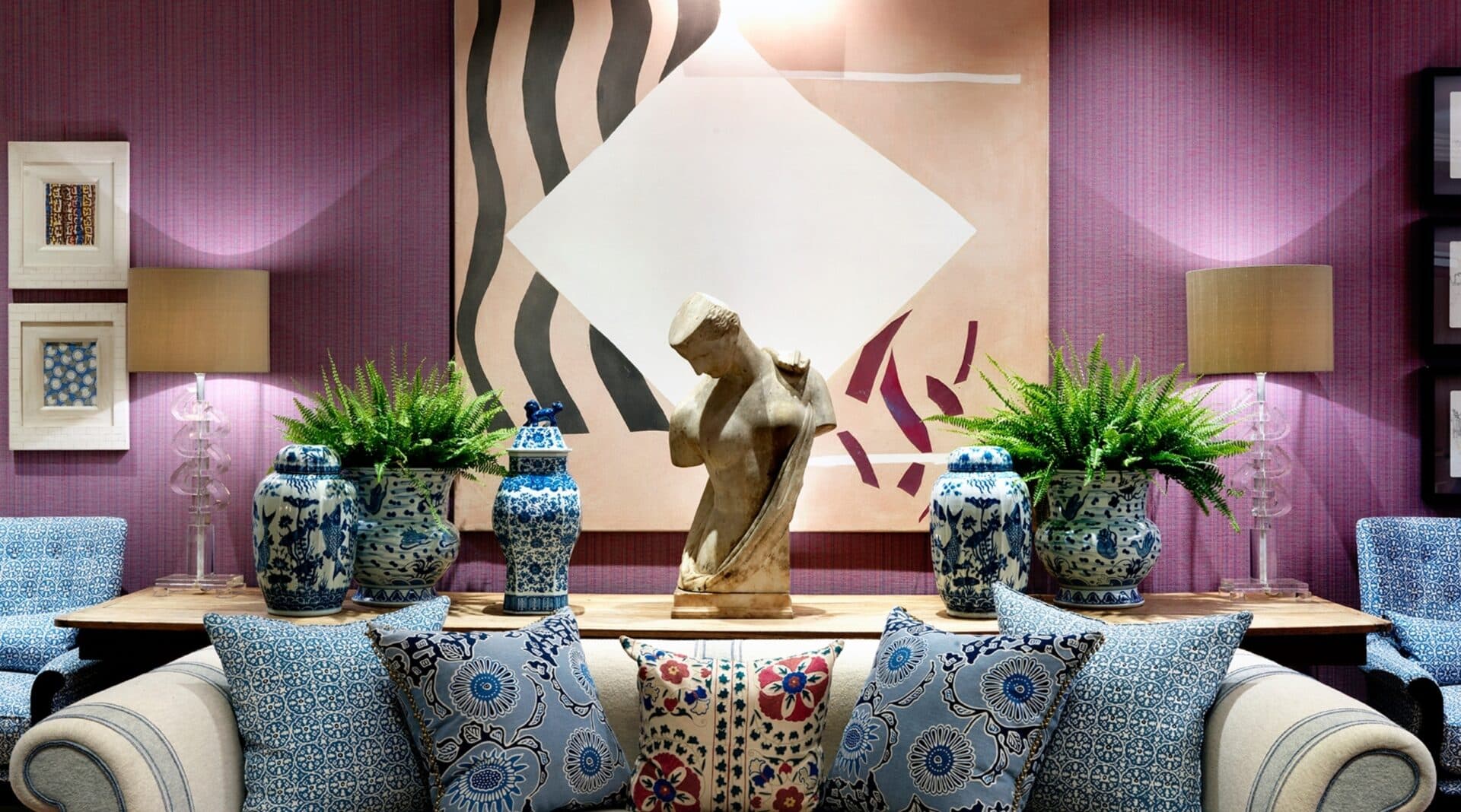
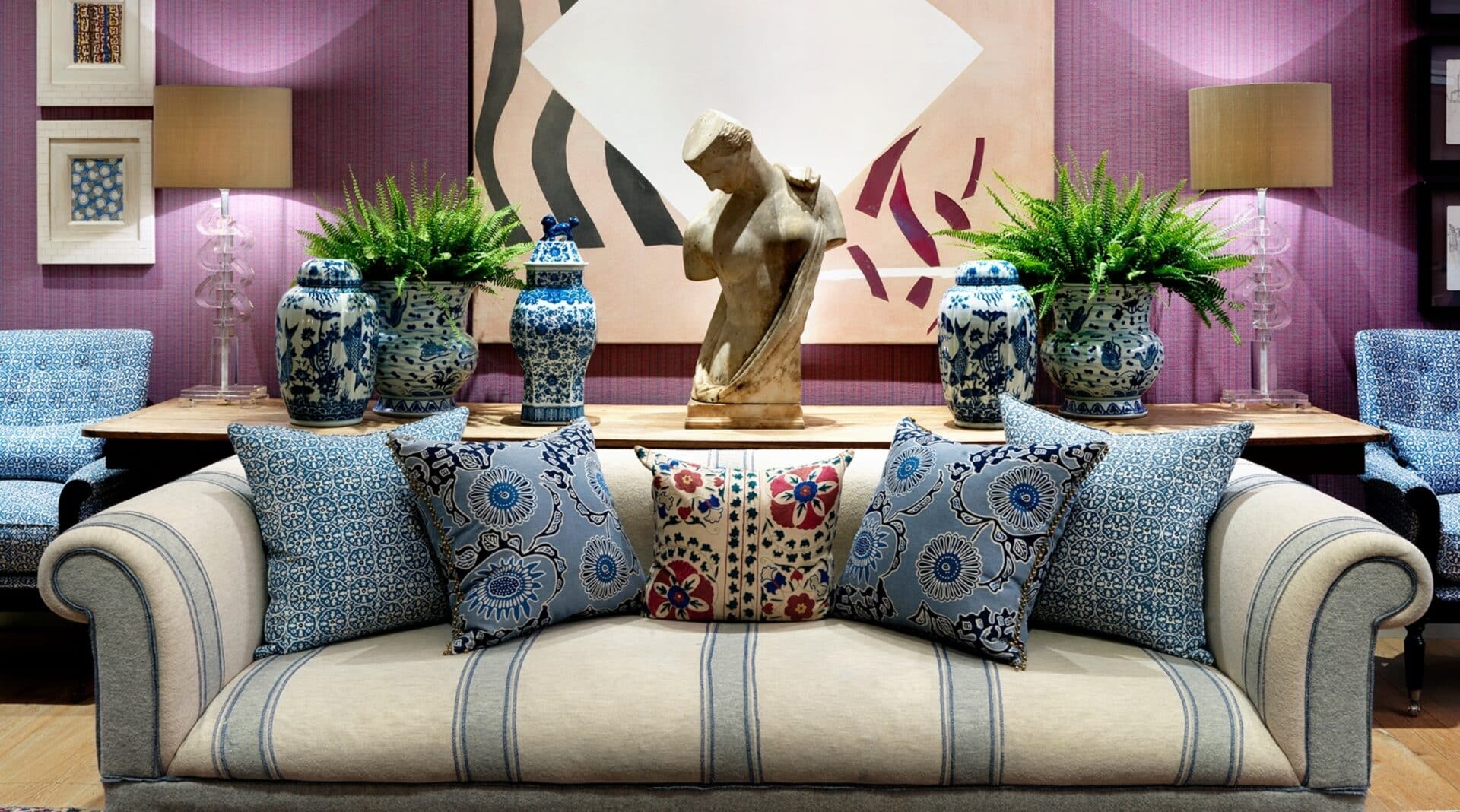
Do liven up a classic group of jars or vases with a bit of planting. The burst of green gives them an interesting silhouette and breaks the uniformity. By placing the planted jars on either side of this sculpture we’ve created symmetry, and coupled with the freshness of the plants the whole area is lifted.
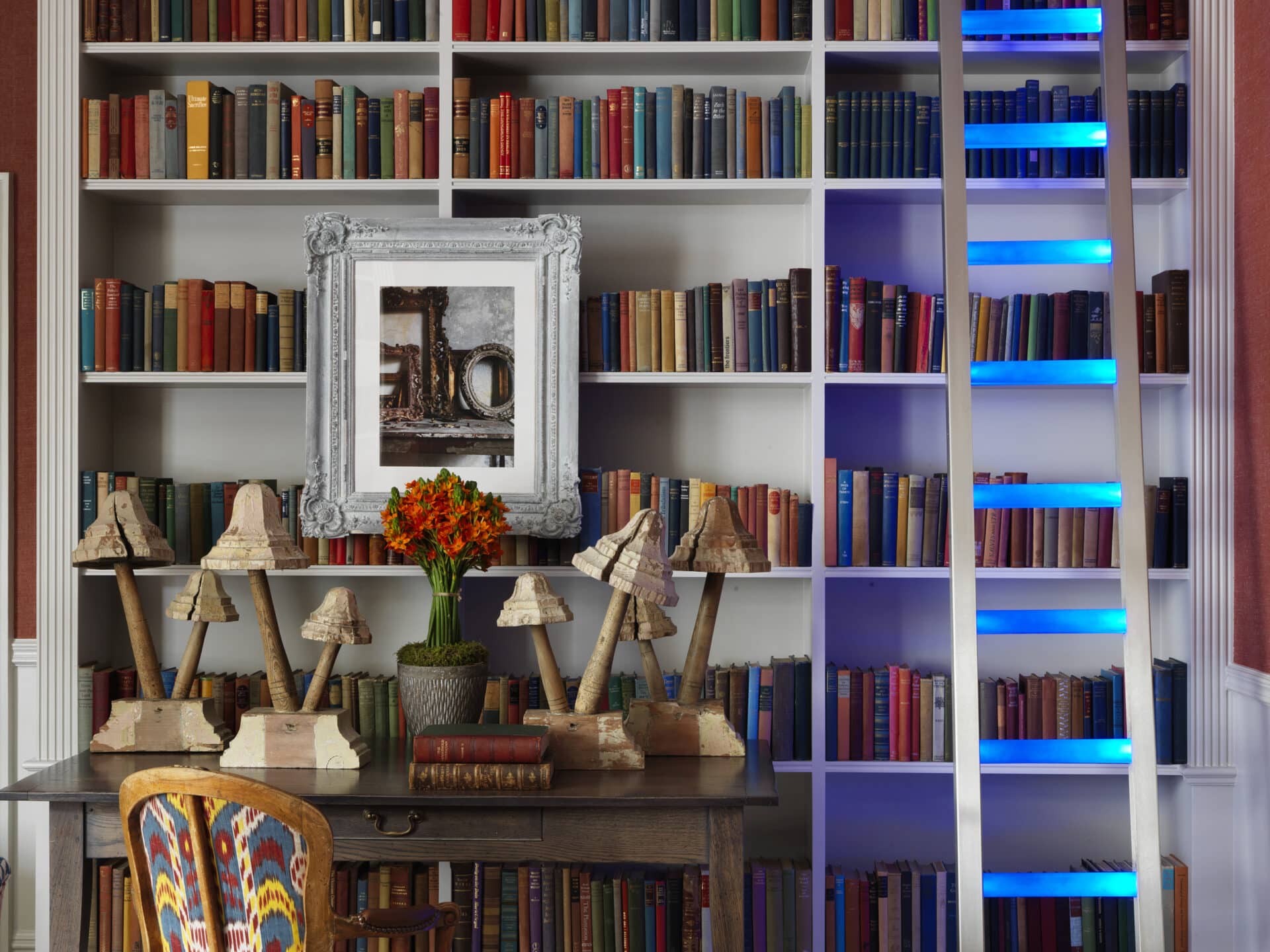
Don’t stick with the same textures. A grouping in a different material will bring balance and cohesiveness to a space. In Knightsbridge Hotel’s Drawing Room, we’ve grouped together a display of carved wooden mushrooms as the final layer in front of a wall of fairly square edges and stripes of neon blue. They soften the overall look and feel and the space immediately becomes more inviting with these playful additions.
So go on, be bold and adventurous with your styling!

