Our Dos and Don’ts for Finding Interior Design Balance
How ToBalance is one of the most important aspects of interior design, as it helps to create a sense of harmony and coherence within a space. There are several ways to achieve balance in interior design, so join us as we share our 'Dos and Don'ts...
Balance is one of the most important aspects of interior design, as it helps to create a sense of harmony and coherence within a space. There are several ways to achieve balance in interior design, so join us as we share our ‘Dos and Don’ts…
Symmetry-Asymmetry
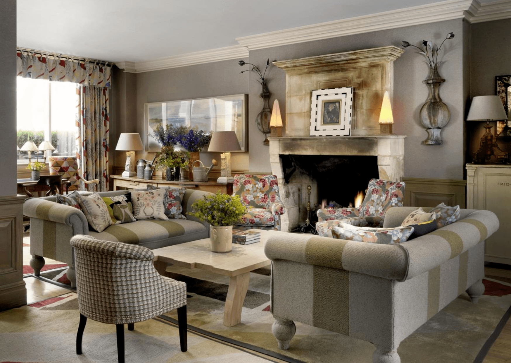
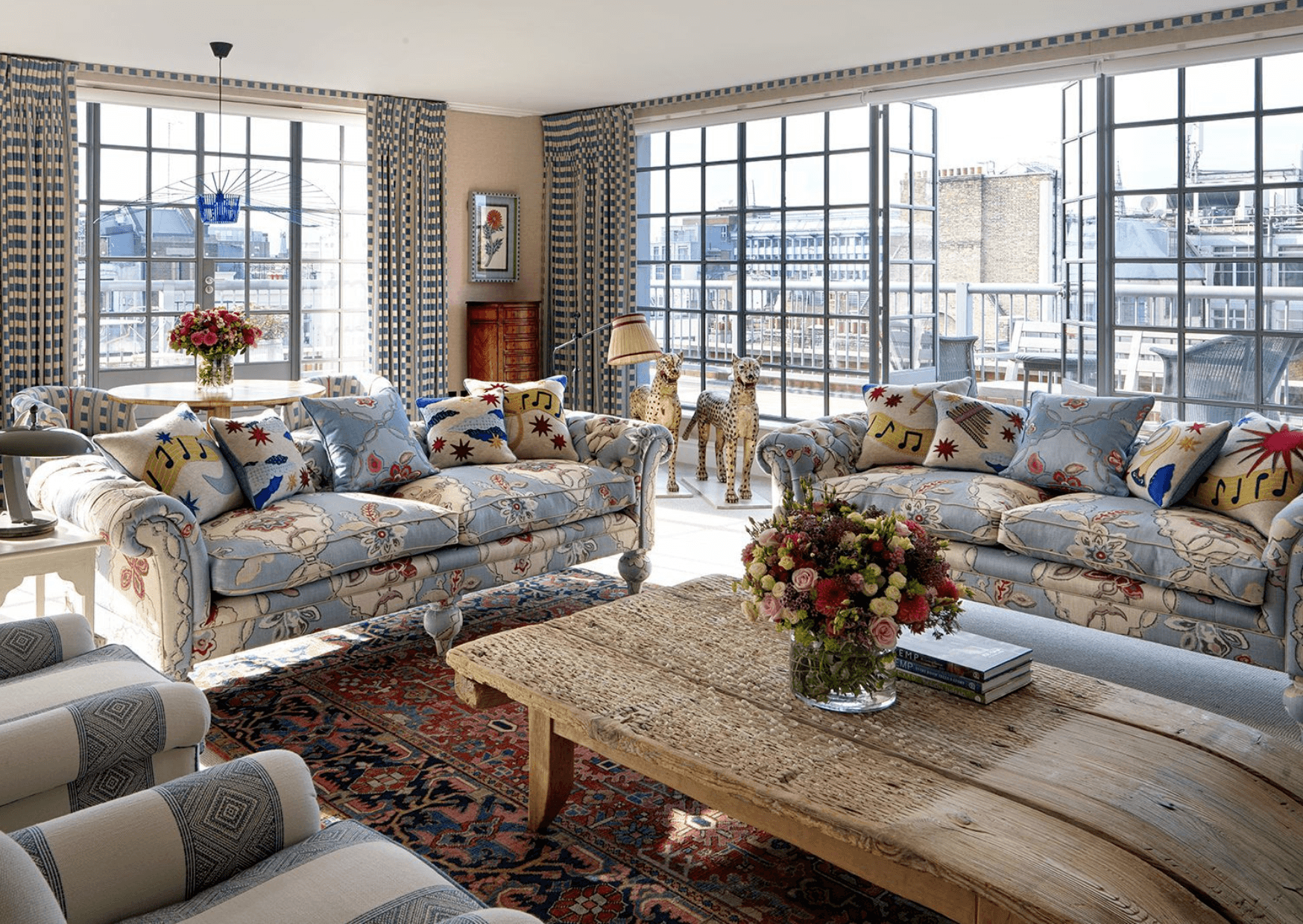
When organising layouts and displays, DO create a symmetrical balance by placing similar objects or furniture on either side of a central axis. This ensures a sense of order and stability and this practice is often used in traditional interior designs.
Colour
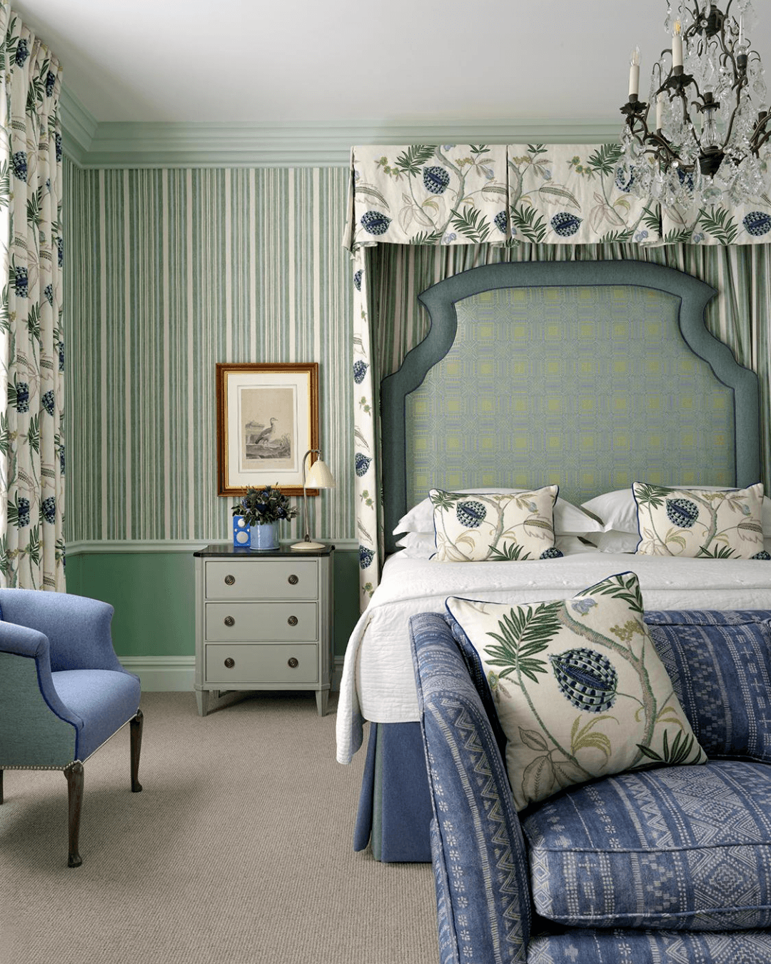
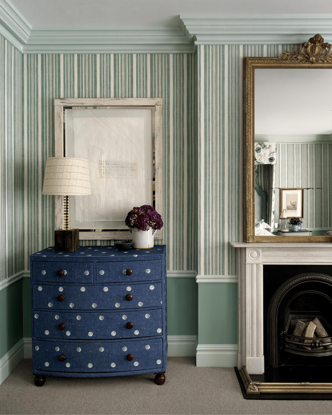
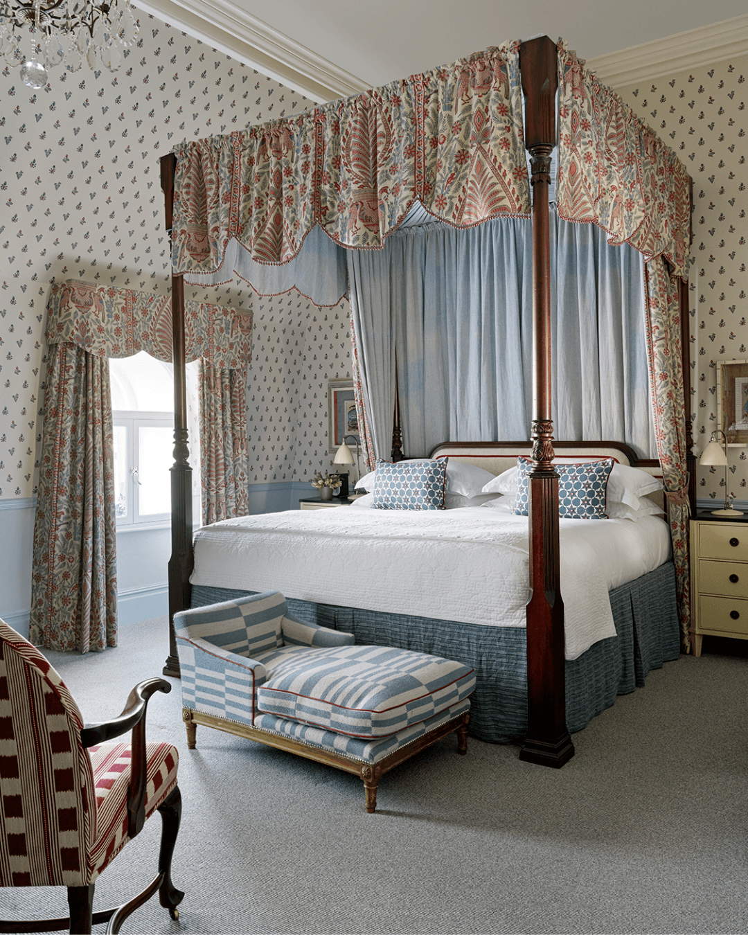
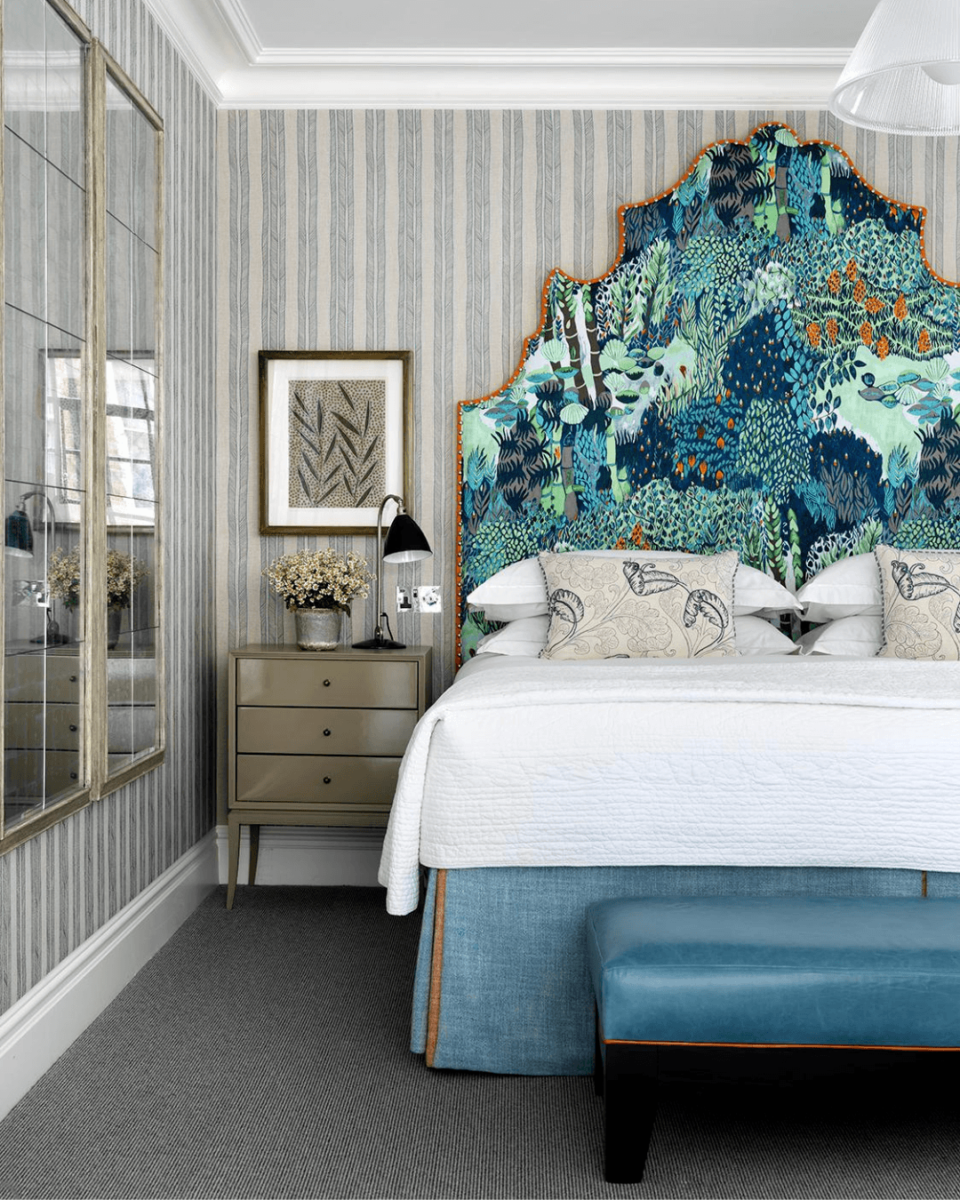
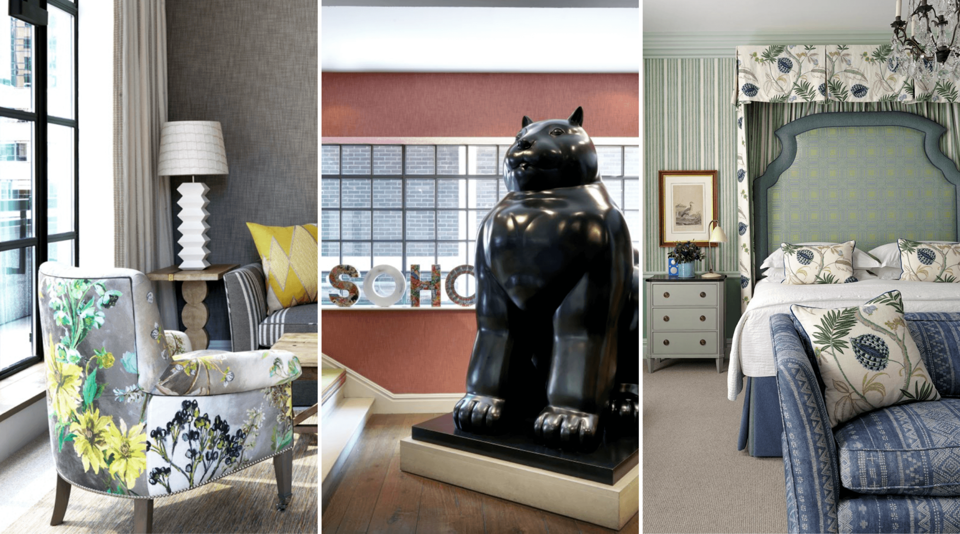
DO use plenty of colour. A bold and bright colour can be balanced out with a more neutral colour. In room 202 at Covent Garden Hotel, we have paired strong blues with subdued greens as well as more subtle blues, allowing for all tones to complement each other beautifully.
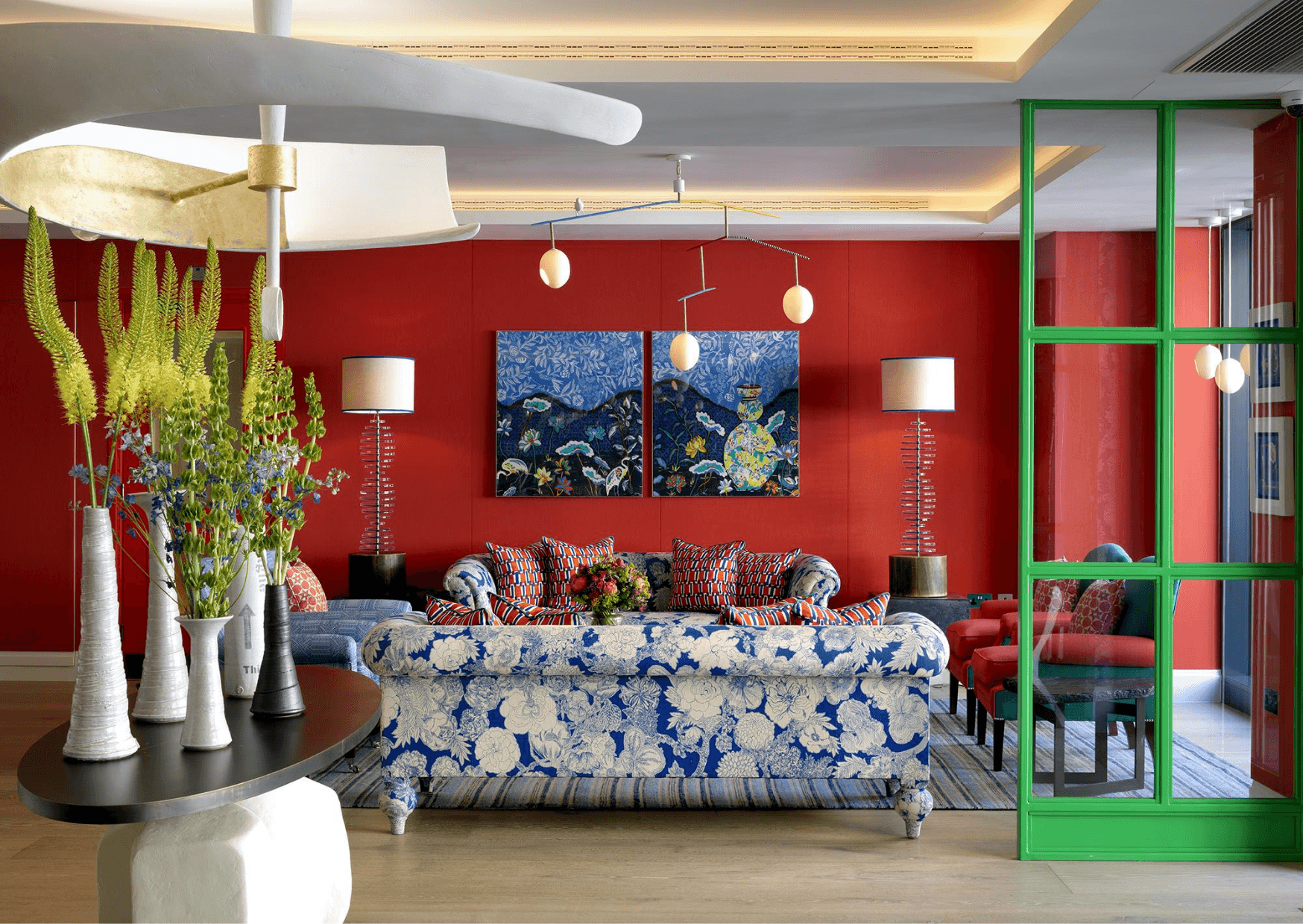
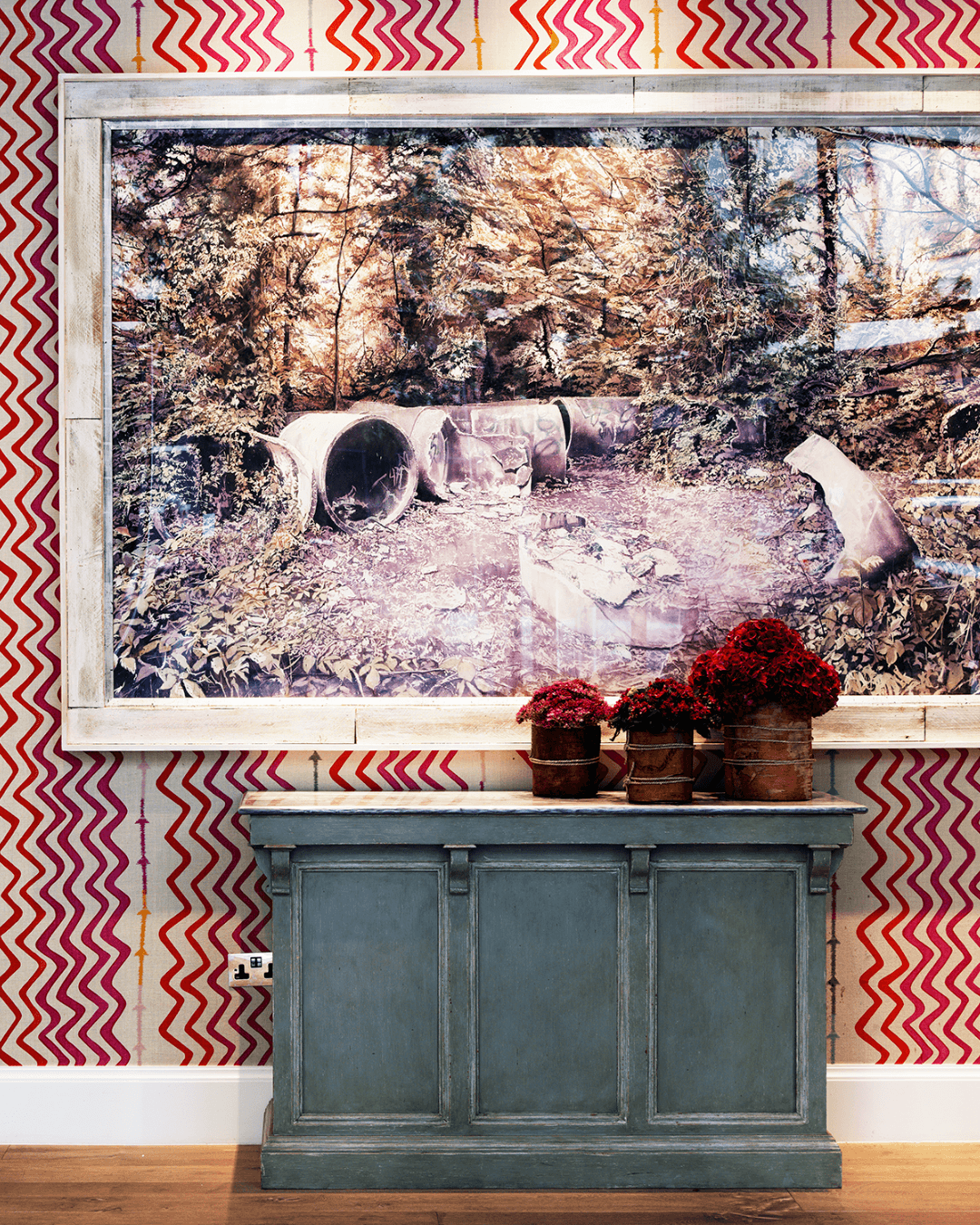
Another great example is the lobby at Richmond Buildings. Here, bold red walls are balanced by green Crittall doors. See also our tips for setting clear boundaries with Crittall windows here.
Pattern
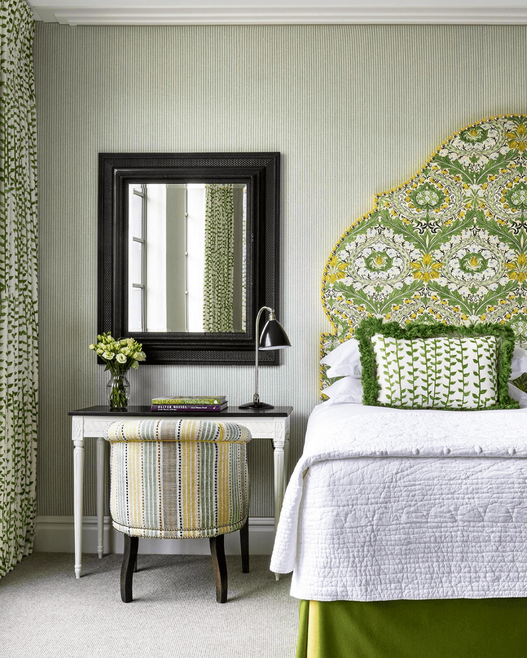
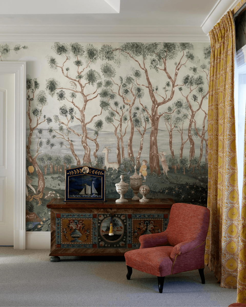
DO use a mixture of patterns. Here at our Design Studio, we love using patterns that bring vibrancy and energy to a space. However, to avoid overwhelming the eye, it’s important to balance different designs. A good rule is to mix large and small prints and to limit the colour palette to a few key hues.
You can also introduce additional elements on either side of a central axis to create interest and dynamism to a space. This is often done in more modern or eclectic interior designs.
Scale
DON’T place items of similar size or shape next to each other. The arrangement will lack visual appeal and harmony. Balance can be achieved through the use of scale, such as by pairing a large piece of artwork with smaller accessories or vice versa. Our Botero bronze cat sculpture who lives in the lobby at The Soho Hotel, makes a great example of how to create an impact through scale.
Texture
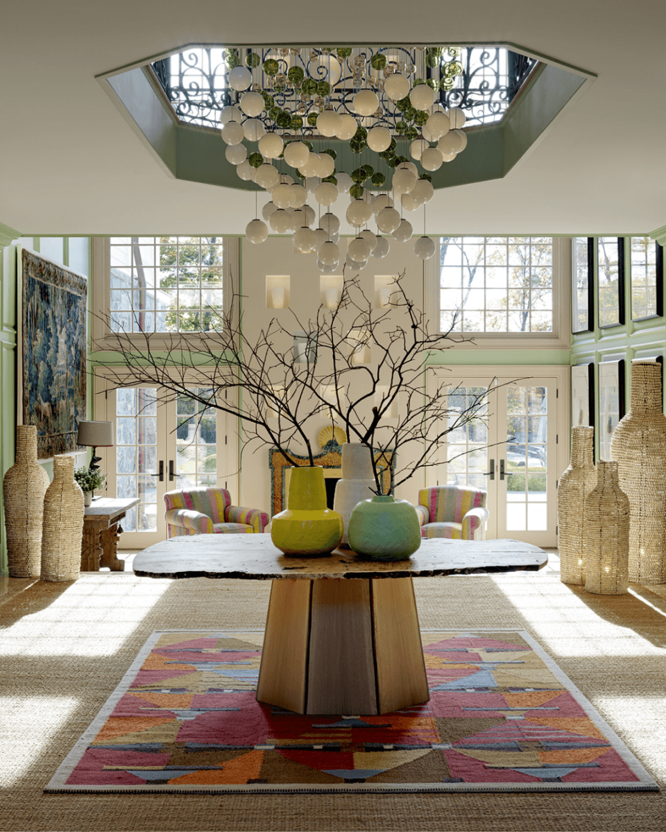
DON’T include only plain items and textiles in your schemes. Texture can also add balance to a space by providing contrast and visual interest. A smooth surface can be balanced out with a rough, natural material such as a woven rug or wooden table.
Focal Point
DO choose a focal point. In order to create a sense of balance, it’s important to have a clear focus of attention in the room. This can be a piece of art, a statement piece of furniture, or even a bold wallpaper pattern. The other elements in the room should complement, rather than compete with the focal point!
Overall, achieving balance in interior design involves careful consideration of the different elements in a space and how they work together. We hope these tips will help you to create a cohesive and harmonious look. Share your designs with us on Instagram @KitKempDesignThread.

