At our Design Studio we’re always championing the use of patterns and prints within schemes. We can all agree that patterns help give character and personality to a room. However, harmony does not exist without a perfect balance and that is why we’re going to celebrate the ‘power of plain’. Join us as we explore neutral tones and block colours as well as ideas on how to use them.
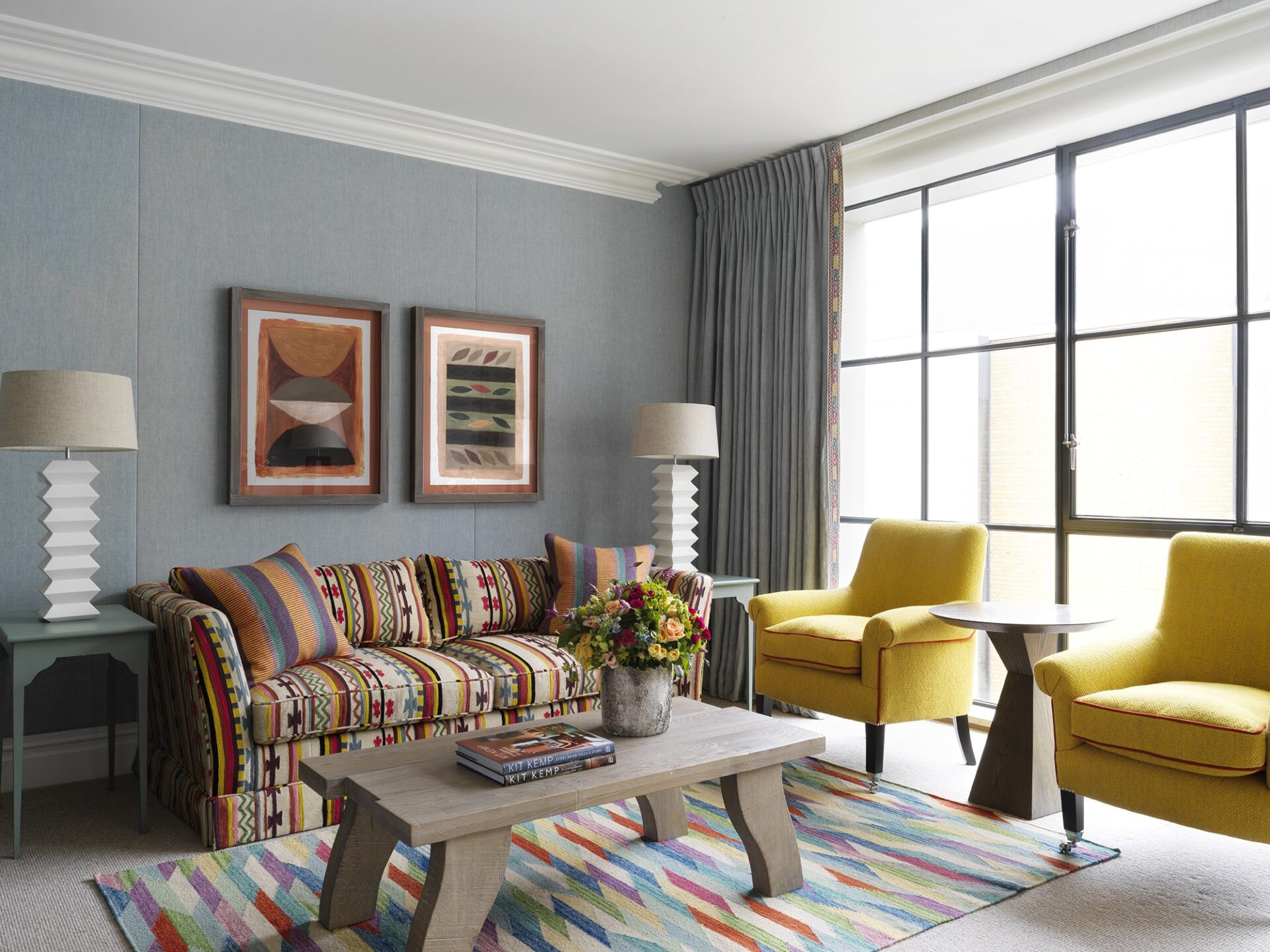
When looking at our spaces you might overlook our use of natural tones. Using a plain colour to calm a scheme doesn’t necessarily mean you need to use a soft or boring colour. In this room at Ham Yard Hotel, we have used a bright, block yellow on the armchairs. It soothes the scheme whilst still conveying a powerful and striking message.
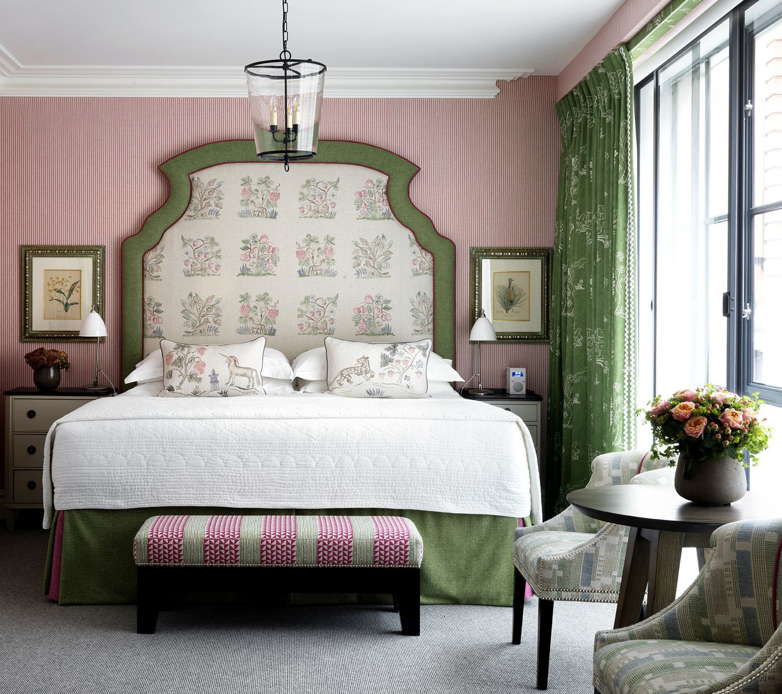
Another good reason to use a solid colour is to emphasise a pattern’s design. You might have seen evidence of this trick with our headboards. In this bedroom, the headboard’s shape creates a perfect frame for the fabric which adorns it. This is our Hedgerow fabric for Andrew Martin. A plain green border with pink piping also encapsulates the fabric’s design.
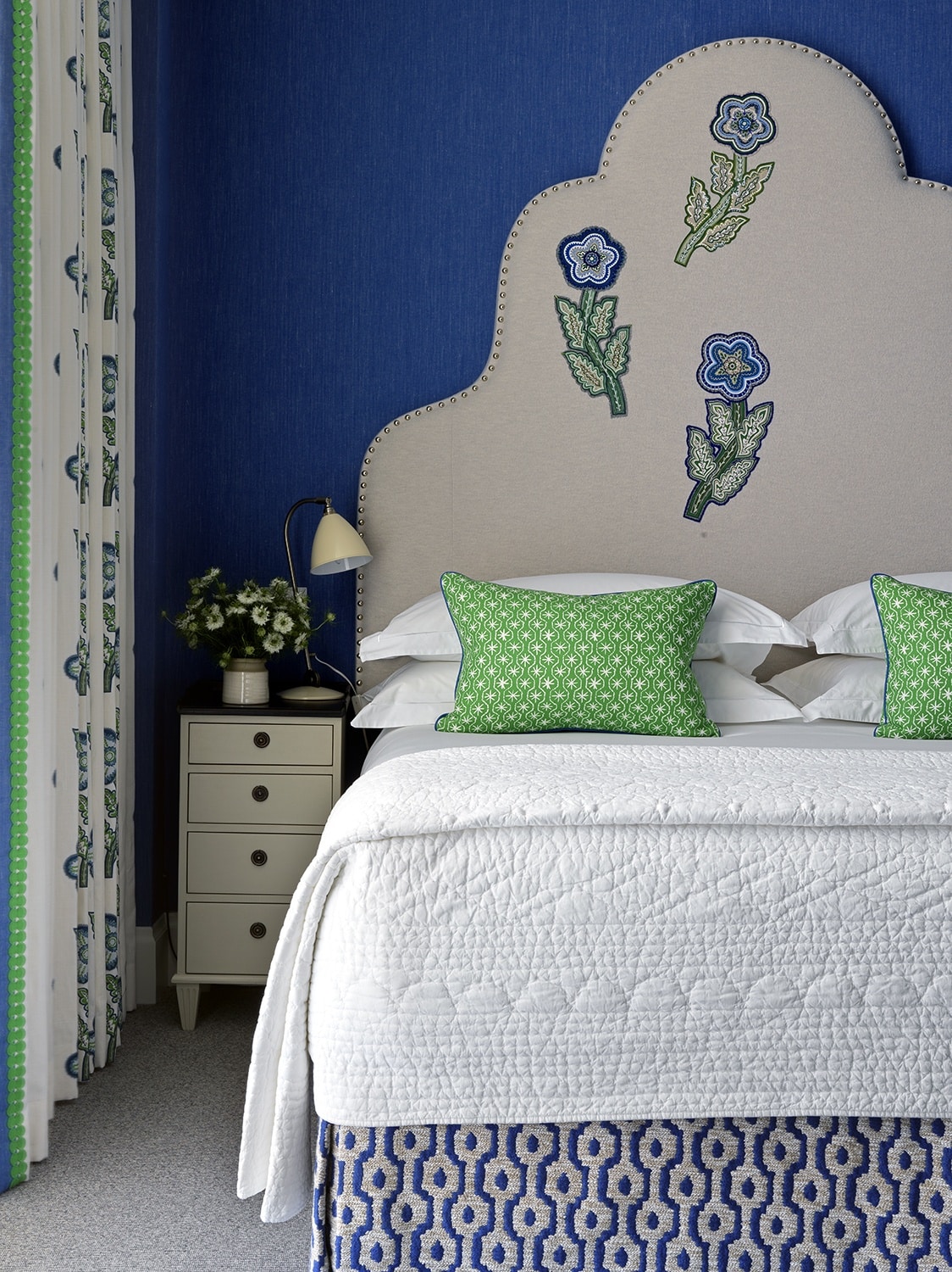
Plain tones and colours also make a great canvas for applique. In this bedroom at Crosby Street Hotel, a plain cloth background adorns the headboard against a striking blue fabric wall. This allows the headboard’s beautifully intricate applique design to take centre stage.
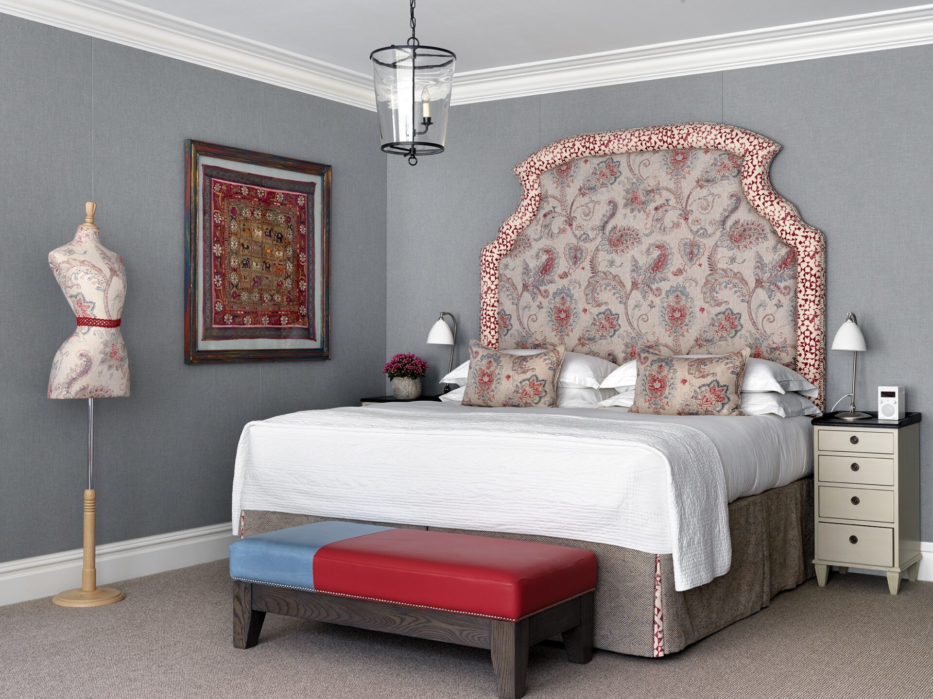
If you’re feeling that your schemes are looking a bit too traditional, solids are a perfect solution to jazz things up. In this bedroom you’ll find floral prints alongside more toned-down colour fabrics. Here we have used this combination to create an unexpected twist and make the room feel more contemporary.
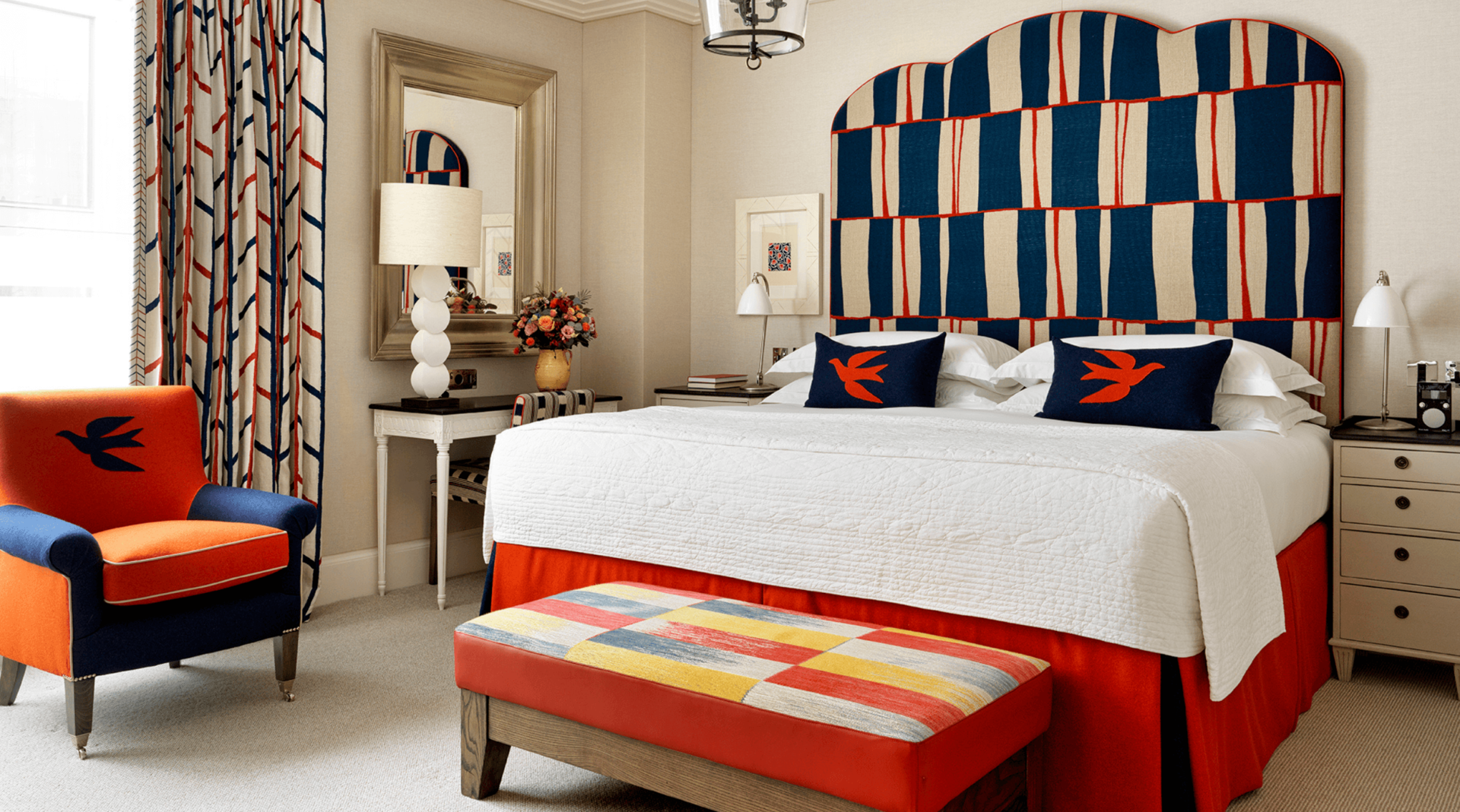
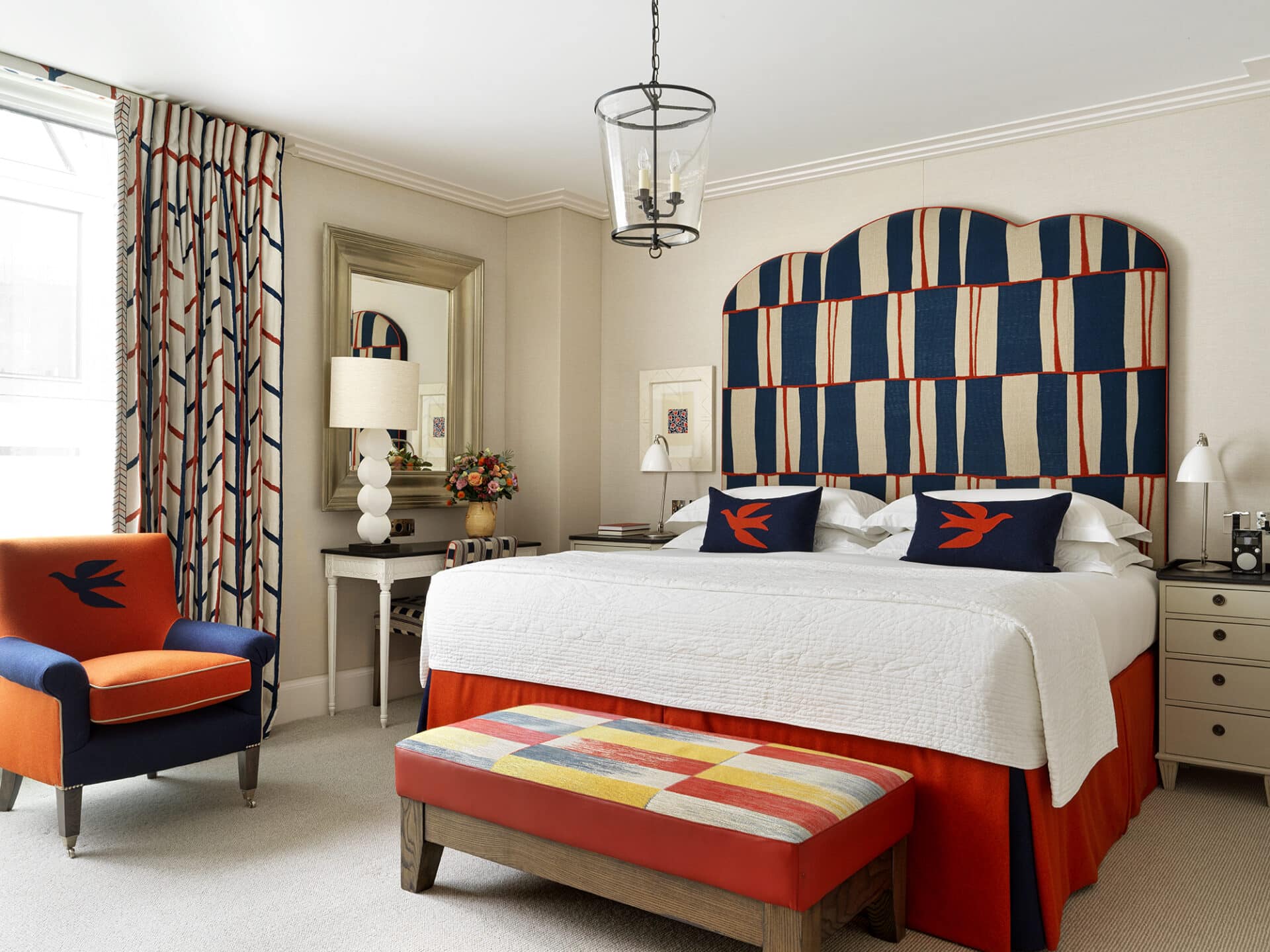
We also love to use plain tones for our bedroom walls. Doing so creates a cosy and warm atmosphere. In this apartment bedroom we have created a sense of sophistication with its neutral walls. For the curtains, we’ve used our One Way fabric for Christopher Farr and thanks to the surrounding neutrals, the design stands out and almost dances as you enter this space!
Remember there is no yin without yang and so when using patterns, also look for plains. Our top tip is to always balance things out!

