How to Decorate Windowless Rooms
How ToHere at our Design Studio we are often faced with the challenge of decorating a room that has no windows. It can be a daunting task, but there are ways to brighten up a room with simple illusions and design tricks. Join us as we share our 5 tips for decorating a windowless room...
Here at our Design Studio we are often faced with the challenge of decorating a room that has no windows. Such spaces include basements or lower ground floors at our hotels. It can be a daunting task, but there are ways to brighten up a room with simple illusions and design tricks. Join us as we share our 5 tips for decorating a windowless room.
1. USE MIRRORS
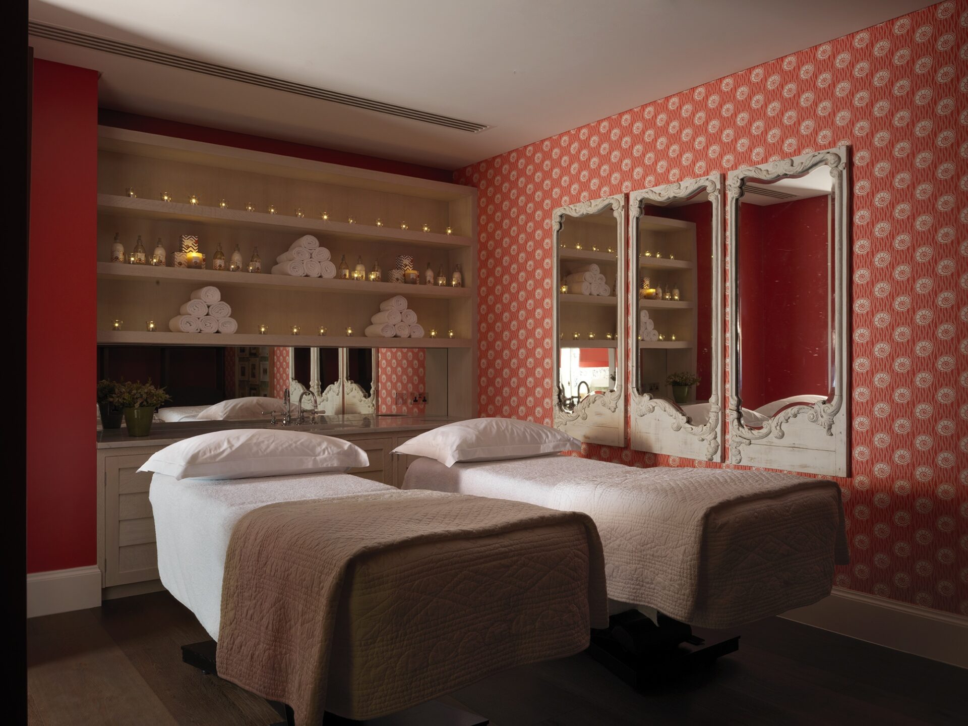
Mirrors are the solution to so many design challenges. They can be used to enhance aspects or deflect attention away from them. At Ham Yard Hotel’s Soholistic Spa, a triptych of mirrors work together to make a relatively small and windowless treatment room feel light and spacious. Decorating with mirrors is a great way to maximise a sense of space. Installing mirrors at the back of a bookshelf can add an illusion of depth. Find our blog: Dos and Don’ts: It’s All Smoke and Mirrors for more ideas.
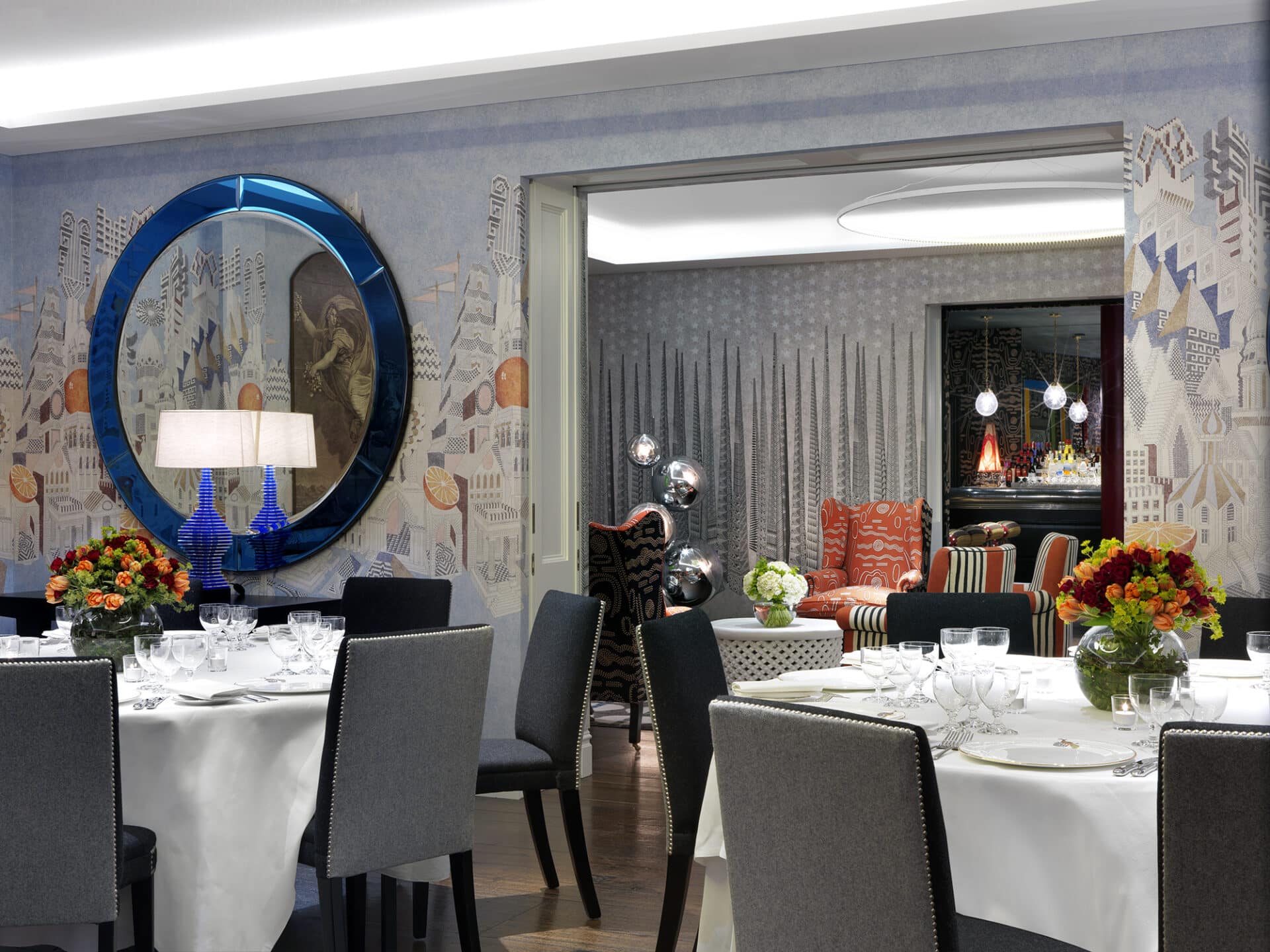
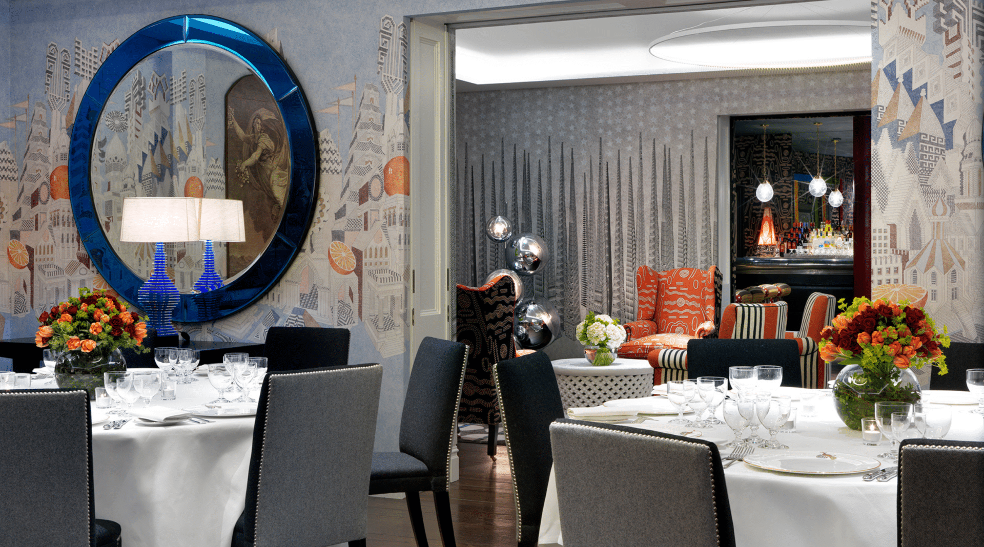
We often think of mirrors as having a traditional rectangular shape and style. However, there are many different mirror designs out there. Go for a strong colour in a circular shape as we have done here at The Soho Hotel’s Indigo Room.
3. BRING THE OUTSIDE IN
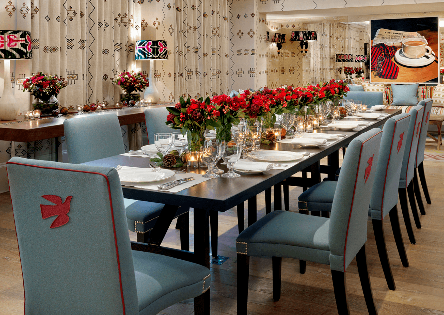
Bring the outside in with foliage and themes of nature. Doing so will instil a sense of freshness in spaces that lack windows. Replicate an ‘al fresco’ feeling with motifs inspired by nature as well as fresh flowers. In our hotels, we always dress our rooms with seasonal flowers, especially those with no windows.
2. USE BRIGHT, BOLD COLOURS
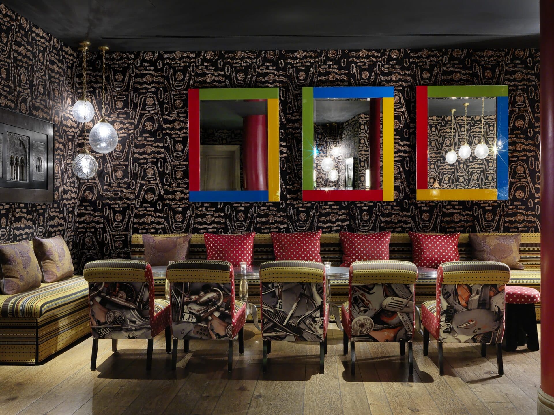
When designing a room it’s important to keep the room’s purpose in mind. Rooms without windows are often on lower ground floors and the use of the space can help determine an appropriate atmosphere to create. The Crimson Bar at The Soho Hotel is a perfect example. We have dressed the walls of this space with a black embroidered fabric by Pierre Frey which elevates the room and makes you feel like you’re entering an old fashioned speakeasy. We love how these dots and undulating lines create a sense of lively movement. The bold, bright colours on the mirror frames against the dark walls really pack a punch and make this room an exciting environment to be in. Explore The Crimson Bar further here.
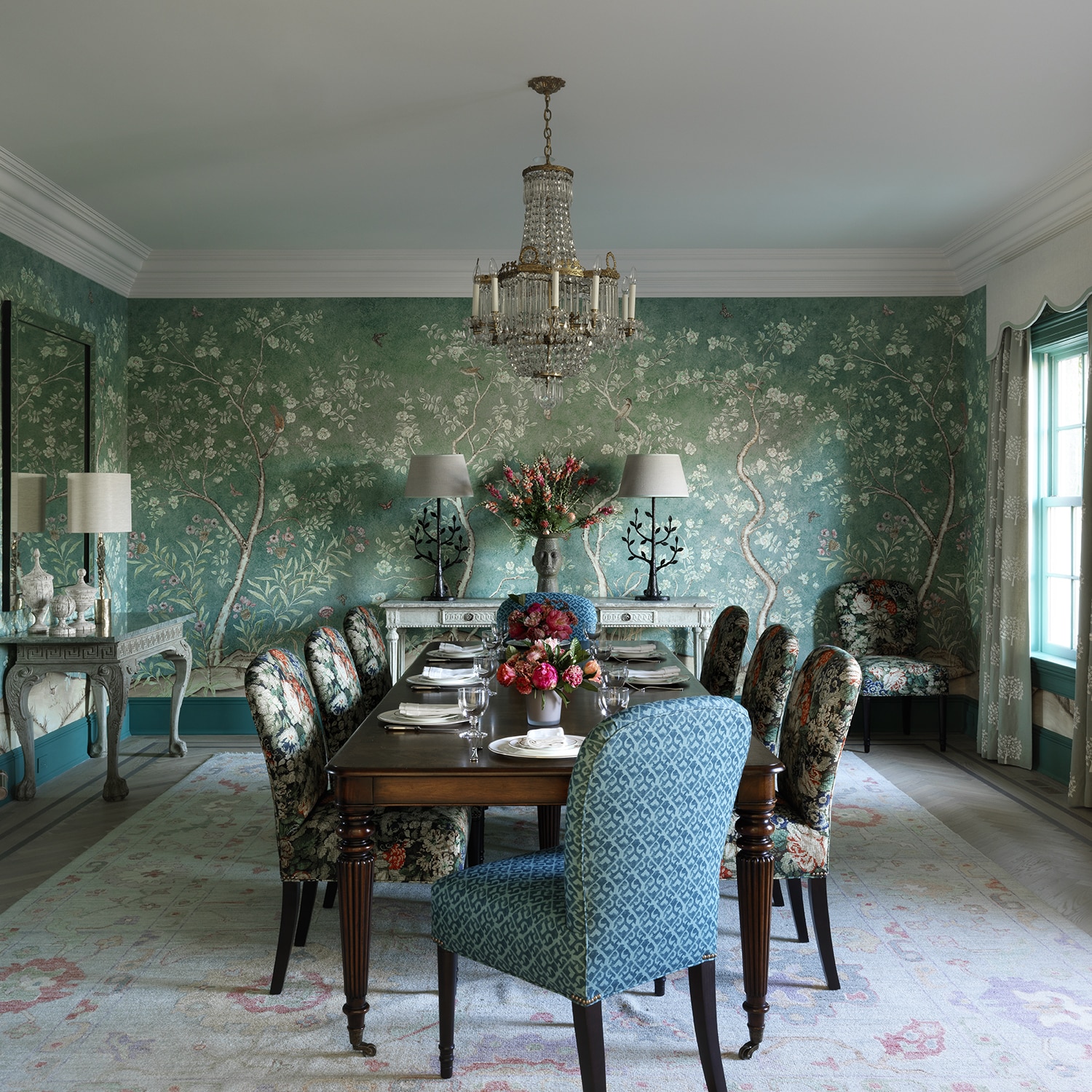
Earlier this year we launched Papillon Wallpaper. This delightful design encompasses willow trees that dance with blooming powder-pink roses and burnt orange butterflies, against chalky teal skies. This large illustrative repeat, depicts that special time of day when the light changes and dusk sets. Nocturnal creatures begin to open their dewy eyes and evening magic is afoot.
4. HANG STATEMENT PIECES OF ARTWORK
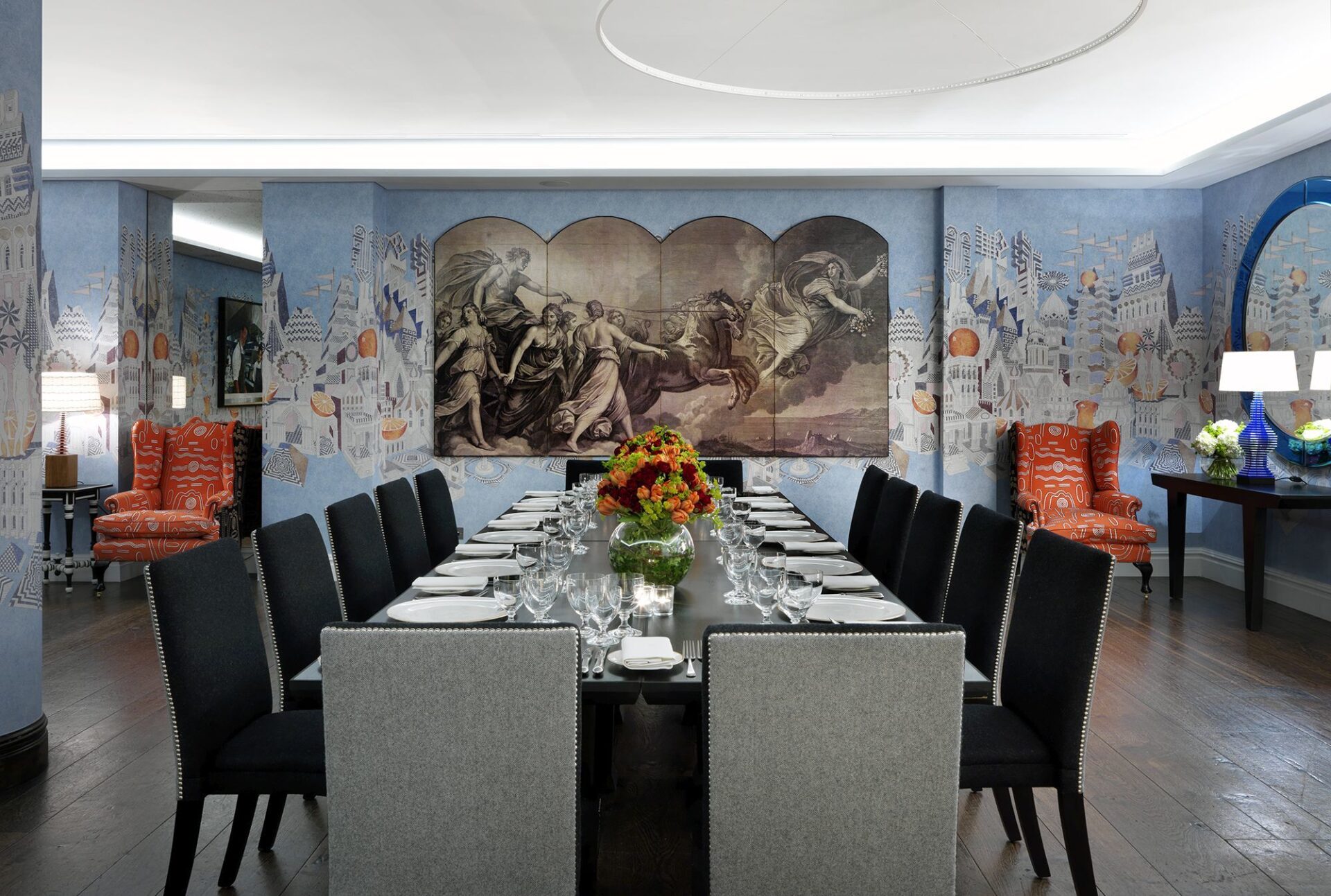
Hanging large statement pieces of art can transport your imagination to another world. Creating a focal point and a theme will deflect attention away from a room’s lack of windows. In this example we have used large scale wallpaper with a soft blue background. A light grey tonal design with orange accents sits on top of a blue sky and illustrates a surrealist city. We have hung a classical style, 4 panelled taupe painting which creates an interesting juxtaposition.
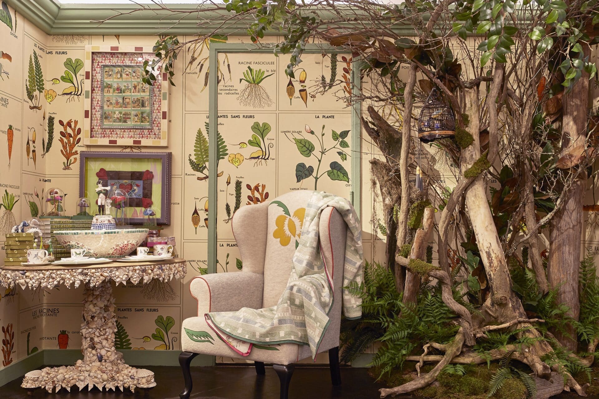
At our Bergdorf Goodman showroom in New York, we also had the challenge of designing a space with no natural light. Our solution was to literally bring the outside in! Collaborating with Lewis Miller Design, we created a natural woodland installation. To evoke the luscious colours and joy of standing in a garden, we used our ‘Racine’ wallpaper design which was inspired by 1950’s French botanical posters.
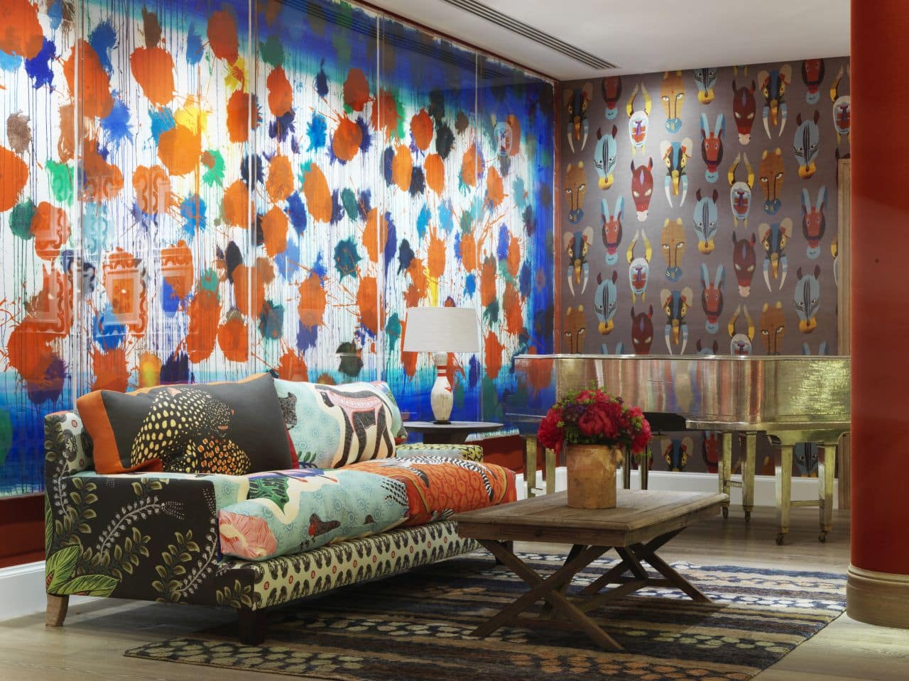
We say you can never make a statement piece too big! Who needs windows at Ham Yard Hotel’s Croc Bowling Alley when there’s two Howard Hodgkin prints. They were the largest and most ambitious etchings ever completed by the artist and we adore them.
5. GET THE RIGHT LIGHTING
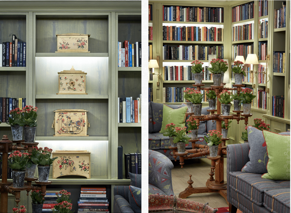
It is often easy to forget about bookshelves and shadow gaps but these details can make all the difference. By installing recessed LED strip lights in your shelving, you will make a library space come alive. Books should be celebrated and not forgotten. Often spotlights can be overbearing and garish, but don’t abandon them completely. Our top tip is to only use spotlights where necessary and put them on a dimmer switch to alter their glow. Placing up-lights in the corners of a room can help to make the space feel bigger. An up-light behind a sculpture can create interesting focal points and shadows, leading your eyes to explore further.
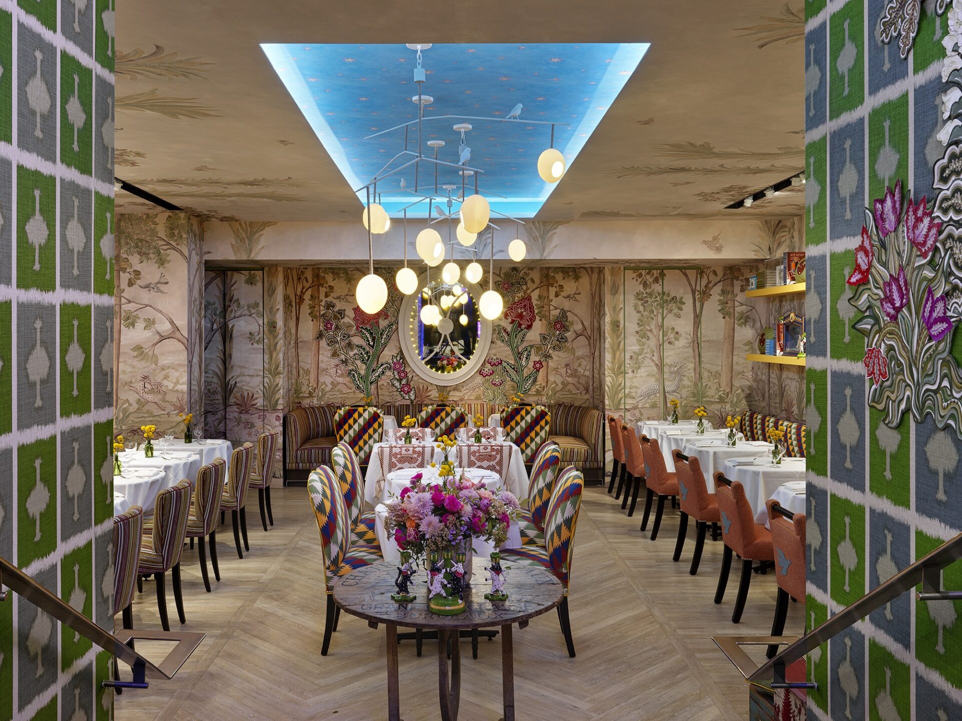
Finally, why not put all our 5 tips into one? On the lower lever of Bergdorf Goodman, you’ll find Palette where we have done just that! Whether day or night, this restaurant gives the illusion you’re dining outdoors. We included an infinity mirror, introduced foliage with natural flower arrangements and our Tall Trees wallpaper adorns both the walls and ceiling. Our Rockin’ Robin lamps for Porta Romana hang from an elevated soffit in the ceiling, which we’ve also covered in our ‘Starry Sky’ design. Explore our scheme at Palette further here.
We hope you have found our tips useful and we can’t wait to see how you incorporate them in your own schemes. Share your designs with us on Instagram @KitKempDesignThread.

