
We’re known for our use of bold and vibrant colours, but sometimes we enjoy taking a softer approach by using pastel tones in our interiors. When people see pastel colours they tend to think of spring, with flowers beginning to bloom. Here we will show you some of our favourite schemes and accessories which have chalkier, restful tones that celebrate the joys of spring.
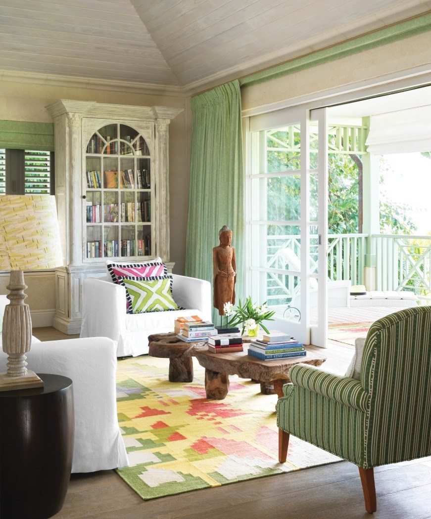
In Barbados at Rossferry we covered this armchair and sofa in a loose fitting, heavy weight white linen to create a luxurious and sophisticated look. ‘Eternal Spring’ is a rug design from our new collection with Annie Selke. The addition of this graphic rug grounds the scheme. It has a contemporary pixel-like image of florals and yet the design feels folkloric in style. The colours we have chosen are much softer than other rugs from the collection. These pastel tones exude joy and comfort.
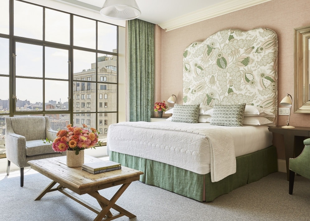
Here in room 1001 at Crosby Street Hotel we have chosen soft pastel tones to create a calm sanctuary. We began by selecting fabric for the headboard. ‘Carnival’ by Christopher Farr Cloth is an all-time favourite of ours and from here, we introduced sage green tones and pastel pinks for the rest of the scheme. The pairing works so well and creates a fresh and tranquil bedroom to retreat to.
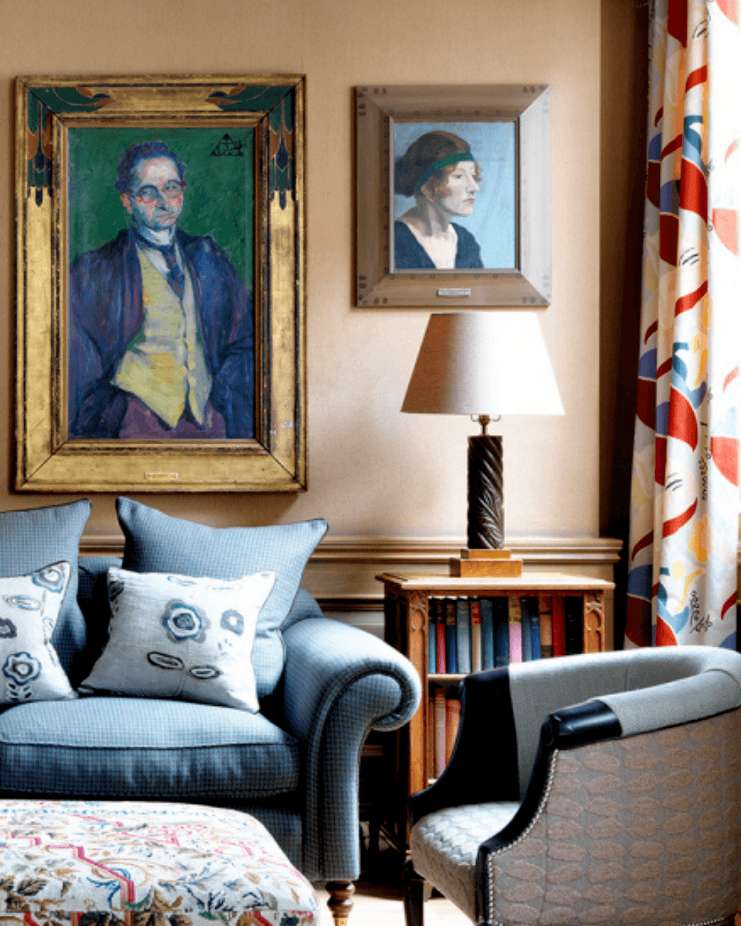
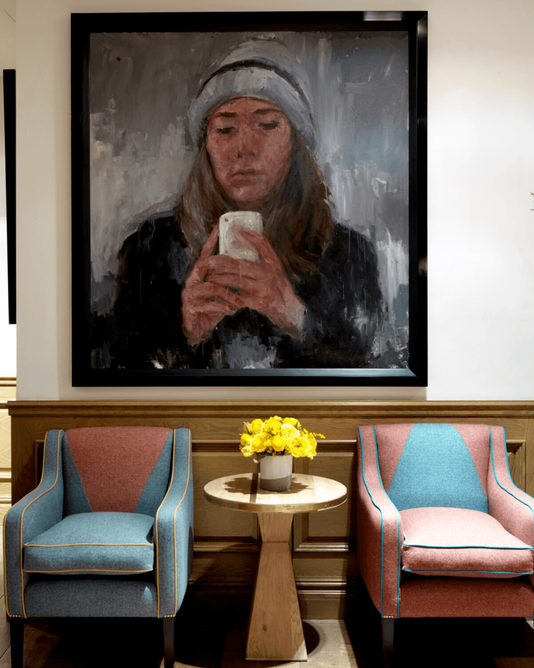
At Crosby Street Hotel these armchairs have been upholstered in a combination of pale wools with an interesting design composition that draws-out the rich tones from an oil painting by Fabienne Labansat above. We’ve added piping to these armchairs which creates a striking contrast. When using chalky colours, you can introduce contemporary design features like we’ve done here. It stops tones from becoming too muted.
Charlotte Street Hotel is known for schemes inspired by the Bloomsbury Group. You’ll find wonderful combinations of soft chalky colours that represent a period of transition, creativity and innovation. For the hotel’s Drawing Room and Library we have used neutral colours with splashes of pastel colours which are characteristic of Bloomsbury interiors.
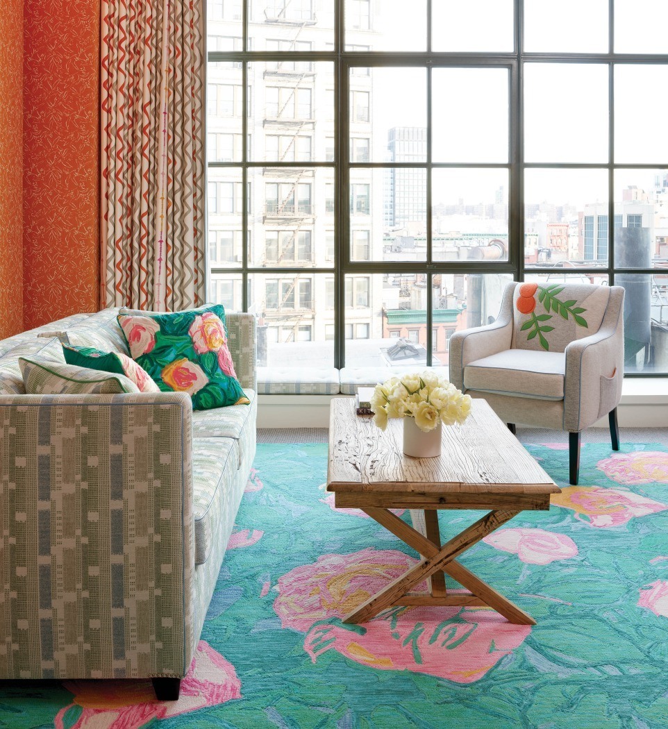
Another design from our Annie Selke collection is ‘Dew Pond’. This rug offers softness and delicacy through its pinks and greens. The pale pinks mixed with different hues of green make the design feel like a large piece of art. To spice things up, we have combined it with our orange Inside Out fabric for Christopher Farr Cloth on the walls to achieve a real sense of spring. We’ve embellished the scheme further by including Dew Pond cushions.
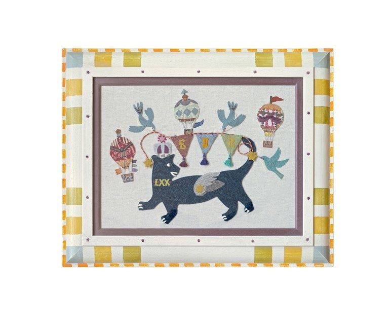
We created these hand appliqué artworks in celebration of the Queen’s Jubilee which also offer the sweetness of pastel colours.
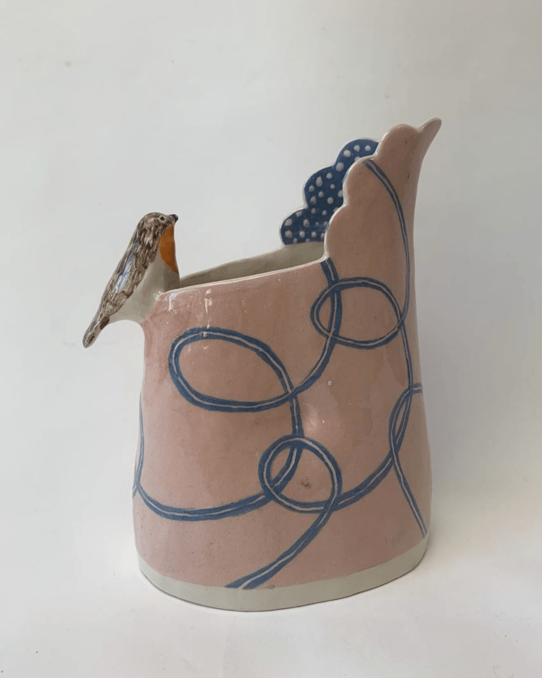
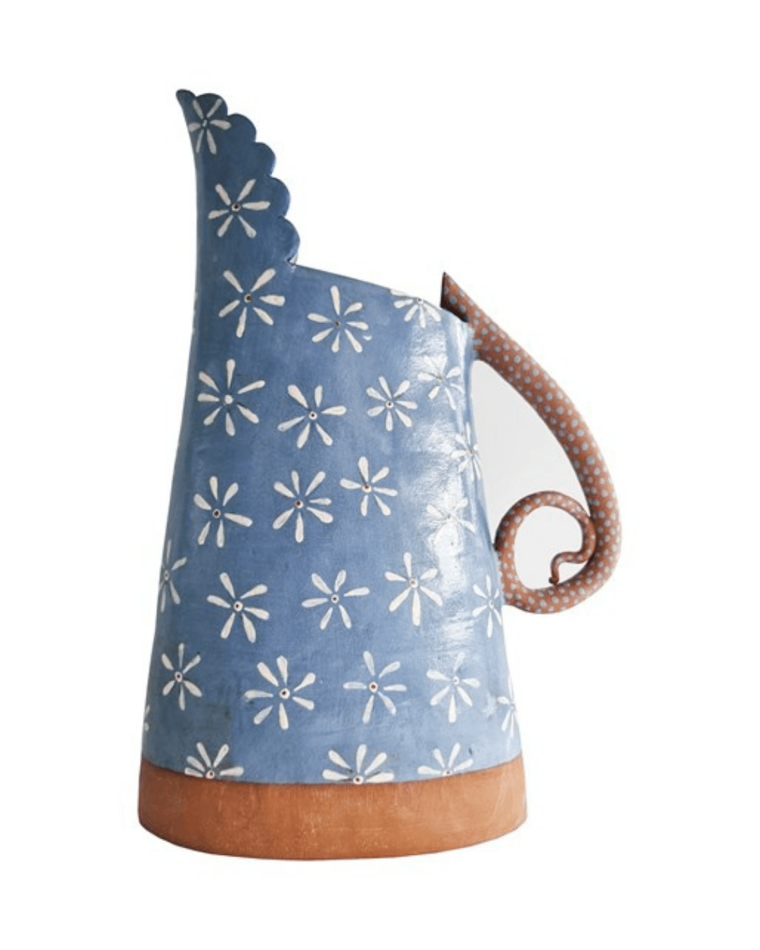
Available from our recently launched Artists Corner at Shop Kit Kemp, fine art meets sculpture with these pieces by Laurance Simon. We absolutely love their pink and blue glaze.

Pastel colours are a great way to soften a room and add tranquillity. But, don’t be afraid to play with strong features that will add character – you don’t want your home to look like a cotton candy shop!