Dos and Don’ts: The 5th Wall
How ToThe ceiling is just as important as any other surface in the room, but often gets left behind in the design process. It's the reason why the ceiling often gets referred to as 'the 5th wall'. Here we bring you our 'Dos and Don'ts' on how to turn your ceiling into a 5th wall...
The ceiling is just as important as any other surface in the room, but often gets left behind in the design process. It’s the reason why the ceiling often gets referred to as ‘the 5th wall’. We love to use ceilings as an opportunity to have fun and provide unexpected delight. Here we bring you our ‘Dos and Don’ts’ on how to turn your ceiling into a 5th wall.
DO: Use a fun wallpaper
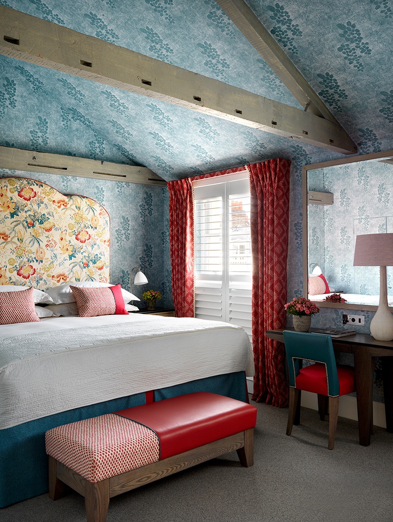
A simple yet effective trick is to use a bold wallpaper. In room 315 at Haymarket Hotel, we saw the sloped and high ceiling as our chance to continue the wallpaper over the room’s eaves. The watery tones and easy movements of Kit’s ‘Mudprint’ wallpaper for Christopher Farr, envelops the room in a calming and cosy way.
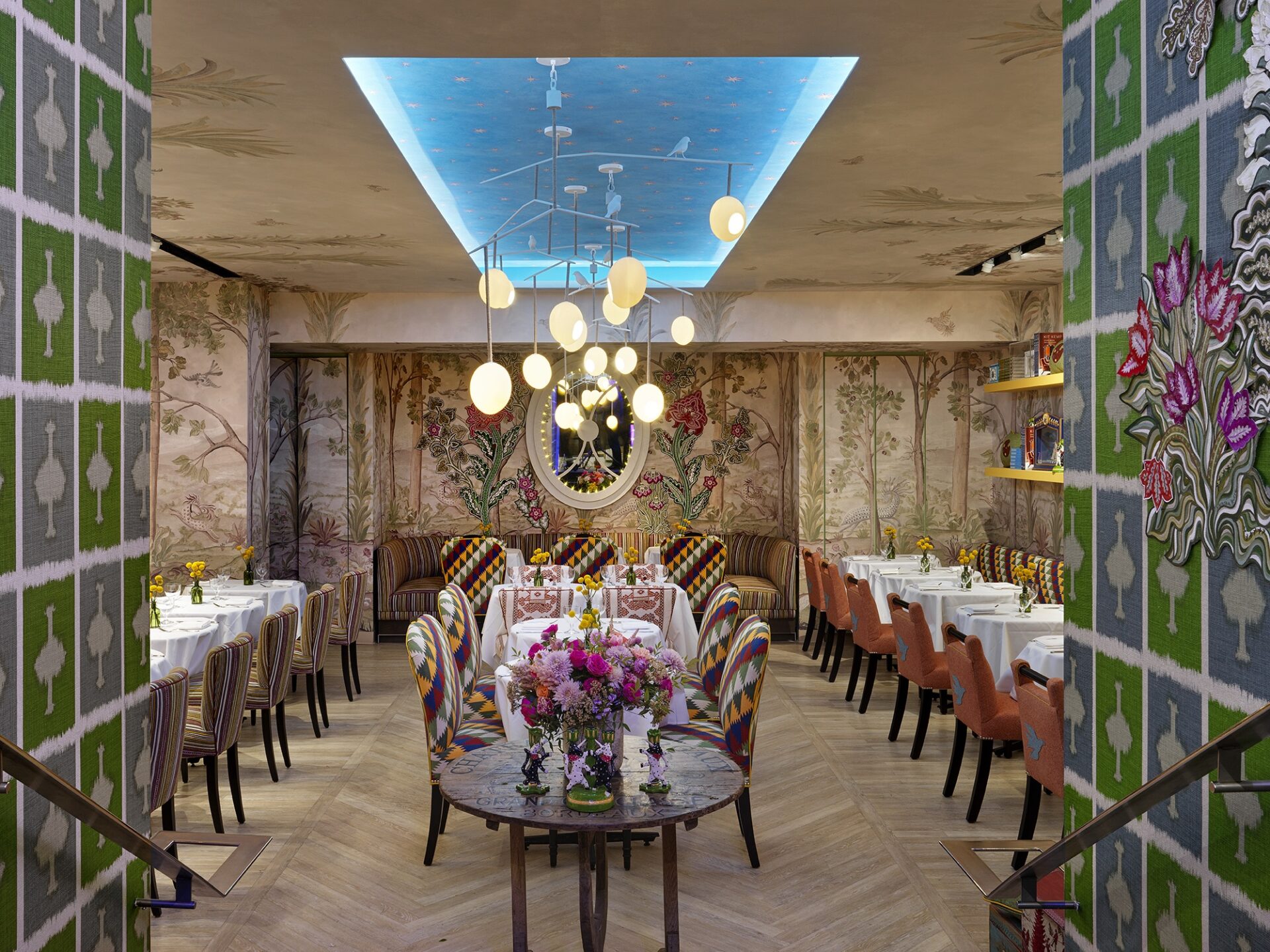
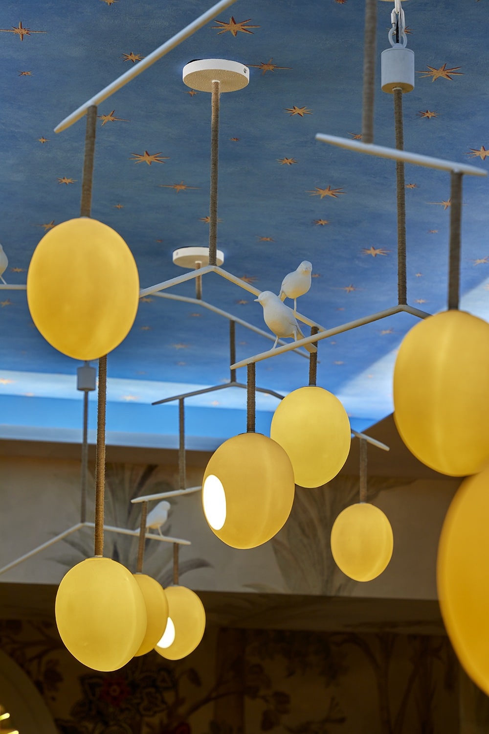
At Bergdorf Goodman’s Palette restaurant, we took advantage of the raised ceiling by using our Starry Sky wallpaper for a moody and magical effect.
DO: Bring the outside in
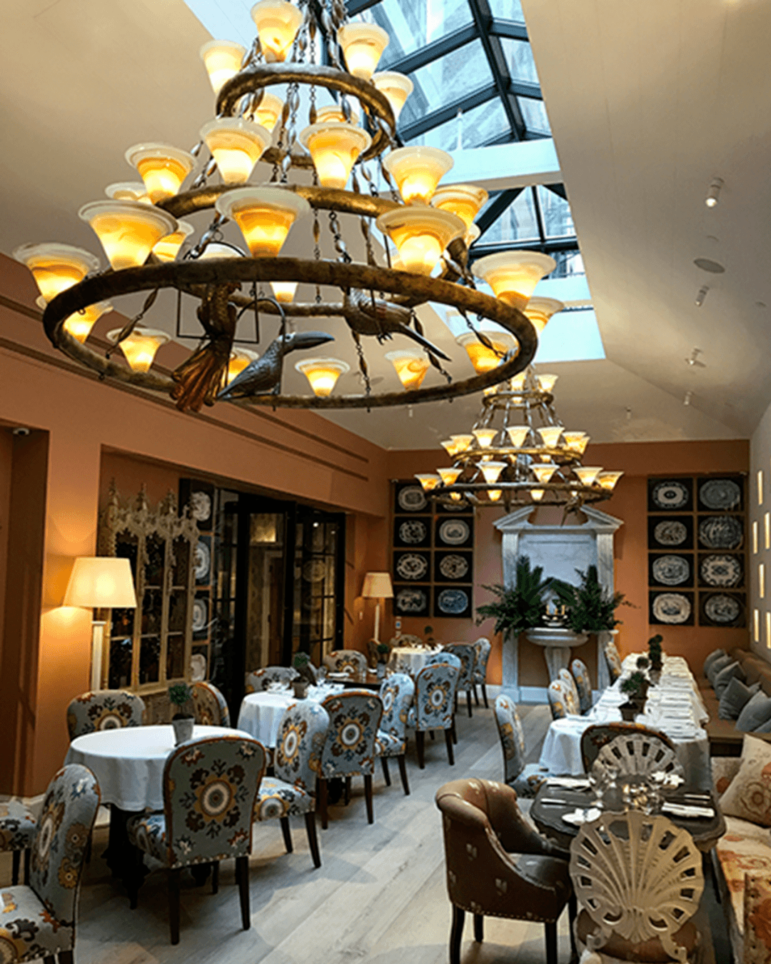
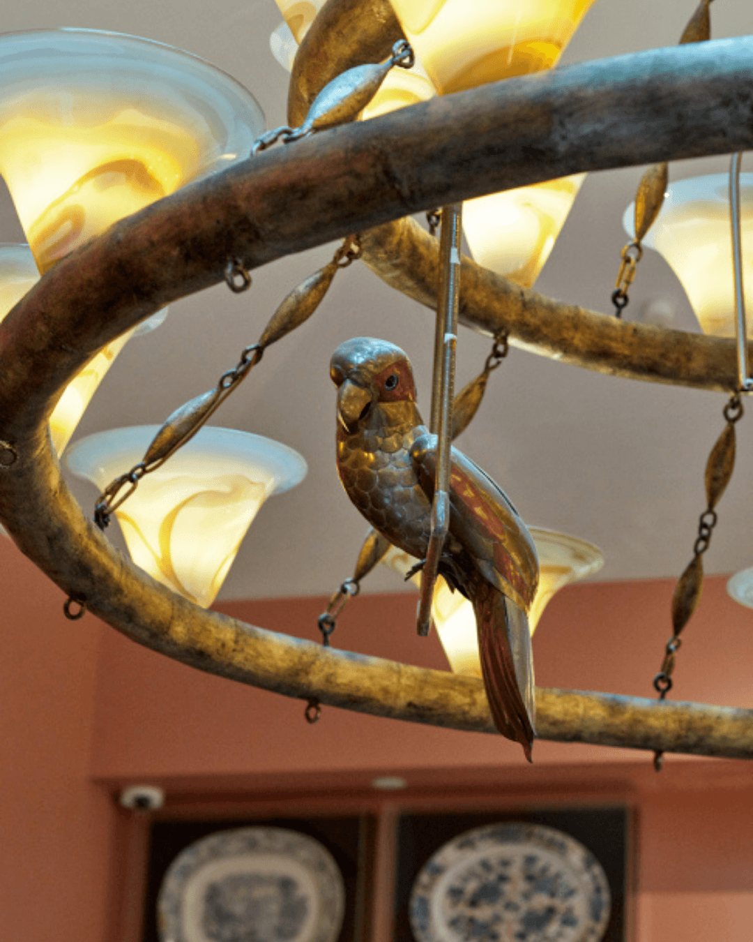
Natural light benefits any type of space. We have created the effect of an open sky in our Orangery at The Whitby Hotel. This skylight brings a new dimension to the ceiling area and encourages you to look up at the chandeliers, where mixed metal parrots and toucans are perched amongst the glass votives – an excellent addition to the indoor outdoor feel of The Orangery.
The extra height allowed us to hang six Rockin’ Robin lights. Designed for Porta Romana, these pendant lights create a whimsy look when set at differing heights.
DON’T: Be afraid of colour
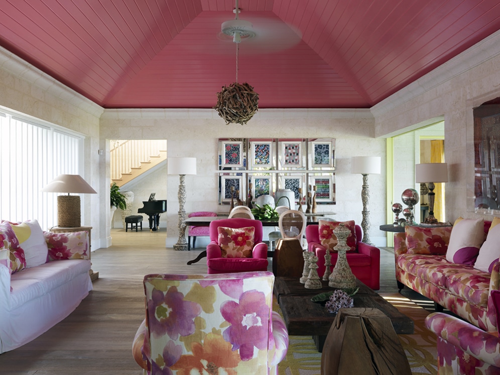
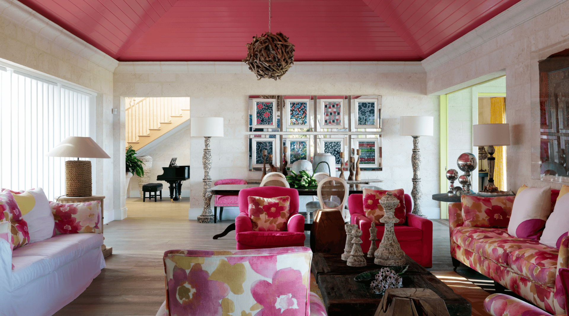
If the setting calls for it, go for it! Cover your ceiling with a bright and cheerful colour as seen here at Rossferry. The hibiscus pink ceiling echoes tones from the upholstery and adds a warm contrast to the cool white walls.
DO: Have fun with lighting
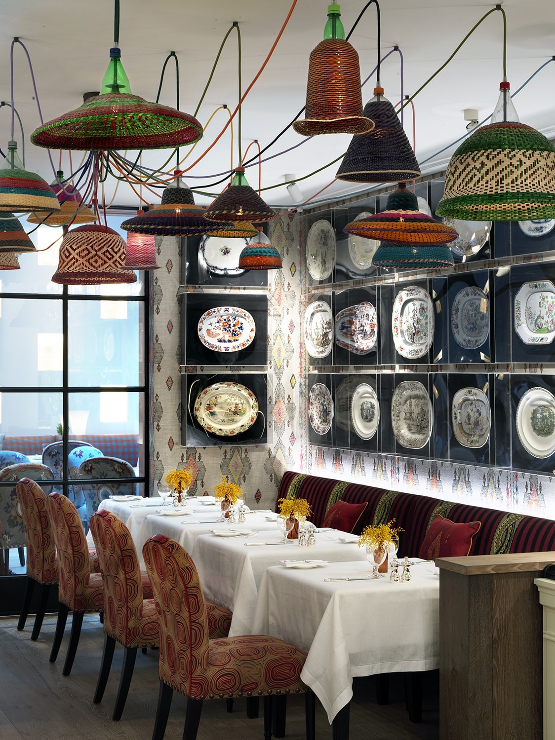
If you’ve got the space for it, create an installation with various light fixtures. In The Whitby Bar’s restaurant, a group of lamps have been used to create a colourful and eclectic art installation.
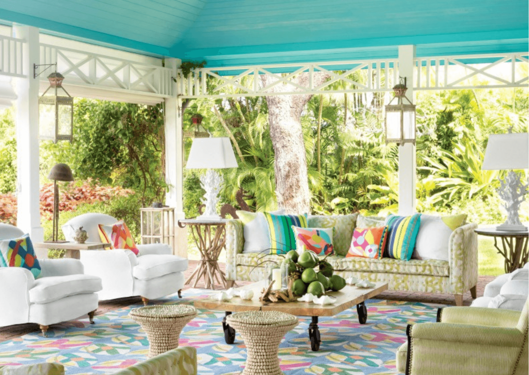
The bright blue of the terrace ceiling mimics the gorgeous tones of the sea. This heightens the tropical flair and complements the surrounding greenery.
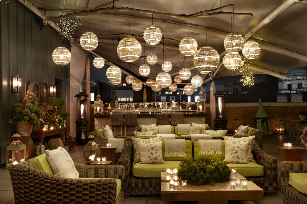
The Roof Terrace at Ham Yard Hotel boasts a fairy-like display of twinkling rattan ball pendants which hang from branches. Incorporating materials and shapes that complement the surrounding environment is key to a successful installation. The natural materials and neutral tones of these ball pendants look totally at home in this outdoor space.
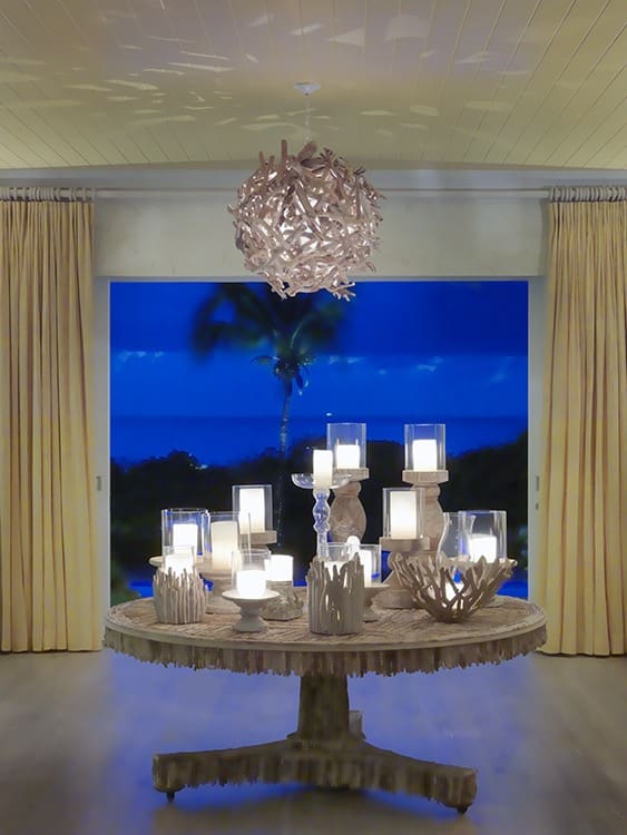
If you don’t have the space for an installation, choose a light that casts interesting shadows upon the ceiling. In the entry hall at Rossferry, a pendant made of driftwood casts geometric shadows all around the room creating a magical atmosphere.
We hope these ‘dos and don’ts’ have shown you that a ceiling should never be forgotten about when creating a scheme. If you’re confronted with sloping ceilings and walls going in every direction, find our guide ‘How to Transform an Awkward Space: Our Dos and Don’ts’ here.

