
Colours have been studied with great interest since the 17th century, when Sir Isaac Newton first discovered that pure white light refracts to show visible colours when passed through a prism.
The psychology of colour however was ahead of its time and can be traced back to ancient Egypt, where sun-filled rooms were lined with coloured glass for therapeutic purposes.
Artists and interior designers have long believed that colour can dramatically affect moods, feelings and emotions. “Colours, like features, follow the changes of the emotions,” the artist Pablo Picasso once remarked.
We have talked at length about the individual colours that we use in our designs, but today we are taking a look at how different colours gained importance, and how their past uses have characterised the emotions and feelings we have towards them today…

Yellow
The colour of the sun, this powerful hue is aligned with hierarchy and status. Yellow pigments derived from clay soils rich in ochre were used as early as 45,000BC for decorating human bodies and cave walls. Its enthusiasm and enlightenment is considered to be a cheerful lift for our mood, and I would certainly agree that walking through the door at the end of the day to a burst of yellow lifts my spirits. In practical terms, yellow can counter the darkness of low lit spaces, which is why I like to use it in dark rooms and on the lower floors of our hotels.


Orange
Orange is an energetic, spontaneous and dynamic colour. It is said to bring energy and positivity to the fore and I use it in the same way that I use yellow, to cheer up a darker room.
These colours are not for everyone, so before taking this step consider its placement and whether you would be happy using it in a room used every day.


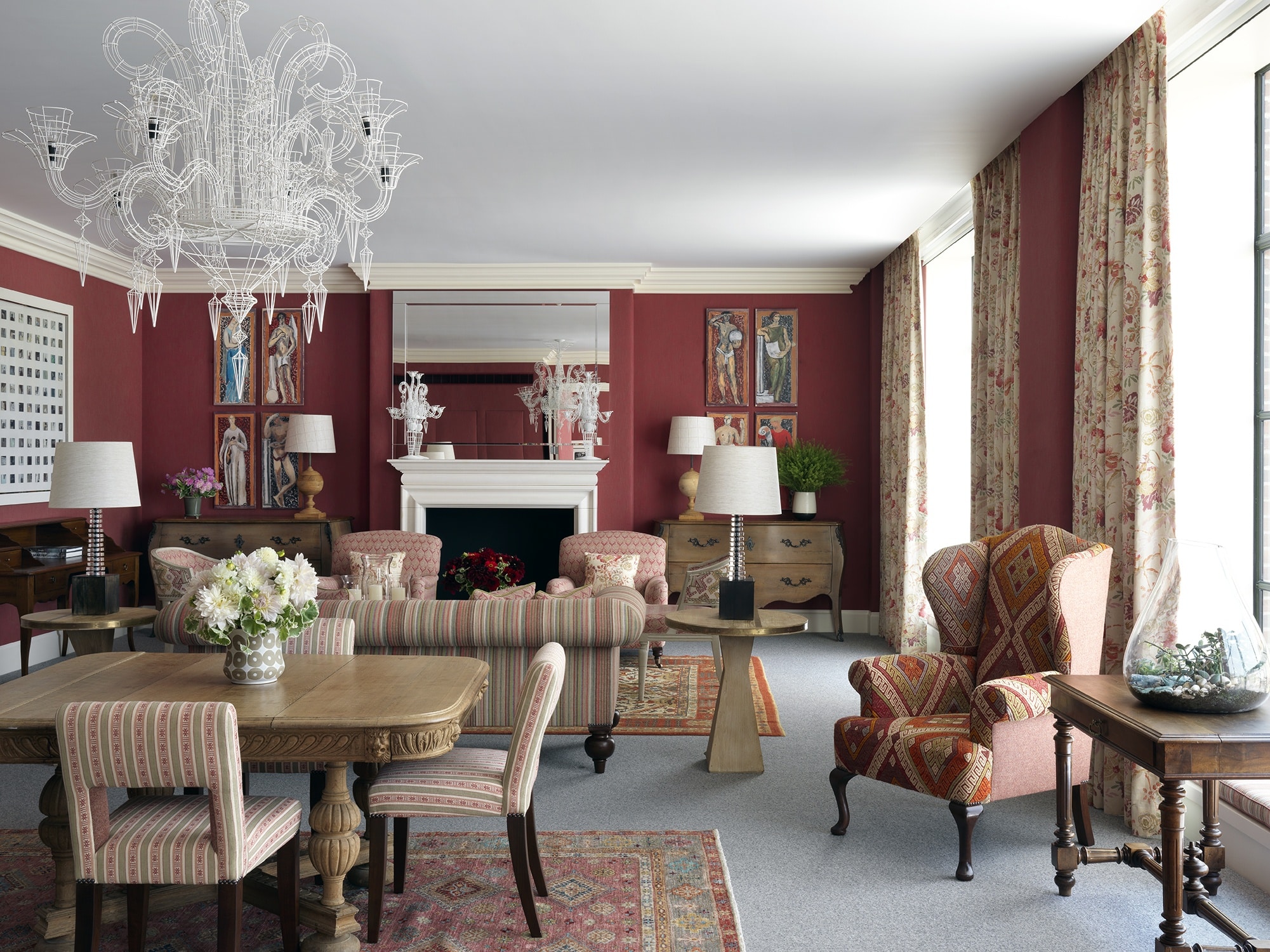

Red
The colour of passion, health, love and war, red certainly has a full roster when it comes to symbolic meaning. In many Asian countries brides wear red as a symbol of fertility and luck. It is also the colour of senators’ tunics in ancient Rome and of a bullfighters’ cape.
It’s a very strong colour and if you are looking for a calm environment for somewhere like a bedroom, perhaps it is not the most appropriate choice. However, it is a colour that lends itself very well to libraries or dining rooms where some “heat” is appropriate.
Use it in smaller doses to lift a space.


Purple
We must confess purple is a colour we use sparingly, but it is said to help boost creativity with an air of calm and thoughtfulness. Rooted in history, the colour was often worn by royalty and people of authority, as the rare occurrence of purple in the nature made it one of the most expensive colour dyes to create.


Green
Taking on many different identities, green is a firm favourite of ours as it is very versatile in its application. The colour of nature, hope and envy, it is perfect for a fresh outlook in an orangery, conservatory, kitchen or bedroom. For a punchier look, combine it with orange or for a lighter, more summery feel combine it with yellow. In a classic English countryside setting, it looks lovely with pink tones.


We could go on discussing the psychology of colour and how to apply this within your interiors for hours.
We hope this brief guide to different colours and their meanings helps to clear your mind and offer a helping hand when you next gather your paint swatches.

Blue
Blue is serene and calming. It represents intelligence and dedication. It is the colour of the sea and the sky and it relaxes us with its cool and relaxing presence. Studies suggest it can lower our heart rates, blood pressure and even slow down our breathing, which makes it perfect for a bedroom or a study. A softer light blue is peaceful, while a darker blue can signify depth and elegance.

Pink
Pink is not just for girls, as you might have read in one of our previous blog posts! Although associated with femininity, the zenith of the colour pink was the 18th Century, when pastel colours became very fashionable in the Courts of Europe. Pink was particularly championed by Madame de Pompadour, the mistress of King Louis XV of France, who wore combinations of pale blue and pink, and had a particular tint of pink made for her by the Sevres porcelain factory, created by adding nuances of blue, black and yellow.
A combination of pink and white is associated with innocence, whereas a combination of pink and black is often used for the power of seduction. With pink the world really is your oyster.

Mixing red with blue can help to create a balanced scheme, where even a touch of red adds sharpness.