Pink Isn’t Just for Girls at Number Sixteen
In a new scheme we have designed for Room 206 at Number Sixteen in South Kensington, we’ve decided that pink isn’t just for girls. In fact, pink is one of the most calming colours and it has even been suggested that it should be used to paint prisons.
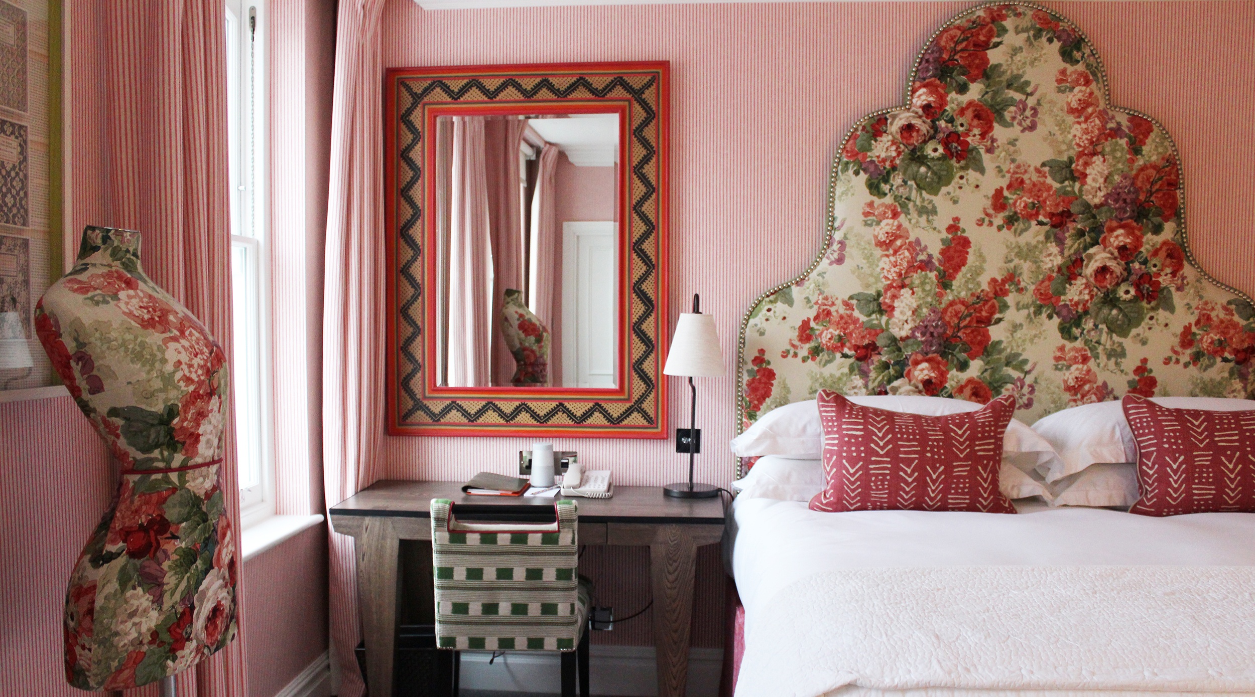
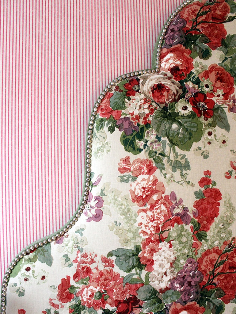
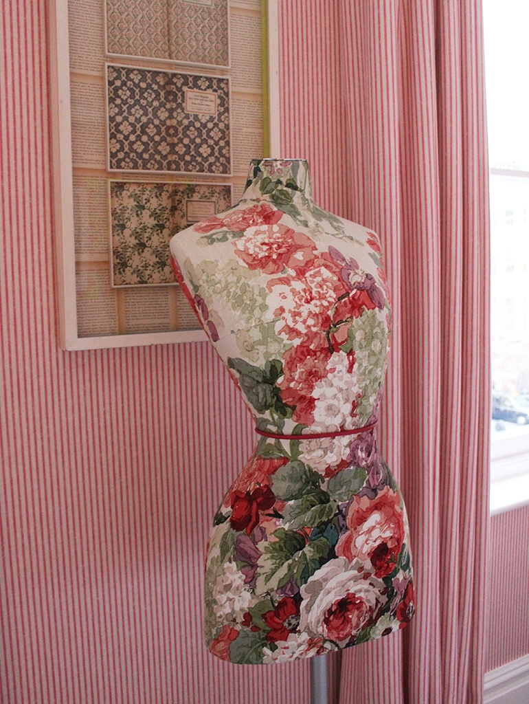
In Room 206, a romantic blush of pink fills the room. We have covered the headboard in a classic Jean Monroe floral print, which sits against the candy coloured pink ticking from Andrew Martin on the walls, matched with floor length curtains in the same fabric.

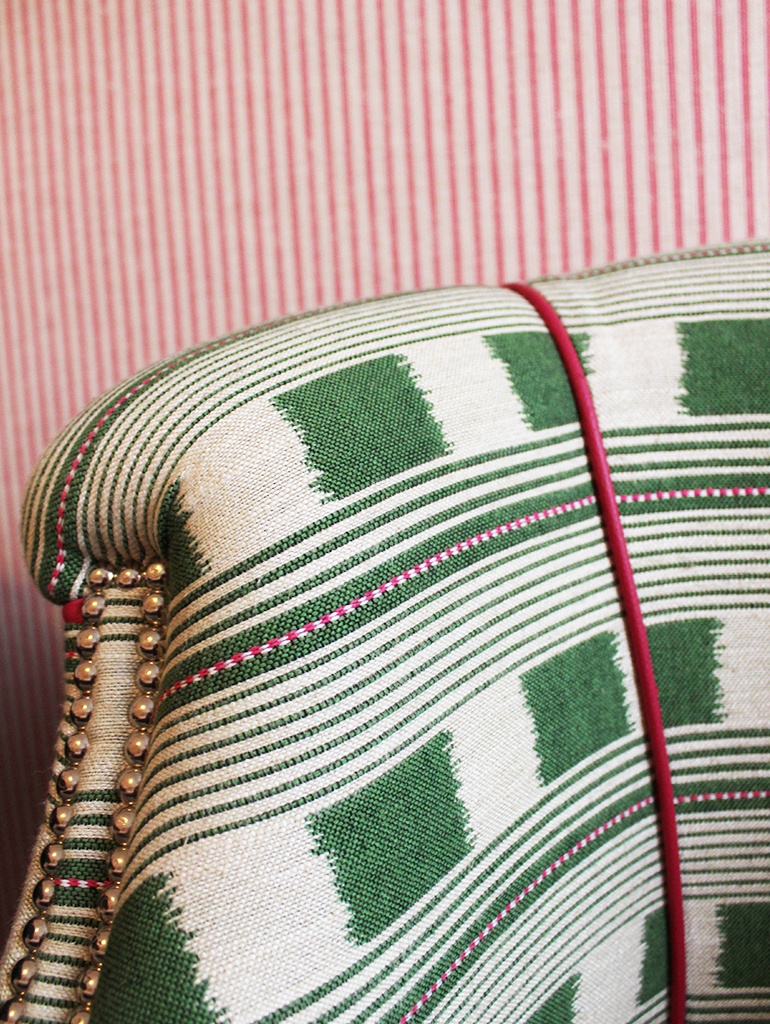
In a marriage of old and new, a traditional print is set against a more contemporary coloured ticking. Key colours of the traditional print are picked out and translated over to the fresh green on the two upholstered chairs, which are covered in my fabric, Lost and Found, from my collection for Christopher Farr with sharp contrast pink leather piping. The colours are reflected in the hot pink and green zigzag framed artwork on the walls.
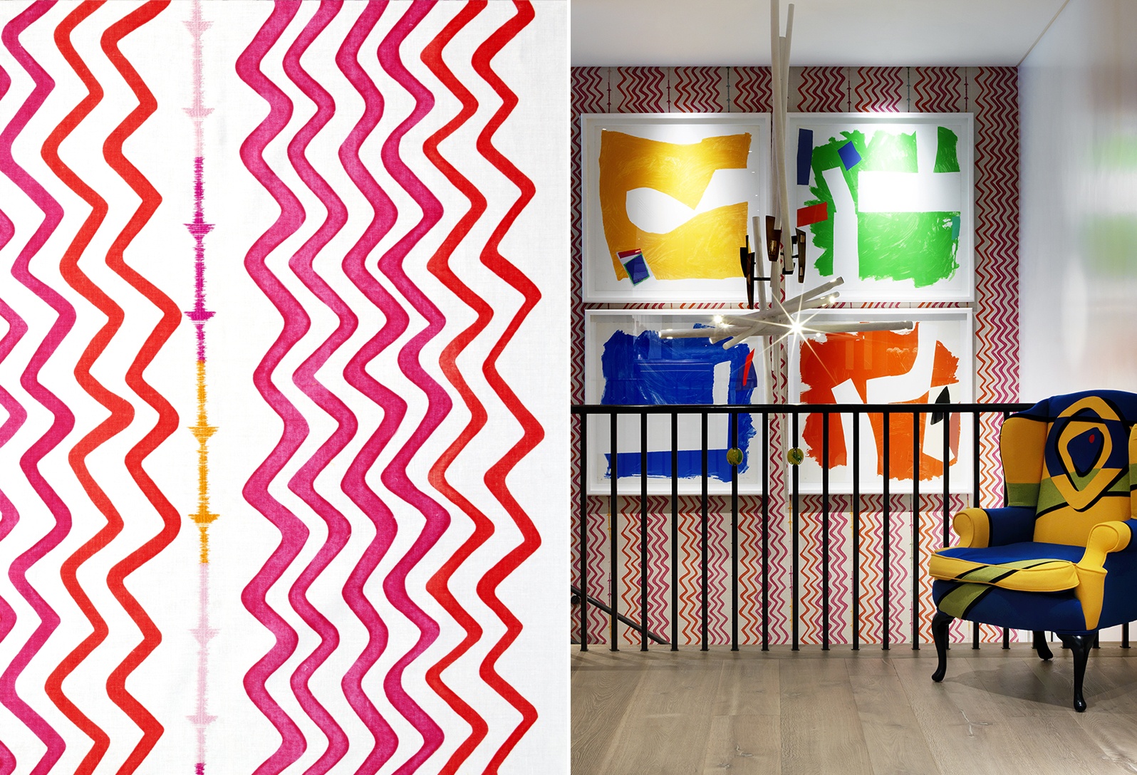
In other schemes, we have used pink to add a bold accent of colour. Being bold can suddenly bring a difficult space to life. In the lobby and stairwell at Ham Yard Hotel, the strong pinks in my Rick Rack wallpaper add a new vibrant dimension to the space, set against four striking Sandra Blow paintings.
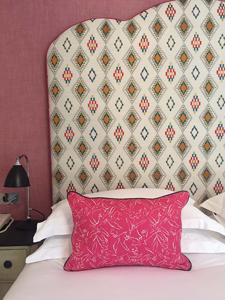
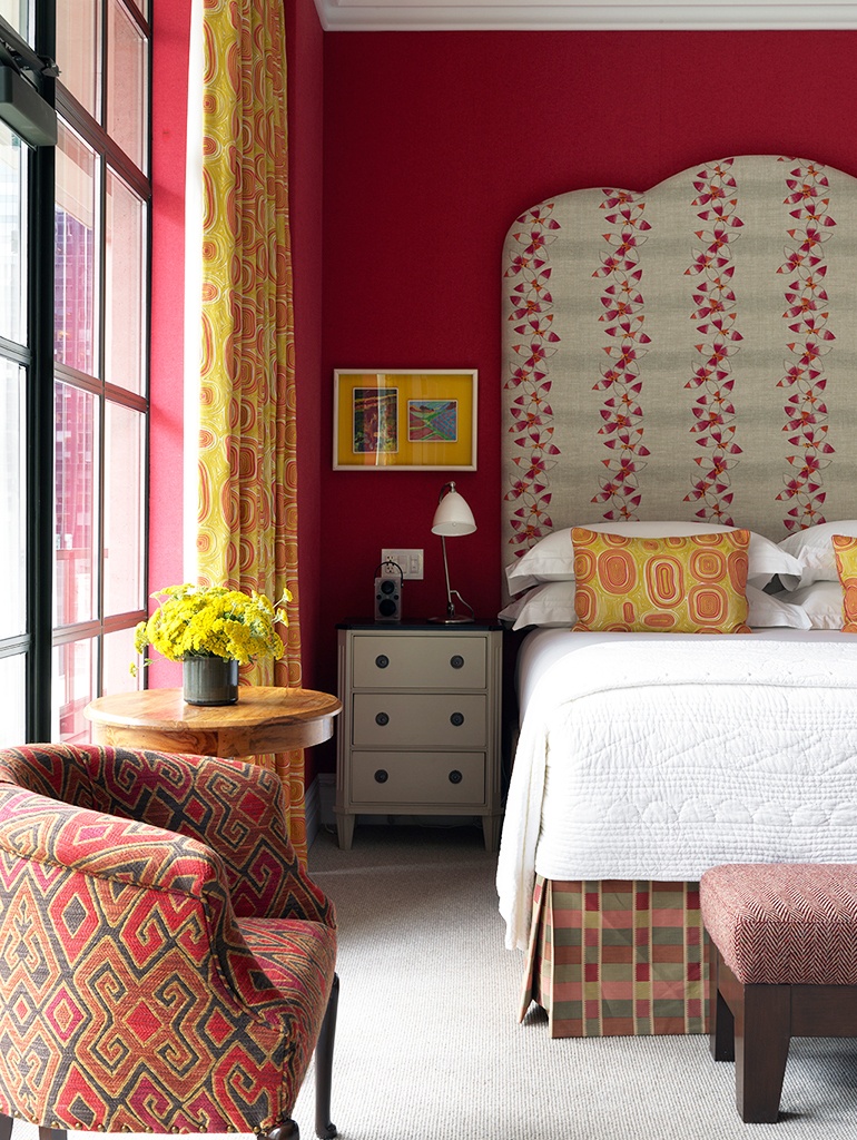
At The Soho Hotel, in Room 212 a hot pink bed cushion in my fabric Inside Out for Christopher Farr is offset against a Coral & Tusk headboard. In The Whitby Suite at The Whitby Hotel in New York, we have paired hot pink walls with bold yellow Pierre Fray curtains and my Daisy Chain fabric on the headboard.
Pink is often a colour people stay away from, with a stereotype of it being too feminine but at Kit Kemp’s Design Workshop, we use pink as a bold and versatile colour…who says pink is just for girls.