
Wonderful Watercolours
Day to DayWe have spoken before about the power of using a neutral tone within a scheme to create impact, and in a very similar way, watercolour has the same power. This week, we have rounded up some of our favourite watercolour inspired schemes to bring you a bit of weekend zen...
We have spoken before about the power of using a neutral tone within a scheme to create impact, and in a very similar way, watercolour has the same power.
As watercolour is semi-transparent, the white of the paper gives a natural luminosity to the washes of colour. It helps create shadowing, depth and strength to a design with the simplest swish of a brush in a certain direction, resulting in dreamy wash of colour.
It creates a great opportunity to use a large scale pattern on mass without worrying about it being too over-powering, and when used cleverly, it evokes an immediate sense of calm. This week, we have rounded up some of our favourite watercolour inspired schemes to bring you a bit of weekend zen…
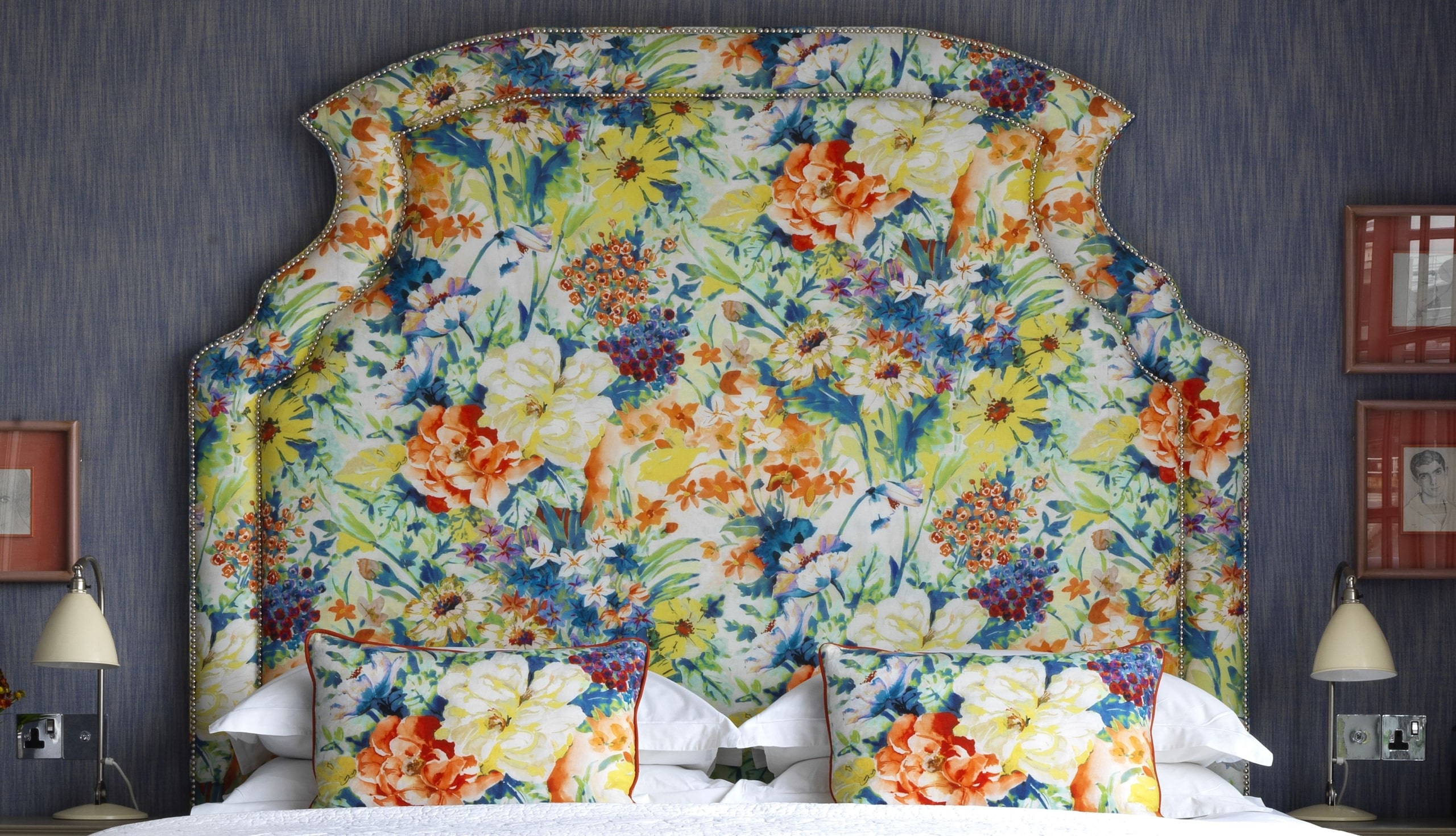
In the Penthouse Suite at The Soho Hotel, we use a floral bombshell of a fabric for the headboard. This meadow scene by Pedroso Osorio is full of wild flowers and long grasses, and was the starting point for bringing together other colours within the scheme – happy blues, fiery oranges and sunny yellows dance throughout the room.
Besides the curtains, which are in the wonderful diamond fabric by Lewis and Wood, the rest of the fabrics are all blocks, which ensure that they do not fight with the headboard.
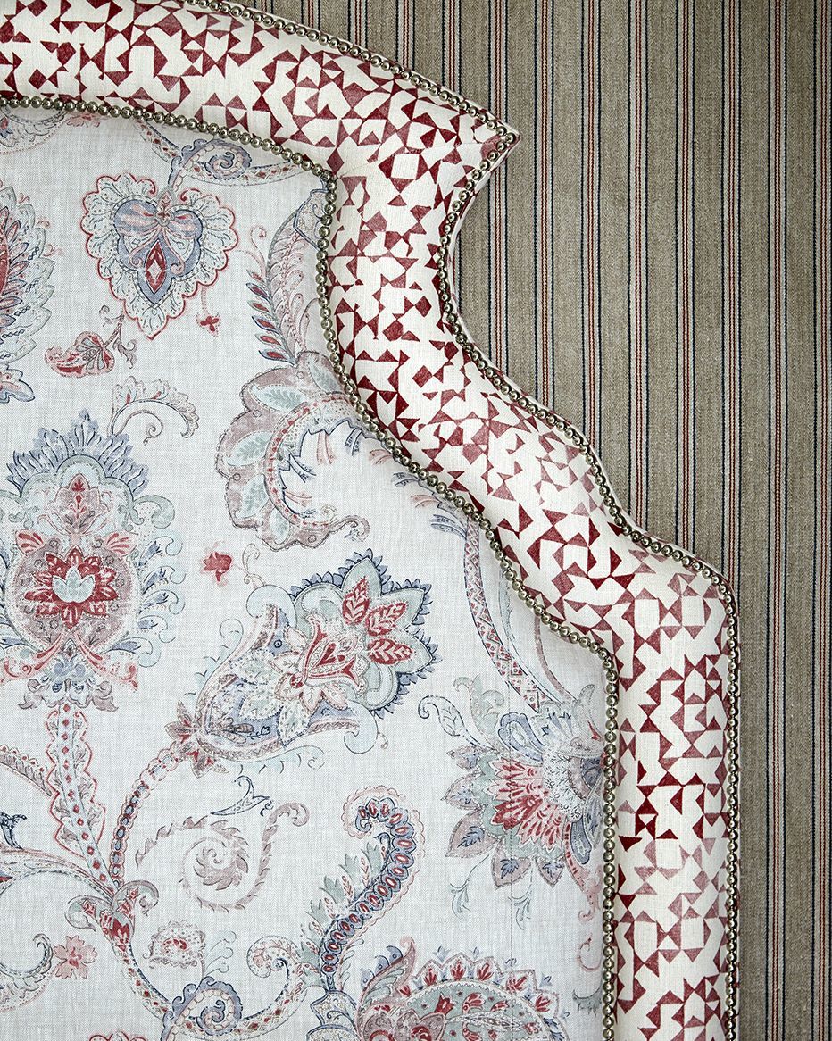
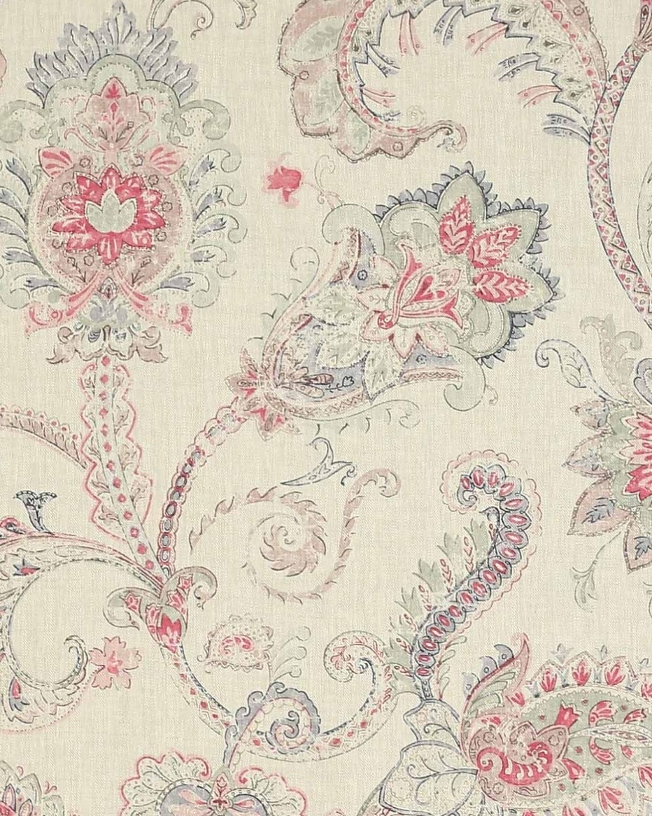
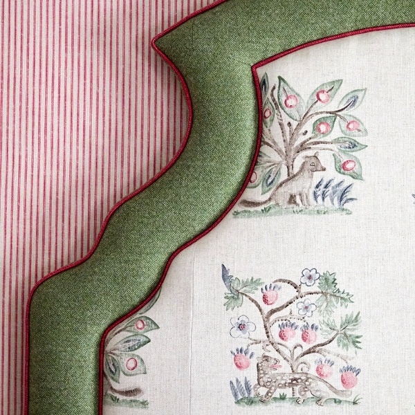
On the headboard we have used a soft, moody floral by Colefax and Fowler, and on the boarder we have used a stronger pattern which almost looks like the fading edge of a watercolour. We love this romantic combination and you will also find it adorning the headboard of the Meadow Suite at Crosby Street Hotel.
In bedroom 107 at Ham Yard Hotel we have a more subdued scheme. Above the sofa hangs a magnificent watercolour painting by one of my favourite artists, Juliette Losq. For the rest of the bedroom we have played with the mid tones of this artwork – picking out the grey, pinky hues which you can only see if you look closely.
In the dreamy drawing room at Number Sixteen, you are transported to a garden full of life. We have upholstered the sofa and two armchairs in a stunning Brunswig and Fils ‘Edenwood’ fabric, which is so restful. The curtains have been made up in my ‘Ashenwood’ embroidery for Chelsea Textiles. The two fabrics pair wonderfully together.
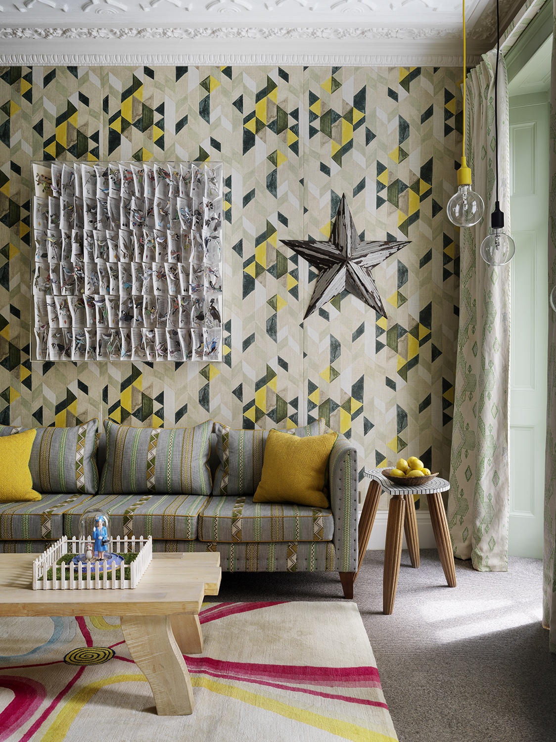
As a fun contrast, the room next door is a different take all together. Greens and yellows combine to create this leafy oasis with pops of sunshine yellow, transporting you to a Spanish lemon grove. The walls are padded and fabric lined which immediately creates a comfortable area.
The fabric on the walls is by Korla. At first glance, it looks to be an overwhelming fabric, with its strong scale and contrasting bursts of geometric design. However, the way it still has a watercolour wash to it, with its perfect imperfections seen through the colours, gives the fabric so much movement.
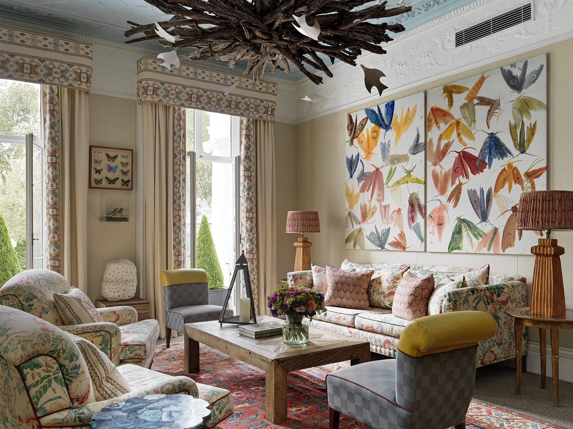
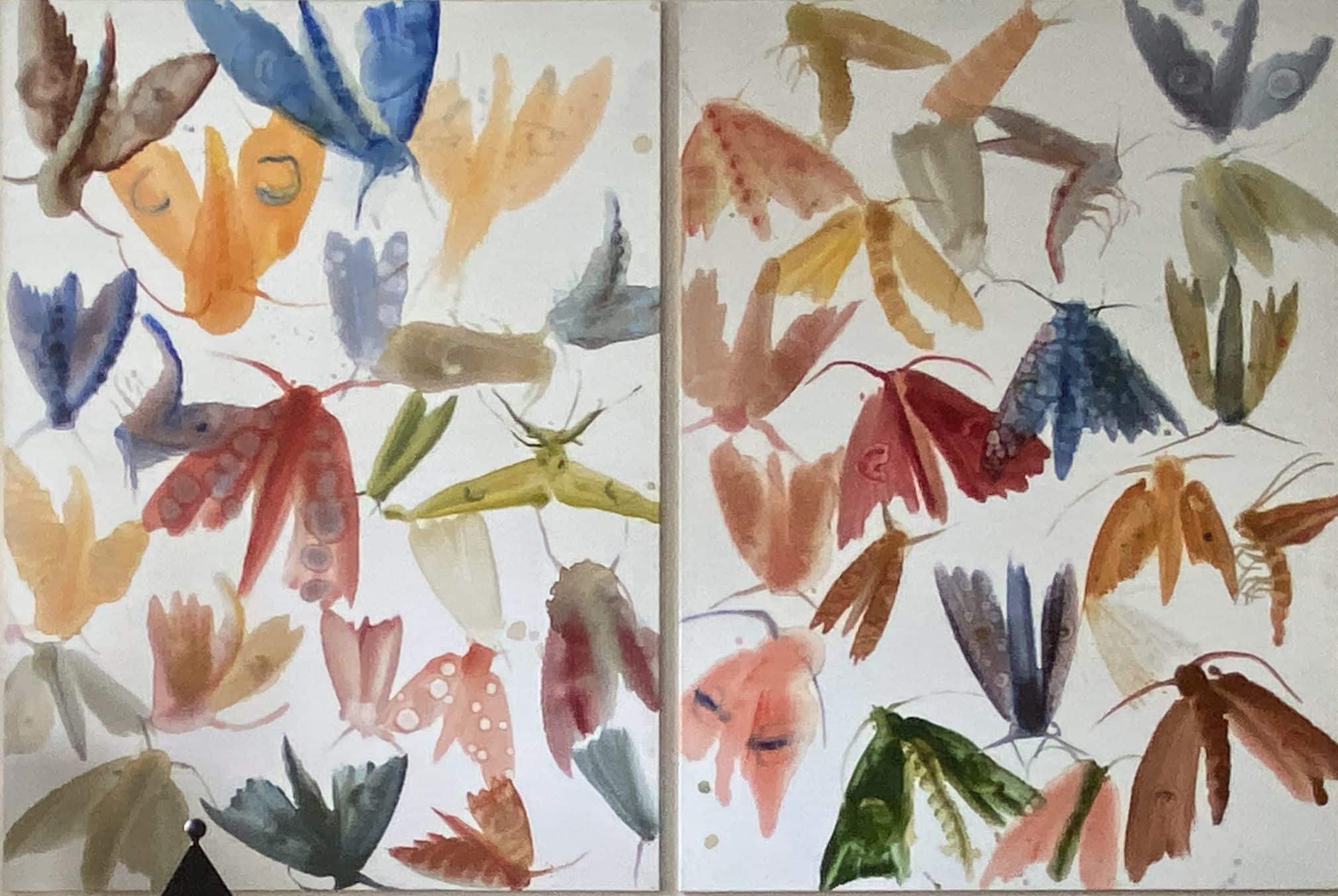
In the Drawing Room at Number Sixteen, an artwork hangs above the sofa bringing a contemporary twist to the room’s traditional array of fabrics. This diptych by Allyson Reynolds was the perfect choice of art for this room, with the fabrics being more or less a similar scale. The watercolours used here give a softer edge and movement to the fluttering inhabitants, and the range of colours tie the room together.
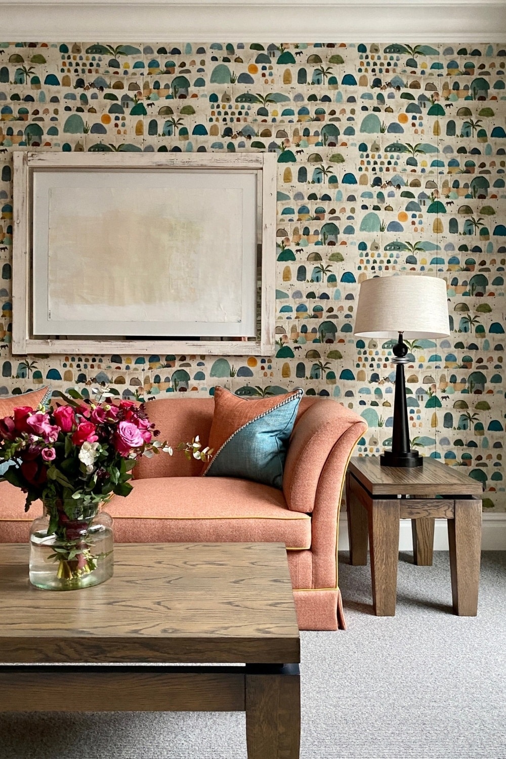
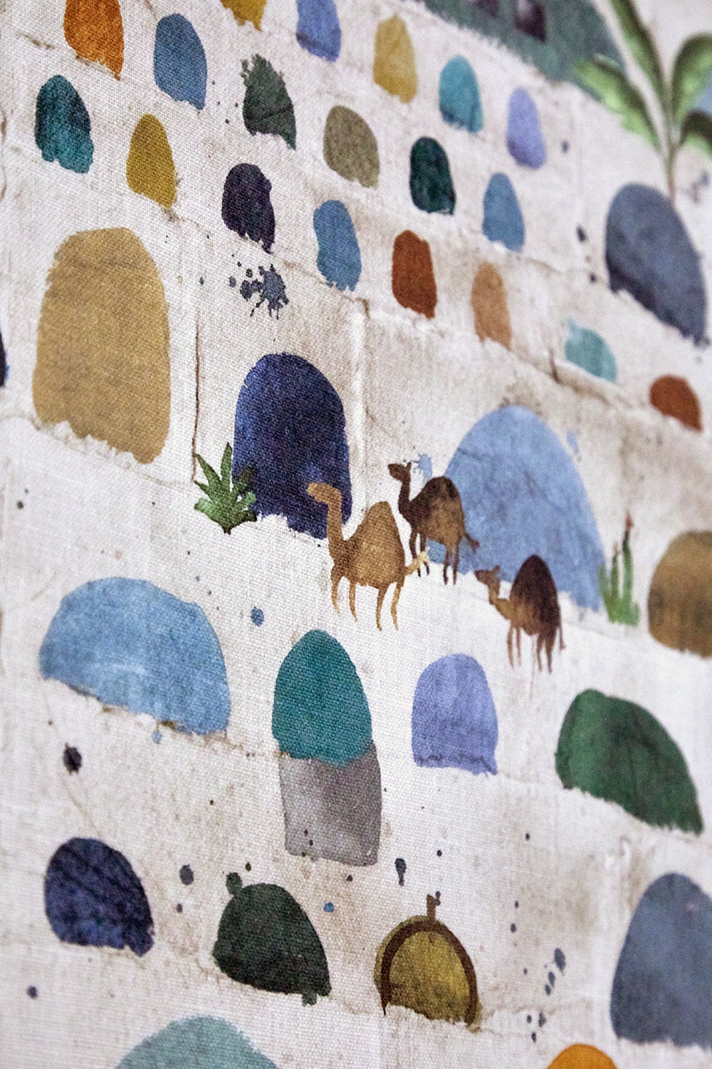
In bedroom 301 at The Soho Hotel, you are transported to the Persian silk roads. Here, we have created a feature wall which has been covered in an Etamine fabric, a beautiful, un-edged design where tiny watercolour boulders line a neutral linen backdrop.
We love how organic these look, and you can make out the detail of each hand-painted blob. Despite it being a busy print, the watery misty blues and burnt oranges with a transparent hue make this design. It is a colourful combination that hopes to evoke dreams of adventures and travel.
Watercolour has also inspired me in my own fabric designs. Using large scale prints is a favourite of ours, but when paired back in softer hues and with a more hand-drawn feel, they immediately become simpler to use.
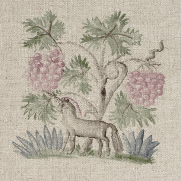
My collections with Andrew Martin are a great example of this – Hedgerow is a lyrical pattern adorned with mythical creatures. The hand painted, natural feel is what we strive to achieve and this design is a great example of this.
In the Suffolk Suite at Haymarket Hotel, we have used the pink and green colourway of Hedgerow on the headboard.
So there we have it. A few of our favourite examples of how watercolour designs can create a sense of strength, whilst exuding an air of calm within a scheme.
We always encourage the use of fun prints, so hopefully this is something you can try yourself. Don’t be afraid of going bold.