Indian Blue, Aquamarine and Jade: Our Recipe for Using Turquoise in Interiors
When it comes to turquoise, the truth is, we don’t really like it. Of all the wondrous shades of blue, turquoise is a colour I’m forever telling my team to avoid. It can often feel sickly and a little distasteful. That said, when the right hues and tones of turquoise come into play, my rule goes completely out of the window.
Turquoise and all its varying tones can often be the spark that gives a room strength, the happy injection that provides that uplifting feeling as you enter a space, and the twist that gives it interest. This post is our celebration of turquoise and how it comes into play – often by accident – into our interiors.
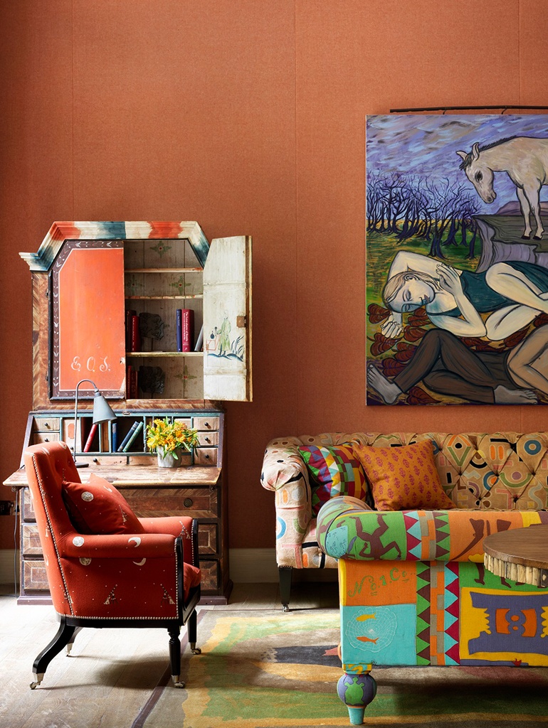
Turquoise can be the zing in a room that adds a lively and uplifting feel. In this predominantly spicy Drawing Room at Ham Yard Hotel, the turquoise that comes through in the sofa fabric is a welcome change of pace for the wider room, providing a sharp contrast to the orange and brown tones.
It wouldn’t be the first colour I would choose to achieve this fun sense of contrast, but its perfect placement in one of our favourite fabrics by Raoul Textiles is a fun jewel-like accent.
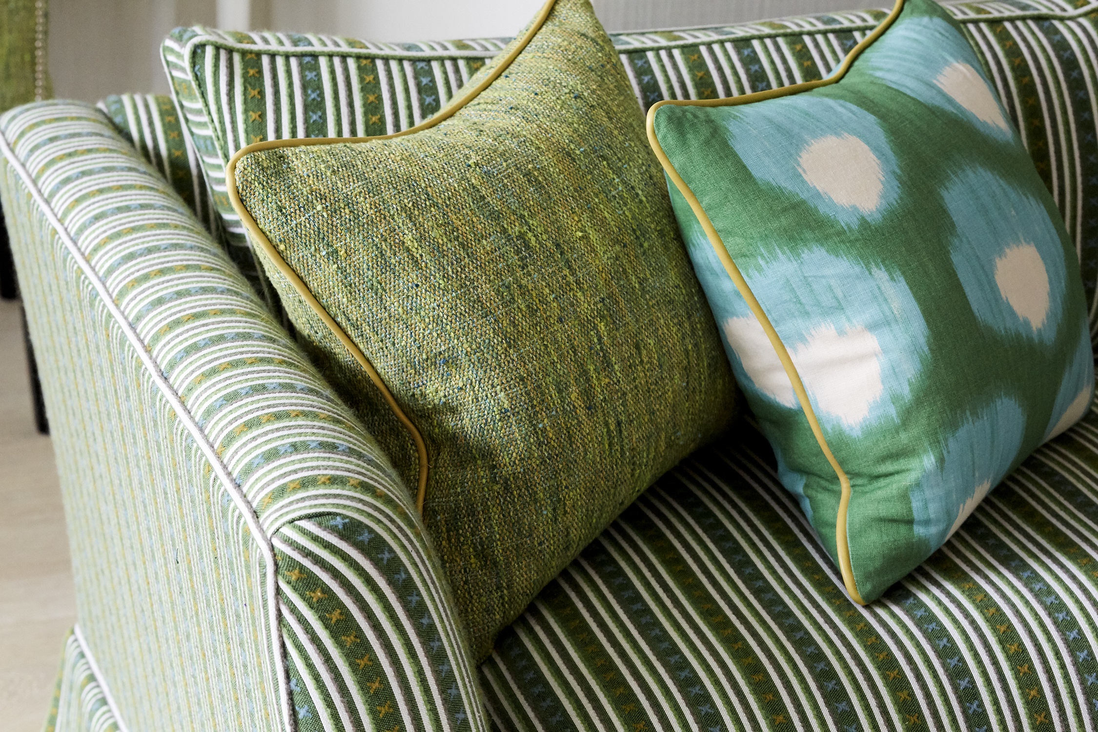
Speaking of accents, this is where turquoise really does come to life. We find in fabrics, it’s the addition of an aqua emerald greenish blue of turquoise that lifts and makes for spirited textiles.
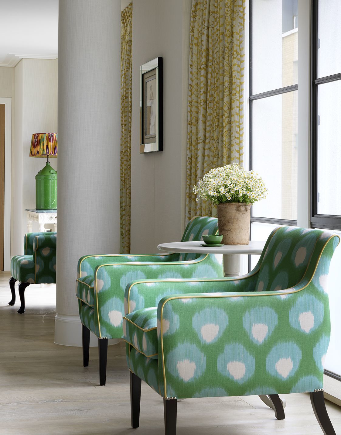
This lovely zingy green fabric on the chairs is perfectly balanced by the inclusion of turquoise. In the wider room, we also brought it in on the sofa cushions to ensure this energy is seen throughout the space. Together green and turquoise create a beautiful jade-like colour, which is rich and exciting to use.
Here in this suite at Haymarket Hotel, the large armoire is an aquamarine dream. It’s all about its placement with navy and cobalt blues here that makes for its successful inclusion in the space. The peacock blue of the mirror above the fireplace and the navy stripes of my Criss Cross fabric on the chair are fun and lively, but the armoire packs a real punch of ocean turquoise in the corner of the room, uplifting everything else with it. Its aged quality with the original pine wood coming through, brass key holes and antique Swedish form make the turquoise feel tasteful and timeless.

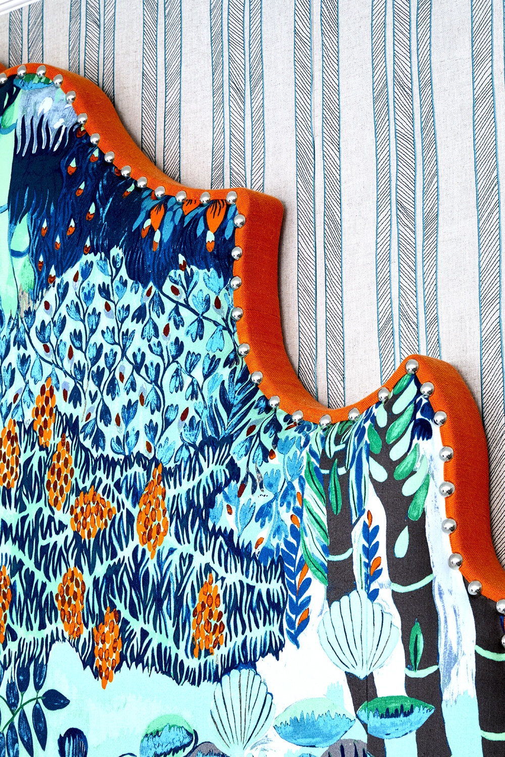
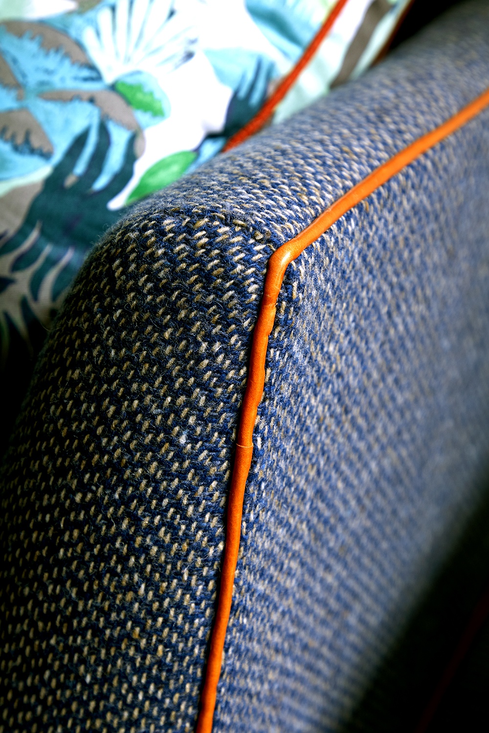
Perfectly pairing turquoise is key to its success in a room. As we have seen with the hot tones of the Drawing Room at Ham Yard Hotel and the array of varying blues in the suite at Haymarket Hotel, it’s always good to provide a balance and think carefully about what you use turquoise with. Orange is one such colour that sets turquoise alive perfectly. Giving that edge with a colour from the opposite side of the colour wheel is a brilliant way to ensure there is depth in a scheme.
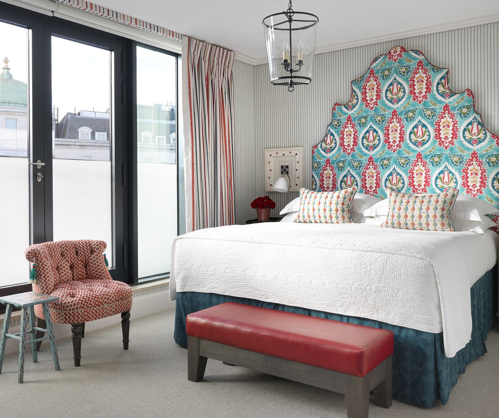
The depth of this headboard at The Soho Hotel is a brilliant shock of orange, picking out the other tones of the main headboard fabric. The orange leather piping on the sofa and cushions gives an energetic zing to what could otherwise feel quite flat.
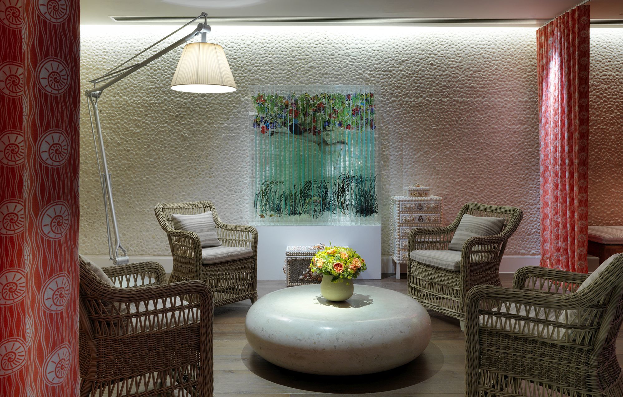
Pinks and chalky neutrals are another perfect pairing that works well with turquoise too. Here in Soholistic Spa at Ham Yard Hotel is this captivating turquoise artwork ‘Ophelia’ by Jack Millroy. The feeling of an under water grotto is perfectly captured with the soft corals and and turquoise focal points.
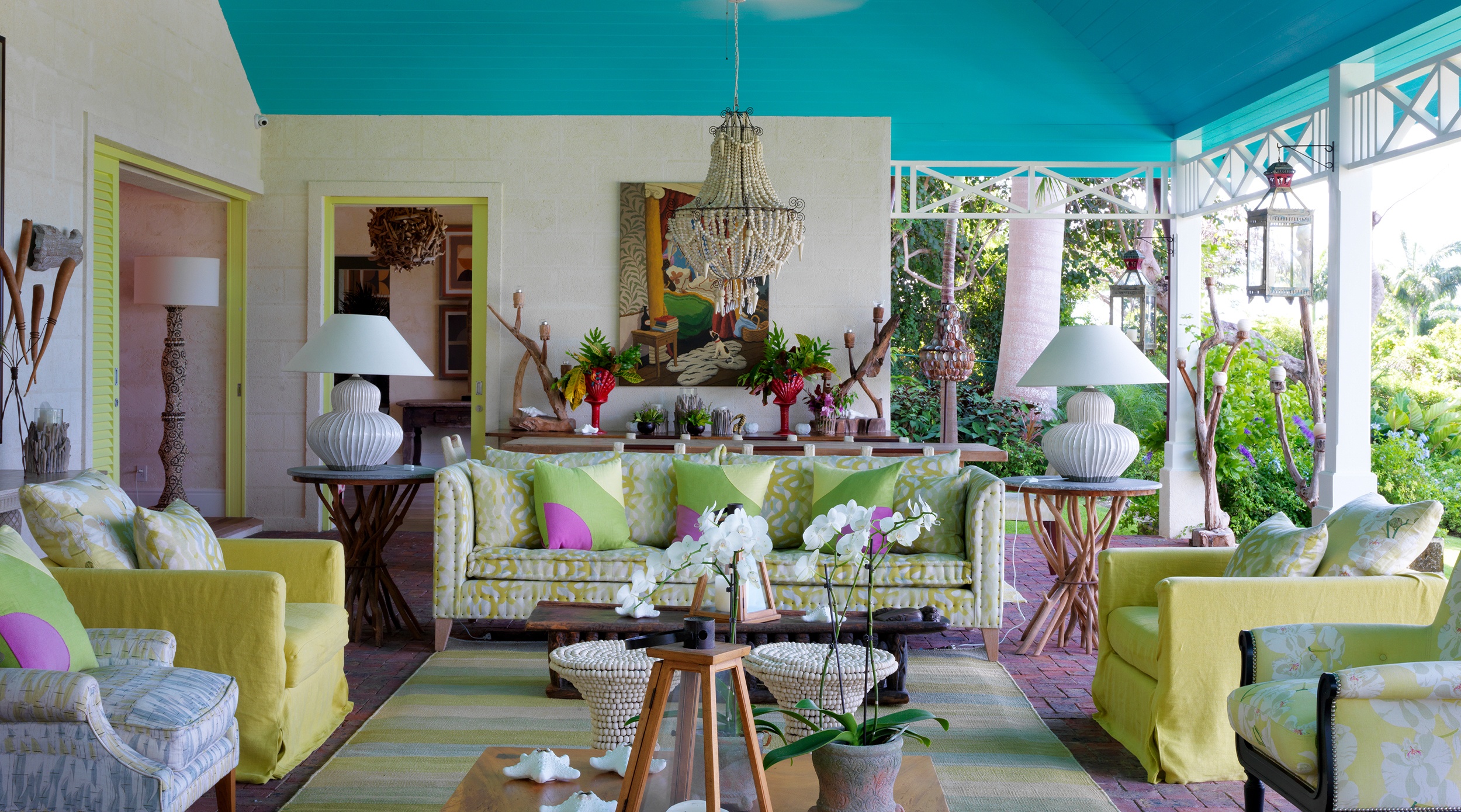
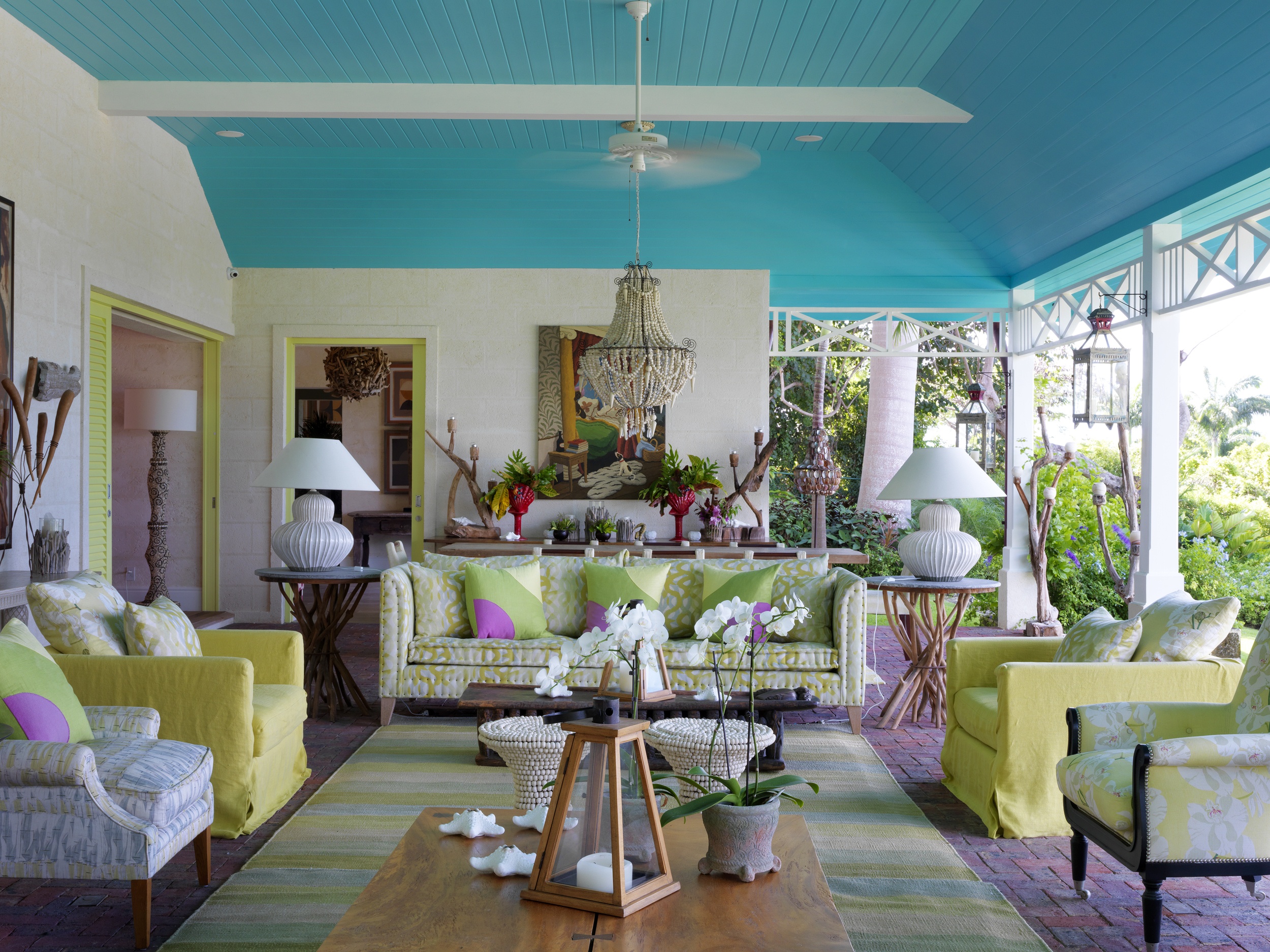
Choosing turquoise is a matter of going for the most beautiful jewel tones that sit within the broader spectrum of the colour. Sometimes turquoise can be too green, too overpowering and too naïve, but indian ocean blue is one such tone within turquoise we love to use. Here at Rossferry in Barbados, the ceiling is painted with this beautiful blue, lifting the ceiling in a dalliance of colour.
We hope this post inspires you to use turquoise in a sophisticated and fun way, giving life and energy to your interiors.