
There are times in life when it is necessary to make a statement; when we believe in something strongly, when we know we are doing something right, or when something is really important to us.
Making a statement in the world of design is possible too. The way you see beauty in this world and the way you try and replicate this in your surrounds is very important. It can be a powerful tool to express your ideas and lifestyle.
Making a statement means something different to everyone, so here are our dos and don’ts of how to create a statement interior of your own…
Do make an entrance.
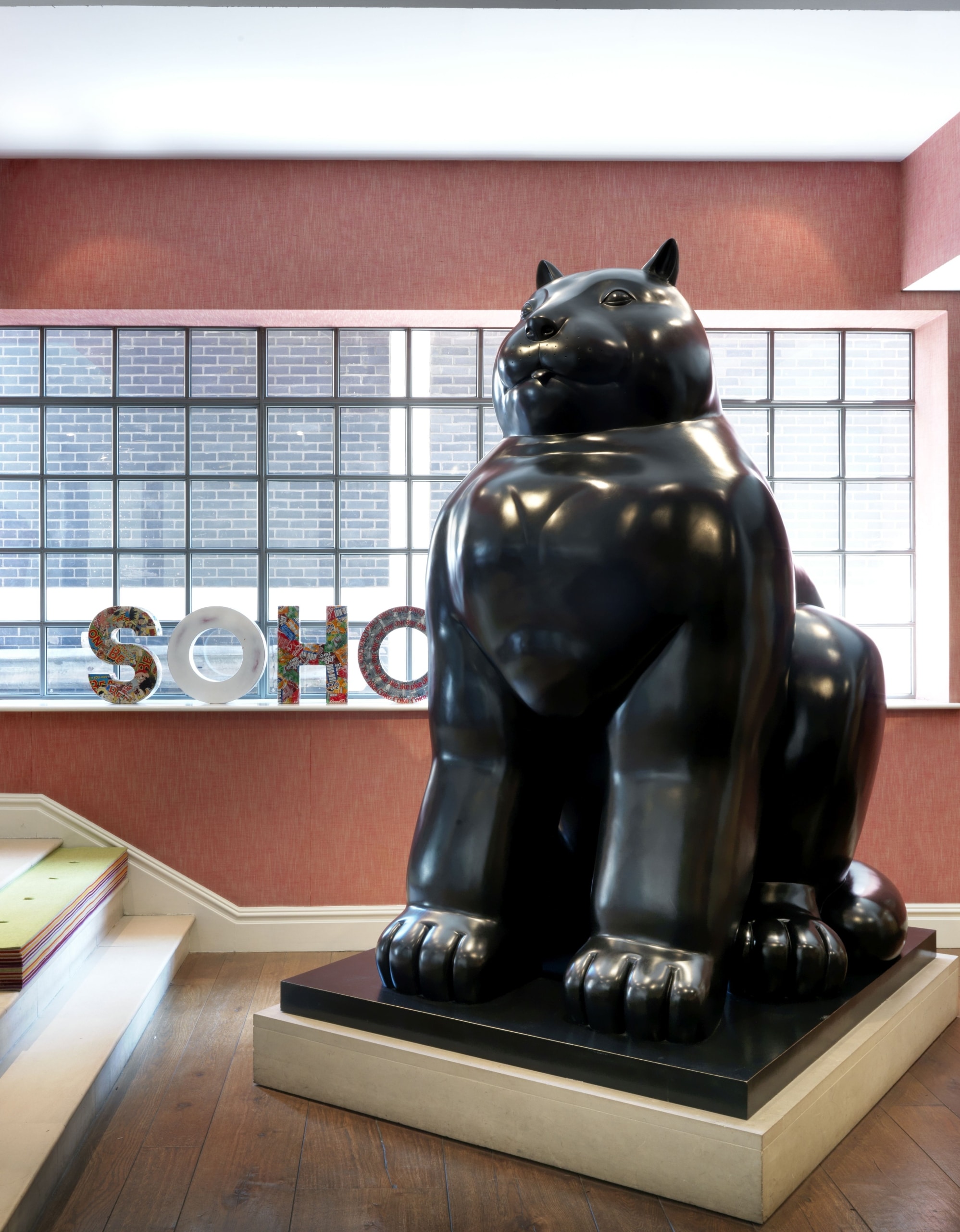
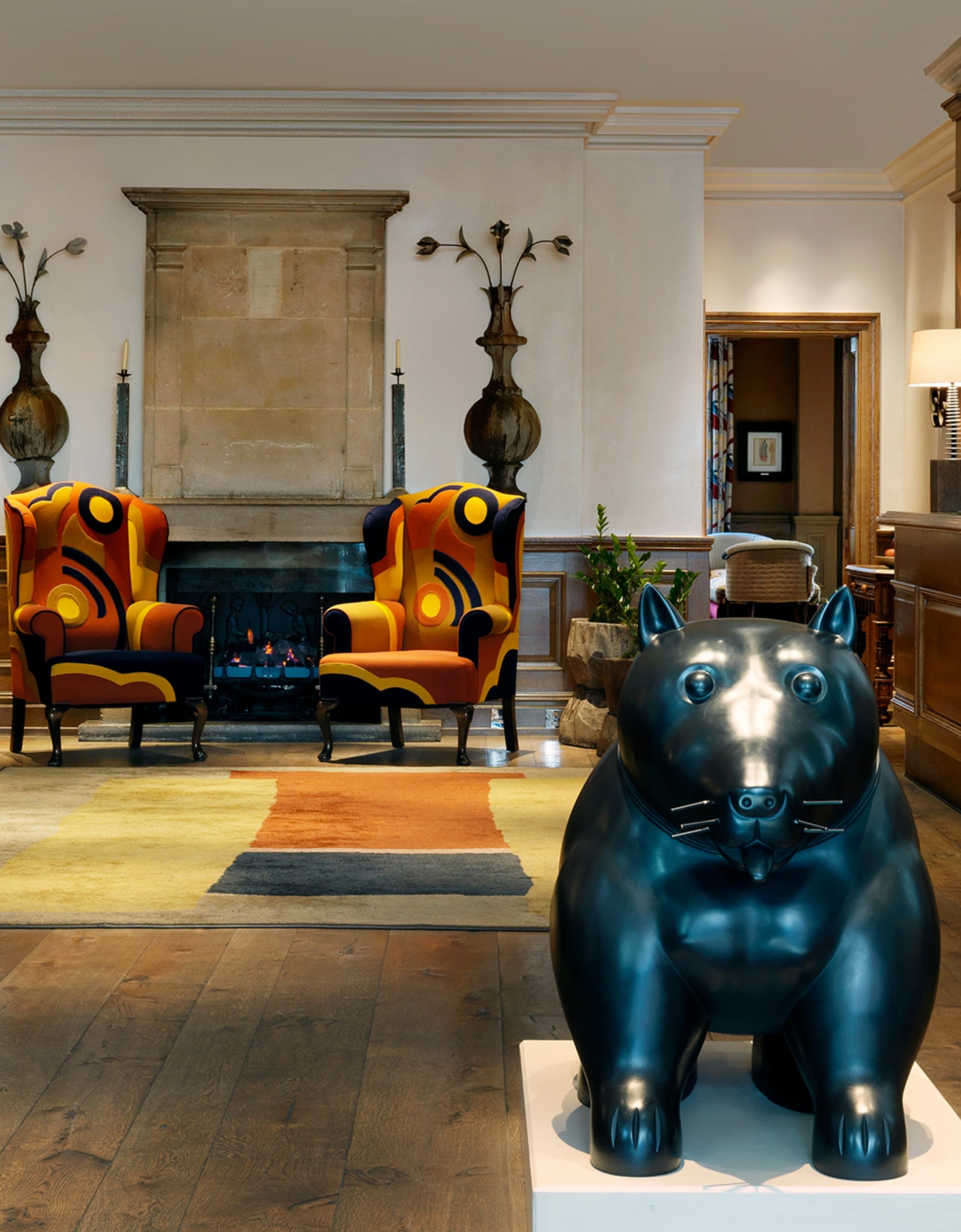
We love to make a statement in our entranceways and lobbies and it is here you will often find some of our most exciting pieces of art: Tony Cragg sculptures, graphic paintings, and Boteros both big and small! Whilst Botero sculptures are pretty impressive, you don’t necessarily have to be as bold or ambitious as we were to create a statement – in fact, we went so bold the walls of The Soho Hotel had to be built around our larger than life Botero cat!

In one of our Terrace Suites at The Whitby Hotel, we have created a beautiful union between two of my fabrics, ‘Friendly Folk’ in Basil Green and ‘Hedgerow’ in Cerise. They come together to create a world of their own, telling the enchanting story of bushy tailed creatures peering amongst hedgerows, blooming trees and rolling English hills. For a pop of colour we added a striped geometric rug in lively colours.
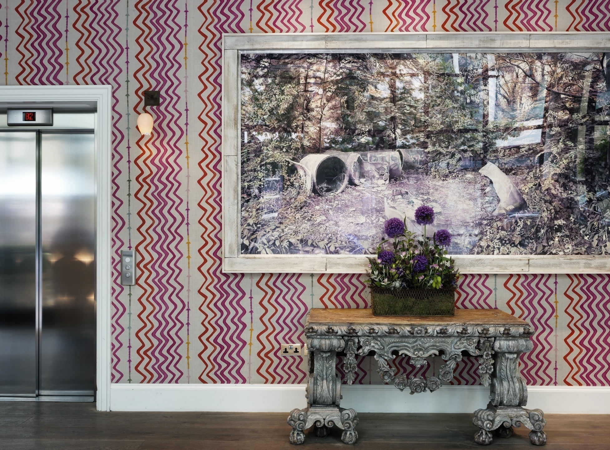
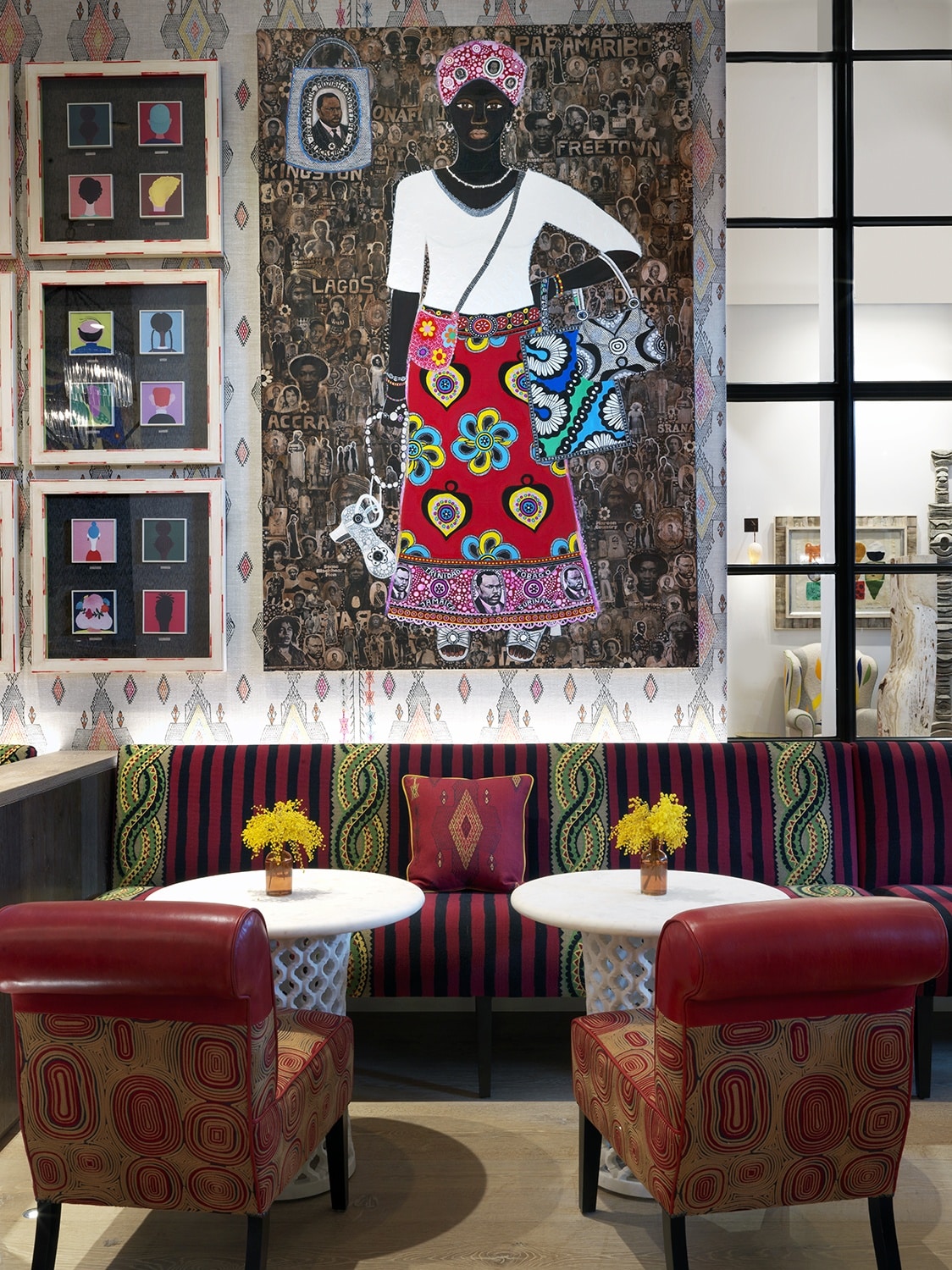
In the bar at The Whitby Hotel, Carla Kranendonk’s vivid brushwork with hand-embroidered paper collage combined with photographic elements make for such a strong piece that not much more is needed. However, in true Kit Kemp Design Studio fashion, we have created a backdrop with a combination of patterns. The appearance is busy but well balanced. When combining different patterns, the secret is to use different scales. It is only then that each pattern has the ability to breathe and not fight against its surroundings.
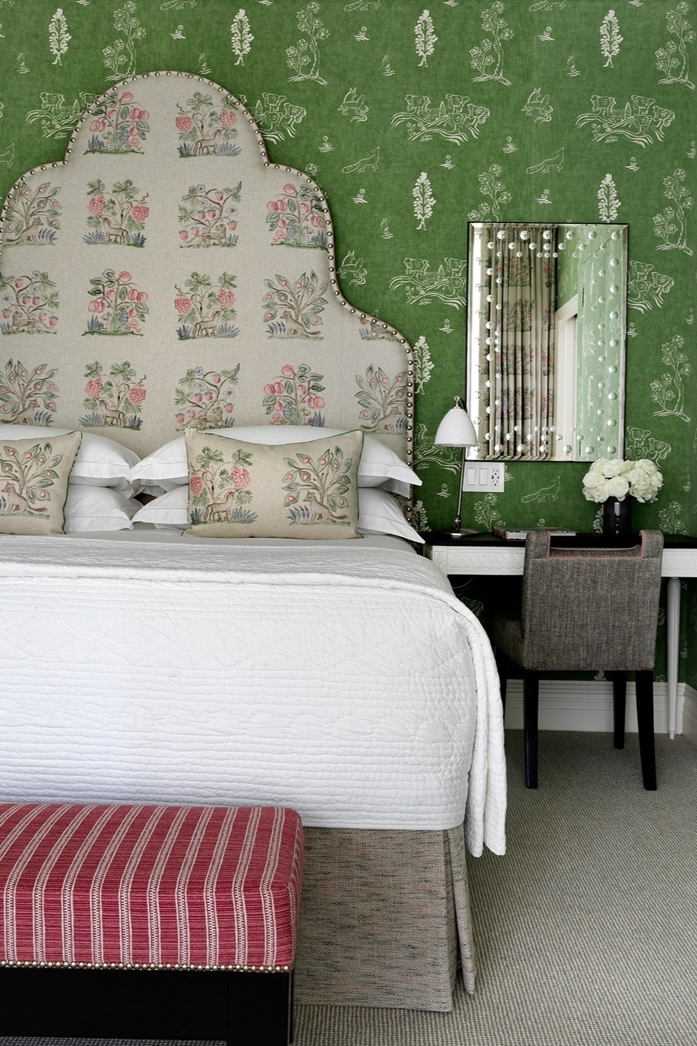
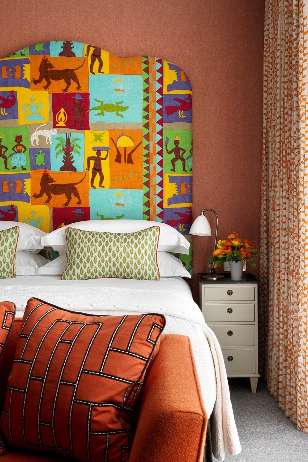
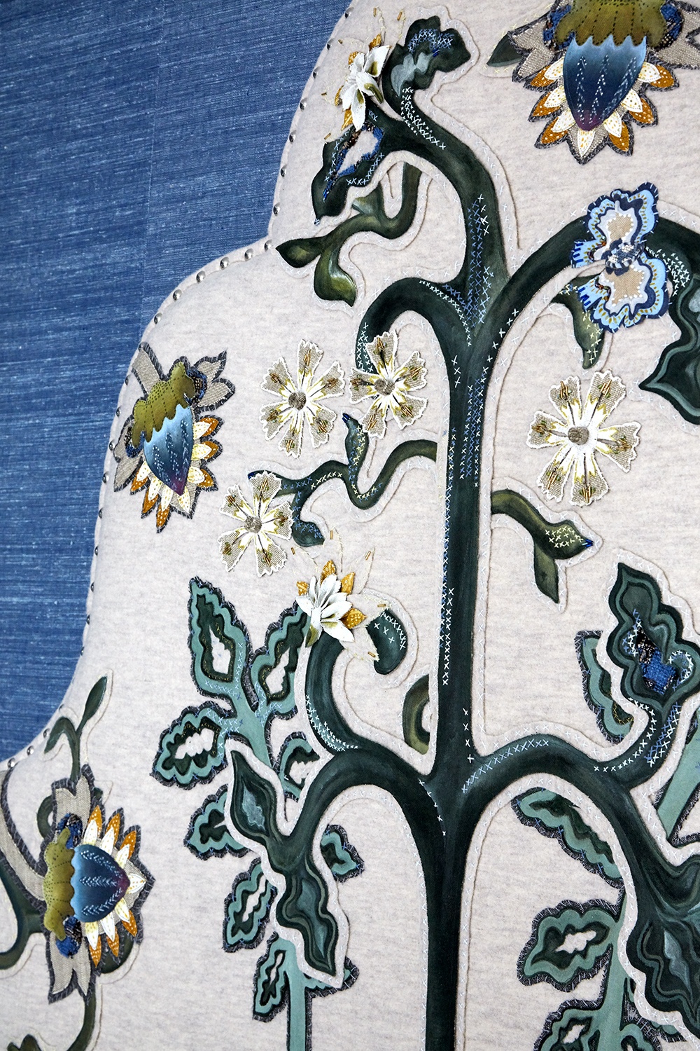
Don’t underestimate the power of a headboard.
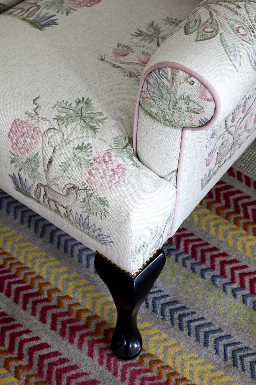
A bedroom without a special piece of art or an impressive piece of furniture can still make quite the statement. Who is to say that a headboard cannot be considered an artwork in itself. We love to use headboards as an expansive canvas for a coveted fabric, textile or piece of embroidery.
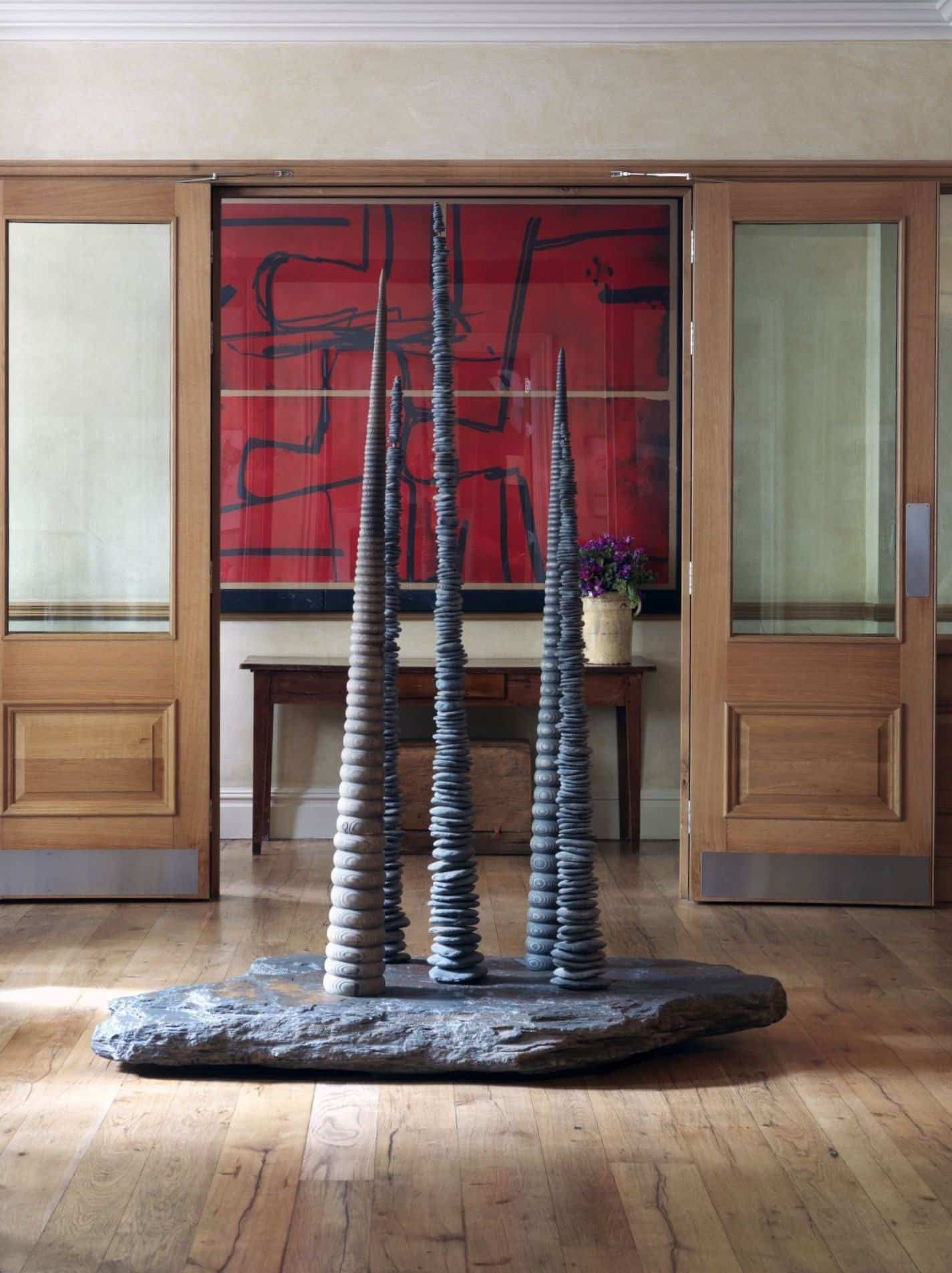
At Knightsbridge Hotel, an abstract red artwork greets you as you walk in the door, but it is the view looking back through from the lobby where this piece really pops and makes a powerful statement.
I love the connection between the abstract painting and the pebble sculptures. It really transforms the space into almost what feels like a curated exhibition.
Don’t be too consumed with the thought of something oversized, sometimes it is the subtle nuances that have the most to say.
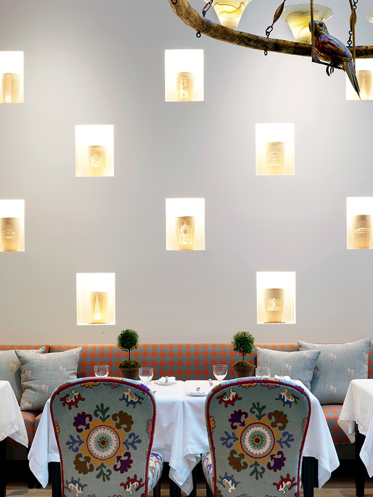
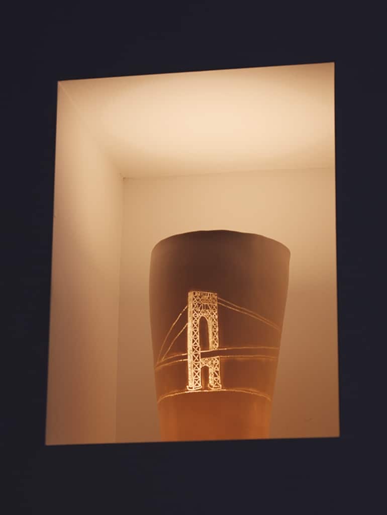
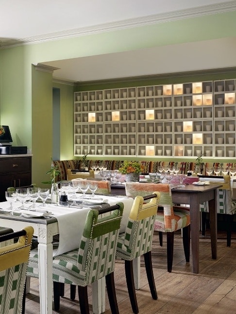
We love Martha Freud’s beautiful hand etched porcelain pots which she designs with motifs or pictures of your own meaning. We have commissioned Martha to create collections for a number of projects, including The Whitby Hotel in New York and The Potting Shed restaurant at Dorset Square Hotel. Softly illuminating the recesses of the restaurant at The Whitby Hotel, you will find depictions of New York’s iconic landmarks and bridges, whilst here in London they pay tribute to Dorset Square Hotel’s cricketing heritage as the site of the first Lord’s Cricket Ground.
Why not commission or even make something yourself that is individual to you. It doesn’t matter what the value of the piece of art is, as long as it is meaningful.
Do play with patterns.
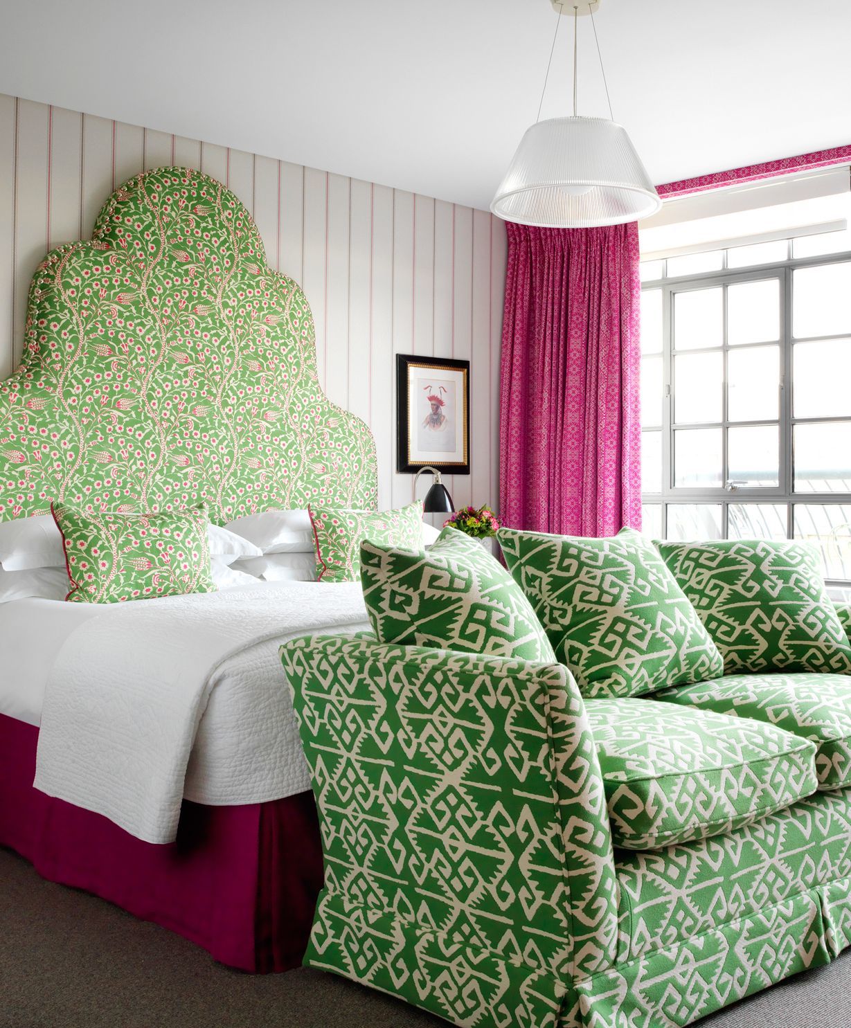
Textiles are so important and for us present countless opportunities to play with patterns and create a memorable moment. Here in this room at The Soho Hotel, we were not shy! We used a very strong summery combination of acid green, a juicy pink, and touches of orange. The combination is a refreshing scheme with florals, different geometrics, stripes and lots of fun.
As a general principal, make sure to look at the bigger picture and don’t overthink the nitty-gritty details. A strong headboard or a big graphic painting can feel frightening, but once integrated within a wider scheme it won’t be as intimidating as you think.
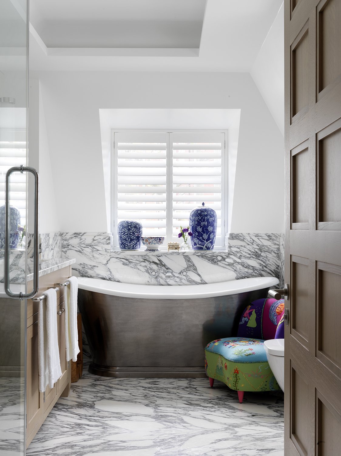
An unexpected chair with bright colours adds a touch of magic to this smart bathroom. The smooth marble contrasts beautifully in texture with the soft wools of the chair and raised embroidery threads.
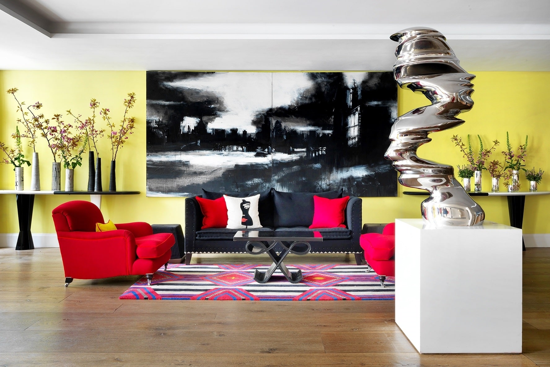
Any sort of strong contrast will create this effect. Instead of playing into the texture of fabrics, add an unexpected burst of colour like we have done at Haymarket Hotel, adding that strong yellow background into a very clean black and white scheme.
Do consider a contrast.
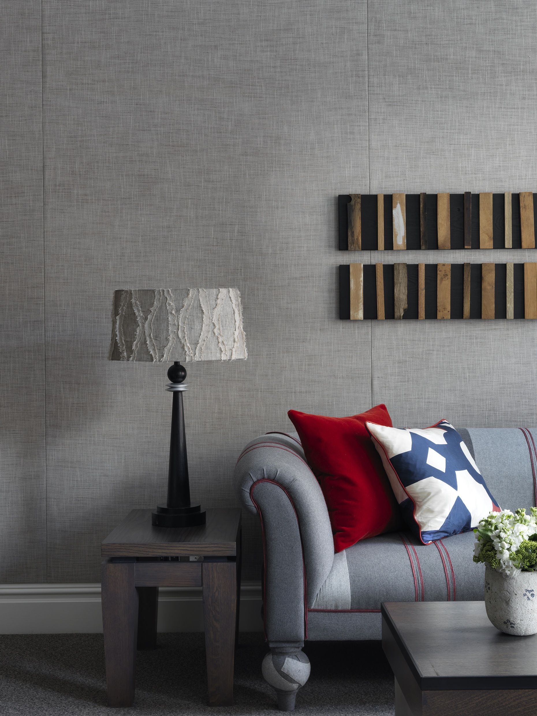
When you’re designing a room, think of the different layers like a journey, inviting the eye to roam and linger over each and every addition. In this room where the grey tones are dominant, a warm wood art installation introduces an unexpected texture, creating a point of attention and adding variation.