How To Work The Colour Wheel
‘Colour theory’ is both the science and art of using colour. It works by creating a logical structure for colour through a visual representation of how colours relate to each other.
There are three basic categories of colour theory that are logical and useful: the colour wheel, colour harmony and the context of how colours are used. These basic categories offer practical guidance to colour matching and colour combination.
In today’s blog, we are going to focus on the colour wheel and give you a few tips on how we apply the different approaches or ways of using the colour wheel to our rooms.
1. Knowledge is Power
Our first and perhaps most important tip is to have an understanding of the colour wheel. Sir Isaac Newton developed the first circular diagram of colours in 1666 and since then, scientists and artists have studied and reinvented numerous variations of this concept.
A colour wheel shows you how colours relate to each other and visually demonstrates the relationship between primary, secondary and tertiary colours. You can use the colour wheel to develop colour schemes through a number of different approaches.
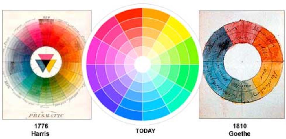
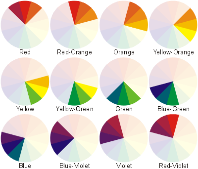
The most common approaches include ‘monochromatic’, the variation of a single colour, or ‘complementary’, the use of colours found on opposite sides of the wheel. One of our favourite applications is ‘triadic’, which is achieved by using three colours that are evenly spaced around the wheel.
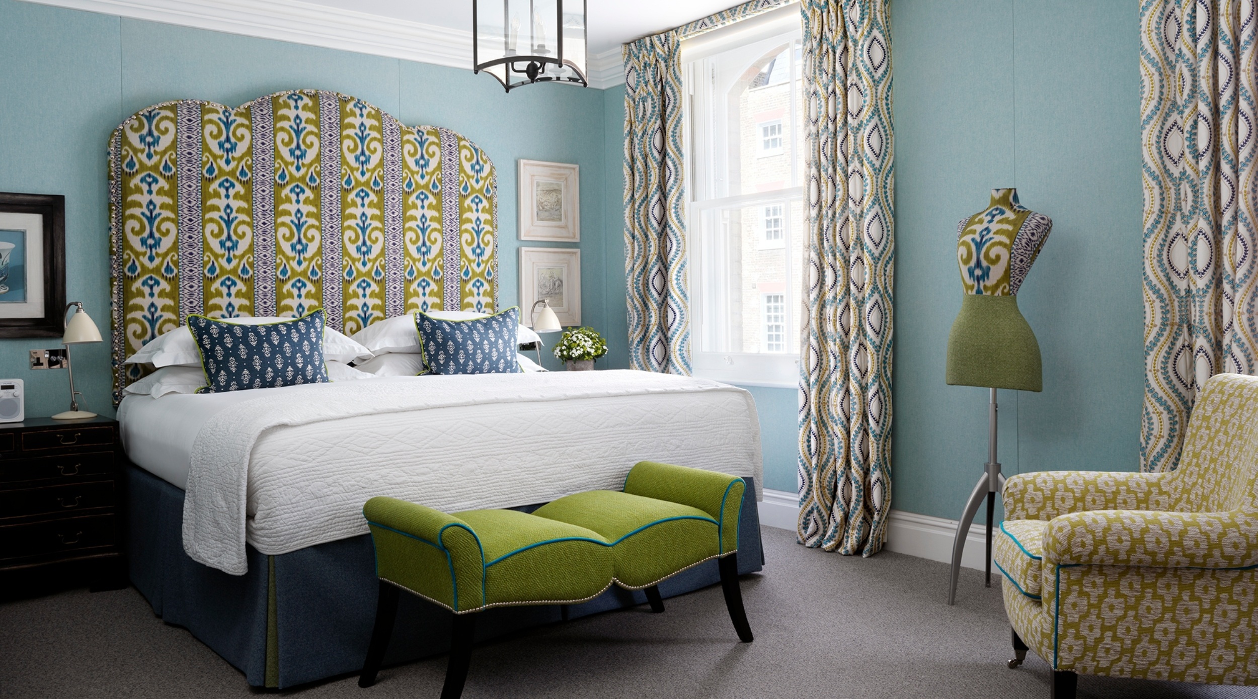
A good example of this is room 701 at Crosby Street Hotel, where we have used a combination of orange, green and just a touch of blue. Our walls are dressed in our “Inside Out” fabric in a vibrant orange, and we have paired it with my “Loom Weave” fabric for Christopher Farr Cloth in a denim and green colourway on the sofa. The result is a high contrast, versatile colour scheme.

Here you can see my Loom Weave fabric in a different colourway that uses the three colours all in one. The result is a bright, cheery and joyful mix of this triadic colour scheme.
2. An Affinity for the Analogous
Analogous colours are three colours that sit side-by-side on the colour wheel. Their grouping will share similar properties.
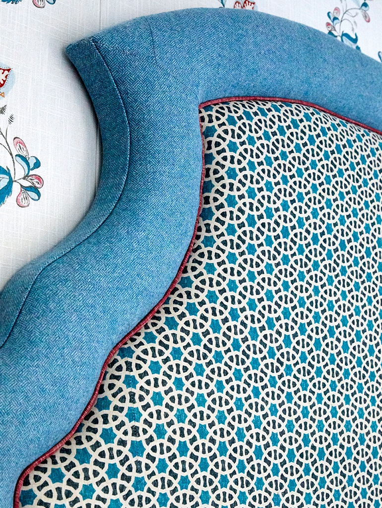
By outlining a colour with a darker and lighter companion, you can enhance the enclosed colour. It is a clever way of achieving a sense of harmony whilst inviting richness and depth into your scheme.
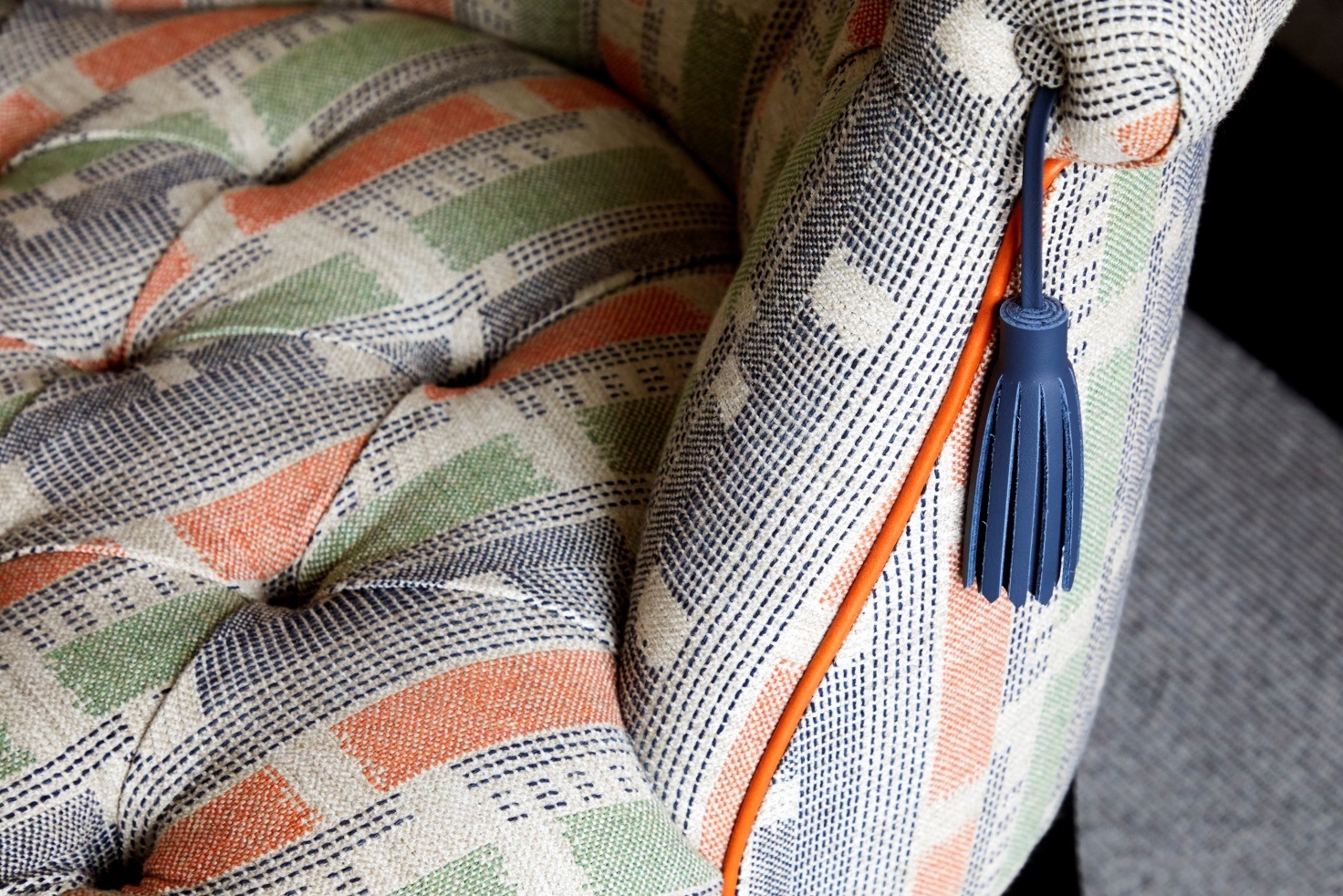
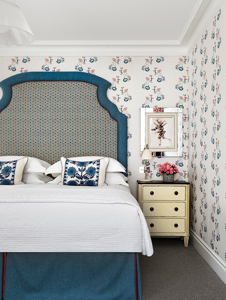
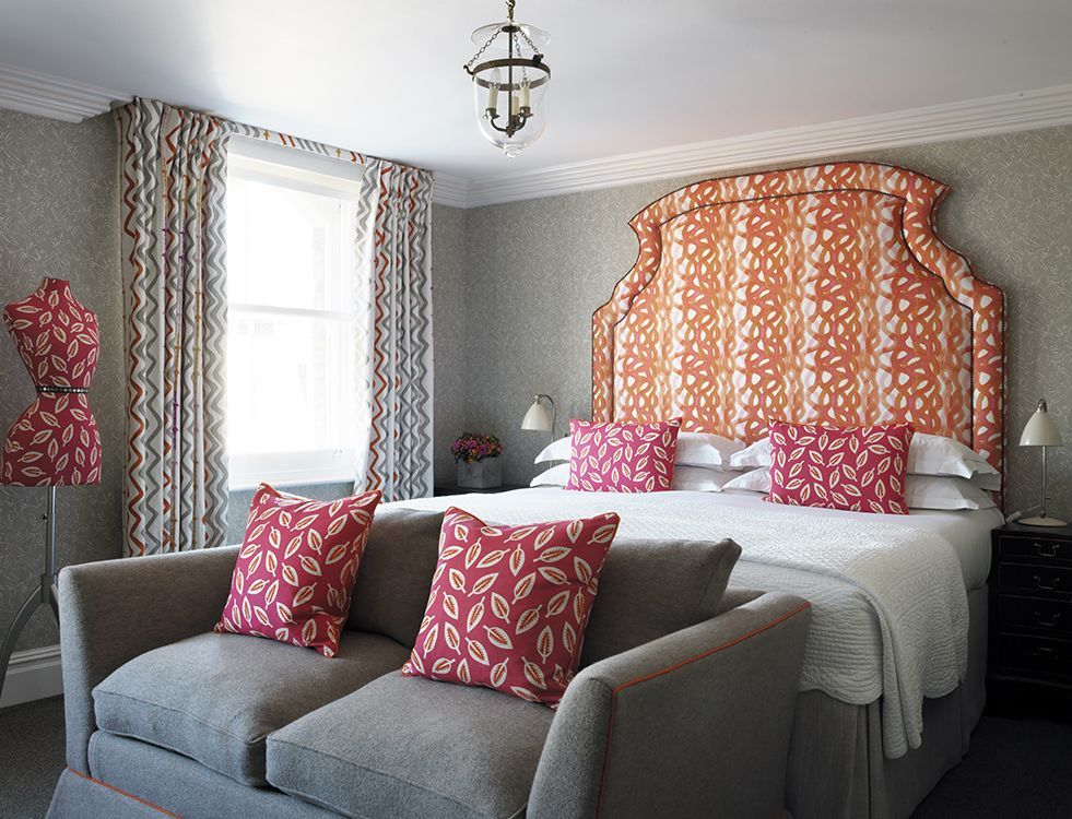
A good way to do this is through piping or a boarder. In room 211 at The Soho Hotel, we have used “Akbar”, a small scale pattern by Susanna Davis on the headboard and we have framed it with a strong and sturdy denim wool and a red Samuel and Sons leather piping.
3. Warm and Cool Colours
A dividing line splits the colour wheel into warm and cool and it is here we dive in when thinking about the purpose of a room. Do you want your room to feel energetic and full of life or are you looking to create a more tranquil, calming haven which sets your mind at rest? It is at this point in time you should let your scheme cool off or start to warm things up.
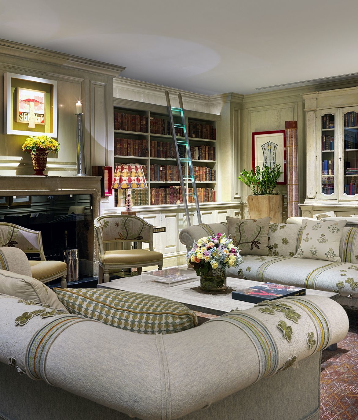
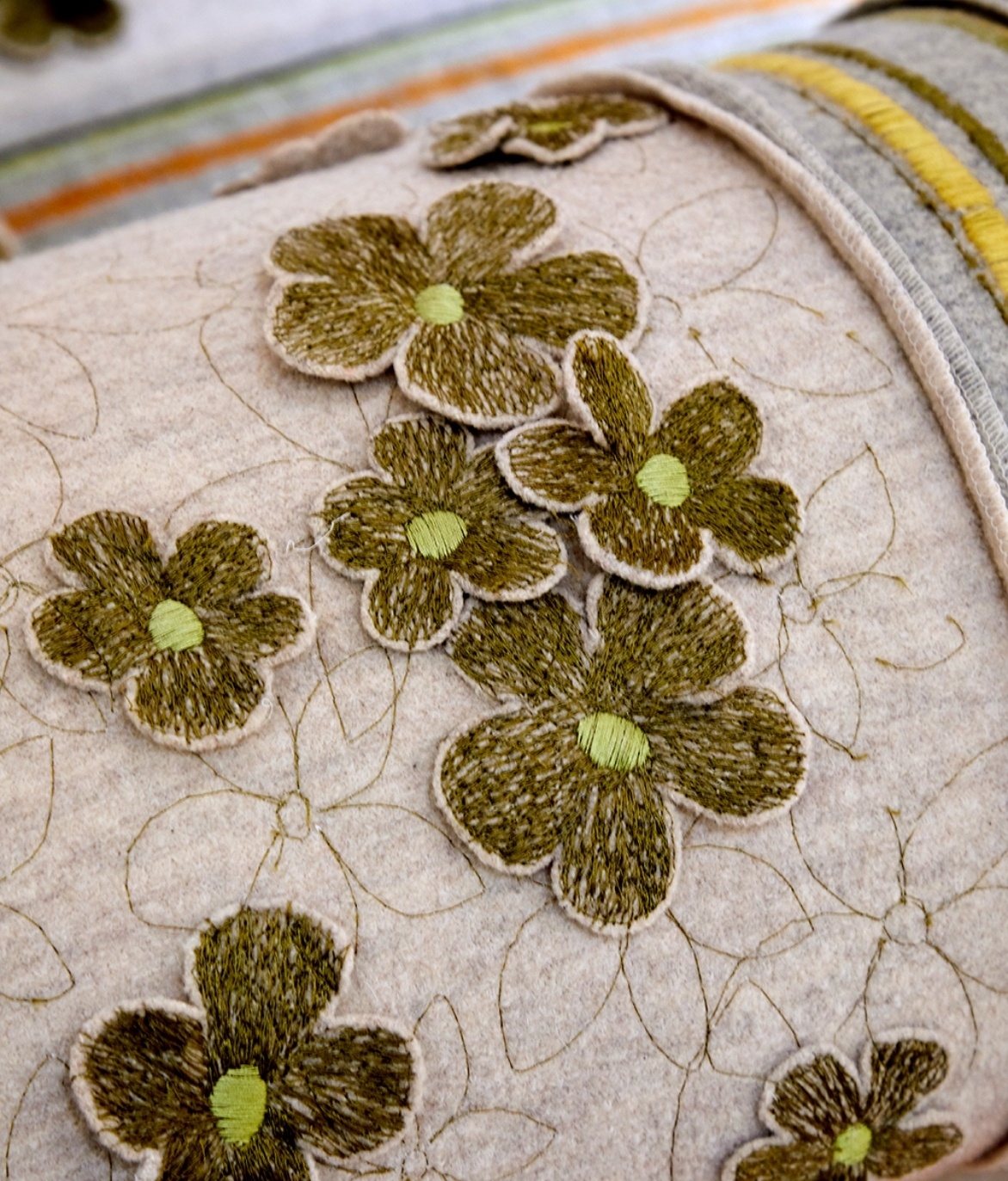
The library at The Soho Hotel has been created around subtle tones, punctuated with lovely sage greens and warming hints of yellow. The result is a relaxing atmosphere, perfect to read a book or enjoy a cup of tea.
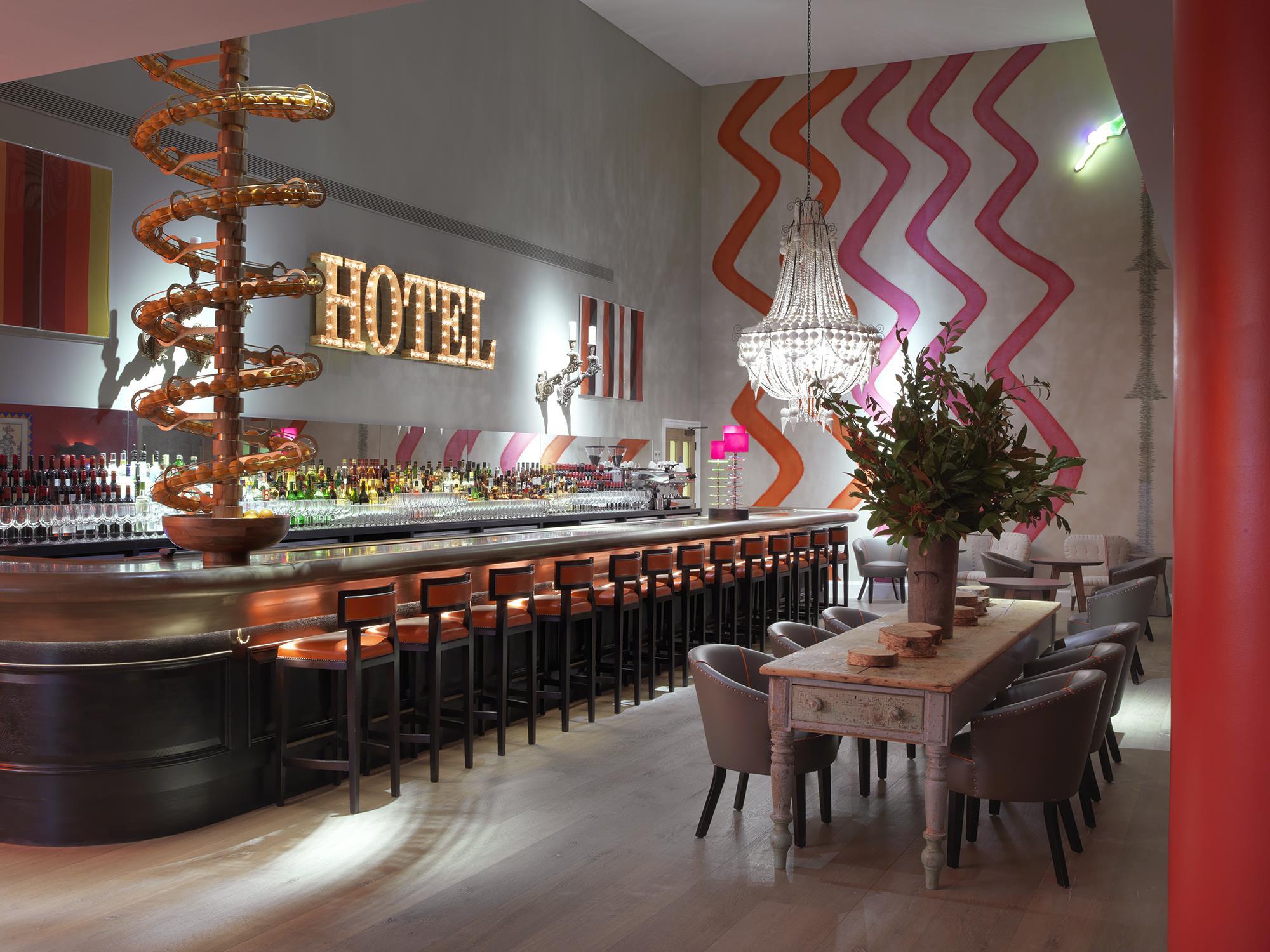
Jumping over the line to more hot and spicy plains, the Dive Bar at Ham Yard Hotel plays with warm colours which exude energy, vibrancy and playfulness, perfect for letting loose while sipping on a cocktail or two at the bar.
4. Don’t underestimate your surroundings
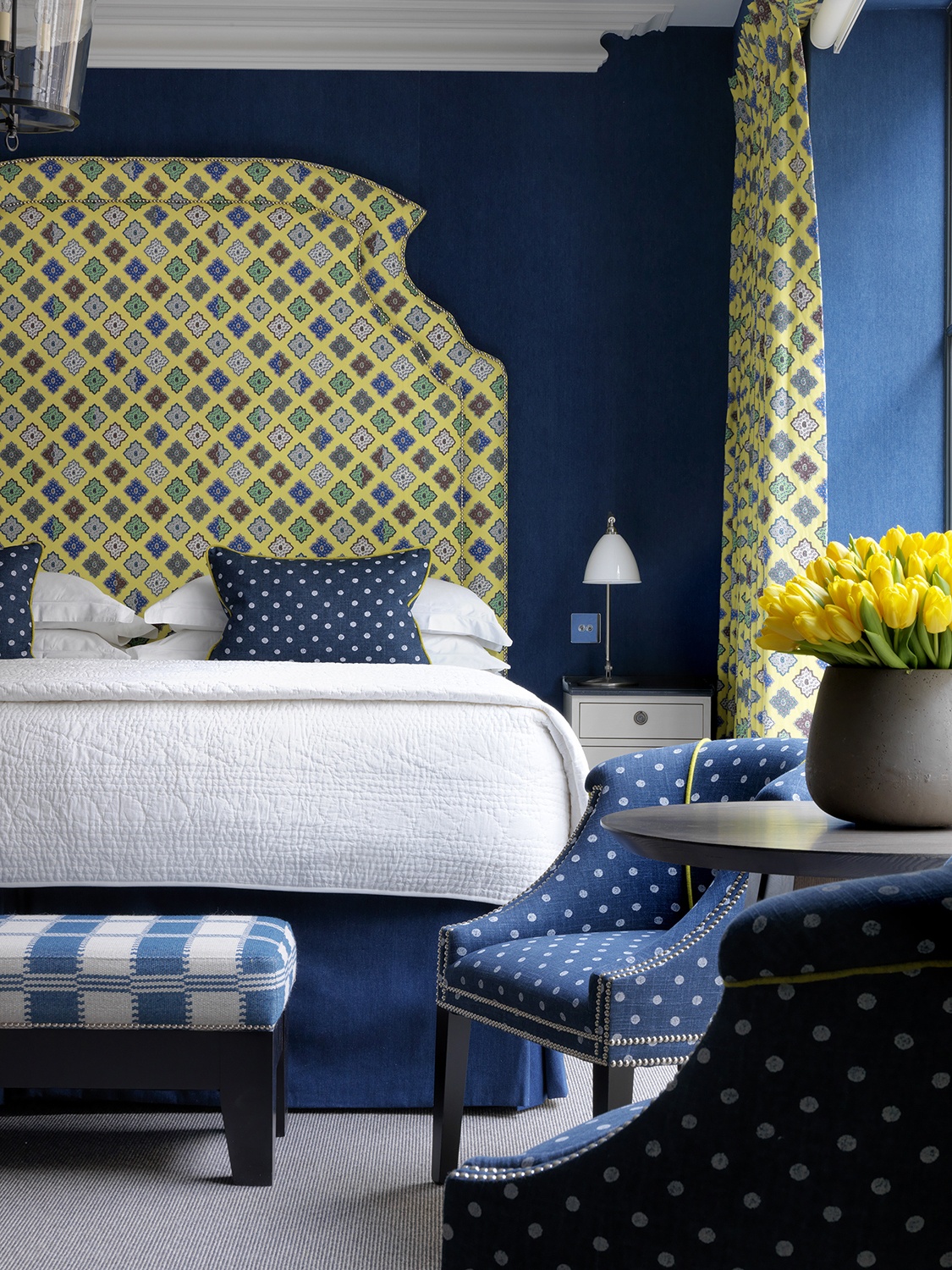
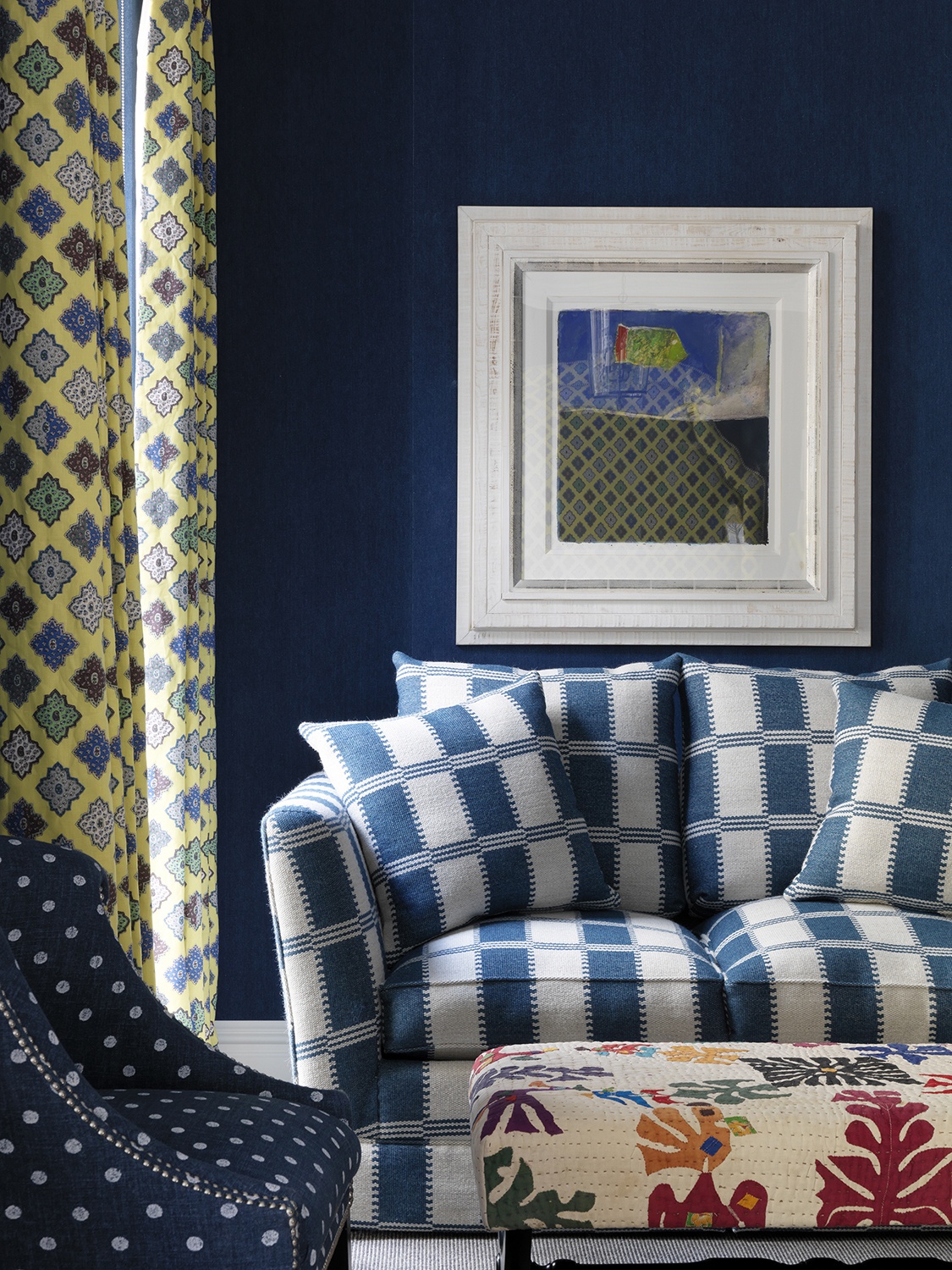
A large expanse of colour will have a direct effect on how a smaller splash of colour reads. Both of these rooms at The Whitby Hotel and Ham Yard Hotel play with a combination of blue and yellow, but the result is quite different.
Here at The Whitby Hotel, this tone of yellow is so clever; it’s cooling on a hot summer’s day but happy and warm when it’s cold. We have a lot of light in this suite, which dances with the yellow and soft blue wall fabric to lift your spirits.

At Ham Yard Hotel, this Provençal inspired fabric by Christian Lacroix provides an uplifting contrast to the rich blue denim fabric on the walls. The tones of the blue and yellow and the way we have used them create a very different feel to our suite at The Whitby Hotel.
5. Don’t Be Afraid To Experiment
It is said that there are certain colours from the wheel that are “forbidden combinations” as they clash when mixed together. As we always say, the rules were made to be broken and that’s what really defines us here at the Kit Kemp Design Studio – the ability to take something scary and turn it into something sublime.
A bold, bright burst of pink and a splash of orange can add so much to a room if you are able to balance these two big characters with something more gentle. We love this colour combination so much we have a whole blog dedicated to making these two colours work together: The Clash of Pink and Orange.
The use of colour can be complex and the colour wheel certainly allows for multiple interpretations.
Besides following our points above, our biggest tip is be bold and be brave. Experiment and have fun, you won’t succeed unless you try!