The Clash of Pink and Orange
Day to DayWe are starting to feel the heat of summer and thought it would be the perfect time to celebrate the hottest duo and one of our favourite colour combinations – pink and orange. These two joyful colours sit so near each other on the colour wheel that they are not often thought of as an obvious mix. But this is just not the case. In this post, we round up our top pink and orange schemes…
We are beginning to feel a spring in our step and thought it would be the perfect time to celebrate one our favourite colour combinations – pink and orange. These two joyful colours sit so near each other on the colour wheel that they are not often thought of as an obvious mix. But this is just not the case. From the hot pinks and vivid oranges of a contemporary setting to the more subdued floral tones of an English garden, this is a pairing that we have never tired from. In this post, we round up our top pink and orange schemes…
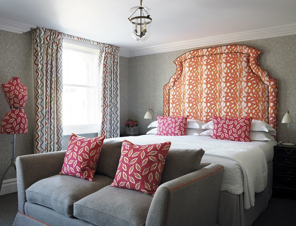
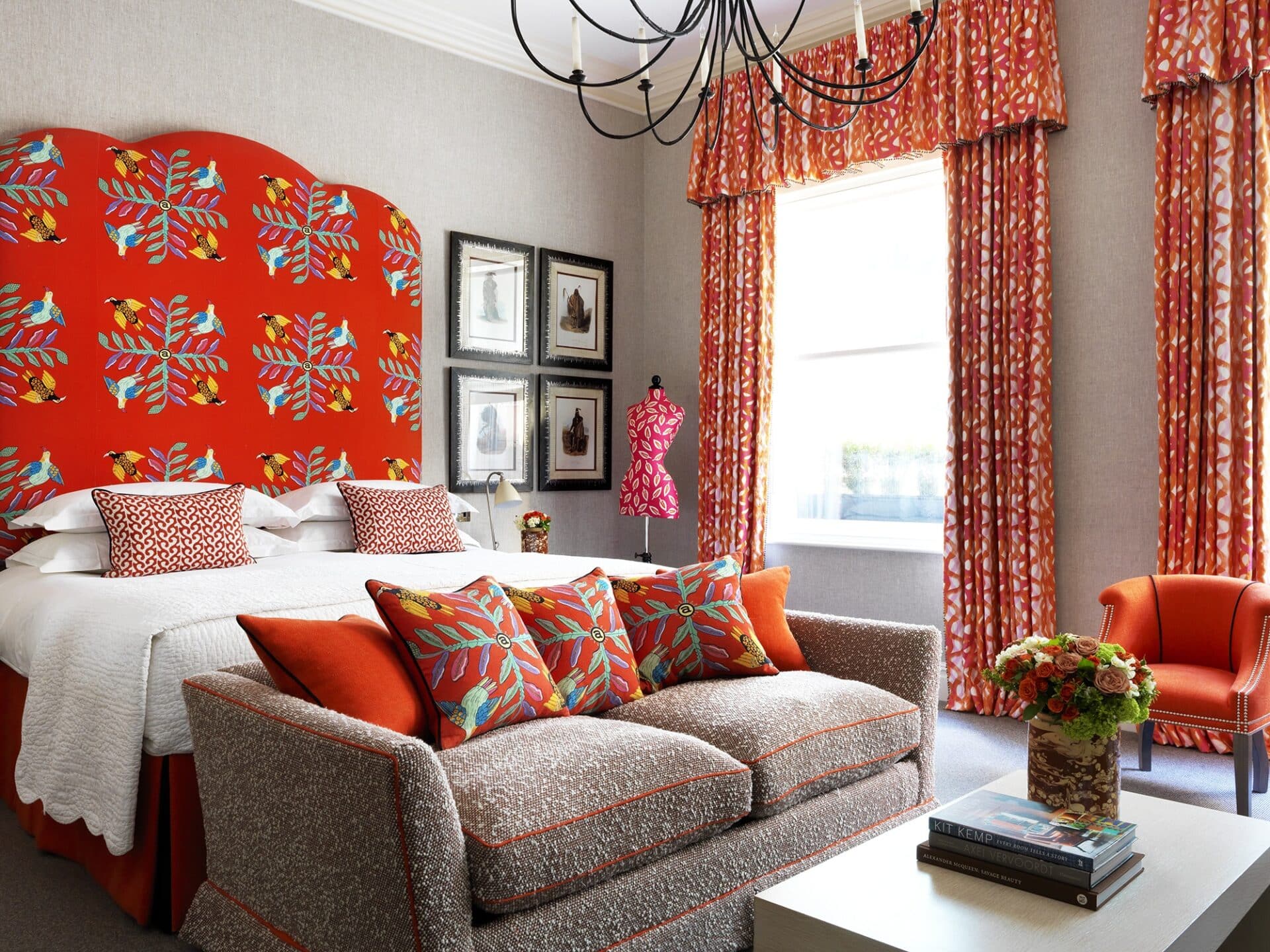
In this bedroom at Charlotte Street Hotel, we have used this energetic print on the headboard called ‘Fathom’ by Christopher Farr. It has a fun imperfect painterly effect, with orange and pink tones running down the fabric. It pairs wonderfully with the hot pink Leaf Cutter fabric by Bennison on the bed cushions and sofa scatter cushions.
When pairing vibrant pinks and oranges together, it is important to bring in a neutral backdrop – especially in a restful area like a bedroom. Here we have used our ‘Inside Out’ fabric which we designed with Christopher Farr. The curtains almost mimic the headboard fabric which is another one of my designs called ‘Rick Rack’. This is a great example of a fresh, fun and contemporary pink and orange scheme!
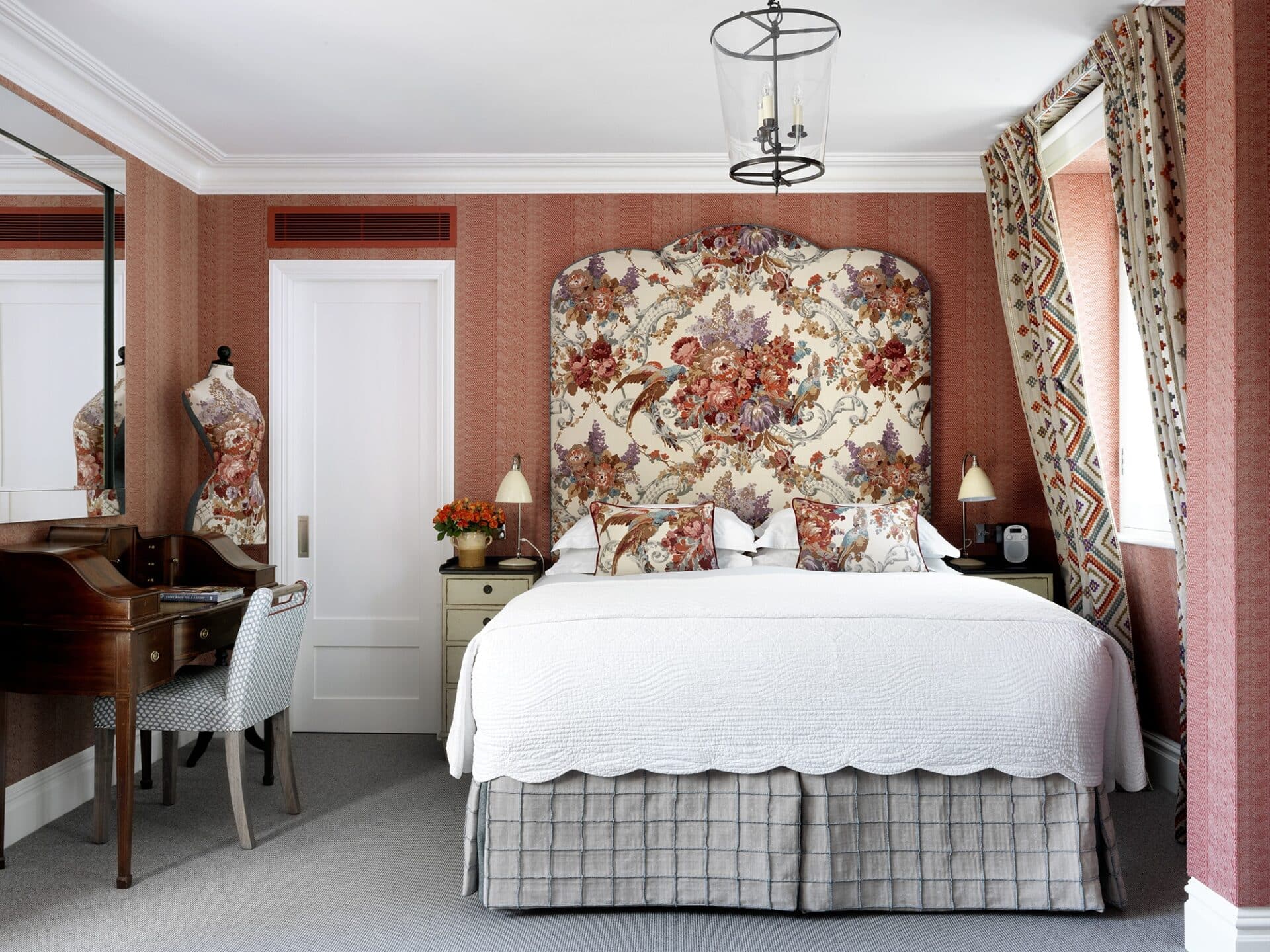
In contrast to these zingy interiors, we also love a more subdued and romantic look, like The Terrace Suite at Covent Garden Hotel.
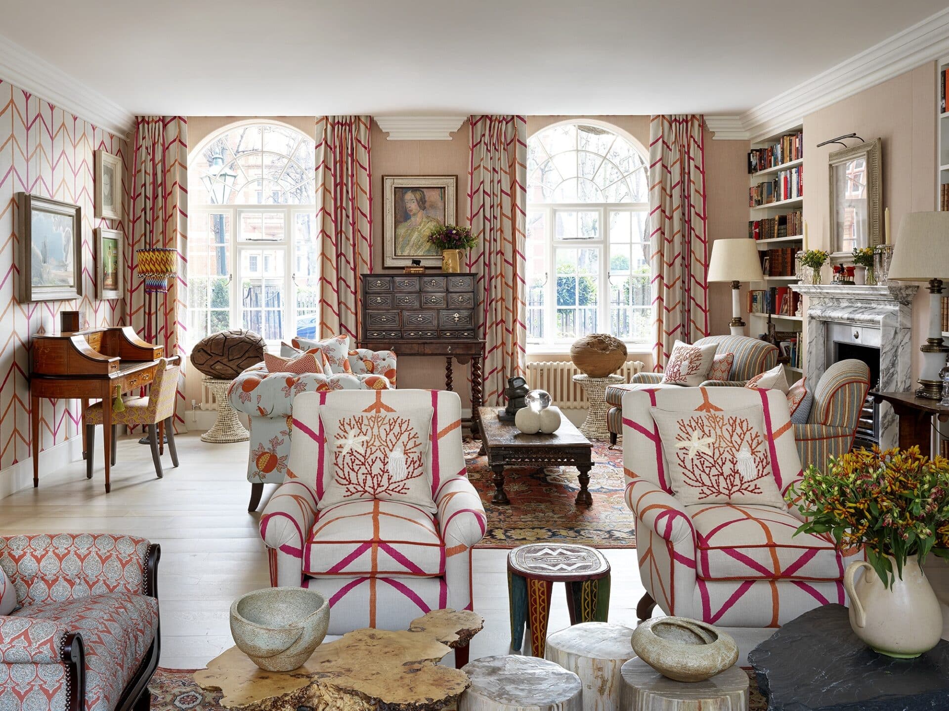
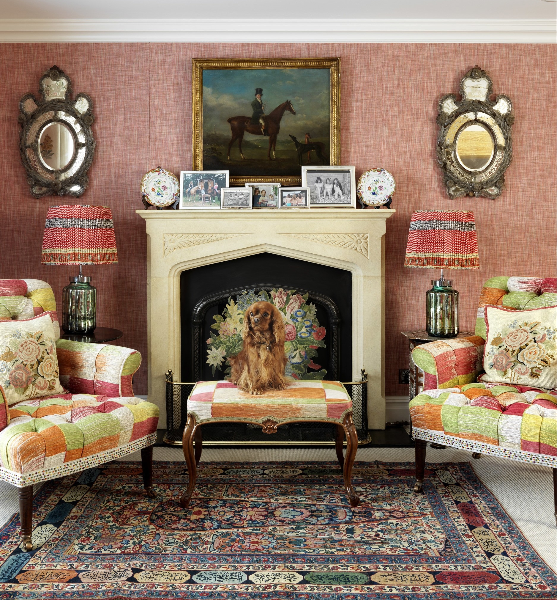
In this glorious drawing room in a recent residential project in London, our goal was to create a warm and inviting interior which was bold yet restful, with Indian pinks and peachy hues. The room remains balanced and tranquil with the help of the soft blue tones on the Raoul fabric, displayed on the chesterfield sofa behind, as well as the aqua ticking stripe on the armchairs. Blue is often a seen as a colder colour, but paired with these vibrant tones makes for a balanced and sophisticated pallet.
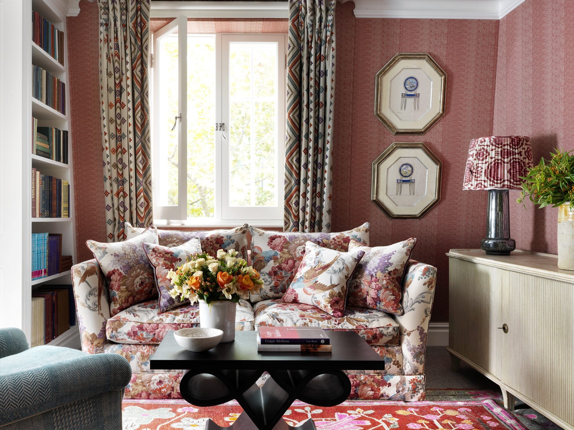
The colour palette draws inspiration from the bold colours of the spectacular hand block fabric of flowers and birds from Hazelton House. This fabric is a tribute to John Fowler of Colefax and Fowler. He and Nancy Lancaster are considered the ‘inventors’ of Country House Style. This fabric has been used on the sofa in the drawing room and on the headboard in the bedroom.
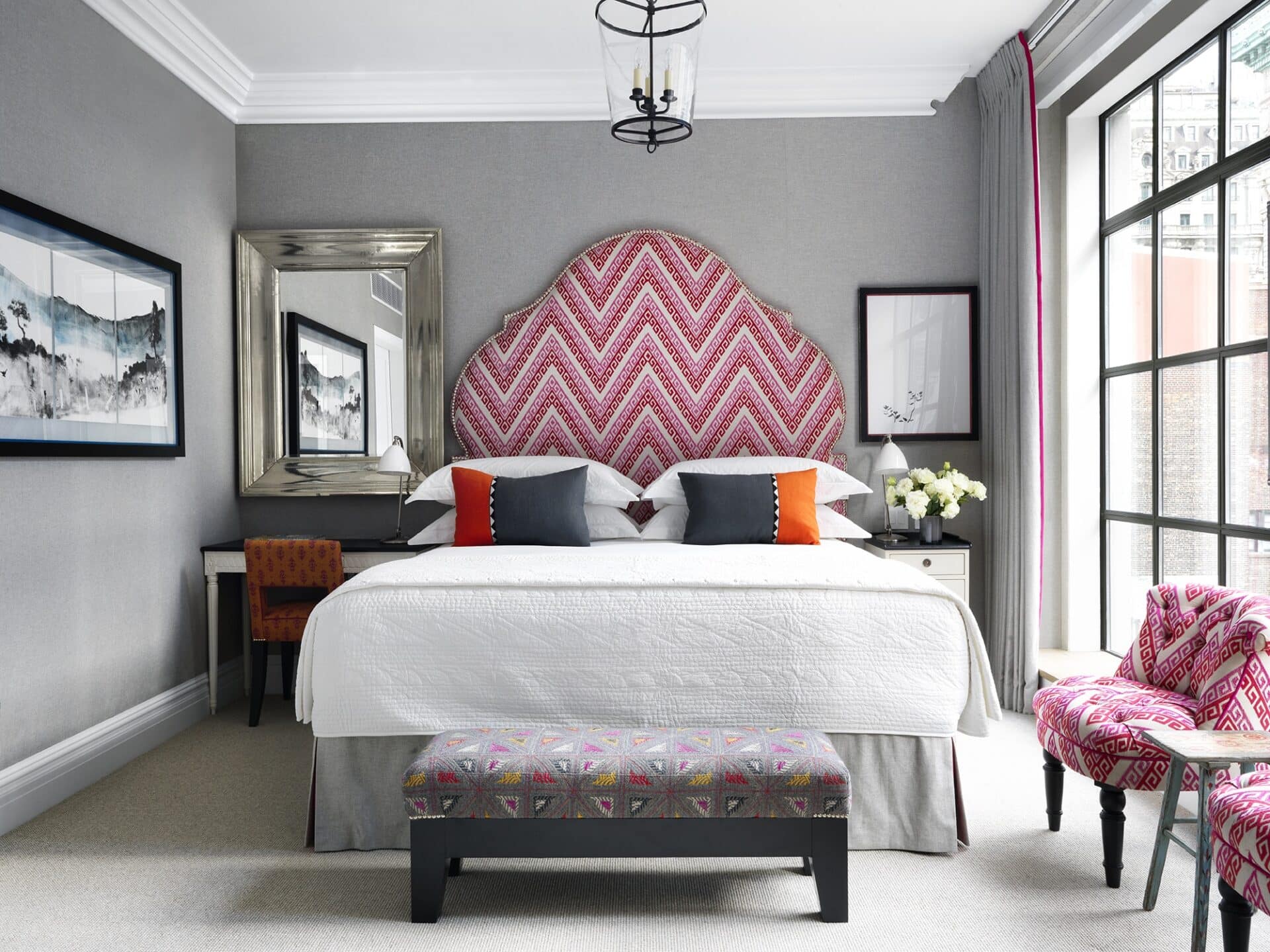
It is important to remember however, when using the bold, zingy pinks and oranges to have a calm and neutral backdrop, balancing the room to prevent it from becoming overbearing and garish. If you have bright pink or orange walling as well as bright furniture, the room does not sing, it shouts. Here are some examples of how we have used the pink and orange colour palette in our room schemes.
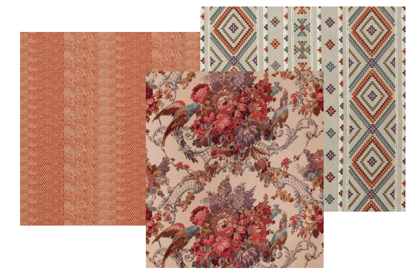
The rusty red textured walls by Nina Cambell provide a peaceful backdrop to this this stunning floral chintz on the headboard, allowing the raspberry pinks within to sing. The suite is an unexpected mix of traditional English patterns and contemporary embroideries. The curtains are in heavily embroidered Mulberry linen, complementing the Hazleton House fabric. Together, the reds, pinks and oranges all integrate in the most beautiful way.
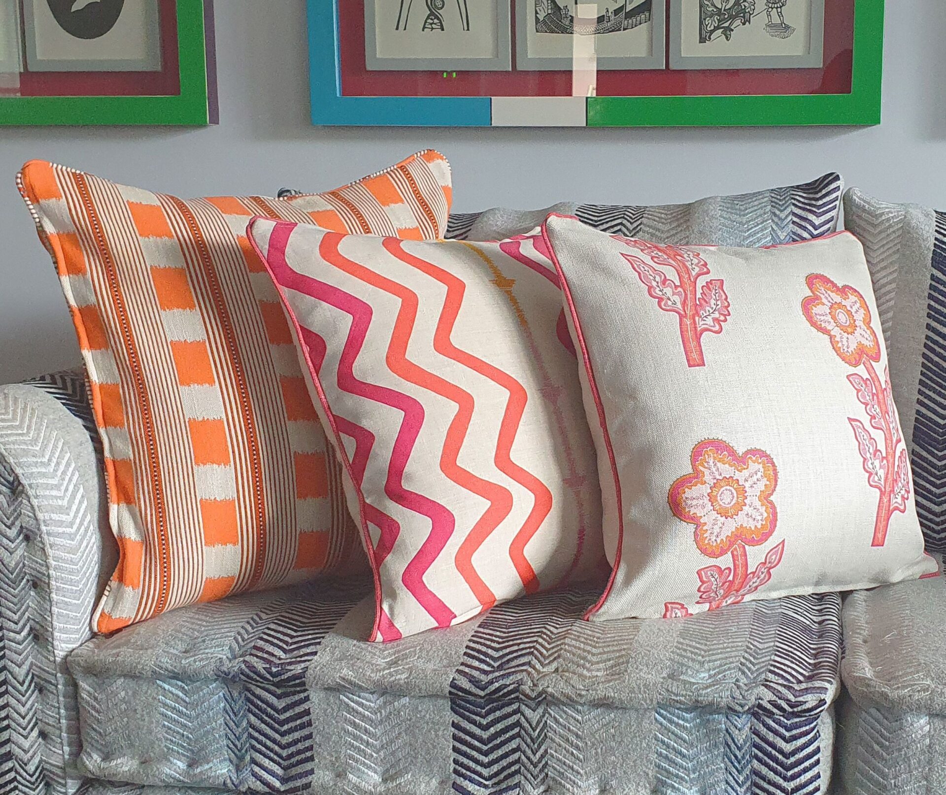
Or even some funky sofa cushions…
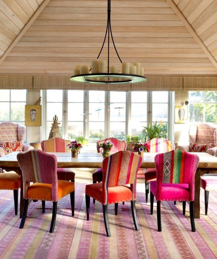
Or go all out and dress your kitchen table with these bold dining chairs in my ‘Lost and Found’ fabric…
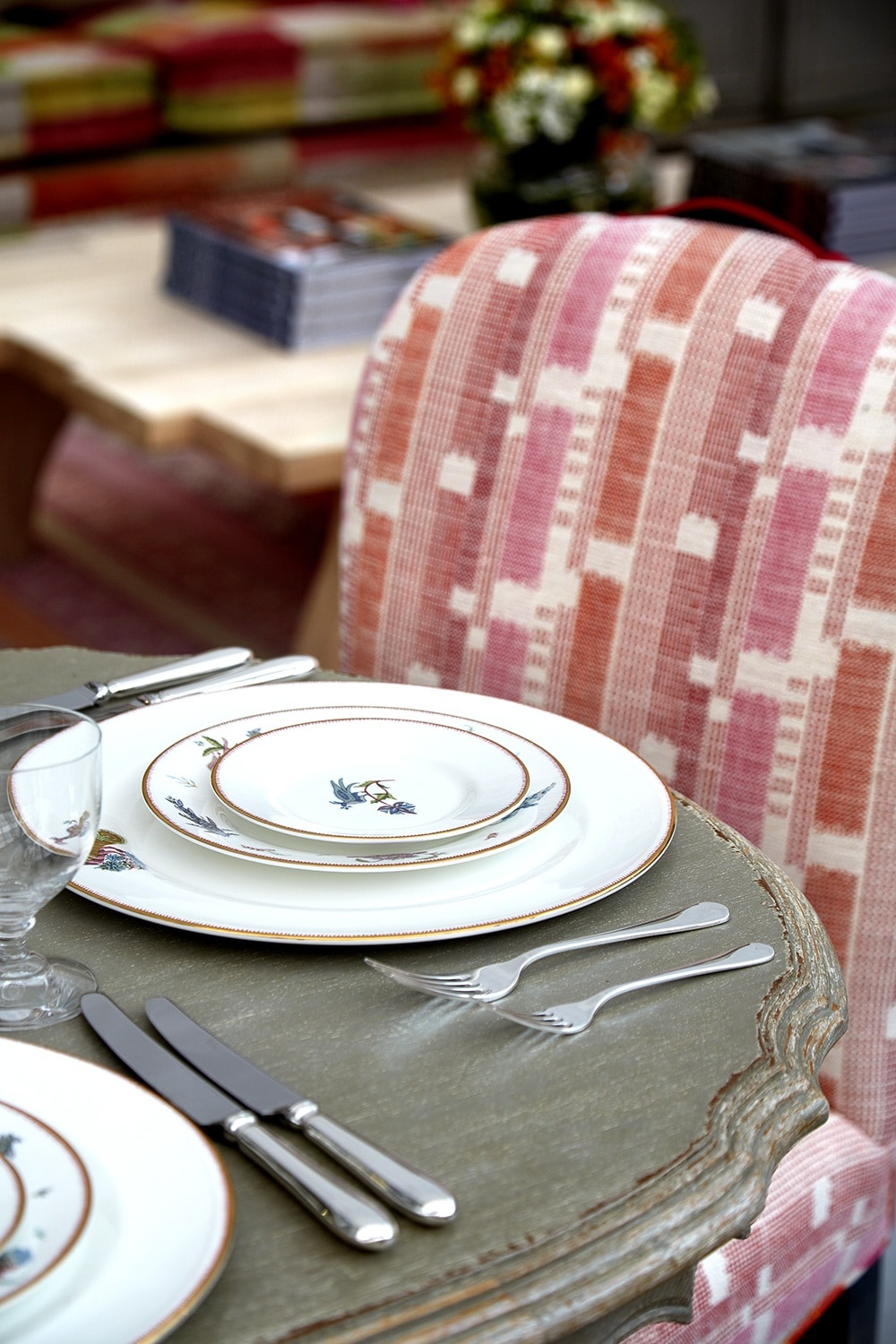
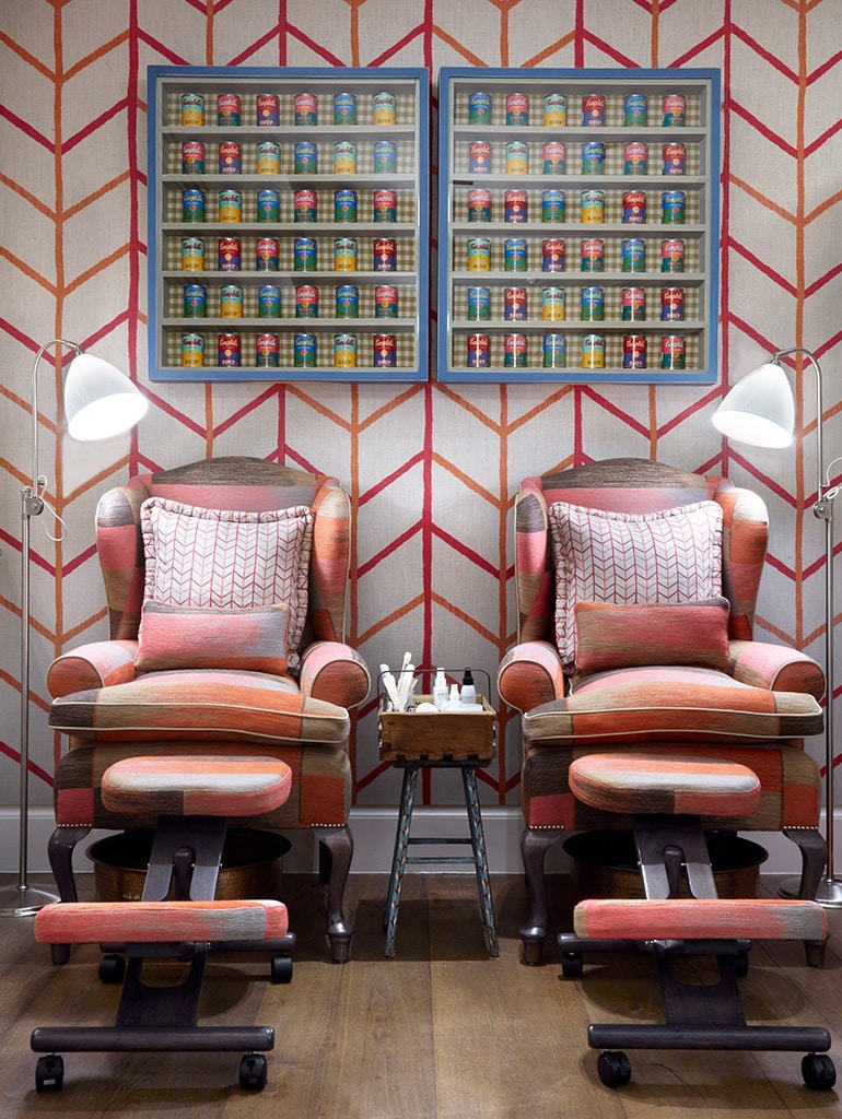
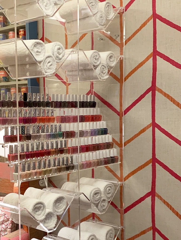
In the Soholistic Nail Bar at Ham Yard Hotel, you will find a feature wall in a hot pink colourway of my ‘One Way’ design. We have paired this print with our ‘Ikat Weave’ we designed for Christopher Farr. It is such vibrant space – perfect for getting your nails done and having a natter with a friend.
Why don’t you give it a go at home? This gorgeous colour combination really will spice up your life!
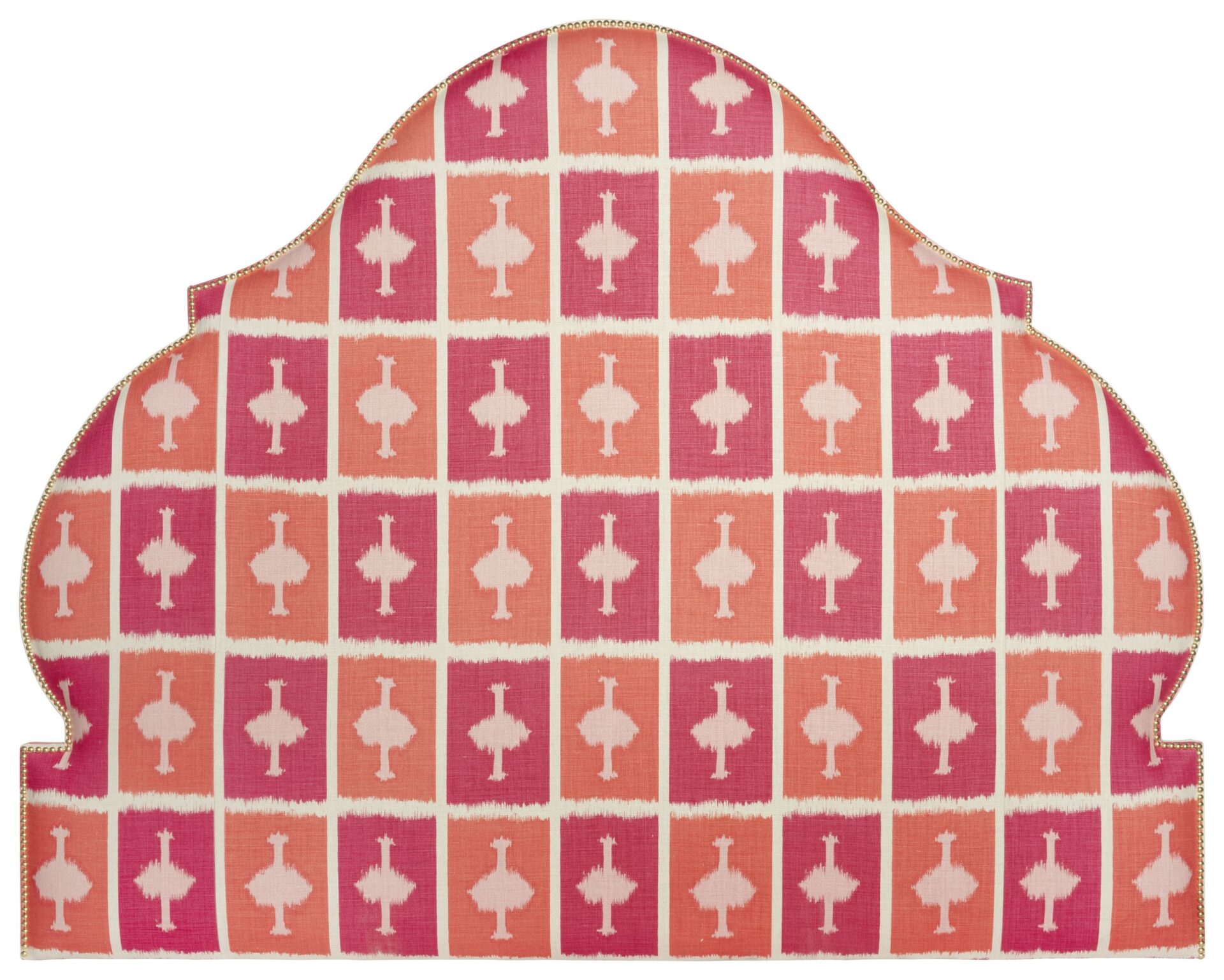
On Shop Kit Kemp, you will find a showstopper of a headboard…
Pink and orange are such vibrant and energetic tones and look glorious when paired together.
Please tag us on Instagram @KitKempDesignThread to show us your pink and orange rooms at home!
In this recent residential project, we recovered the dining chairs in found Kilim rugs – all mixed and matched in varying tones of pinks and oranges. The joy and beauty of using found or vintage fabrics is that they have imperfections that make them feel more unique. This dining room exudes fun, vibrancy and intrigue.

