
Strong Colours – Our Dos & Don’ts
How ToColour makes us feel happy. With the last dashes of sunshine in London, we thought it would be the perfect time to celebrate our colourful interiors and its importance in our design. Here are our dos and don'ts of how to use strong colours together at home...
Colour makes us feel happy. With the last dashes of sunshine in London, we thought it would be the perfect time to celebrate our colourful interiors and its importance in our design. Here are our dos and don’ts of how to use strong colours together at home.
1. Mix strong colours with neutral ones and antiques
A neutral background provides the perfect base for a mix of Fluor colours, as we did here at Charlotte Street Hotel.

In this scheme, the powerful bright yellow and pinks are perfectly integrated and ‘sing’. If the original fabrics have a bit of that grey or beige undertone, it will work even better.

A nice warm beige walling would also do the trick if you are not too keen on grey.
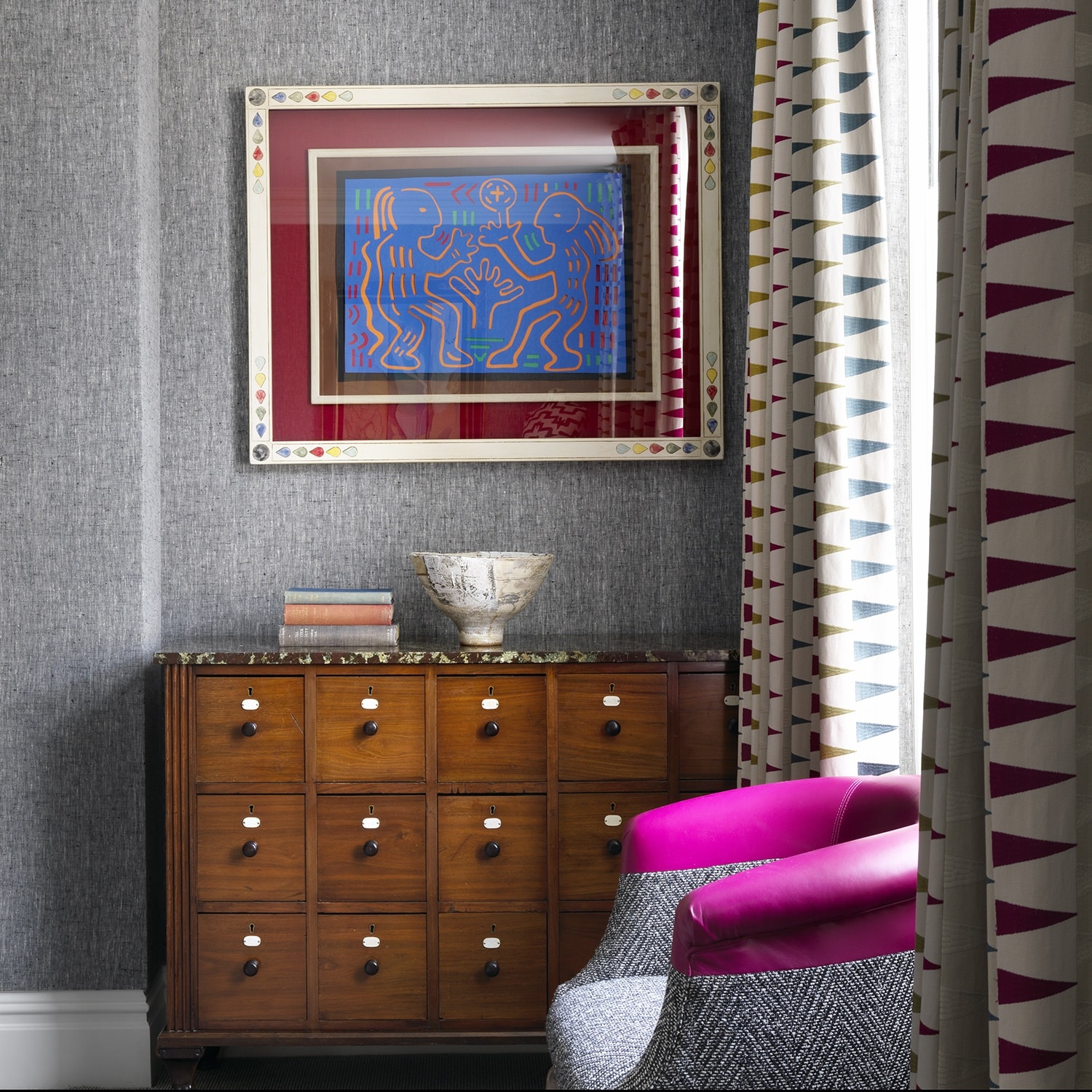
2. Start with small touches
They can still make a huge impact: Art pieces, leather piping on a sofa, a headboard with depth for sharpness, or small bits on an armchair. Adding a touch of brightness to a room is always a good idea.


What’s more, the antiques play a very important role in making the scheme more earthy and everlasting. It’s the richness in layers that will make the room comfortable and lasting in time.
In this suite at The Whitby Hotel, the result is calm, but if we have a closer look, we appreciate the many touches with strong colours: reds, blues, oranges, yellows … they are all there!


Here at Haymarket Hotel, the lobby walls work perfectly well with the sleekness of the black and white pieces that surround it. It’s definitely something to remember!
3. Paint your walls in a bright colour to refresh your scheme
As they are easy to change, choose an acidic/bold colour for a bit of fun in a classic and more “old-fashioned” scheme. It will cheer up and modernise the space immediately.
At Charlotte Street Hotel, the acidic green on the walls makes the room striking and different to what would be expected of a floral scheme.

4. Use strong colours in columns and architectural elements
This will invigorate and lift the space. At Refuel Bar & Restaurant at The Soho Hotel, the space looks much taller because of the chunky bright orange columns. They make the space solid and tie everything together.

5. Don’t be afraid of combining a variety of strong colours
This could be almost anything, from blue and yellow


Yellow and magenta

Yellow and orange
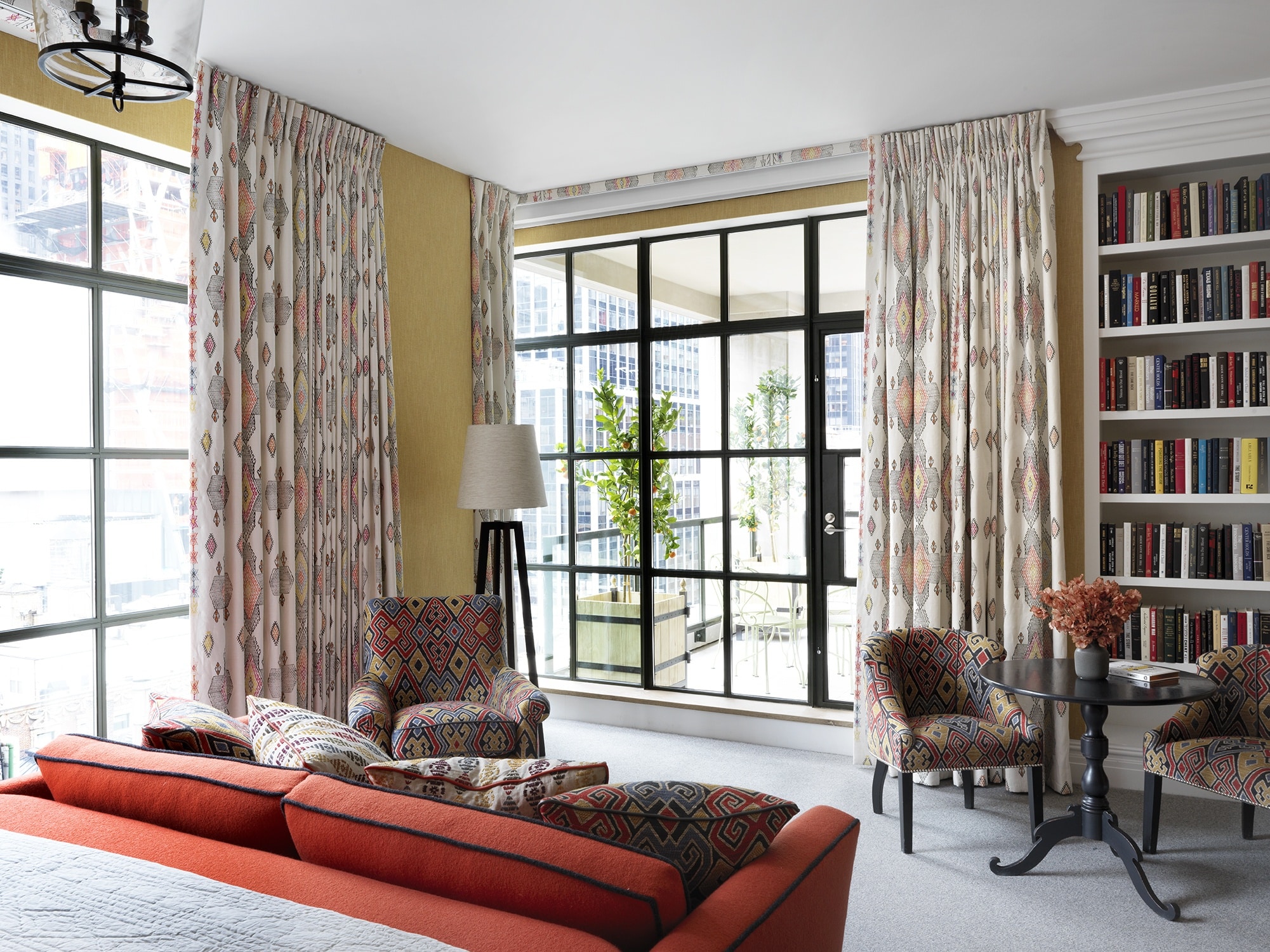
Orange and green


Pink and orange

Even a fun corner of your room can be lifted up and steal the show!

Show us how you have introduced bold colours in your house by tagging us on @KitKempDesignThread and #designthreads.