
Stripes are very simple but extremely effective; they can be in a single colour or a combination of many, different thickness and different directions. Every year, the fabric houses go one step further creating innovative stripes that we love to use in our interiors. Here are our dos and don’ts for using stripes in your designs:
1. Don’t think stripes are classic
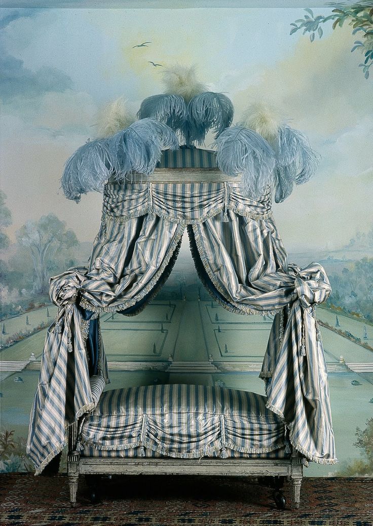
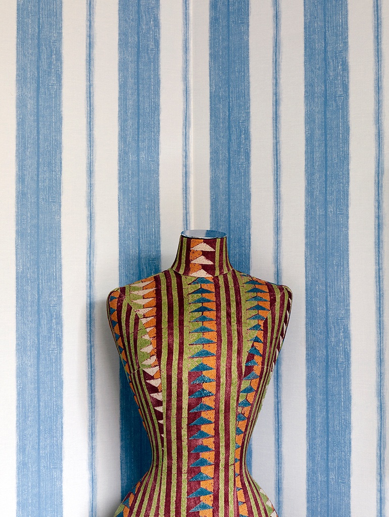
Stripes have been a recurring pattern in interiors since the beginning of interior design history. Who doesn’t remember Marie Antoinette’s wonderful ‘Playhouse Bed’? However, don’t assume that Marie Antoinette’s use of stripes means they are too traditional.
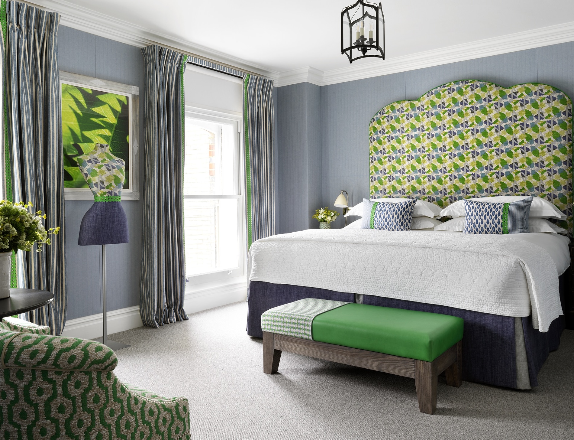
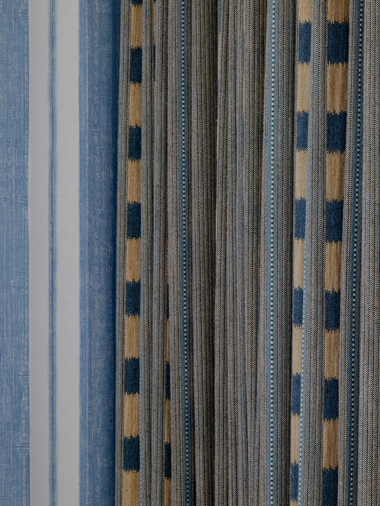
In room 307 at Charlotte Street Hotel, we have used Fermoie’s ‘York Stripe’ fabric on the curtains with a fun braid from GP & J Baker. The combination of the blue and lime colours gives it an unexpected twist, making the room appear fresh and playful.
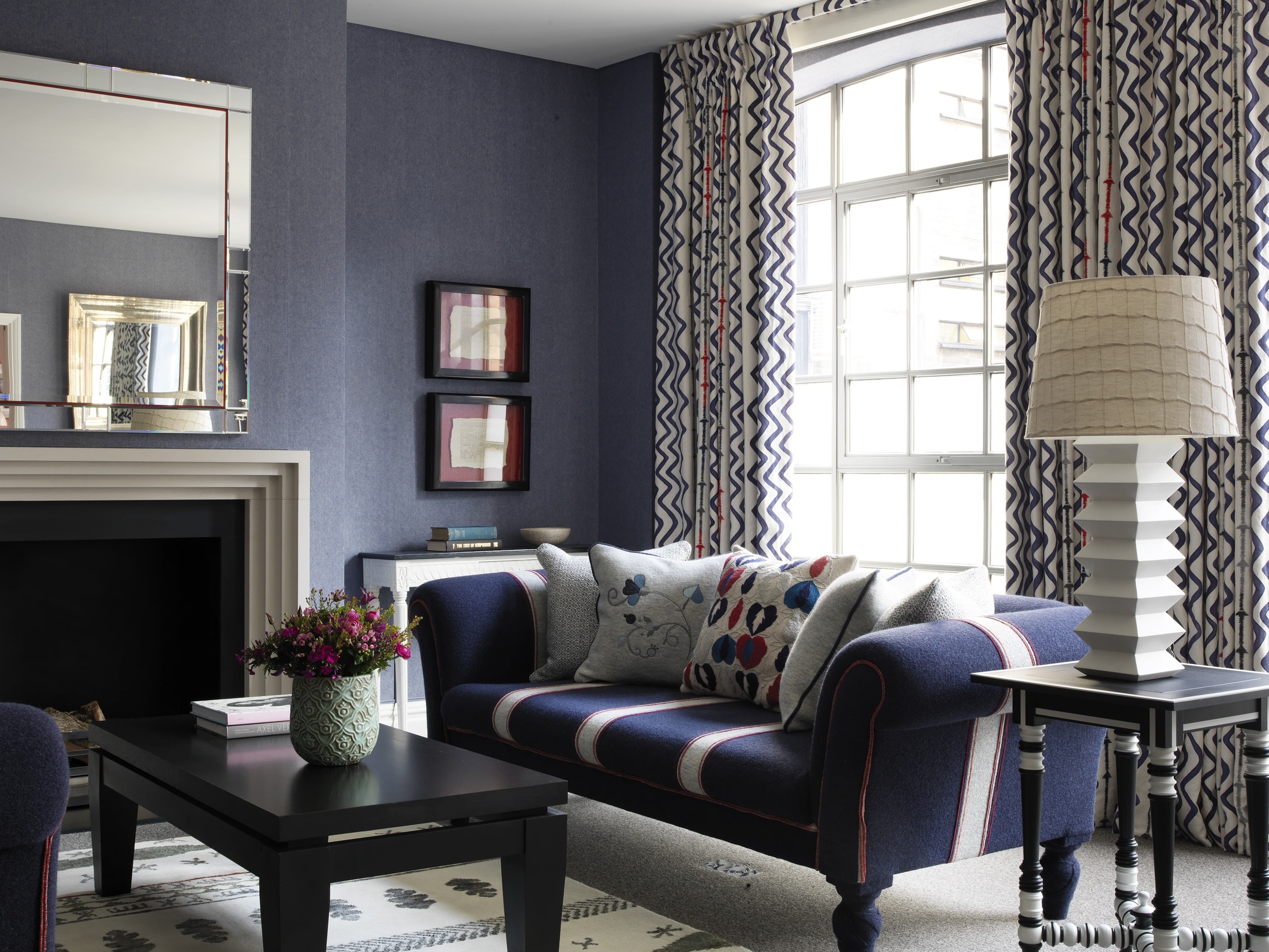
In room 117 at The Soho Hotel, the sofa stripes in Holland & Sherry wools add a different thickness and texture. The juxtaposition of this fabric against the curtains in my ‘Rick Rack’ fabric for Christopher Farr Cloth makes the whole space look graphic.
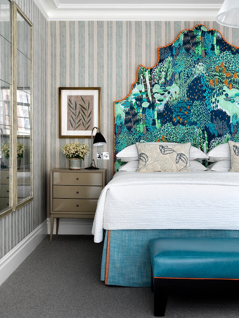
2. Do use stripes on your walls
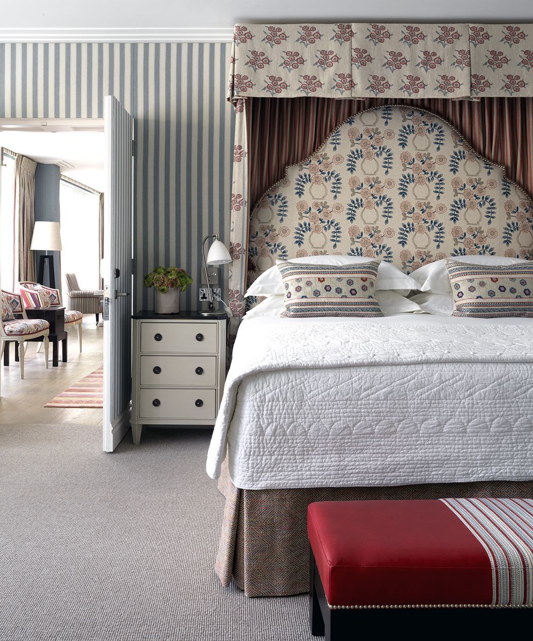
Stripes are a fantastic way to add texture and height to a space, especially where the designs run vertically. In the Terrace Suite at Ham Yard Hotel, we used a classic stripe by Colefax and Fowler, complemented by a smaller scale red stripe within the half tester.
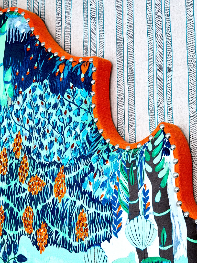
In the newly refurbished room 201 at The Soho Hotel, the walls are lined in one of our favourite Kravet fabrics. We loved the serene colourway and the sharp, hand-drawn quality of the pattern. The colourful headboard fabric adds moment and balance which makes the scheme feel contemporary.
3. Do use various stripes together
In Suite 609 at Crosby Street Hotel, the layering of stripes in various scales works wonders. The William Yeoward striped wallpaper in Scillo Sky with various widths of stripes adds dimension to the room.
Pairing the striped wallpaper with my ‘Lost & Found’ fabric on the curtains creates a harmonious space. Although not a traditional stripe, the vertical checks add interest.
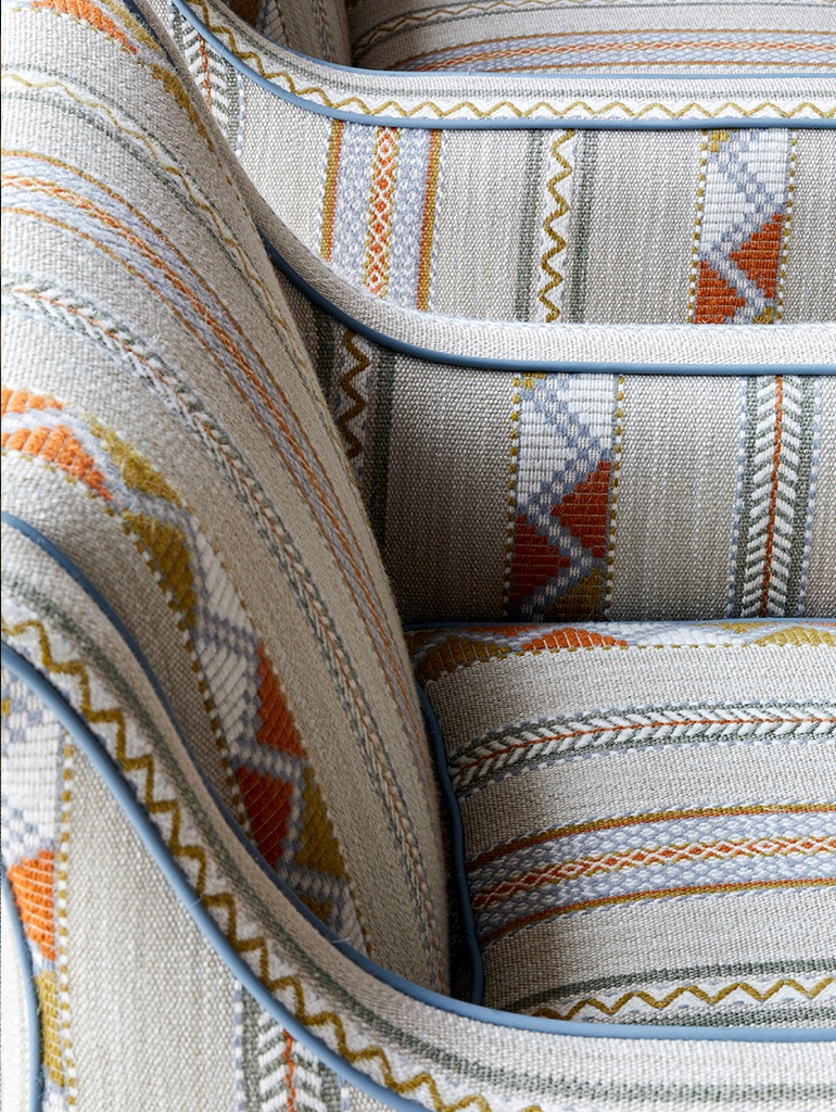
In the drawing room of this suite, the blue and orange hues have been carried through with a slight twist. The Pierre Frey ‘Ohio’ curtains have a horizontal stripe, which makes the room seem wider. My ‘Woven Fabric’ for Christopher Farr Cloth in the honey colourway has been used on the armchairs with a Samuel & Sons blue pipe.
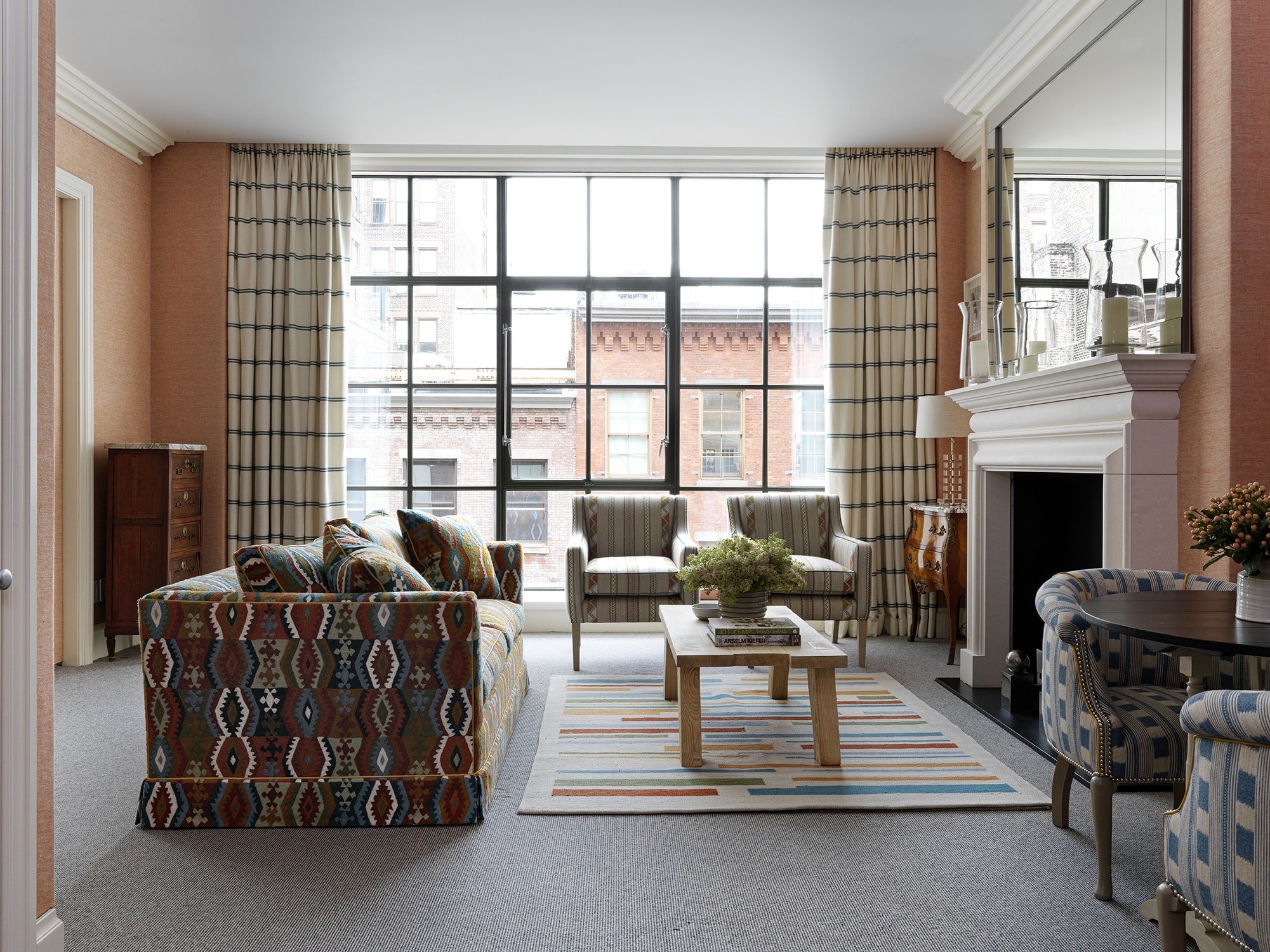
We echoed fabrics from the bedroom on the tub chairs and sofa. The most impactful element to tie all the stripes together is the rug with broken stripes of blue and orange mixed with a hint of green for contrast.
5. Do use stripes in two directions
In the vibrant Lyric Room at Covent Garden Hotel, the beautiful bright walling with a subtle broad stripe sets an energetic scene to surround a mixture of stripes. Two types of stripes have been used in this room, placed upon the ‘By Way’ rug I designed for Wilton Carpets. This rug draws your eye to the back of the room where the sofas stand their ground by using the horizontal stripe in a deep red, which strengthens their presence in room.
I have used ‘Lost & Found’ in lemon on both the armchairs. I love how this fabric looks rail-roaded. These stripes work wonders together because we have only used four styles of stripe in varying scales, and we only repeat the two smaller designs.
Find a stripe to trick the eye into following the direction of the stripe or find one you love and work a scheme around it. Either way, this iconic pattern always has a place in every room.