Spring Greens
Spring is nearly upon us. It’s time to fold away our winter blankets and wait patiently as flowers begin to bloom and trees burst back to life after the long winter months.
Green is the colour of life, hope, energy and nature, so we often use it to bring a freshness to a room. We have pulled some of our favourite green schemes to give a burst of inspiration.
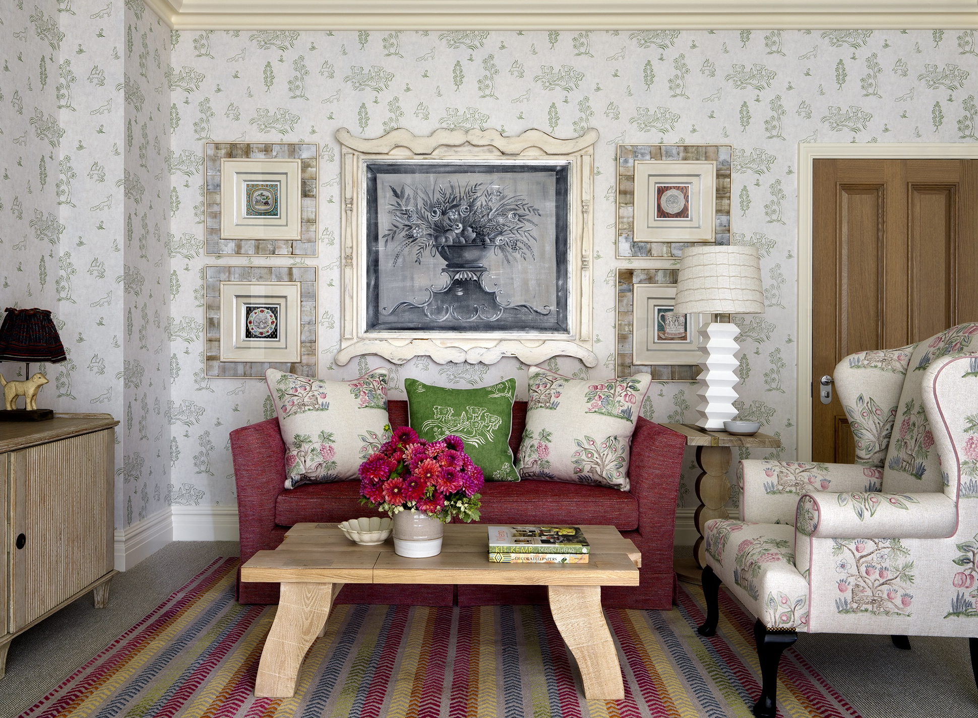
In the Terrace Suite 1402 at The Whitby Hotel, the walls of the drawing room are papered in my ‘Friendly Folk’ design for Andrew Martin; a chalky white background with soft green figures. The windows are framed in the same design, but on a leafy green linen with two matching tub chairs in front.

A broad comfy armchair sits opposite in my ‘Hedgerow’ design, again for Andrew Martin, where little jewels of pink burst from the linen like spring flowers, making you quite forget the concrete jungle outside.
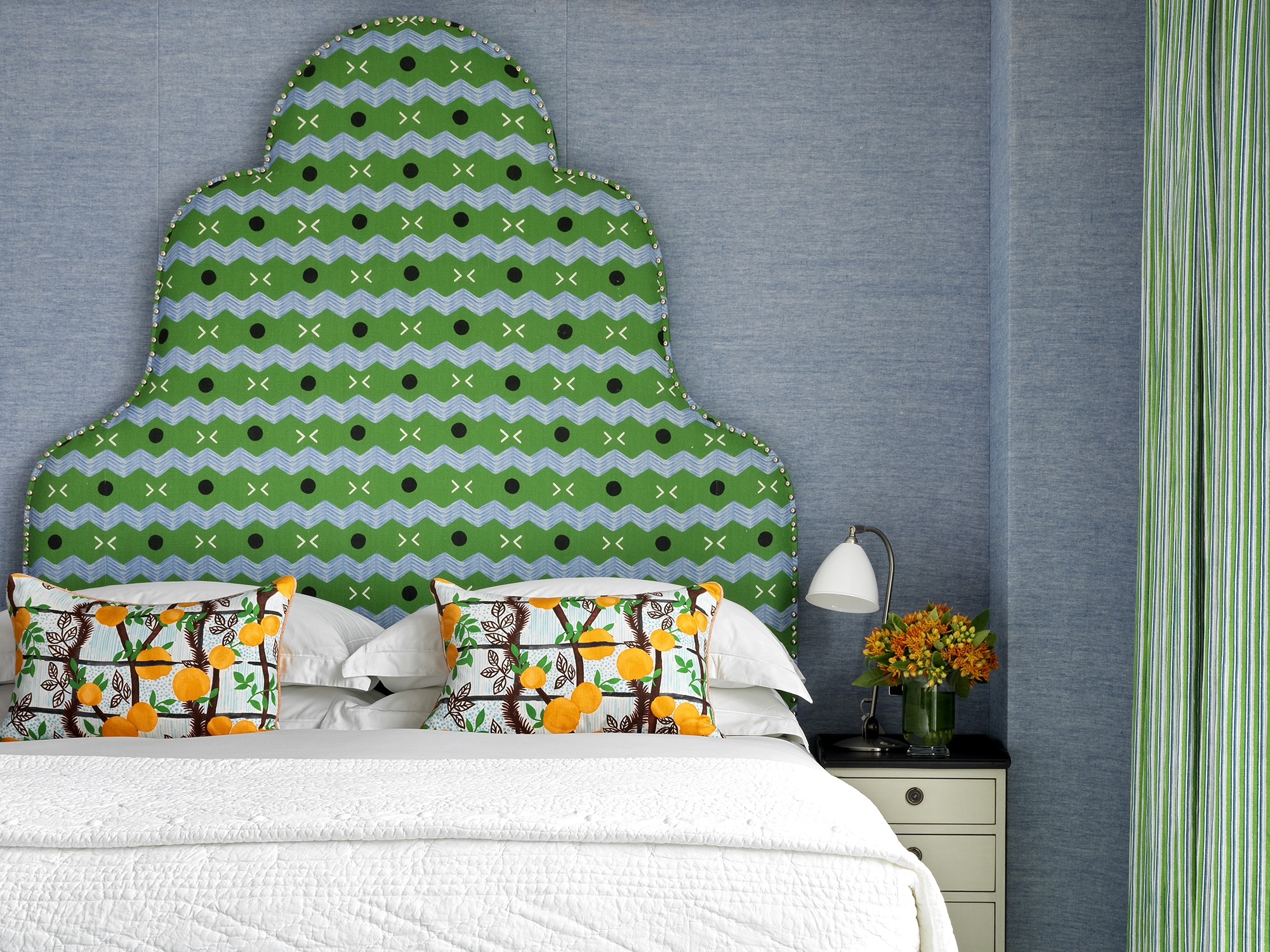
In Apartment 22 at One Denman Place, you are whisked away to a sunny Spanish orange grove in this light and airy space. In the bedroom, we have used an electric zig zag fabric by James Malone against the fresh blue of the walling. The green of this design is continued on the curtains where my green striped ‘Peace & Love’ drapes the windows. The bed cushion fabric depicts leafy oranges that look good enough to eat. For the end of bed footstool, we used a fun bubble braid from Kravet around the base.
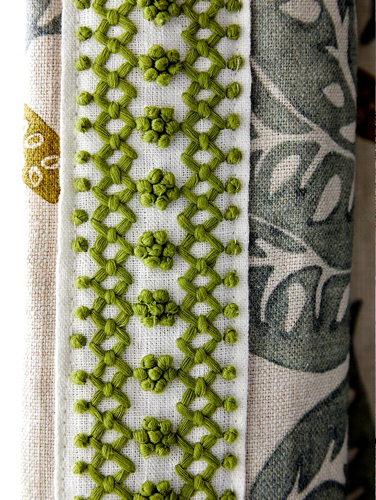
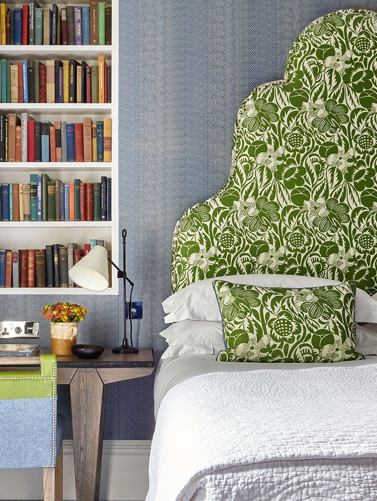
In the Terrace Suite at Ham Yard Hotel, we commissioned the talented artist Natasha Hulse to applique our signature statement headboard with an elaborate floral design. The three dimensional quality of her work gives the room depth and breaks the boundary between indoors and outdoors. We have used Turnell & Gigon’s ‘Tobias and the Angel’ in Olive on the curtains with a lime green trim down the leading edge.


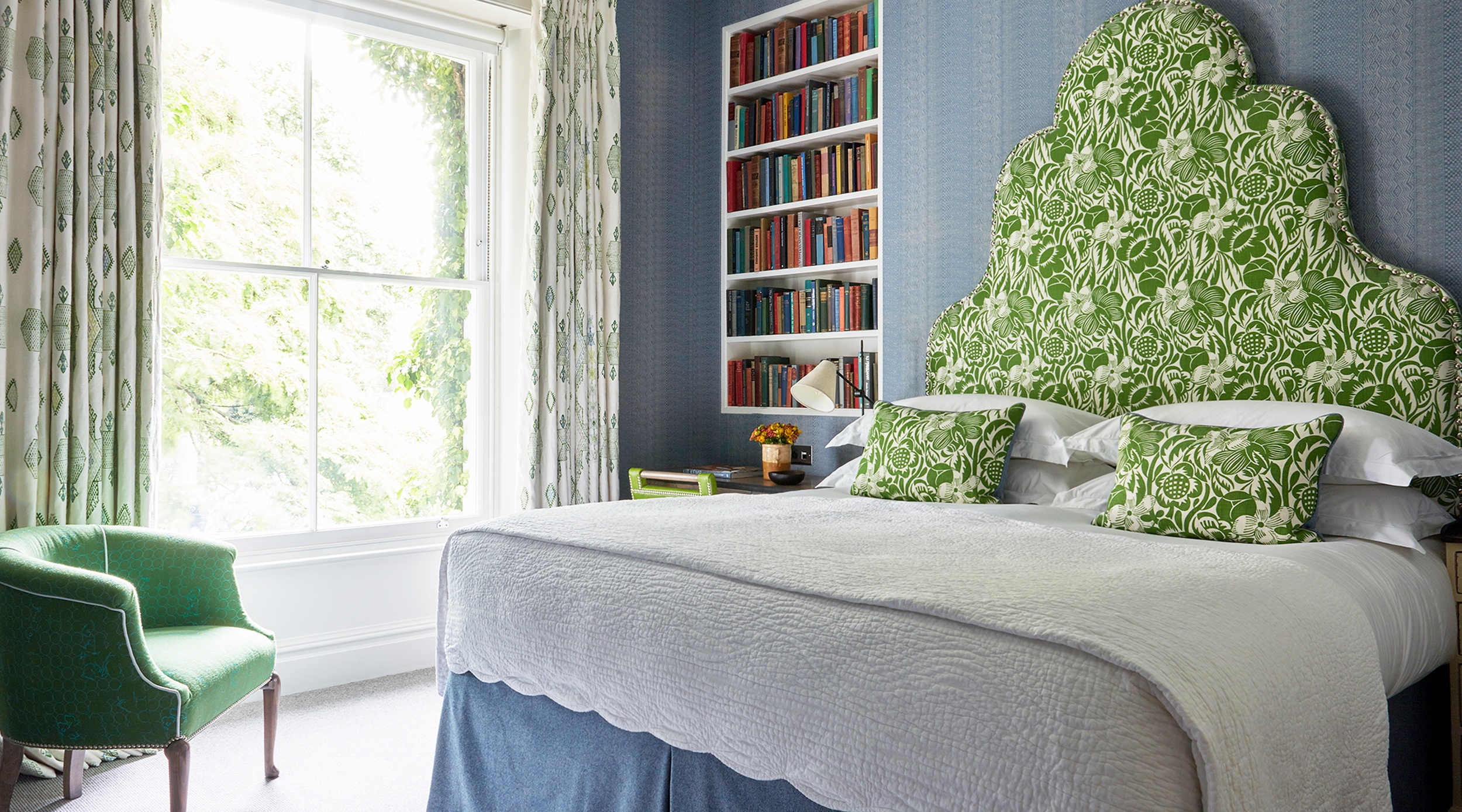
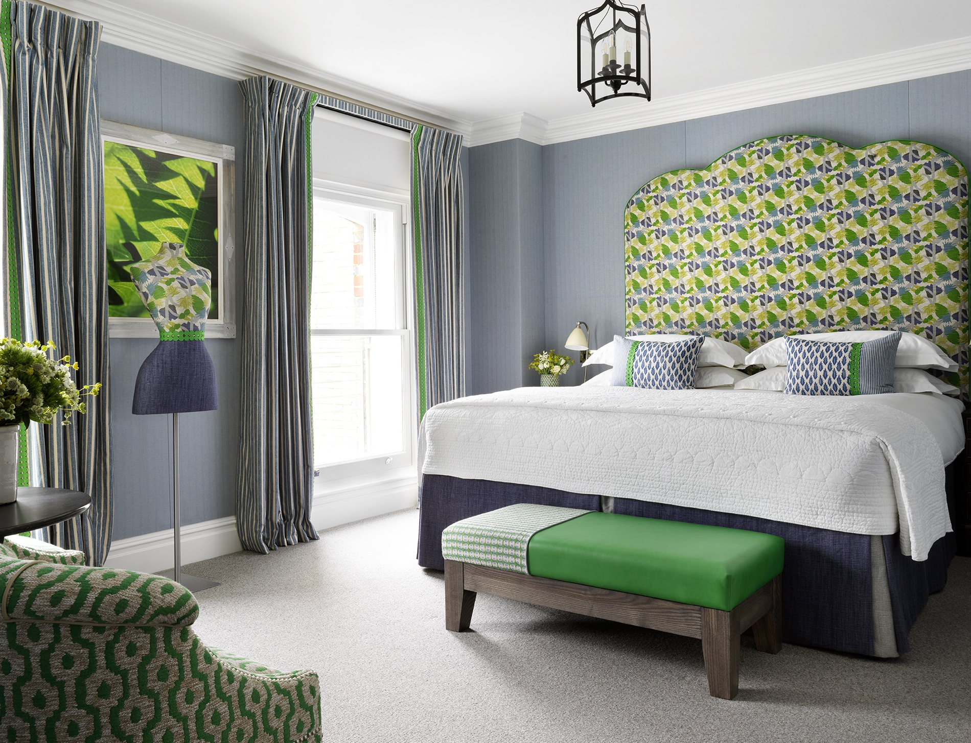
Room 307 at Charlotte Street Hotel is another example of a leafy green London hideaway. We have used a woven blue fabric on the walls, a fresh backdrop to Christopher Farr’s ‘Cactus Flower’ fabric on the headboard. We used a bright green leather on the depth lifting it from the wall, which we used again on the end of bed stool. We have repeated this flash of green on the leading edge of the striped curtains. These sharp accents are what make you remember this room as a green, despite it actually being predominately blue. There is no doubt this scheme is happy and uplifting.
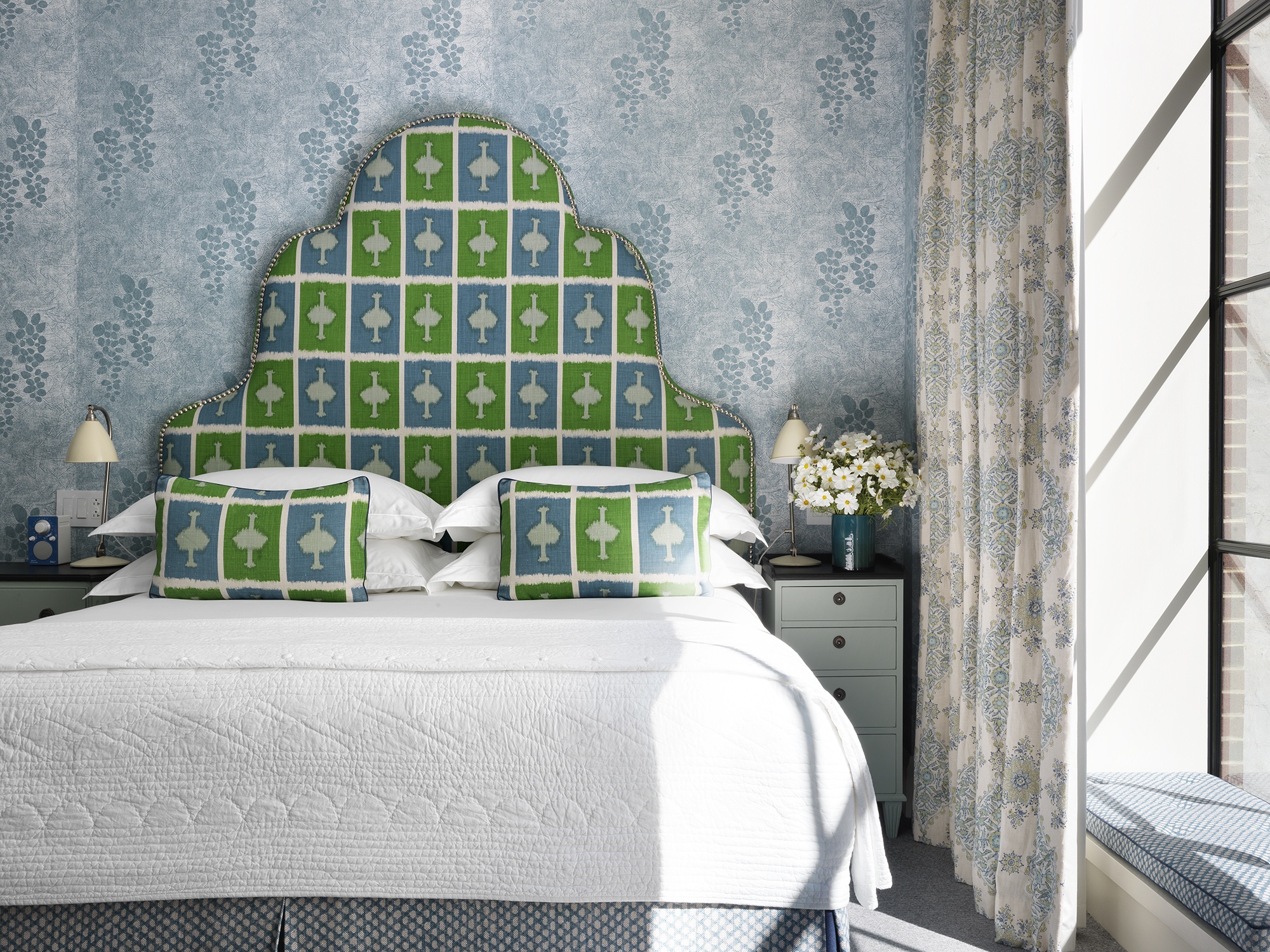
Room 108 at Number Sixteen is another example of balancing greens and blues to the same effect.
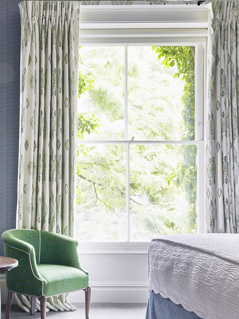
The curtains are my ‘Travelling Light’ fabric for Christopher Farr Cloth. This linen drapes beautifully and the white background looks fresh against the leafy view.
In room 304 at Crosby Street Hotel, we have used my ‘Ozone’ fabric for Christopher Farr Cloth in the green colourway with my ‘Mud Print’ design on the walls, to create a bright and airy scheme which feels like spring.
We are feeling inspired with the change of season and hope you are too!