Soulful Sage
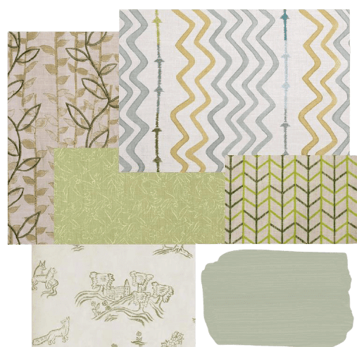
Day to DayIn recent years, a new neutral colour has been making its way into our interiors. It is not a white or a grey – but a soft shade of green. Sage! This week we are looking at our favourite sage schemes and talking about how you can use this serene and soulful colour in a number of different ways…
In recent years, a new neutral colour has been making its way into our interiors. It is not a white or a grey – but a soft shade of green. Sage!
Here at the Kit Kemp Design Studio we are really enjoying this colour tone. It has a restfulness about it with its muted, chalk-like finish. We love the subdued, slightly aged look – it offers more interest and personality than a traditional neutral like a taupe, grey or white.
This week we are looking at our favourite sage schemes and talking about how you can use this serene and soulful colour in a number of different ways…
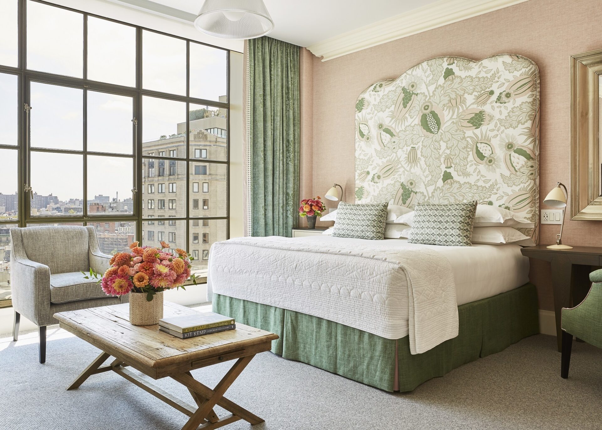
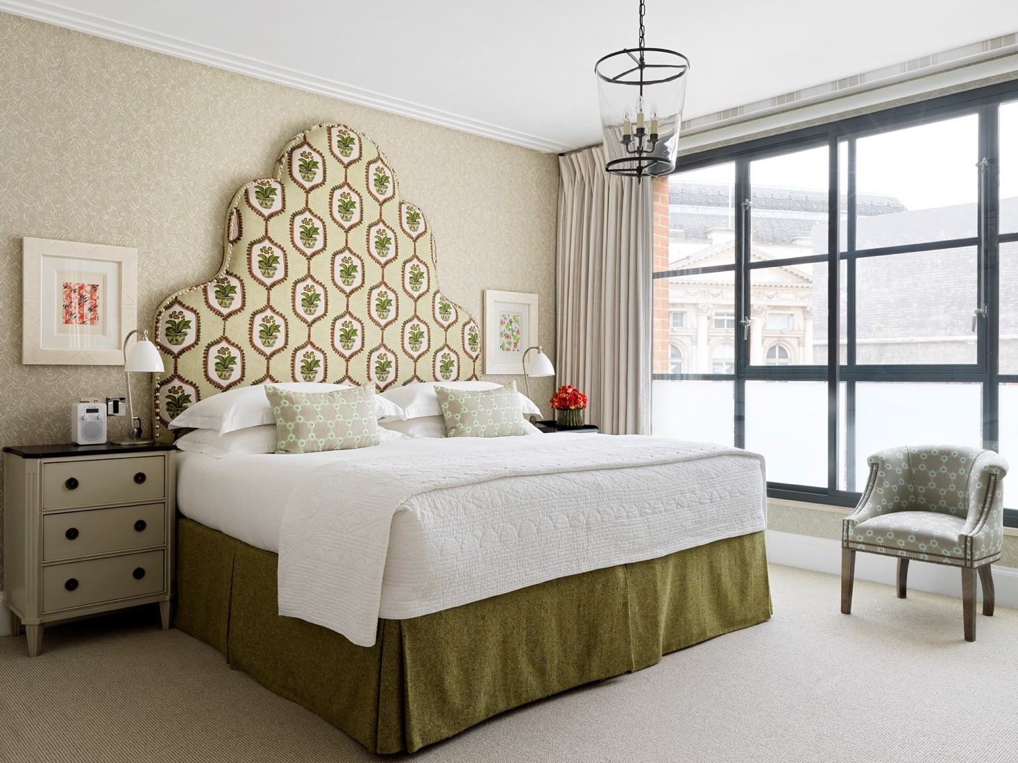
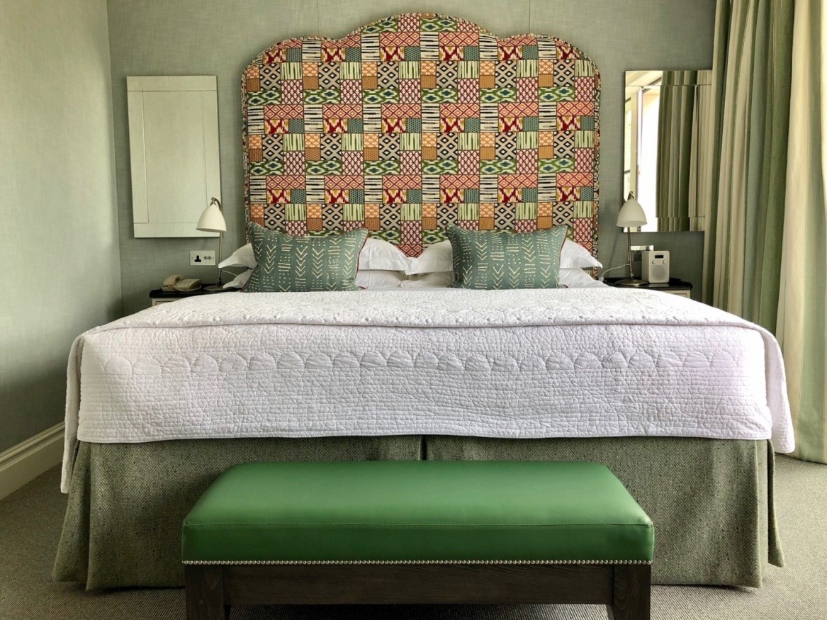
Here at Crosby Street Hotel in room 1001 we have chosen soft pastel tones to create a calm sanctuary. Our starting fabric was the headboard. It is an all time favourite of ours called Carnival by Christopher Farr Cloth. From here we drew in the sage green tones and pastel pinks for the rest of the scheme. It is a pairing that works wonderfully well together, creating a fresh and tranquil bedroom.
On the curtains we have used our Mud Print design which has a gorgeous textured depth. The bed cushions have been made up in a Penny Morrison fabric, which has a lovely small repeat. The plaster pinks and sage greens complement each other in such a beautiful way.
In this apartment at One Denman Place we have opted for a more subdued colour palette. This bedroom is kept restful with the soft chalky green hues mixed with neutral undertones. On the walls we have used Kit’s wallpaper design called Inside Out and paired this with an inspiring fabric by Tigger Hall on the headboard. The medallions combined with the curvaceous headboard shape create movement and add to the soft, romantic feel of the scheme.
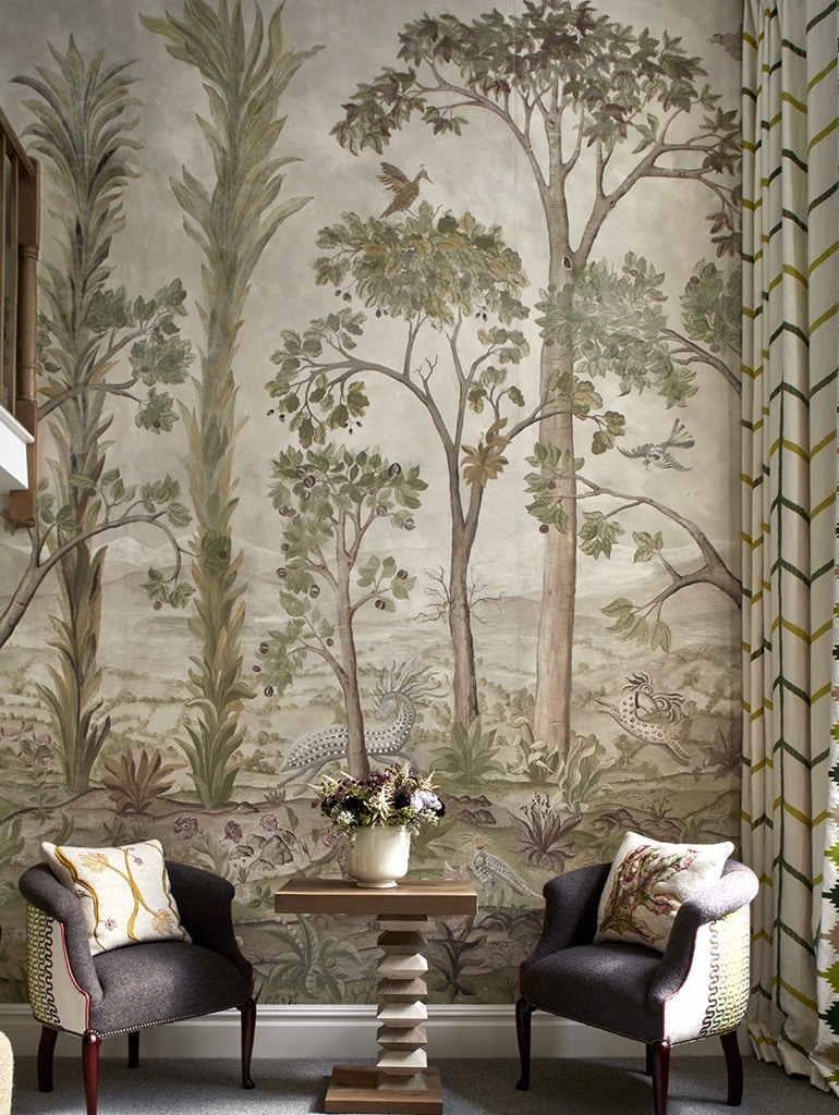
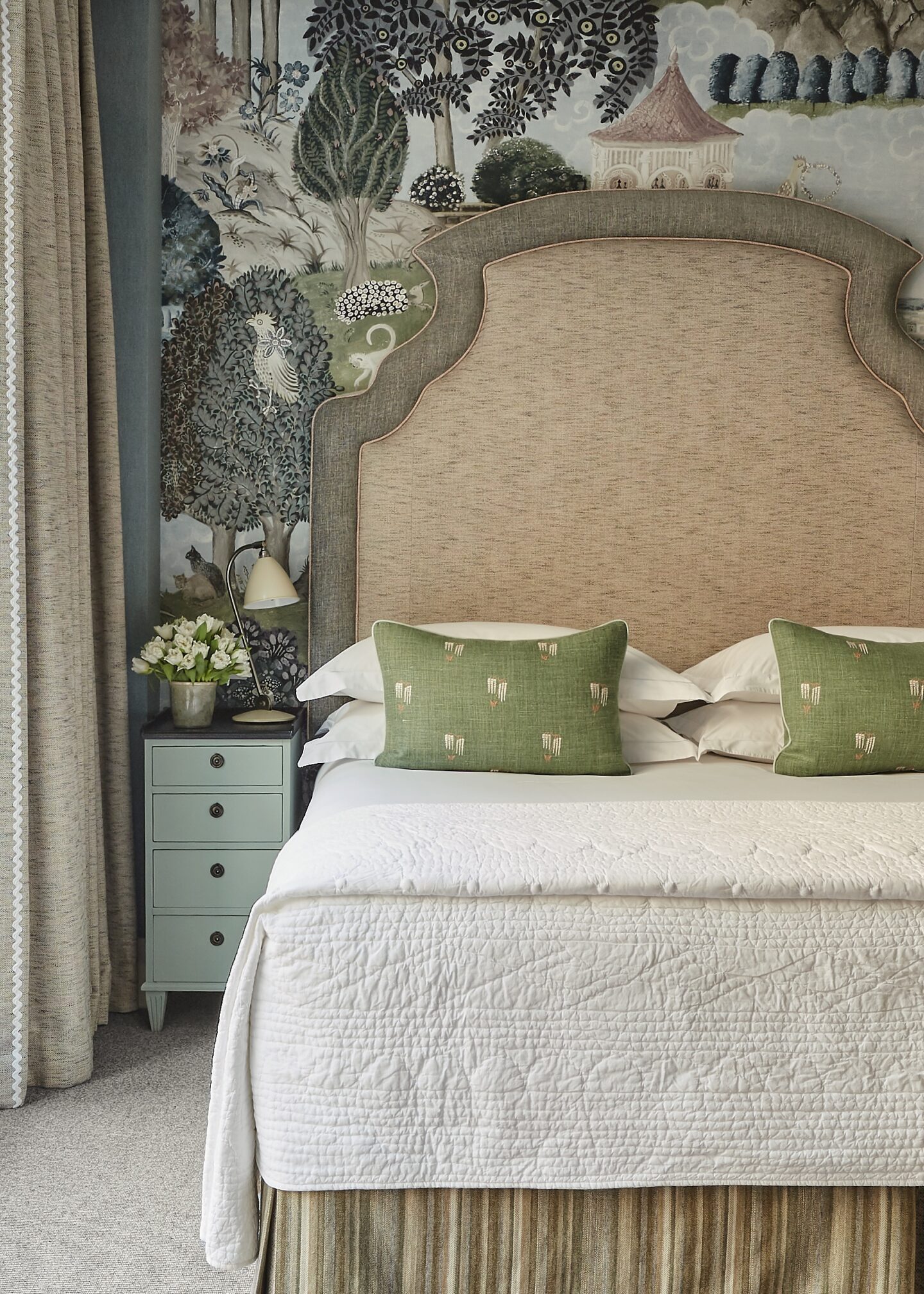
Charlotte Street Hotel is home to one of our most loved sage schemes. Tall Trees is a spectacular mural and was created in collaboration with our dear friend Melissa White. The wallpaper stretches up to four meters high and tells a unique story, transporting you to a special treetop view surrounded by birds, mythical creatures and rolling hills fading into the distance. The scale is large, but as the colours are de-saturated and chalky the scene comforts you rather than overwhelms. It sits back as a clever neutral yet provides our guests with a very special and immersive stay. Create your own enchanted forest with our Tall Trees wallpaper now available on Shop Kit Kemp.
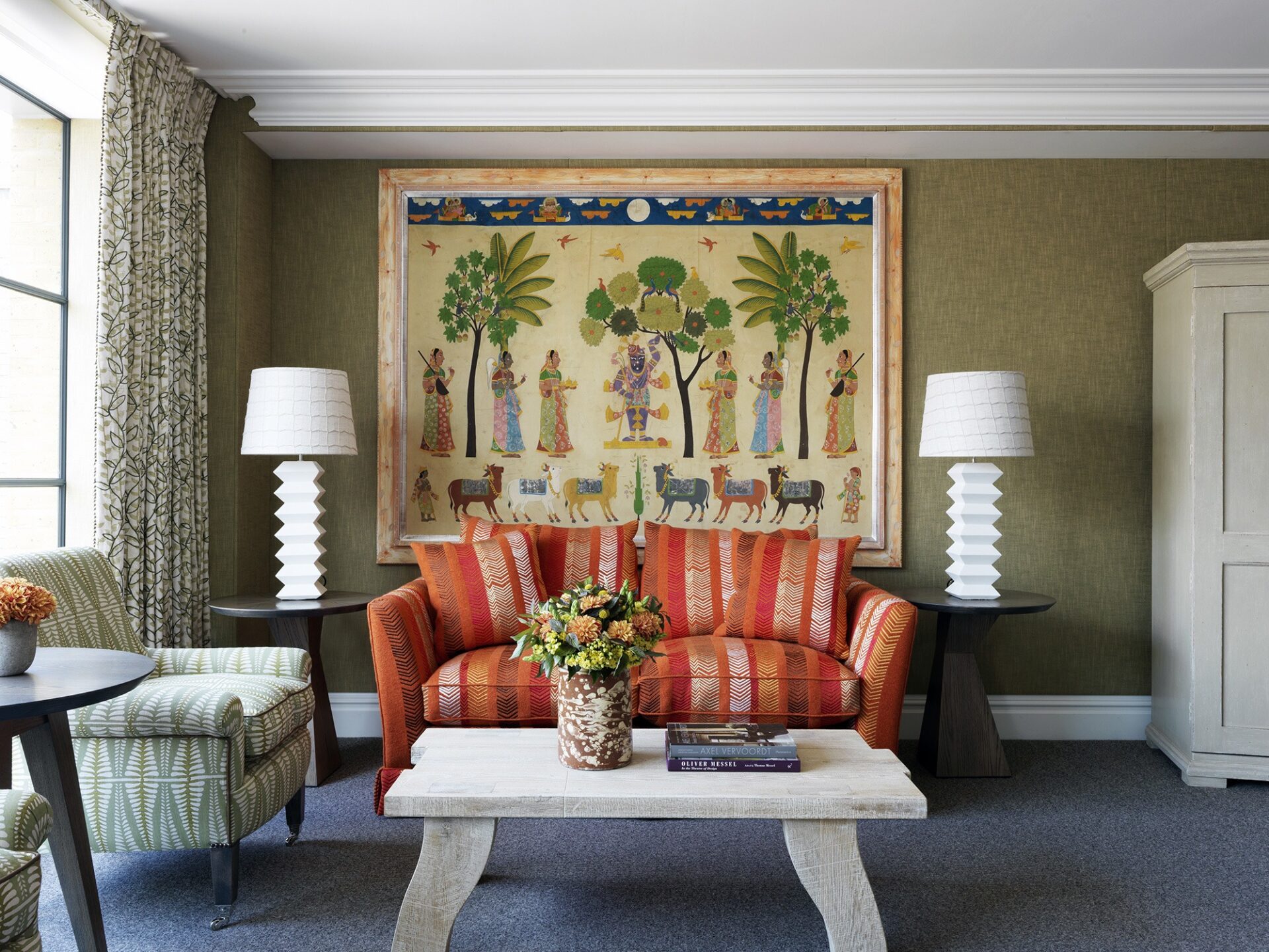
At Ham Yard Hotel we have upholstered the walls of this bedroom in a sage linen fabric which has a two tone texture within it. It sits back as a neutral and is the perfect backdrop for this punchy orange sofa, which has been covered in Kit Kemp’s Bookends fabric.
The windows have been dressed in another of Kit’s designs called Tea Leaf in the sage colourway. We love the faded antique look with the stronger stitch of vines running on top of the print. The sage tones in this room are a wonderful foundation to this rich, earthy scheme.
We thought we would end with something bright. In this bedroom at Ham Yard Hotel we have upholstered the walls in a chalky green linen which provides a timeless backdrop that is both subdued and romantic. The headboard has been upholstered in a contemporary fabric by G P and J Baker, which pops wonderfully against the linen on the walls.
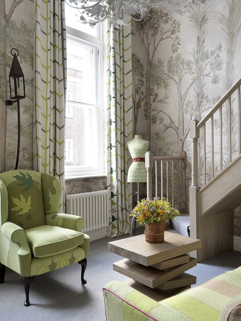
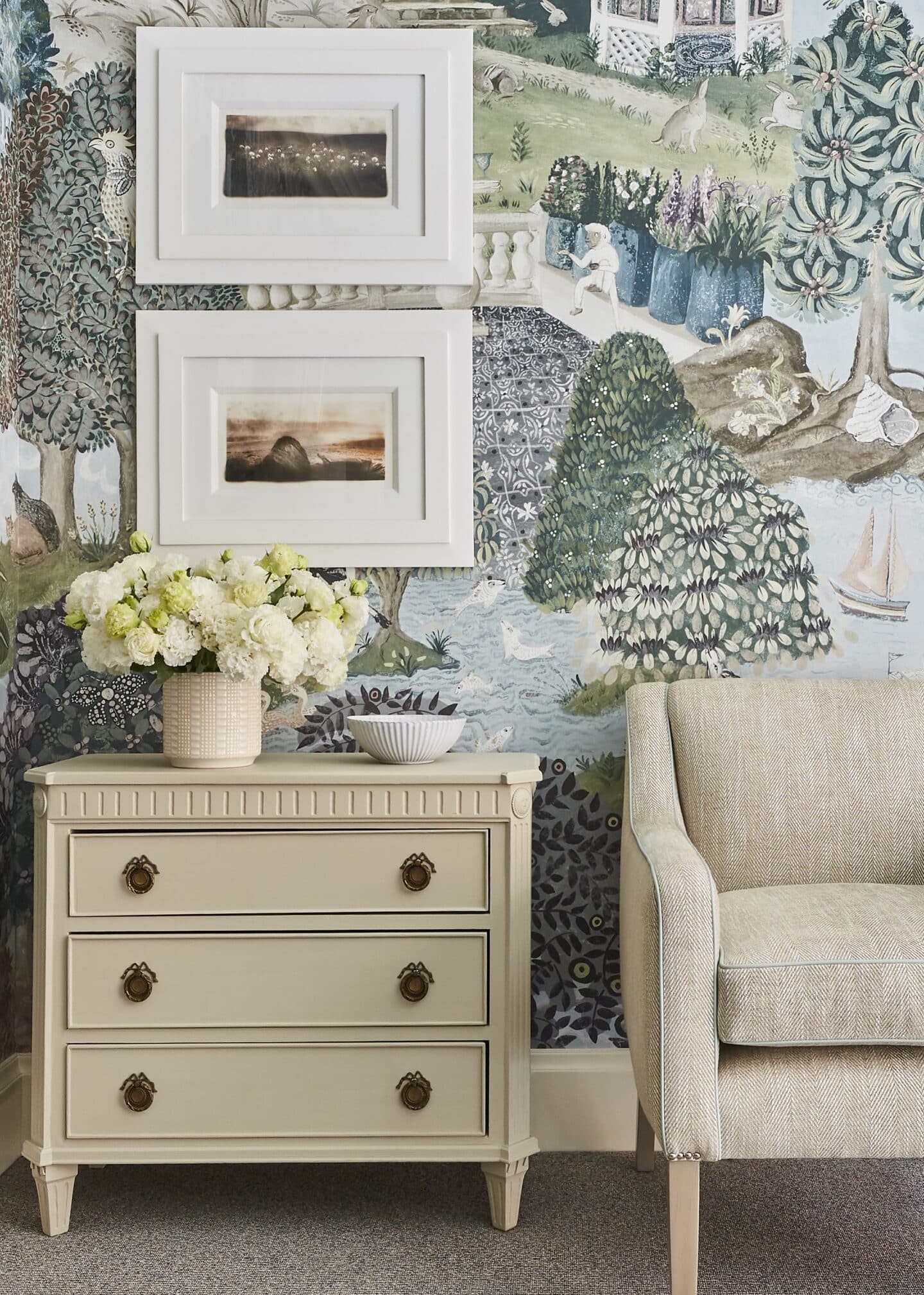
Back at Crosby Street Hotel, in room 207 our guests are transported into the magic of ‘Emily’s Garden’. Another fabulous wallpaper mural by Melissa White. The painterly story and soft tonal colour palette is paired with Kit’s delicate “Autumn Leaf” fabric, which sits subtly on the bed cushions and mannequin.
With such a detailed story on the walls, we knew that the rest of the room almost needed to fade away as you become lost in this fairy-tale world. We have used textured linens in dusty rose pinks and chalky blues and greens for the upholstery, which sit peacefully in front of the sage toned walling.
All in all, sage is such a versatile colour tone which can be used in so many ways. It is elegant, sophisticated and timeless. We absolutely love it and believe it is a much more interesting neutral than white or beige!

