Interiors breathe, live and change. A room should never feel like it has been decorated in one day. It should feel as though the room has evolved with a story, with several layers that have been added through time.
The best way to achieve this is by mixing the old and the new. Old pieces have a patina and add character and history, while new designs bring comfort and lightness.
In the entrance of Haymarket Hotel, the white walls create a powerful contrast against the 22 foot long art work of tiny stones by Sue Lawty, who was an Artist in Residence at the V&A. The fluid steel sculpture by Tony Cragg looks contemporary against the ornate Louis XVI inspired furniture and wing chair. The solid block blue and yellow colours on the antique sofa add a modern twist. It is fun to play with scale and balance.
Ham Yard Hotel is a new build that we created from the ground up in the heart of the London’s Soho. Light floods through the floor to ceiling Crittal windows in the hotel’s entrance. We added a limestone antique fireplace as central piece, flanked by two wing chairs covered in a modern design to make the modern space feel warm and comfortable.
The same can be done in the opposite way; by introducing a contemporary piece in a room filled with antiques to create a pop. In the library at Haymarket hotel, the playful combination of more traditional fabrics works perfectly with the abstract painting by Sandra Blow, inspired by ripples made by water on sand.
In the Drawing Room at The Whitby Hotel in New York, the eclectic embroidered walling by Casamance adds dynamism to the walls. The antique console and mirror steals the show and adds character to this new building.
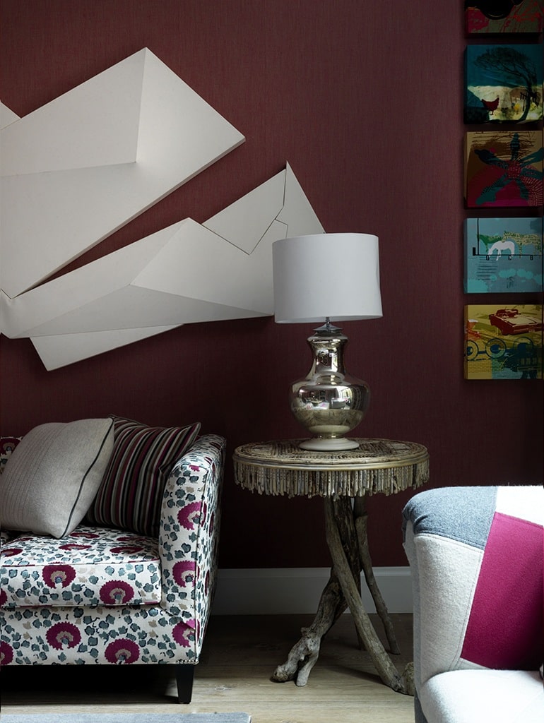
At Crosby Street Hotel a striking modern contrast is created with this cartoonish ‘Kapow’ shaped canvas wall sculpture in the drawing room. The white artwork pops against a solid darker backdrop. On the opposite wall, a traditional fireplace adds another layer of time to this scheme.
The Knightsbridge Hotel is an old building full of character and architectural mouldings. A simple yet traditional bookcase showcasing old books and art sits behind an illuminated contemporary ladder.
In the Terrace Suite at The Soho Hotel, the Crittal windows and doors contrast with the antique corner bookcase, complemented by simple cream curtains. The found leopards add an unexpected pop of whimsy to the room.
The key to creating an interesting space with depth is to mix the old and new. This is how we design a beautiful space which tells a story.


