Subtle Juxtapositions: Suite 1202 at The Whitby Hotel
Sleeping AroundOne of our favourite suites at The Whitby Hotel has to be Suite 1202. With its wrap around balcony and a double aspect seating area to enjoy the morning and the afternoon sun, it's truly a special space to relax privately or entertain in...
One of our favourite suites at The Whitby Hotel has to be Suite 1202. With its wrap around balcony and a double aspect seating area to enjoy the morning and the afternoon sun, it’s truly a special space to relax privately or entertain in.
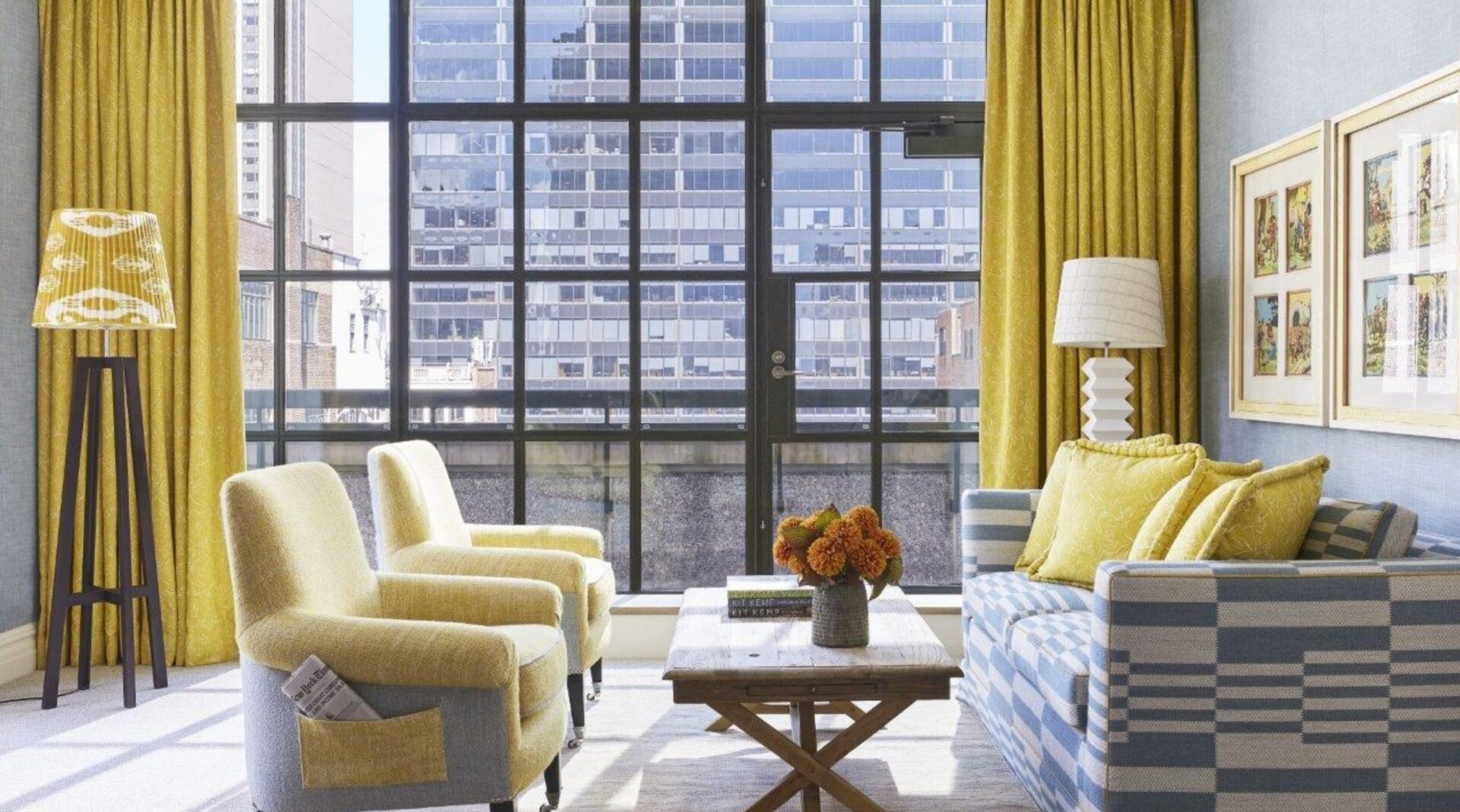
When we know a space will be multifunctional, we like to add subtle juxtapositions to the details of our design. We designed the suite with vibrant and happy colours that evoke both a sense of calm and a playful atmosphere.
My first instinct was to bring together sophisticated shapes with happy colours. I used a cheerful fabric, my ‘Friendly Folk’ design for Andrew Martin in yellow on this regal and elegant statement headboard, to make it feel less serious.
In the drawing room, we created two zones – one for dining and the other with more casual seating for relaxing or reading the papers. We added a little newspaper pocket to the two Leo armchairs.
The dining area is alive with texture. We used a fabulous marble dining table, over which we hung a cluster of my favourite beaded Kirdi lights, a joyful little juxtaposition that makes the space more curious and intriguing.
The same fabric is used on the curtains. This tone of yellow is so clever; it’s cooling on a hot summer’s day but happy and warm when it’s cold. We have a lot of light in this suite, which dances with the yellow to lift your spirits. Fun little details like the zig zag trim on the leading edge are always an essential element to bring a room to life. The soft blue wall fabric matches perfectly with the grey blue illustrations on the ‘Friendly Folk’ design.
I played into the bucolic feel of my ‘Friendly Folk’ fabric with the pair of leaf wall sconces and the oak leg console table that sits below them. They are at once sculptural and playful; another little collation of opposites.
Behind the console and sconces, we installed a foxed mirror wall to extend the space beyond the confines of the room. By reflecting the room it creates a more open space, but its mottled and antique look isn’t too stark or overbearing. It feels cosy and fresh.
The happy yellow hues are punctuated throughout the space in both the fabrics and the room’s embellishments, from the beaded artwork that sits between the two wall sconces to the ikat shade and the details on the frames for the vintage cartoons.
This suite is both indoor and outdoor, private and social. It has the capacity to take on many different moods; it is a chameleon in that way. Through carefully thought out details, this suite is able to wear many hats.


