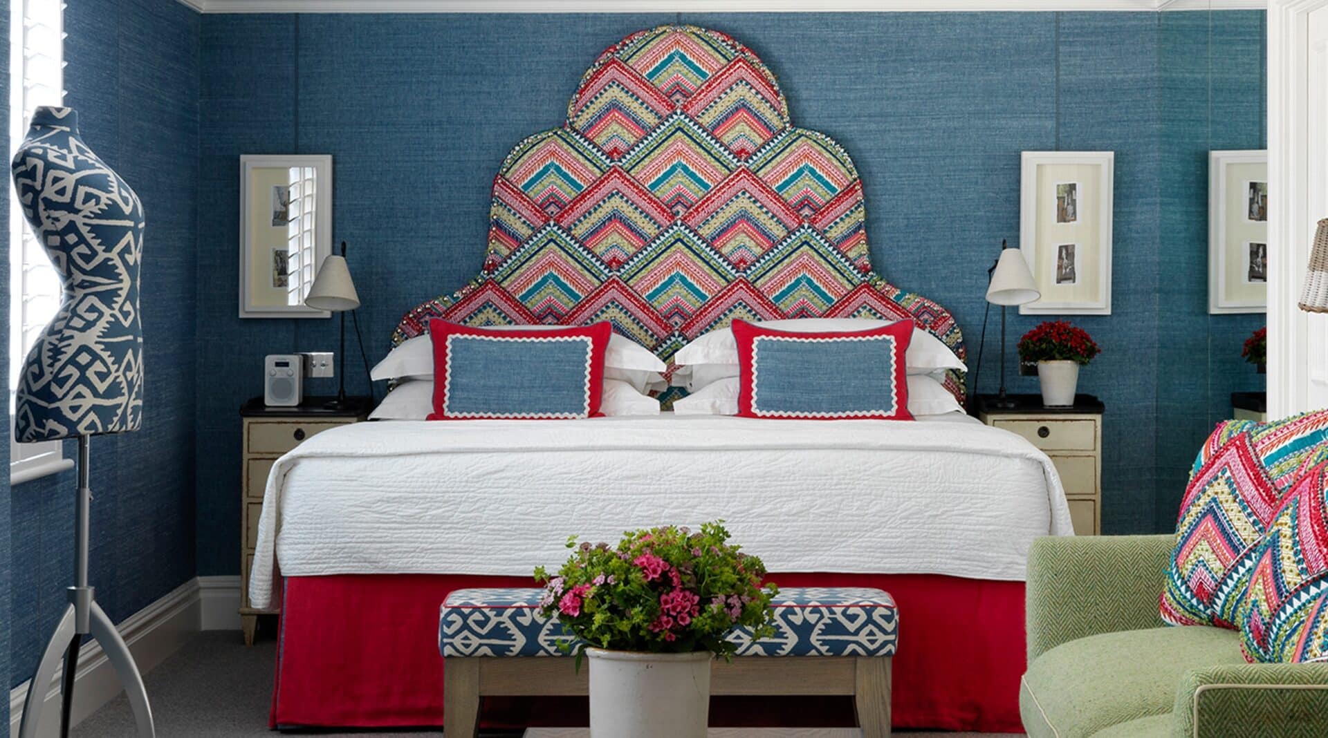
In Room 204 at Knightsbridge Hotel, we have used a variety of design tricks to make this space look both larger and more comfortable.
The long and narrow proportions of this room make the layout challenging: with the wrong set-up, the eye gets lost. By adding a mirrored wall beside the bed, we have been able to double both the light and sense of space. We did not use curtains in this room because we felt it would accentuate the narrow dimensions. Instead we used wide louvered shutters.
The warm and lively colours are concentrated in the sleeping area, making the bed look inviting. On the headboard, we used the embroidered Pierre Frey ‘Santa Rosa’ design. A range of manual and mechanical techniques have been used for the embroidery of this fabric. The multi-coloured weaves reminds us of the Argentinian haciendas.
At the opposite end of the room are the breakfast and work areas, which evoke a sense of a smart South Kensington studio. In this space, we have put the emphasis on playing with different materials and textures – rather than with different patterns.
To make the room feel more spacious, we have used a blue linen by Jim Thompson on the walls to “cool” the space. Instead of looking for a high contrast, we have used one of our favourite fabrics by Tissus d’Helene: a classic wool Herringbone in a fresh lime colour on the sofa.
Contrasting white leather piping throughout the room adds definition to the sofa and chairs, while the different timber finishes on the coffee table, hand-painted side table and lamps add textural layers which make the room interesting and bespoke.


