
It’s no secret that we thrive on colours. Whilst some of our schemes accent just a few tones, there are times when we dare to be bold and bring together a full spectrum of colour. Here are some examples of where we’ve incorporated all colours of the rainbow as well as some tips on how to do so without ‘overwhelming’ your scheme.
Nothing celebrates colour better than The Kit Kemp Collection for Annie Selke. We’re excited about its upcoming debut and we’ve already been working pieces into our schemes. We love how striking these rugs look from the new collection here in the Terrace Suite at Ham Yard Hotel. We can’t wait to share the full collection with you soon!

Room 410 at Crosby Street Hotel is undoubtedly cheerful, with a multi-coloured fabric used for the cushions and furniture. Its graphic weaves range from turquoise to hot pink in repetitive patterns. These textiles set the stage with a kaleidoscopic effect and we love the sense of playfulness this evokes.


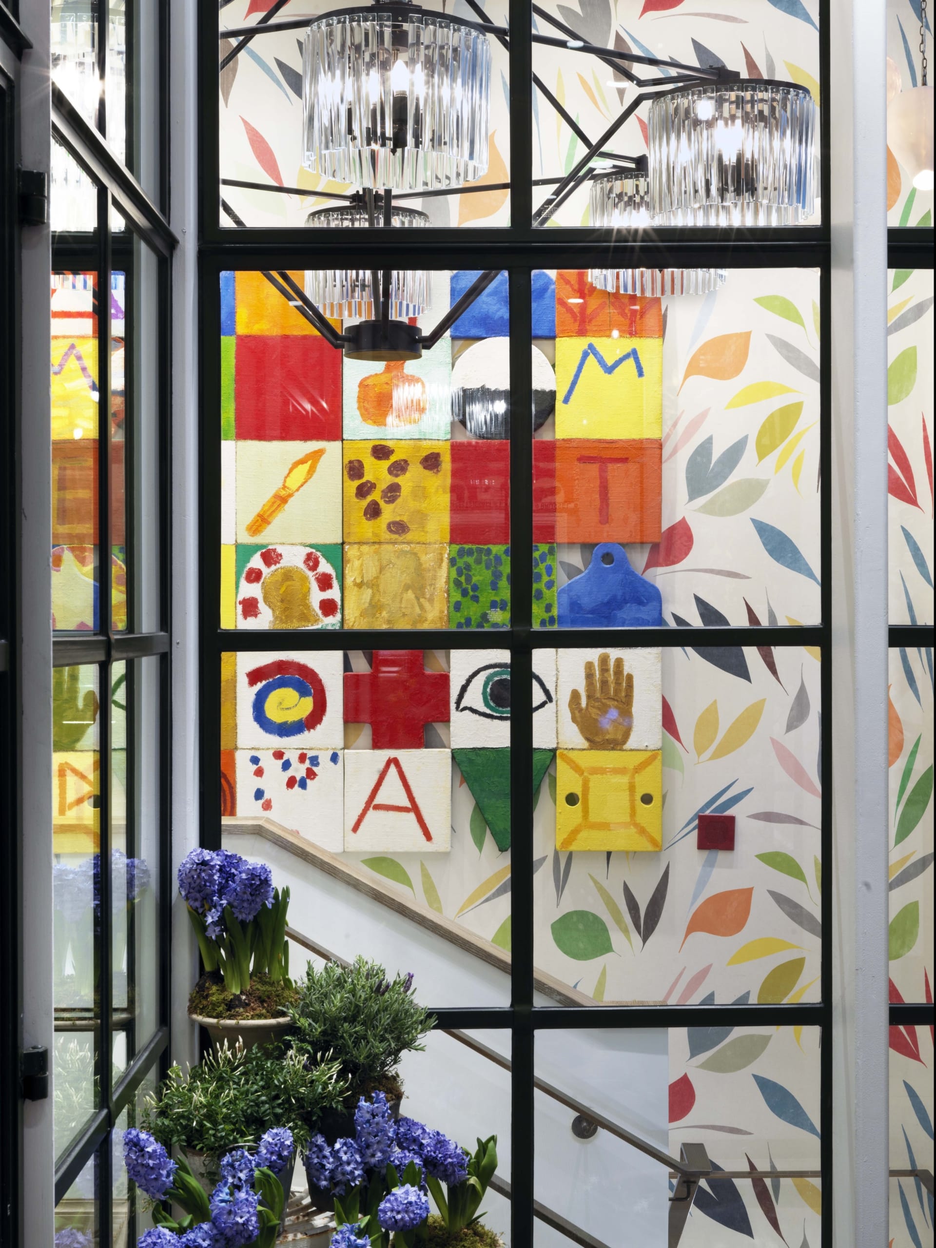
Through loft-style windows, a joyful wallpaper leads you downstairs, whilst artwork from Joe Tilson jumps forth and brings all colours of the rainbow into a small space. Plain white walls in the background lend a sense of ease and allows us to absorb and enjoy this concentrated area of colour.
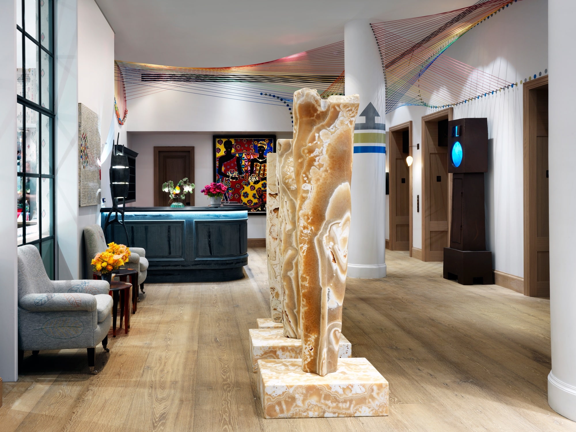
In The Whitby Hotel’s lobby, artist Hermione Skye’s loom weave lifts the eye to new heights, spreading glorious threads of colour across the ceiling.
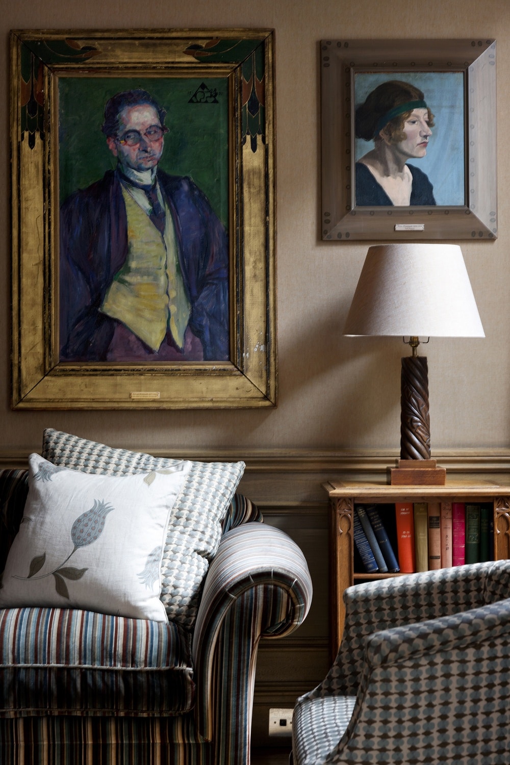
The Drawing Room at Charlotte Street Hotel pays homage to the Bloomsbury Group and their legacy. The multi-coloured fabrics and deeply hued artworks have a dynamic relationship and create a sense of excitement without compromising the room’s sophistication.
We hope this exploration encourages you to embrace and introduce the many colours of the rainbow into your schemes.