Never underestimate the power of the cushion. They are key for adding that little extra contrast, pattern, texture and softness to a space, as well as a tool for tying a scheme together and creating balance within a room.
They may be small but they are oh so mighty. Here are a few of our dos and don’ts for picking out the perfect cushion for your home…
Do think about balance…
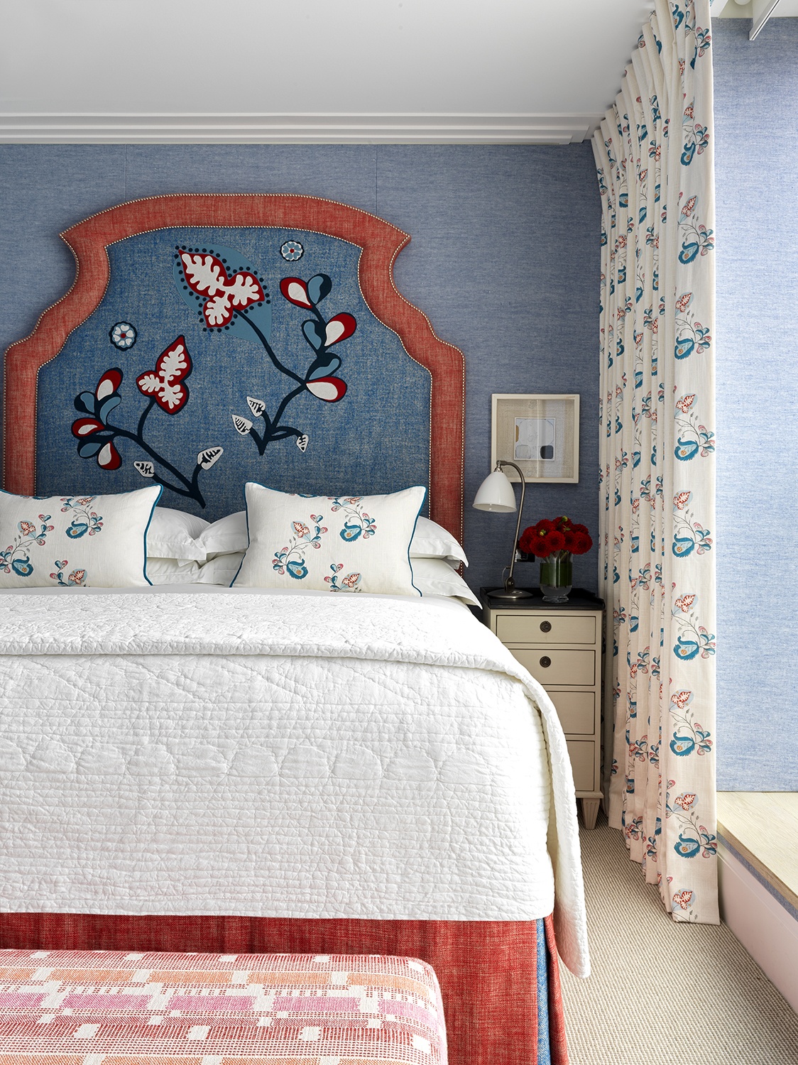
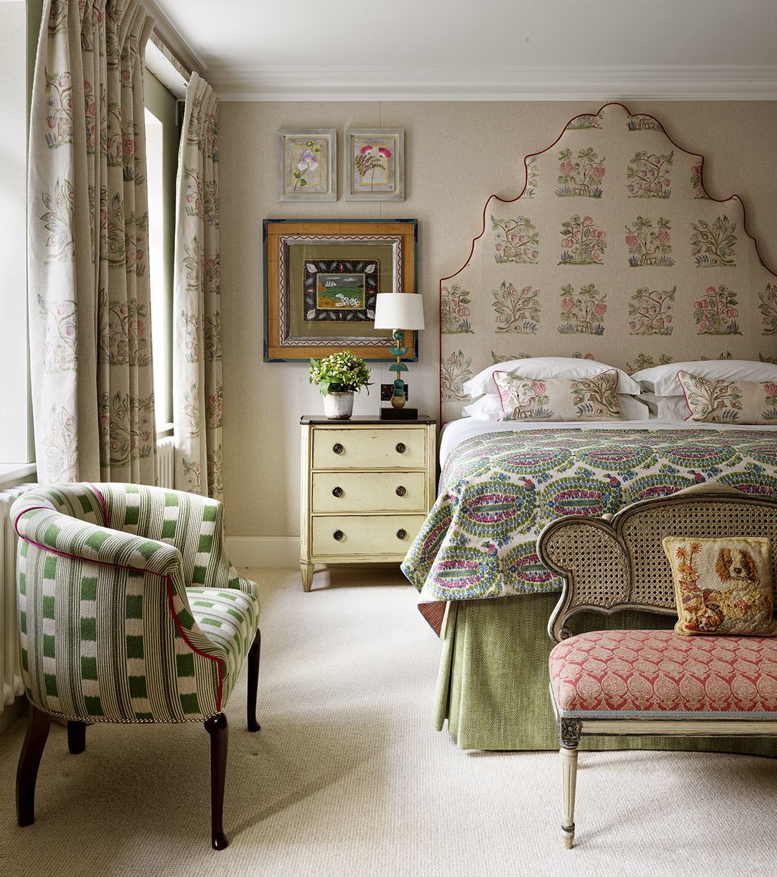
Here in Apartment 22 at One Denman Place, my ‘Psycho Sprig’ fabric has been used on the curtains and bed cushions. Windows often require the largest metreage of fabric and are typically on the same wall or corner of a room. By reintroducing the same fabric either on a sofa or a bed cushion, you’re able to pull the pattern into the centre of the space, ensuring overall balance.
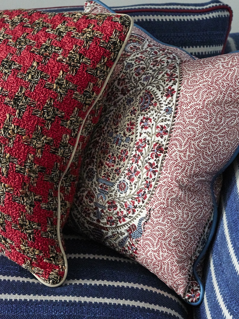
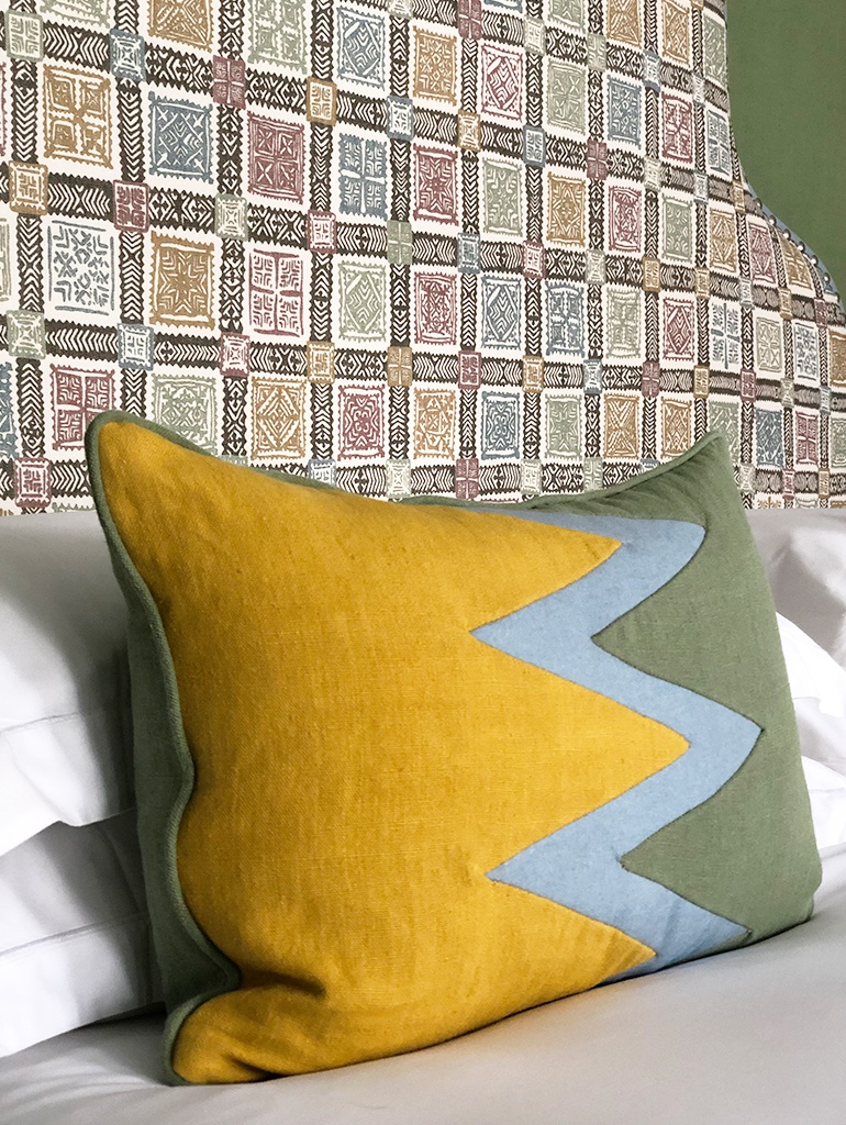
In this room at the recently reopened Charlotte Street Hotel, we have created our own cushion design using a combination of two fabrics and a braid to separate the two. We love this little trick as it allows us to create something totally unique and striking, achieving a design which is simple yet bold in equal measure.
Don’t forget to frame…
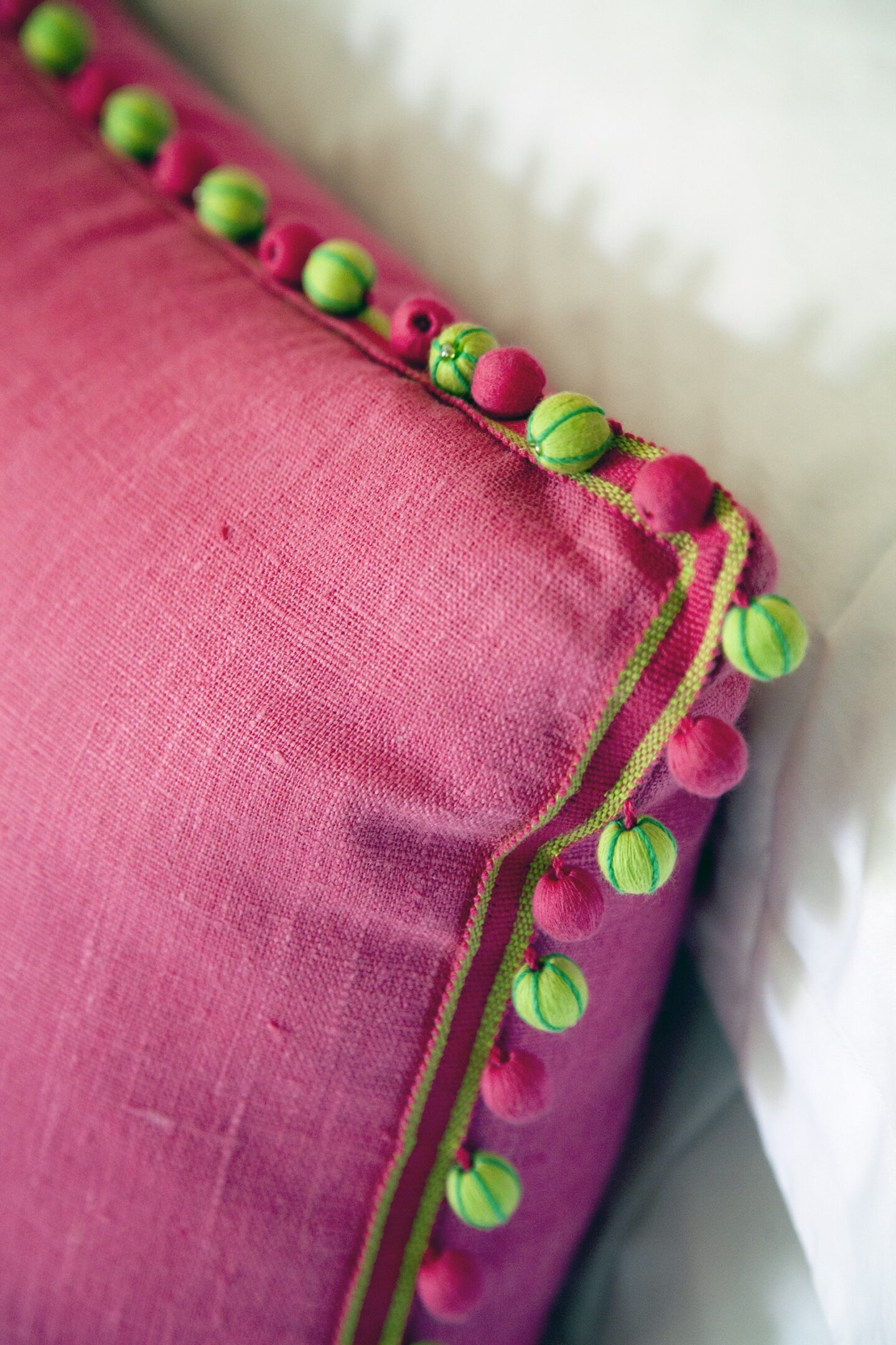
Frame a cushion as you would a painting. The edge of a cushion can be finished with a pipe, fringe or braid and this is a go to design detail for us at the Kit Kemp Design Studio. We love to use this extra detail to add colour, texture and to make a cushion really stand out in a scheme.
Do throw in a wild card…
I love to collect fabric and textile fragments on my travels and often have them made up into cushions for the spaces we design. It is the unexpected details that catch your eye, so what better way to add interest to a space than to create something completely bespoke.
Do think outside the box to create something totally unique…
See our Design Threads post to learn how to create your own bespoke applique cushion, featuring a step by step guide.
Don’t forget that less is sometimes more…
If in doubt, keep it simple as we’ve done here in Apartment 14 at One Denman Place. However, it is important to mention that the success of these cushions is due to the large and bold print on the walls behind. The neutral cushions here allow us to focus our attention on the walling and artwork and prevent the scheme from feeling overworked or too busy.
We also love to be creative with plains as we’ve done here with this zig zag design using three colours picked out from Lewis & Wood fabric on the headboard.
Don’t shy away from print or pattern…
We know that for some, working with large scale prints and bold patterns can often feel intimidating. A cushion is the perfect place to start to build confidence and will instantly liven up a space.
Why not try one of our Hedgerow cushions at home, from my collection with Andrew Martin, now available on Shop Kit Kemp.
Do think about contrast…
Here, our ‘Wee Beasties’ cushion from my embroidered collection with Chelsea Textiles, creates an interesting juxtaposition positioned on this one-off brutalist chair. Do be brave and surprise the eye.
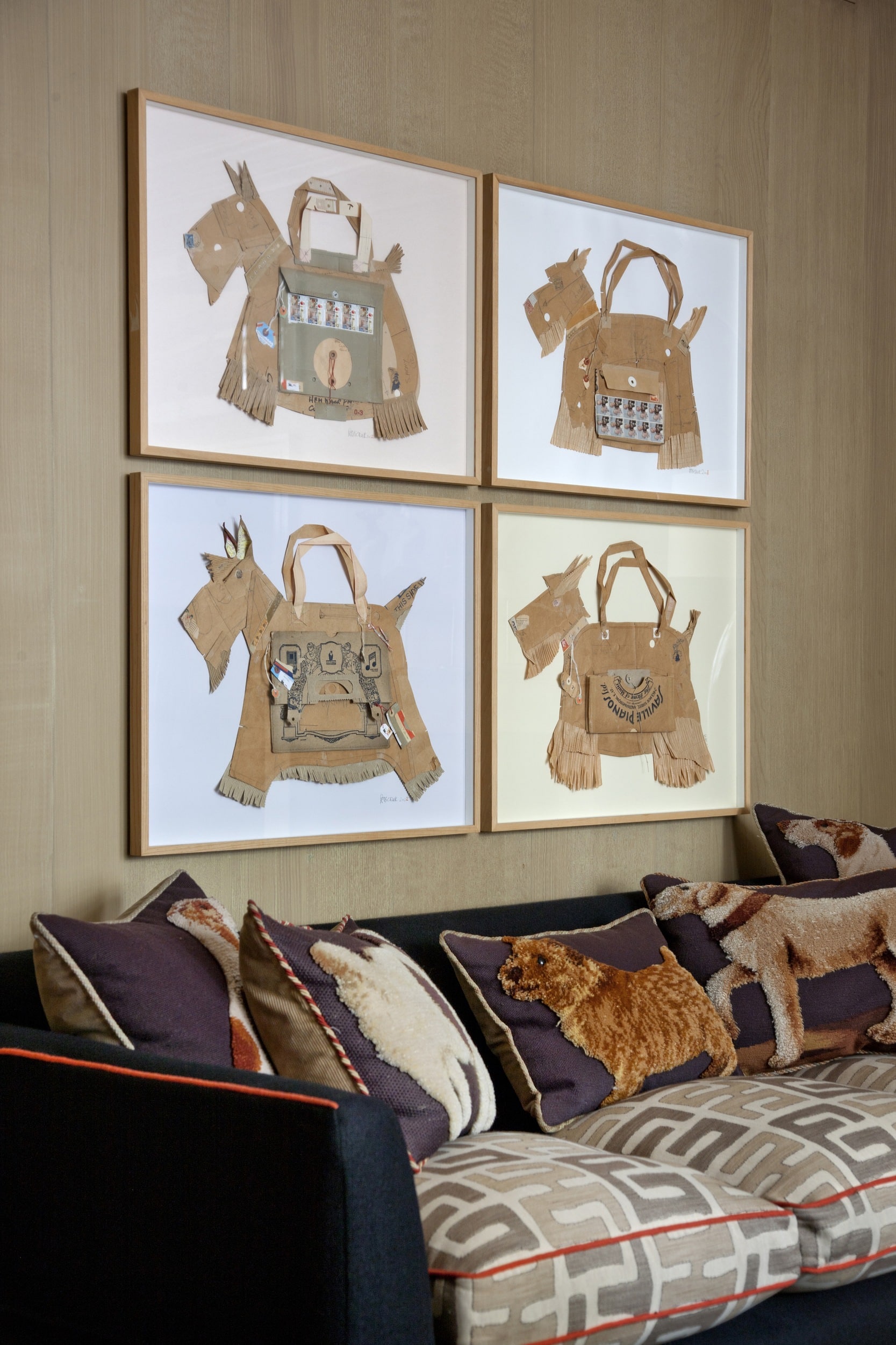
Don’t think you can have too many Doggie cushions…
Cuddling up to our Peter Clark Collages, we have a collection of Doggie cushions in the Drawing Room at our Knightsbridge Hotel.
Do think about scale…
This ‘Hearts of Oak’ Cushion works in perfect unison with this elaborately carved chair. Do think of the size of the cushion to fit the size of the chair.
