
376 Olympic athletes recently touched down on British soil carrying a marvellous 65 medals between them – what an impressive display of sportsmanship, comradery and achievement the 2021 Olympic Games brought us! Now we’re out of the starting blocks once again as the Paralympic Games have begun, with yet another extraordinary display of athleticism.
As the flags of the participating nations were displayed in the parade during this week’s opening ceremony, we got to thinking about the magnificent red, white and blue that bears significance not only for our beloved Union Jack, but for 29 other flags from around the world that wave the same colours. The anonymous quote “My patriotic heart beats red, white and blue” was very befitting of the moment, as a sea of colour washed over the Olympic Stadium in Tokyo for the second time this summer.

As we have hotels on both sides of the pond with nations that proudly wear these colours, we thought there would be no better time to showcase how we use red, white and blue in some of our schemes.
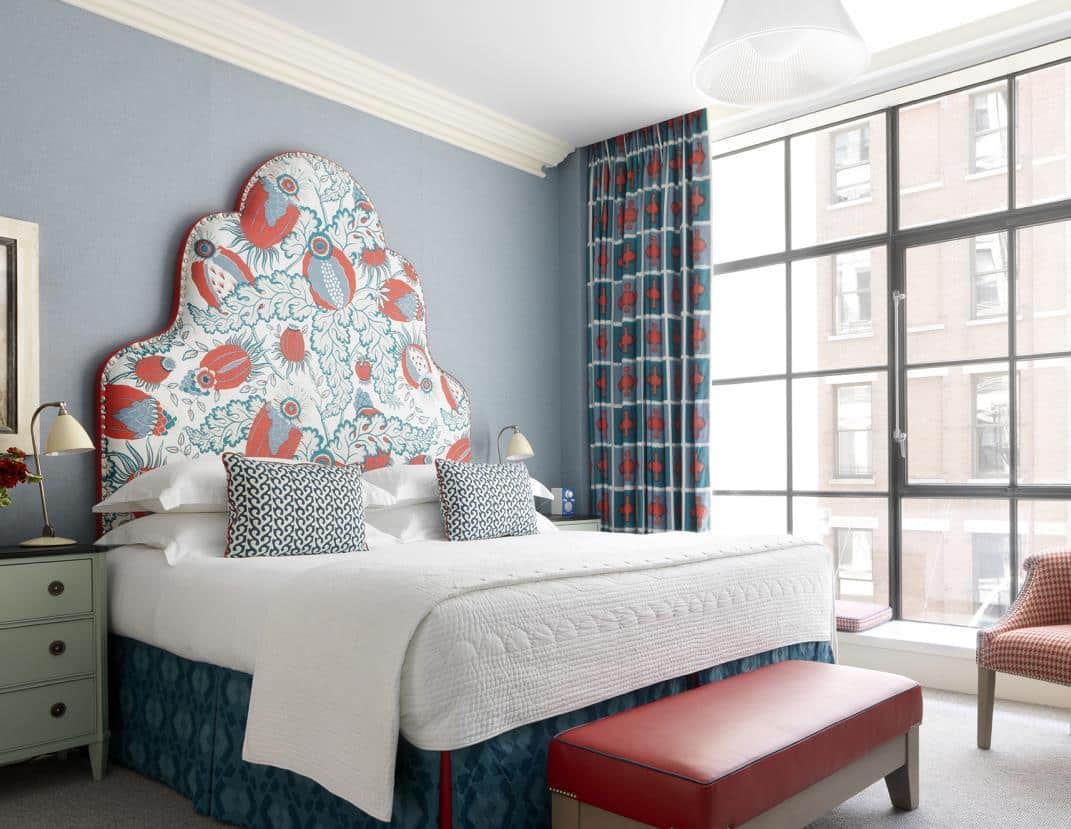
In room 405 at Charlotte Street Hotel, we have an array of fabrics making up a medley of red, white and blue. Fun and full of character, we love the “Garden Party Tomato Vine” fabric that adorns the headboard, which is contrasted against an iris coloured Abbot & Boyd valance with red kick pleats. Our staple white bed linen (available on Shop Kit Kemp) with its clean lines and fresh feel completes this patriotic play on colours.


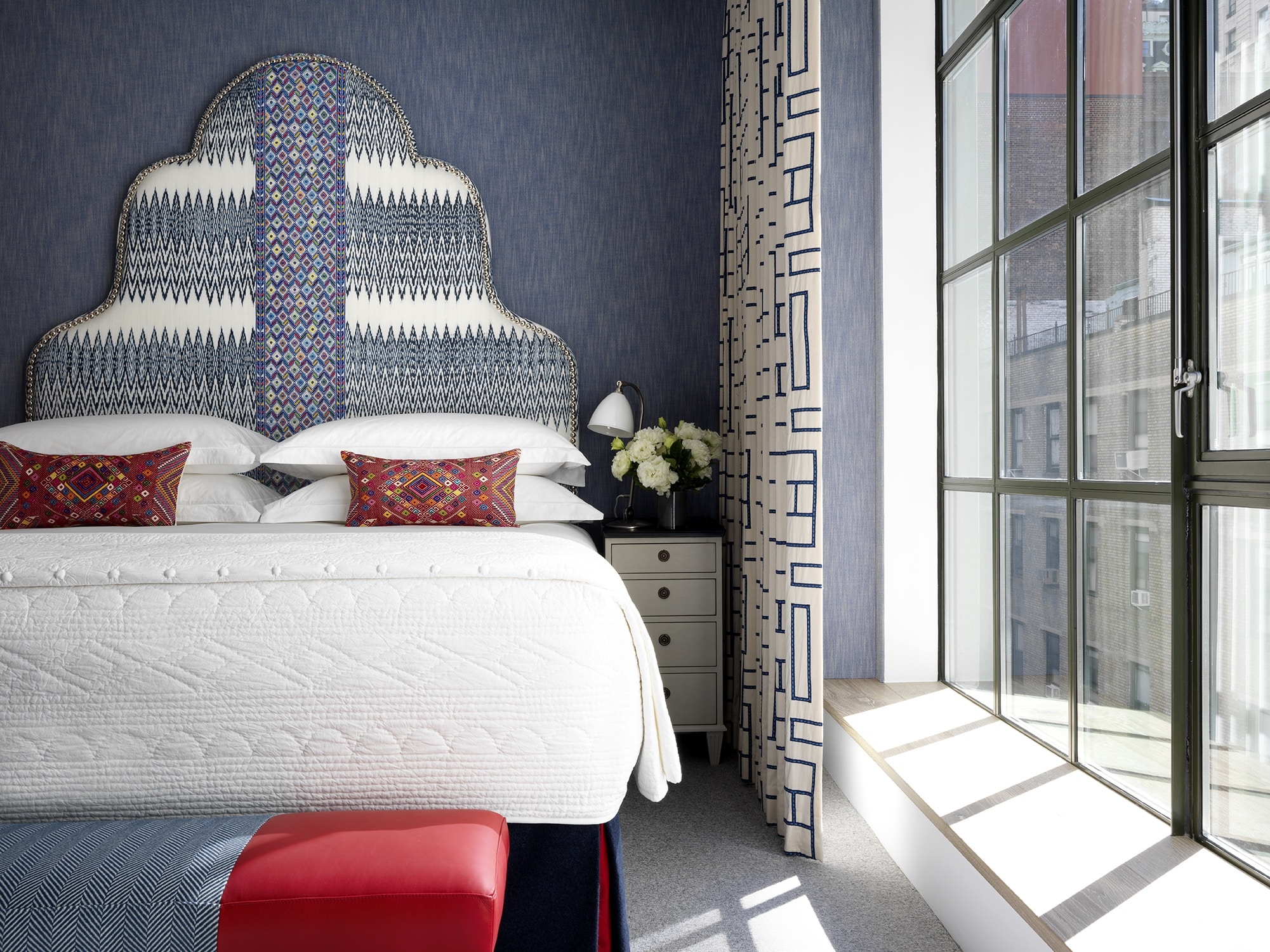
Across the Atlantic and in upper-midtown New York, you’ll find room 807 at The Whitby Hotel. We stretched the walls of this room in Romo’s “Blue Rumba” and covered the headboard in a lively blue and white Ikat weave with a central panel by A Rum Fellow. Our end of bed stool has been upholstered in a cherry red leather and a wide herringbone blue, with the nickel studs catching the light and acting as a sparkling white accent. Some might even say it is reminiscent of The Star-Spangled Banner.
Bennison’s “Aztec” linen is a clever little fabric, offering a burst of colour whilst allowing other designs to breathe and have a moment of their own.
We have used the red, white and blue colourway on the headboard and paired its geometric repeat with the softer movement of John Robshaw’s “Ginger Coral” design on the bed cushions. The latter third of the cushions have been accented in a juicy red which is echoed on the end of bed stool. The two reading chairs, upholstered in my “Bookends” fabric in the denim colourway, marry the scheme together.
Moving down to SoHo, Crosby Street Hotel’s room 301 is home to a patriot riot led by Christopher Farr Cloth’s “Carnival” in coral. This large scale repeat acts almost as an inverse colourway to my “Ozone” fabric used on the curtains.
When using two very lively designs that each have a life of their own, it is important to offer them a common ground that will hold the scheme together. We have used a calm expanse of sky blue on the walls to help unify these two fabrics and create a winning combination.


The next time you visit one of our hotels, before you enter the front door, look up. You’ll see our old friend, the Union Jack, softly waving in the wind. We hope you’ll think of this post and be inspired to use the fiery strength of red, the calm determination of blue and brilliance of white to help you cross the finish line.
I suppose it is time to let the cat out of the bag and tell you why we love these three colourful soulmates. Applying colour to a design project has a lot to do with balance. The more colours you use, the harder that is to achieve. You will find you get better results if you stick to a maximum of three primary colours.

