
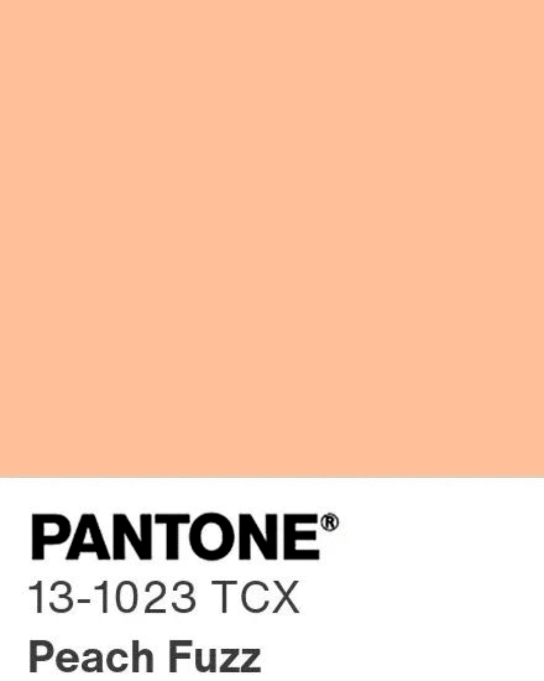
Pantone’s Colour of the Year, Peach Fuzz (13-1023), is a velvety, gentle peach tone. Described as a colour that resonates with warmth and modern elegance, effortlessly bridging the youthful with the timeless. Join us as we explore how to incorporate peach tones in your designs.

We love using peach walls at our hotels. Its subtle, yet inviting quality brings the room to life. It offers a light contrast to textured surfaces like stone and marble, while adding life to natural materials such as oak and wood. In The Orangery at The Whitby Hotel, we have used a peach soft terracotta colour by Farrow and Ball. It creates a solid background for our antique plates, displayed in Perspex boxes.
In the Drawing Room at Dorset Square Hotel, we’ve incorporated elegant peach-toned walls, complementing it with various peachy tones and hues to enhance the warmth of the environment.


Peach proves to be a delightful accent colour, seamlessly balancing other hues and infusing warmth into cooler tones. In the kitchens shown below, we’ve opted for a peachy paint colour for the lower cabinets. This unexpected touch of colour brings a playful and vibrant element to the room.


In Suite 704 at The Whitby Hotel, where blue hues take centre stage, we’ve introduced pops of corals and peach to balance out the cool tones. The appliqué leaves on the wing chair provided a playful opportunity to incorporate shades of peach, adding a touch of romantic softness to the overall colour scheme.


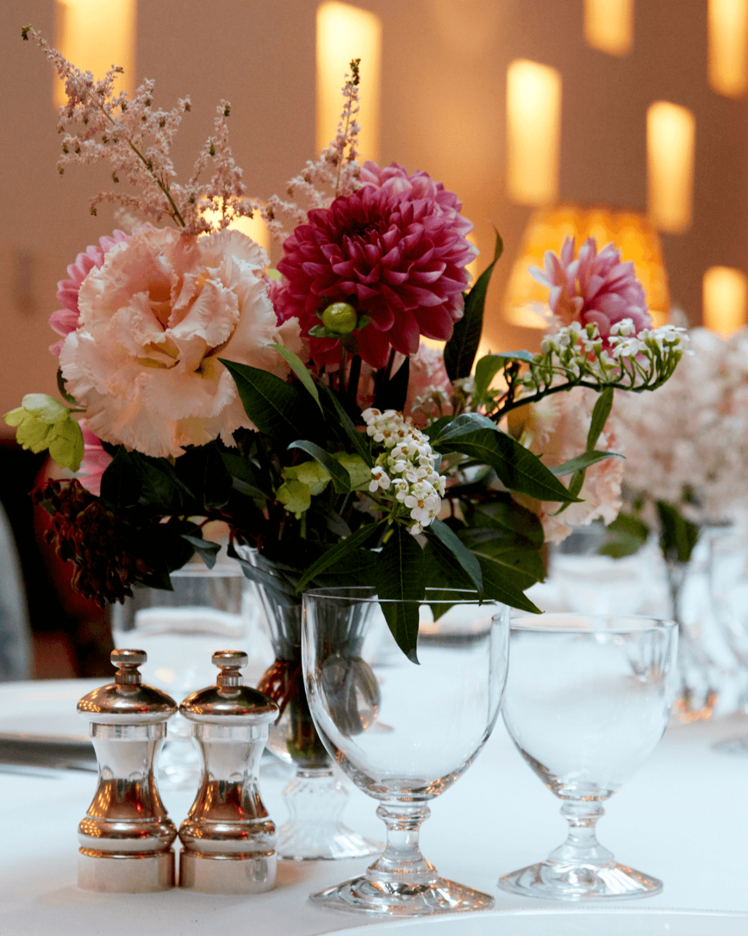
Of course, a soft peachy flower is always a perfect complement to any room and is the cherry on top to making a space feel complete.

We hope we have inspired you to get creative and use the colour ‘peach fuzz’ in your designs. Don’t be afraid to mix and match this colour to bring added warmth into your home.