Pantone is known worldwide as one of the key platforms that allow designers or creators to determine and communicate colours, from inspiration to realisation.
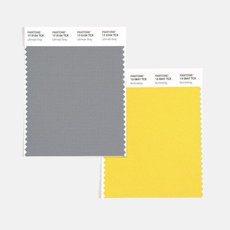
Every year, Pantone defines the ‘colour of the year’ through a very careful and thoughtful process based on trend analysis and colour influences. Unlike previous years, Pantone has chosen two colours to define the colour of 2021 – PANTONE 17-5104 Ultimate Grey + PANTONE 13-0647 Illuminating.
This combination represents “two independent colours that highlight how different elements come together to support one another. It is a story of colour that encapsulates deeper feelings of thoughtfulness with the promise of something sunny and friendly”.
As a tribute, we will highlight some of our fabrics that combine these colours as well as revisiting schemes which celebrate this combination.
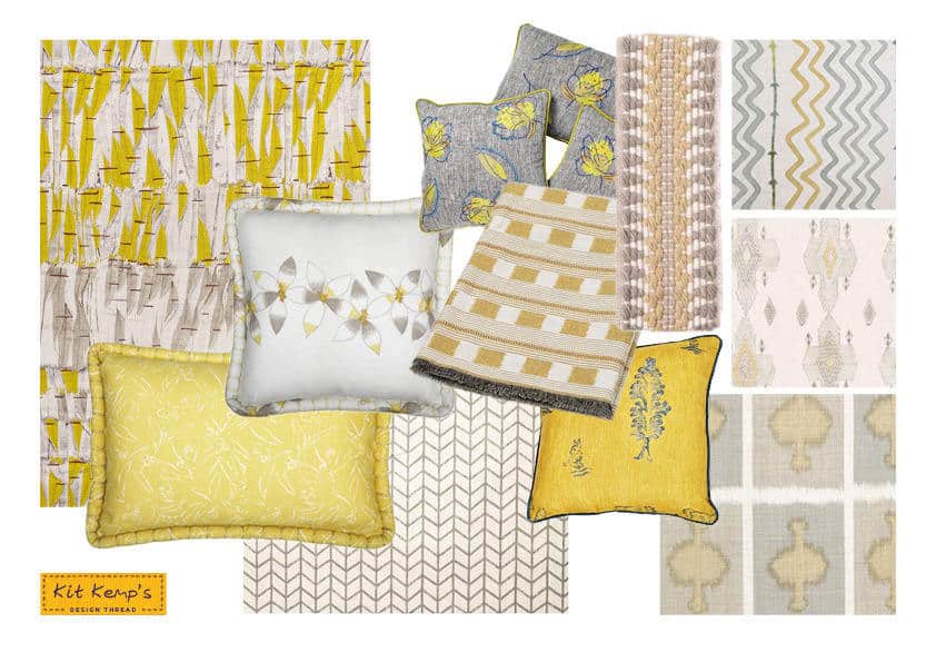
On this Pantone inspired moodboard, our ‘Daisy Chain’ Lemon cushion with Christopher Farr combines a soft grey and butter yellow on the embroidered floral detail. Our new ‘Railroad’ trim, also for Christopher Farr, picks up the two colours with a textured feel. Our favourite ‘Ozone’ in smoke and ‘Travelling Light’ fabric designs capture the subtle combination of the Pantone colour of the year. The selection of colours in this composition create a balance of warmth and optimism, strength and positivity.
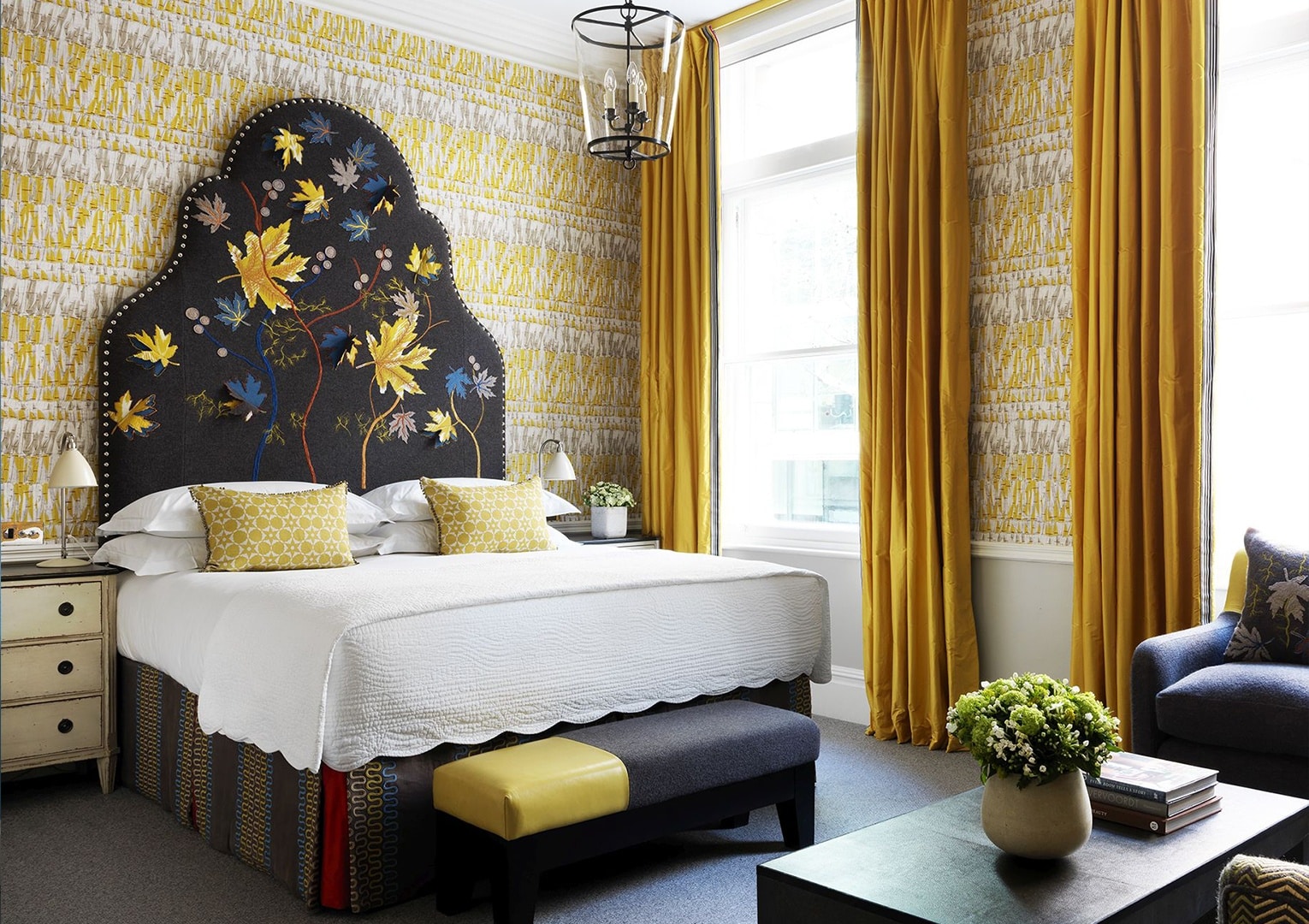
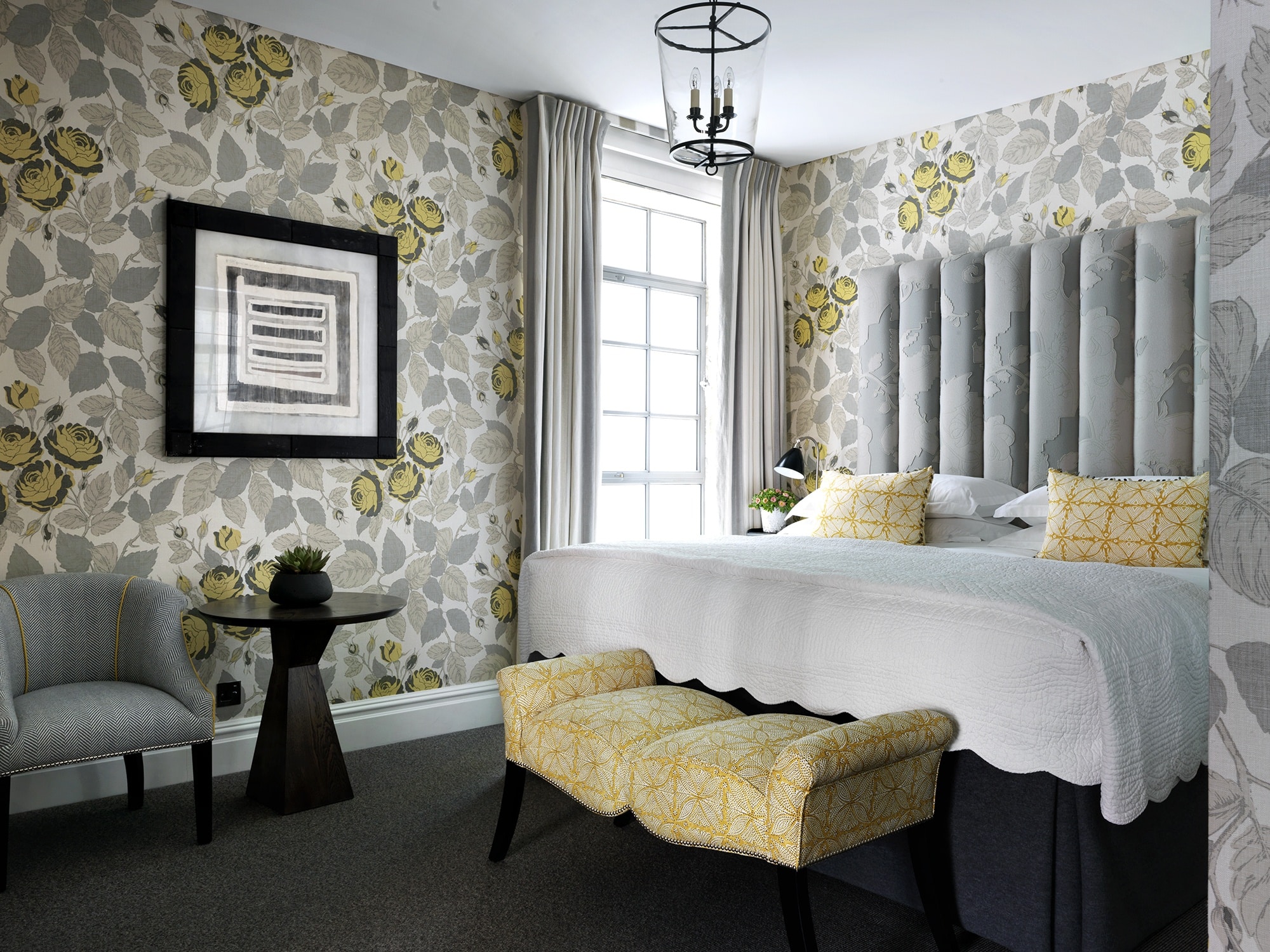
This room at The Soho Hotel captures the yellow and grey colour scheme, dressed in ‘Simila Lemon’ by Christopher Farr. The look is reinforced by a Tissus d’Helene fabric used for both the bed cushions and end of the bed footstool.
In this room at Covent Garden Hotel, our ‘Willow’ fabric is the perfect example of our grey and yellow combination. The wallpaper, curtains and bench unify the room, while the contrast headboard adds a punch of freshness.
Pantone’s definition of this combination of colours couldn’t define this room any better – “A message of happiness supported by fortitude, it is aspirational and gives us hope. A need to feel that everything is going to get brighter – which is essential to the human spirit”. This inspires us to push further and think of sunnier days ahead.
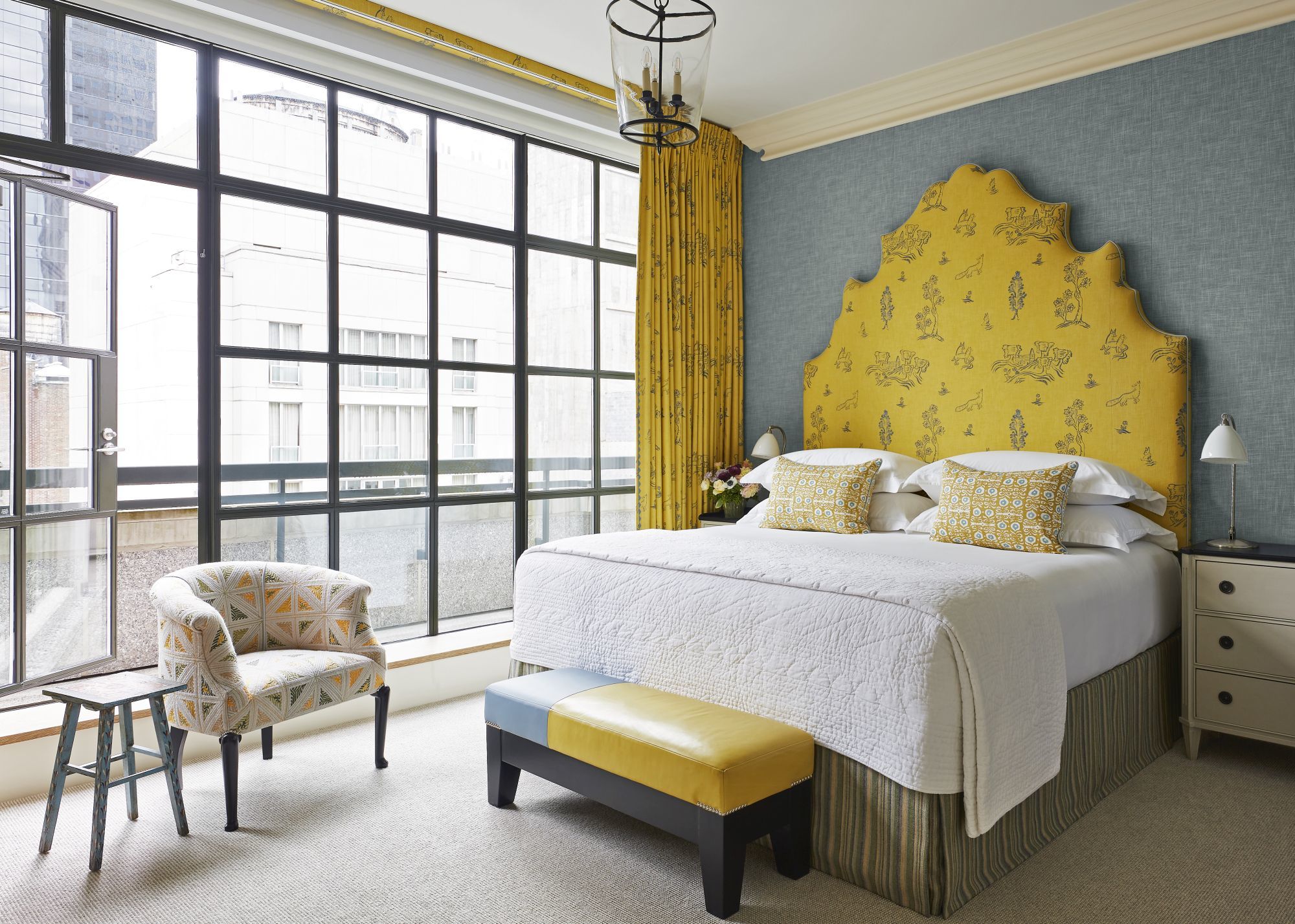
Combined with a blue rather than grey, yellow is still the protagonist of this scheme. This suite at The Whitby Hotel uses my ‘Friendly Folk’ design in Provencal for both headboard and curtains. It is matched with a yellow leather end of the bed stool.
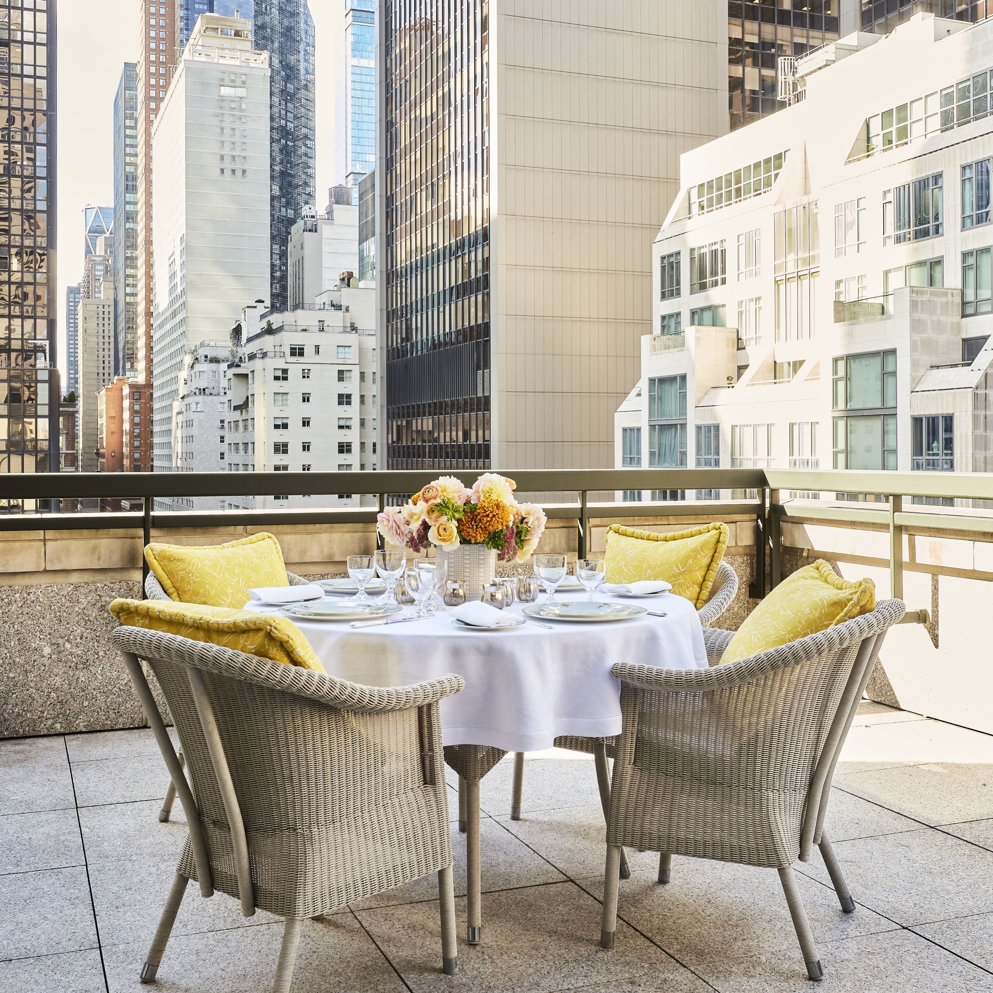
Finally, the terrace reflects a summary of the Pantone of The Year 2021 colour: a beautiful stamp of a sunny and friendly terrace with yellow cushions against a grey background made by the overlap of Manhattan’s skyscrapers.
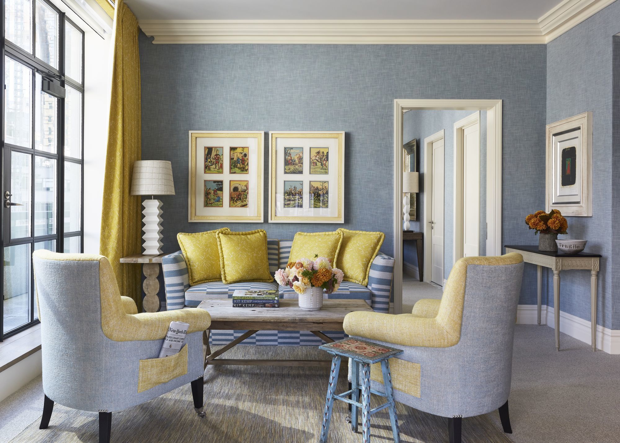
Our Leo armchairs in the drawing room are upholstered in ‘Arsene’ by Pierre Frey with yellow on the front and on the side pocket. The frames above the sofa pick up the colours of our ‘Inside Out’ fabric designed for Christopher Farr, which are used for the curtains and sofa cushions.