
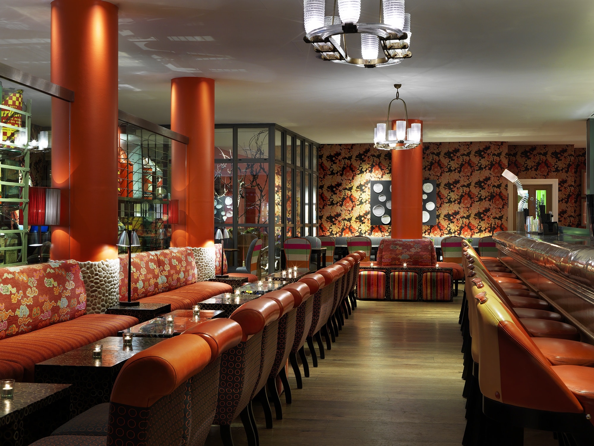
Orange is a bold, striking colour. We use orange to evoke feelings of enthusiasm and happiness – just what we need to get us through these final months of winter! Orange has less intensity than red and yet it is charged with energy. This is evident at Refuel Bar & Restaurant at The Soho Hotel. Here we see bright pops of the colour, particularly because of the pillars. The bright orange that adorns them creates a fun feature that instantly commands your attention.
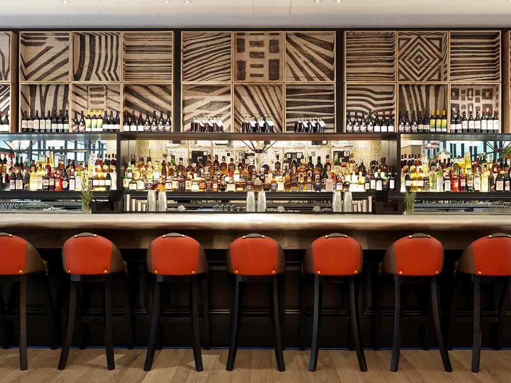
At Ham Yard Bar, you’ll find flashes of orange from the bar stool’s leather upholstery. It brings a sense of animation to the bar area with the colours inviting us to take a seat and enjoy a cocktail.
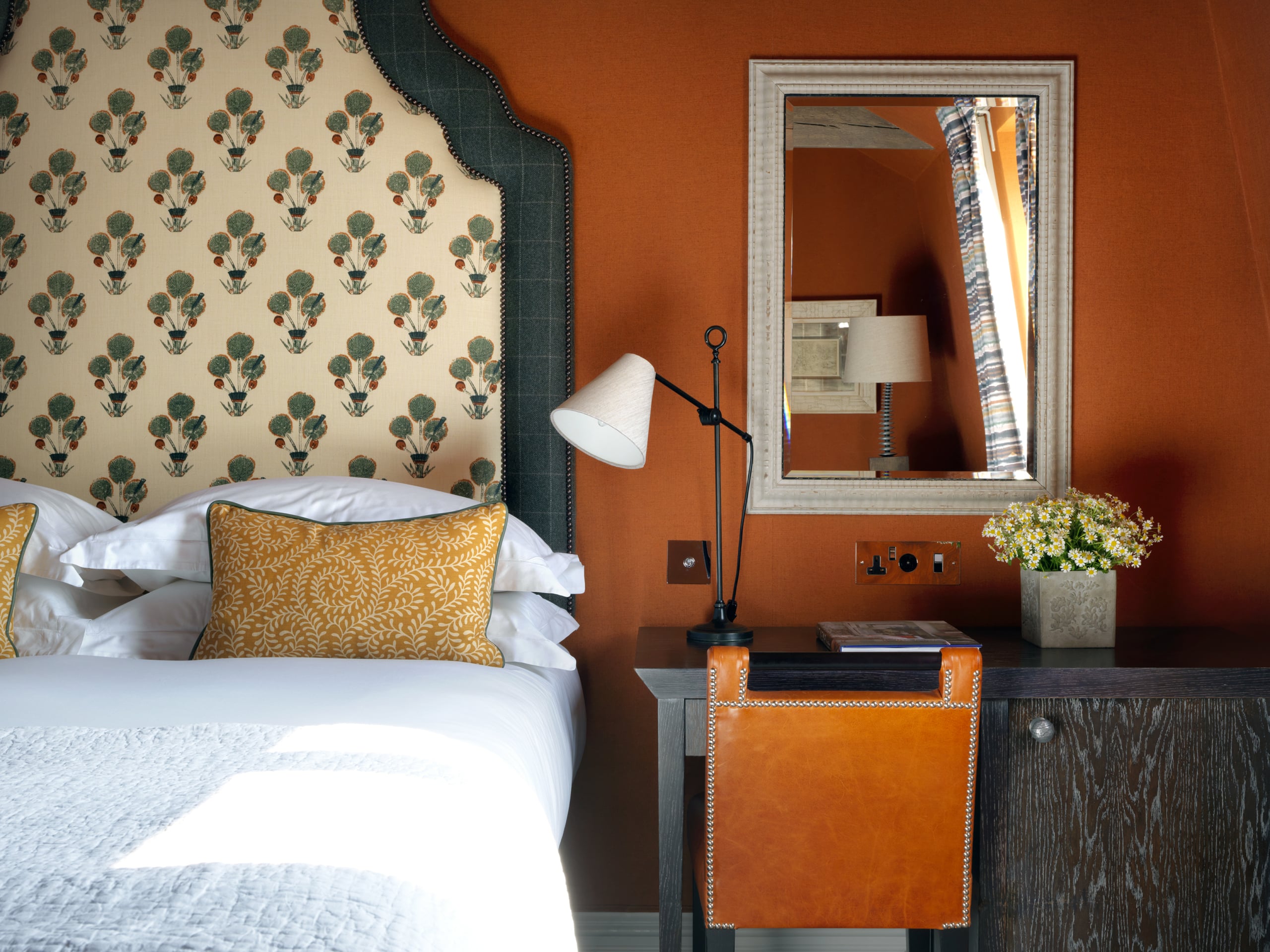
To create a sense of sophistication, we used a darker burnt orange on the walls in room 214 at Haymarket Hotel. The shaded hues help to create a cosy atmosphere and a feeling of intimacy in this bedroom.
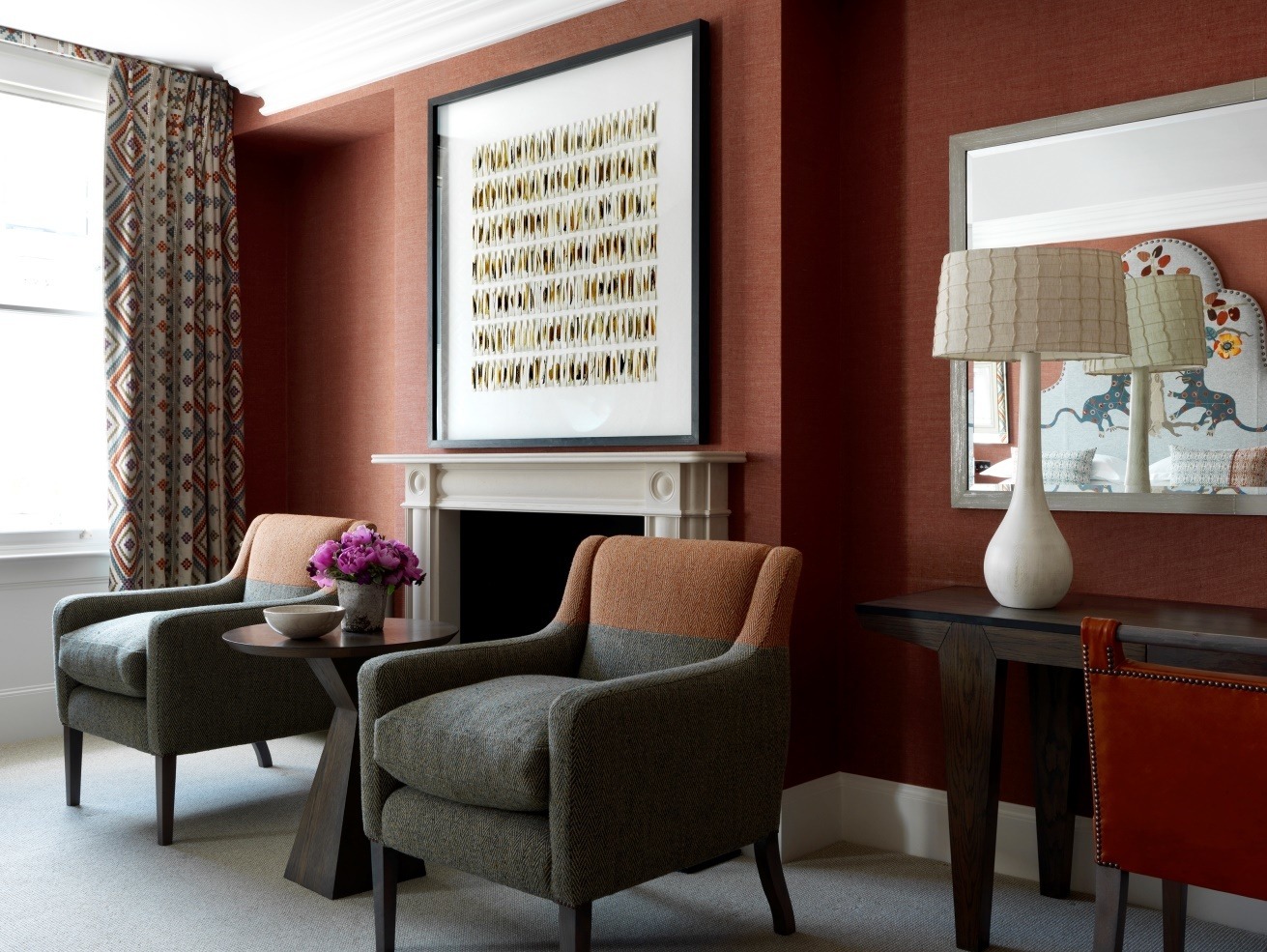
For the headboard and wallpaper in this scheme we have used Friendly Folk from Kit Kemp’s collection for Andrew Martin. The design is inspired by the Charterhouse’s late medieval tapestries, portraying mischievous animals peering amongst trees and British green pastures. These orange colourways give a contemporary edge to the design, where you can cast one eye to the past and another to the future.
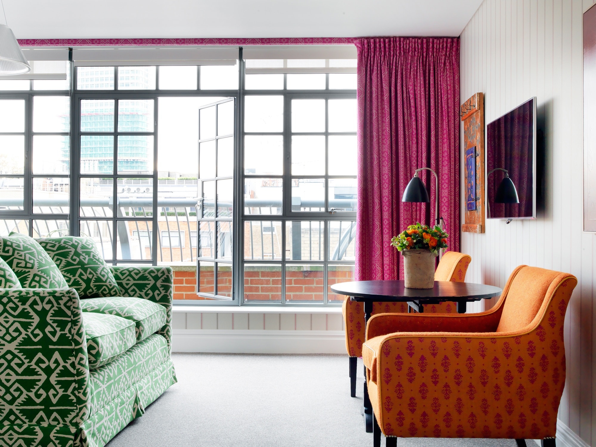
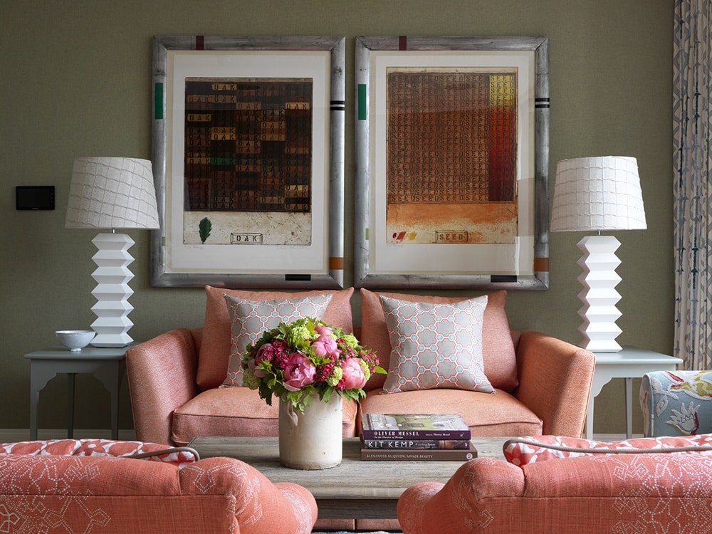
At times we clash orange and pink together in our schemes. Although this isn’t your typical pairing, these colours play-off their intensity when put together in the right way. A perfect example is at The Soho Hotel in room 508. Here this animated combination thrives with magenta curtains and saffron coloured chairs. This stimulates a sense of escapism and momentarily transports us to India, a country famous for using bright colourful pigments.

Vincent van Gogh famously said, ‘There is no blue without yellow and without orange’. He was aware that mixing juxtaposing colours in his paintings made each individual colour appear brighter. This logic works just as well in interiors and we often mix complementary colours in our schemes. This bedroom at Ham Yard Hotel is a perfect example where the vibrant orange sofa is mellowed by tranquil blues and greens.
In room 306 at Number Sixteen, combinations of orange hues have been used throughout the room. This creates balance and a warm calming flow throughout the space.
We hope we have inspired you to bring bursts of orange into your interiors. Don’t be afraid to clash orange with other colours and let its outcomes surprise you!