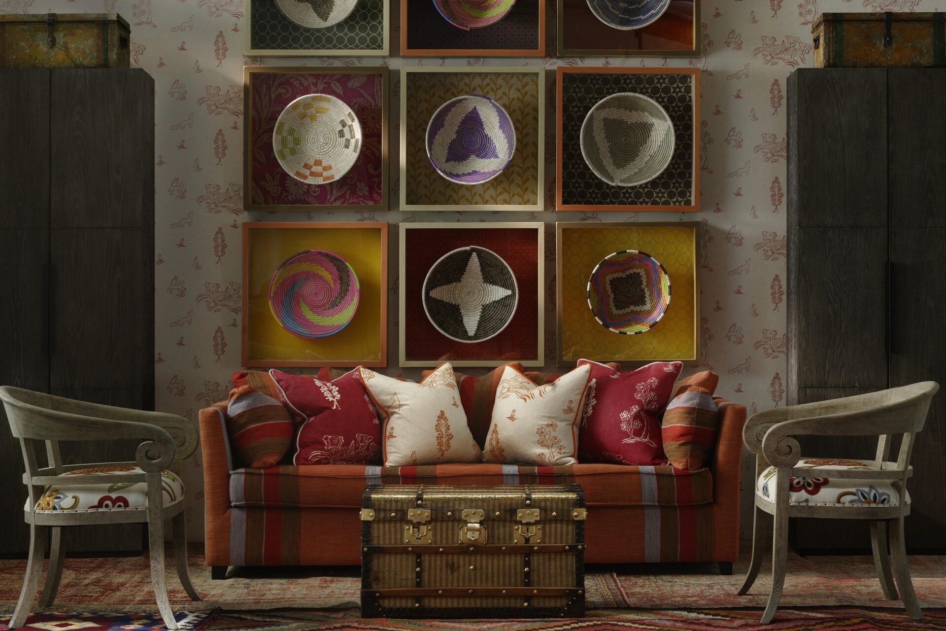
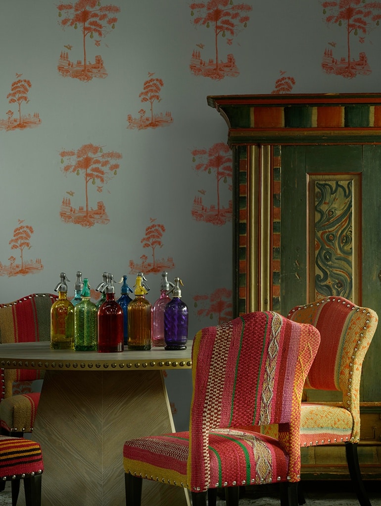
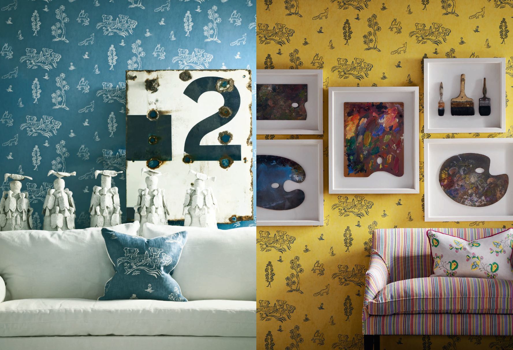
Andrew Martin is a design emporium on Walton Street, in London, founded by Martin Waller in the late 1970s, although it didn’t move to its current Chelsea location until 1987. Entering through the doors of the shop is like disappearing into a magical wonderland of desirable and quirky furniture and all sorts of weird and wonderful things for the home.
Martin started the Andrew Martin Designer of the Year Award at the beginning of the 21st century. To my great glee, I won the award in 2008. I have known him, and admired his work, for many years. I always tease him that he should award himself the prize of Designer of the Year. His consistency of original thought and execution of good furniture and lighting design is considerable. What’s more, working with him is really good fun.
This week we caught up with Martin Waller to find out a bit more about his ethos and inspiration…
How would you describe the Andrew Martin style in three words?
Eclectic, unpredictable, global.
Where do you get your inspiration from?
From the astonishing array of cultures and people who comprise our world. All around us is a toy box stuffed with history, art and human achievement. It cannot fail to exhilarate and inspire.
What advice would you give when combining design elements such as fabrics and, or furniture?
As Frank Sinatra might have sung, fabrics and furniture go together like a horse and carriage. They need to be mutually enhancing. All design is about mix, contrast and balance.
You started in in 1978, how much has your style developed over the years?
I called the 1970s ‘the decade that taste forgot’. It’s only in the last couple of years that I have come to re-appreciate the exuberant inventiveness of that decade and now it’s fun to see elements return.
What is your favourite fabric from the Kit Kemp collection and why?
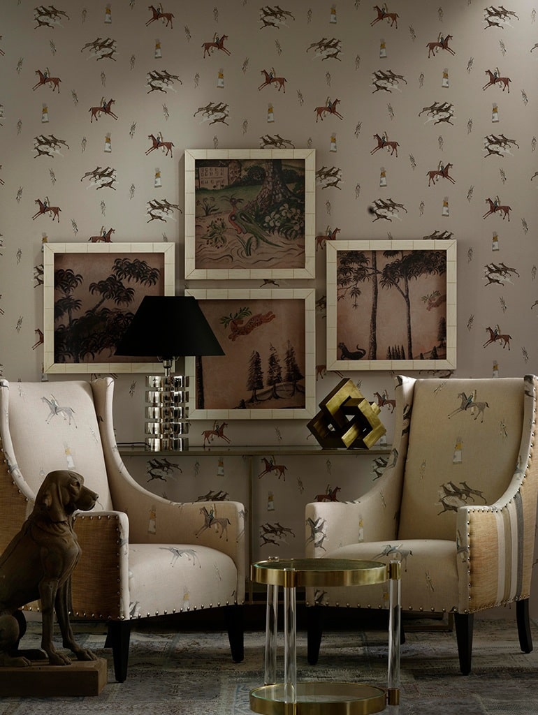
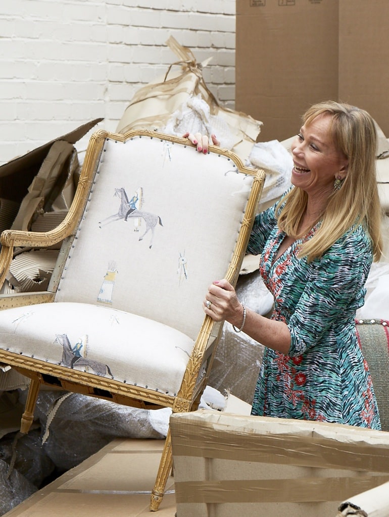
‘Great Plains’ has a special place in my heart. I grew up with the cowboy movies of the 1950s and 60s and it’s been a remarkable journey to see the art of the Native American people finally gather attention and appreciation.
What do you look for when collaborating with designers?
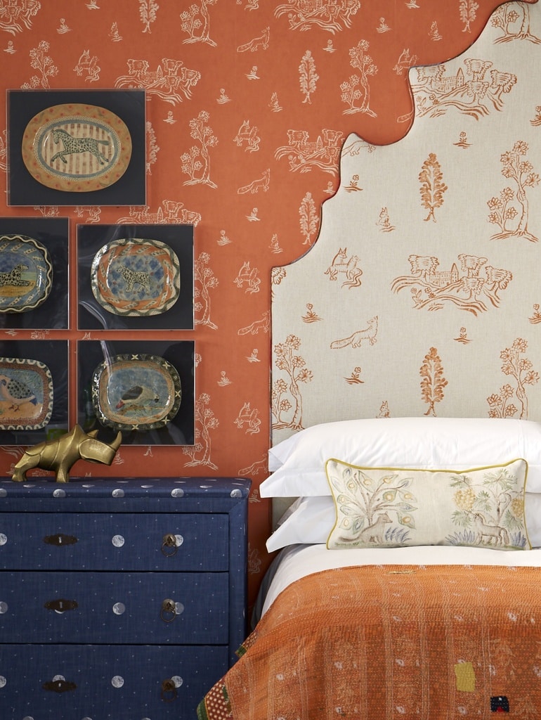
It’s important to get out of the way so that you can’t dilute or compromise. Kit has such a distinct, original and individual point of view, you need to ensure you capture it.
