
Magic Carpet – A Recipe for Designing a Rug
Day to DayThe rug you choose for your room is a careful balancing act. It should be a statement piece, breathing extra colour and life into the space, but it also has to be pared back and not fight with the myriad of textures under which it sits. We love to use vintage or antique rugs, but a wonderful way to make a room really bespoke is to design your own area rug for the space...
The rug you choose for your room is a careful balancing act. It should be a statement piece, breathing extra colour and life into the space, but it also has to be pared back and not fight with the myriad of textures under which it sits.
We love to use vintage or antique rugs, but a wonderful way to make a room really bespoke is to design your own area rug for the space.
The Recipe
Within my design process, the rug tends to be one of the last things I think about. Once I have the scheme together and I have a strong idea of its tones and its story, then the rug can come to life.
One of my all time favourite tricks is to base my rug on one of the fabrics in the scheme. This way, I am at an advantage with several pieces of knowledge: the colours work well together, the balance of the design works, and the rug will undoubtedly harmonise with the scheme. Here is our recipe; the careful mixing of ingredients that make the rug come together…

1. Pattern
When you sit with your scheme in front of you, it’s usually quite clear which fabric could become the rug design. I tend to choose the most graphic and punchy fabric in the scheme, so the rug has weight and presence. The key to choosing your design or pattern is to create a thread between the rug and the rest of your scheme – this can be done in two ways. The above design called Domino is one of the collection I designed for Wilton Carpets.
In Room 709 at Crosby Street Hotel, we collaborated with Pierre Frey to match the rug with the sofa and headboard fabric. The ‘Cartoon’ design on the sofa blends into the rug. There is something really fun about how the two work together. It is simple and effective.


2. Scale
Once you choose the correct pattern, the real creativity starts when we begin to play with scale.
The rug in the Spring Room is a much larger repeat than the original fabric, so you don’t end up with something too busy and distracting.

In contrast to the matching of patterns, I used an entirely different fabric for the rug in the Spring Room at Crosby Street Hotel.
This blocky large scale take on my ‘Lost and Found’ fabric adds a new dimension to the room. I chose this pattern to ground the soft and subtle fabric of the balloon back chairs.
This is especially important for large area rugs. Here in the Crosby events lobby, we upscaled the Fine Nobilis wallpaper to such a degree that the rug is almost unrecognisable as the same design as the wallpaper. It’s strong and powerful and works perfectly in this large open space.


3. Colour Play
Getting the colours right is essential, to ensure the rug doesn’t fight with the rest of the space. When designing our new Crosby Street Hotel Drawing Room rug, I wanted to create an oversized version of the collaged Kate Blee inspired wing chairs.
We spent a long time matching the poms to the moon wools used to create the chair. For the base of the rug, it needed to be a darker tone since it is such a high traffic area. It’s a cosy space, so having something more moody felt right.
At The Soho Hotel, we needed a bold rug design to fill the space in this spill out area. It was the perfect opportunity to use ‘Open Plan’ from my collection for Wilton Carpets. This large scale print takes the traditional and turns it into something that says today.


When creating the rug for 907, I spent a long time with the rug threads to get the colours just right. I wanted to bring the colours from the end of bed stool in the bedroom into the drawing room, to create a thread between the spaces.


For our collection with Wilton Carpets, we were able to create subtle effects and gradations of colour to give the carpets a unique feel, similar to the finish of a hand-blocked fabric. The looms at Wilton Carpets made my ideas a joyful reality.
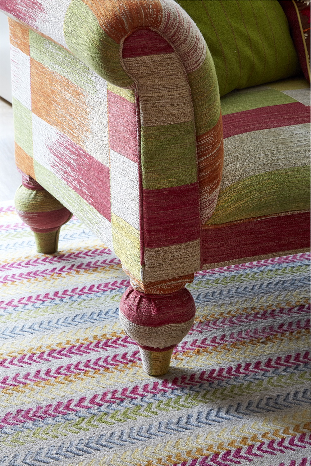
Here in the library at The Soho Hotel, my ‘By Way’ design infuses a classic herringbone with bright colour combinations which works perfectly with my vibrant ‘Ikat Weave’ design on the sofa.
4. Texture
In all elements of my design work, texture is key. It creates depth and intrigue and this is especially important for a rug.
For this rug, I played with tufted and knotted techniques. The differentiation in texture also serves to break up this rather intricate design.

The same technique was used to create the rug in Room 709, only this time it directly paid homage to the textile itself. A tight knotted background creates the linen effect of the fabric, then a combination of tufts form the graphic colourful design. This one came out beautifully. We were really happy with the results.
With this fun and easy recipe, you are sure to create wonderful and effective rug designs for your space.
