Maximising the efficiency of scale when designing a space and incorporating patterns can be a daunting task. However, with the right approach, it can yield remarkable results. Different scales have the potential to infuse depth, visual interest, and dynamism into a room. Join us today as we unveil our top tips on mastering scale in your designs.
Mix Scales
Achieving harmony in a space begins with incorporating a variety of large, medium, and small-scale patterns. Below at Warren Street Hotel, we introduced a large headboard pattern, complemented by medium-scale curtains, and small-scale patterns on accent pieces like the end of bed stool and cushions, which serve as subtle anchors.
Focal Point
Utilise scale as a focal point by selecting a dominant pattern or textile to serve as the foundation of your design. Whether it’s a bold print on a headboard, a striking rug, or a patterned sofa, the juxtaposition of large and small-scale patterns creates a compelling contrast that enhances the room’s visual appeal.
Consider Proportion
Be mindful of pattern proportions in relation to the size of the space. Small-scale patterns may fade into insignificance in a large room, while large-scale patterns might overwhelm a smaller space. Striking a balance ensures that each pattern contributes harmoniously to the overall aesthetic.
Solids
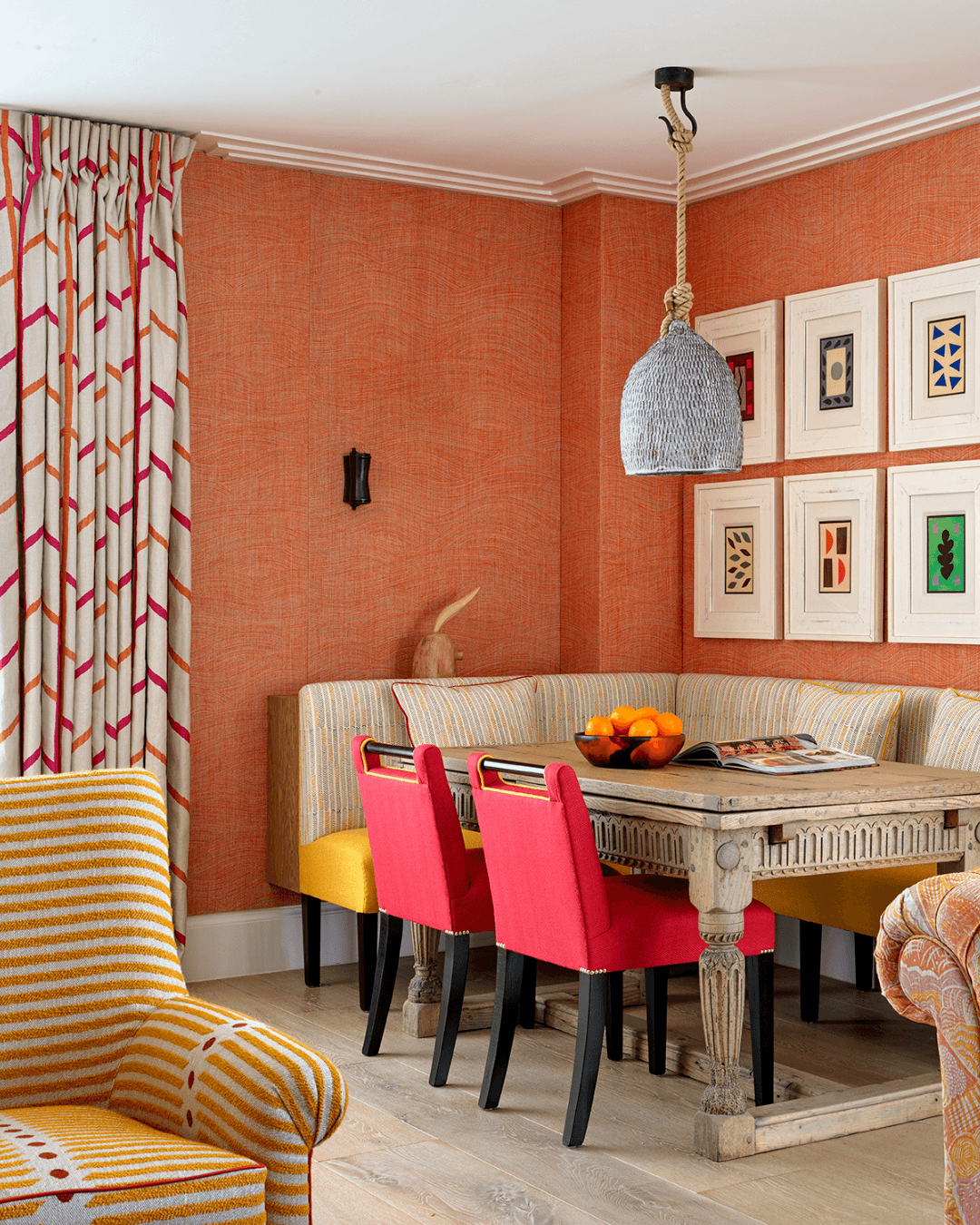
Incorporate solid elements strategically to prevent patterns from overpowering the visual landscape. For instance, in Apartment 24 at Ham Yard Hotel, colour-block handle chairs serve as cohesive anchor points. We have used a solid double piping on our ‘Whitby’ chair below, to accentuate and ground the surrounding patterns.
Stick to a Colour Palette
While experimenting with various design and scale patterns adds visual interest, maintaining a cohesive colour palette is essential in preventing the space from feeling chaotic. Consistency in hues and tones fosters coherence and unity, even amidst diverse patterns.
Edit and Balance
Take a step back to assess the overall composition of patterns in the space. Editing out excessive patterns and introducing solids where necessary helps maintain balance and avoids visual clutter, ensuring a harmonious and inviting atmosphere.
We hope these tips have encouraged you to play with scale and create a balanced and cohesive space, full of expression and working patterns! Happy scheming and don’t forget to tag your creations at @kitkempdesignthread!


