The entrance hall is where your guests make their first impression of your home, so why not make an impact?
Consider this space your opportunity to sweep guests off their feet. Whether visitors are welcomed into a large space with a chandelier, or a cosy room with warm wooden floorboards and a bouquet of flowers, it sets the tone for the rest of your home. It is the perfect spot to showcase a statement mirror, a bold painting, sculpture, or a beautiful table.
This week, we have put together our dos and don’ts for designing an impactful entrance hall.
1. Do get a good central table
A table is an important element in any room but in an entrance hall it should never go amiss. A round central table invites your guests to circulate a space. In our hotel lobbies you will always find a table adorned with an ever changing flower arrangement or a careful composition of delightful objects. At The Whitby Hotel in New York, a whalebone leg table holds a gorgeous selection of vases.
In this residential property in Barbados, we dressed the table in candles to give the room a warm and welcoming feel.
3. Don’t forget to hang a good mirror
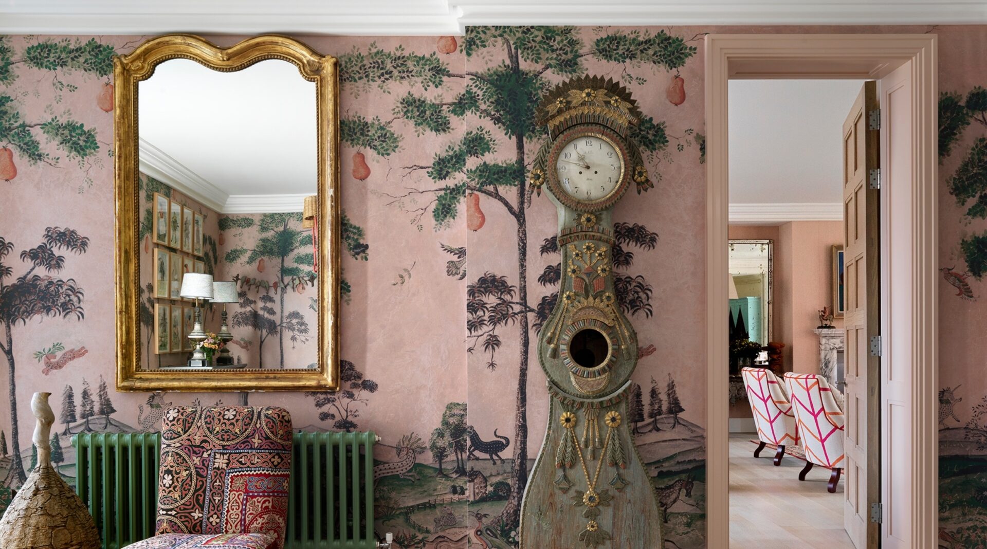
When leaving home, the majority of us like to have a quick look in a mirror. It is always a good idea to hang a mirror near your front door so you or your guests can check they look great before leaving or upon entering your home. It’s also a wonderful way of reflecting light and lending depth to the space.
2. Do consider a console table
If you don’t have space for a round table, consider a console. Not only do they allow you to display personal touches and prized possessions, but they are also practical to drop bags, keys and mail onto as you go in and out of the house.
4. Do install a statement ceiling light
In its many forms and sizes, a pendant light’s purpose is to light up a room. However, it can also add a decorative element to a space through shape and colour. It is a design feature that can give personality to an entrance hall and should not be overlooked.
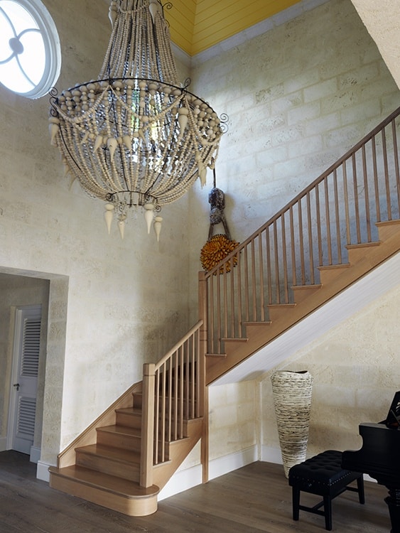
It is worth making the most of the bones of your hallway. In our residential property in Barbados we had incredibly high ceilings. We installed a statement pendant light to draw the eye up, highlighting the height of the space as well as being a wonderful talking point.
6. Don’t forget about statement art
The entrance hall is the best place to show off a real statement piece of art. In the lobby of Dorset Square Hotel, we installed a collection of framed cricket bats to honour the hotel’s heritage as the original site of Lords Cricket Ground.
5. Do add a durable rug
A rug can transform any space by adding colour, texture and style. It can either sit in harmony with the room or become the focal point by making a bold statement. Remember the hallway often receives a lot of traffic, so make sure it is relatively durable, you don’t want your rug to wear quickly.
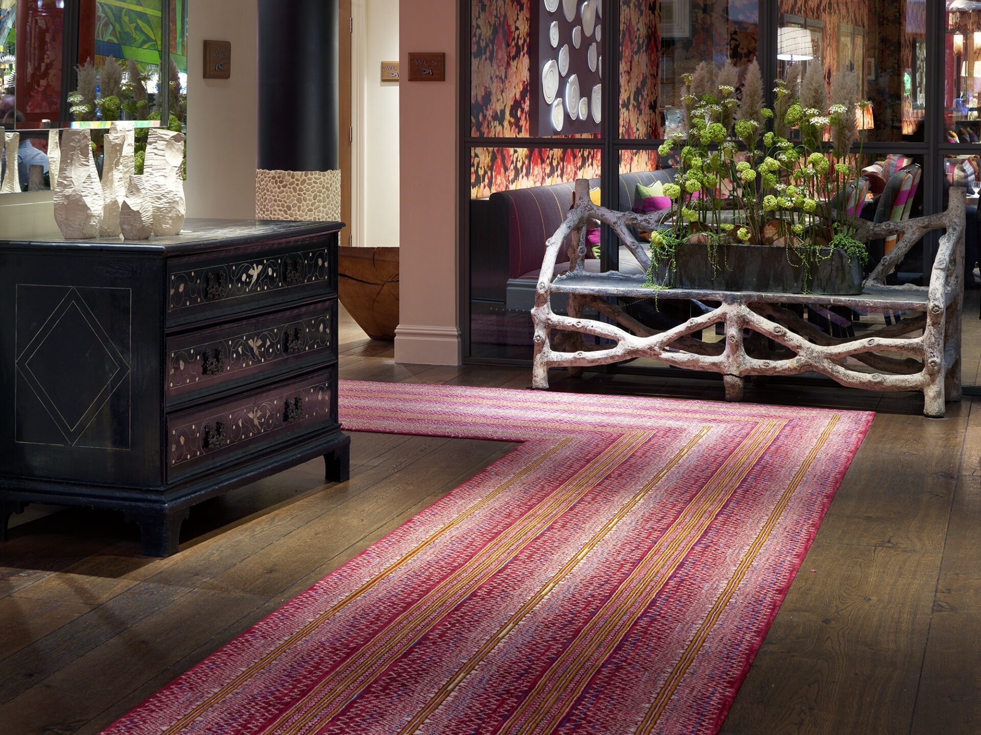
A hallway runner can also create a visual pathway that draws the eye to connecting rooms. At The Soho Hotel, our ‘Batik’ rug from Kit Kemp’s collection for Wilton Carpets forms a regal red carpet leading guests through the hotel lobby.
At Ham Yard Hotel, this art piece is formed of a grid of clocks where each hand rotates and stops at certain positions to create digits, falling apart every minute, rotating and reforming again. Even though the movement of each clock-hand is simple, as the multiple hands move simultaneously, they create something practical and beautiful.
7. Finally, don’t forget about storage!
Storage is vital to disguise clutter. Whether it’s shoes, coats, keys or general jumble – get a good piece of storage to hide it all. In this entrance hall at Haymarket Hotel there is an interesting jagged chest of drawers. We found this unique piece in France, it has varying drawer sizes that jut out in different areas and play with balance and scale. This just proves that not all storage pieces are boring.
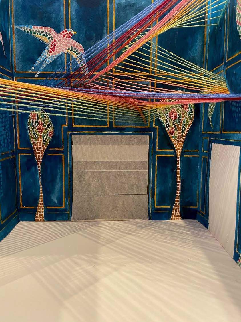
We hope this post provides you with some exciting design ideas for your entrance hall. It is the one place where you can truly show off and make a real showstopper of a room. Here is a little sneak peak of a show-stopping design we did for a residential project…


