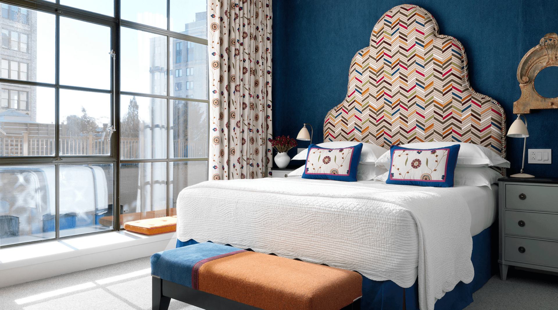
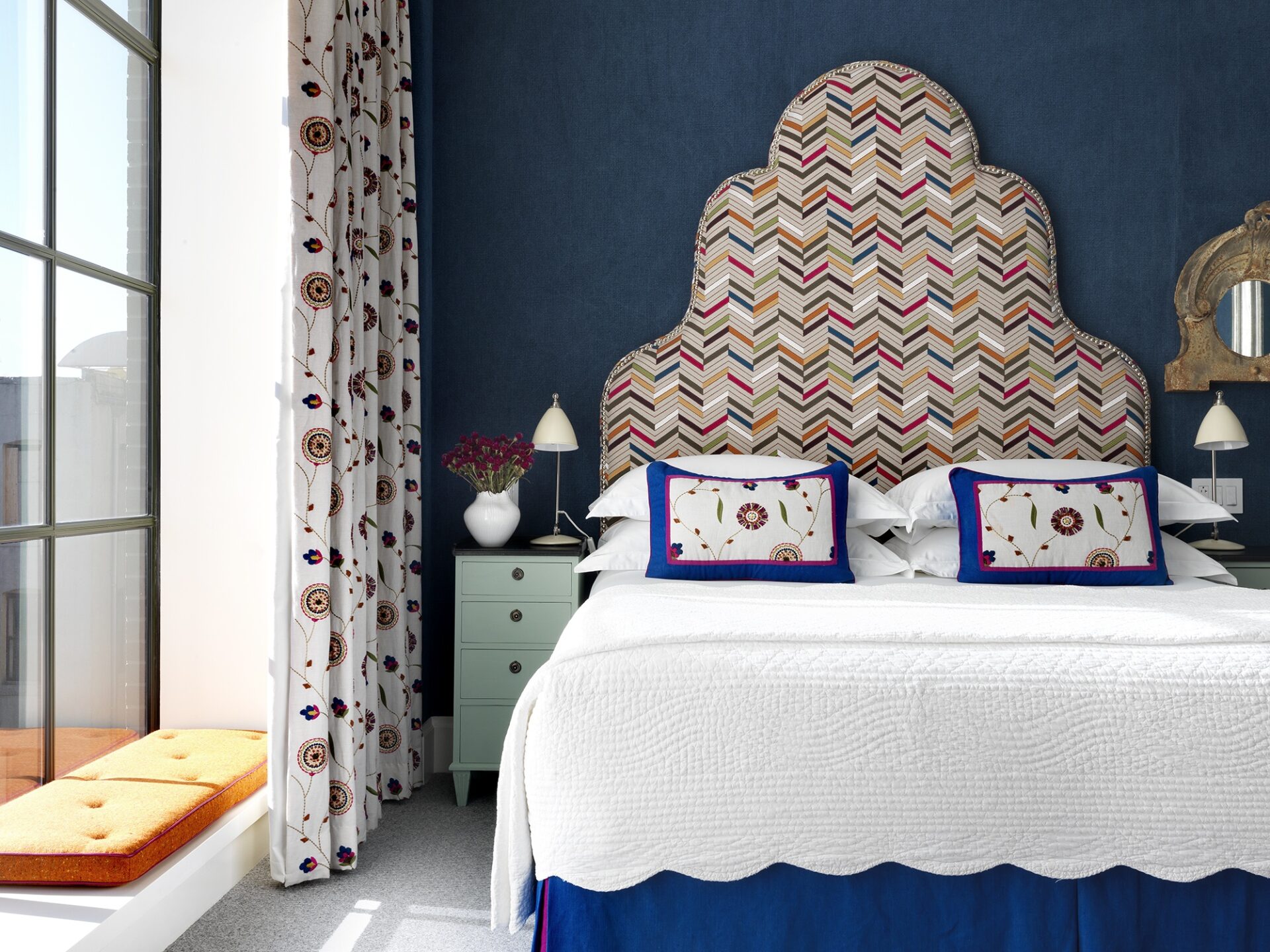
Patterns and prints elevate a room’s personality, but the magic doesn’t stop there. At the Kit Kemp Design Studio we love combining geometric and organic patterns. Despite their differences, they can engage in cordial bliss, as seen here in Room 603 at Crosby Street Hotel.
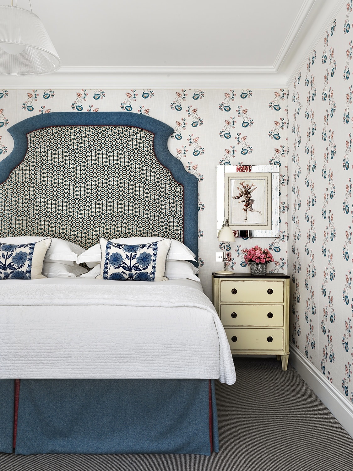
We see curtains and cushions with organic patterns of embroidered flowers. They bring a comforting sense of femininity to the space, but politely give way to the vibrant headboard. The relationship is made possible by the similarity of colours as well as pattern scale. Framing these designs, we’ve added a plain navy linen wall. This makes the space strikingly elegant.
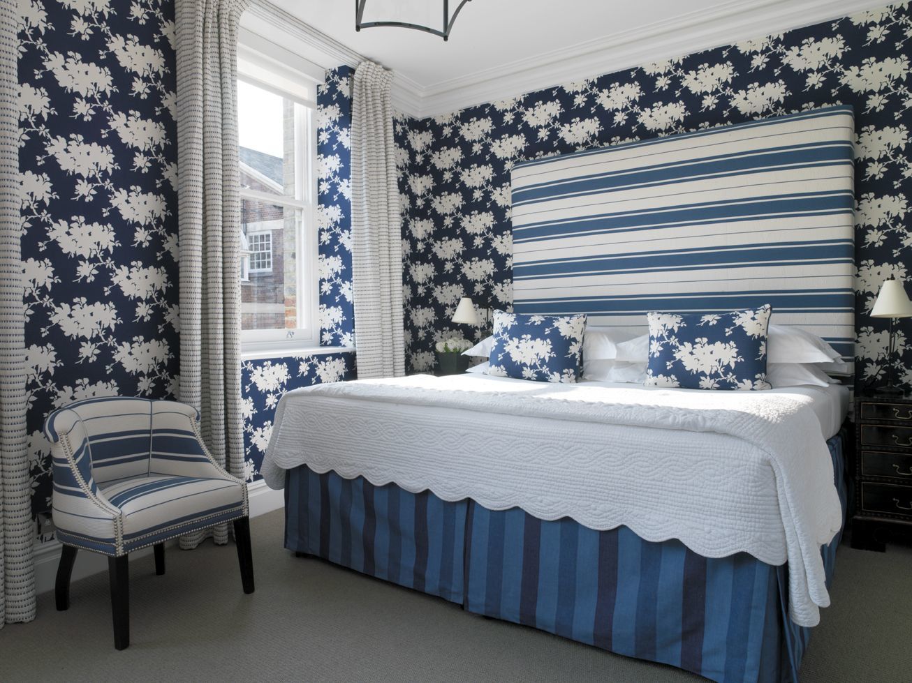
When it’s not possible to match patterns based on scale, use the formality and rigour of a geometric design to break-up an organic pattern. In this example the headboard’s horizontal stripes expand the room, but also give an affirming sense of balance against the floral wallpaper. Keeping colours to a simple palette of navy and white allows these designs to complement each other.
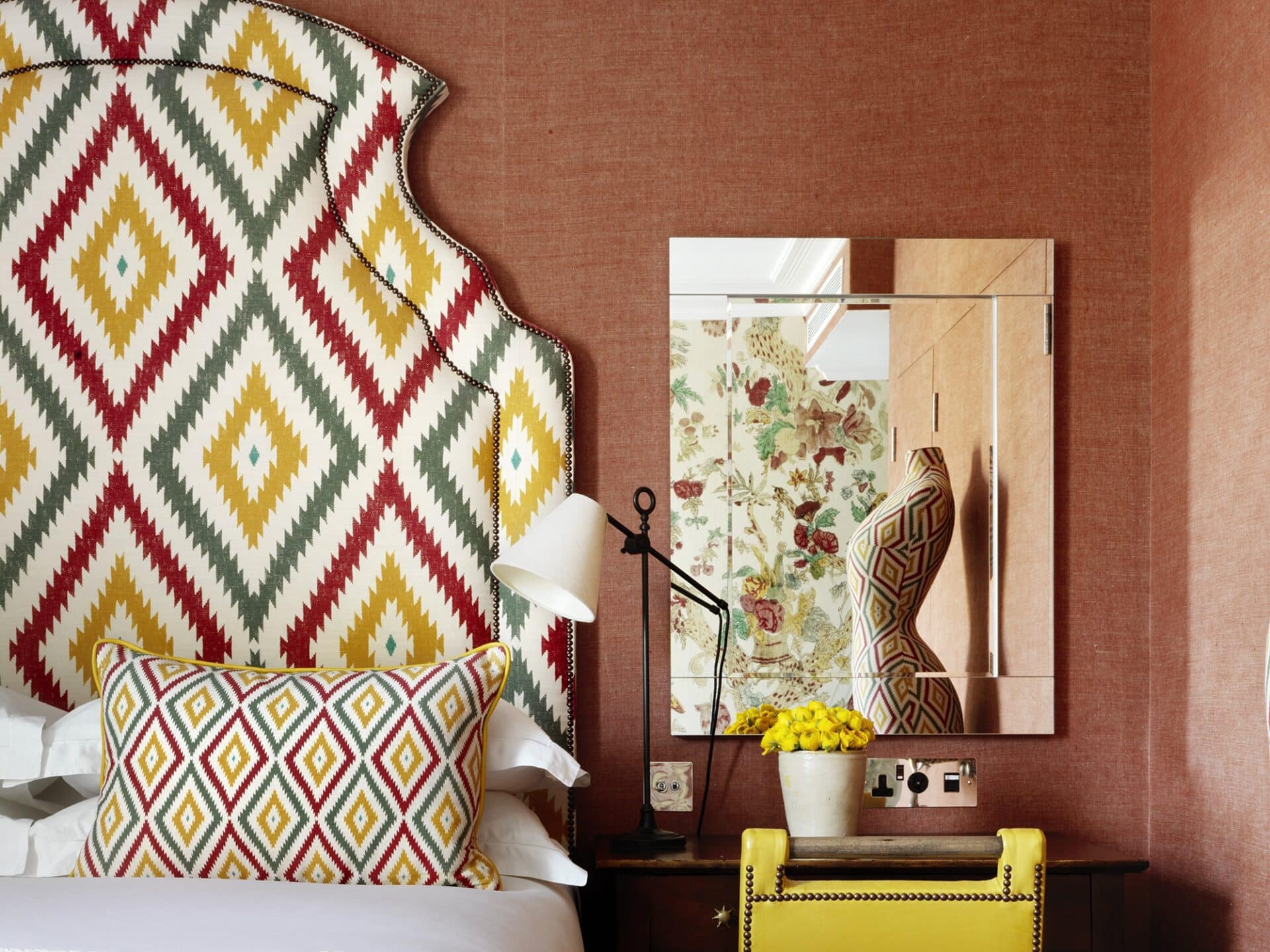
Positioning can help differing patterns talk to each other. This bedroom mirror at Knightsbridge Hotel is a reflection of that. In contrast to the geometric headboard, we see a softer, more natural design cover the opposite wall. These prints would fight horribly if adjacent, but a plain linen for the remaining walls encourages cooperation, whilst the mirror subtly connects the designs together.
You can also use composition to create balance. Let your prints do the talking and ask yourself: ‘How should this design be seen?’. We did just that with this masterpiece of a headboard here at The Soho Hotel. Framed against a softer pinstripe fabric, the look is completed with flower motif cushions. Together, they allow playful interpretations of these organic shapes.
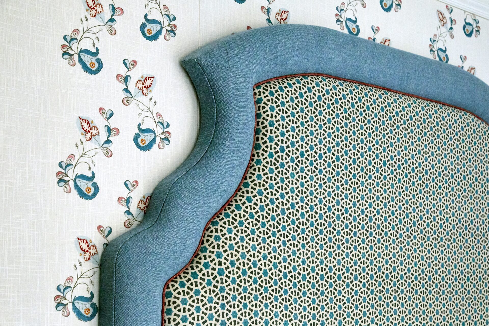
In Room 211 at The Soho Hotel, balance is achieved by two very different pattern characteristics. The headboard uses a small scale fabric, but it is only when viewed from a distance that it is possible to appreciate how it manipulates the contrasting wallpaper. It articulates the vertical symmetry of the wall and our perception of the organic print is immediately transformed.
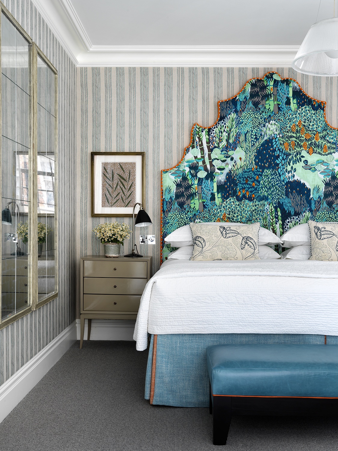
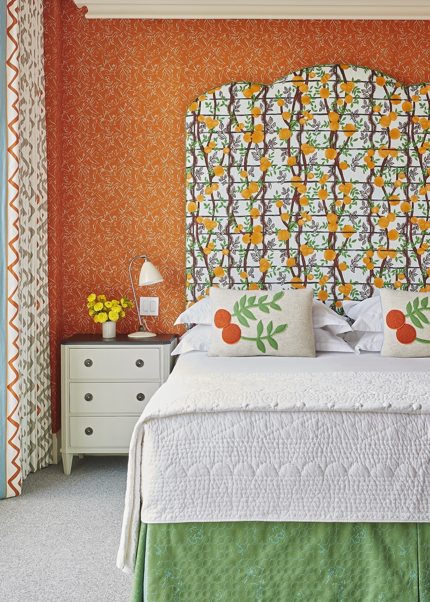
The vertical arrangement of branches and oranges in this next headboard resemble the orderly attributes of a geometric pattern. A smaller organic print lines the walls and affords the headboard its own personality. Here we’ve taken the same principles of colour, scale and composition to create balance.
We hope this gives you the confidence to bring geometric and organic patterns together. Strike a balance with considerations of scale and colour. This is the spark that ignites unique, exciting relationships between opposing patterns.

