We love to see how other people use our fabrics and trims, it provides a fresh perspective and new surroundings for our designs.
Instagram has expanded our ability to take in the design world and we love sitting down every week to go through any designs in particular that have caught our eye.
This week, we thought we would take you through some of our favourites…
Mythical Land
It is no secret that this giant 3 metre repeat wallpaper we designed with Andrew Martin is one of our favourites. We have enjoyed using it hugely in a number of our own residential projects and in the hotels. Evidently, it is also a favourite for some other people and we have seen it used in a number of different settings.
Recently, we came across a room looking out onto none other than the world famous Pantheon in the centre of Rome. I would never have thought that someone would use my Mythical Land design in such a classic and historic place, but I feel very honoured!
From the cobbled streets of Rome to hard-working family homes, The Times Property showcased Mythical Land at the heart of British television personality Zoe Ball’s countryside kitchen.
We were also very taken with the beautiful backdrop for the band at this fabulous wedding. The stage is certainly set for a wonderful evening!
Pear Tree
Our Pear Tree design takes you on a walk through an imaginative land, from rolling hills carpeted with wild flowers to a tree growing giant orange pears and a whole dance of mythical creatures along the way.
Surrounded by black joinery in this elegant powder room, the design really sings. It looks almost like a Toile de Jouy in this setting.
This design seems to be at home in a contemporary bathroom setting, as we have also seen it captured here in the powder room of this Wellington home. A beautiful and calming place to take a moment in, it is surely a space where if the door was ajar you couldn’t help but take a peek inside.
One Way
One way or another seems to come to mind when we think of this graphic and bold fabric design from my collection for Christopher Farr Cloth. The large scale, geometric print is an illusion in itself depending on how you plan to use it, and we have seen it used in a myriad of ways.
Perfect for playing with the proportions of a room, this nook has been dressed in the cobalt colourway, creating a tailored yet homely feel when paired with the soft green of the cabinetry.
If you’re looking for something really different, here we saw our One Way walling taken up onto the ceiling of a bedroom. What an out-of-the-box idea! We love seeing people push the boundaries and conventions of traditional design.
Lost and Found
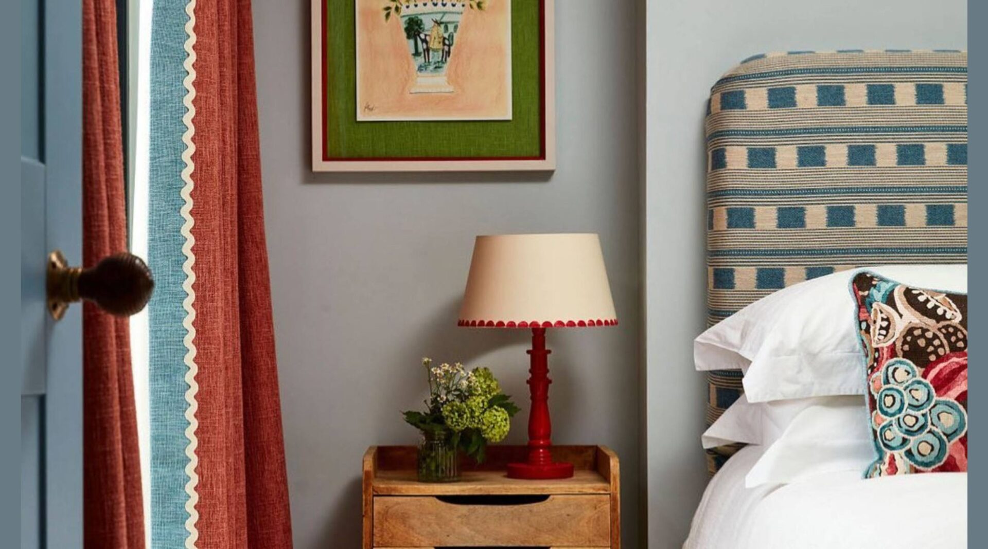
This timeless design has found its way into many of our schemes, traditionally in the form of upholstery or curtains. We are very fond of this simple design that features a dotted stripe, and repeating squares.
It looks very at home here on the headboard of a cosy guest bedroom. The real beauty of this fabric is that it has the ability to play the star of the show or seamlessly blend with a variety of other patterns and textures.
The joy of Instagram is seeing the different interpretations of the way something was originally imagined. We occasionally see this repeat used running the stripes vertically rather than horizontally, as seen here in this smart banquette seating area.
Rick Rack
A pop of colour and a burst of energy, our beloved Rick Rack design makes our spirits soar whenever we see it used. This chair has been beautifully upholstered, and is a refreshing lift against the strong dark blue behind. When asked about where to start when using colour and patterns in design, we always suggest starting small with a chair or cushion, and building up from there. This is the perfect example.
This week, we came across this wonderful shoot from Ideal Home which uses Rick Rack as a wall hanging. What an ingenious idea for a colourful focal point that contrasts beautifully against the mellow green behind. We also spotted our Pop Art trim used as a border of the window seat cushion and our Small Way fabric on one of the cushions.
Growing Up
Our last example focuses not on a single fabric, but a single use, as some of the most charming settings for our fabrics can be found in children’s bedrooms. These designs are always carefully curated in a way that are fun and imaginative for a young one, whilst maneuvering away from a more cliché bedroom that would soon be outgrown. One of my favourite examples is this little boy’s bedroom that has been dressed in my Great Plains fabric for Andrew Martin.
Last, but by certainly no means least, is this beautiful bedroom featuring my Moondog fabric for Chelsea Textiles. Just like our little dog looking out into the night’s sky, we’re sure someone will sleep soundly here under the stars.
We hope you’ve enjoyed seeing these designs used in other settings as much as we have. We look forward to seeing more of your designs in the weeks and months ahead!

