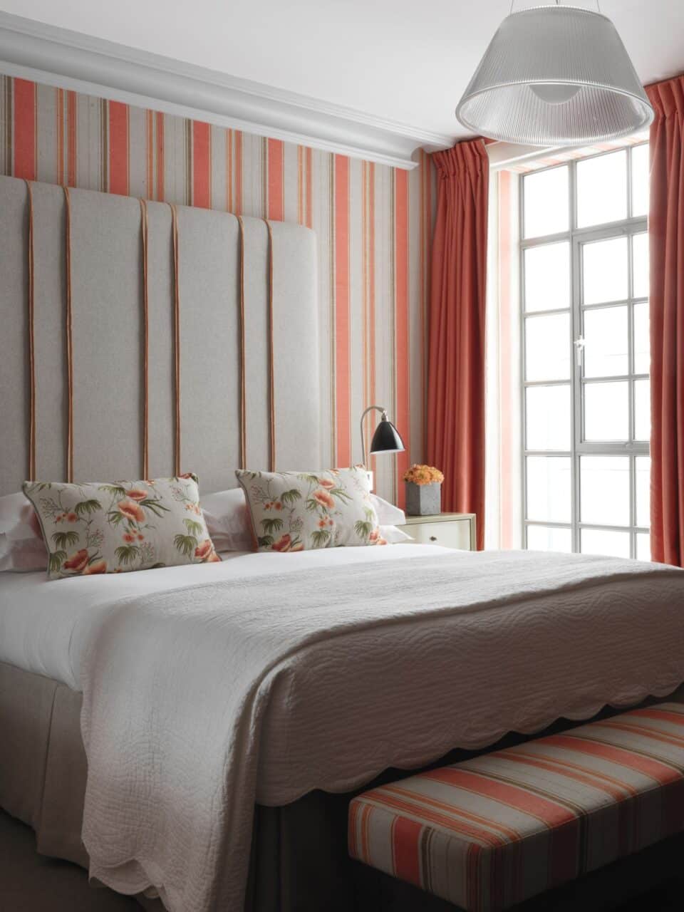
For a striking and timeless look, a nice stripe will always do the trick. From classic to modern spaces, stripes will create a sophisticated and fun finish to a room depending on the pattern, colour and rhythm.
If there’s something that has been reinvented over and over again, it is the stripe, and here at Kit Kemp Design Studio we can’t resist its charm. Here’s our guide to how we use stripes…
Up to the sky
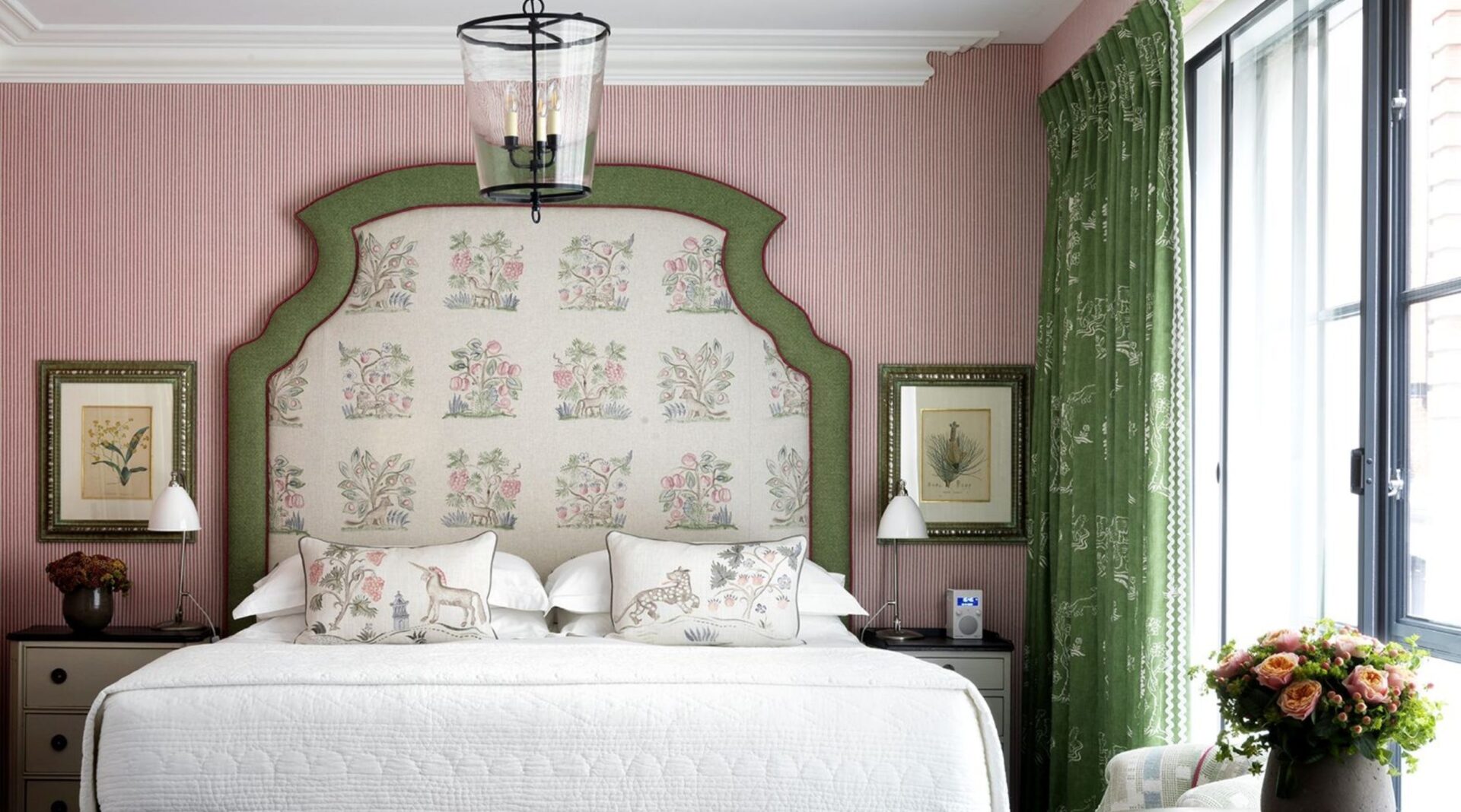
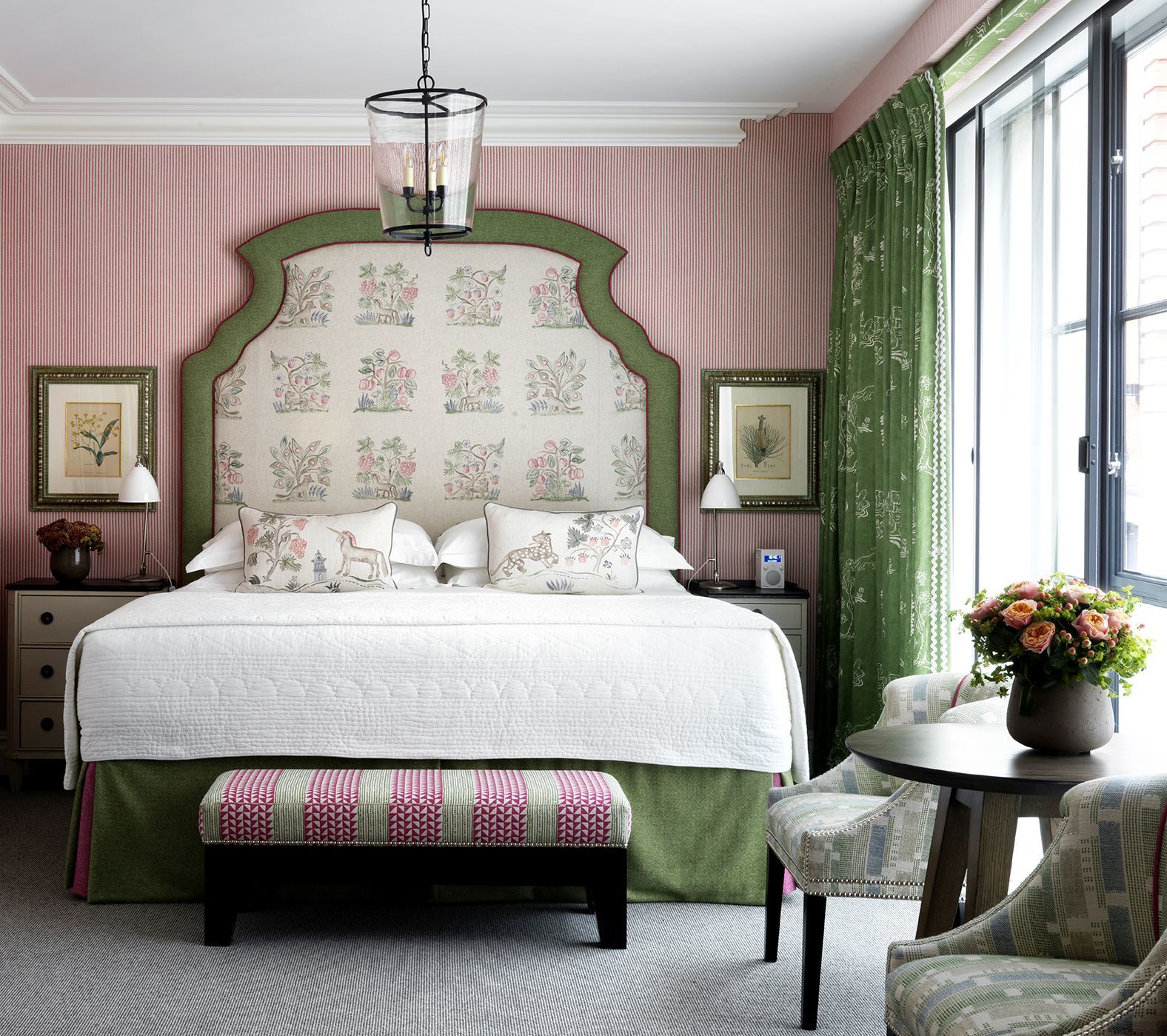
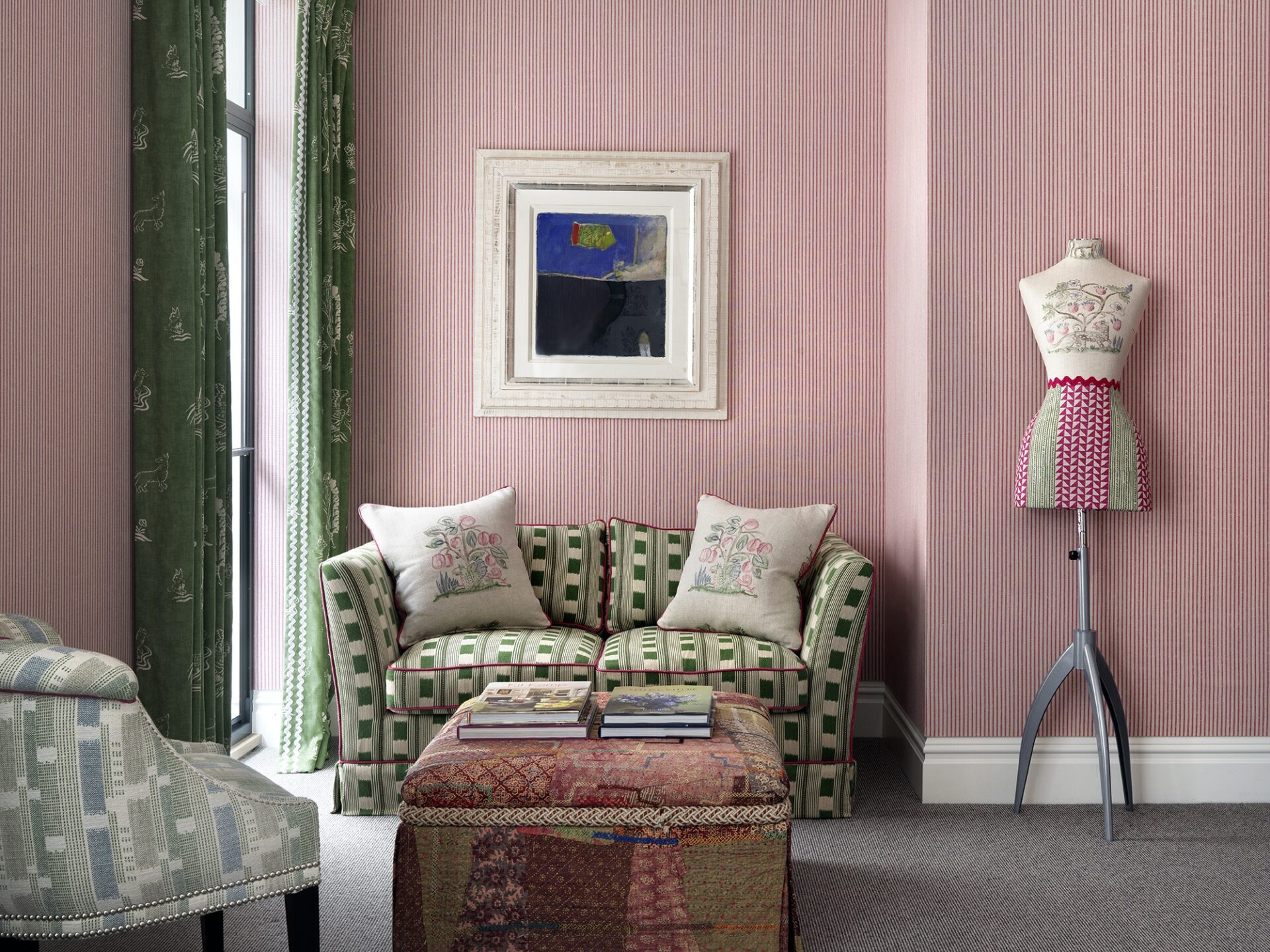
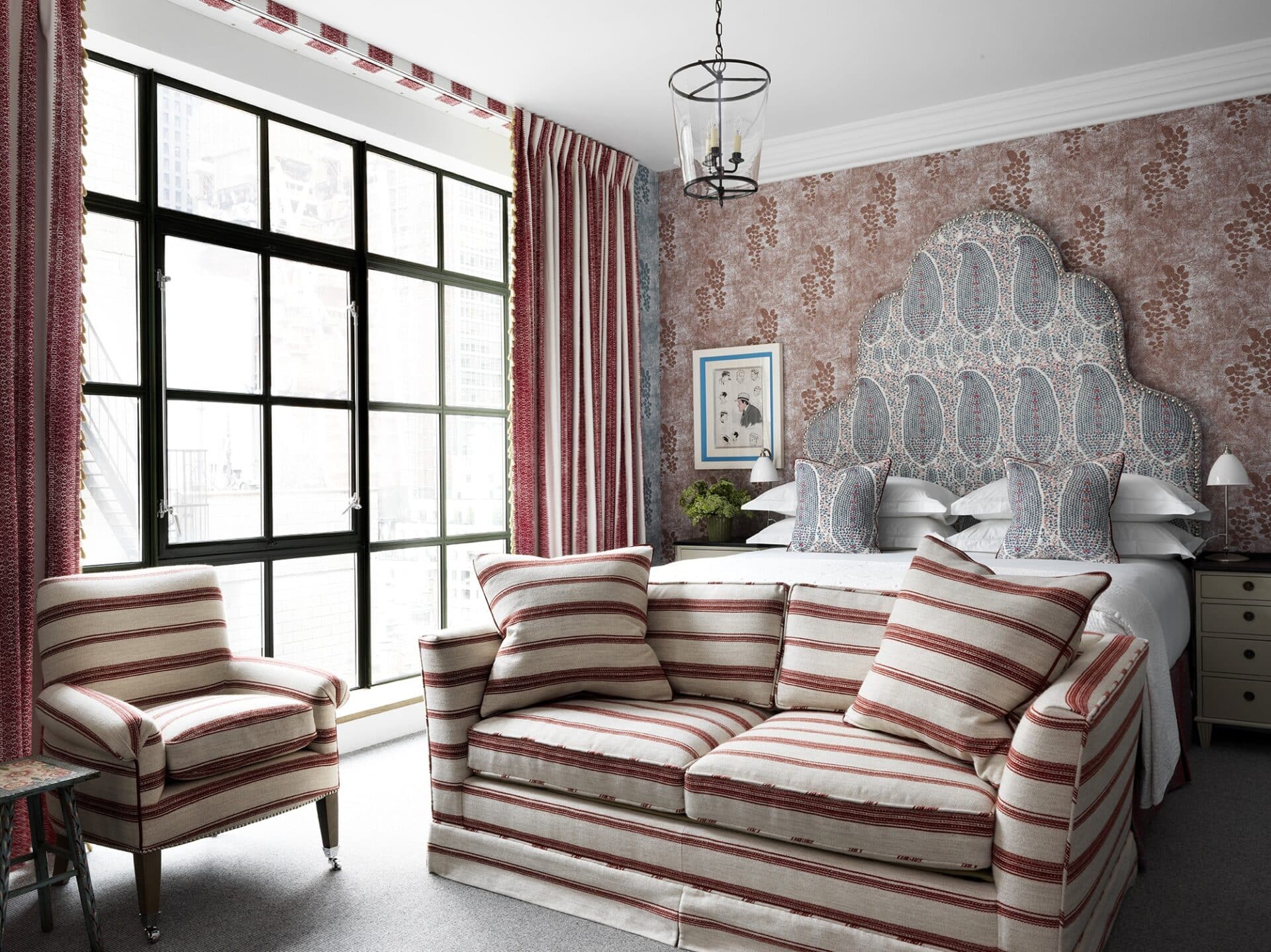
For a tailored look, use it on the walls. The ticking stripe by Andrew Martin adds just the right amount of lively pink to the walls of this room at Ham Yard Hotel to create an eye catching moment.
Direction matters too
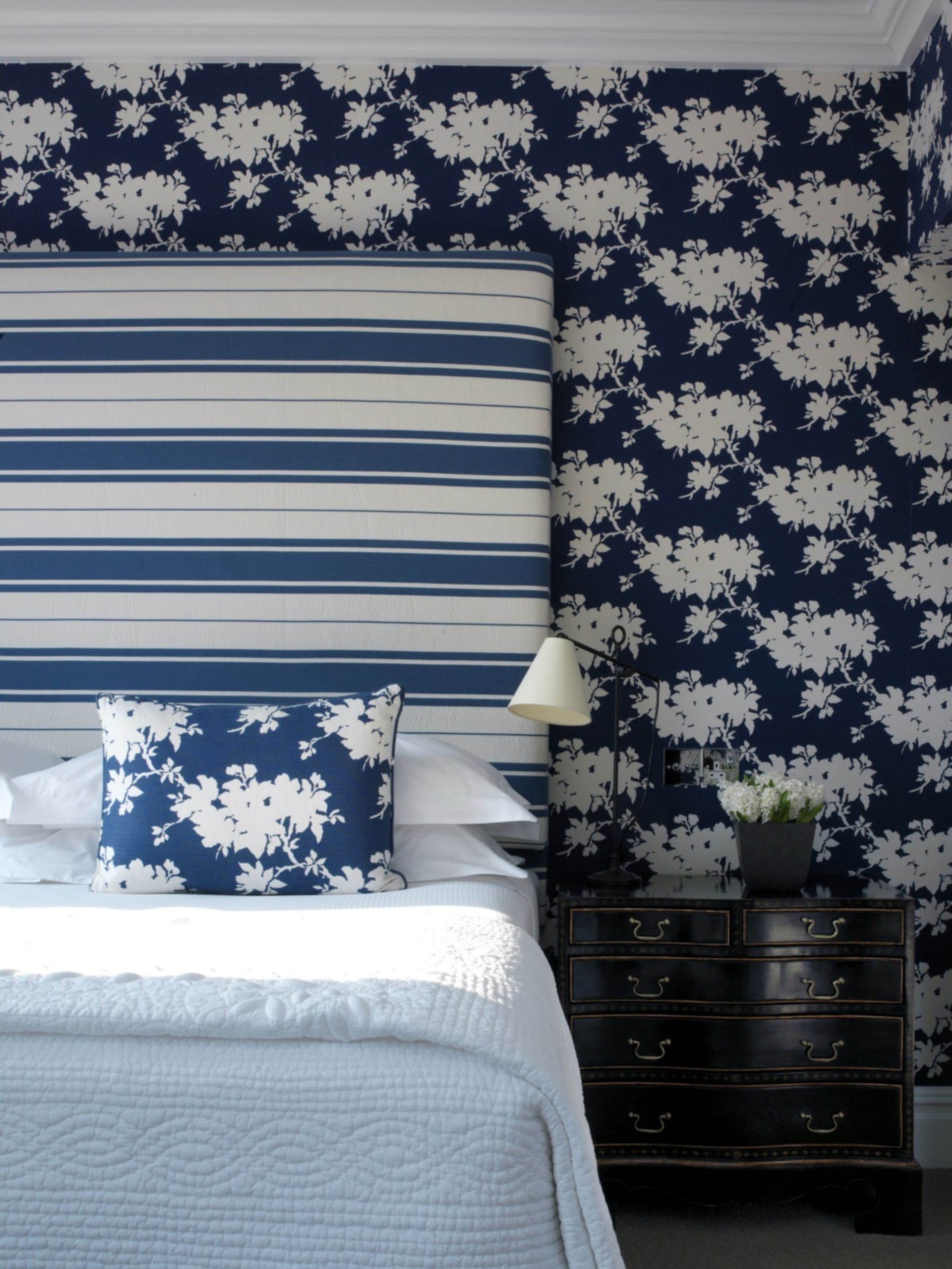
A horizontal stripe will add length and make a space look more contemporary.
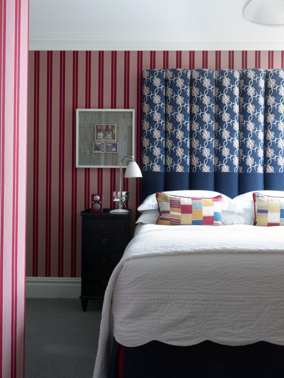
This headboard at Charlotte Street Hotel looks much larger because of the direction of the stripes. It’s also an unexpected contrast between the floral wall covering, taking what could have been quite a traditional design and giving it a modern twist.
Balance it out
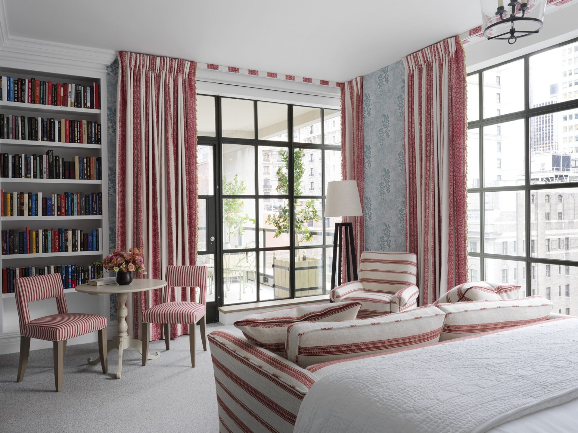
As with paintings, composition in interiors is key. If the room is relatively tall and we have many vertical or ascending elements, like my “Mud Print” wallpaper, a horizontal stripe will balance the proportions of the room. I love the playful dialogue that has been established between the different stripes in this room.
For a more traditional and serious look, we love a slightly thicker stripe in more settled colours. If the stripes are a bit more noticeable, the room will look taller.
Mix and match
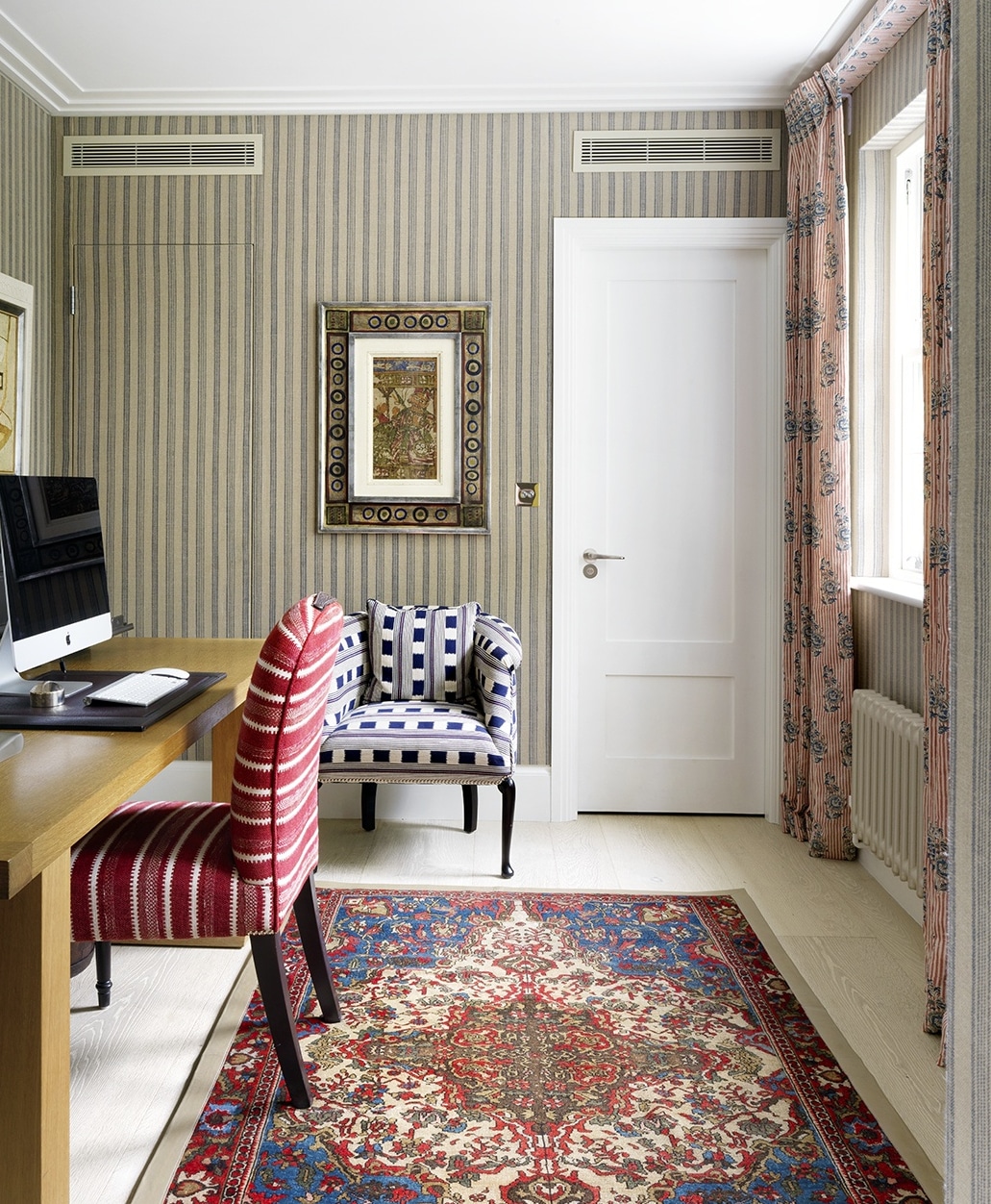
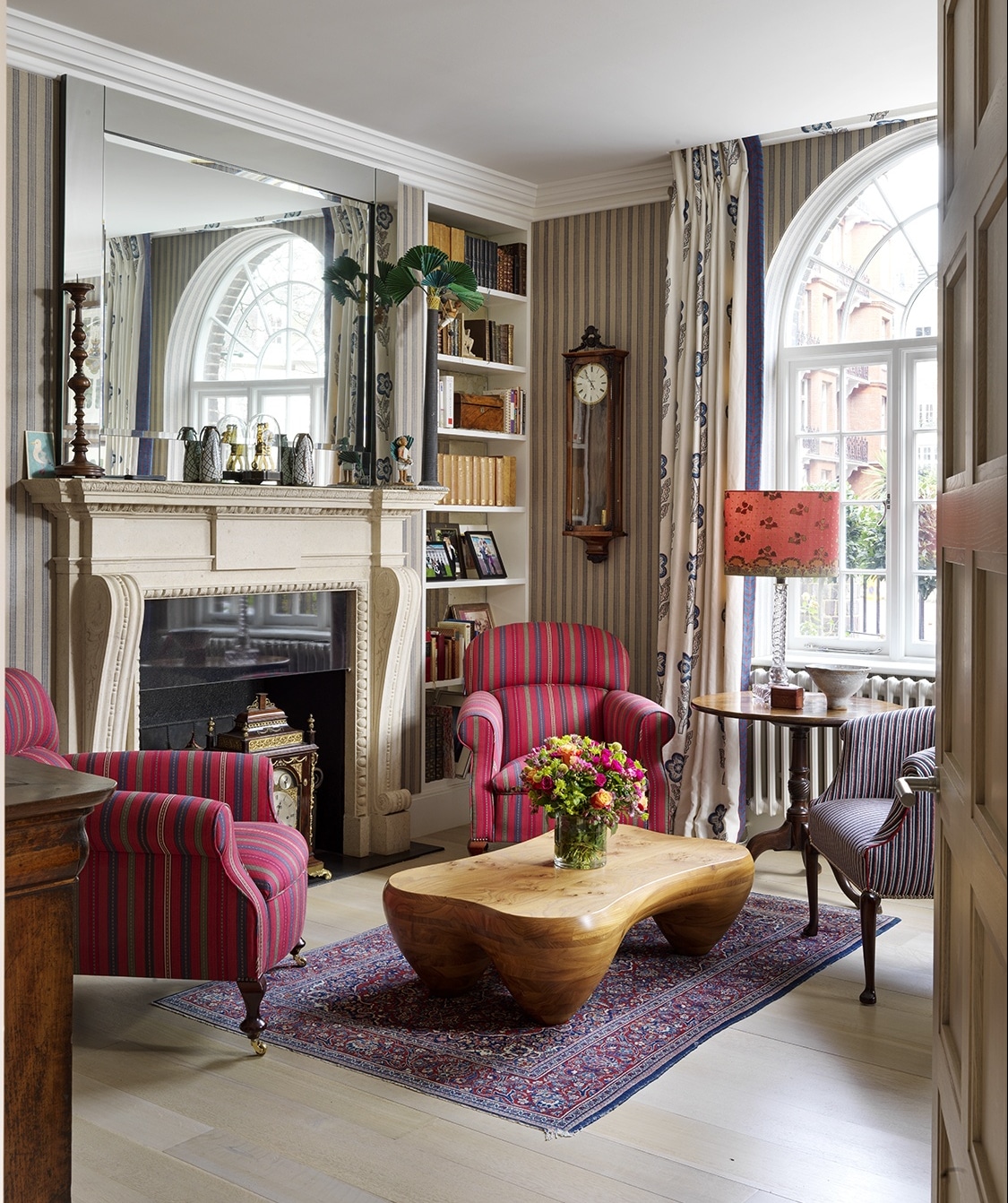
You can combine several different stripes of varying thicknesses, as we have done in this gentleman’s study in London.
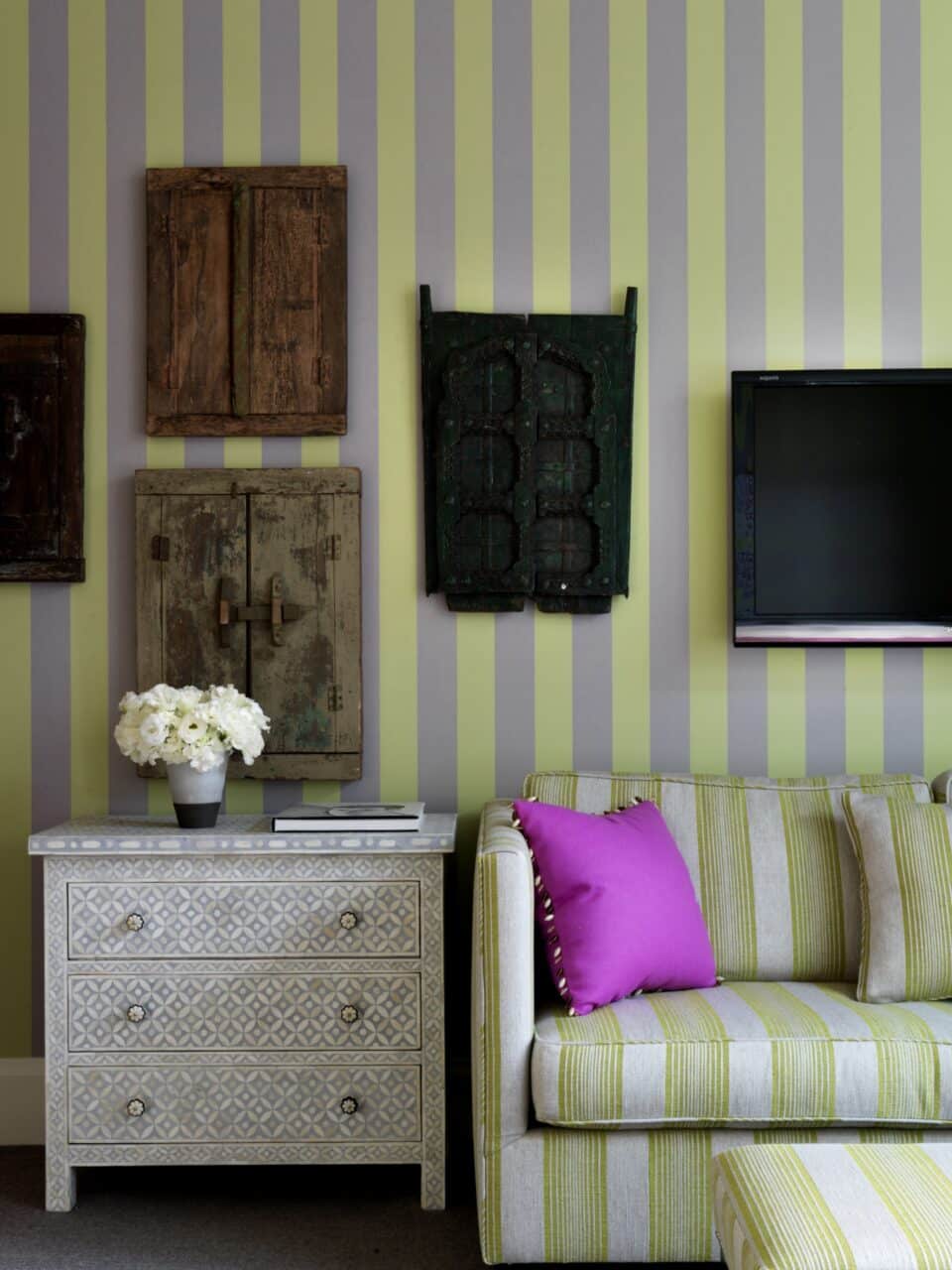
Graphic stripes will create a timeless and eye catching look, whilst wider and more colourful lines will create a pop of colour.
Size matters
A thicker stripe will be more impactful and have a bolder presence. Take this into account when you are choosing your stripes.
Don’t forget the upholstery
Stripes read in such a wonderful way when used on upholstery – in fact, a well upholstered stripe is hard to beat!
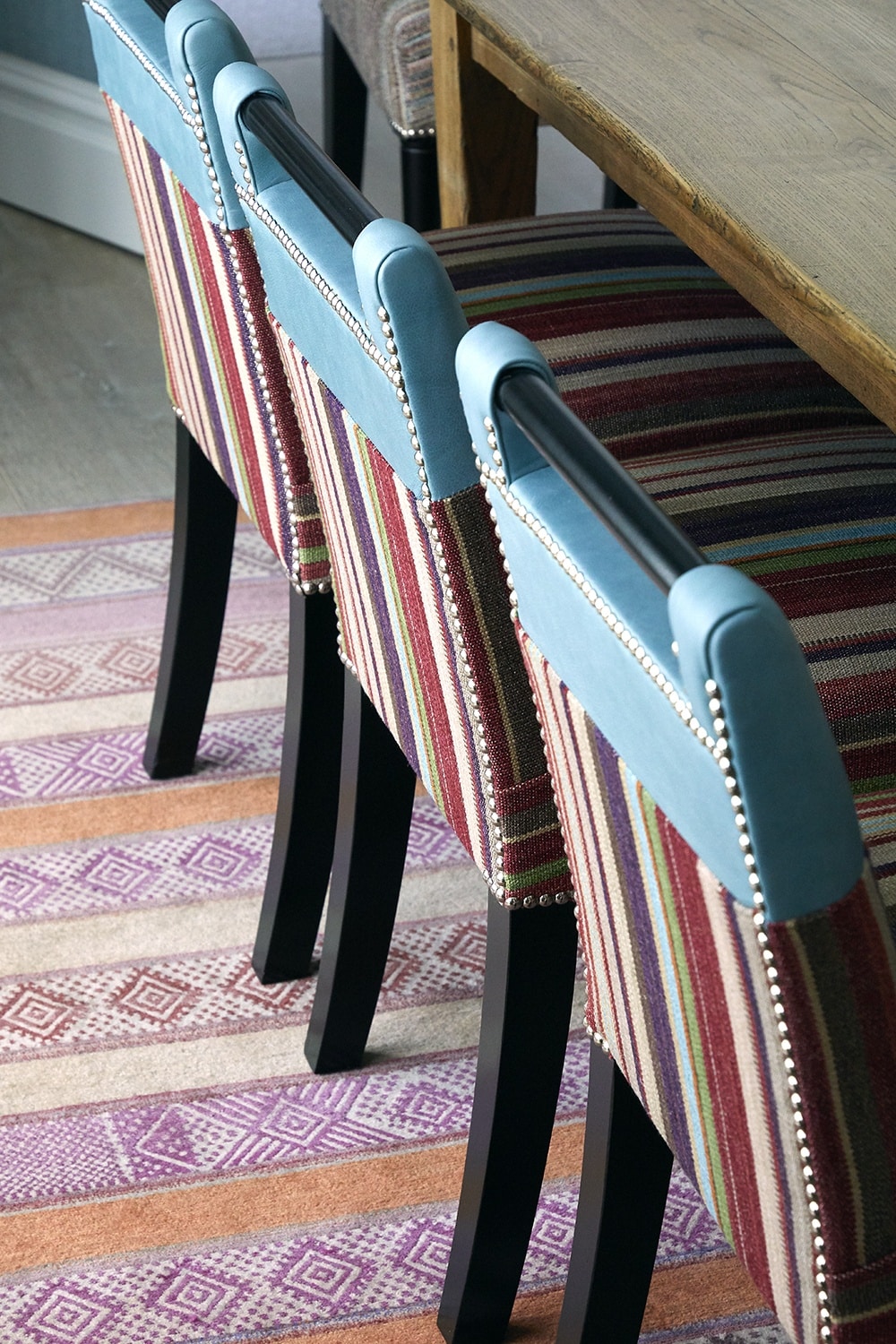
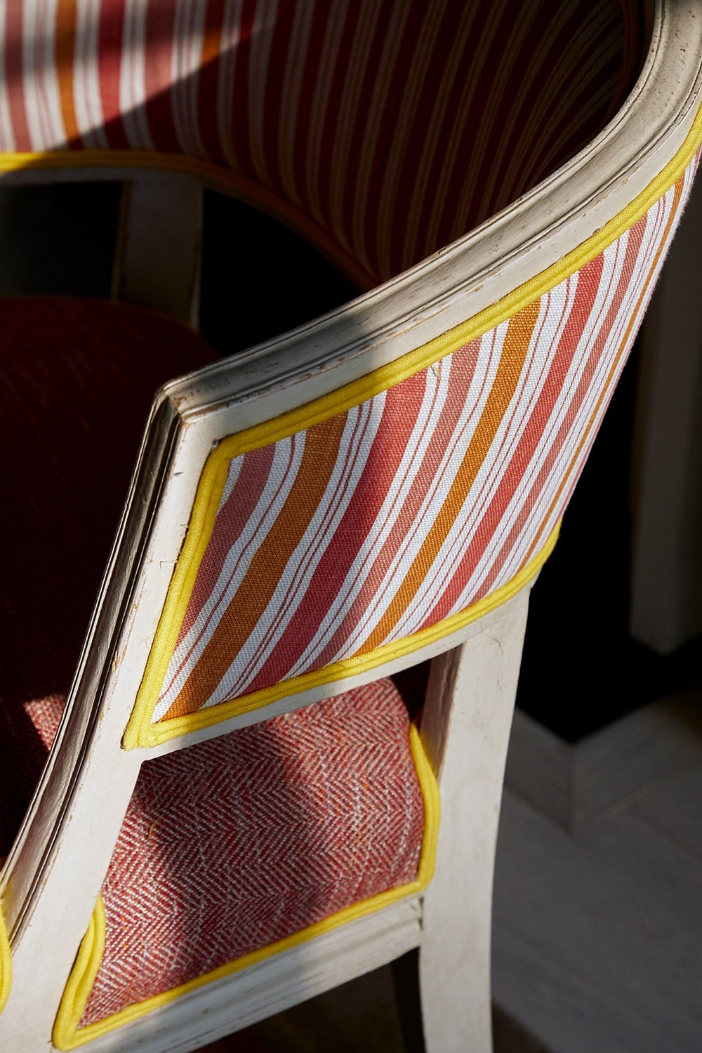
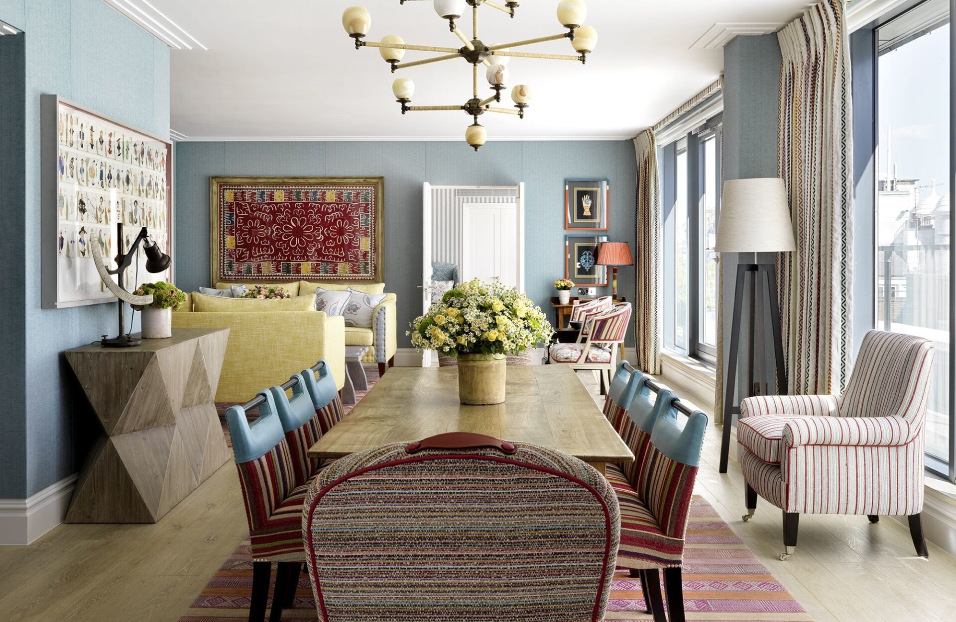
If you find an upholstered stripe too traditional, add a sharp piping for an extra layer of detail or combine it with leather-made items for a contrast in texture. The refreshing blue leather on the top of these handle chairs elevates and rejuvenates the scheme.
An unexpected yellow piping lifts up a very traditional stripe on this chair at Ham Yard Hotel.
Not all that glitters is gold
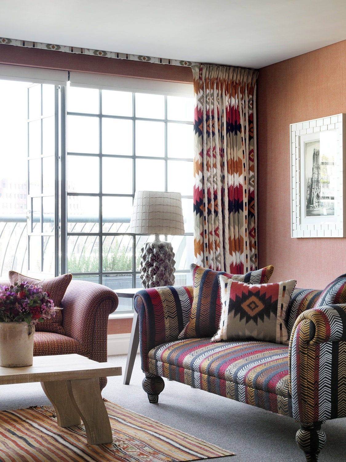
I love to use fabrics that look like a stripe but are not. My “Bookend” fabric for Christopher Farr Cloth is a clever depiction of an arrow that reads as a stripe, but it has a bit more movement.
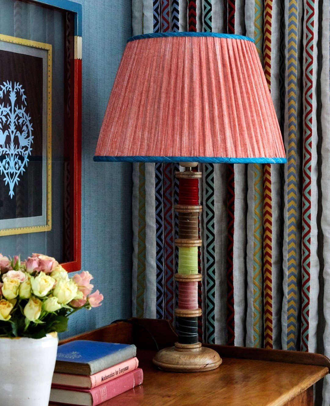
We also love the fun colourful arrow motif used within these plain linen curtains. This little corner packs a punch and is the perfect place to put pen to paper.
Use them on the floors
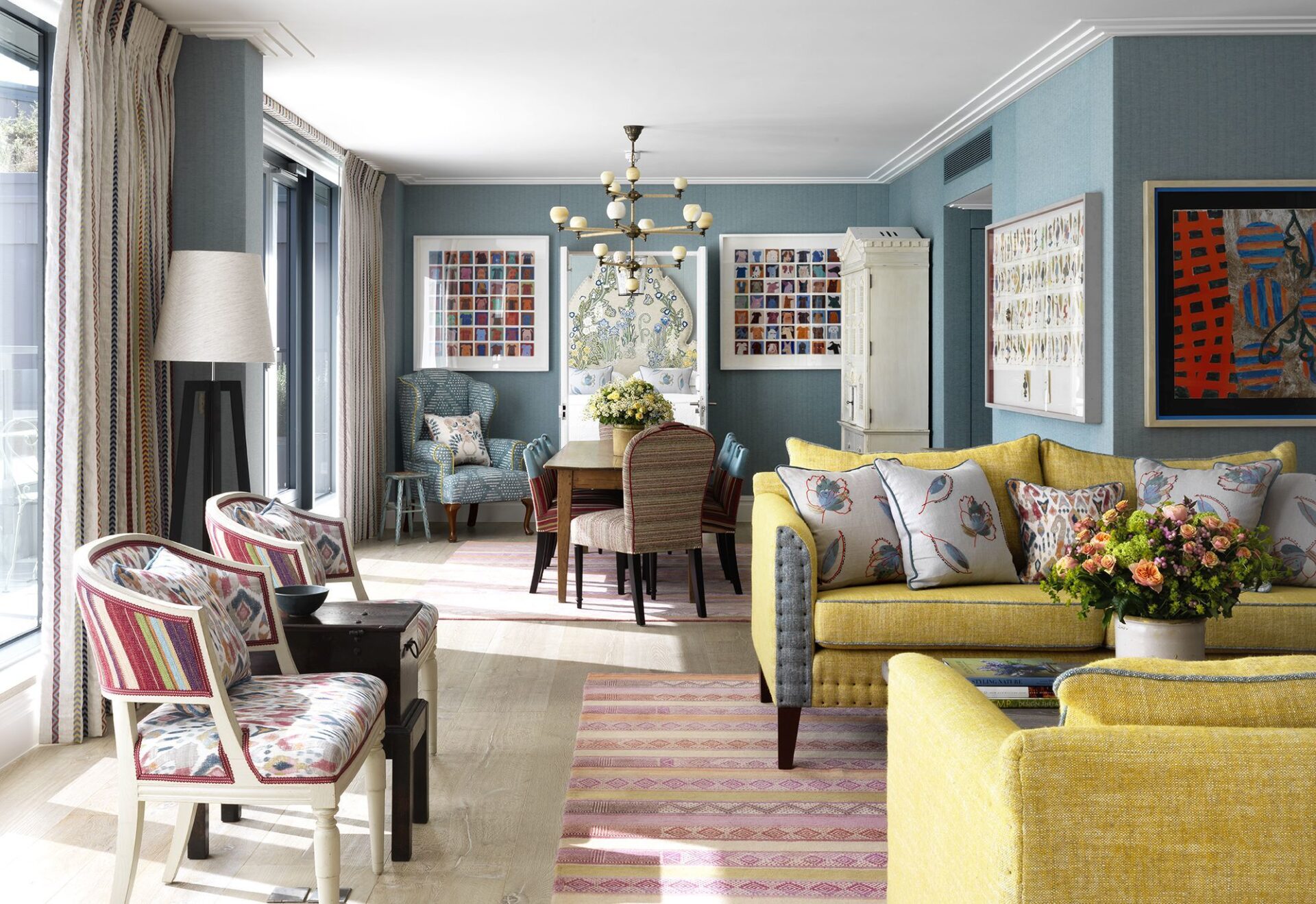
Using a striped rug against an otherwise plain background is a powerful tool in interior architecture – it redirects the eye and can reshape a space.
In the Terrace Suite at Ham Yard Hotel, the living and dining area is a long rectangle. By having the stripes of the rug run horizontally, the room looks well-proportioned.
In the bag
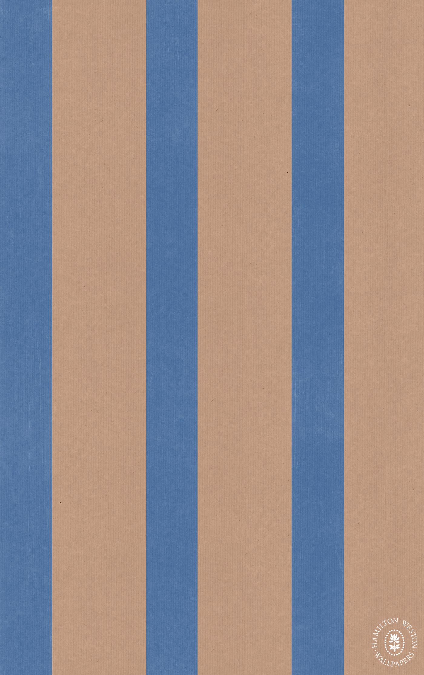
We recently discovered “Brown Paper Stripe” by Adam Bray at Hamilton Weston. This understated stripe has a chic twist and is available in six different colourways. We’re looking forward to scheming with it in our next projects.
Don’t underestimate the power of a stripe. We think they get a bit of a bad rep for being boring, but used in the right way stripes are a versatile, elegant and timeless resource to use in your interiors.

