Decorating a Room – Our Dos and Don’ts
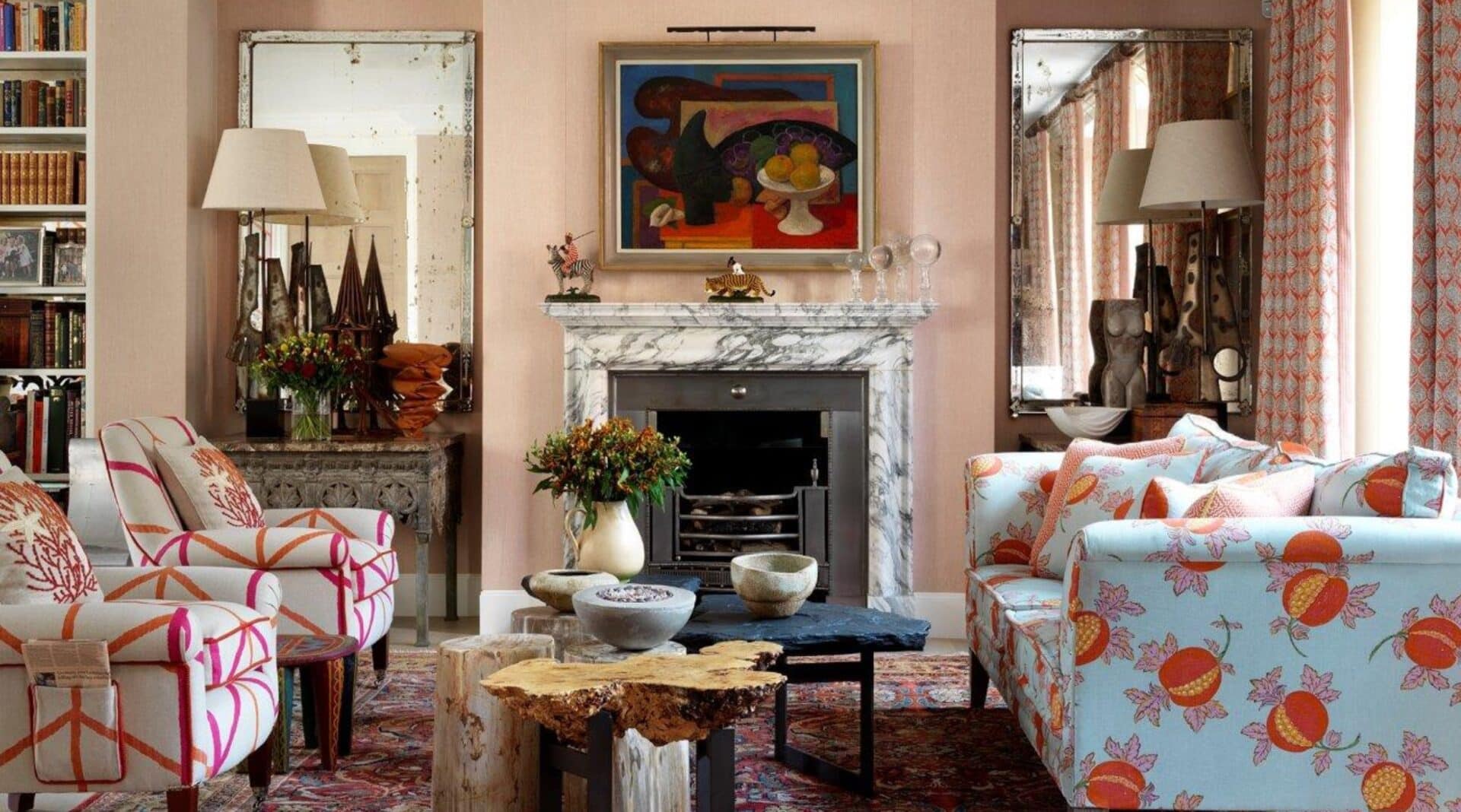
How ToDecorating our interiors so they feel welcoming, balanced, and memorable is what we strive for in the Kit Kemp Design Studio. It is so important to get the details right, so our guests feel comfortable and relaxed. This week, we have put together our do’s and don’ts for decorating a room, which we hope will help you create harmonious interiors in your home...
Decorating our interiors so they feel welcoming, balanced, and memorable is what we strive for in the Kit Kemp Design Studio. It is so important to get the details right, so our guests feel comfortable and relaxed. This week, we have put together our dos and don’ts for decorating a room, which we hope will help you create harmonious interiors in your home.
DON’T OVERLOOK THE PRACTICAL DETAILS
I once bought an armoire that wouldn’t fit through the bedroom door. We had to take it to pieces and put it back together which is not ideal. Scale is always important when it comes to practicality.
Over the years, we have seen so many homes where the furniture is made for a much larger room and immediately it feels cramped. Equally, small furniture in a large room can look uncomfortable and out of proportion. The height of furniture has to be right. A coffee table that is too high beside a sofa makes you want to stand up and leave, you shouldn’t feel as though you are making an effort to put your feet up or put a cup of tea down.
DO BALANCE STRONG COLOURS WITH NEUTRALS
We love colour, but there always needs to be a neutral thrown in to give a room some breathing space. We carefully balance our interiors with neutral toned materials. They are timeless and create the very foundation that our schemes are built upon.
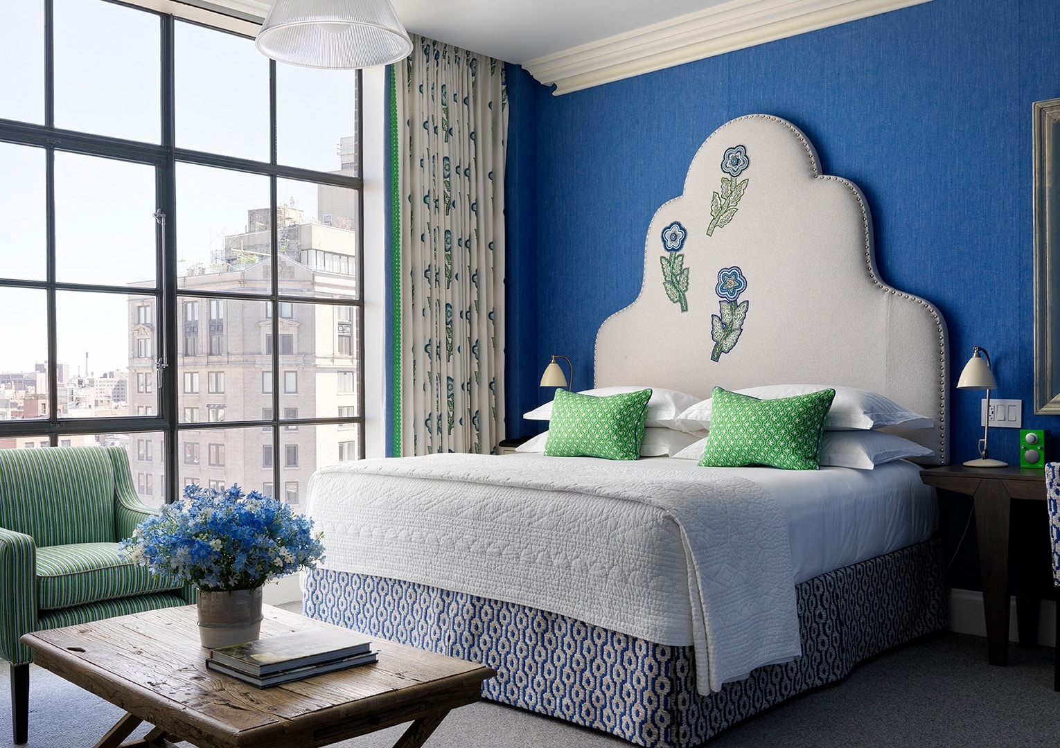
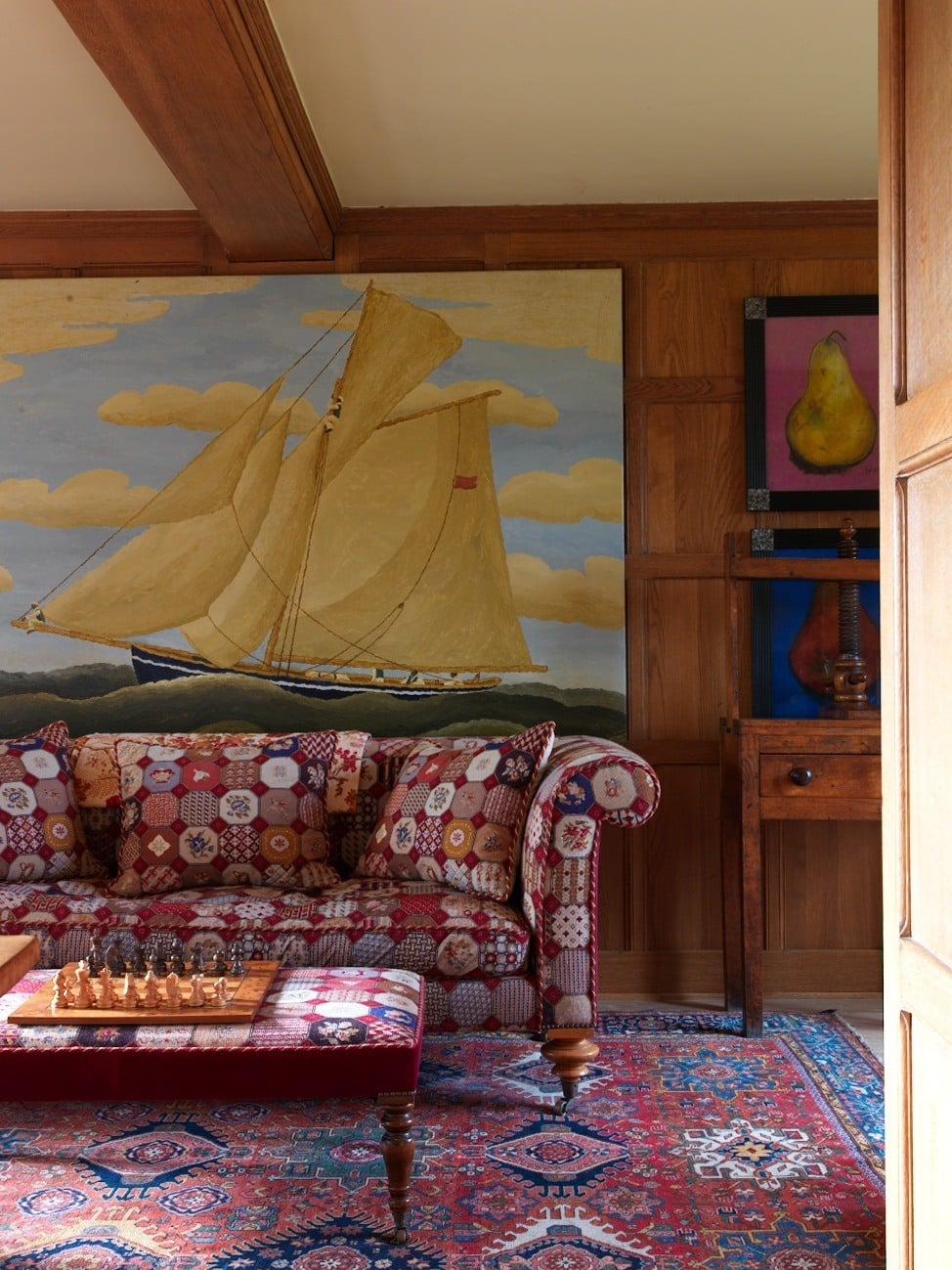
Layering linens, wools, cottons and leathers of all different weights and textures creates an interesting scheme. Opt for a fabric with a neutral background to allow colours and patterns to burst from the backcloths, creating a spectacular impact. Whether it’s printed or embroidered, appliqued or woven, neutrals are vital.
DON’T FORGET ABOUT THE FUNCTION OF THE ROOM
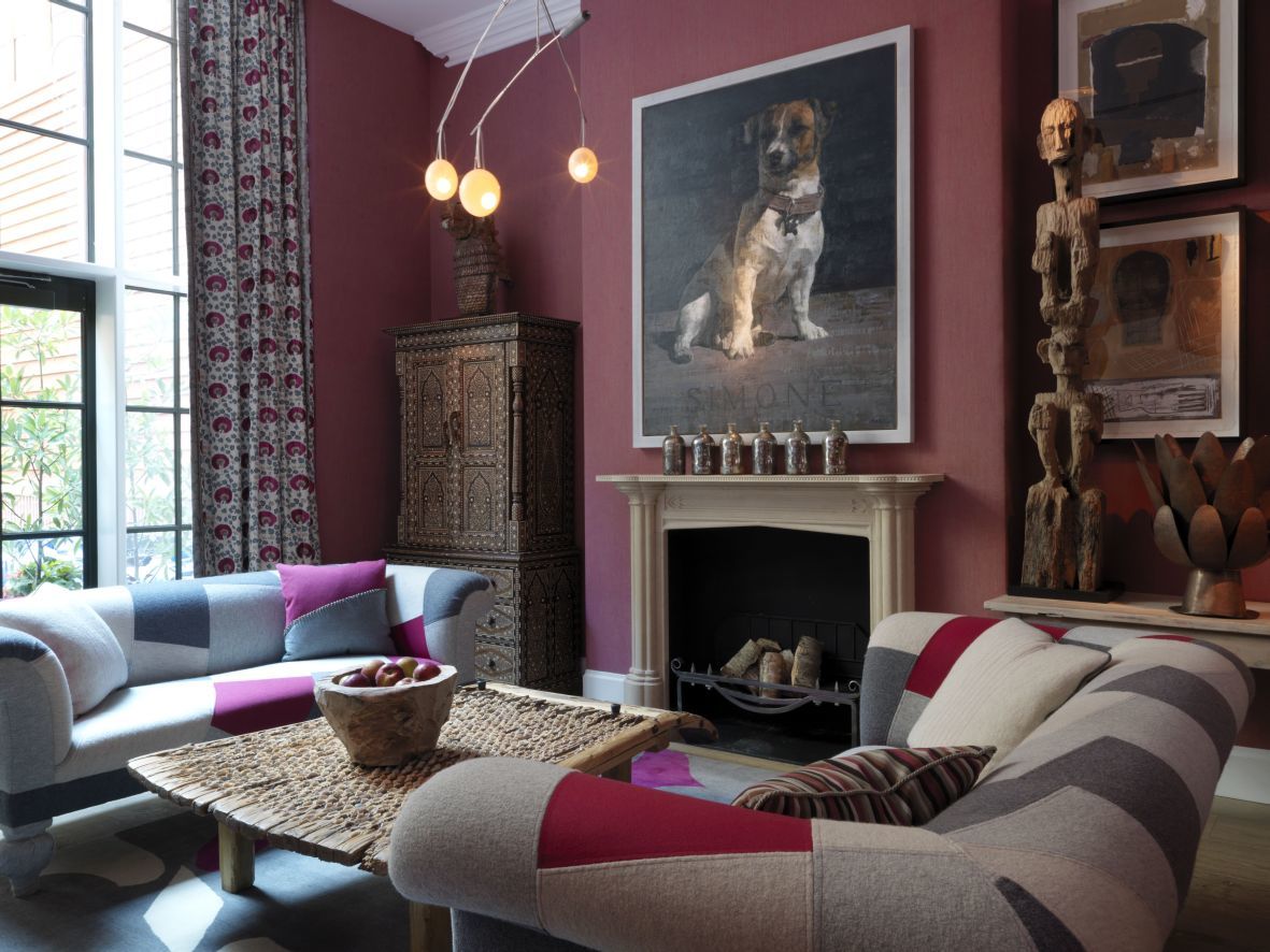
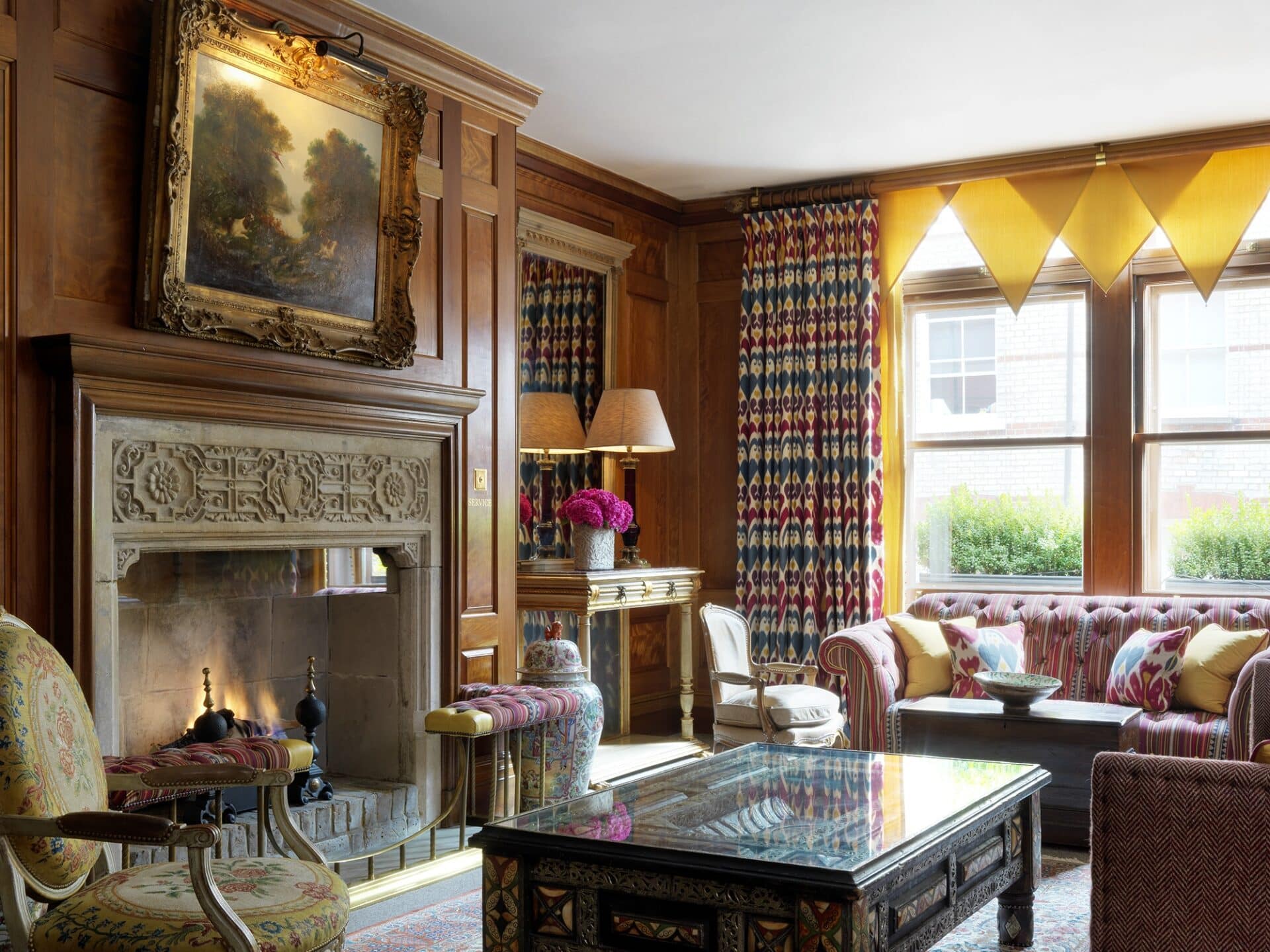
One of our favourite rooms is the Drawing Room at Covent Garden Hotel. The wood-panelled walls and fireplace look as though they have always been there, but in reality we added these features in. The panelling and working fireplace create a comforting ambiance at any time of day or night. The room looks as if it was “meant to be”. It’s big enough for receptions but still cosy enough to sit by the fire and read a good book!
DO DESIGN YOUR OWN FABRICS AND FURNITURE
Over the years, we have designed numerous textiles and pieces of furniture. I love using bespoke pieces in my schemes to give a space originality.
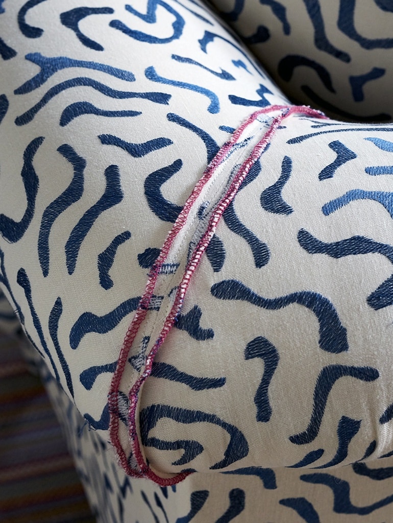
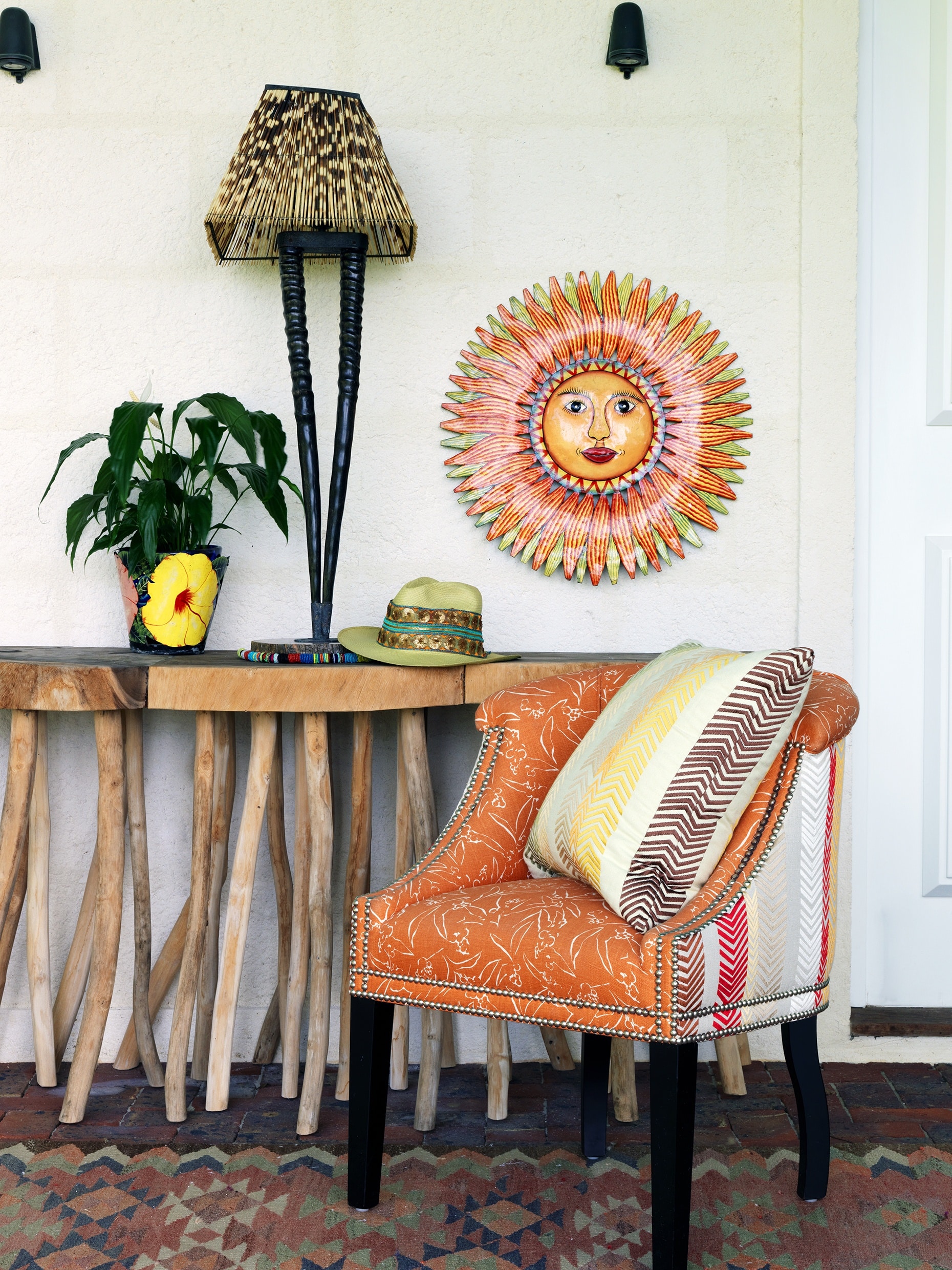
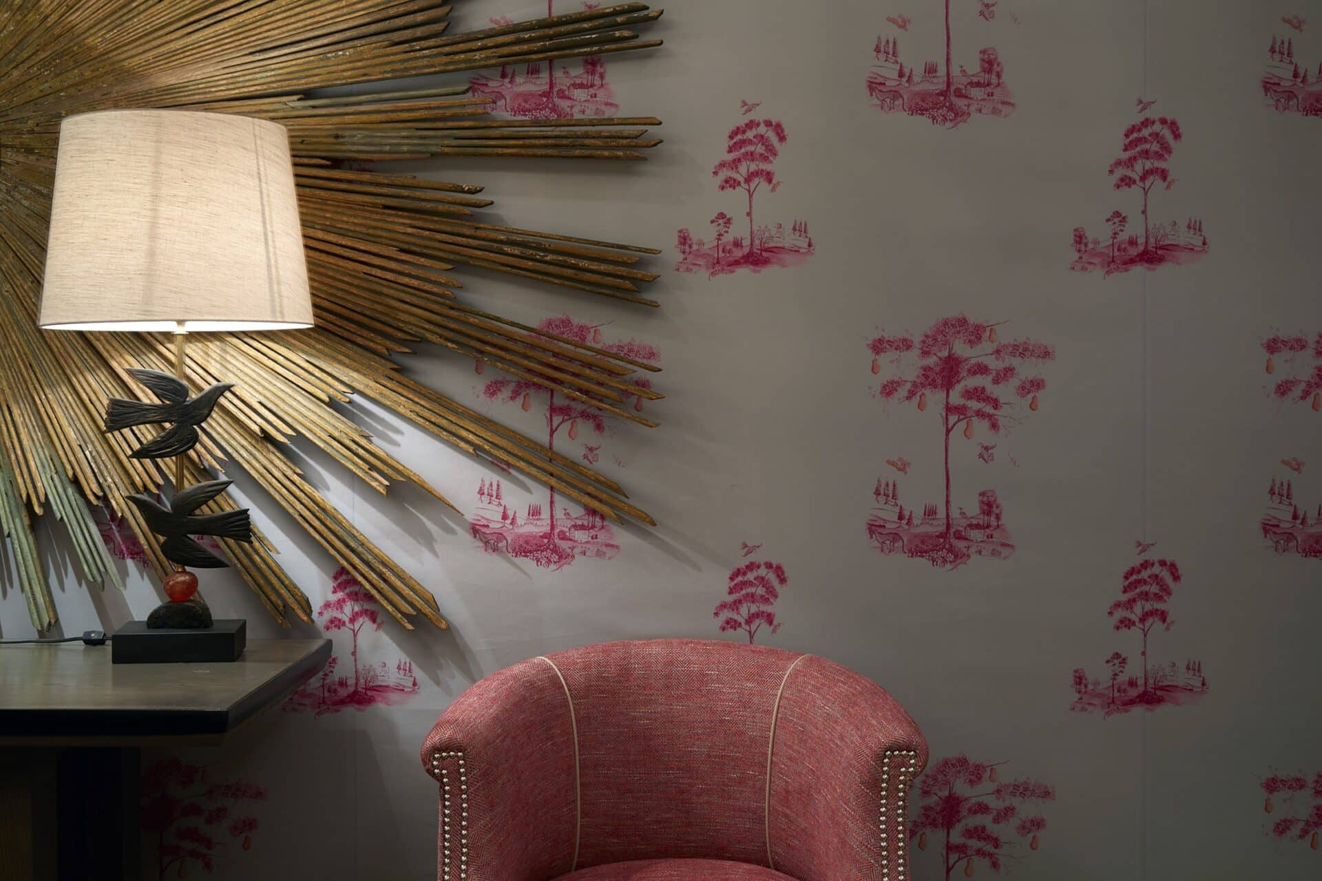
This tub chair we designed is named after my daughter Min, we call it the Min’s Tub! On the back of the chair I have used my ‘Bookend’ fabric and on the front I have used a more sturdy fabric called ‘Inside Out’. This way we have made this chair totally unique!
DON’T USE SYNTHETIC FABRICS
Natural fabrics have an authenticity and character that synthetics have yet to achieve. We choose fabrics that are rich with natural imperfections and texture within the weave. It’s an easy way to create a sense of understated luxury within a space. A blend of linens and wools, weaves and prints lend depth to the space as the raised surfaces reflect light and create shadows.
DO USE DESIGNS THAT ARE HANDCRAFTED
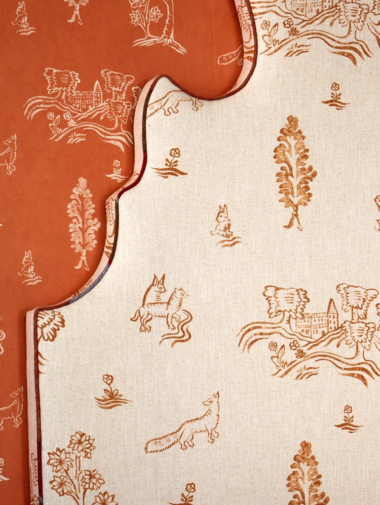
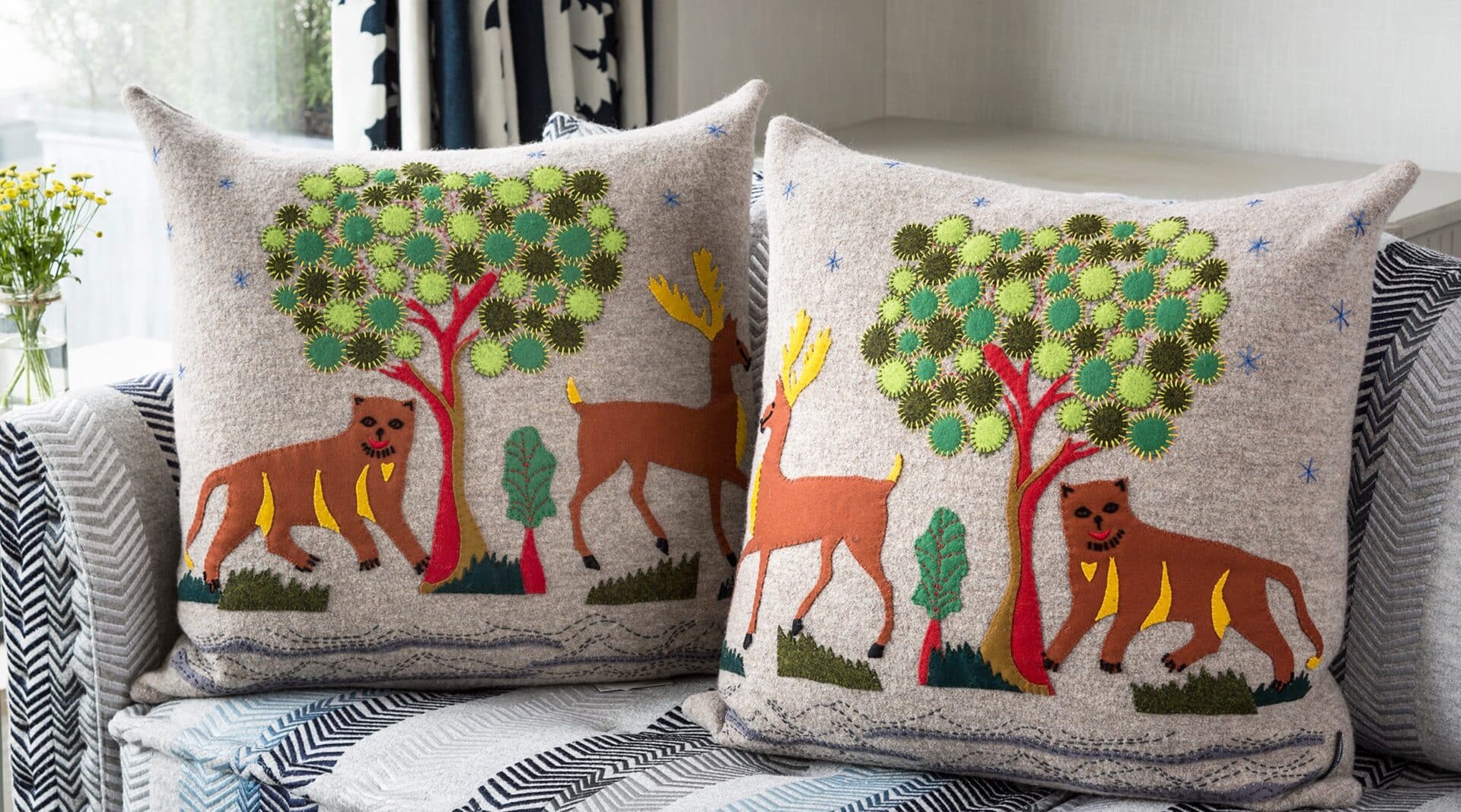
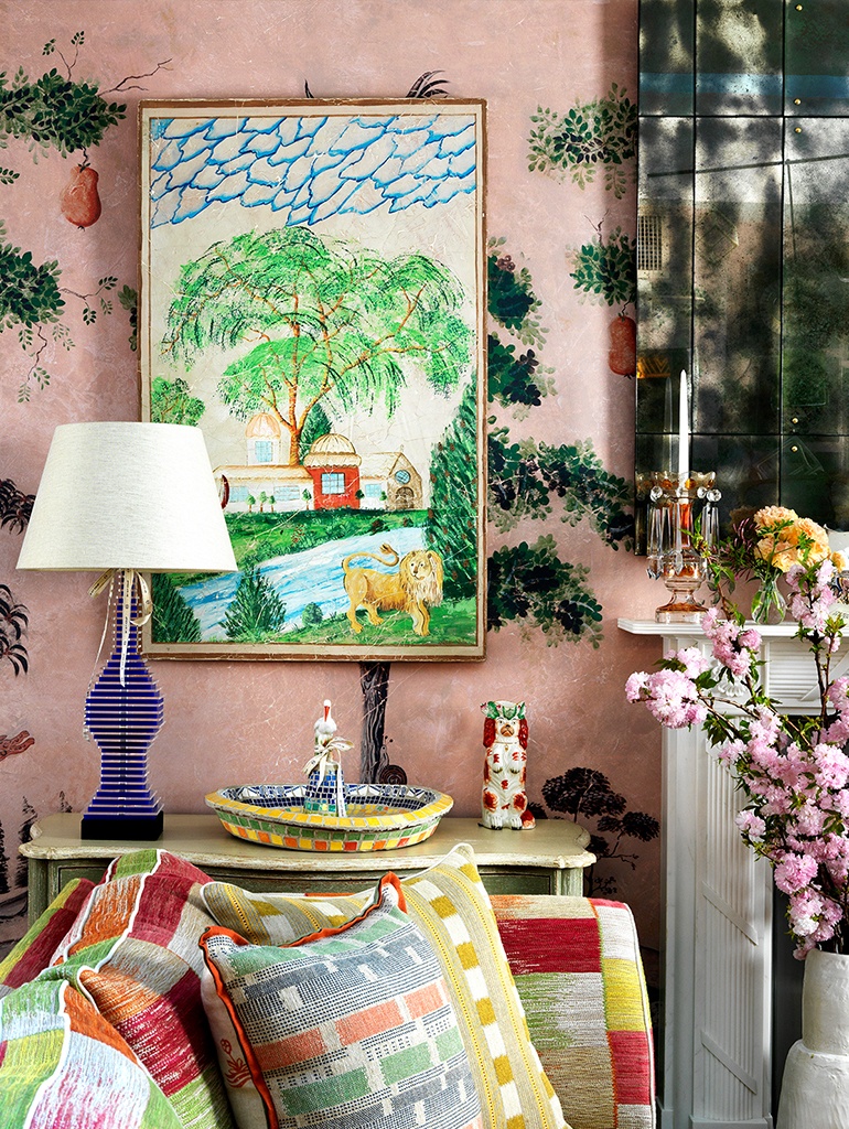
We are known for our handcrafted interiors and bespoke designs. It is these details that add life to a room. I love to create one-of-a-kind pieces which make a room completely individual, from hand-painted murals to embellished cushions and headboards.
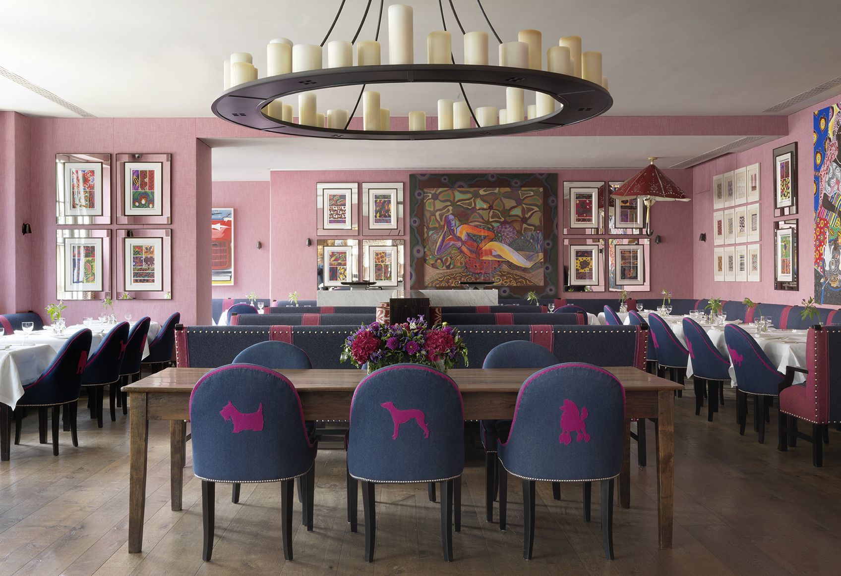
We are currently working on new chairs for Shop Kit Kemp which includes bespoke applique designs similar to these – keep your eyes peeled!
DON’T FOLLOW A THEME
Here at the Kit Kemp Design Studio we can’t bear interiors that follow a theme too closely. For example, a room that is a “gentleman’s club” with big leather sofas and dark moody lighting – it is so generic and unoriginal. We like to think outside the box and design rooms which are individual and interesting, with details that haven’t been seen before. This is what makes a room memorable.
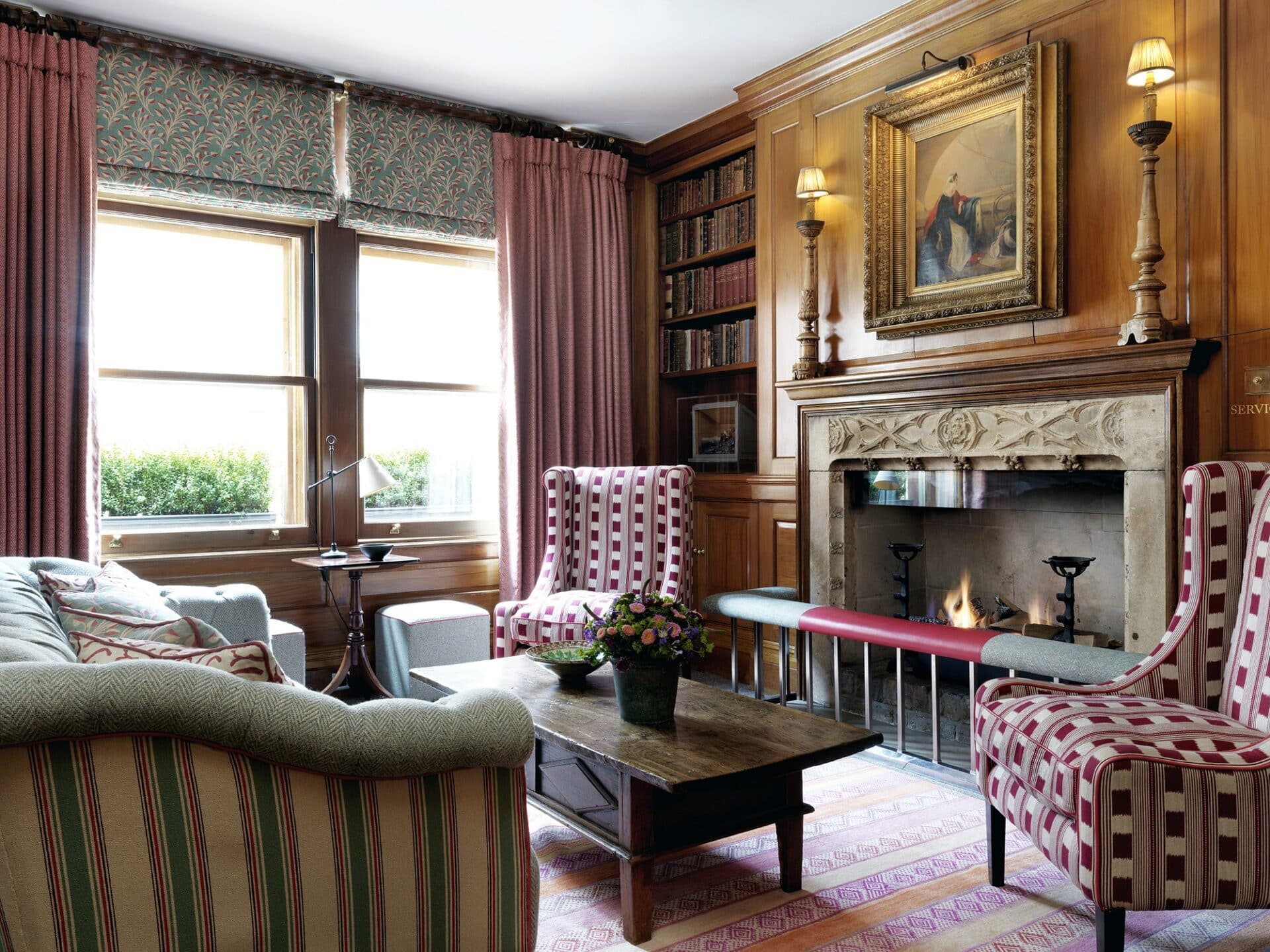
For example, in Tiffany’s Library at Covent Garden Hotel, we have used our colourful Lost & Found fabric on the wing chairs flanking the fireplace. A lot of the time library spaces can be very brown and beige. We believe bringing colour and eclectic pieces into a library helps to inspire our guests.
DO USE DIRECTIONAL LIGHTING AND KEEP IT LOW
Don’t accentuate bald patches on the top of people’s heads! Keep lighting low, directional and practical. We try to avoid using spotlights where possible, especially in rooms such as living rooms, libraries and bedrooms. These spaces are meant to be warm and inviting, so we tend to use low level lighting with table lamps, standing lights and picture wall lights. By placing table lamps or a standing light behind furniture or a plant in the corner of the room, it can actually make the room feel larger!

