Our Top Tips for Hallway and Corridor Design
How ToWe never think of a hallway or an internal lobby as a dark hole, we think of it as a space in which to take a moment and to dream. It should be an area that can be dramatic and interesting. In between spaces are special areas – they make all the difference to the beauty and flow of a building...
The flow of a home, between rooms and spaces is very important. The key is to have a length of view that makes you feel curious to see what is just around the corner. The Kit Kemp design team is always thinking of new and exciting ways to make corridors feel vibrant and joyful. When designing our hotels, we try to make the whole building an adventure for all the senses.
Hallways and corridors are often forgotten spaces that lack life and design. It is important to understand that when entering a home, an entrance hallway makes the first impression. Corridors and staircases take up a considerable area of a property so it is important to make the most of them. For us, no space is a dead space. We have put together a list of our top tips for corridor and hallway design.
BE DRAMATIC WITH ART AND SCULPTURE
We often work with emerging artist and weaver, Hermione Skye to create impactful art installations, seen in the lobbies at Ham Yard Hotel and The Whitby Hotel. Hermione created a dramatic and colourful loom above each of the front desks.
ADD A RUNNER OR RUG
A great way to liven up a hallway is by adding a runner, especially if your space is limited. If the corridor is very narrow, there won’t be any space to add furniture. A runner is a great way to add texture, colour and fun. We added a runner to the lobby at The Soho Hotel to really finish the space. The runner is called ‘Batik’ from Kit Kemp’s collection for Wilton Carpets, which includes nine exciting designs, perfect for making a statement.
Hermione has designed a to scale model loom weave installation for above the front door of a current residential project we are working on. We cannot wait to see the end result!
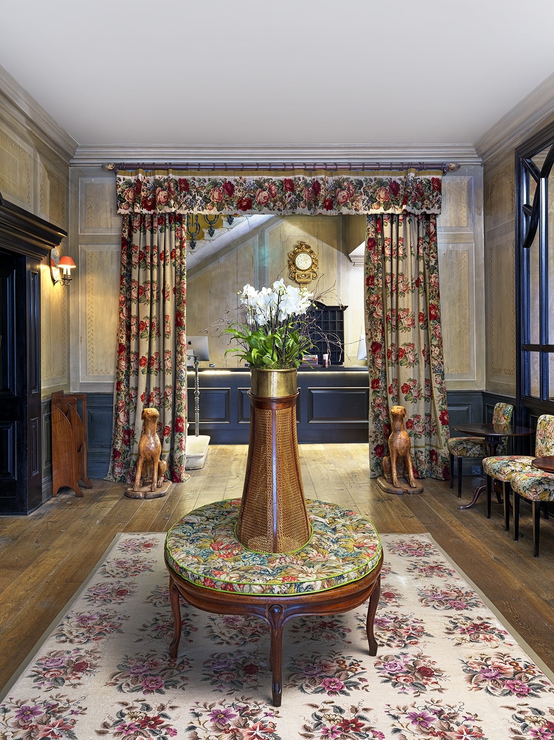
In the entrance of Covent Garden Hotel, we installed an antique rug which lies beneath a vintage conversation bench. The rug grounds the room, making the lobby a warm and inviting space.
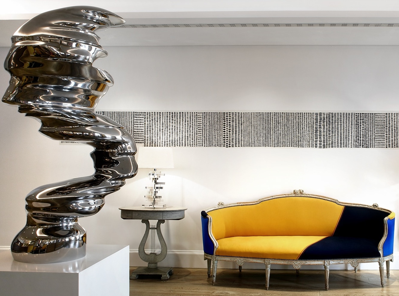
At Haymarket Hotel, we added an antique Rococo sofa covered in vibrant blue and yellow felt. This stands strong against the white backdrop, which has an artwork of a thousand tiny stones by Sue Lawty, which draws your eye into the space.
ADD A PIECE OF FURNITURE
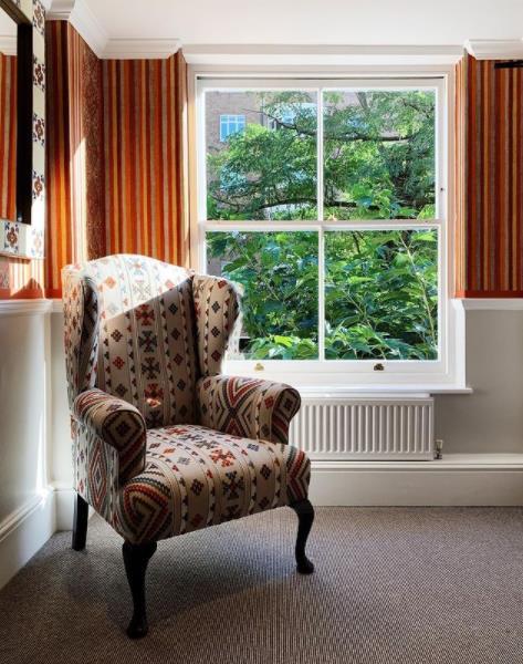
If you do have more room, adding upholstered seating or a bold piece of furniture will help to soften the space . At Number Sixteen in South Kensington, we have added a wing chair in the corner of the corridor by a window.
DO ADD HUMOUR
It’s always important to have fun in your designs, adding humour will brighten any space. It could be in the form of a sculpture or simply by using a cheerful wallpaper.
At The Whitby Hotel, we have used Kate Blee’s ‘Tribe’ wallpaper in this staircase. This pop art display makes a serious impact when seen through the Crittall windows. What a way to make an entrance!
At Crosby Street Hotel, we were inspired by the dogs of SoHo. In the hotel’s entrance, Justine Smith’s dog sculptures lined with old Beano comics amiably greet guests as they arrive.
It’s important to fill these spaces in which you travel from one area to another with something exciting and punchy. In this staircase at The Whitby Hotel we hung a collection of vintage spy prints in strong black frames on the walls to really play into the graphic ‘Ozone’ design.
DON’T FORGET TO PLAY WITH LIGHTING
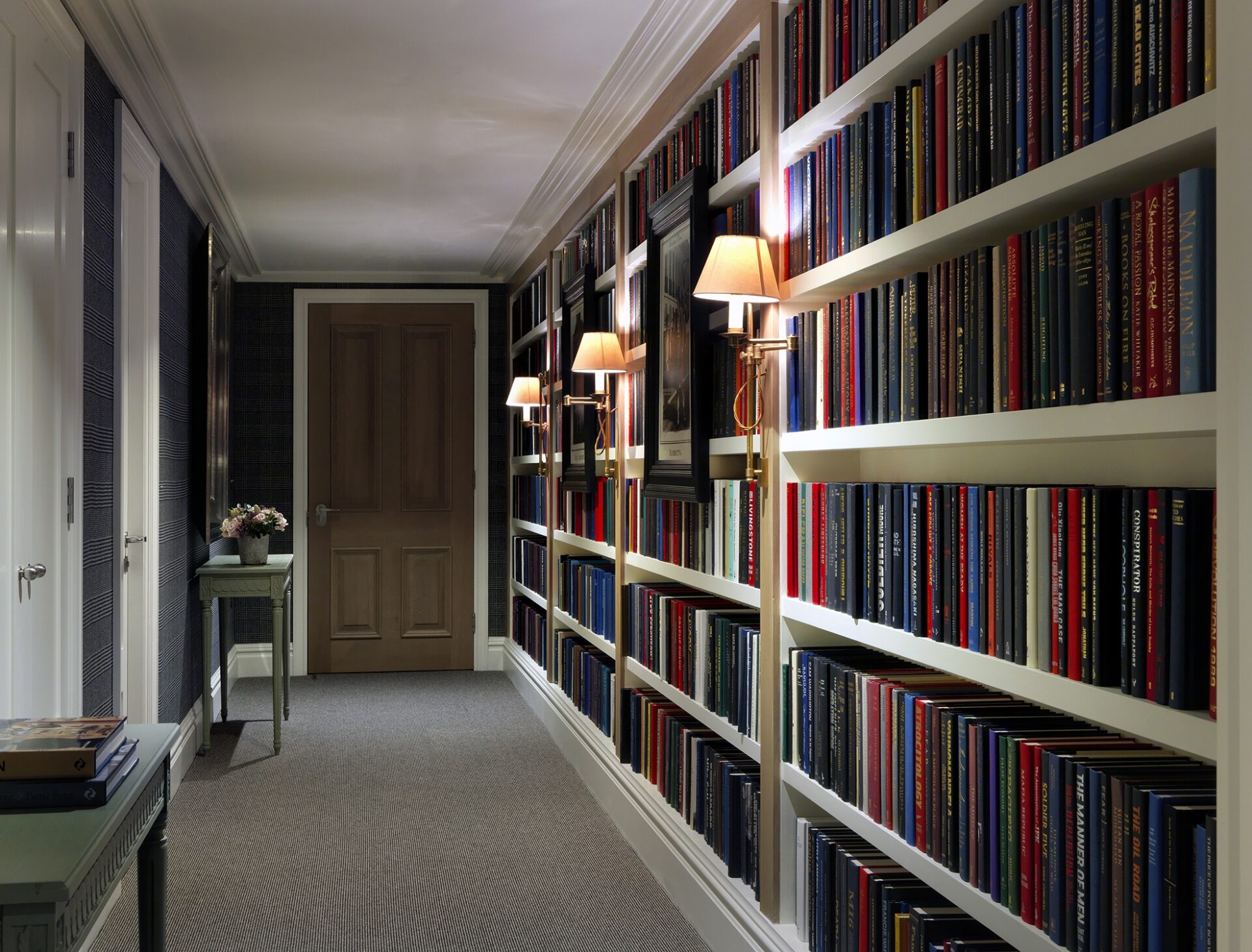
In this apartment in One Denham Place, we added a book-lined corridor and installed these traditional wall lights to make this space cosy and romantic for our long stay guests.
At the Soholistic Spa at Ham Yard Hotel, we have used these down lights on the walls and placed lanterns on the ground. This dramatic lighting leads the eye down the corridor, to meet the little elephant water feature. We believe that there should always be something that piques your interest.
It’s also important not to forget about exterior corridors! In Ham Yard village, we have installed The River of Lights. It is an unique piece of architectural lighting made of Cube market lights in a winding stream pattern. We installed this to draw people through the arcade into the hotel’s courtyard, creating an exquisite atmosphere.
Finally, as it is the festive season – if you are looking to fill a corner of a hallway or corridor in your home, why not put your Christmas tree there and light the corner with fairy lights as we have done here at Charlotte Street Hotel.
We never think of a hallway or an internal lobby as a dark hole, we think of it as a space in which to take a moment and to dream. It should be an area that can be dramatic and interesting. In between spaces are special areas – they make all the difference to the beauty and flow of a building.


