A Place within Space: Our Dos and Don’ts for Partitions
How ToCreating divides within a large space is a way to create interesting nooks and to differentiate between ‘zones’. It’s how these divides are created where the creativity and playfulness comes in. Here are our do’s and don'ts for breaking up a space with fun and unique partitions...
Creating divides within a large space is a way to create interesting nooks and to differentiate between ‘zones’. It’s how these divides are created where the creativity and playfulness comes in. Here are our do’s and don’ts for breaking up a space with fun and unique partitions.
DO use something unexpected
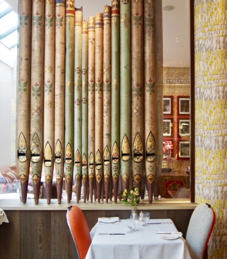
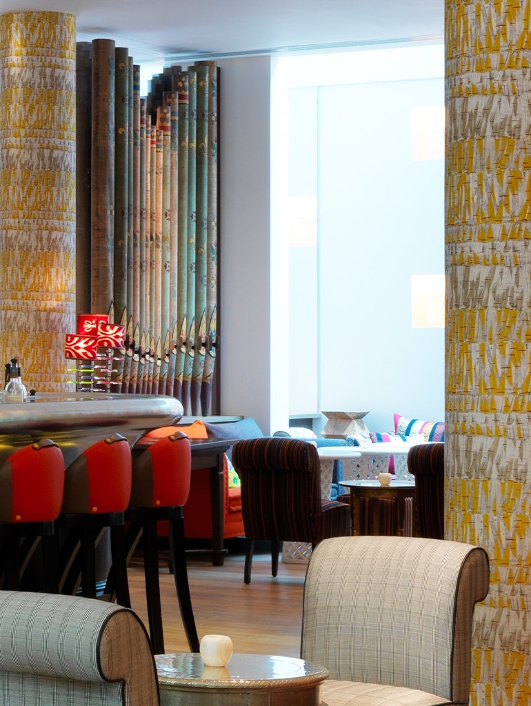
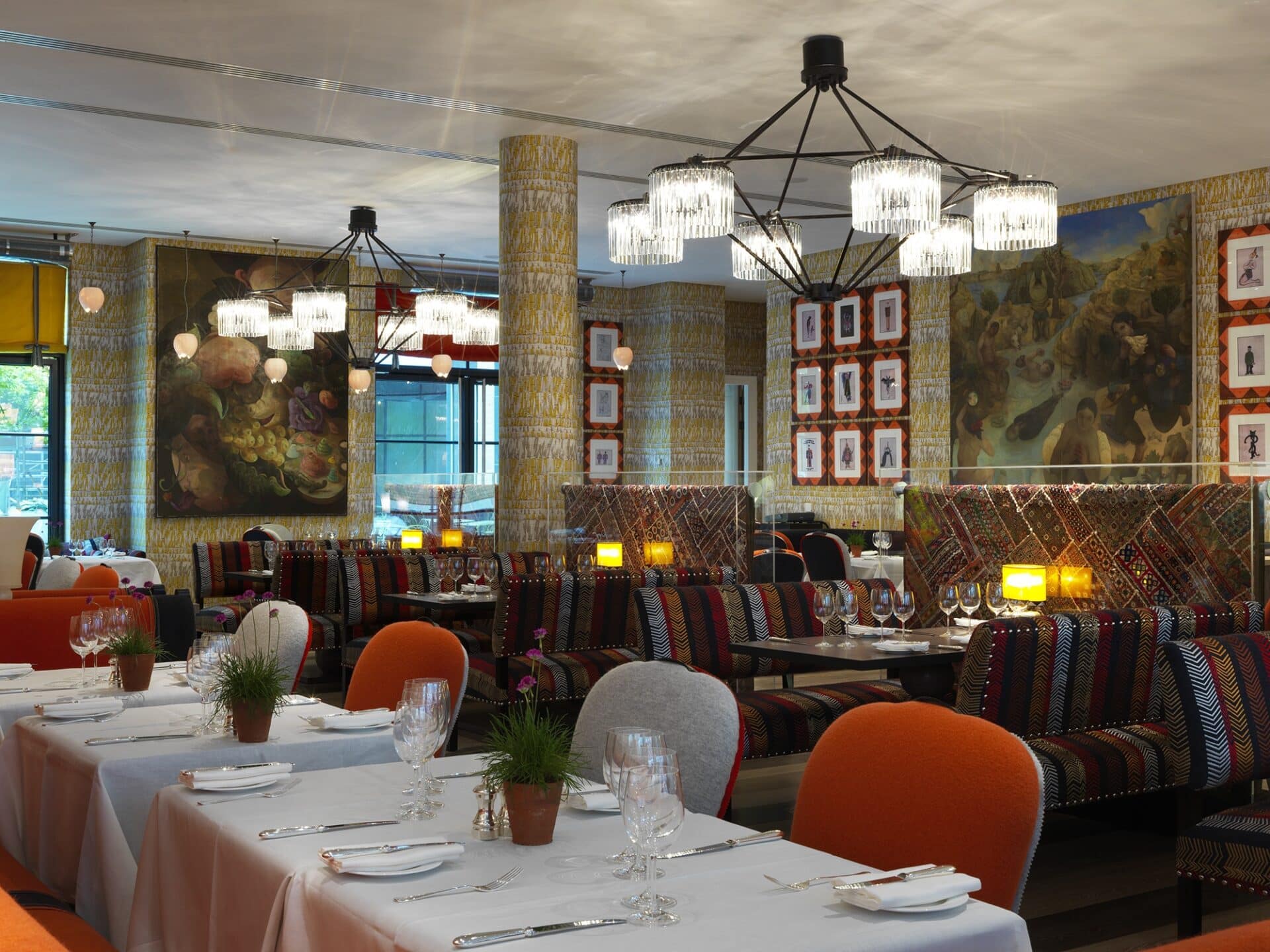
When we were putting together the design for Ham Yard Hotel’s restaurant, we were faced with a large open plan space with a very generous square footage. We knew we had to creatively construct alcoves and zones within the space to create privacy for diners. My first point of call was to divide up the back seating area, so it didn’t feel like one expansive wall. I decided to use some beautiful old organ pipes framed in perspex. We love to use something totally unexpected that will cause guests to stop and look.
DON’T limit yourself
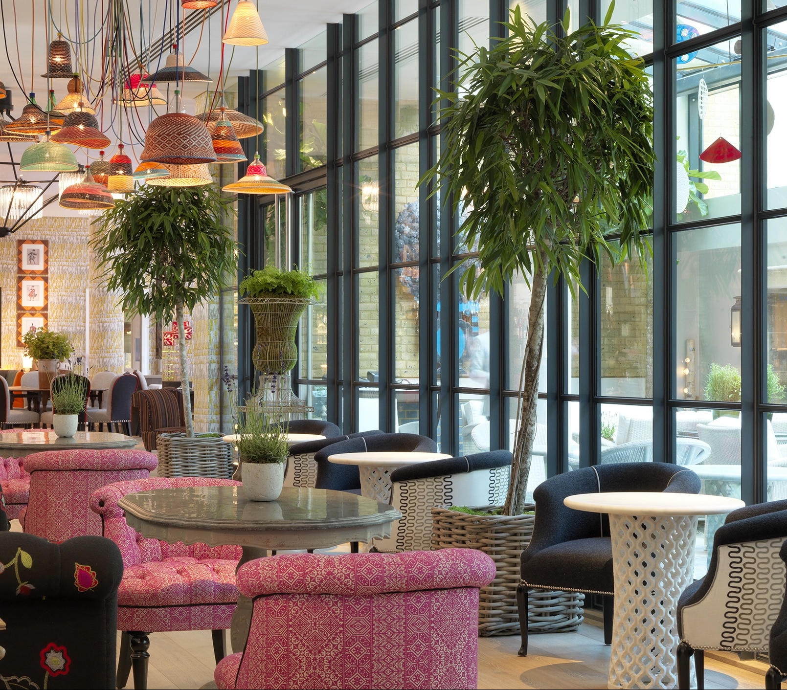
Just a few steps away from the Ham Yard Restaurant is the Orangery. I wanted to create a distinction between the outdoor-style lounge area in the conservatory and the Shade Bar. It was so important the hotel was filled with different spaces that people could discover. We decided to create an internal divider with a Crittall window wall. We softened this with trees and a row of cosy low seats to create a transition between the spaces.
When these were installed, my PA and long standing partner in crime, Susan had a good laugh. She remembered when I bought them and could never imagine where they would end up. Here, they aren’t only a talking point but they serve a purpose in dividing the space beautifully and breaking up the noise travelling between the restaurant and bar.
DO use creative shelving
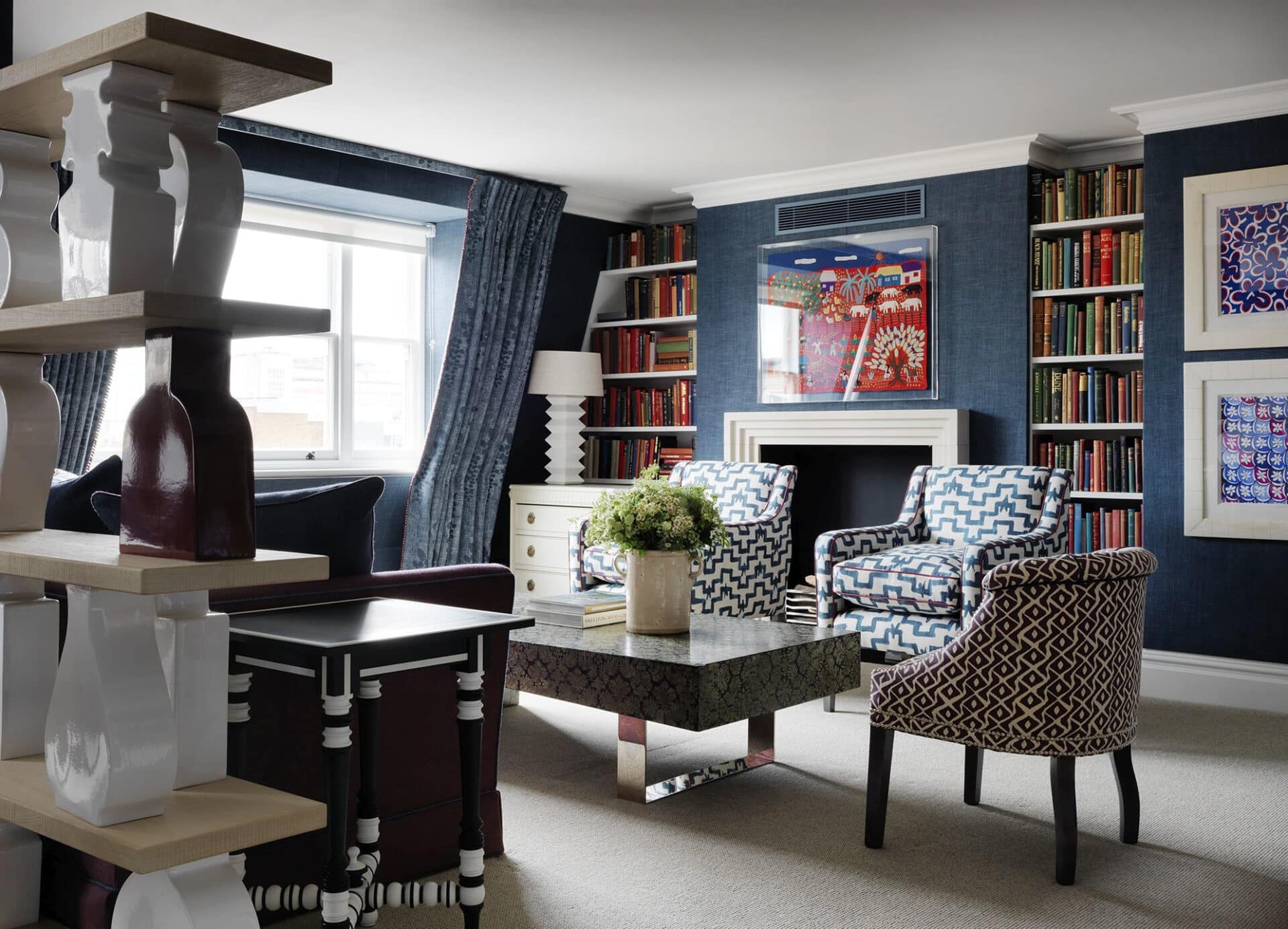
Shelving is a wonderful way to create divides. One of my all time favourite shelving designs is the sculptural Lando shelves with their ceramic silhouettes of pots, vases and urns. We always bring in a shock of colour or gold to bring the predominantly white ceramics to life.
We have used this in many different spaces, including this spacious suite at Charlotte Street Hotel, where we needed to differentiate between the bedroom and living room.
DON’T overlook subtle spatial divides
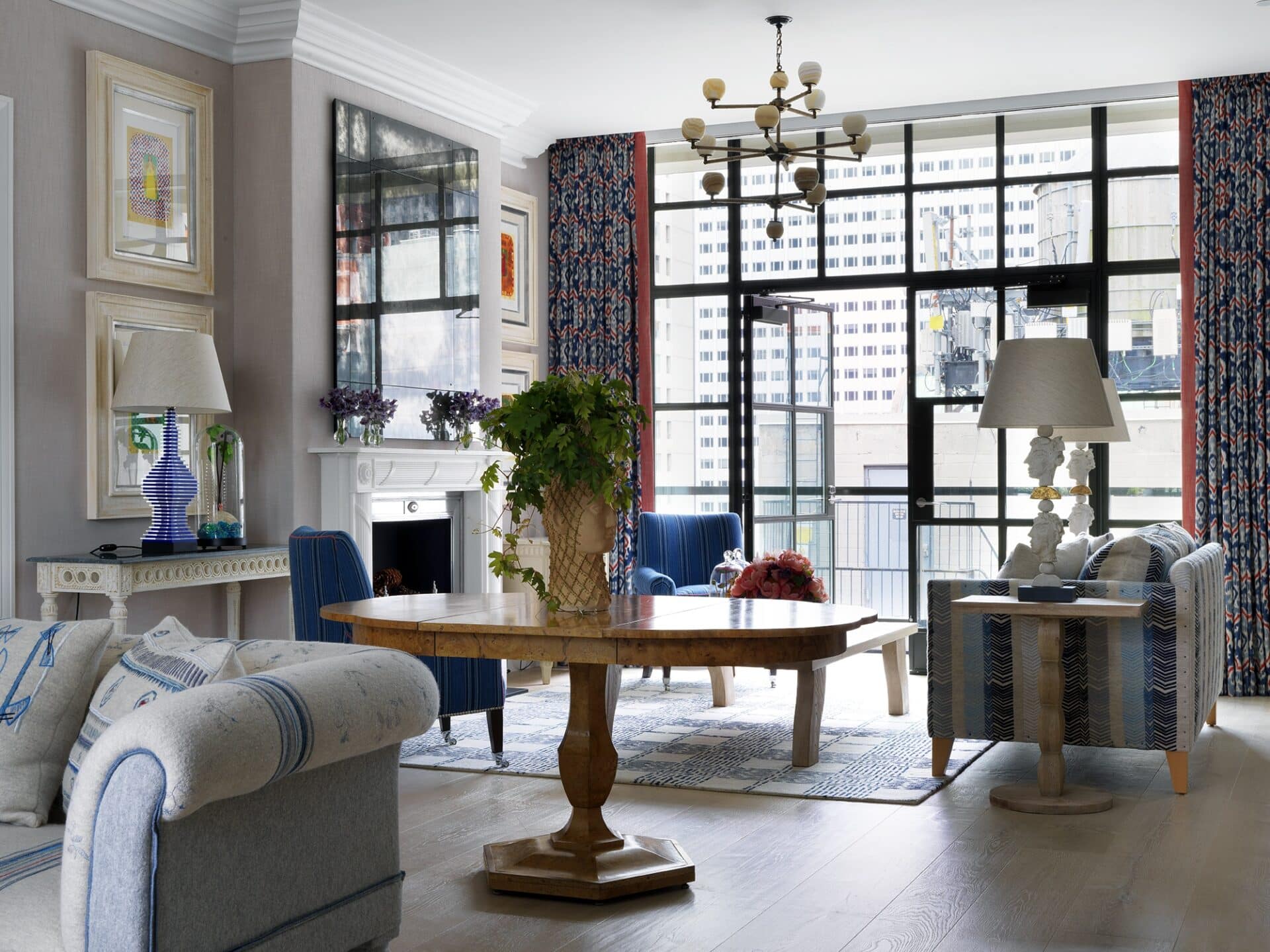
Sometimes a room needs a divider that doesn’t separate the space but creates a subtle distinction. In the penthouse suite at The Whitby Hotel, we wanted to create a double aspect drawing room with two fireplaces and seating areas. I placed a beautiful antique dining table in the centre of the room so these areas didn’t fade into one another.
We didn’t line it with chairs as it felt too cluttered – if dinner is being served these can always be added. This way the table is a sculptural and simple partition.
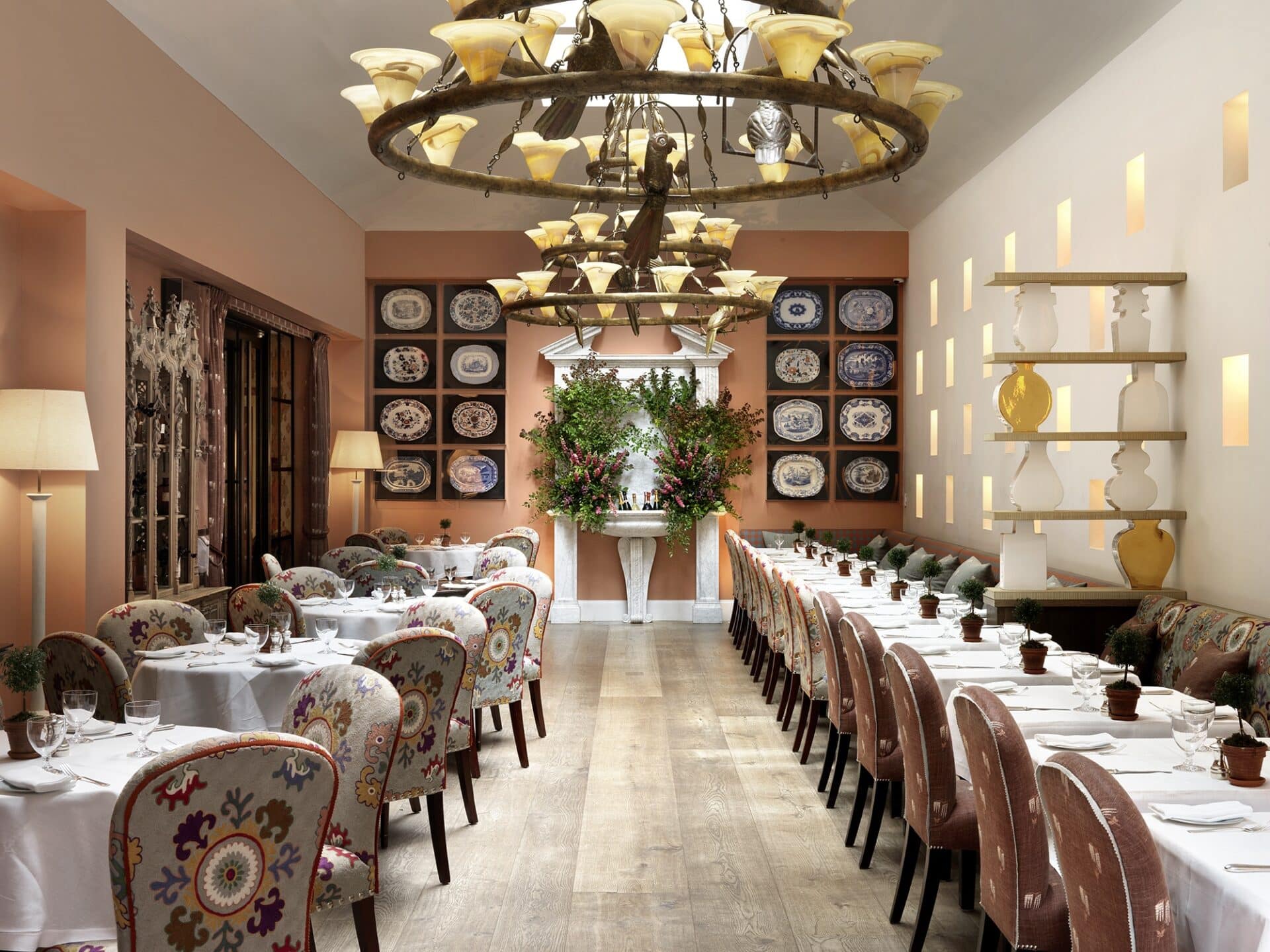
In the Orangery at The Whitby Hotel, we used shelving divides to introduce depth to the space and break up the banquettes. In both instances, there is nothing final about this divide, it allows the space to breathe and keeps things light and airy.
DO experiment with texture
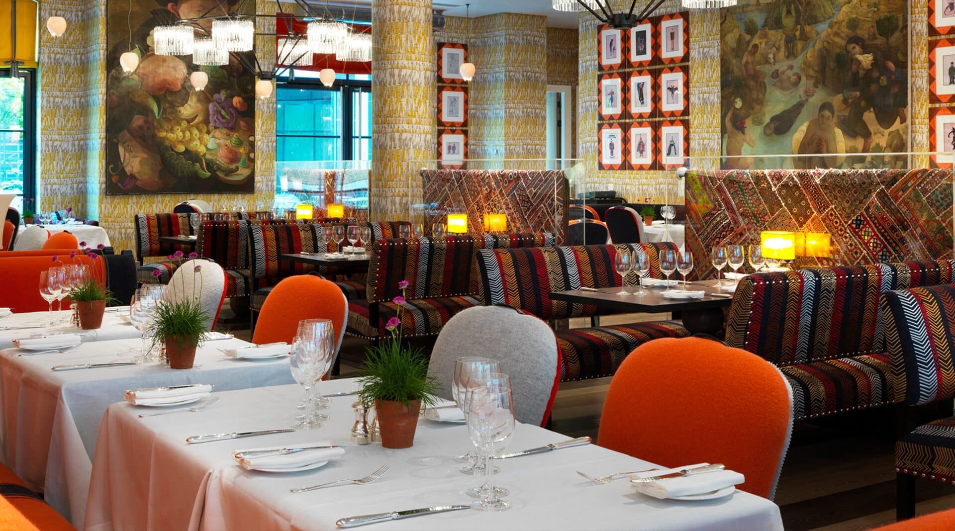
Another clever way to create partitions is by draping beautiful fabrics and framing them in perspex. That’s how we achieved a cosy feel in the dining space in Ham Yard Restaurant. Using something ornate and dynamic like these vintage Indian textiles was a way to complement the hot tones of my ‘Bookends’ fabric on the benches.
DO use collections and curiosities
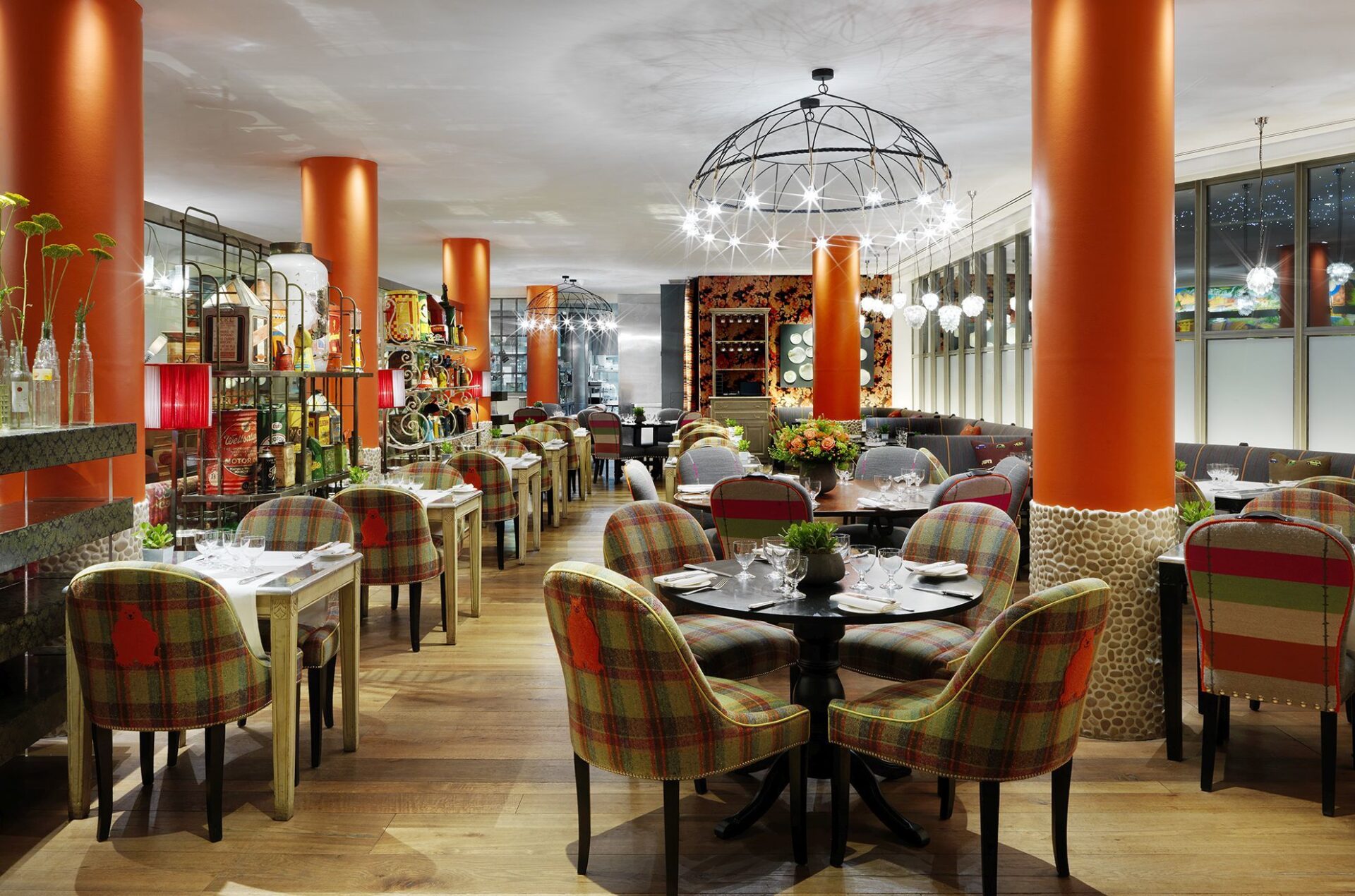
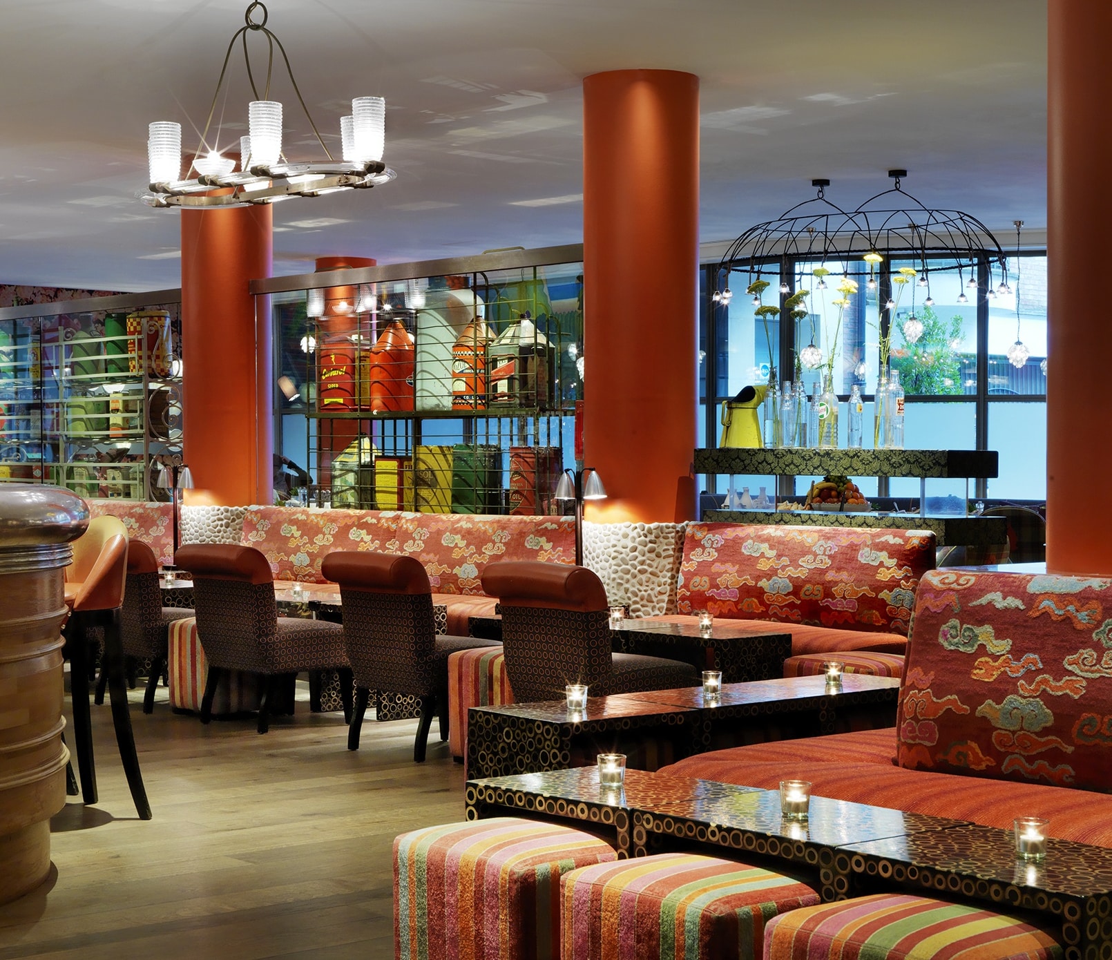
In The Soho Hotel’s Refuel Restaurant, we wanted the bar to be a hub of action and chatter, without interfering with the dining space. We used metal shelving units to separate the two areas.
We filled them with a collection of vintage oil cans and other curiosities that bring the space to life and energise the design, in a homage to the hotel’s past as an NCP car park. This playful divide creates two very different moods either side of the shelving.
We love airy and open spaces, but sometimes a room needs a partition to create zones which add interest in depth. We hope these tips help you find a way to organise a space. It is always rewarding when you discover a fun and interesting way to achieve it!

