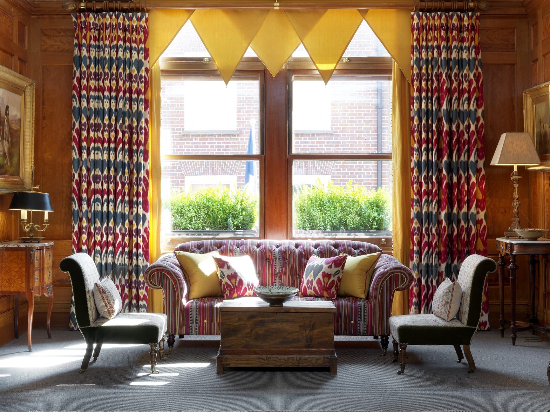
Over the centuries there have been many different styles for dressing windows. From ornate swags and tails, to wave headed minimalism. At Firmdale Hotels, we usually prefer a full length curtain with a single goblet pleat heading. This type of heading gives a classic finish that is neither contemporary nor traditional, with a regular fold that isn’t too structured or fussy.
There are plenty of ways to come up with new and exciting curtain designs. Here is our list of dos and don’ts when designing your own:
1. DO go for a large scale print
Curtains are the perfect place to use a ‘wow-factor’ large scale print that you love. Bold prints are best used on tall curtains so you can see a good amount of the repeat. We love a wide geometric design. In this London mews house, my over-scaled ‘One Way’ fabric for Christopher Farr Cloth brings a zingy freshness to the scheme.
At Number Sixteen in Room 19, the dramatic red curtains make a bold statement. We wouldn’t typically use a deep red for curtains but in this room, the full-length windows and wonderful natural light allow this dark and punchy colour to make a real statement.
2. DO use solid colours
In the newly designed Oak Leaf suite at Ham Yard Hotel, we’ve had great fun using Etamine’s ‘Voyage a Tunis’ wallpaper which features camels and sand dunes. This adventurous walling works well with the plain burnt orange curtain finished with a lovely trim.
3. DON’T be afraid of a pelmet
A pelmet is stiffened and shaped fabric that covers the top of the curtains. Pelmets are often thought to be old fashioned and fussy, however in the right setting and with the right fabrics they can finish off a pair of curtains perfectly.
In the library at Knightsbridge Hotel, Peter Dunham’s big and beautiful paisley ‘Samarkand’ looks great against the strong warm linen walls. The pelmet offers a chance to admire the pattern repeat without the curtain folds and helps to frame the bay window.
5. DO get creative!
We always encourage creativity with curtains. In the Drawing Room at Covent Garden Hotel, we have used yellow flags along the top of the curtains, which creates a point of interest and brings sunshine yellow light flooding into the room.
4. DON’T forget the detail
We’re known for our love of detail and the same applies when it comes to curtains. We love to add detail to the leading edge, whether it be a braid, trim, piping or contrast fabric. One of our favourite trims is Samuel & Sons wavy jumbo ‘Ric Rac’. In the Townhouse at Haymarket Hotel, we added a double row of ‘Ric Rac’ on the leading edge, one in navy and one in crisp white.
In this suite at Crosby Street Hotel in New York, we have used a plain fabric on the leading edge of the curtains with an added detail of jangly bronze beading.
At Crosby Street Hotel in Room 709, we have used a white linen on the curtains but added a punch of colour to the edge with a fun green and navy zigzag collage. This makes the curtains an interesting design feature whether open or closed.
There are so many options out there but don’t be afraid to have some fun. Curtains are a great opportunity to add colour and pattern to any scheme.


