
In the design studio, we are always playing with a collage of colour, pattern and texture. My style is best described as carefree and colourful – colour always makes me smile. When working in an uncompromising city landscape, I like to return to a room filled with light and colour. I believe people gravitate towards colour as it makes them happy, especially during these darker, uncertain times. Below are my top five tips on how to use colour in design.
1. Look at colour in terms of shades.
When working out which colours will work together, look at the different shades and tones. For example, if you crack open a watermelon, you see red and green. However, if you look more closely, you will see different shades from watery white to shell pink to a yellow grey. It is the way these colours tone through from one to the other that gives me ideas of creating a harmonious colour palette.
3. Choose a specific palette to suit the room.
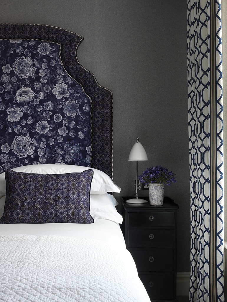
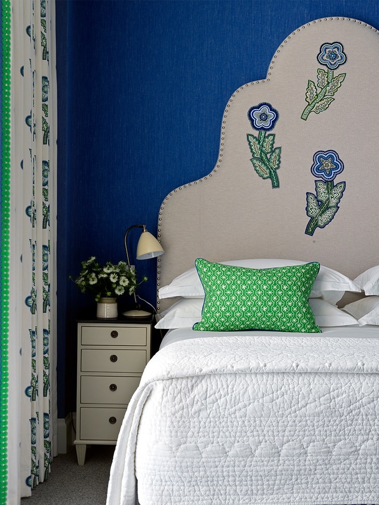
I look at the aspect of a room and decide how I want it to feel. If it’s facing north, a dark navy-blue wall will seem uninviting and heavy; a more reflective, lighter tone of blue with a hint of warmth will work better. I can then add touches of dark navy to the piping of a chair or a trim on the leading edge of a curtain to still get the feel of the shade without overwhelming a space that lacks light.
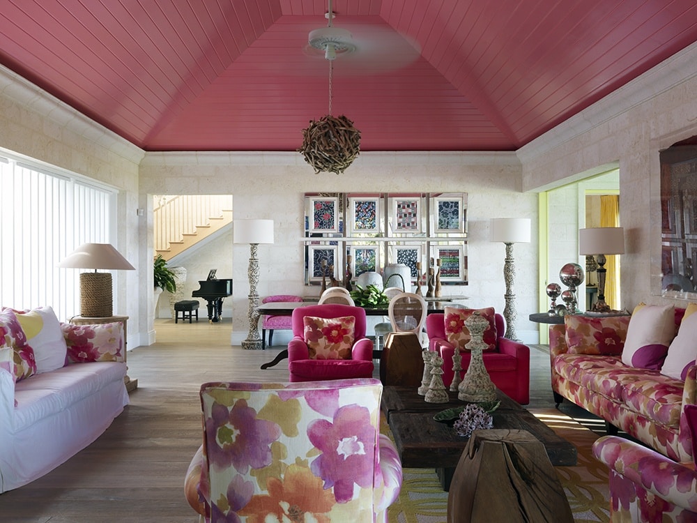
Conversely, in a south-facing room with good light, I can use denim on the walls with a contrasting colour for the curtains, such as a patterned fabric with a bright yellow trim, which will please the eye.

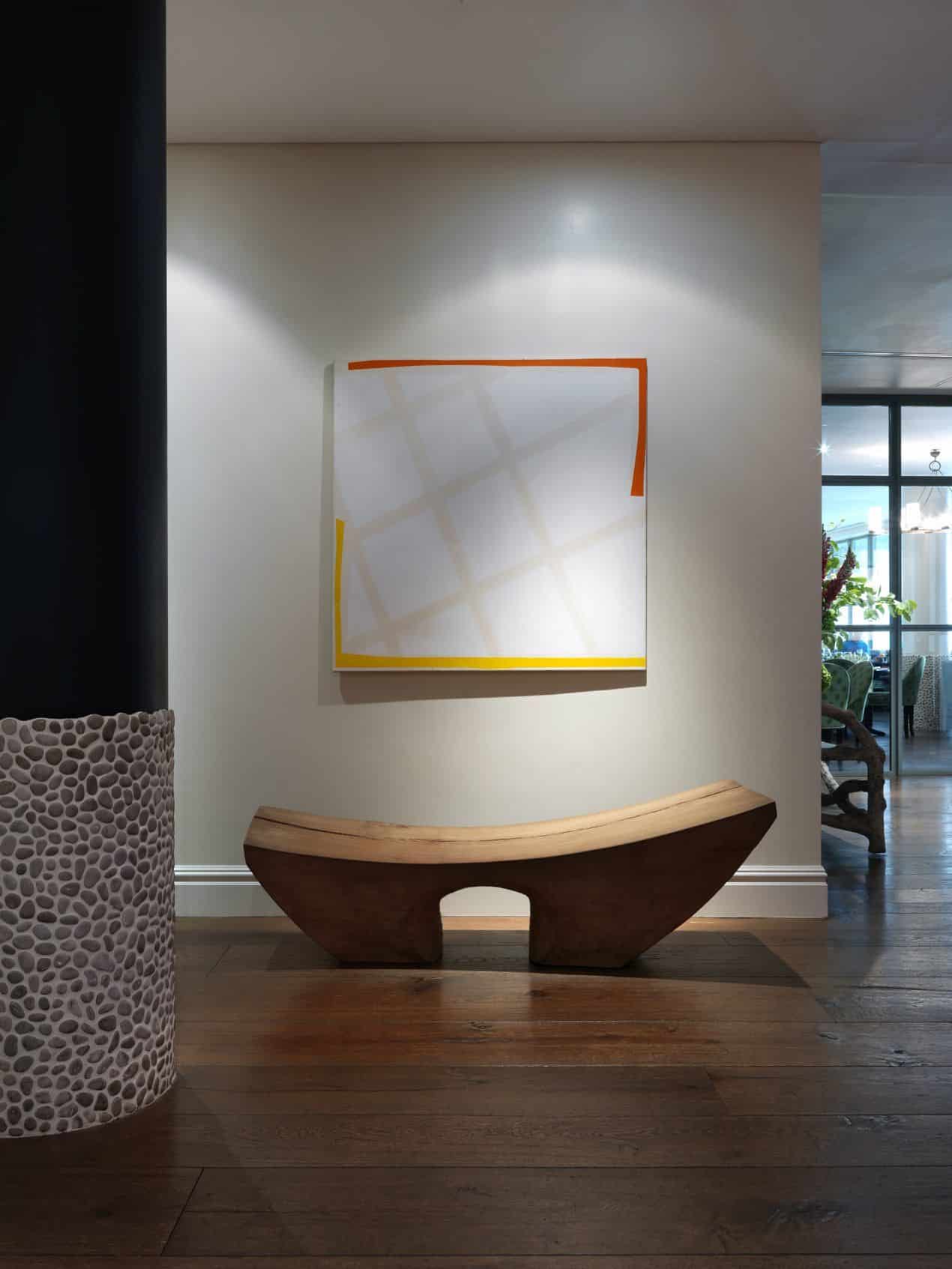
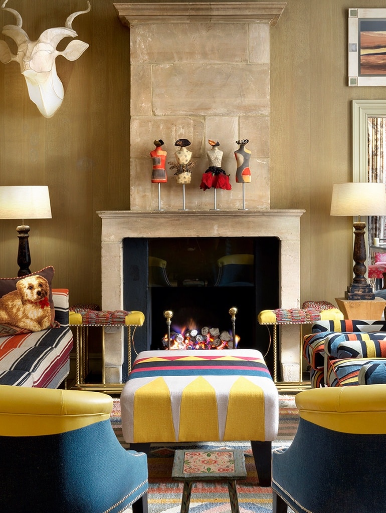
2. Not everything in a room should zing with colour.
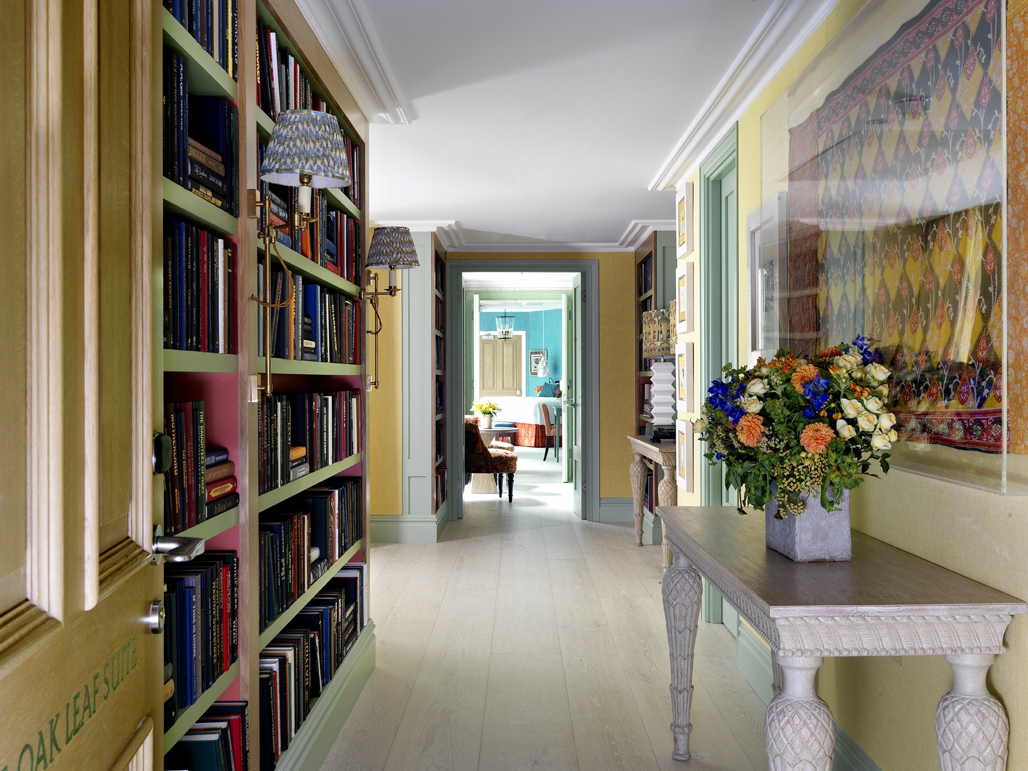
Balance and scale are a part of the equation. I always look at the plans of a room as a whole and then create a sequence of spaces – a calm area leading into a vivid colourscape. I like spaces to tell a story and lift the imagination as I travel through them.
4. Be inspired by nature.
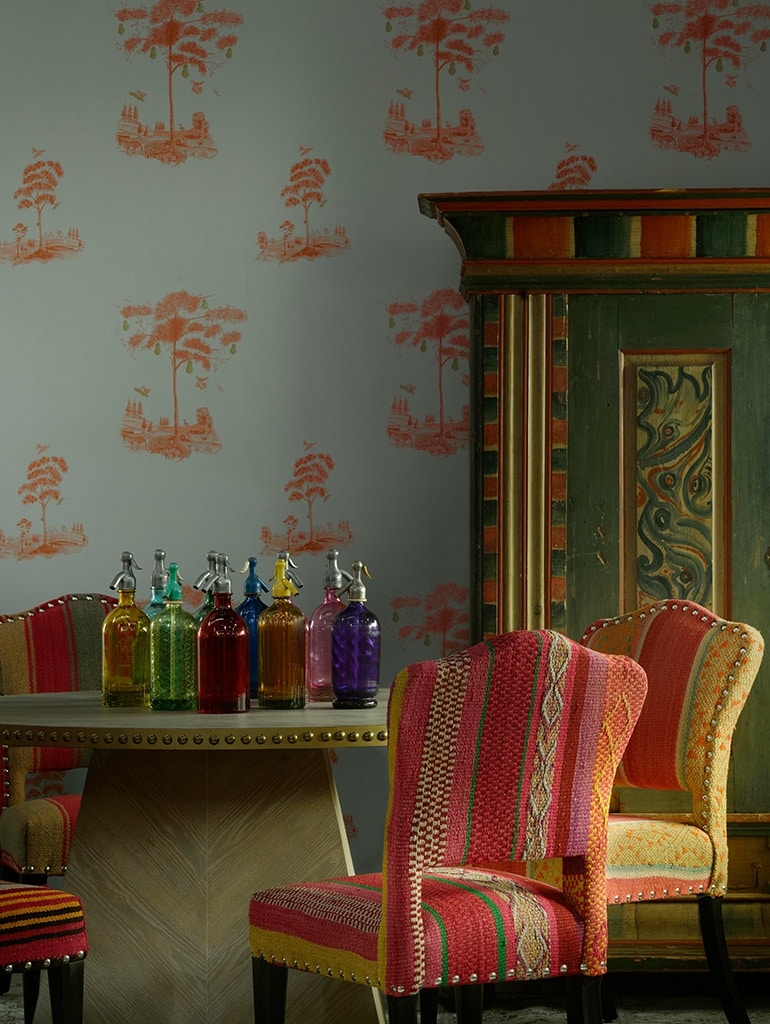
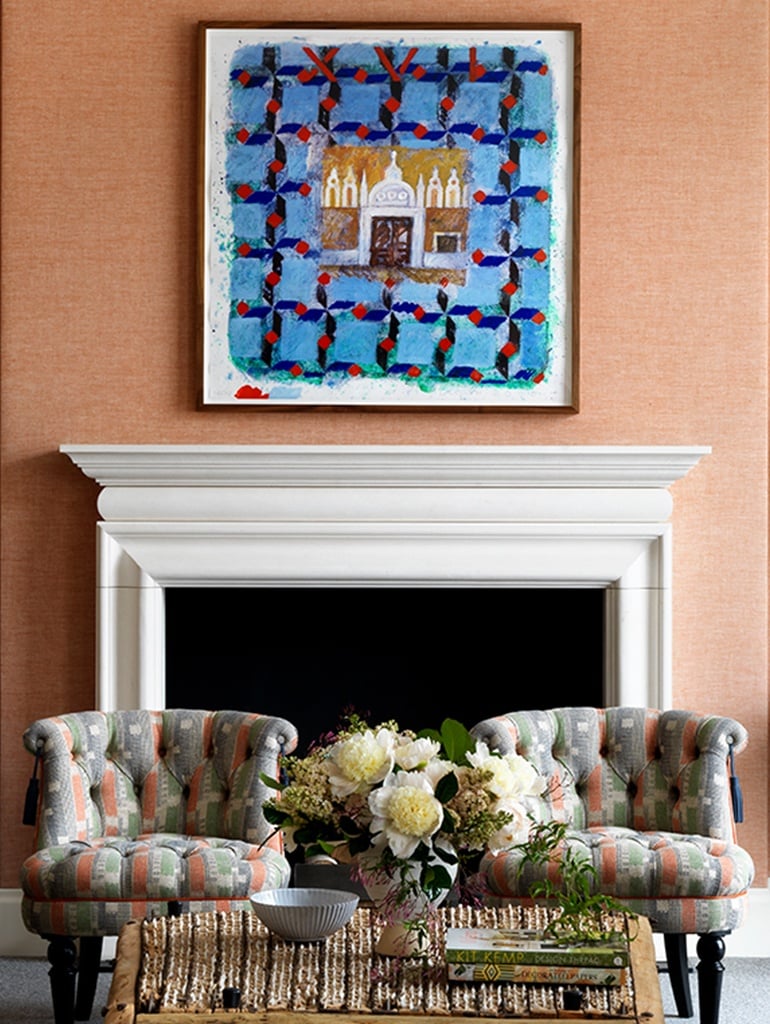
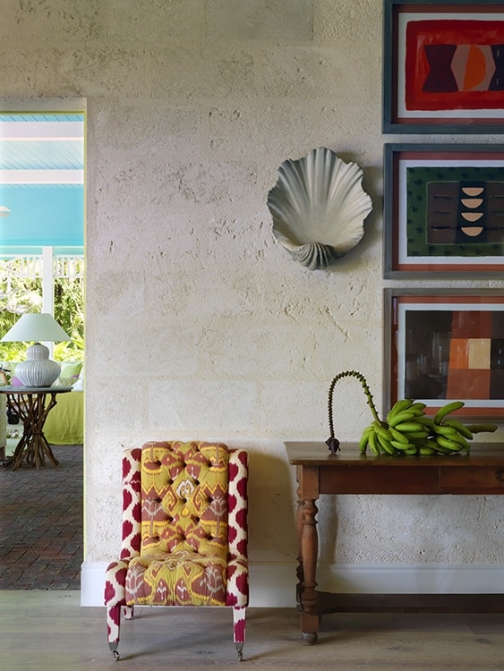
I often look to nature for ideas of colour palettes that work, such as the natural hues of ochre, terracotta, sienna or indigo. From these organic base tones, I can create different moods with various colour and pattern combinations.

These are my top 5 tips; be brave and go for it! I would love to see how you have used colour in your own homes. Tag us on Instagram using #DesignThreads.
5, Throw in a neutral.
I love all colours, but there always needs to be a neutral thrown in to give the room some breathing space. It is important to be bold, not frantic.