How to Create and Present a Scheme Board
How ToWith our Design Team working hard on exciting new residential projects, we decided to share with you our tips and tricks for creating a scheme and presenting it, whether you are a designer presenting to a client or simply sharing ideas with friends or family...
With our Design Team working hard on exciting new residential projects, we decided to share with you our tips and tricks for creating a scheme and presenting it, whether you are a designer presenting to a client or simply sharing ideas with friends or family.
This part of the design process is one of the most important and often the most challenging. You are creating a home – not with the physical space, bricks and plaster, but with a cork board and snippets of materials.
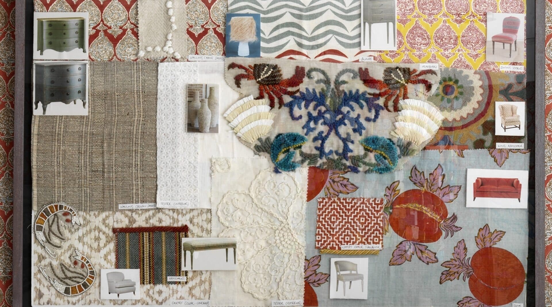
A scheme board should transport you to the finished room even before ground is broken on site, using your proposed scheme components such as imagery, scale and texture. How will the scale of the sofa in a certain fabric look next to the rug designed for the space? Where will the chairs be positioned either side of the French windows? These are all incredibly important factors and make the process intricate and precise, but ultimately vital in establishing the scheme. These are our top tips and tricks that we use again and again…
1. Fabrics and materials
When it comes to cuttings, the challenge can often lie in the size limitation you have for scheme boards. For large pattern repeats, choose cuttings that are the best representation of the overall design. It may mean you need to print out a larger image of the fabric to show the repeat, but always have a snippet of the fabric itself to show the weight and texture of the cloth.
2. Layout
Once you have your samples, start arranging your board and think carefully about where things are going to go.
Take a Master Bedroom scheme for example, what is the room made up of? You have the bed area, the windows with curtains and blinds, a dressing area and even a seating area. Think about where in the room these areas are in relation to one another and begin to create pockets on the board for each.
We like to position these around our floor plan which we often place in the centre of the board. That way the client can look at their dressing area plan and fabric selection together without having to join the dots.
Incorporating samples is paramount for the storytelling of the scheme board. The wood of the floor, the brass of a curtain rail, the paint of the walls, if these fittings and features already exist, go out of your way to source samples if you can.
These orbs are samples of glass for a chandelier we have created for a project. An image would not convey the true depth of the colour, samples however small, are so important.
3. Check stock and reserve if necessary
As with all good things, these processes take time. From the moment you source the fabric to the confirmation from the client could take weeks, even months, so get those fabrics on reserve to avoid having to choose a second option.
4. Paint
Often overlooked but vitally important. Ensure you have the proposed paint colours painted neatly up on the board.
Checking your paint sample in different lights is hugely important if you are able to make a site visit. Your paint samples will look different in a cooler London light compared to the warmer light of the Caribbean for example. Ensure you have tested!
7. Layering
Anything that is too regimented ends up losing its spark entirely. Whether you are a monochromatic designer with a set plan or an antiques fanatic who believes more is more, your scheme board should not be rigid, it should feel as though the client can step into the board and feel instantly at home.
5. Imagery
High resolution images go a long way. It always helps to have high quality images of your furniture, architectural features or artworks.
6. Scale
Think about the uses of each fabric or material within the room. Which is the largest and which is the smallest?
In our pop up with Turnell & Gigon, it was important to convey the different uses of the fabrics, raw materials and artworks throughout the room.
Our scheme board needed to illustrate the uses and placements of each design. It was then hung in the showroom itself for all to see.
The below scheme board is from a project we worked on with Christie’s auction house, where we suggested antique pieces from their collections and how they would work within an existing room. We layered images, textures and fabrics to create a board that illustrated this perfectly.
8. Mounting
Furniture cutouts placed flat on top of fabric samples may get lost once the board is put together. To avoid this, mount your individual images onto foam board and cut round delicately with a scalpel. This immediately creates layering and adds depth to the board, allowing key elements to stand out.
9. Visuals
Visuals and drawings are a must for elevating your proposals to the next level. We ensure each room has been surveyed and drawn up to show the layout suggestions, which is again part of the story you are telling to the client. Having elevation visuals, whether computer or hand drawn, is a beautiful way of bringing the scheme to life.
If you do not have the software or team to be able to put this together do not worry, there are plenty of fantastic companies to outsource to. Visuals are a fantastic way to see ideas that might not be able to be completely told through the board alone.
10. Essentials
Lastly, hot cups of tea, fresh pastries and a jug of flowers are essential when it comes to the preparation and presentation of your work. We hope you have enjoyed our tips and tricks – send us your takes on this and how you put your design creations together!


