

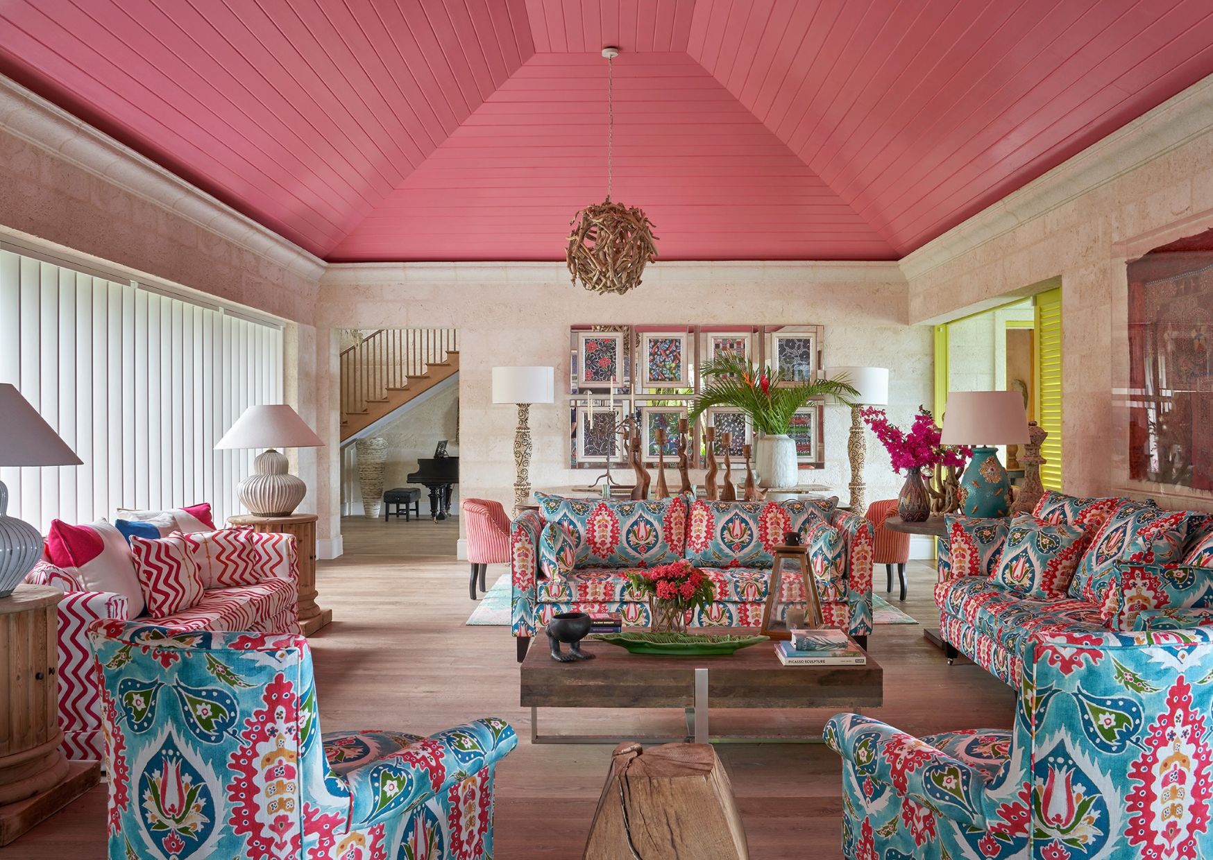
Colour blocking is all about placing distinct areas of colour side by side to create contrast, rhythm and visual interest. Rather than blending tones softly together, it celebrates clear boundaries and confident combinations. It can bring definition to a room, draw attention to architectural details or simply introduce an unexpected moment of colour.
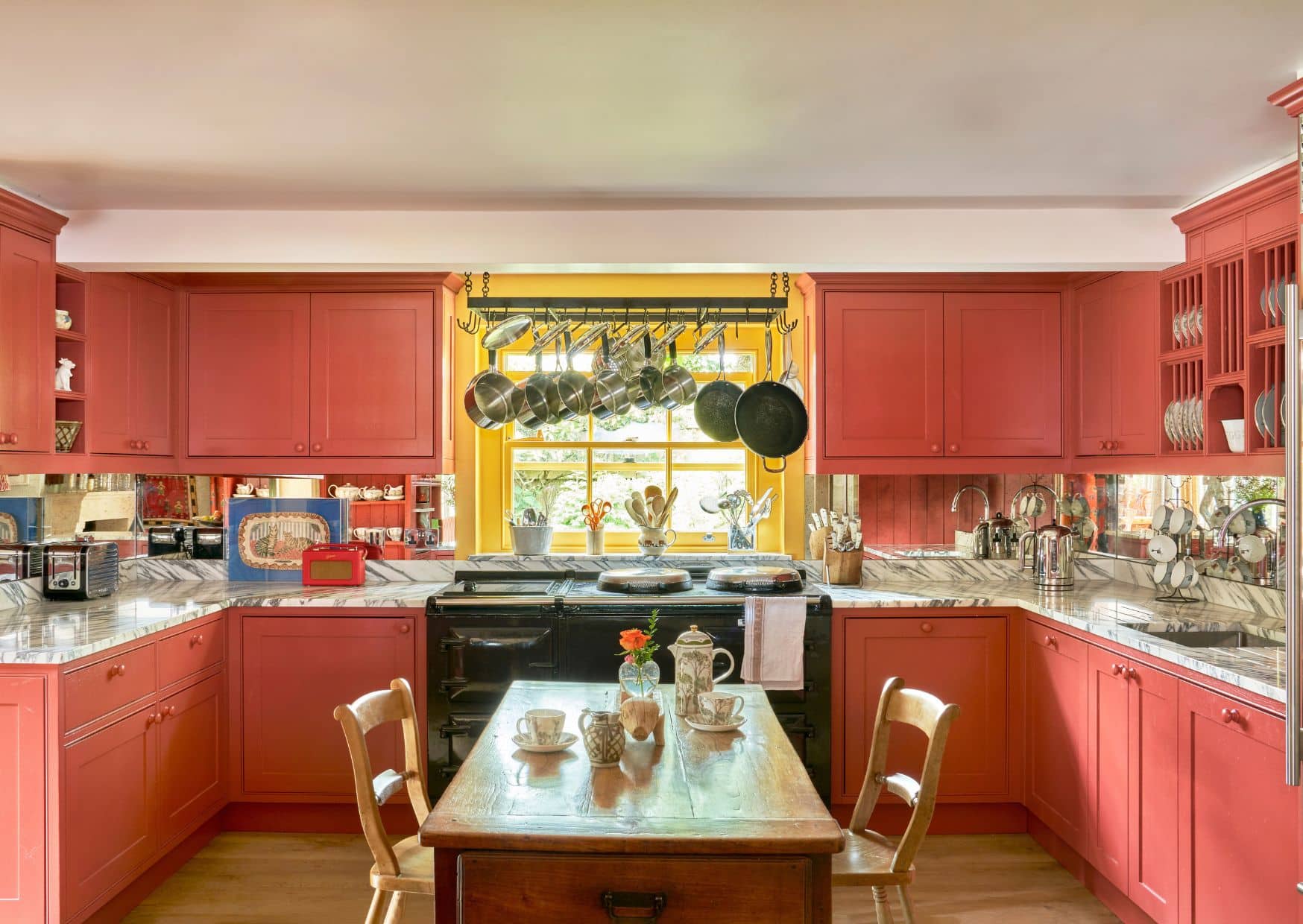
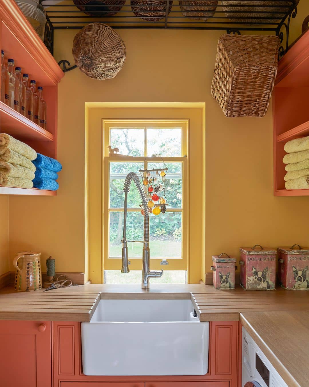
We often use colour blocking to bring the architecture of a room to life. Alcoves, niches, ceiling lines and joinery can all be picked out in contrasting shades, turning these features into part of the decoration rather than allowing them to fade into the background.
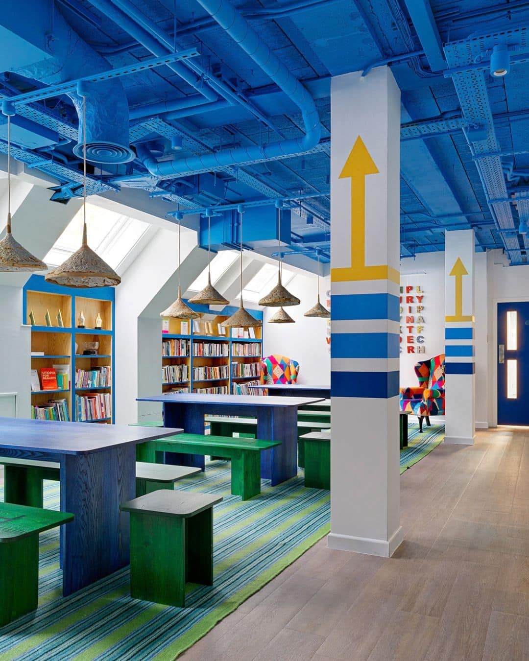
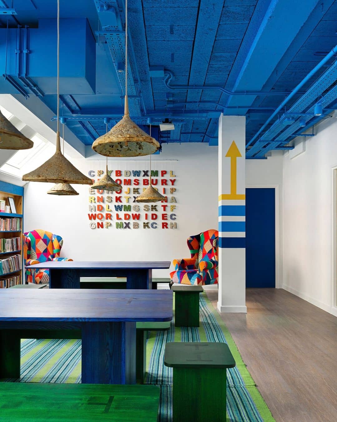
In the Bloomsbury Publishing offices, we painted the industrial-style ceiling in a bold blue to bring a sense of creativity to the space. Rather than concealing the exposed pipework and mechanical elements behind plasterboard, we chose to celebrate them as part of the design.
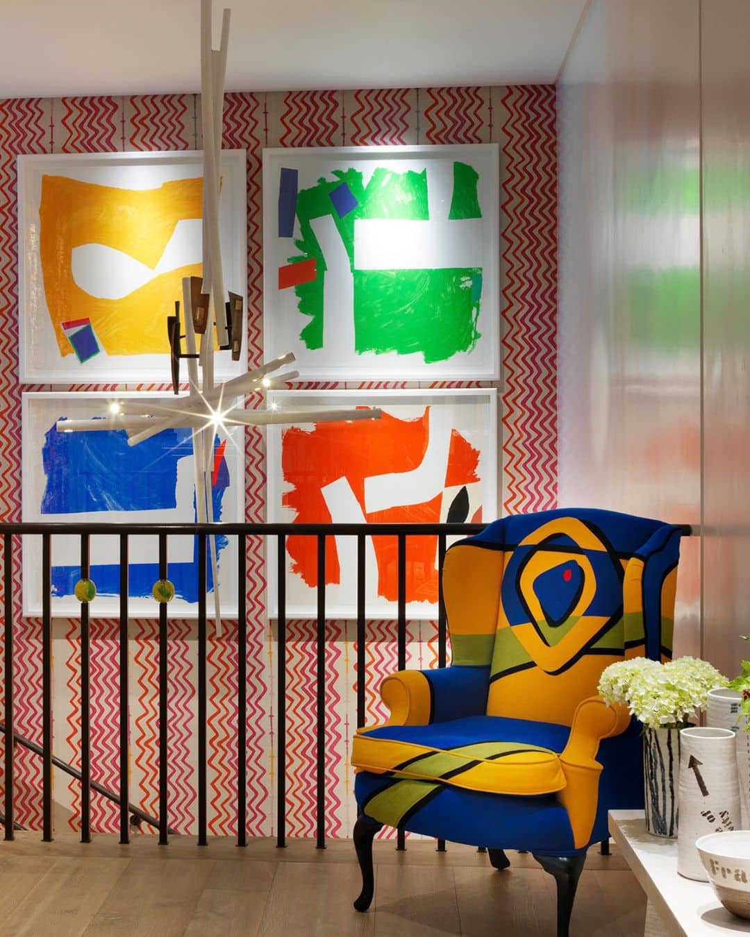
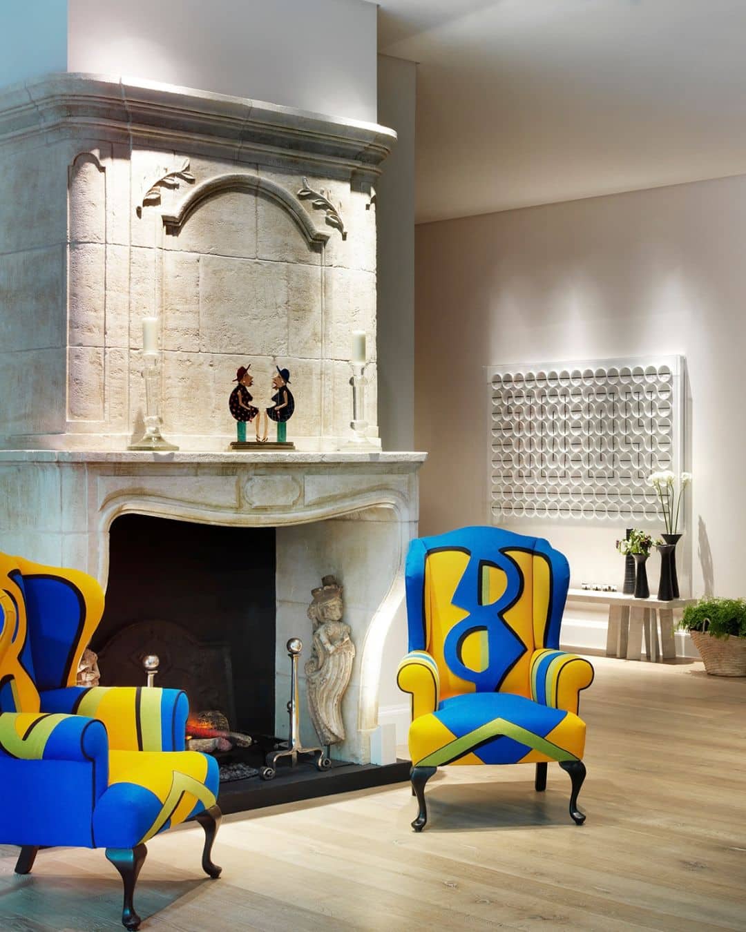
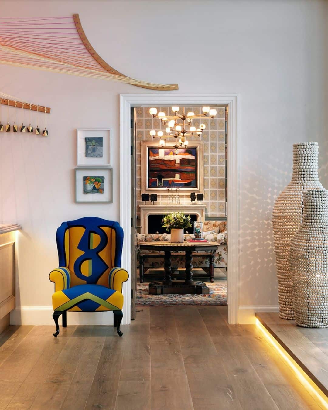
This approach is not limited to architecture. We also use colour blocking when designing furniture, helping individual pieces hold their own within a room. In the lobby at Ham Yard Hotel, our Kit’s Wing Chairs are appliquéd in contrasting blue and yellow. The blocks of primary colour define their shape and give the chairs a stronger presence within the space.
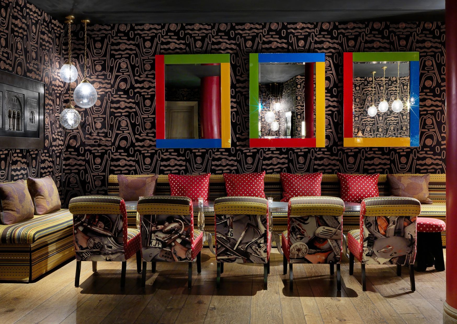
In the Crimson Bar at The Soho Hotel, bold framed mirrors introduce striking areas of colour against the dark walls. They punctuate the room and add another layer of interest without competing with the richness of the surrounding scheme.
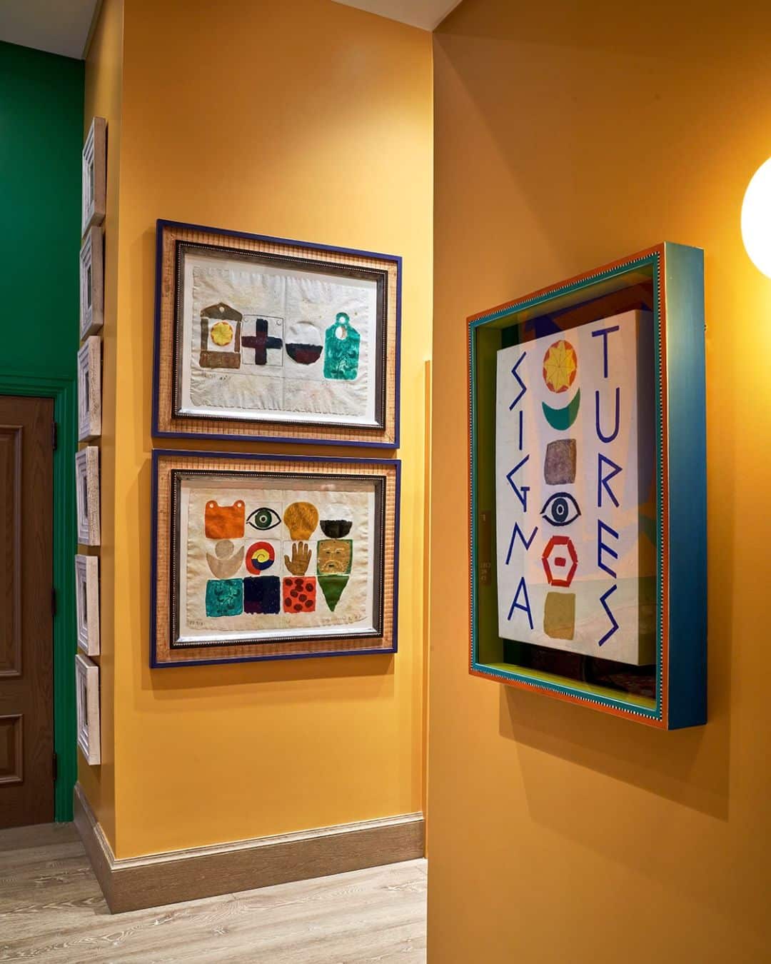
Colour also has an incredible ability to change the mood of a space. Used thoughtfully, it can influence how a room feels as you move through it, from light to dark and calm to vibrant. At Warren Street Hotel, warm yellow brings an uplifting quality to the lobby, while grounding greens introduce a feeling of calm and balance as you move further through the hotel.
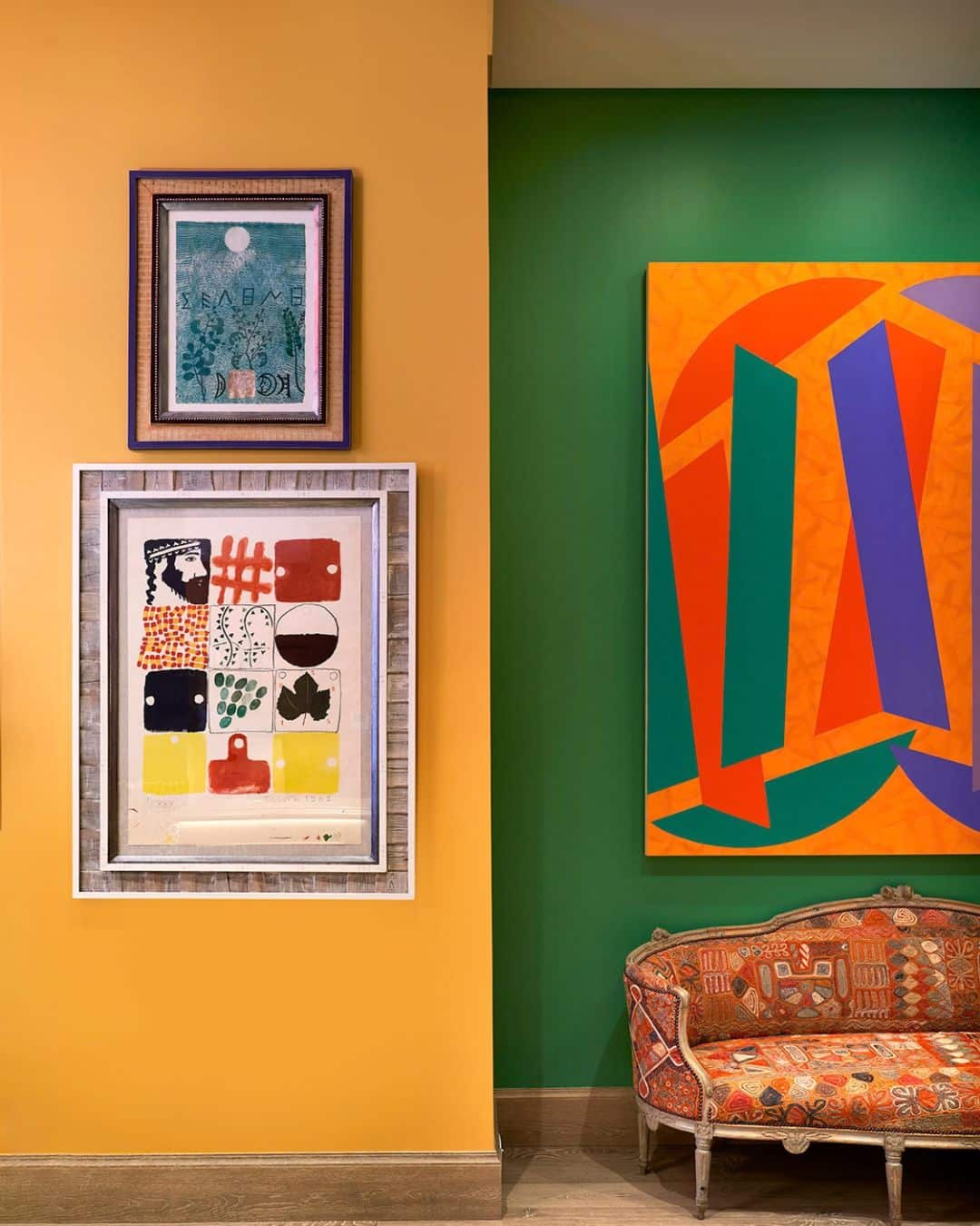
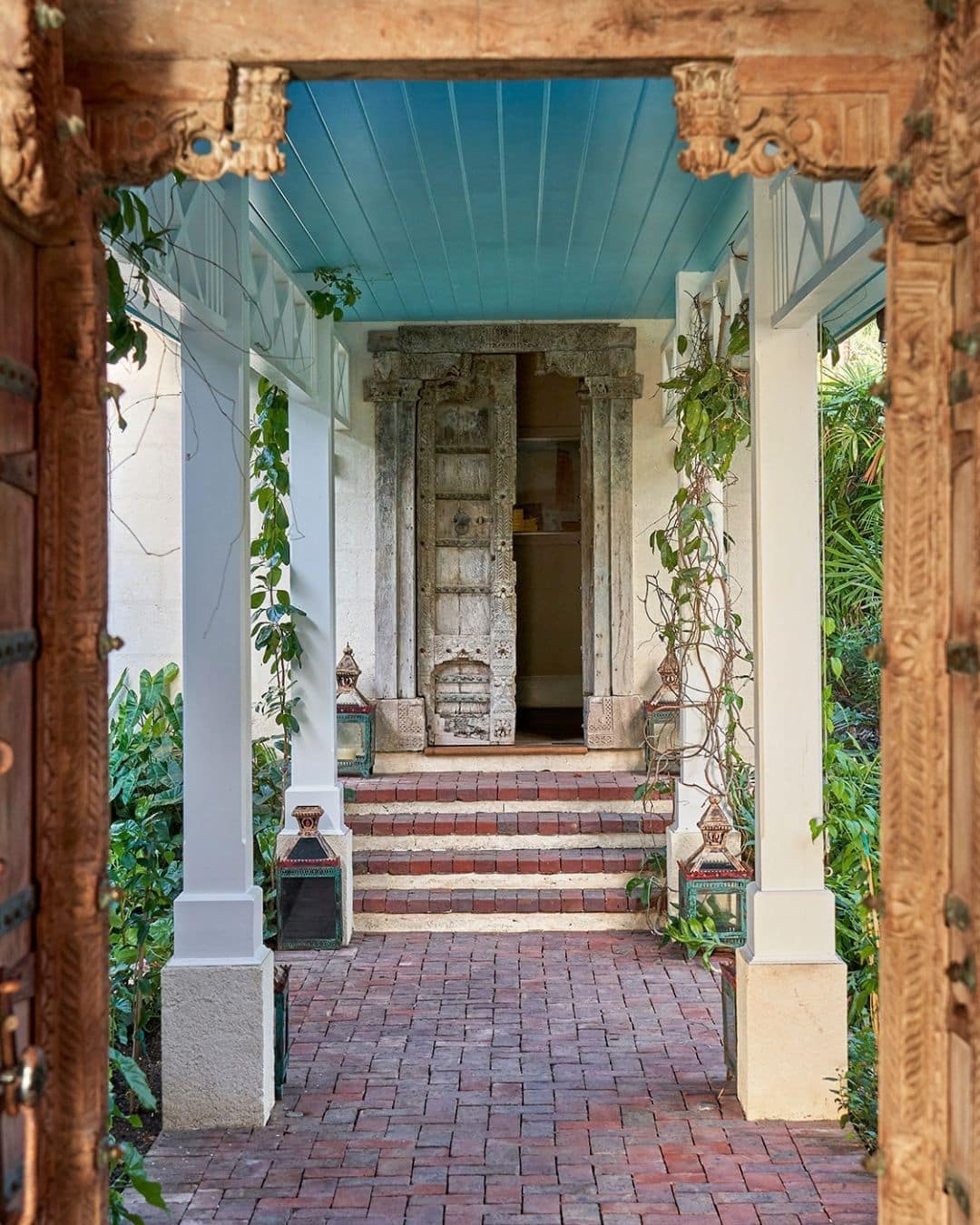
At the heart of our design philosophy is the belief that interiors should never feel too serious. Colour blocking gives us the freedom to be brave with colour and use it in unexpected ways. It can transform an ordinary architectural detail into something that becomes a focal point within the room.
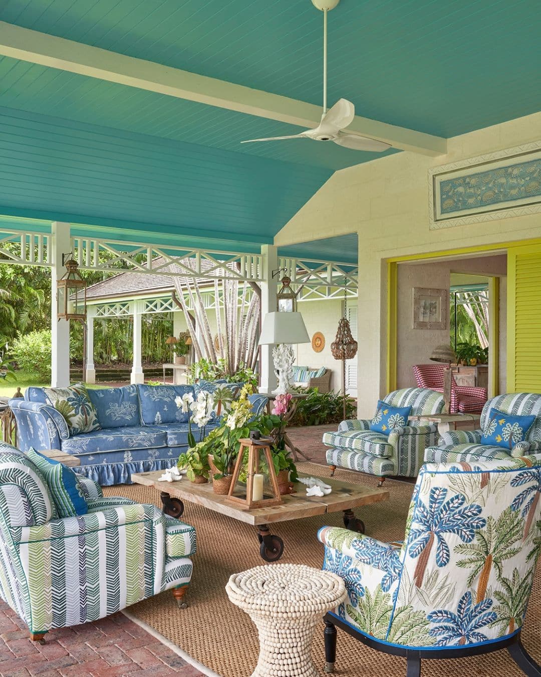
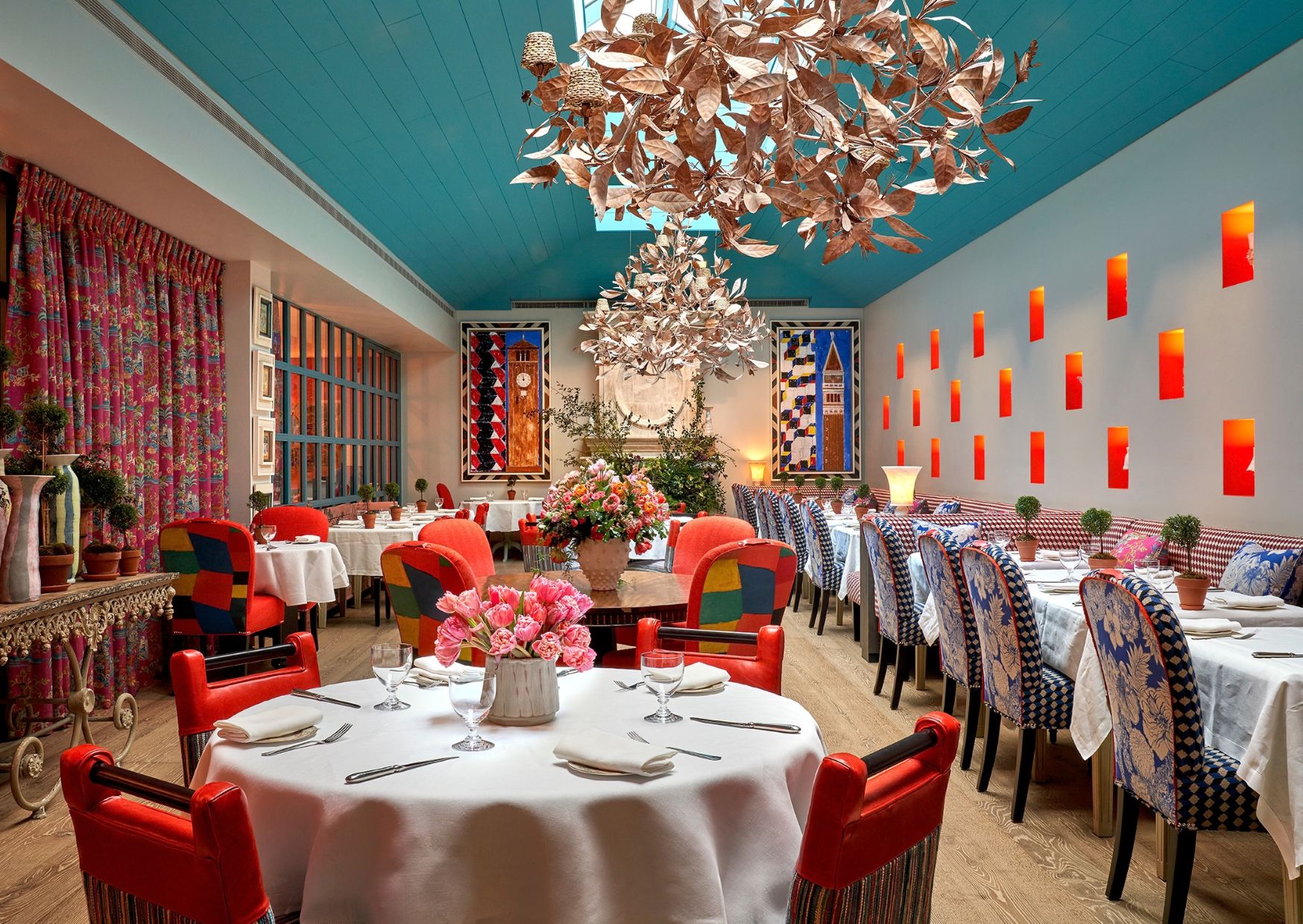
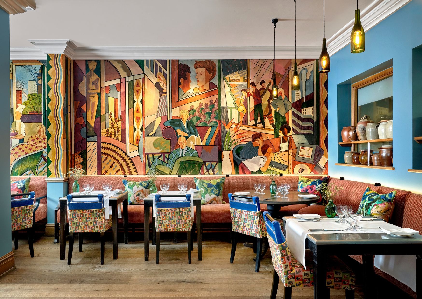
Block colour also works particularly well alongside pattern, texture and artwork, giving the eye somewhere to rest and helping to balance a layered interior. In the Oscar restaurant at Charlotte Street Hotel, the cobalt blue detail on the tops of the chairs cuts through the surrounding pattern while sitting comfortably alongside the mural on the walls.
Ultimately, colour blocking is about having fun with colour. It gives rooms character, warmth and individuality and can make even the smallest detail feel special. Sometimes, all it takes is one unexpected flash of colour to completely change the way a space feels.