
If you stay in one of our hotels, you may notice a subtle detail that quietly, and sometimes boldly, brings a room together. Across our upholstery, we often explore the meeting point between two fabrics: pattern and plain, texture and colour, softness and structure. It is one of the simplest ways to introduce depth, rhythm and visual balance into a space.
When two textiles find common ground, they create a dialogue within the room. Rather than relying on a single fabric throughout, we consider proportion, contrast and placement to ensure each piece feels both distinctive and harmonious. Here are some of the ways we use two-tone upholstery throughout our interiors, creating spaces that feel cohesive, even as they embrace contrast.
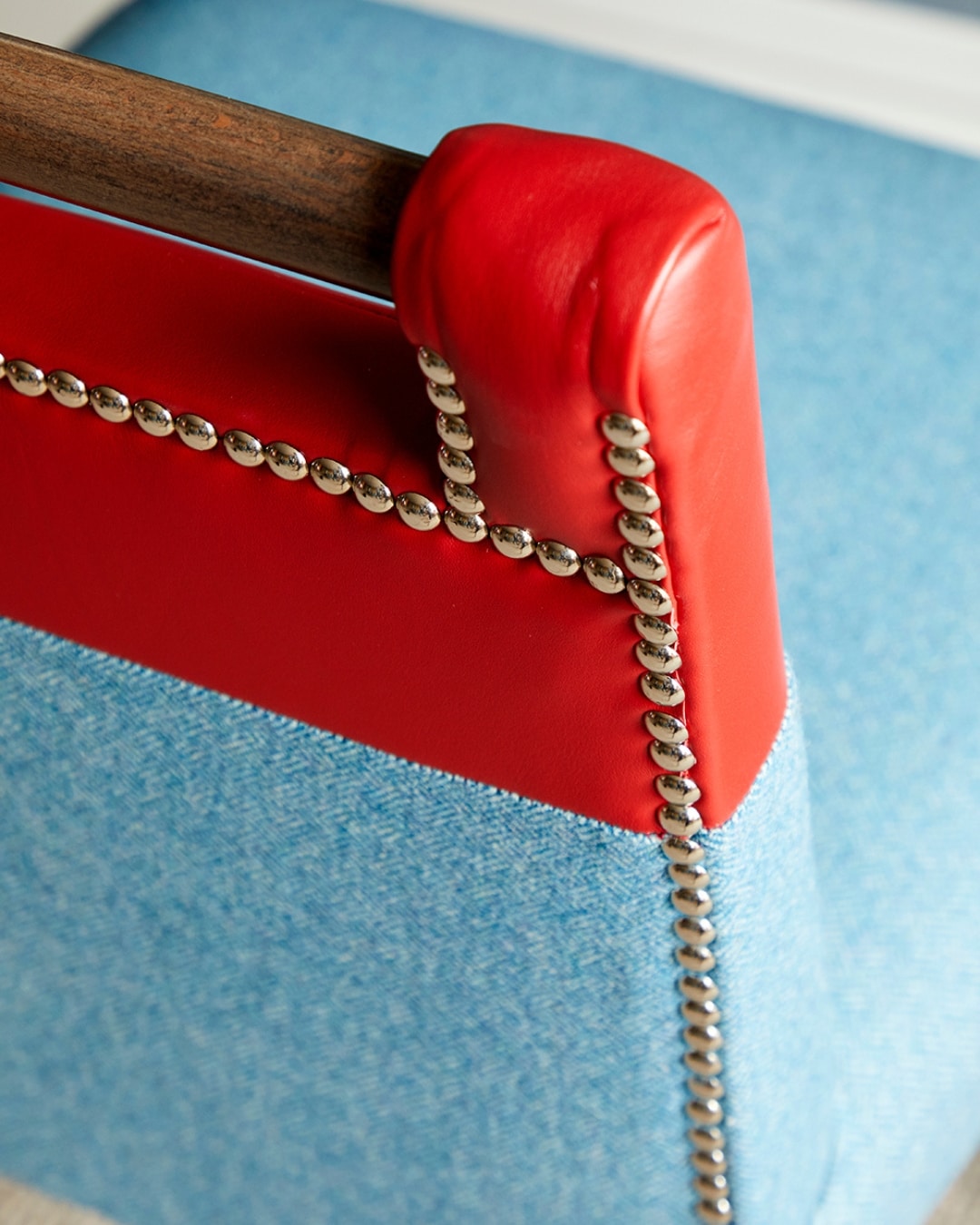
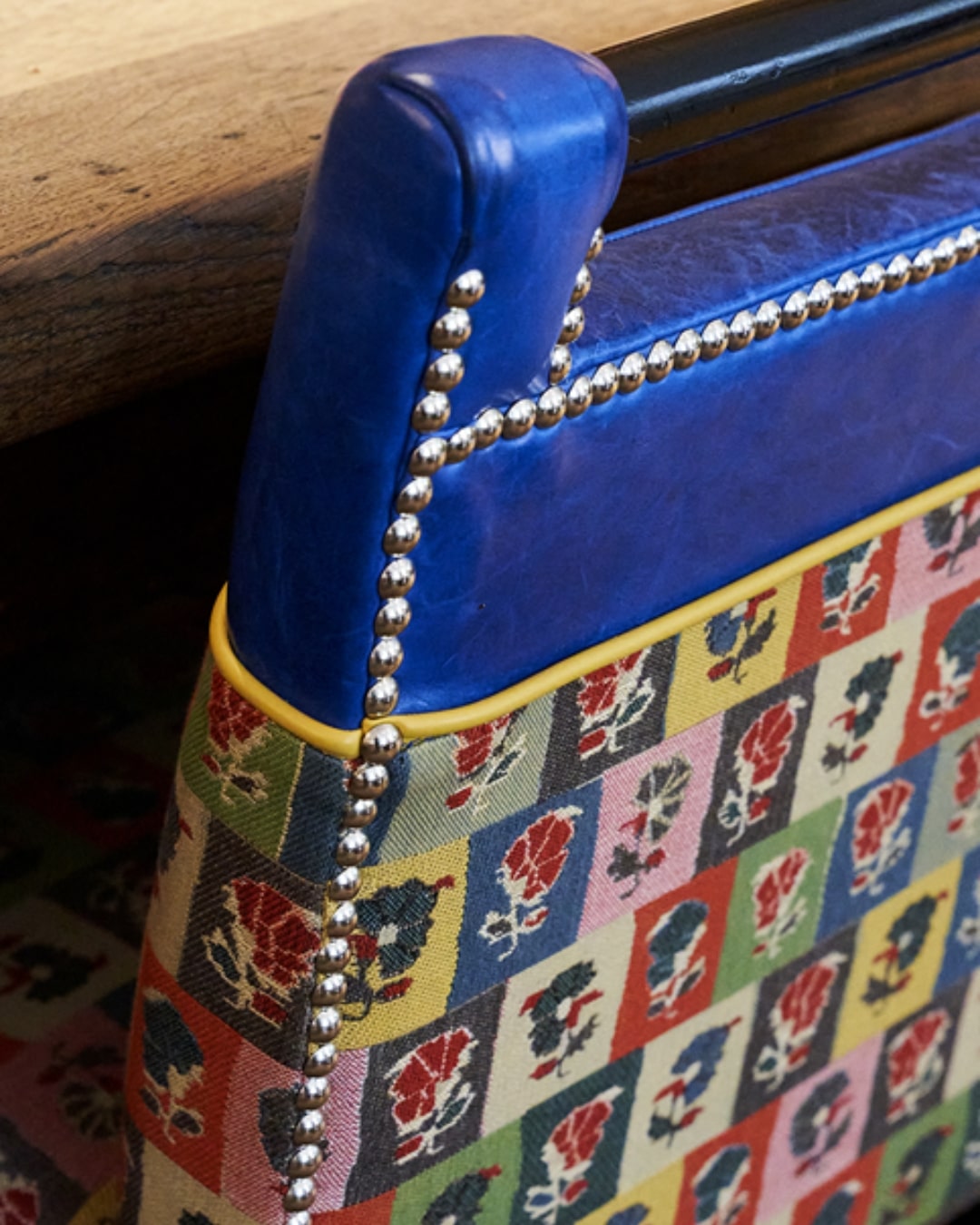
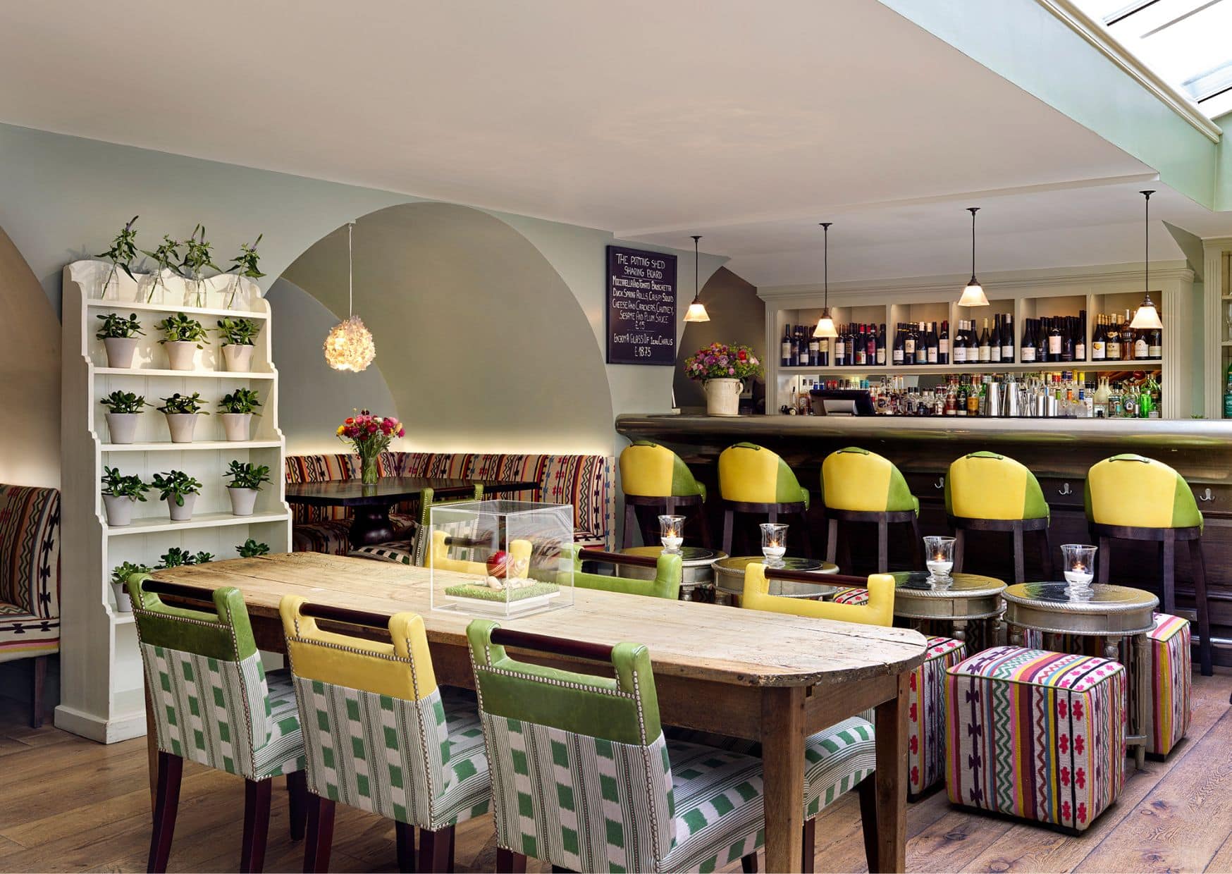
The Handle Chair
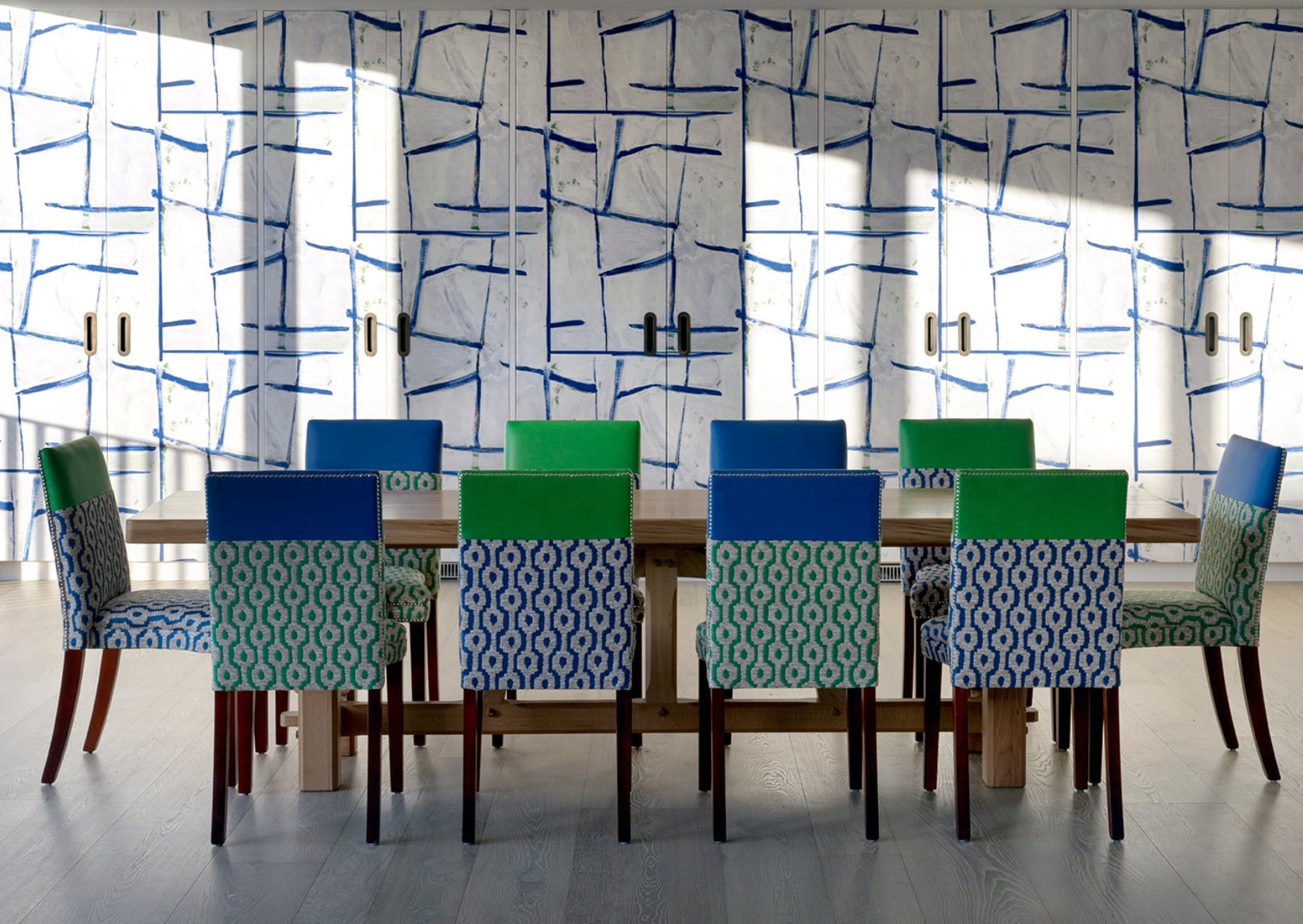
One of the most recognisable examples of split upholstery at Firmdale Hotels is the Handle Chair. Throughout our hotels, you will often find two-tone chairs upholstered in a lively patterned fabric, paired with a bold plain or leather.
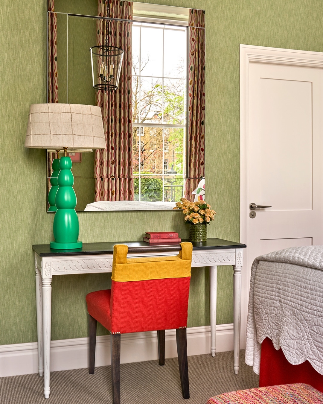
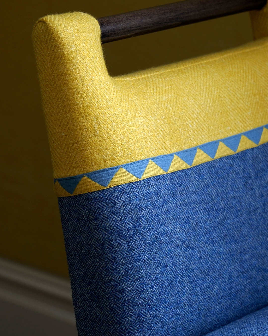
In many of our bedrooms, the handle chair follows a two-thirds to one-third proportion, with the lower section wrapped in pattern and the upper portion balanced by leather or a contrasting accent colour. This proportion helps to ground the chair visually, while allowing the upper section to lift and frame the silhouette. The contrast creates interest, but more importantly, it enables the chair to connect with multiple elements in the room, echoing both the bolder patterns and the quieter plains.
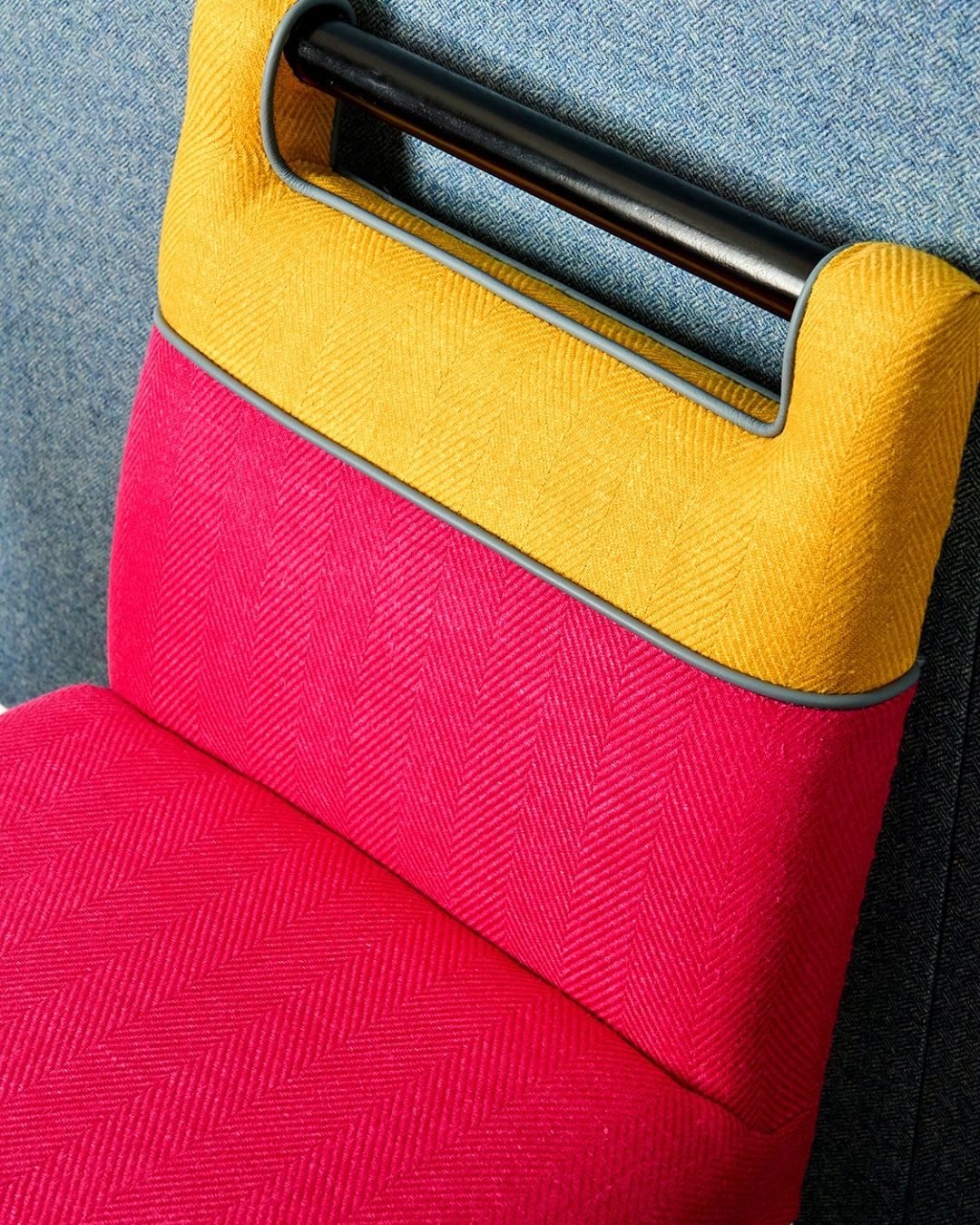
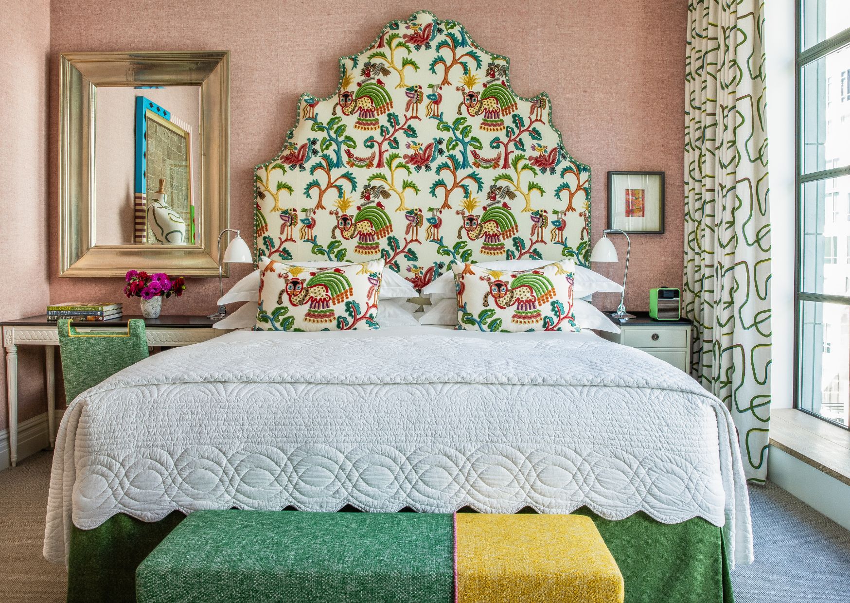
End of Bed Stools
We take a similar approach with our Ella end of bed stools, which offer a perfect opportunity to introduce an additional layer of texture and colour. These pieces are often upholstered in more than one fabric, with piping used as a finishing detail to define the join and give the piece a tailored feel.
Whether combining two vibrant plains or pairing leather with a fabric in a similar tone, these combinations elevate a simple stool into something far more considered.
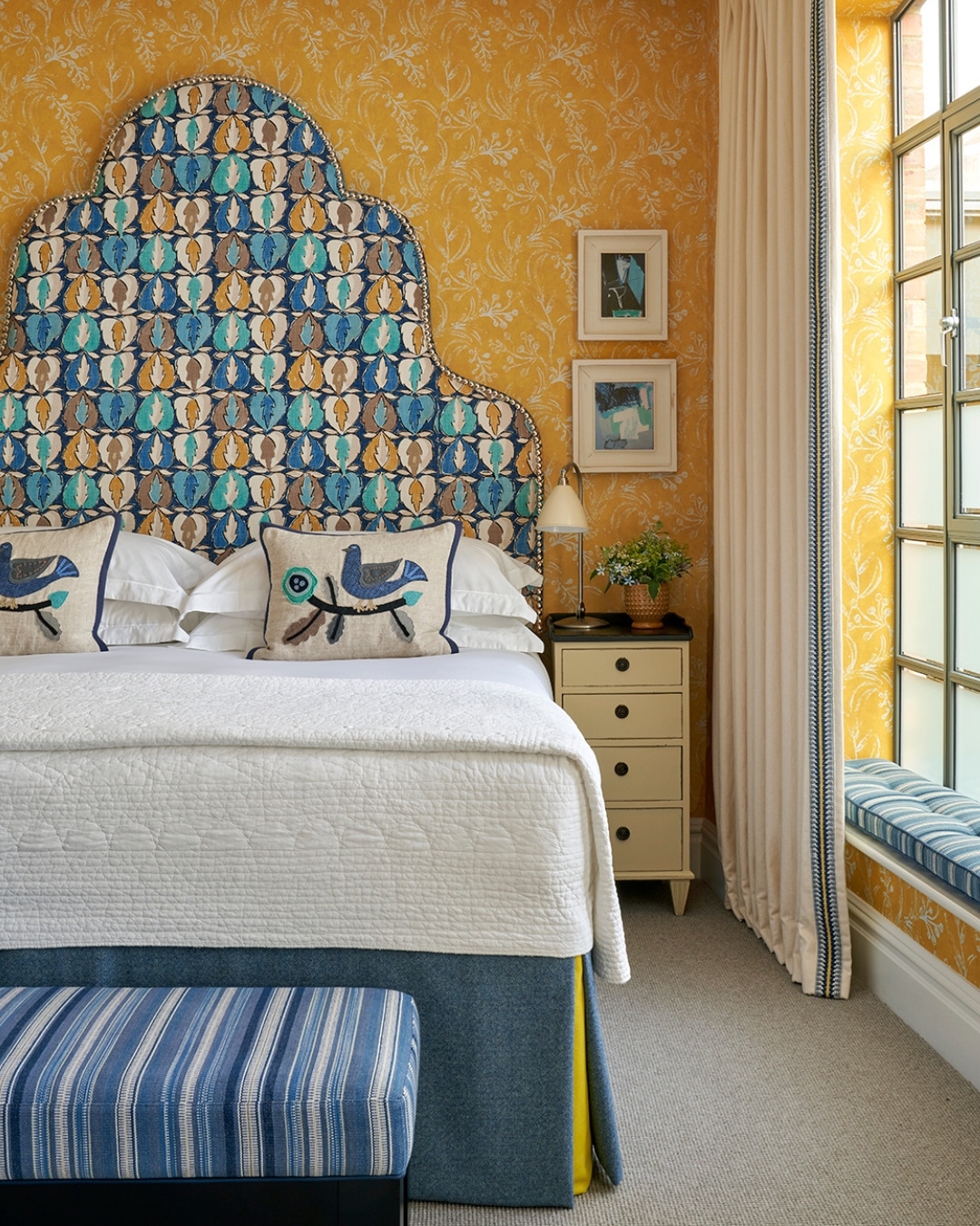
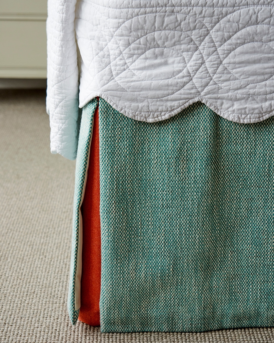
Bed Valances
The bed valance is another area where a seemingly small detail can have a significant impact. A kick pleat in a contrasting fabric introduces a subtle yet striking pop of colour, drawing the eye down from the headboard, anchoring the bed and bringing balance to the overall scheme. Without this contrast, the valance can recede into the carpet, causing the visual weight of the room to sit too heavily at the top. It is a quiet adjustment, but one that transforms how the space is experienced.
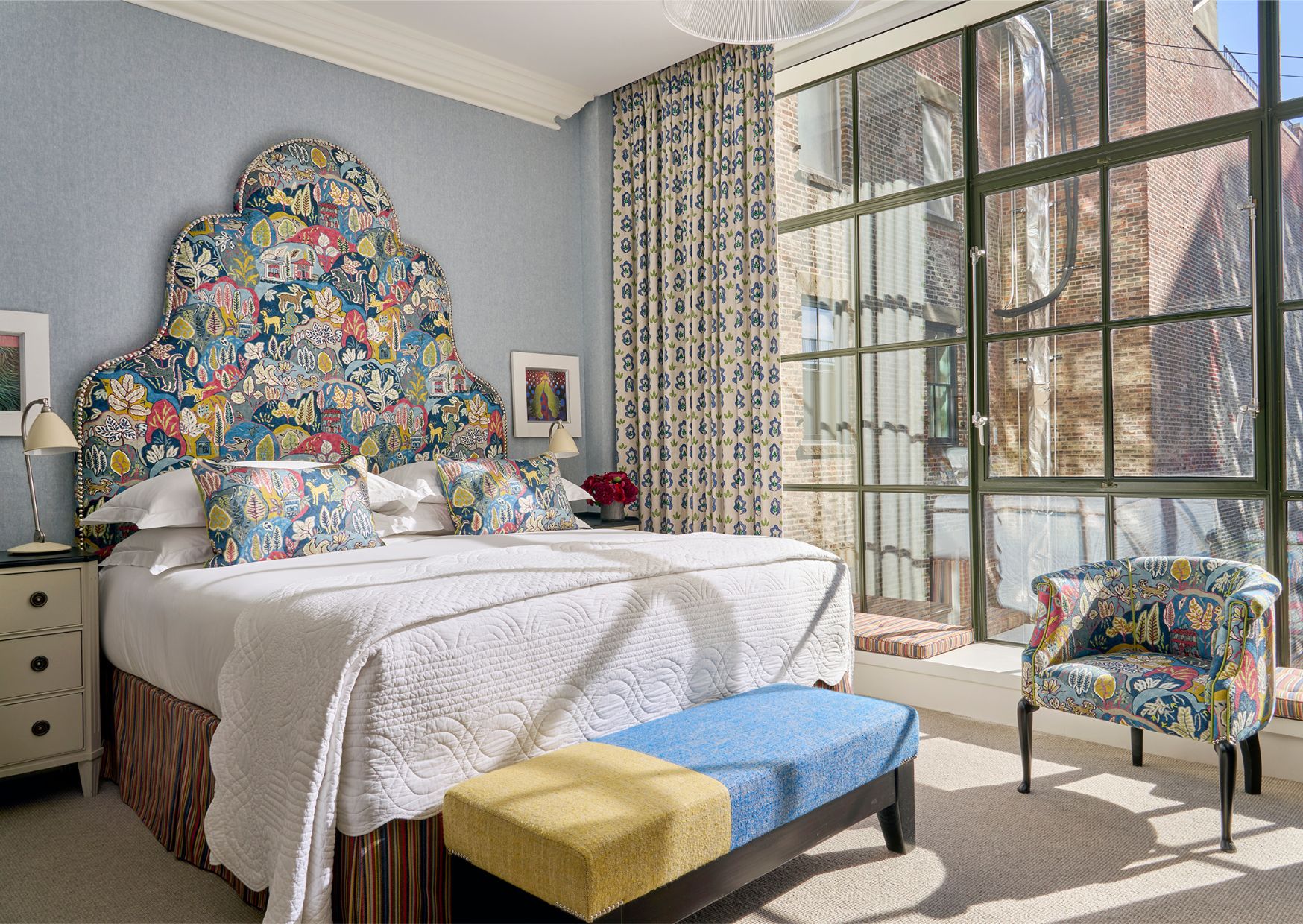
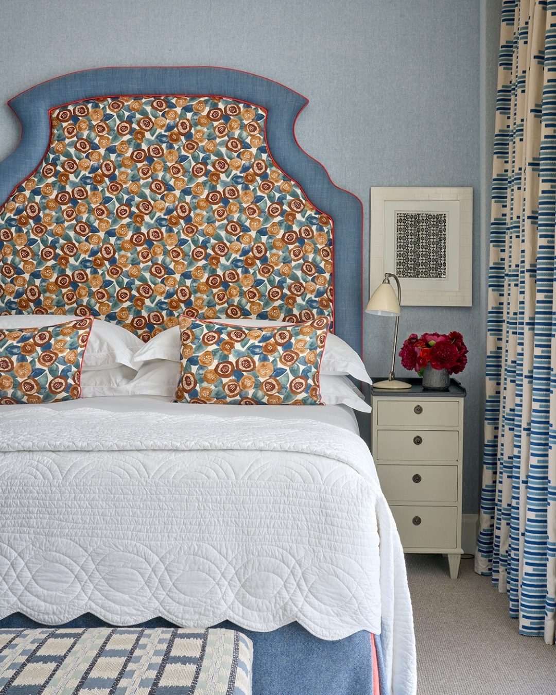
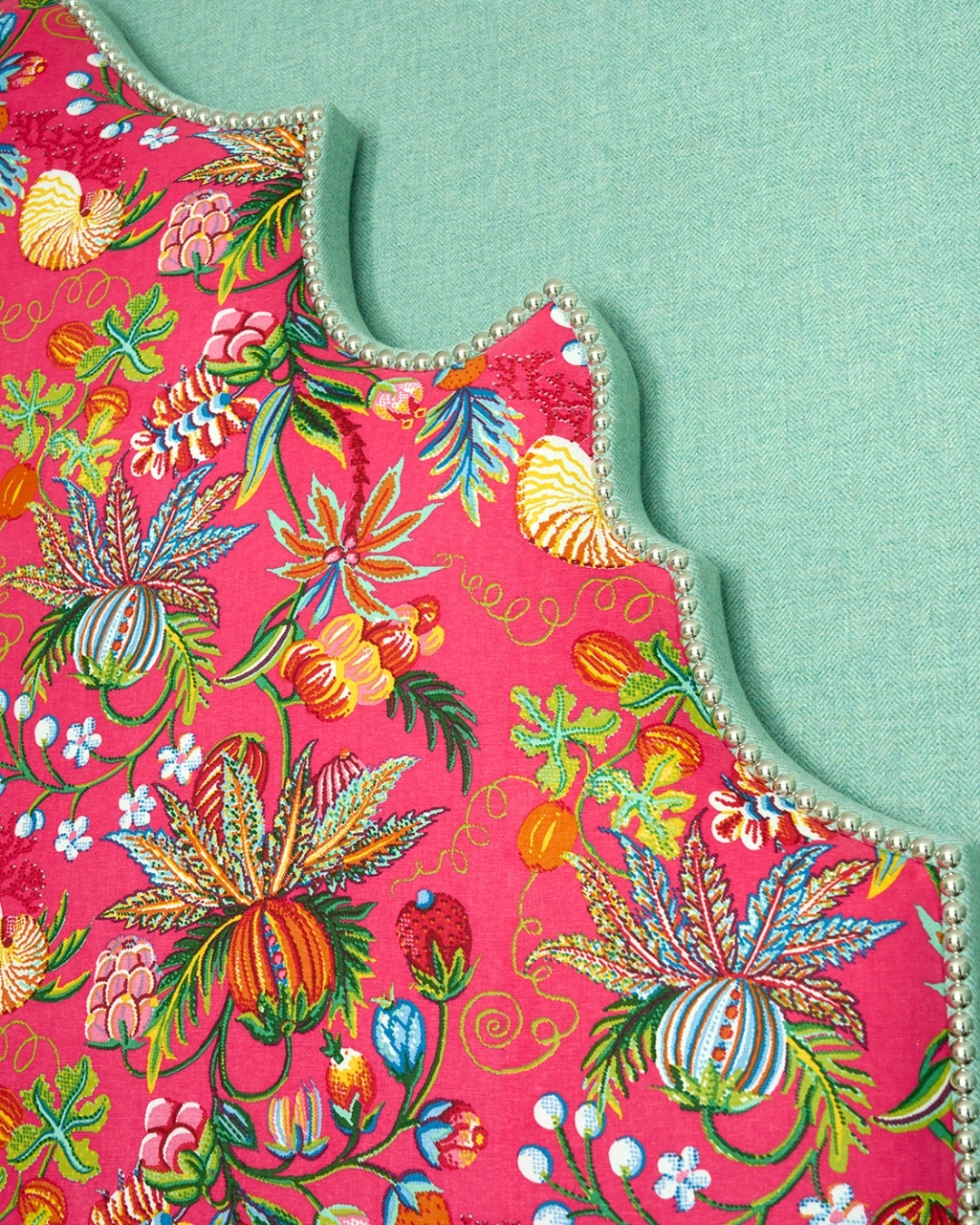
Headboard Depth
We also like to explore the relationship between plain and patterned fabrics through the edges of the headboard. Using a colour drawn from the main fabric along the depth helps to frame the headboard against the wall. A thicker border, such as on our Ellie headboard, adds further dimension and gives the piece a stronger architectural presence.
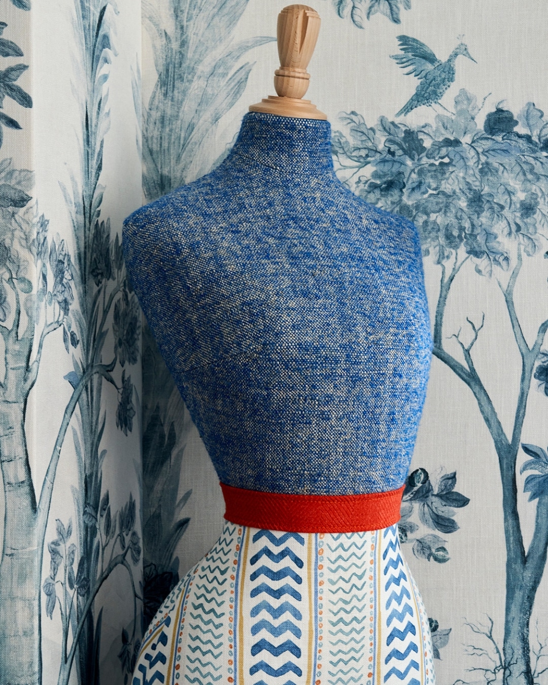
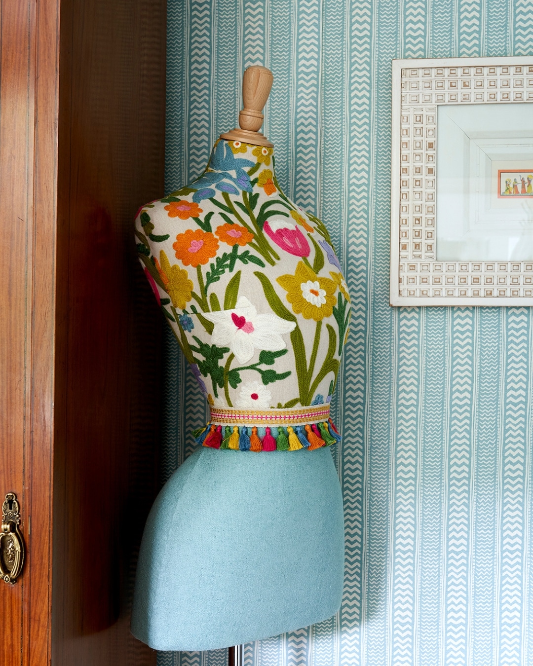
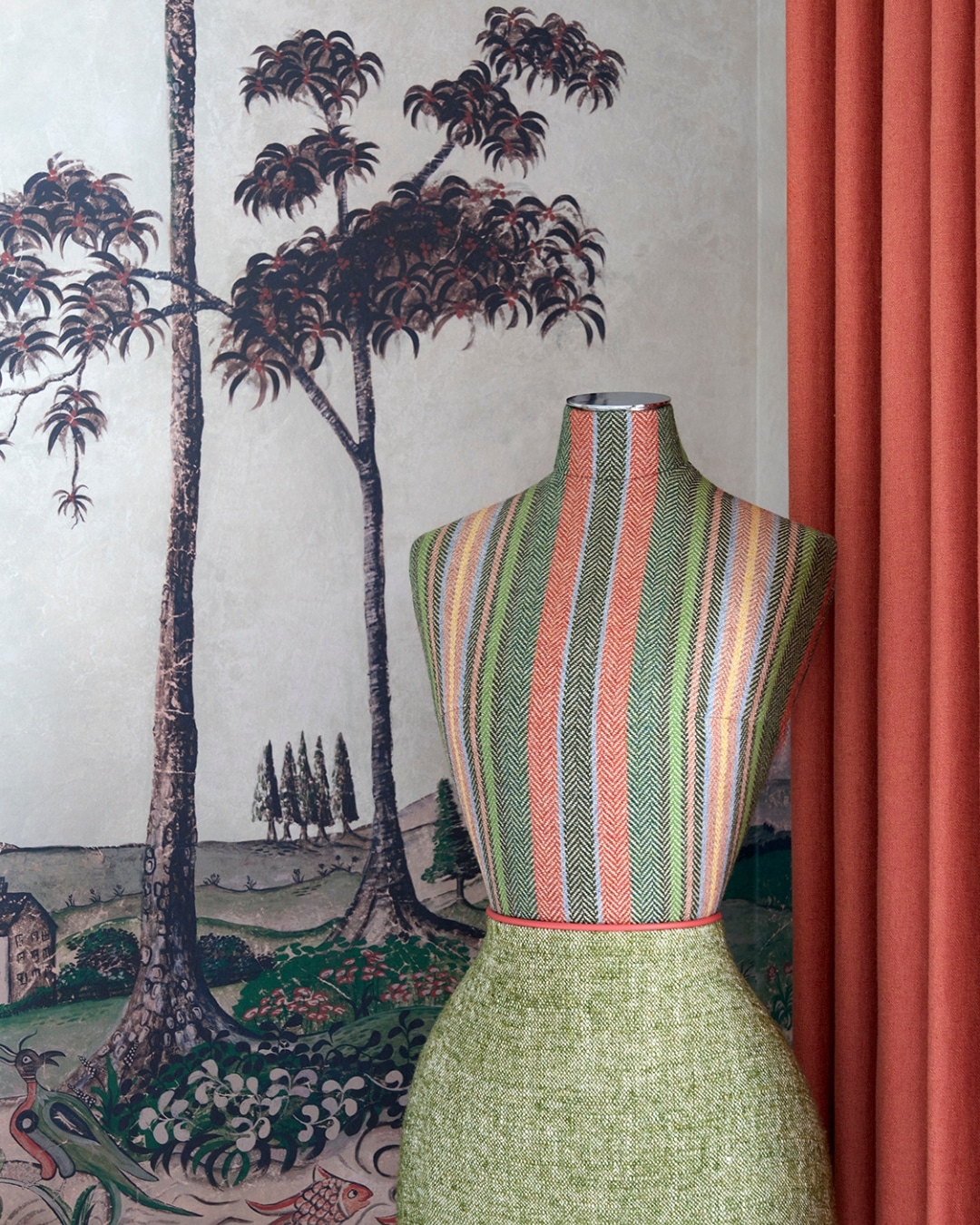
Mannequins
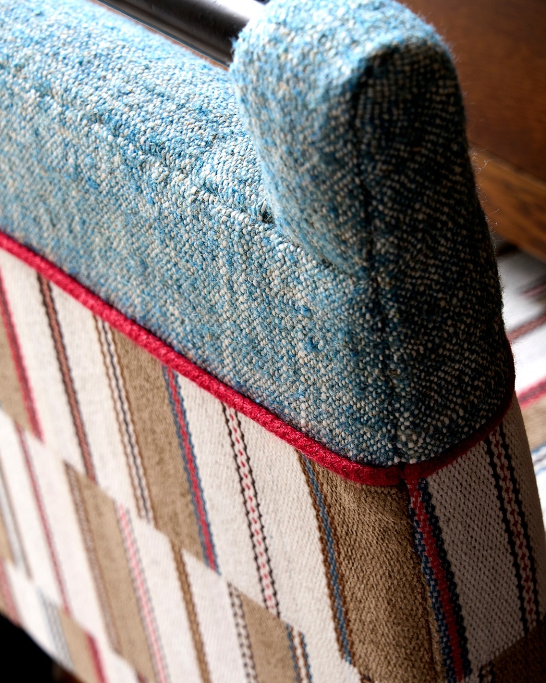
Another opportunity to experiment with fabric blocking is through our mannequins. Often divided between a patterned or striped textile on one half and a complementary plain on the other, these pieces introduce a sense of character and playfulness into the room. A trim or fringed belt defines the meeting point, completing a cohesive look while adding movement and colour.
What makes this approach so effective is its simplicity. Bringing life to upholstery does not need to be complex. Often, it is the clearest gestures that create the most memorable impact, with straightforward details delivering a strong visual statement. Imagine each of these pieces in a single fabric and how the room might shift, how much quieter it would feel. Each division, trim and contrast becomes part of the room’s rhythm. By allowing fabrics to converse with one another, you introduce depth, balance and harmony.
We hope this inspires you to experiment with two-tone upholstery in your own interiors. It is often within these quieter design decisions that a room finds its true sense of balance, character and completion.