Things That Spook Us In Interior Design

Day to Day

Discover our top design dilemmas to avoid this spooky season...

It’s that thrilling time of year when the eerie and unsettling take centre stage! While interior design is often celebrated for its creativity, beauty, and harmony, lurking behind every project can be a few nightmarish scenarios. While most dread ghosts and creepy crawlies, our design terrors stem from missteps within a space. Join us on today’s blog as we unveil some of our spookiest design dilemmas.

The Haunted Colour Palette

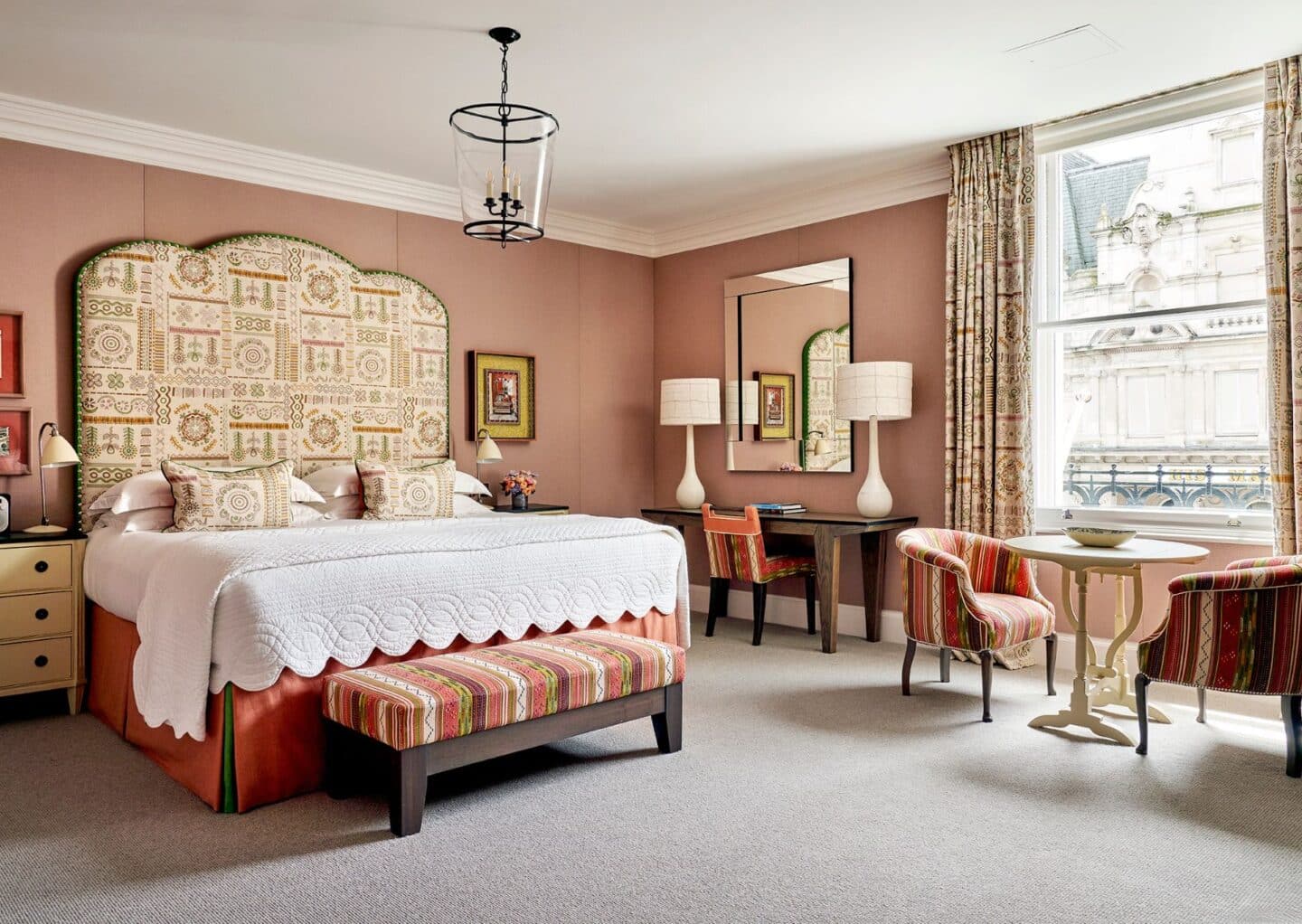
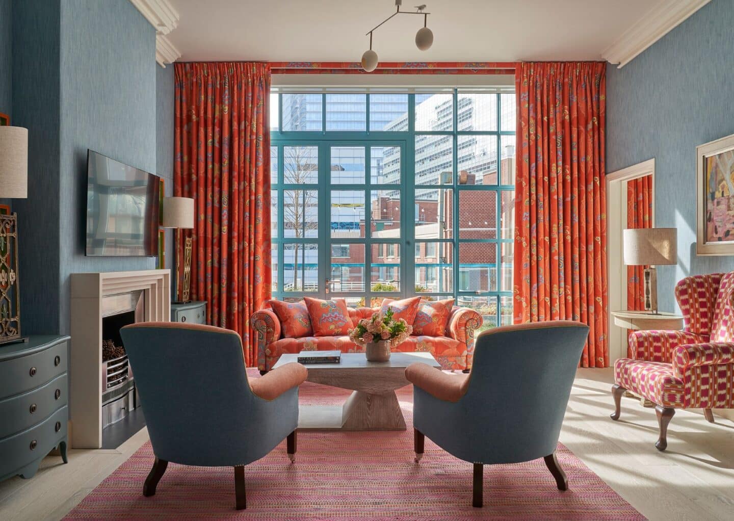
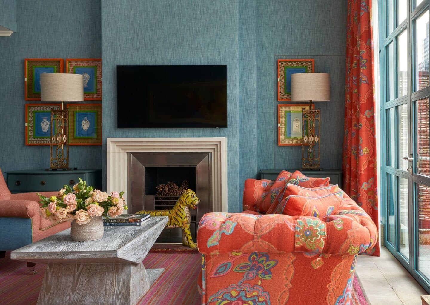
Selecting the perfect colour palette can be a daunting task. Factors like room size, shape, and orientation all play a crucial role. Take your time to curate samples in the space, as that breathtaking green might appear murky or dull in the light, and a bold accent may clash instead of pop! It’s enough to send chills down your spine!

Sinister Scale

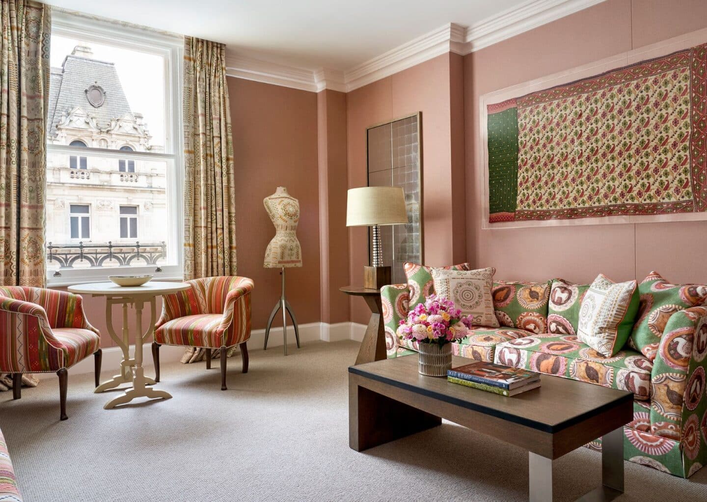
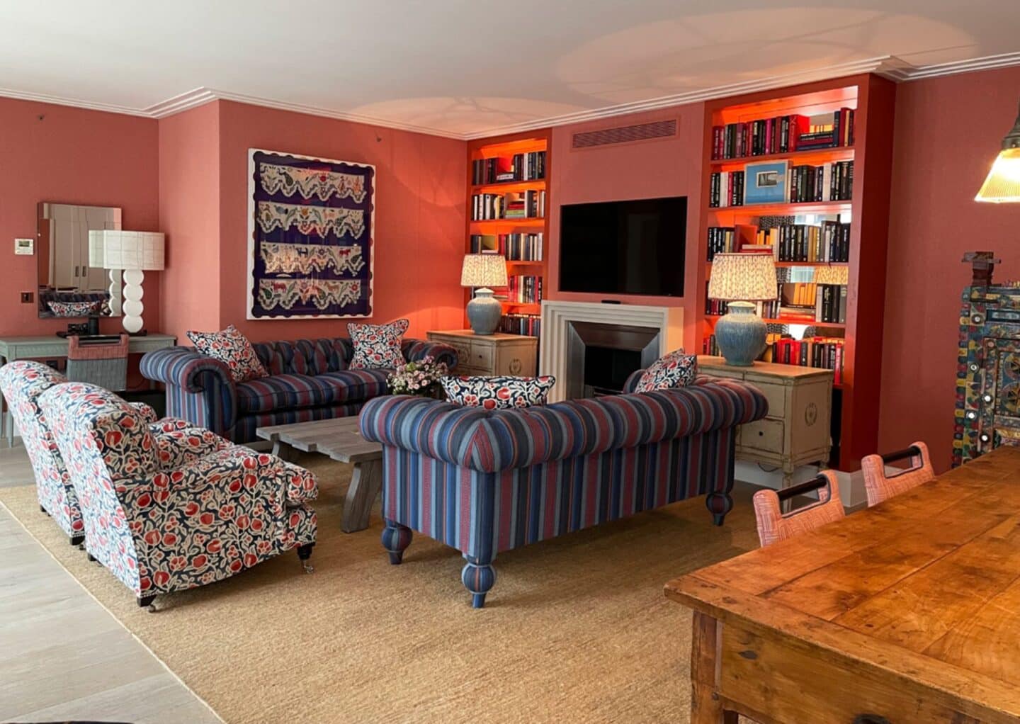
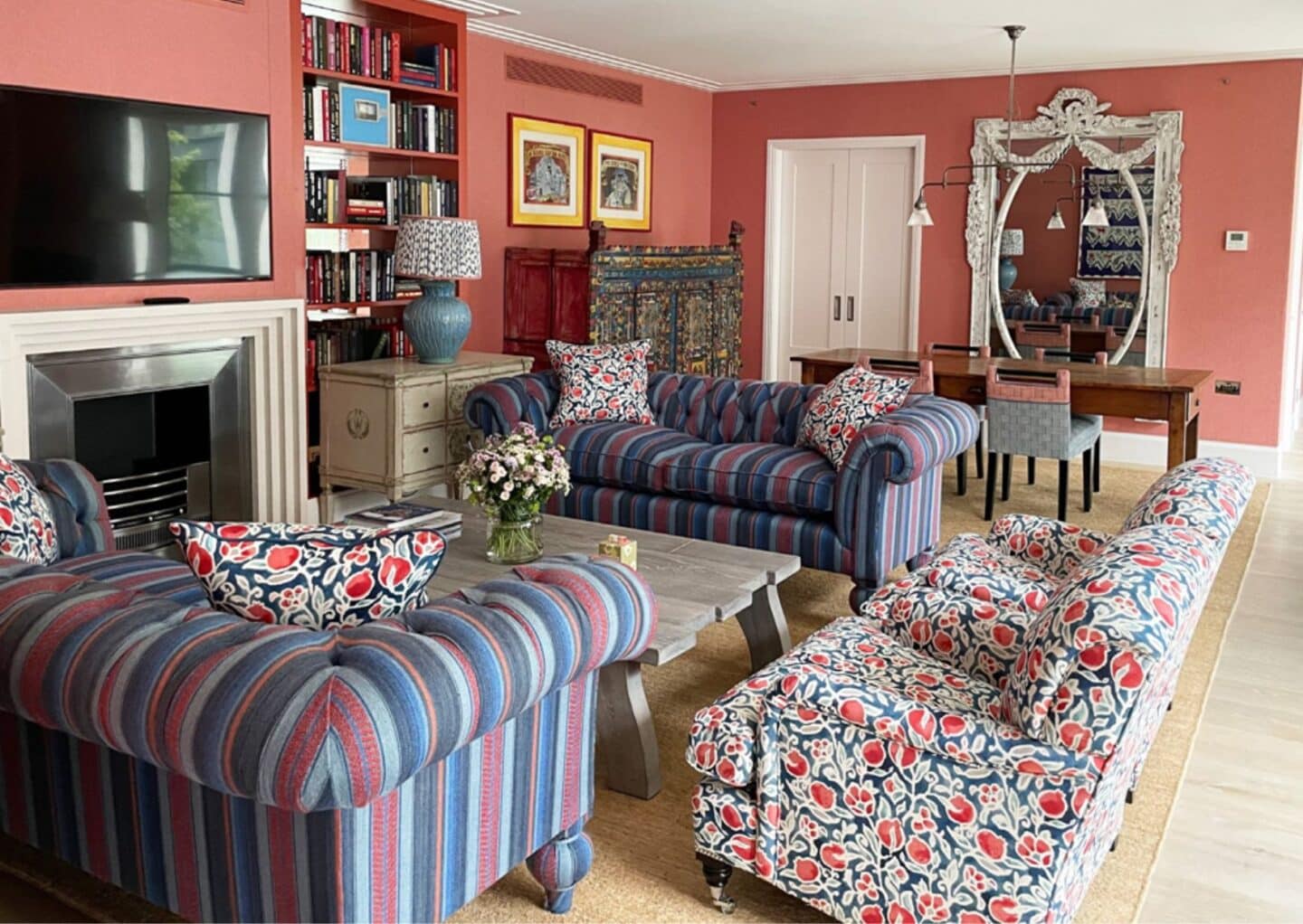
Scale is essential in design, and when it goes awry, the room can feel possessed by poor choices. Beware of rugs that are too small for seating areas, sofas that require acrobatics to navigate, and coffee tables that are just out of reach. Remember, a small room doesn’t have to be overrun with miniatures, and a larger space shouldn’t be filled with oversized furniture!

The Curse of Bad Lighting

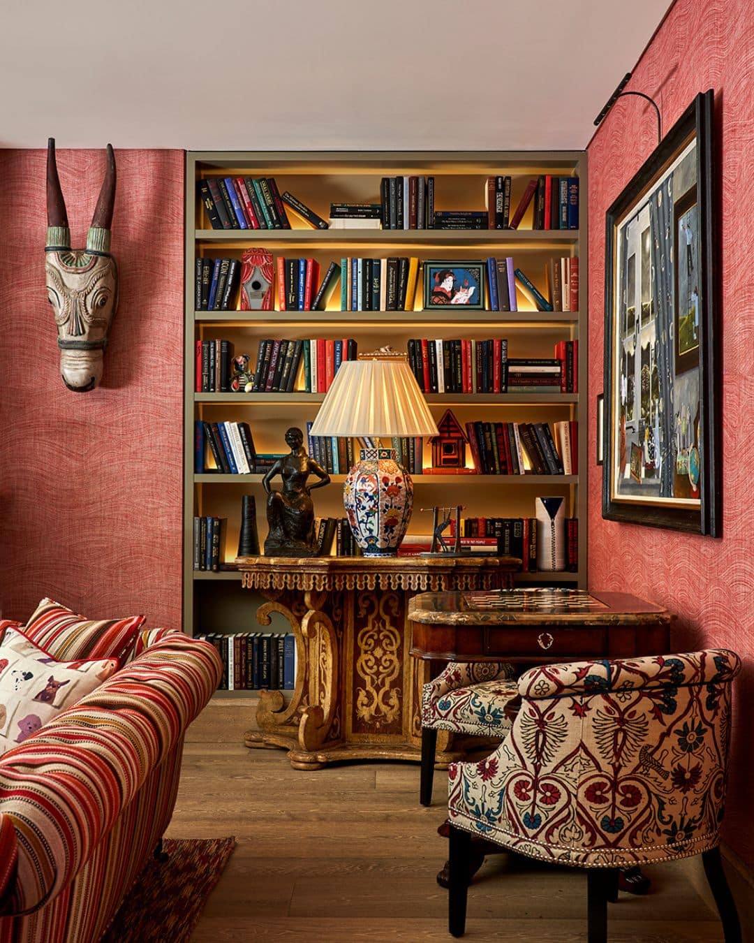
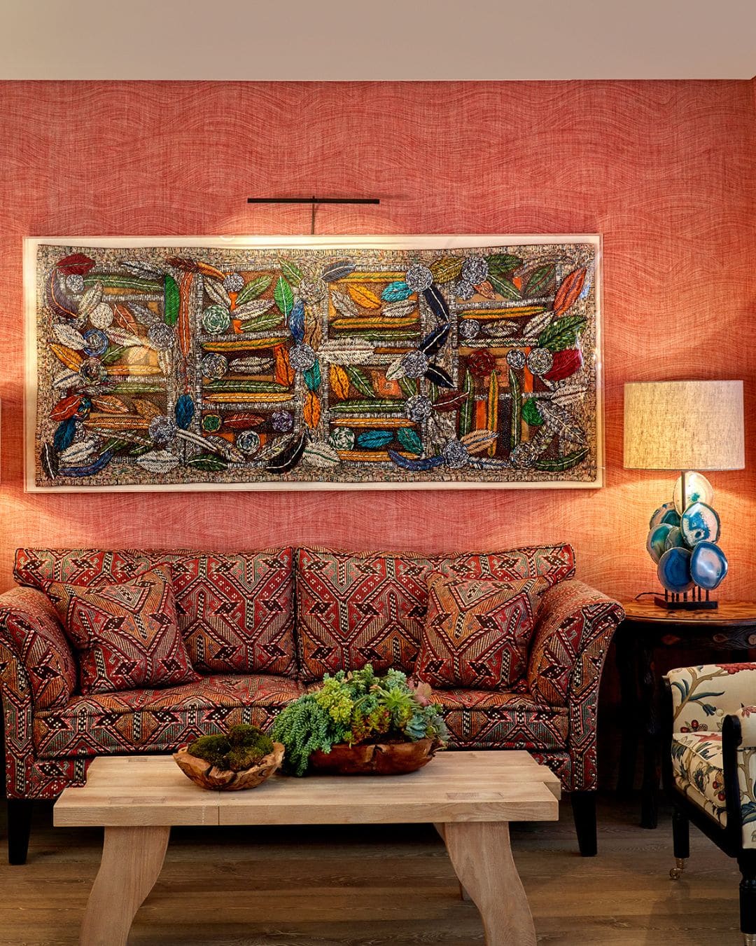
Lighting can transform a space from drab to delightful—or vice versa. A stunning room can lose its charm with harsh lighting. At the Kit Kemp Design Studio, we often steer clear of spotlights in cosy spaces like living rooms and bedrooms, opting instead for warm, inviting low-level lighting through table lamps and wall sconces. However, spotlights do have their place—our secret? Use them sparingly and equip them with dimmer switches for versatility. Uplighters can also create the illusion of spaciousness and highlight key features, adding depth and intrigue to your design.

Ignoring Functionality for Aesthetics

The most chilling design misstep? Prioritising looks over practicality. A beautiful room that fails to meet the needs of its inhabitants is a ticking time bomb. Whether it’s a bathroom devoid of storage, a kitchen with impractical surfaces, or a living room that hinders conversation, neglecting function is unforgivable. Every space must cater to its intended use, balancing beauty with comfort and convenience.

The Unruly Floor Plan

An effective floor plan fosters spaciousness and encourages social interaction while allowing light to flow freely. Avoid the dark side of design with poorly considered layouts where furniture hugs the walls or blends into a chaotic mishmash. Create visual boundaries using rugs, strategic furniture placement, and lighting zones to maintain openness while defining areas.

We hope you’ve enjoyed this glimpse into the spine-chilling realities of the design world and picked up some tips to avoid these common pitfalls!