We love sourcing unique items for our hotels and design projects and a top trick of ours is to bring together newer pieces with unexpected antiques. Join us as we explore some examples that will help you elevate a space and add a sense of richness to your interior designs…
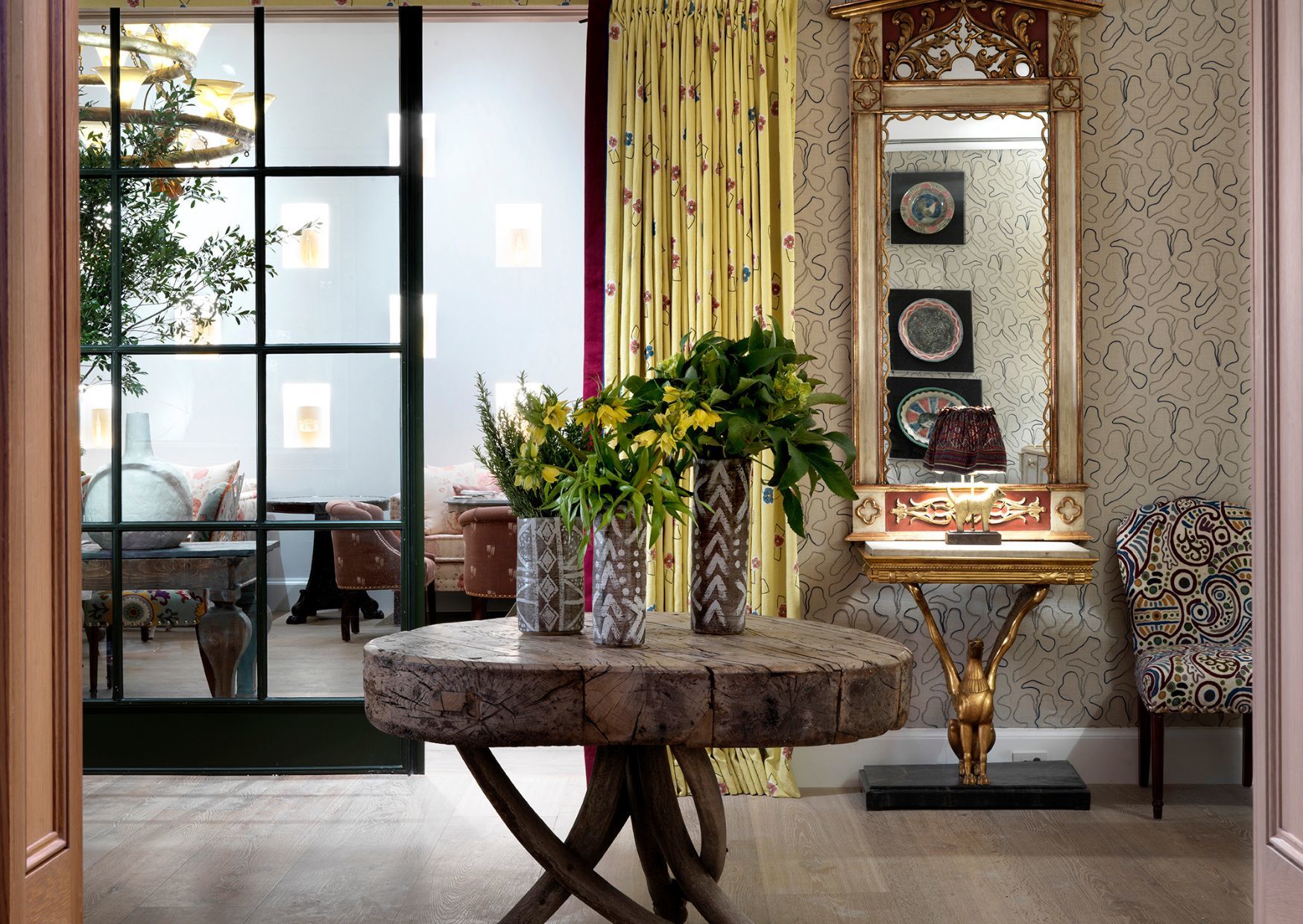
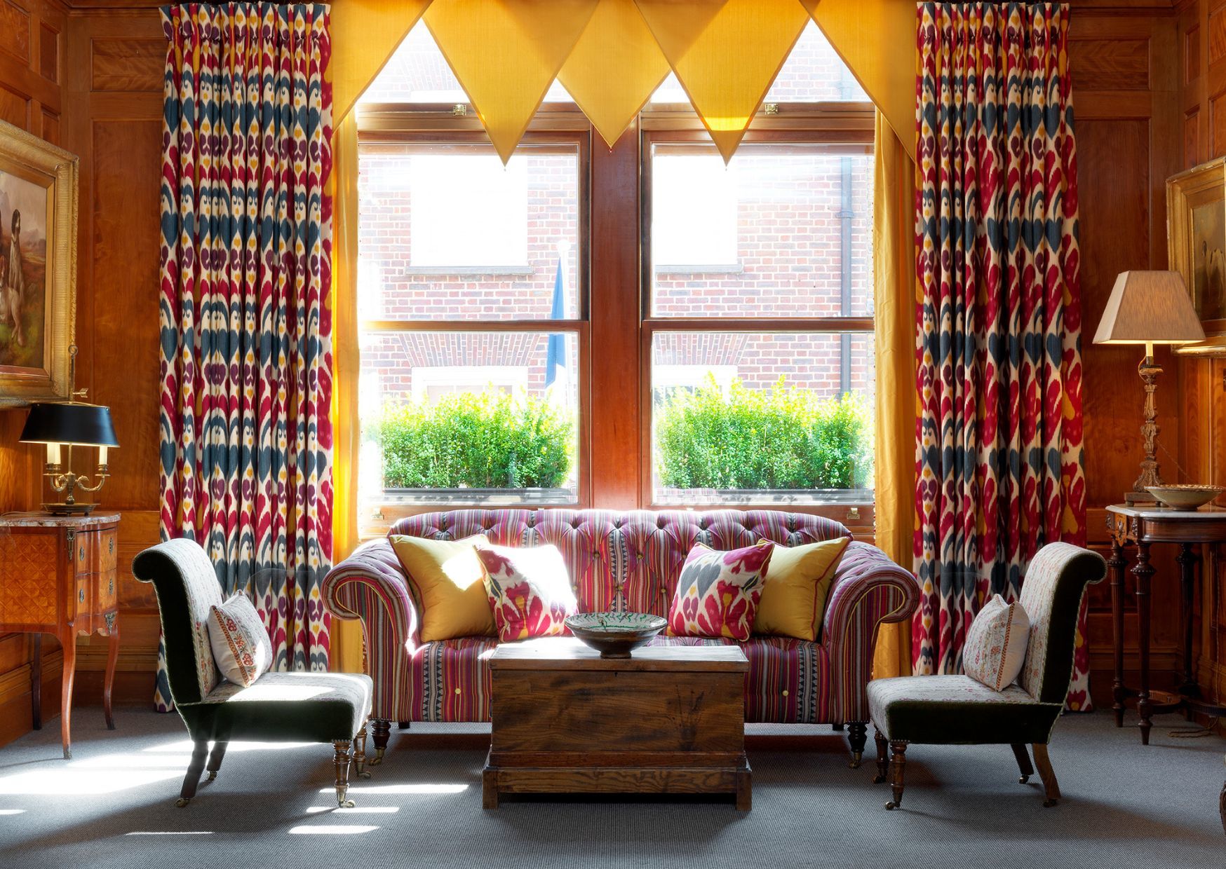
Our Drawing Room at The Whitby Hotel really packs a punch with a layering of fabrics, ceramics and artworks. The mirror and console table add a chic element and sense of historical texture along with their gilding. A modern crewel work from Clarence House harks back to the past where this form of wool embroidery was extremely popular, especially in the 17th century.
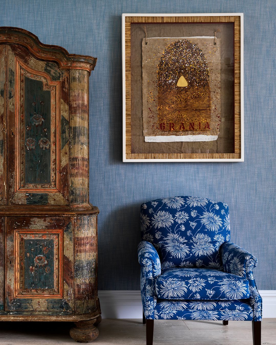
Here in The Whitby Hotel’s Penthouse Suite, a folkart painted Swiss armoire completes the space. Its strong form and large proportions are balanced by beautiful and delicate painted flowers. We’ve used a complementing colour for the surrounding upholstery and walls, while a clean white frame contains textured artwork by Joe Tilson.
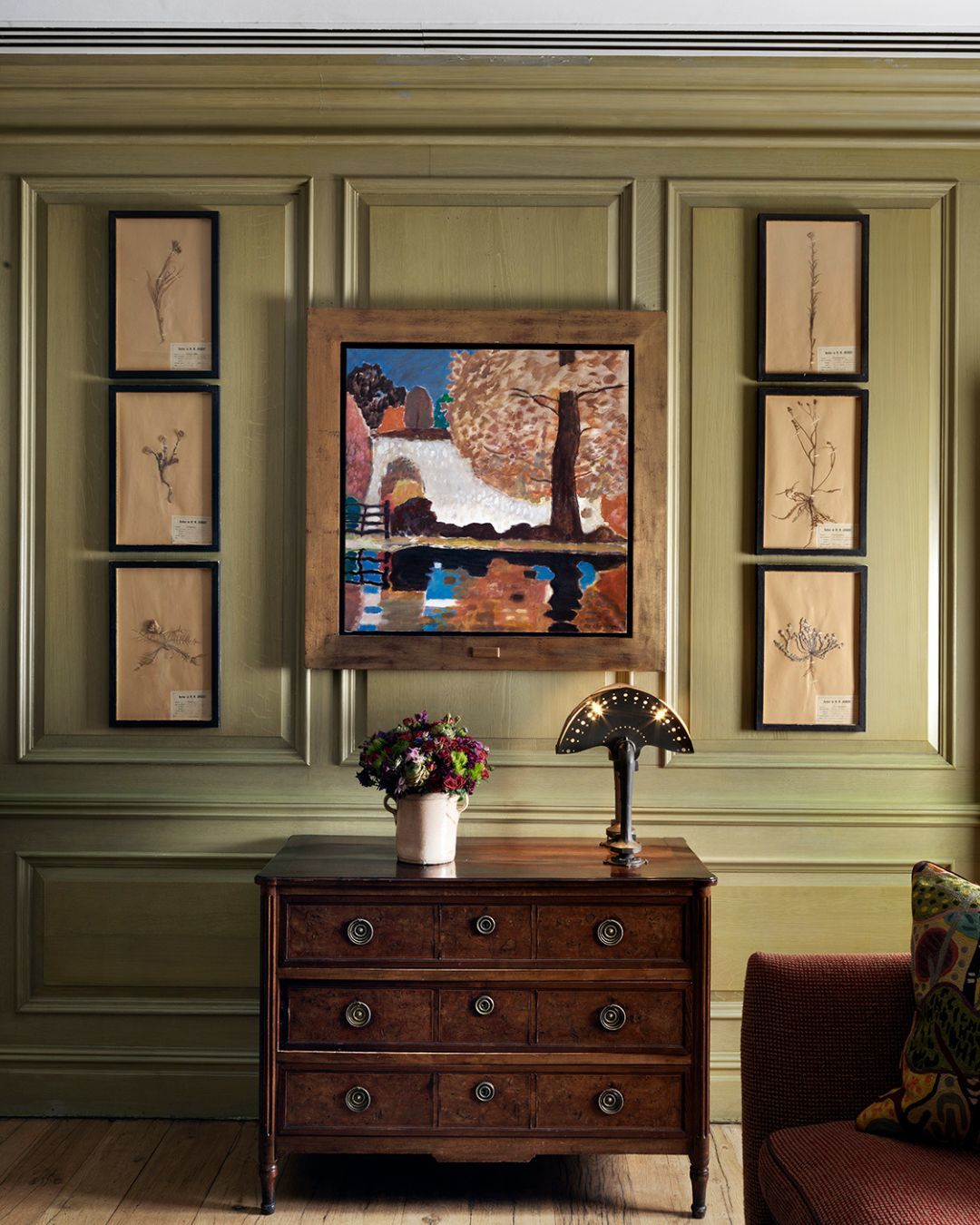
A Joanna Carrington landscape painting brings a pop of colour and balances the rich darkness of the burr walnut chest. Who says you can’t mix woods!
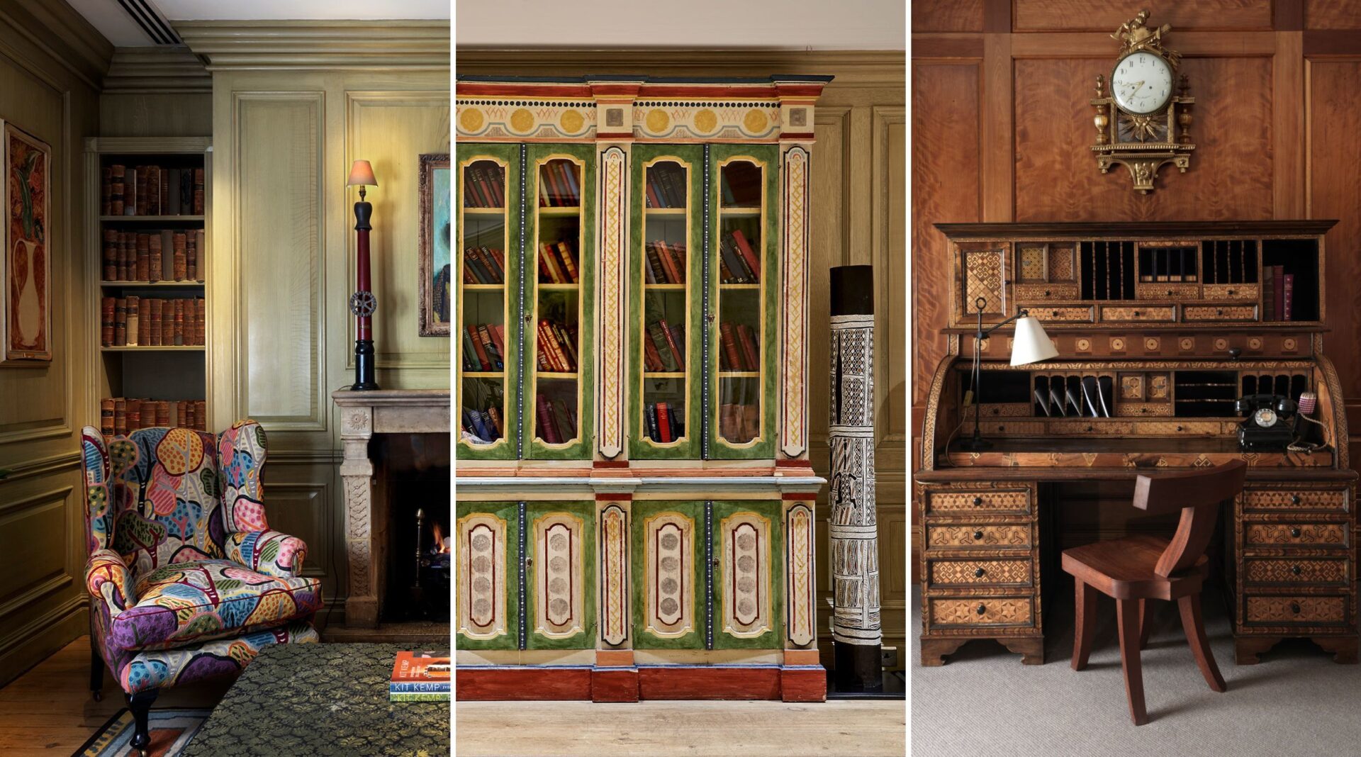
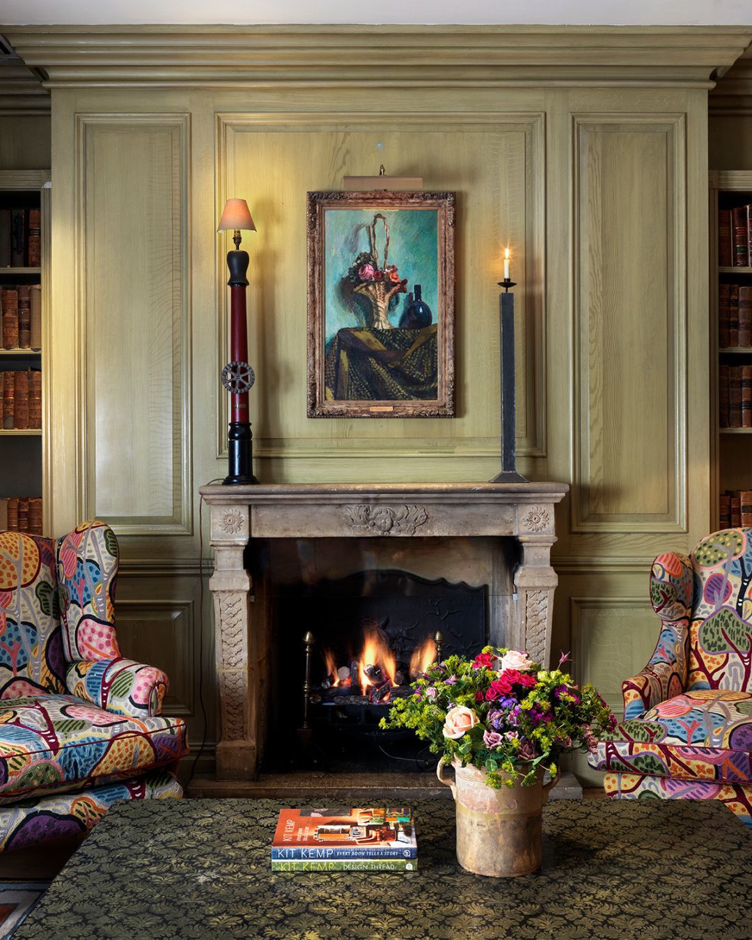
Panelling is a classic and beautiful way to decorate walls. Using strong architectural elements in interiors can be essential to add form and character where a space may be lacking. In the Library at Charlotte Street Hotel, the mixed width oak floorboards have an aged patina and texture. Reclaimed boards are not only environmentally friendly but they also add charm. Here, they set off the texture of the panelling, which has been finished in a green wash, celebrating the integral beauty of the grain.
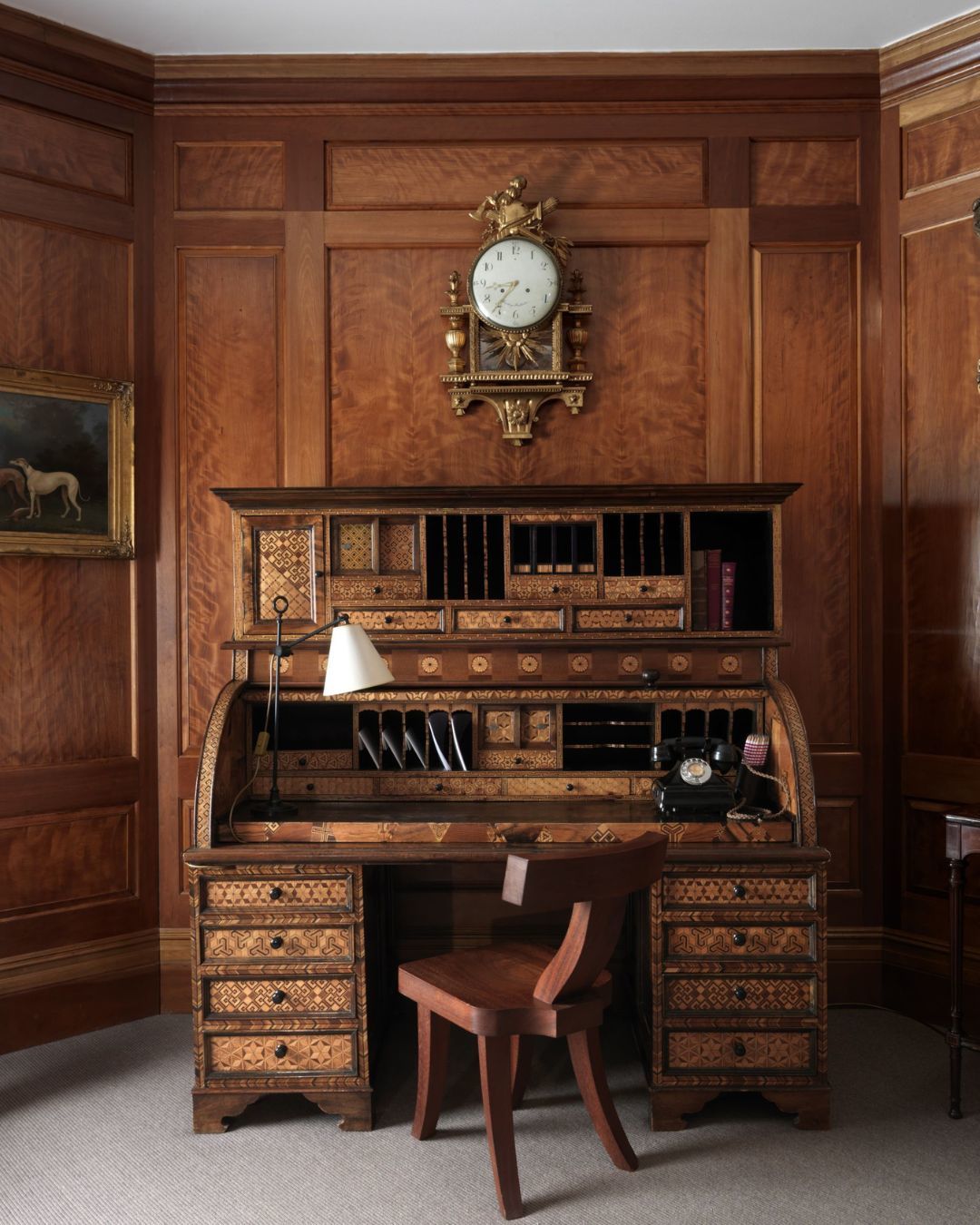
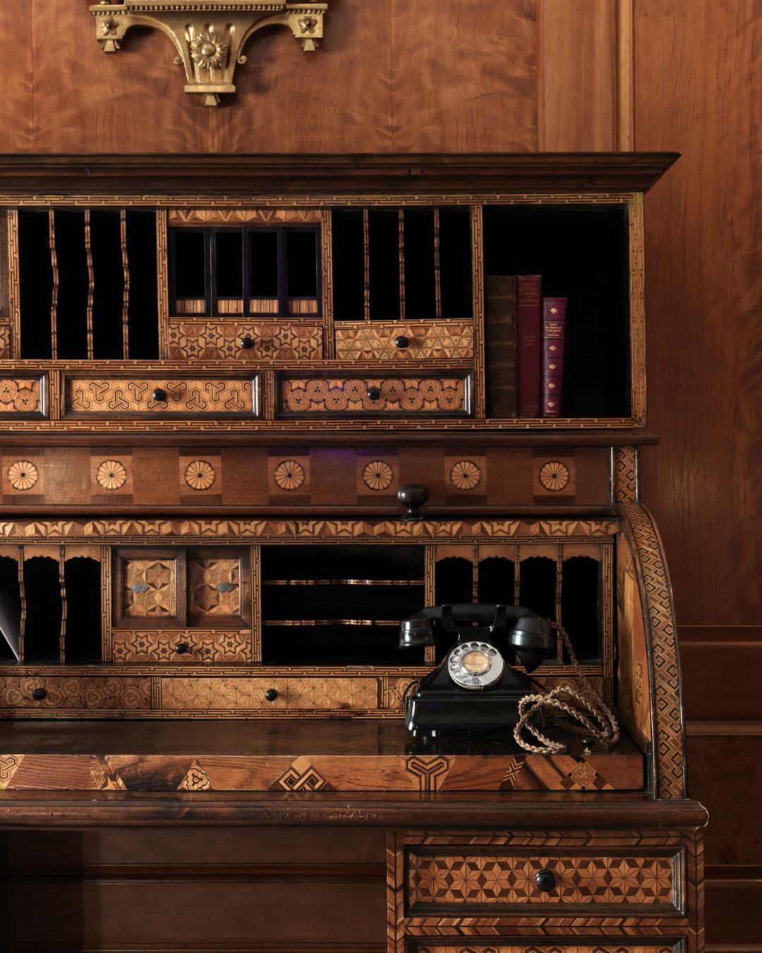
The Drawing Room at Covent garden Hotel is another example with its sensational and rich bookmatched burr. This 19th century secretaire is from Japan and made in the western style, which became fashionable after Japan ended its 220 year long period of isolation. The marquetry is highly unusual and displays traditional Japanese patterns often used in paper and fabric designs. Here, the furniture surrounding the piece is simple, to really let it do the talking.
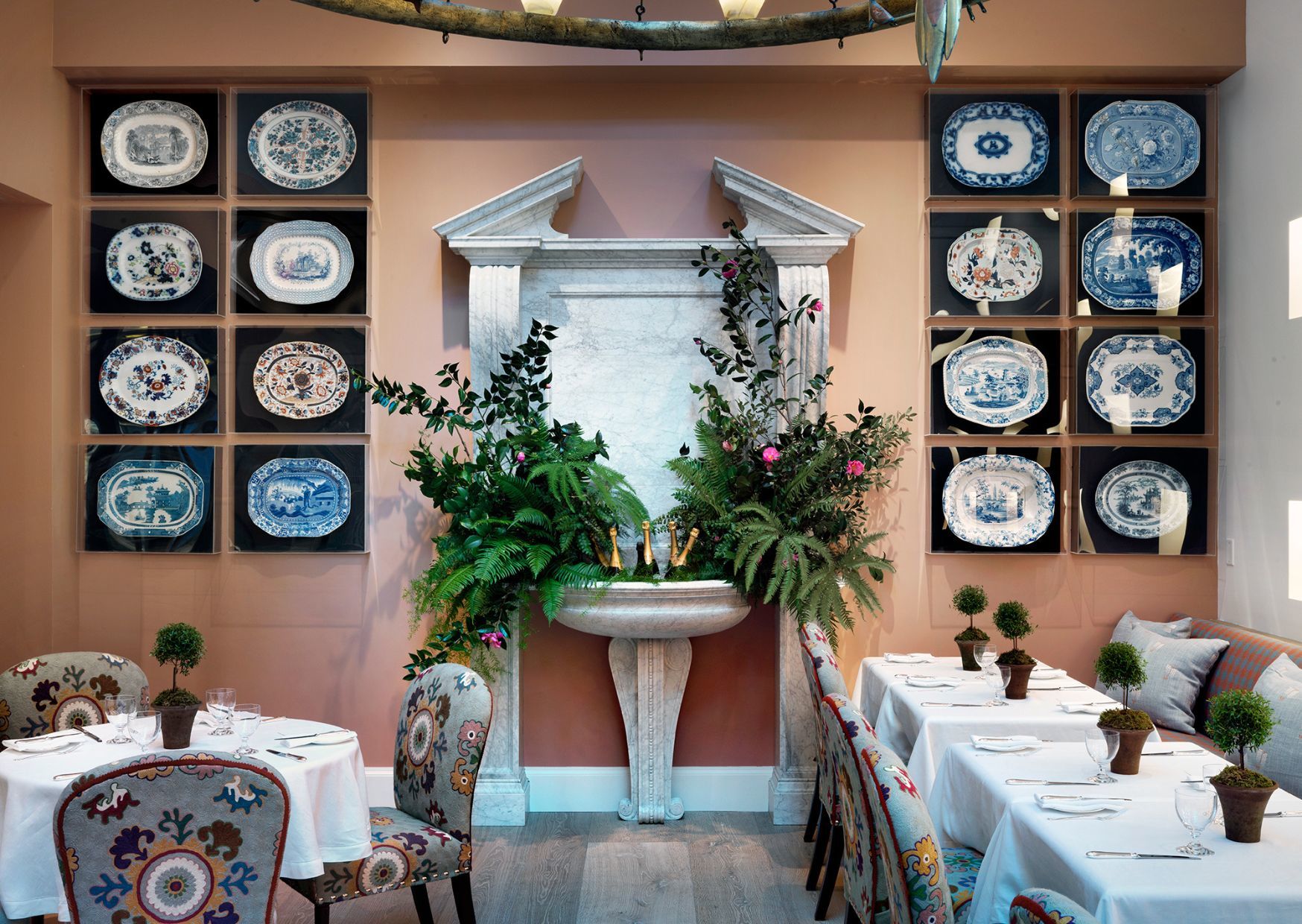
In The Whitby Hotel’s Orangery we created a grand focal point with this Italian style pedestal sink. On each side there are collections of antique and vintage serving platters, which have been framed in unfussy, modern perspex. Placed on black backgrounds, the colours of each platter sing against the terracotta walls. References to the past make a space timeless!
Another view from this room shows how we’ve used textiles to add a contemporary touch amongst traditional surroundings.
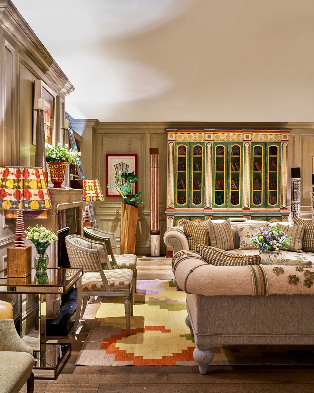
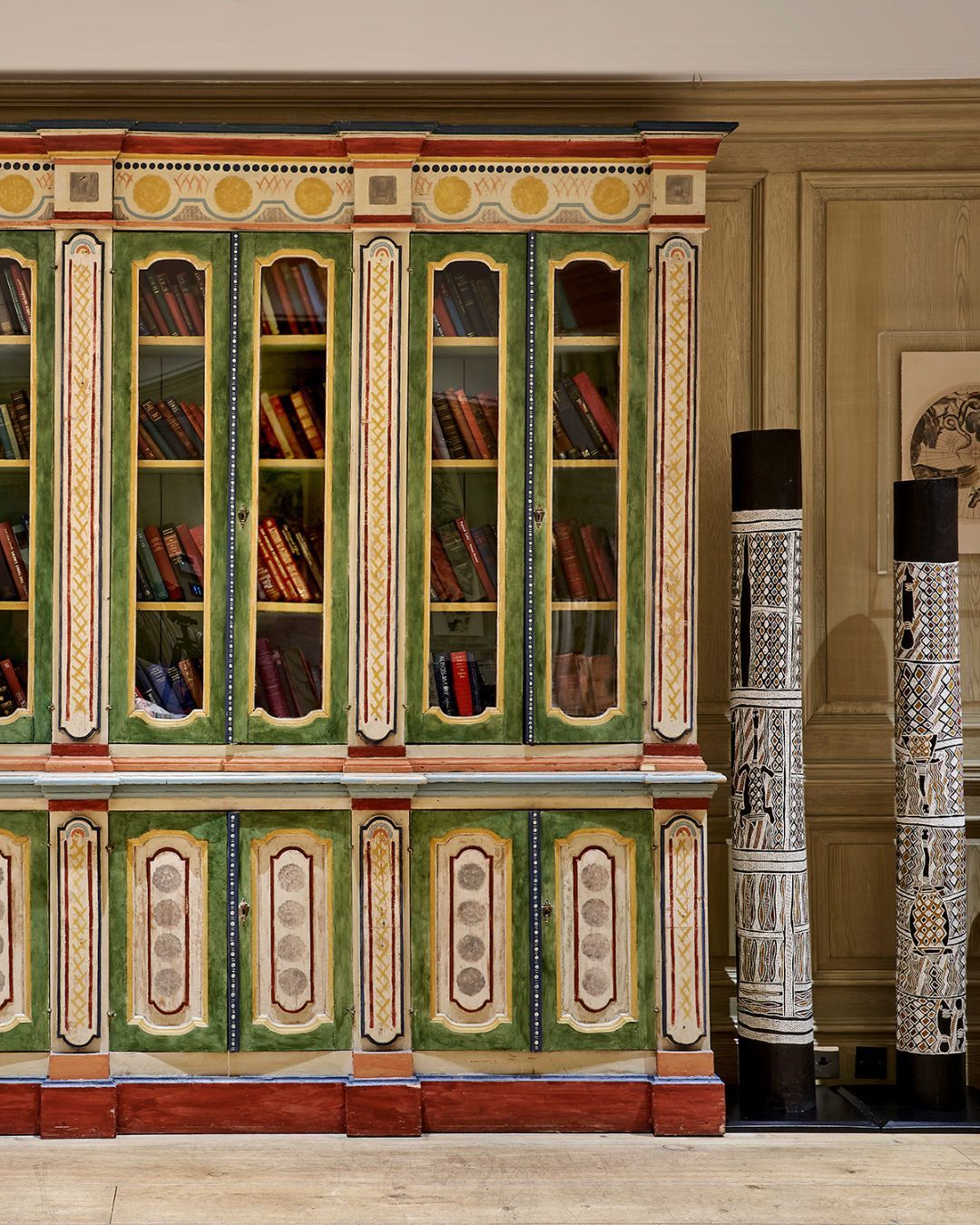
In the Library at The Soho Hotel, this 19th century glazed bookcase was recently stripped and repainted in bold colours by artist Tess Newall and celebrates the style of The Bloomsbury Group.
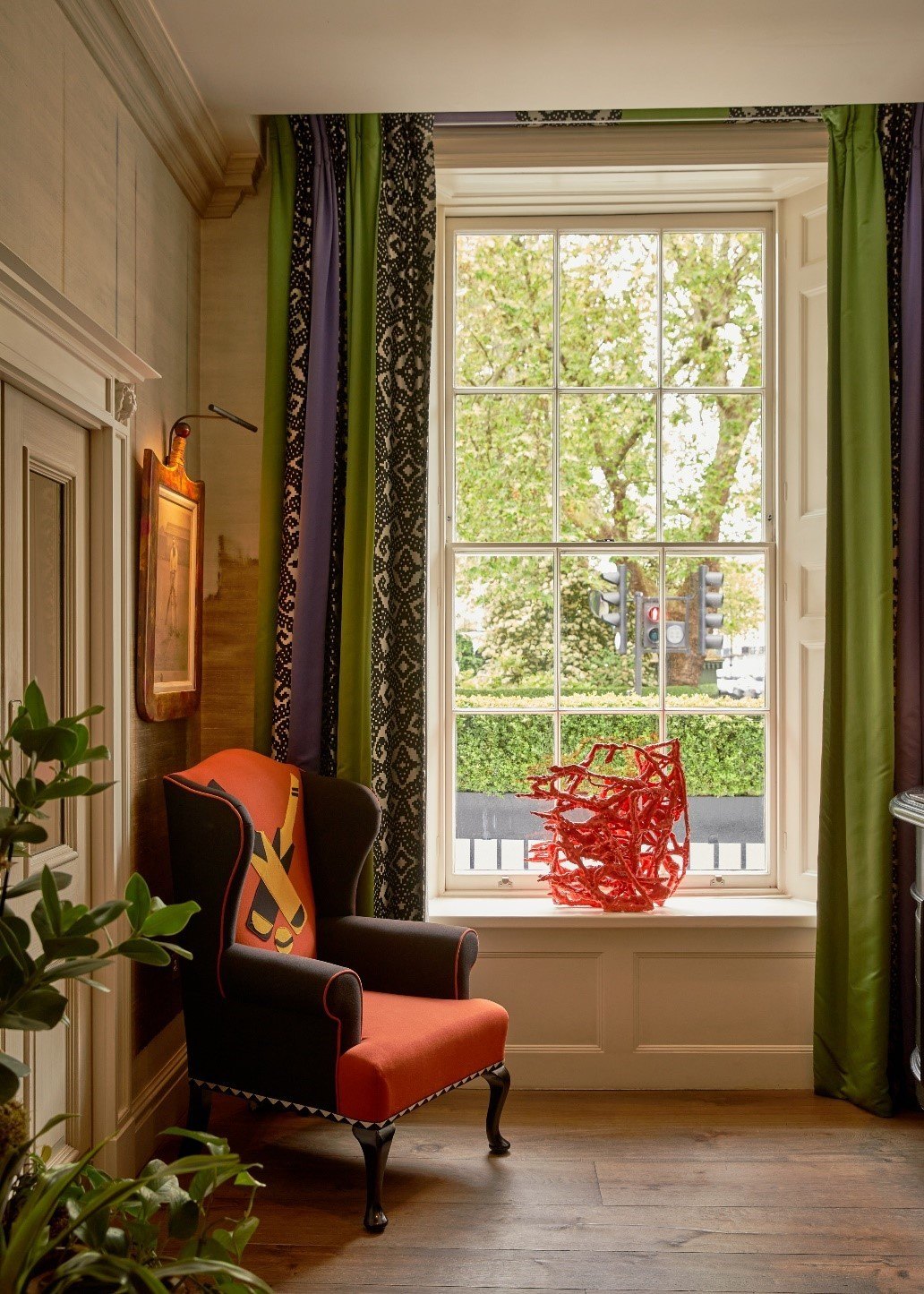
In Dorset Square Hotel’s lobby you’ll find aged oak floors which make a foundation for layering other elements of the room. New bold curtains are set alongside an armchair. Using bold fabrics and colours together, such as apple green and burnt sienna adds excitement.
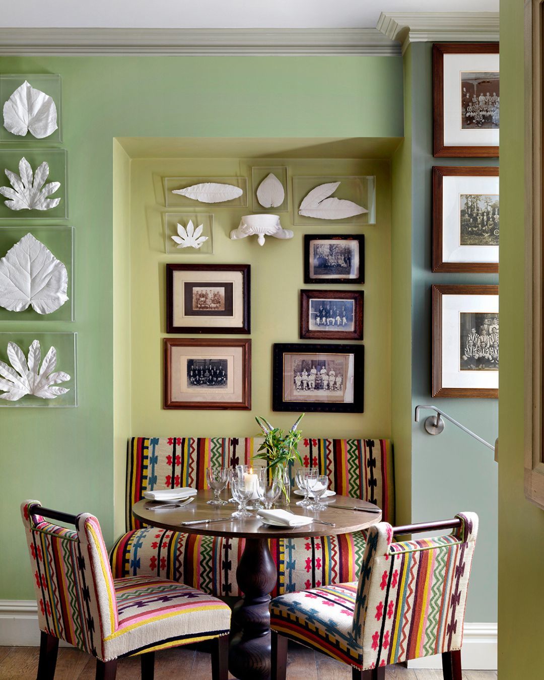
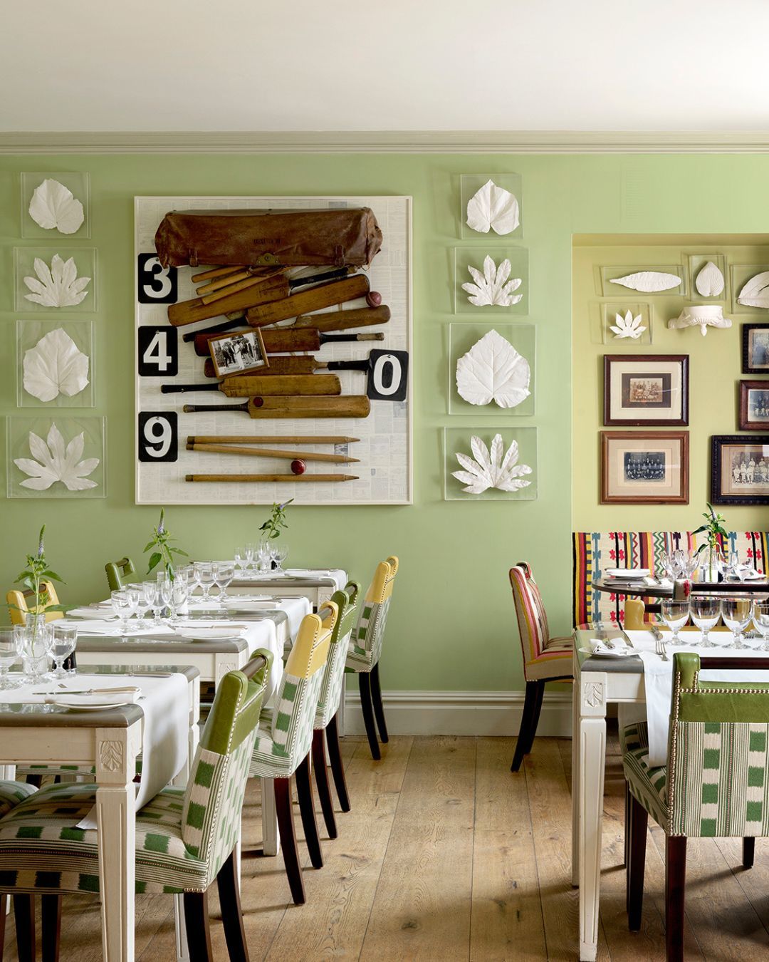
At The Potting Shed, bold pistachio green makes a bold contrast alongside the wooden framed antique photographic prints, while bright and bold embroidered seating fabric by Pierre Frey brings a sense of character.
We hope we’ve inspired you to get creative and playful when bringing together the new with the old.

