We redesign our hotel schemes and residences every three to five years. As trends come and go, we refresh our spaces so that our interiors stay contemporary and exciting for our guests. We’d like to share some before and after interior design transformations – we hope these will inspire you when refreshing your home…
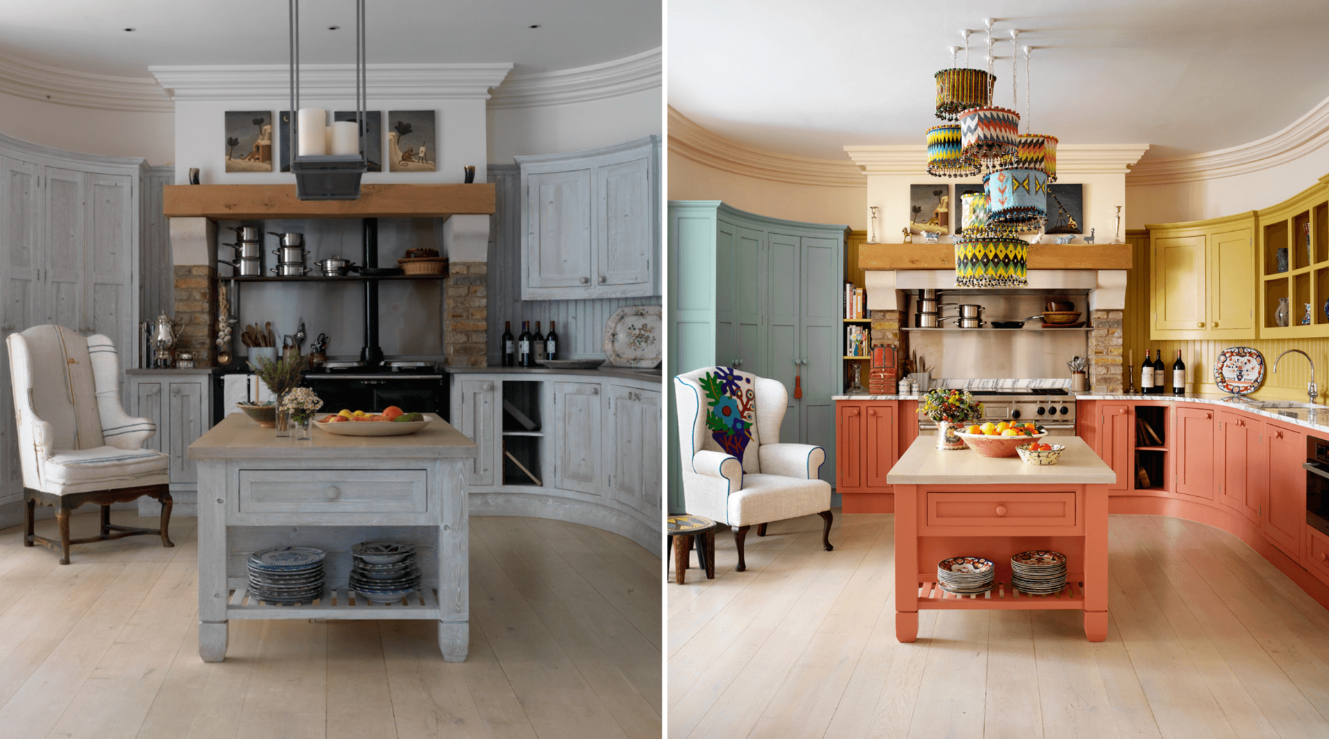
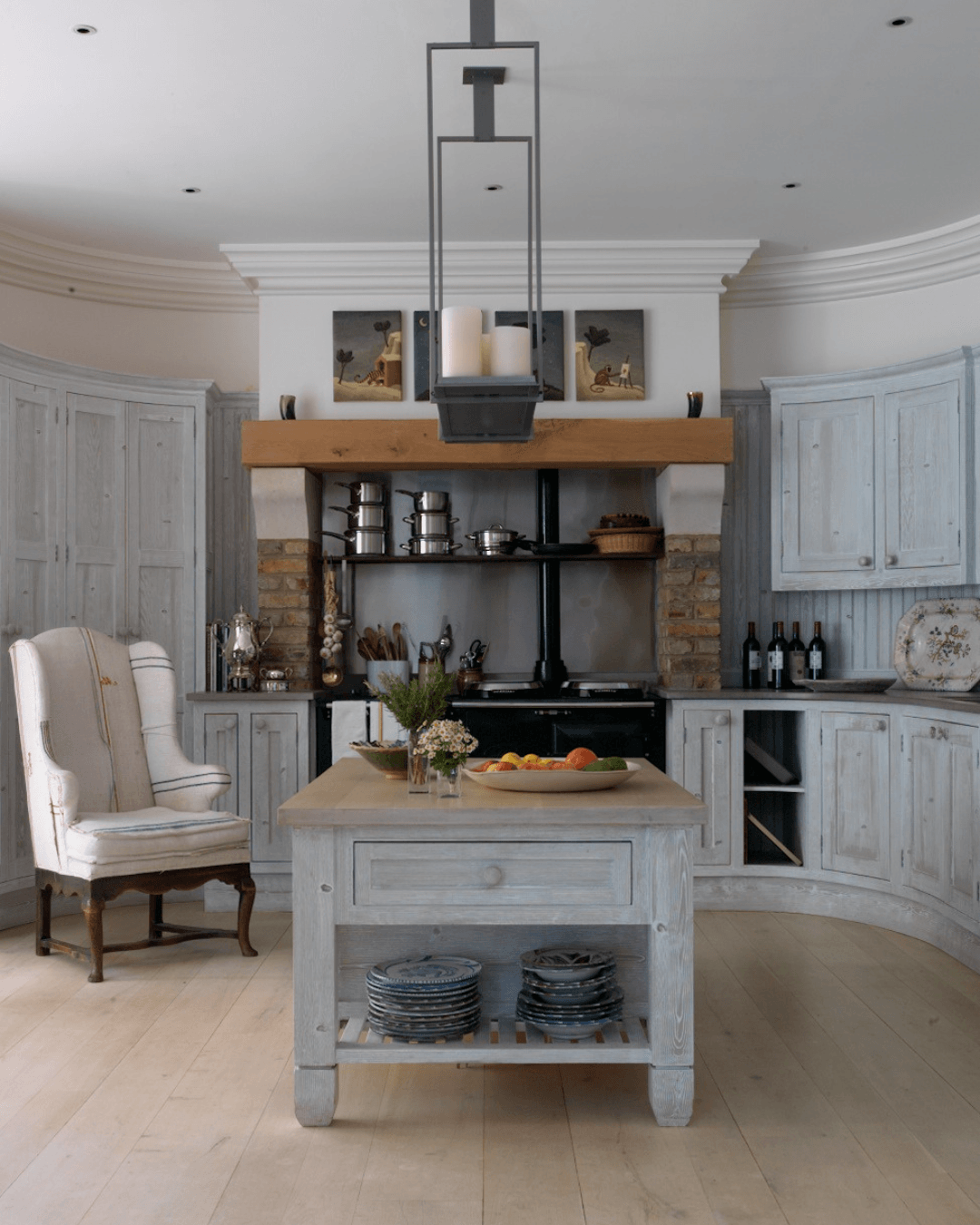
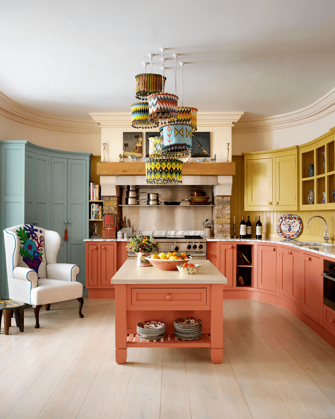
For this residential project in London, we gave the kitchen a new lease of life by adding a lick of paint on the cabinets. We tend to use block colours in kitchens as this often makes the room feel bigger. What a difference a splash of paint makes!
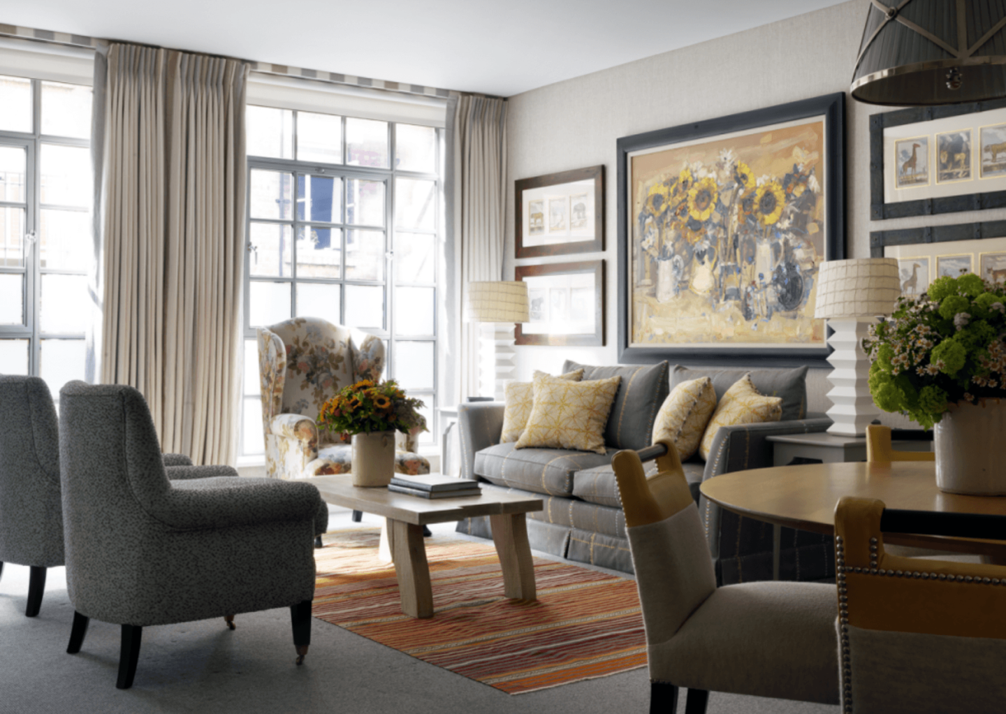
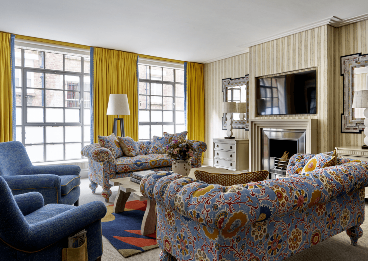
Here in Residence 24 at Ham Yard Hotel, the scheme went from calming neutrals to energetic and warm sunny hues. Explore the space further with our ‘Sleeping Around’ blog post here.
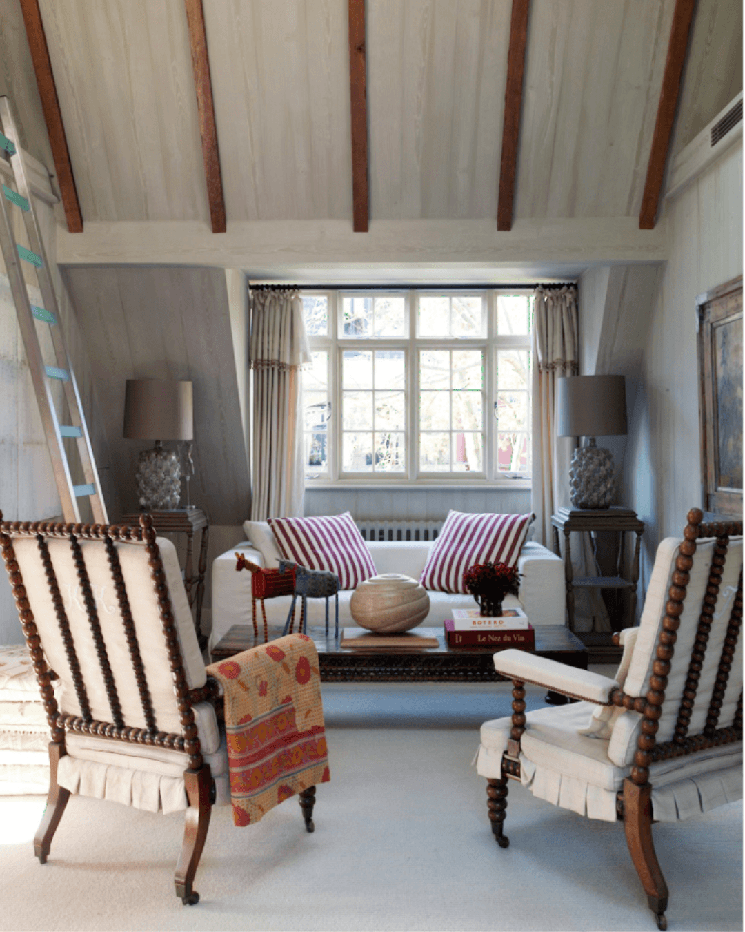
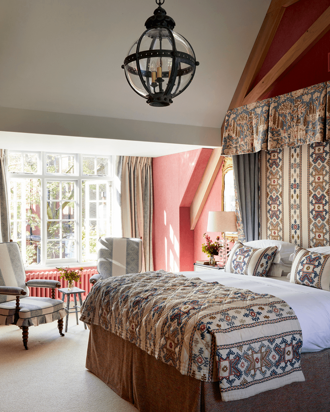
In this attic room, we filled and plastered the slanted ceiling, creating a smooth finish. This space was originally a reading room, but we transformed it to become the master bedroom. When a room has tall or slanted high ceilings, we recommend installing a bed canopy. This helps to draw the eye up, highlighting the height of the space. For tips and ideas, visit our blog post: How to Design a Canopy Bed.
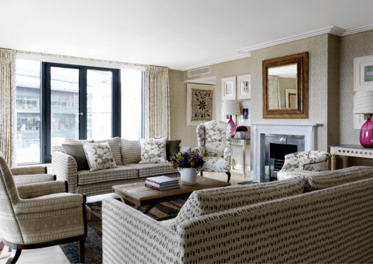
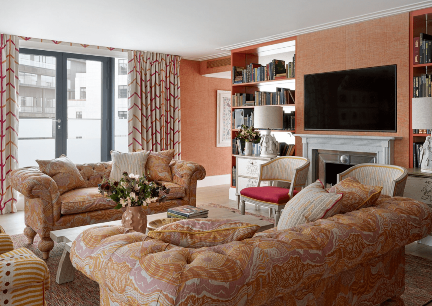
We have recently refurbished The Soho Hotel’s Residence suite using new and contemporary fabric designs. We also installed a fireplace, creating a new focal point within the drawing room. We like to install fireplaces where possible as they create two separate areas in one room – another trick to make a space feel bigger. Explore our Soho Residence here.
We hope these interior transformations bring you inspiration and ideas for when looking to refresh your own schemes!

